
Let's start by implementing a modal view that's displayed as the result of the user successfully performing an action. Here's the Modal component, which is used to show the user a success confirmation:
import React from 'react';
import PropTypes from 'prop-types';
import { View, Text, Modal } from 'react-native';

import styles from './styles';

// Uses "<Modal>" to display the underlying view
// on top of the current view. Properties passed to
// this component are also passed to the modal.
const ConfirmationModal = props => (
  <Modal {...props}>
    {/* Slightly confusing, but we need an inner and
         an outer "<View>" to style the height of the
         modal correctly. */}
    <View style={styles.modalContainer}>
      <View style={styles.modalInner}>
        {/* The confirmation message... */}
        <Text style={styles.modalText}>Dude, srsly?</Text>

        {/* The confirmation and the cancel buttons. Each
             button triggers a different callback function
             that's passed in from the container
             component. */}
        <Text
          style={styles.modalButton}
          onPress={props.onPressConfirm}
        >
          Yep
        </Text>
        <Text
          style={styles.modalButton}
          onPress={props.onPressCancel}
        >
          Nope
        </Text>
      </View>
    </View>
  </Modal>
);

ConfirmationModal.propTypes = {
  visible: PropTypes.bool.isRequired,
  onPressConfirm: PropTypes.func.isRequired,
  onPressCancel: PropTypes.func.isRequired
};

ConfirmationModal.defaultProps = {
  transparent: true,
  onRequestClose: () => {}
};

export default ConfirmationModal;
The properties that are passed to ConfirmationModal are forwarded to the React Native Modal component. You'll see why in a moment. First, let's see what this confirmation modal looks like:
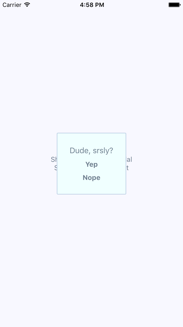
The modal that's displayed once the user completes an action has our own styling and confirmation message. It also has two actions, but it might only need one, depending on whether this confirmation is pre- or post-action. Here are the styles used for this modal:
modalContainer: {
  flex: 1,
  justifyContent: 'center',
  alignItems: 'center',
},

modalInner: {
  backgroundColor: 'azure',
  padding: 20,
  borderWidth: 1,
  borderColor: 'lightsteelblue',
  borderRadius: 2,
  alignItems: 'center',
},

modalText: {
  fontSize: 16,
  margin: 5,
  color: 'slategrey',
},

modalButton: {
  fontWeight: 'bold',
  margin: 5,
  color: 'slategrey',
},
With the React Native Modal component, it's pretty much up to you how you want your confirmation modal view to look. Think of them as regular views, with the only difference being that they're rendered on top of other views.
A lot of the time, you might not care to style your own modal views. For example, in web browsers, you can simply call the alert() function, which shows text in a window that's styled by the browser. React Native has something similar: Alert.alert(). The tricky part here is that this is an imperative API, and you don't necessarily want to expose it directly in your application.
Instead, let's implement an alert confirmation component that hides the details of this particular React Native API so that your app can just treat this like any other component:
import React, { Component } from 'react';
import PropTypes from 'prop-types';
import { Alert } from 'react-native';

// The "actions" Map will map the "visible"
// property to the "Alert.alert()" function,
// or to a noop function.
const actions = new Map([[true, Alert.alert], [false, () => {}]]);

class ConfirmationAlert extends Component {
  state = { visible: false, title: '', message: '', buttons: [] };

  static getDerivedStateFromProps(props) {
    return props;
  }

  render() {
    actions.get(this.state.visible)(
      this.state.title,
      this.state.message,
      this.state.buttons
    );

    return null;
  }
}

ConfirmationAlert.propTypes = {
  visible: PropTypes.bool.isRequired,
  title: PropTypes.string,
  message: PropTypes.string,
  buttons: PropTypes.array
};

export default ConfirmationAlert;
There are two important aspects to this component. First, take a look at the actions map. Its keys—true and false—correspond to the visible state value. The values correspond to the imperative alert() API and a noop function. This is the key to translating the declarative React component interface we know and love into something that's hidden from view.
Second, note that the render() method doesn't need to render anything, since this component deals exclusively with imperative React Native calls. But, it feels like something is being rendered to the person that's using ConfirmationAlert.
Here's what the alert looks like on iOS:
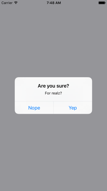
In terms of functionality, there's nothing really different here. There's a title and text beneath it, but that's something that could easily be added to a modal view if you wanted. The real difference is that this modal looks like an iOS modal, instead of something that's styled by the app. Let's see how this alert appears on Android:
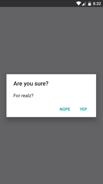
This modal looks like an Android modal, and you didn't have to style it. I think using alerts over modals is a better choice most of the time. It makes sense to have something styled to look like it's part of iOS or part of Android. However, there are times when you need more control over how the modal looks, such as when displaying error confirmations. Here's the code that's used to display both the modal and the alert confirmation dialogs:
import React, { Component } from 'react';
import { View, Text } from 'react-native';
import { fromJS } from 'immutable';

import styles from './styles';
import ConfirmationModal from './ConfirmationModal';
import ConfirmationAlert from './ConfirmationAlert';

export default class SuccessConfirmation extends Component {
  // The two pieces of state used to control
  // the display of the modal and the alert
  // views.
  state = {
    data: fromJS({
      modalVisible: false,
      alertVisible: false
    })
  };

  // Getter for "Immutable.js" state data...
  get data() {
    return this.state.data;
  }

  // Setter for "Immutable.js" state data...
  set data(data) {
    this.setState({ data });
  }

  // A "modal" button was pressed. So show
  // or hide the modal based on its current state.
  toggleModal = () => {
    this.data = this.data.update('modalVisible', v => !v);
  };

  // A "alert" button was pressed. So show
  // or hide the alert based on its current state.
  toggleAlert = () => {
    this.data = this.data.update('alertVisible', v => !v);
  };

  render() {
    const { modalVisible, alertVisible } = this.data.toJS();

    const { toggleModal, toggleAlert } = this;

    return (
      <View style={styles.container}>
        {/* Renders the "<ConfirmationModal>" component,
             which is hidden by default and controlled
             by the "modalVisible" state. */}
        <ConfirmationModal
          animationType="fade"
          visible={modalVisible}
          onPressConfirm={toggleModal}
          onPressCancel={toggleModal}
        />

        {/* Renders the "<ConfirmationAlert>" component,
             which doesn't actually render anything since
             it controls an imperative API under the hood.
             The "alertVisible" state controls this API. */}
        <ConfirmationAlert
          title="Are you sure?"
          message="For realz?"
          visible={alertVisible}
          buttons={[
            {
              text: 'Nope',
              onPress: toggleAlert
            },
            {
              text: 'Yep',
              onPress: toggleAlert
            }
          ]}
        />

        {/* Shows the "<ConfirmationModal>" component
             by changing the "modalVisible" state. */}
        <Text style={styles.text} onPress={toggleModal}>
          Show Confirmation Modal
        </Text>

        {/* Shows the "<ConfirmationAlert>" component
             by changing the "alertVisible" state. */}
        <Text style={styles.text} onPress={toggleAlert}>
          Show Confimation Alert
        </Text>
      </View>
    );
  }
}
The approach to rendering modals is different to the approach to rendering alerts. However, they're both still declarative components that change based on changing property values.