
In the final section of this chapter, you'll learn how to render icons in React Native components. Using icons to indicate meaning makes web applications more usable. So, why should native mobile applications be any different?
You'll want to use the react-native-vector-icons package to pull in various vector font packages into your React Native project:
npm install --save @expo/vector-icons
Now you can import the Icon component and render them. Let's implement an example that renders several FontAwesome icons based on a selected icon category:
import React, { Component } from 'react';
import { View, Picker, FlatList, Text } from 'react-native';
import Icon from 'react-native-vector-icons/FontAwesome';
import { fromJS } from 'immutable';

import styles from './styles';
import iconNames from './icon-names.json';

export default class RenderingIcons extends Component {
  // The initial state consists of the "selected"
  // category, the "icons" JSON object, and the
  // "listSource" used to render the list view.
  state = {
    data: fromJS({
      selected: 'Web Application Icons',
      icons: iconNames,
      listSource: []
    })
  };

  // Getter for "Immutable.js" state data...
  get data() {
    return this.state.data;
  }

  // Setter for "Immutable.js" state data...
  set data(data) {
    this.setState({ data });
  }

  // Sets the "listSource" state based on the
  // "selected" icon state. Also sets the "selected"
  // state.
  updateListSource = selected => {
    this.data = this.data
      .update('listSource', listSource =>
        this.data.getIn(['icons', selected])
      )
      .set('selected', selected);
  };

  // Make sure the "listSource" is populated
  // before the first render.
  componentDidMount() {
    this.updateListSource(this.data.get('selected'));
  }

  render() {
    const { updateListSource } = this;

    // Get the state that we need to render the icon
    // category picker and the list view with icons.
    const selected = this.data.get('selected');
    const categories = this.data
      .get('icons')
      .keySeq()
      .toJS();
    const listSource = this.data.get('listSource');

    return (
      <View style={styles.container}>
        <View style={styles.picker}>
          {/* Lets the user select a FontAwesome icon
               category. When the selection is changed,
               the list view is changed. */}
          <Picker
            selectedValue={selected}
            onValueChange={updateListSource}
          >
            {categories.map(c => (
              <Picker.Item key={c} label={c} value={c} />
            ))}
          </Picker>
        </View>
        <FlatList
          style={styles.icons}
          data={listSource
            .map((value, key) => ({ key: key.toString(), value }))
            .toJS()}
          renderItem={({ item }) => (
            <View style={styles.item}>
              {/* The "<Icon>" component is used
                   to render the FontAwesome icon */}
              <Icon name={item.value} style={styles.itemIcon} />
              {/* Shows the icon class used */}
              <Text style={styles.itemText}>{item.value}</Text>
            </View>
          )}
        />
      </View>
    );
  }
}
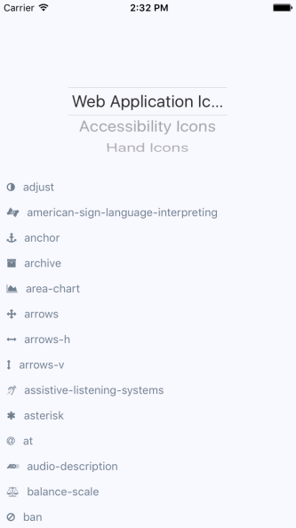
When you run the example, you should see something that looks like the following:
The color of each icon is specified in the same way you would specify the color of text, via styles.