
In this final section of the chapter, you'll learn how to combine rows and columns to create a sophisticated layout for your app. For example, sometimes you need the ability to nest columns within rows or rows within columns. Let's take a look at the App component of an application that nests columns within rows:
import React from 'react';
import { View, StatusBar } from 'react-native';

import styles from './styles';
import Row from './Row';
import Column from './Column';
import Box from './Box';

export default () => (
  <View style={styles.container}>
    <StatusBar hidden={false} />
    {/* This row contains two columns. The first column
        has boxes "#1" and "#2". They will be stacked on
        top of one another. The next column has boxes "#3"
        and "#4", which are also stacked on top of one
        another */}
    <Row>
      <Column>
        <Box>#1</Box>
        <Box>#2</Box>
      </Column>
      <Column>
        <Box>#3</Box>
        <Box>#4</Box>
      </Column>
    </Row>
    <Row>
      <Column>
        <Box>#5</Box>
        <Box>#6</Box>
      </Column>
      <Column>
        <Box>#7</Box>
        <Box>#8</Box>
      </Column>
    </Row>
    <Row>
      <Column>
        <Box>#9</Box>
        <Box>#10</Box>
      </Column>
      <Column>
        <Box>#11</Box>
        <Box>#12</Box>
      </Column>
    </Row>
  </View>
);
You've created abstractions for the layout pieces (<Row> and <Column>) and the content piece (<Box>). Let's see what this screen looks like:
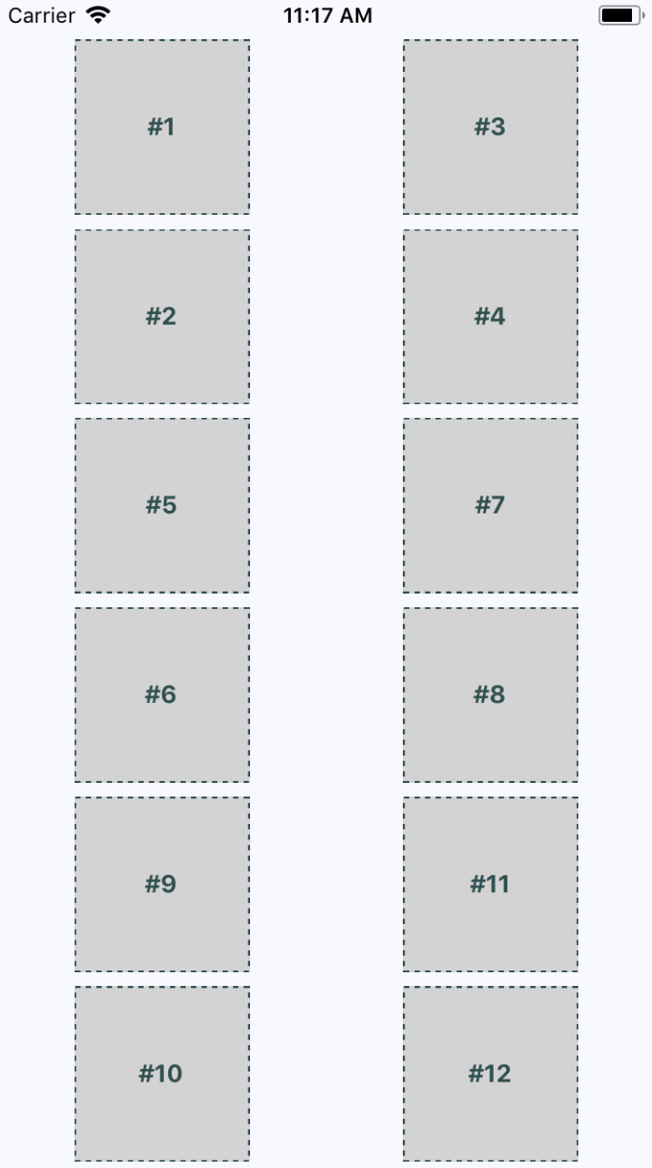
This layout probably looks familiar, because you've done it already in this chapter. The key difference is in how these content sections are ordered. For example, #2 doesn't go to the left of #1, it goes below it. This is because we've placed #1 and #2 in a <Column>. The same with #3 and #4. These two columns are placed in a row. Then the next row begins, and so on.
This is just one of many possible layouts that you can achieve by nesting row flexboxes and column flexboxes. Let's take a look at the Row component now:
import React from 'react';
import PropTypes from 'prop-types';
import { View } from 'react-native';

import styles from './styles';

// Renders a "View" with the "row" style applied to
// it. It's "children" will flow from left to right.
const Row = ({ children }) => (
  <View style={styles.row}>{children}</View>
);

Row.propTypes = {
  children: PropTypes.node.isRequired
};

export default Row;
This component applies the row style to the <View> component. The end result is cleaner JSX markup in the App component when creating a complex layout. Finally, let's look at the Column component:
import React from 'react';
import PropTypes from 'prop-types';
import { View } from 'react-native';

import styles from './styles';

// Renders a "View" with the "column" style applied
// to it. It's children will flow from top-to-bottom.
const Column = ({ children }) => (
  <View style={styles.column}>{children}</View>
);

Column.propTypes = {
  children: PropTypes.node.isRequired
};

export default Column;
This looks just like the Row component, only with a different style applied to it. It also serves the same purpose as Row - to enable simpler JSX markup for layouts in other components.