
The notifications you've examined so far in this chapter all have required input from the user. This is by design because it's important information that you're forcing the user to look at. You don't want to over-do this, however. For notifications that are important but not life-altering if ignored, you can use passive notifications. These are displayed in a less obtrusive way than modals, and don't require any user action to dismiss.
In this section, you'll create a Notification component, which uses the Toast API for Android, and creates a custom modal for iOS. It's called the Toast API because the information that's displayed looks like a piece of toast popping up. Here's what the Android component looks like:
import React from 'react';
import PropTypes from 'prop-types';
import { ToastAndroid } from 'react-native';
import { Map } from 'immutable';

// Toast helper. Always returns "null" so that the
// output can be rendered as a React element.
const show = (message, duration) => {
  ToastAndroid.show(message, duration);
  return null;
};

// This component will always return null,
// since it's using an imperative React Native
// interface to display popup text. If the
// "message" property was provided, then
// we display a message.
const Notification = ({ message, duration }) =>
  Map([[null, null], [undefined, null]]).get(
    message,
    show(message, duration)
  );

Notification.propTypes = {
  message: PropTypes.string,
  duration: PropTypes.number.isRequired
};

Notification.defaultProps = {
  duration: ToastAndroid.LONG
};

export default Notification;
Once again, you're dealing with an imperative React Native API that you don't want to expose to the rest of your app. Instead, this component hides the imperative ToastAndroid.show() function behind a declarative React component. No matter what, this component returns null, because it doesn't actually render anything. Here's what the ToastAndroid notification looks like:
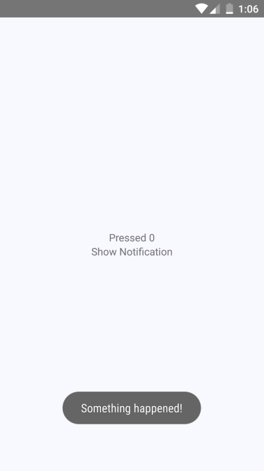
The notification that something has happened is displayed at the bottom of the screen and is removed after a short delay. The key is that the notification is unobtrusive.
The iOS notification component is a little more involved, because it needs state and lifecycle events to make a modal view behave like a transient notification. Here's the code:
import React, { Component } from 'react';
import PropTypes from 'prop-types';
import { View, Modal, Text } from 'react-native';
import { Map } from 'immutable';

import styles from './styles';

class Notification extends Component {
  static propTypes = {
    message: PropTypes.string,
    duration: PropTypes.number.isRequired
  };

  static defaultProps = {
    duration: 1500
  };

  static getDerivedStateFromProps(props) {
    // Update the "visible" state, based on whether
    // or not there's a "message" value.
    return {
      ...this.state,
      visible: Map([[null, false], [undefined, false]]).get(
        props.message,
        true
      )
    };
  }

  // The modal component is either "visible", or not.
  // The "timer" is used to hide the notification
  // after some predetermined amount of time.
  state = { visible: false };
  timer = null;

  componentWillUnmount() {
    clearTimeout(this.timer);
  }

  render() {
    const modalProps = {
      animationType: 'fade',
      transparent: true,
      visible: this.state.visible
    };

    this.timer = Map([
      [null, () => null],
      [undefined, () => null]
    ]).get(this.props.message, () =>
      setTimeout(
        () => this.setState({ visible: false }),
        this.props.duration
      )
    )();

    return (
      <Modal {...modalProps}>
        <View style={styles.notificationContainer}>
          <View style={styles.notificationInner}>
            <Text>{this.props.message}</Text>
          </View>
        </View>
      </Modal>
    );
  }
}

Notification.propTypes = {
  message: PropTypes.string,
  duration: PropTypes.number.isRequired
};

Notification.defaultProps = {
  duration: 1500
};

export default Notification;
You have to style the modal to display the notification text, as well as the state that's used to hide the notification after a delay. Here's what the end result looks like for iOS:
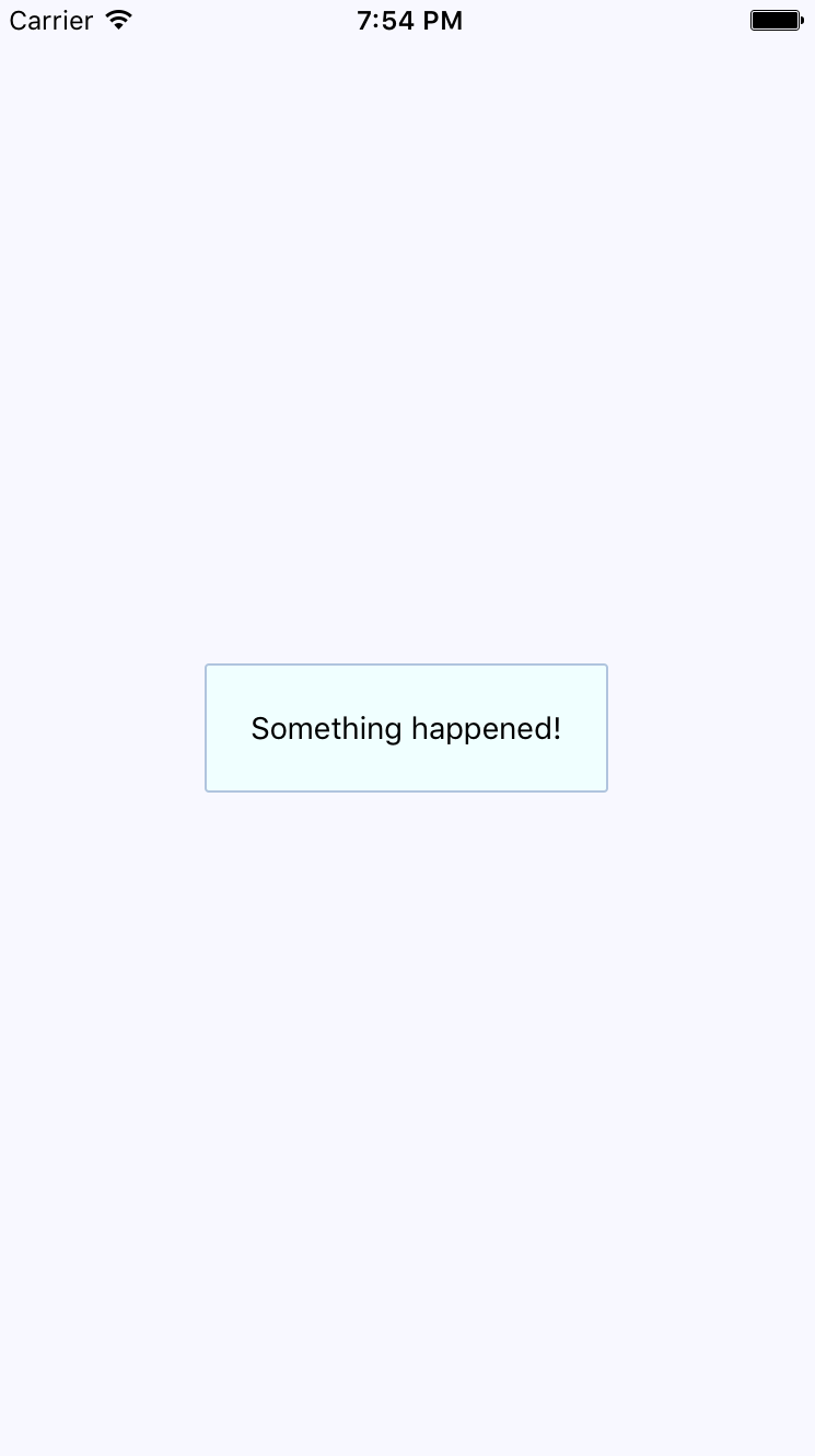
The same principle with the ToastAndroid API applies here. You might have noticed that there's another button in addition to the Show Notification button. This is a simple counter that re-renders the view. There's actually a reason for demonstrating this seemingly obtuse feature, as you'll see momentarily. Here's the code for the main application view:
import React, { Component } from 'react';
import { Text, View } from 'react-native';
import { fromJS } from 'immutable';

import styles from './styles';
import Notification from './Notification';

export default class PassiveNotifications extends Component {
  // The initial state is the number of times
  // the counter button has been clicked, and
  // the notification message.
  state = {
    data: fromJS({
      count: 0,
      message: null
    })
  };

  // Getter for "Immutable.js" state data...
  get data() {
    return this.state.data;
  }

  // Setter for "Immutable.js" state data...
  set data(data) {
    this.setState({ data });
  }

  render() {
    const { count, message } = this.data.toJS();

    return (
      <View style={styles.container}>
        {/* The "Notification" component is
             only displayed if the "message" state
             has something in it. */}
        <Notification message={message} />

        {/* Updates the count. Also needs to make
             sure that the "message" state is null,
             even if the message has been hidden
             already. */}
        <Text
          onPress={() => {
            this.data = this.data
              .update('count', c => c + 1)
              .set('message', null);
          }}
        >
          Pressed {count}
        </Text>

        {/* Displays the notification by
             setting the "message" state. */}
        <Text
          onPress={() => {
            this.data = this.data.set(
              'message',
              'Something happened!'
            );
          }}
        >
          Show Notification
        </Text>
      </View>
    );
  }
}
The whole point of the press counter is to demonstrate that, even though the Notification component is declarative and accepts new property values when the state changes, you still have to set the message state to null when changing other state values. The reason for this is that if you re-render the component and the message state still has a string in it, it will display the same notification, over and over.