
It turns out that there's a lot to think about when implementing text inputs. For example, should it have placeholder text? Is this sensitive data that shouldn't be displayed on screen? Should you process text as it's entered, or when the user moves to another field?
The noticeable difference with mobile text input versus traditional web text input is that the former has its own built-in virtual keyboard that you can configure and respond to. Let's build an example that renders several instances of the <TextInput> component:
import React, { Component } from 'react';
import PropTypes from 'prop-types';
import { Text, TextInput, View } from 'react-native';
import { fromJS } from 'immutable';

import styles from './styles';

// A Generic "<Input>" component that we can use in our app.
// It's job is to wrap the "<TextInput>" component in a "<View>"
// so that we can render a label, and to apply styles to the
// appropriate components.
const Input = props => (
  <View style={styles.textInputContainer}>
    <Text style={styles.textInputLabel}>{props.label}</Text>
    <TextInput style={styles.textInput} {...props} />
  </View>
);

Input.propTypes = {
  label: PropTypes.string
};

export default class CollectingTextInput extends Component {
  // This state is only relevant for the "input events"
  // component. The "changedText" state is updated as
  // the user types while the "submittedText" state is
  // updated when they're done.
  state = {
    data: fromJS({
      changedText: '',
      submittedText: ''
    })
  };

  // Getter for "Immutable.js" state data...
  get data() {
    return this.state.data;
  }

  // Setter for "Immutable.js" state data...
  set data(data) {
    this.setState({ data });
  }

  render() {
    const { changedText, submittedText } = this.data.toJS();

    return (
      <View style={styles.container}>
        {/* The simplest possible text input. */}
        <Input label="Basic Text Input:" />

        {/* The "secureTextEntry" property turns
             the text entry into a password input
             field. */}
        <Input label="Password Input:" secureTextEntry />

        {/* The "returnKeyType" property changes
             the return key that's displayed on the
             virtual keyboard. In this case, we want
             a "search" button. */}
        <Input label="Return Key:" returnKeyType="search" />

        {/* The "placeholder" property works just
             like it does with web text inputs. */}
        <Input label="Placeholder Text:" placeholder="Search" />

        {/* The "onChangeText" event is triggered as
             the user enters text. The "onSubmitEditing"
             event is triggered when they click "search". */}
        <Input
          label="Input Events:"
          onChangeText={e => {
            this.data = this.data.set('changedText', e);
          }}
          onSubmitEditing={e => {
            this.data = this.data.set(
              'submittedText',
              e.nativeEvent.text
            );
          }}
          onFocus={() => {
            this.data = this.data
              .set('changedText', '')
              .set('submittedText', '');
          }}
        />

        {/* Displays the captured state from the
             "input events" text input component. */}
        <Text>Changed: {changedText}</Text>
        <Text>Submitted: {submittedText}</Text>
      </View>
    );
  }
}
I won't go into depth on what each of these <TextInput> components is doing—there are comments in the code. Let's see what these components look like on screen:
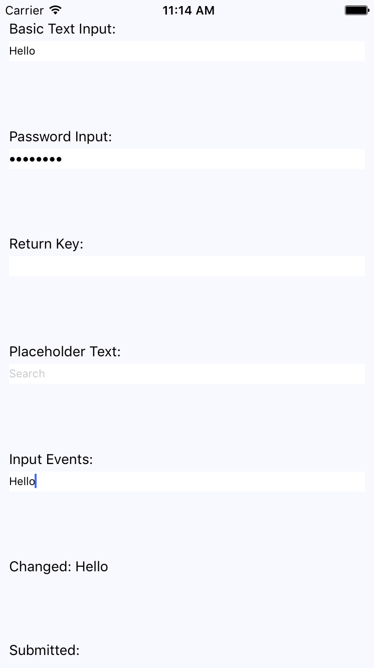
The plain text input shows the text that's been entered. The password field doesn't reveal any characters. The Placeholder Text is displayed when the input is empty. The Changed text state is also displayed. You're not seeing the submitted text state because I didn't press the Submitted button on the virtual keyboard before I took the screenshot.
Let's take a look at the virtual keyboard for the input element where you changed the return key text via the returnKeyType prop:
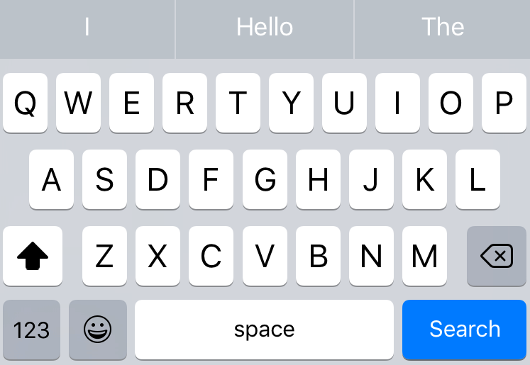
When the keyboard Return Key reflects what's going to happen when they press it, the user feels more in tune with the application.