The React Native examples you've worked with so far in this book have used plain text to act as buttons or links. In web applications, to make text look like something that can be clicked, you just wrap it with the appropriate link. There's no such thing as mobile links, so you can style your text to look like a button.
Let's style some text as a button. This is a great first step, making the text look touchable. But you also want to give visual feedback to the user when they start interacting with the button. React Native provides two components to help with this: TouchableOpacity and TouchableHighlight. But before diving into the code, let's take a look at what these components look like visually when users interact with them, starting with TouchableOpacity:
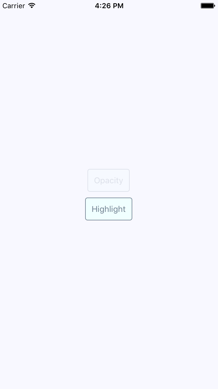
There's two buttons rendered here, and the top one labeled Opacity is currently being pressed by the user. The opacity of the button is dimmed when pressed, which provides important visual feedback for the user. Let's see what the Highlight button looks like when pressed, as follows:
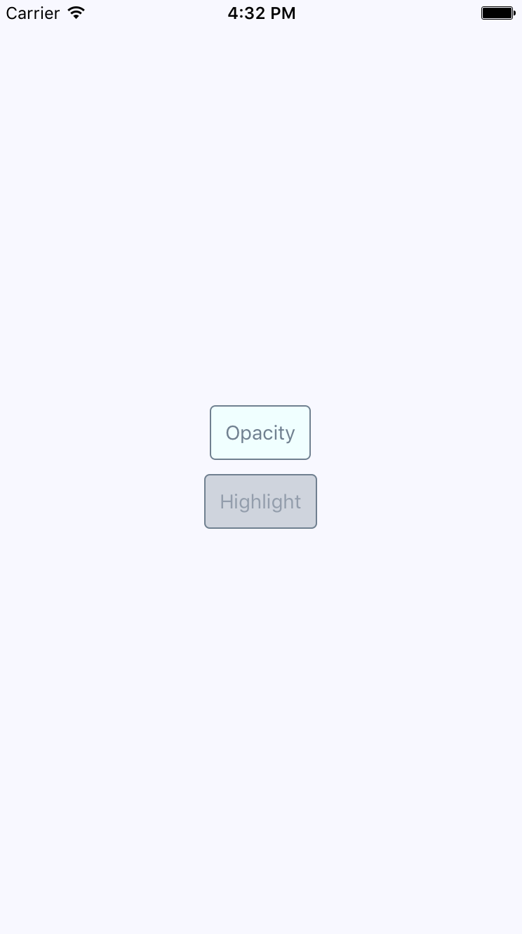
Instead of changing the opacity when pressed, the TouchableHighlight component adds a highlight layer over the button. In this case, it's highlighted using a more transparent version of the slate gray used in the font and border colors.
Which approach you use doesn't really matter. The important thing is that you provide the appropriate touch feedback for your users as they interact with your buttons. In fact, you might want to use the two approaches in the same app, but for different things. Let's create a Button component, which makes it easy to use either approach:
import React from 'react';
import PropTypes from 'prop-types';
import {
  Text,
  TouchableOpacity,
  TouchableHighlight
} from 'react-native';

import styles from './styles';

// The "touchables" map is used to get the right
// component to wrap around the button. The
// "undefined" key represents the default.
const touchables = new Map([
  ['opacity', TouchableOpacity],
  ['highlight', TouchableHighlight],
  [undefined, TouchableOpacity]
]);

const Button = ({ label, onPress, touchable }) => {
  // Get's the "Touchable" component to use,
  // based on the "touchable" property value.
  const Touchable = touchables.get(touchable);

  // Properties to pass to the "Touchable"
  // component.
  const touchableProps = {
    style: styles.button,
    underlayColor: 'rgba(112,128,144,0.3)',
    onPress
  };

  // Renders the "<Text>" component that's
  // styled to look like a button, and is
  // wrapped in a "<Touchable>" component
  // to properly handle user interactions.
  return (
    <Touchable {...touchableProps}>
      <Text style={styles.buttonText}> {label} </Text>
    </Touchable>
  );
};

Button.propTypes = {
  onPress: PropTypes.func.isRequired,
  label: PropTypes.string.isRequired,
  touchable: PropTypes.oneOf(['opacity', 'highlight'])
};

export default Button;
The touchables map is used to determine which React Native touchable component wraps the text, based on the touchable property value. Here's the styles used to create this button are as follows:
button: {
  padding: 10,
  margin: 5,
  backgroundColor: 'azure',
  borderWidth: 1,
  borderRadius: 4,
  borderColor: 'slategrey',
},

buttonText: {
  color: 'slategrey',
}
Here's how you can put those buttons to use in the main app module:
import React from 'react';
import { View } from 'react-native';

import styles from './styles';
import Button from './Button';

export default () => (
  <View style={styles.container}>
    {/* Renders a "<Button>" that uses
         "TouchableOpacity" to handle user
         gestures, since that is the default */}
    <Button onPress={() => {}} label="Opacity" />

    {/* Renders a "<Button>" that uses
         "TouchableHighlight" to handle
         user gestures. */}
    <Button
      onPress={() => {}}
      label="Highlight"
      touchable="highlight"
    />
  </View>
);
Note that the onPress callbacks don't actually do anything,—we're passing them because they're a required property.