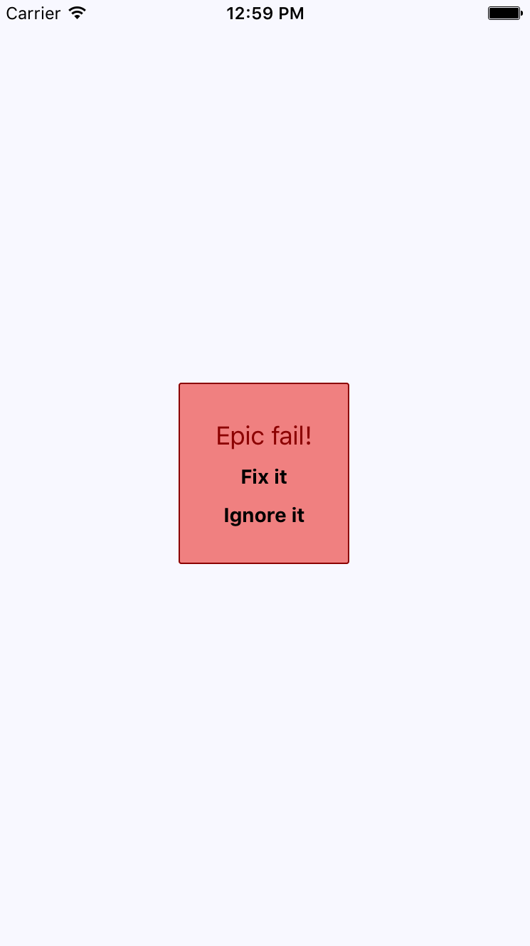
All of the principles you learned about in the preceding section are applicable when you need the user to acknowledge an error. If you need more control of the display, use a modal. For example, you might want the modal to be red and scary looking:
Here are the styles used to create this look. Maybe you want something a little more subtle, but the point is that you can make this look however you want:
import { StyleSheet } from 'react-native';

export default StyleSheet.create({
  container: {
    flex: 1,
    justifyContent: 'center',
    alignItems: 'center',
    backgroundColor: 'ghostwhite',
  },

  text: {
    color: 'slategrey',
  },

  modalContainer: {
    flex: 1,
    justifyContent: 'center',
    alignItems: 'center',
  },

  modalInner: {
    backgroundColor: 'azure',
    padding: 20,
    borderWidth: 1,
    borderColor: 'lightsteelblue',
    borderRadius: 2,
    alignItems: 'center',
  },

  modalInnerError: {
    backgroundColor: 'lightcoral',
    borderColor: 'darkred',
  },

  modalText: {
    fontSize: 16,
    margin: 5,
    color: 'slategrey',
  },

  modalTextError: {
    fontSize: 18,
    color: 'darkred',
  },

  modalButton: {
    fontWeight: 'bold',
    margin: 5,
    color: 'slategrey',
  },

  modalButtonError: {
    color: 'black',
  },
});
The same modal styles that you used for the success confirmations are still here. That's because the error confirmation modal needs many of the same styles. Here's how you apply both to the Modal component:
import React from 'react';
import PropTypes from 'prop-types';
import { View, Text, Modal } from 'react-native';

import styles from './styles';

// Declares styles for the error modal by
// combining regular modal styles with
// error styles.
const innerViewStyle = [styles.modalInner, styles.modalInnerError];

const textStyle = [styles.modalText, styles.modalTextError];

const buttonStyle = [styles.modalButton, styles.modalButtonError];

// Just like a success modal, accept for the addition of
// error styles.
const ErrorModal = props => (
  <Modal {...props}>
    <View style={styles.modalContainer}>
      <View style={innerViewStyle}>
        <Text style={textStyle}>Epic fail!</Text>
        <Text style={buttonStyle} onPress={props.onPressConfirm}>
          Fix it
        </Text>
        <Text style={buttonStyle} onPress={props.onPressCancel}>
          Ignore it
        </Text>
      </View>
    </View>
  </Modal>
);

ErrorModal.propTypes = {
  visible: PropTypes.bool.isRequired,
  onPressConfirm: PropTypes.func.isRequired,
  onPressCancel: PropTypes.func.isRequired
};

ErrorModal.defaultProps = {
  transparent: true,
  onRequestClose: () => {}
};

export default ErrorModal;
The styles are combined as arrays before they're passed to the style property. The error styles always come last since conflicting style properties, such as backgroundColor, will be overridden by whatever comes later in the array.
In addition to styles in error confirmations, you can include whatever advanced controls you want. It really depends on how your application lets users cope with errors; for example, maybe there are several courses of action that can be taken.
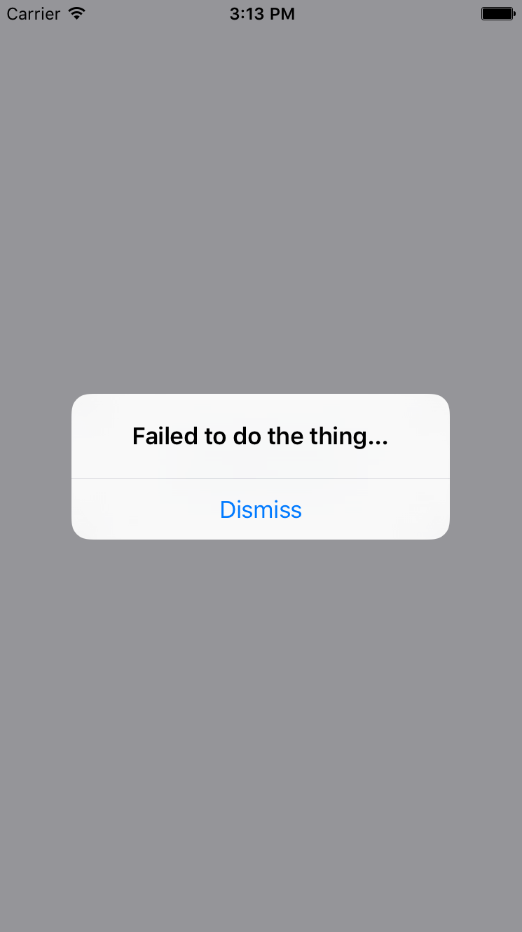
However, the more common case is that something went wrong and there's nothing you can do about it, besides making sure that the user is aware of the situation. In these cases, you can probably get away with just displaying an alert: