
Mobile-first design is a strategy that treats mobile devices as the primary target for user interfaces. Larger screens, such as laptops or big monitors, are secondary targets. This doesn't necessarily mean that the majority of users are accessing your app on their phones. It simply means that mobile is the starting point for scaling the user interface geometrically.
For example, when mobile browsers first appeared it was customary to design the UI for normal desktop screens, and then to scale down to smaller screens when necessary. The approach is illustrated here:
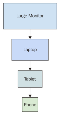
The idea here is that you design the UI with larger screens in mind so that you can fit as much functionality as possible onto the screen at once. When smaller devices are used, your code has to either use a different layout or different components on the fly.
This is very limiting for a number of reasons. First, it's very difficult to maintain code that has lots of special-case handling for different screen resolutions. Second, and the more compelling argument against this approach, is that it's next to impossible to provide a similar user experience across devices. If large screens have a ton of functionality displayed all at once, you simply cannot replicate this on smaller screens. Not only is there less real estate, but the processing power and network bandwidth of smaller devices are limiting factors as well.
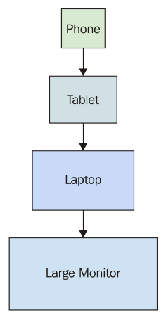
The mobile-first approach to UI design tackles these issues by scaling the UI up, instead of trying to scale it down, as shown here:
This approach never used to make sense because you would be limiting the capabilities of your application; there weren't many tablets or phones around. This is not the case today, where the expectation is that users can interact with applications on their mobile devices without any issues. There are a lot more of them now, and mobile browsers are quite capable of handling anything you throw at them.
Once you've implemented your application functionality in a mobile context, scaling it up to larger screen sizes is a relatively easy problem to solve. Now, let's take a look at how to approach mobile-first in React applications.