There are a few things that I think you can improve upon from the last example. Let's fix the styles so that the children of the flexbox stretch to take advantage of the available space. Remember in the last example, when you rotated the device from portrait to landscape orientation? There was a lot of wasted space. It would be nice to have the components automatically adjust themselves. Here's what the new styles module looks like:
import { Platform, StyleSheet, StatusBar } from 'react-native';

const styles = StyleSheet.create({
  container: {
    flex: 1,
    flexDirection: 'column',
    backgroundColor: 'ghostwhite',
    alignItems: 'center',
    justifyContent: 'space-around',
    ...Platform.select({
      ios: { paddingTop: 20 },
      android: { paddingTop: StatusBar.currentHeight }
    })
  },

  box: {
    height: 100,
    justifyContent: 'center',
    // Instead of given the flexbox child a width, we
    // tell it to "stretch" to fill all available space.
    alignSelf: 'stretch',
    alignItems: 'center',
    backgroundColor: 'lightgray',
    borderWidth: 1,
    borderStyle: 'dashed',
    borderColor: 'darkslategray'
  },

  boxText: {
    color: 'darkslategray',
    fontWeight: 'bold'
  }
});

export default styles;
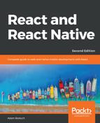
The key change here is the alignSelf property. This tells elements with the box style to change their width or height (depending on the flexDirection of their container) to fill space. Also, the box style no longer defines a width property because this will be computed on the fly now. Here's what the sections look like in portrait mode:
Now each section takes the full width of the screen, which is exactly what you want to happen. The issue of wasted space was actually more prevalent in landscape orientation, so let's rotate the device and see what happens to these sections now:
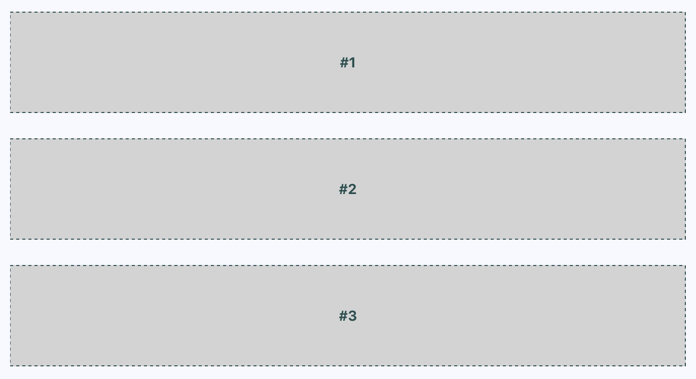
Now your layout is utilizing the entire width of the screen, regardless of orientation. Lastly, let's implement a proper Box component that can be used by App.js instead of having repetitive style properties in place. Here's what the Box component looks like:
import React from 'react';
import { PropTypes } from 'prop-types';
import { View, Text } from 'react-native';

import styles from './styles';

// Exports a React Native component that
// renders a "<View>" with the "box" style
// and a "<Text>" component with the "boxText"
// style.
const Box = ({ children }) => (
  <View style={styles.box}>
    <Text style={styles.boxText}>{children}</Text>
  </View>
);

Box.propTypes = {
  children: PropTypes.node.isRequired
};

export default Box;
You now have the beginnings of a nice layout. Next, you'll learn about flexing in the other direction—left to right.