
Part of what makes native mobile applications easier to use than mobile web applications is that they feel more intuitive. Using gestures, you can quickly get a handle on how things work. For example, swiping an element across the screen with your finger is a common gesture, but the gesture has to be discoverable.
Let's say that you're using an app, and you're not exactly sure what something on the screen does. So, you press down with your finger, and try dragging the element. It starts to move. Unsure of what will happen, you lift your finger up, and the element moves back into place. You've just discovered how part of this application works.
You'll use the Scrollable component to implement swipeable and cancelable behavior like this. You can create a somewhat generic component that allows the user to swipe text off the screen and, when that happens, call a callback function. Let's look at the code to render the swipeables before we look at the generic component itself:
import React, { Component } from 'react';
import { View } from 'react-native';
import { fromJS } from 'immutable';

import styles from './styles';
import Swipeable from './Swipeable';

export default class SwipableAndCancellable extends Component {
  // The initial state is an immutable list of
  // 8 swipable items.
  state = {
    data: fromJS(
      new Array(8)
        .fill(null)
        .map((v, id) => ({ id, name: 'Swipe Me' }))
    )
  };

  // Getter for "Immutable.js" state data...
  get data() {
    return this.state.data;
  }

  // Setter for "Immutable.js" state data...
  set data(data) {
    this.setState({ data });
  }

  // The swipe handler passed to "<Swipeable>".
  // The swiped item is removed from the state.
  // This is a higher-order function that returns
  // the real handler so that the "id" context
  // can be set.
  onSwipe = id => () => {
    this.data = this.data.filterNot(v => v.get('id') === id);
  };

  render() {
    return (
      <View style={styles.container}>
        {this.data
          .toJS()
          .map(i => (
            <Swipeable
              key={i.id}
              onSwipe={this.onSwipe(i.id)}
              name={i.name}
            />
          ))}
      </View>
    );
  }
}
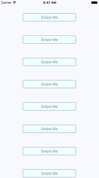
This will render eight <Swipeable> components on the screen. Let's see what this looks like:
Now, if you start to swipe one of these items to the left, it will move. Here's what it looks like:
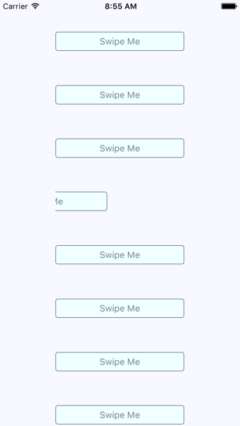
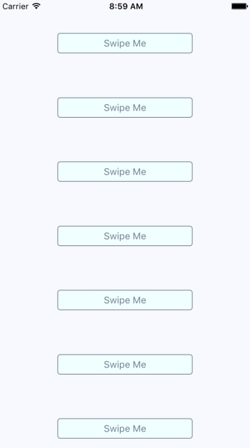
If you don't swipe far enough, the gesture is canceled and the item moves back into place as expected. If you swipe it all the way, the item is removed from the list completely and the items on the screen fill the empty space like this:
Now let's take a look at the Swipeable component itself:
import React from 'react';
import PropTypes from 'prop-types';
import {
  View,
  ScrollView,
  Text,
  TouchableOpacity
} from 'react-native';

import styles from './styles';

// The "onScroll" handler. This is actually
// a higher-order function that returns the
// actual handler. When the x offset is 200,
// when know that the component has been
// swiped and can call "onSwipe()".
const onScroll = onSwipe => e =>
  e.nativeEvent.contentOffset.x === 200 && onSwipe();

// The static properties used by the "<ScrollView>"
// component.
const scrollProps = {
  horizontal: true,
  pagingEnabled: true,
  showsHorizontalScrollIndicator: false,
  scrollEventThrottle: 10
};

const Swipeable = ({ onSwipe, name }) => (
  <View style={styles.swipeContainer}>
    {/* The "<View>" that wraps this "<ScrollView>"
         is necessary to make scrolling work properly. */}
    <ScrollView {...scrollProps} onScroll={onScroll(onSwipe)}>
      {/* Not strictly necessary, but "<TouchableOpacity>"
           does provide the user with meaningful feedback
           when they initially press down on the text. */}
      <TouchableOpacity>
        <View style={styles.swipeItem}>
          <Text style={styles.swipeItemText}>{name}</Text>
        </View>
      </TouchableOpacity>
      <View style={styles.swipeBlank} />
    </ScrollView>
  </View>
);

Swipeable.propTypes = {
  onSwipe: PropTypes.func.isRequired,
  name: PropTypes.string.isRequired
};

export default Swipeable;
Note that the <ScrollView> component is set to be horizontal and that pagingEnabled is true. It's the paging behavior that snaps the components into place, and provides the cancelable behavior. This is why there's a blank component beside the component with text in it. Here are the styles used for this component:
swipeContainer: {
  flex: 1,
  flexDirection: 'row',
  width: 200,
  height: 30,
  marginTop: 50,
},

swipeItem: {
  width: 200,
  height: 30,
  backgroundColor: 'azure',
  justifyContent: 'center',
  borderWidth: 1,
  borderRadius: 4,
  borderColor: 'slategrey',
},

swipeItemText: {
  textAlign: 'center',
  color: 'slategrey',
},

swipeBlank: {
  width: 200,
  height: 30,
},
The swipeBlank style has the same dimensions as swipeItem, but nothing else. It's invisible.