In web applications, you typically use the <select> element to let the user choose from a list of options. React Native comes with a <Picker> component, which works on both iOS and Android. There is some trickery involved with styling this component based on which platform the user is on, so let's hide all of this inside of a generic Select component. Here's the Select.ios.js module:
import React from 'react';
import PropTypes from 'prop-types';
import { View, Picker, Text } from 'react-native';
import styles from './styles';

// The "<Select>" component provides an
// abstraction around the "<Picker>" component.
// It actually has two outer views that are
// needed to get the styling right.
const Select = props => (
  <View style={styles.pickerHeight}>
    <View style={styles.pickerContainer}>
      {/* The label for the picker... */}
      <Text style={styles.pickerLabel}>{props.label}</Text>
      <Picker style={styles.picker} {...props}>
        {/* Maps each "items" value to a
             "<Picker.Item>" component. */}
        {props.items.map(i => <Picker.Item key={i.label} {...i} />)}
      </Picker>
    </View>
  </View>
);

Select.propTypes = {
  items: PropTypes.array,
  label: PropTypes.string
};

export default Select;
That's a lot of overhead for a simple Select component. Well, it turns out that it's actually quite hard to style the React Native <Picker> component. Here's the Select.android.js module:
import React from 'react';
import PropTypes from 'prop-types';
import { View, Picker, Text } from 'react-native';
import styles from './styles';

// The "<Select>" component provides an
// abstraction around the "<Picker>" component.
// It actually has two outer views that are
// needed to get the styling right.
const Select = props => (
  <View>
    {/* The label for the picker... */}
    <Text style={styles.pickerLabel}>{props.label}</Text>
    <Picker {...props}>
      {/* Maps each "items" value to a
           "<Picker.Item>" component. */}
      {props.items.map(i => <Picker.Item key={i.label} {...i} />)}
    </Picker>
  </View>
);

Select.propTypes = {
  items: PropTypes.array,
  label: PropTypes.string
};

export default Select;
Here are what the styles look like:
import { StyleSheet } from 'react-native';

export default StyleSheet.create({
  container: {
    flex: 1,
    flexDirection: 'row',
    flexWrap: 'wrap',
    justifyContent: 'space-around',
    alignItems: 'center',
    backgroundColor: 'ghostwhite',
  },

  // The outtermost container, needs a height.
  pickerHeight: {
    height: 175,
  },

  // The inner container lays out the picker
  // components and sets the background color.
  pickerContainer: {
    flex: 1,
    flexDirection: 'column',
    alignItems: 'center',
    marginTop: 40,
    backgroundColor: 'white',
    padding: 6,
    height: 240,
  },

  pickerLabel: {
    fontSize: 14,
    fontWeight: 'bold',
  },

  picker: {
  width: 100,
    backgroundColor: 'white',
  },

  selection: {
    width: 200,
    marginTop: 230,
    textAlign: 'center',
  },
});
Now you can render your <Select> component:
import React, { Component } from 'react';
import { View, Text } from 'react-native';
import { fromJS } from 'immutable';

import styles from './styles';
import Select from './Select';

export default class SelectingOptions extends Component {
  // The state is a collection of "sizes" and
  // "garments". At any given time there can be
  // selected size and garment.
  state = {
    data: fromJS({
      sizes: [
        { label: '', value: null },
        { label: 'S', value: 'S' },
        { label: 'M', value: 'M' },
        { label: 'L', value: 'L' },
        { label: 'XL', value: 'XL' }
      ],
      selectedSize: null,
      garments: [
        { label: '', value: null, sizes: ['S', 'M', 'L', 'XL'] },
        { label: 'Socks', value: 1, sizes: ['S', 'L'] },
        { label: 'Shirt', value: 2, sizes: ['M', 'XL'] },
        { label: 'Pants', value: 3, sizes: ['S', 'L'] },
        { label: 'Hat', value: 4, sizes: ['M', 'XL'] }
      ],
      availableGarments: [],
      selectedGarment: null,
      selection: ''
    })
  };

  // Getter for "Immutable.js" state data...
  get data() {
    return this.state.data;
  }

  // Setter for "Immutable.js" state data...
  set data(data) {
    this.setState({ data });
  }

  render() {
    const {
      sizes,
      selectedSize,
      availableGarments,
      selectedGarment,
      selection
    } = this.data.toJS();

    // Renders two "<Select>" components. The first
    // one is a "size" selector, and this changes
    // the available garments to select from.
    // The second selector changes the "selection"
    // state to include the selected size
    // and garment.
    return (
      <View style={styles.container}>
        <Select
          label="Size"
          items={sizes}
          selectedValue={selectedSize}
          onValueChange={size => {
            this.data = this.data
              .set('selectedSize', size)
              .set('selectedGarment', null)
              .set(
                'availableGarments',
                this.data
                  .get('garments')
                  .filter(i => i.get('sizes').includes(size))
              );
          }}
        />
        <Select
          label="Garment"
          items={availableGarments}
          selectedValue={selectedGarment}
          onValueChange={garment => {
            this.data = this.data.set('selectedGarment', garment).set(
              'selection',
              this.data.get('selectedSize') +
                ' ' +
                this.data
                  .get('garments')
                  .find(i => i.get('value') === garment)
                  .get('label')
            );
          }}
        />
        <Text style={styles.selection}>{selection}</Text>
      </View>
    );
  }
}
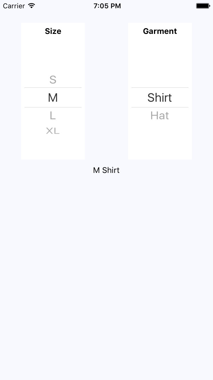
The basic idea of this example is that the selected option in the first selector changes the available options in the second selector. When the second selector changes, the label shows the selected size and garment as a string. Here's how the screen looks: