React and React Native
Second Edition
Second Edition
Complete guide to web and native mobile development
with React
with React

BIRMINGHAM - MUMBAI

Copyright © 2018 Packt Publishing
All rights reserved. No part of this book may be reproduced, stored in a retrieval system, or transmitted in any form or by any means, without the prior written permission of the publisher, except in the case of brief quotations embedded in critical articles or reviews.
Every effort has been made in the preparation of this book to ensure the accuracy of the information presented. However, the information contained in this book is sold without warranty, either express or implied. Neither the author, nor Packt Publishing or its dealers and distributors, will be held liable for any damages caused or alleged to have been caused directly or indirectly by this book.
Packt Publishing has endeavored to provide trademark information about all of the companies and products mentioned in this book by the appropriate use of capitals. However, Packt Publishing cannot guarantee the accuracy of this information.
Commissioning Editor: Kunal Chaudhari
Acquisition Editor: Devanshi Doshi
Content Development Editor: Onkar Wani
Technical Editor: Diksha Wakode
Copy Editor: Safis Editing
Project Coordinator: Sheejal Shah
Proofreader: Safis Editing
Indexer: Aishwarya Gangawane
Production Coordinator: Arvindkumar Gupta
First published: March 2017
Second edition: September 2018
Production reference: 1260918
Published by Packt Publishing Ltd.
Livery Place
35 Livery Street
Birmingham
B3 2PB, UK.
ISBN 978-1-78934-679-4

Mapt is an online digital library that gives you full access to over 5,000 books and videos, as well as industry leading tools to help you plan your personal development and advance your career. For more information, please visit our website.
Spend less time learning and more time coding with practical eBooks and Videos from over 4,000 industry professionals
Improve your learning with Skill Plans built especially for you
Get a free eBook or video every month
Mapt is fully searchable
Copy and paste, print, and bookmark content
Did you know that Packt offers eBook versions of every book published, with PDF and ePub files available? You can upgrade to the eBook version at www.packt.com and as a print book customer, you are entitled to a discount on the eBook copy. Get in touch with us at customercare@packtpub.com for more details.
At www.packt.com, you can also read a collection of free technical articles, sign up for a range of free newsletters, and receive exclusive discounts and offers on Packt books and eBooks.
Adam Boduch is a seasoned web application developer with a breadth of experience ranging from jQuery to React and everything in between. He is the author of over 10 books, including React Tooling and React Essentials.
Piotr Sroczkowski is a JavaScript developer, focused mainly on the backend with Node.js and NoSQL databases. He started amateur programming in 2009 and professional programming in 2014. In 2017, he graduated with an MSc in computer science from the Silesian University of Technology in Gliwice with a thesis entitled "Application of Heuristic Algorithms in Exploration of the Gene Mutations." As that title suggests, he's excited by heuristic algorithms and bioinformatics too. Beside his backend-focused job, in his free time, he’s interested in the web frontend with React and the mobile frontend with React Native. Moreover, one of his hobbies is data mining with JavaScript. Beside programming, he loves running long distances such as marathons and half-marathons.
Carlos Santana Roldan is a Senior Web Developer (frontend and backend); with more than 11 years of experience in the market. Currently he is working as a React Technical Lead in Disney ABC Television Group. He is the founder of Codejobs, one of the most popular Developers Communities in Latin America, training people in different web technologies such React, Node.js & JS (@codejobs).
If you're interested in becoming an author for Packt, please visit authors.packtpub.com and apply today. We have worked with thousands of developers and tech professionals, just like you, to help them share their insight with the global tech community. You can make a general application, apply for a specific hot topic that we are recruiting an author for, or submit your own idea.
I never had any interest in developing mobile apps. I used to believe strongly that it was the web, or nothing, that there was no need for more yet more applications to install on devices that are already overflowing with apps. Then React Native happened. I was already writing React code for web applications and loving it. It turns out that I wasn’t the only developer that balked at the idea of maintaining several versions of the same app using different tooling, environments, and programming languages. React Native was created out of a natural desire to take what works well from a web development experience standpoint (React), and apply it to native app development. Native mobile apps offer better user experiences than web browsers. It turns out I was wrong, we do need mobile apps for the time being. But that’s okay, because React Native is a fantastic tool. This book is essentially my experience as a React developer for the web and as a less experienced mobile app developer. React Native is meant to be an easy transition for developers who already understand React for the Web. With this book, you’ll learn the subtleties of doing React development in both environments. You’ll also learn the conceptual theme of React, a simple rendering abstraction that can target anything. Today, it’s web browsers and mobile devices. Tomorrow, it could be anything.
The second edition of this book was written to address the rapidly evolving React project - including the state-of-the-art best practices for implementing React components as well as the ecosystem surrounding React. I think it's important for React developers to appreciate how React works and how the implementation of React changes to better support the people who rely on it. I've done my best to capture the essence of React as it is today and the direction it's moving, in this edition of React and React Native.
This book is written for any JavaScript developer—beginner or expert—who wants to start learning how to put both of Facebook’s UI libraries to work. No knowledge of React is needed, though a working knowledge of ES2017 will help you follow along better.
This book covers the following three parts:
Chapter 1, Why React?, covers the basics of what React really is, and why you want to use it.
Chapter 2, Rendering with JSX, explains that JSX is the syntax used by React to render content. HTML is the most common output, but JSX can be used to render many things, such as native UI components.
Chapter 3, Component Properties, State, and Context, shows how properties are passed to components, how state re-renders components when it changes, and the role of context in components.
Chapter 4, Event Handling—The React Way, explains that events in React are specified in JSX. There are subtleties with how React processes events, and how your code should respond to them.
Chapter 5, Crafting Reusable Components, shows that components are often composed using smaller components. This means that you have to properly pass data and behavior to child components.
Chapter 6, The React Component Lifecycle, explains how React components are created and destroyed all the time. There are several other lifecycle events that take place in between where you do things such as fetch data from the network.
Chapter 7, Validating Component Properties, shows that React has a mechanism that allows you to validate the types of properties that are passed to components. This ensures that there are no unexpected values passed to your component.
Chapter 8, Extending Components, provides an introduction to the mechanisms used to extend React components. These include inheritance and higher-order components.
Chapter 9, Handling Navigation with Routes, explains that navigation is an essential part of any web application. React handles routes declaratively using the react-router package.
Chapter 10, Server-Side React Components, discusses how React renders components to the DOM when rendered in the browser. It can also render components to strings, which is useful for rendering pages on the server and sending static content to the browser.
Chapter 11, Mobile-First React Components, explains that mobile web applications are fundamentally different from web applications designed for desktop screen resolutions. The react-bootstrap package can be used to build UIs in a mobile-first fashion.
Chapter 12, Why React Native?, shows that React Native is React for mobile apps. If you’ve already invested in React for web applications, then why not leverage the same technology to provide a better mobile experience?
Chapter 13, Kickstarting React Native Projects, discusses that nobody likes writing boilerplate code or setting up project directories. React Native has tools to automate these mundane tasks.
Chapter 14, Building Responsive Layouts with Flexbox, explains why the Flexbox layout model is popular with web UI layouts using CSS. React Native uses the same mechanism to layout screens.
Chapter 15, Navigating Between Screens, discusses the fact that while navigation is an important part of web applications, mobile applications also need tools to handle how a user moves from screen to screen.
Chapter 16, Rendering Item Lists, shows that React Native has a list view component that’s perfect for rendering lists of items. You simply provide it with a data source, and it handles the rest.
Chapter 17, Showing Progress, explains that progress bars are great for showing a determinate amount of progress. When you don’t know how long something will take, you use a progress indicator. React Native has both of these components.
Chapter 18, Geolocation and Maps, shows that the react-native-maps package provides React Native with mapping capabilities. The Geolocation API that’s used in web applications is provided directly by React Native.
Chapter 19, Collecting User Input, shows that most applications need to collect input from the user. Mobile applications are no different, and React Native provides a variety of controls that are not unlike HTML form elements.
Chapter 20, Alerts, Notifications, and Confirmation, explains that alerts are for interrupting the user to let them know something important has happened, notifications are unobtrusive updates, and confirmation is used for getting an immediate answer.
Chapter 21, Responding to User Gestures, discusses how gestures on mobile devices are something that’s difficult to get right in the browser. Native apps, on the other hand, provide a much better experience for swiping, touching, and so on. React Native handles a lot of the details for you.
Chapter 22, Controlling Image Display, shows how images play a big role in most applications, either as icons, logos, or photographs of things. React Native has tools for loading images, scaling them, and placing them appropriately.
Chapter 23, Going Offline, explains that mobile devices tend to have volatile network connectivity. Therefore, mobile apps need to be able to handle temporary offline conditions. For this, React Native has local storage APIs.
Chapter 24, Handling Application State, discusses how application state is important for any React application, web or mobile. This is why understanding libraries such as Redux and Immutable.js is important.
Chapter 25, Why Relay and GraphQL?, explains that Relay and GraphQL, used together, is a novel approach to handling state at scale. It’s a query and mutation language, plus a library for wrapping React components.
Chapter 26, Building a Relay React App, shows that the real advantage of Relay and GraphQL is that your state schema is shared between web and native versions of your application.
You can download the example code files for this book from your account at www.packt.com. If you purchased this book elsewhere, you can visit www.packt.com/support and register to have the files emailed directly to you.
You can download the code files by following these steps:
Once the file is downloaded, please make sure that you unzip or extract the folder using the latest version of:
The code bundle for the book is also hosted on GitHub at https://github.com/PacktPublishing/React-and-React-Native-Second-Edition. In case there's an update to the code, it will be updated on the existing GitHub repository.
We also have other code bundles from our rich catalog of books and videos available at https://github.com/PacktPublishing/. Check them out!
There are a number of text conventions used throughout this book.
CodeInText: Indicates code words in text, database table names, folder names, filenames, file extensions, pathnames, dummy URLs, user input, and Twitter handles. Here is an example: "Mount the downloaded WebStorm-10*.dmg disk image file as another disk in your system."
A block of code is set as follows:
import React, { Component } from 'react';
// Renders a "<button>" element, using
// "this.props.children" as the text.
export default class MyButton extends Component {
  render() {
    return <button>{this.props.children}</button>;
  }
}
Any command-line input or output is written as follows:
$ npm install -g create-react-native-app
$ create-react-native-app my-project
Bold: Indicates a new term, an important word, or words that you see onscreen. For example, words in menus or dialog boxes appear in the text like this. Here is an example: "Select System info from the Administration panel."
Feedback from our readers is always welcome.
General feedback: Email feedback@packtpub.com and mention the book title in the subject of your message. If you have questions about any aspect of this book, please email us at questions@packtpub.com.
Errata: Although we have taken every care to ensure the accuracy of our content, mistakes do happen. If you have found a mistake in this book, we would be grateful if you would report this to us. Please visit www.packt.com/submit-errata, selecting your book, clicking on the Errata Submission Form link, and entering the details.
Piracy: If you come across any illegal copies of our works in any form on the Internet, we would be grateful if you would provide us with the location address or website name. Please contact us at copyright@packtpub.com with a link to the material.
If you are interested in becoming an author: If there is a topic that you have expertise in and you are interested in either writing or contributing to a book, please visit authors.packtpub.com.
Please leave a review. Once you have read and used this book, why not leave a review on the site that you purchased it from? Potential readers can then see and use your unbiased opinion to make purchase decisions, we at Packt can understand what you think about our products, and our authors can see your feedback on their book. Thank you!
For more information about Packt, please visit packt.com.
If you're reading this book, you might already have some idea of what React is. You also might have heard a React success story or two. If not, don't worry. I'll do my best to spare you from additional marketing literature in this opening chapter. However, this is a large book, with a lot of content, so I feel that setting the tone is an appropriate first step. Yes, the goal is to learn React and React Native. But, it's also to put together a lasting architecture that can handle everything we want to build with React today, and in the future.
This chapter starts with a brief explanation of why React exists. Then, we'll talk about the simplicity that makes React an appealing technology and how React is able to handle many of the typical performance issues faced by web developers. Next, we'll go over the declarative philosophy of React and the level of abstraction that React programmers can expect to work with. Finally, we'll touch on some of the major new features of React 16.
Let's go!
I think the one-line description of React on its home page (https://facebook.github.io/react) is brilliant:
It's a library for building user interfaces. This is perfect because as it turns out, this is all we want most of the time. I think the best part about this description is everything that it leaves out. It's not a mega framework. It's not a full-stack solution that's going to handle everything from the database to real-time updates over web socket connections. We don't actually want most of these pre-packaged solutions, because in the end, they usually cause more problems than they solve.
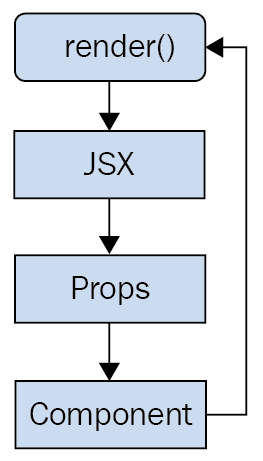
React is generally thought of as the view layer in an application. You might have used a library such as Handlebars or jQuery in the past. Just like jQuery manipulates UI elements, or Handlebars templates are inserted onto the page, React components change what the user sees. The following diagram illustrates where React fits in our frontend code:
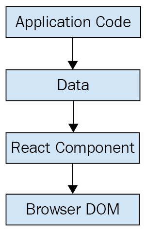
This is literally all there is to React—the core concept. Of course there will be subtle variations to this theme as we make our way through the book, but the flow is more or less the same. We have some application logic that generates some data. We want to render this data to the UI, so we pass it to a React component, which handles the job of getting the HTML into the page.
You may wonder what the big deal is, especially since at the surface, React appears to be yet another rendering technology. We'll touch on some of the key areas where React can simplify application development in the remaining sections of the chapter.
React doesn't have many moving parts to learn about and understand. Internally, there's a lot going on, and we'll touch on these things here and there throughout the book. The advantage to having a small API to work with is that you can spend more time familiarizing yourself with it, experimenting with it, and so on. The opposite is true of large frameworks, where all your time is devoted to figuring out how everything works. The following diagram gives a rough idea of the APIs that we have to think about when programming with React:
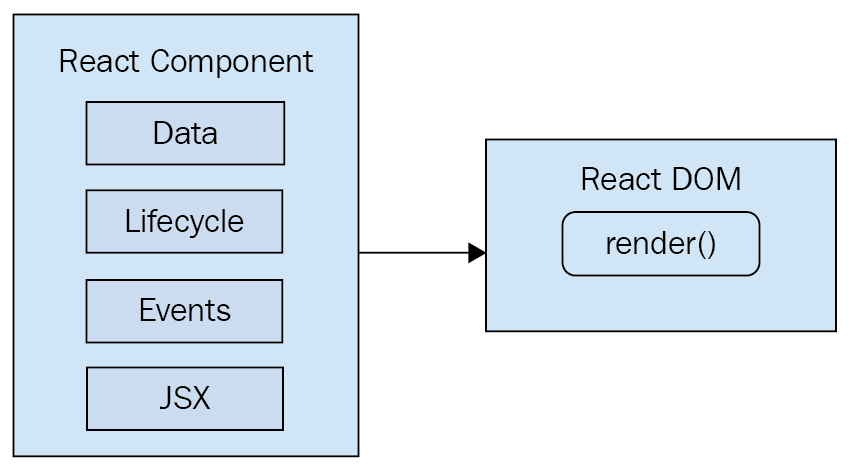
React is divided into two major APIs. First, there's the React DOM. This is the API that's used to perform the actual rendering on a web page. Second, there's the React component API. These are the parts of the page that are actually rendered by React DOM. Within a React component, we have the following areas to think about:
Don't fixate on what these different areas of the React API represent just yet. The takeaway here is that React, by nature, is simple. Just look at how little there is to figure out! This means that we don't have to spend a ton of time going through API details here. Instead, once you pick up on the basics, we can spend more time on nuanced React usage patterns.
React newcomers have a hard time coming to grips with the idea that components mix markup in with their JavaScript. If you've looked at React examples and had the same adverse reaction, don't worry. Initially, we're all skeptical of this approach, and I think the reason is that we've been conditioned for decades by the separation of concerns principle. Now, whenever we see things mixed together, we automatically assume that this is bad and shouldn't happen.
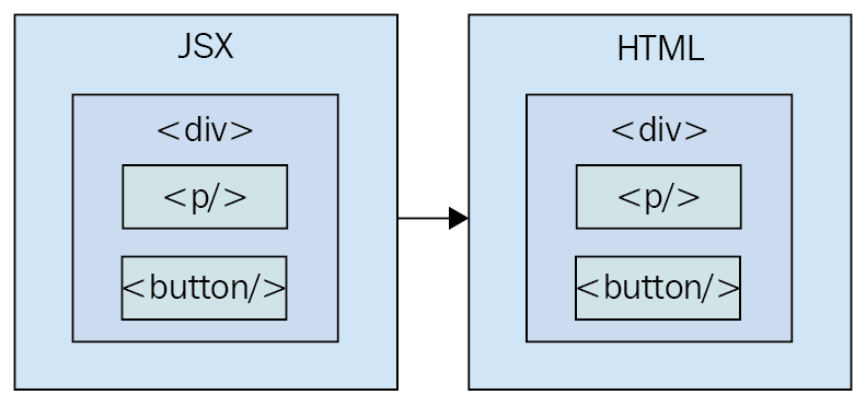
The syntax used by React components is called JSX (JavaScript XML). A component renders content by returning some JSX. The JSX itself is usually HTML markup, mixed with custom tags for the React components. The specifics don't matter at this point; we'll get into details in the coming chapters. What's absolutely groundbreaking here is that we don't have to perform little micro-operations to change the content of a component.
For example, think about using something like jQuery to build your application. You have a page with some content on it, and you want to add a class to a paragraph when a button is clicked. Performing these steps is easy enough. This is called imperative programming, and it's problematic for UI development. While this example of changing the class of an element in response to an event is simple, real applications tend to involve more than three or four steps to make something happen.
React components don't require executing steps in an imperative way to render content. This is why JSX is so central to React components. The XML-style syntax makes it easy to describe what the UI should look like. That is, what are the HTML elements that this component is going to render? This is called declarative programming, and is very well suited for UI development.
Another area that's difficult for React newcomers to grasp is the idea that JSX is like a static string, representing a chunk of rendered output. This is where time and data come into play. React components rely on data being passed into them. This data represents the dynamic aspects of the UI. For example, a UI element that's rendered based on a Boolean value could change the next time the component is rendered. Here's an illustration of the idea:
Each time the React component is rendered, it's like taking a snapshot of the JSX at that exact moment in time. As your application moves forward through time, you have an ordered collection of rendered user interface components. In addition to declaratively describing what a UI should be, re-rendering the same JSX content makes things much easier for developers. The challenge is making sure that React can handle the performance demands of this approach.
Using React to build user interfaces means that we can declare the structure of the UI with JSX. This is less error-prone than the imperative approach to assembling the UI piece by piece. However, the declarative approach does present us with one challenge: performance.
For example, having a declarative UI structure is fine for the initial rendering, because there's nothing on the page yet. So, the React renderer can look at the structure declared in JSX, and render it into the DOM browser.
This concept is illustrated in the following diagram:
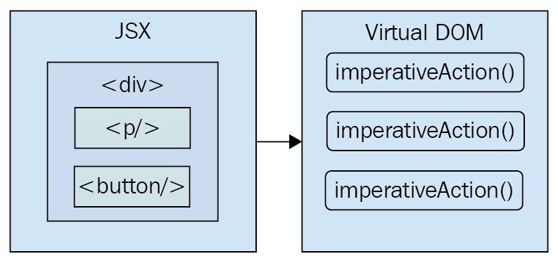
On the initial render, React components and their JSX are no different from other template libraries. For instance, Handlebars will render a template to HTML markup as a string, which is then inserted into the browser DOM. Where React is different from libraries such as Handlebars is when data changes and we need to re-render the component. Handlebars will just rebuild the entire HTML string, the same way it did on the initial render. Since this is problematic for performance, we often end up implementing imperative workarounds that manually update tiny bits of the DOM. We end up with a tangled mess of declarative templates and imperative code to handle the dynamic aspects of the UI.
We don't do this in React. This is what sets React apart from other view libraries. Components are declarative for the initial render, and they stay this way even as they're re-rendered. It's what React does under the hood that makes re-rendering declarative UI structures possible.
React has something called the virtual DOM, which is used to keep a representation of the real DOM elements in memory. It does this so that each time we re-render a component, it can compare the new content to the content that's already displayed on the page. Based on the difference, the virtual DOM can execute the imperative steps necessary to make the changes. So not only do we get to keep our declarative code when we need to update the UI, React will also make sure that it's done in a performant way. Here's what this process looks like:
Like any other JavaScript library, React is constrained by the run-to-completion nature of the main thread. For example, if the React internals are busy diffing content and patching the DOM, the browser can't respond to user input. As you'll see in the last section of this chapter, changes were made to the internal rendering algorithms in React 16 to mitigate these performance pitfalls.
Another topic I want to cover at a high level before we dive into React code is abstraction. React doesn't have a lot of it, and yet the abstractions that React implements are crucial to its success.
In the preceding section, you saw how JSX syntax translates to low-level operations that we have no interest in maintaining. The more important way to look at how React translates our declarative UI components is the fact that we don't necessarily care what the render target is. The render target happens to be the browser DOM with React, but it isn't restricted to the browser DOM.
React has the potential to be used for any user interface we want to create, on any conceivable device. We're only just starting to see this with React Native, but the possibilities are endless. I personally will not be surprised when React Toast becomes a thing, targeting toasters that can singe the rendered output of JSX on to bread. The abstraction level with React is at the right level, and it's in the right place.
The following diagram gives you an idea of how React can target more than just the browser:
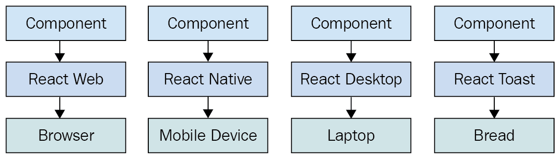
From left to right, we have React Web (just plain React), React Native, React Desktop, and React Toast. As you can see, to target something new, the same pattern applies:
This is obviously an oversimplification of what's actually implemented for any given React environment. But the details aren't so important to us. What's important is that we can use our React knowledge to focus on describing the structure of our user interface on any platform.
In this section, I want to highlight the major changes and the new features of React 16. I'll go into more detail about the given changes as we encounter them in the subsequent chapters throughout the book.
Perhaps the biggest change in React 16 is to the internal reconciliation code. These changes don't impact the way that you interact with the React API. Instead, these changes were made to address some pain points that were preventing React from scaling up in certain situations. For example, one of the main concepts from this new architecture is that of a fiber. Instead of rendering every component on the page in a run-to-compilation way, React renders fibers—smaller chunks of the page that can be prioritized and rendered asynchronously.
For a more in depth look at this new architecture, these resources should be helpful:
React 16 had to revamp some of the lifecycle methods that are available to class components. Some lifecycle methods are deprecated and will eventually be removed. There are new lifecycle methods to replace them. The main issue is that the deprecated lifecycle methods encourage coding in ways that doesn't work well with the new async React core.
For more on these lifecycle methods, visit this page: https://reactjs.org/blog/2018/03/27/update-on-async-rendering.html.
React has always provided a context API for developers, but it was always considered experimental. Context is an alternative approach to passing data from one component to the next. For example, using properties, you can pass data through a tree of components that is several layers deep. The components in the middle of this tree don't actually use any of these properties—they're just acting as intermediaries. This becomes problematic as your application grows because you have lots of props in your source that add to the complexity.
The new context API in React 16.3 is more official and provides a way for you to supply your components with data at any tree level. You can read more about the new context API here: https://reactjs.org/docs/context.html.
If your React component renders several sibling elements, say three <p> elements for instance, you would have to wrap them in a <div> because React would only allow components to return a single element. The only problem with this approach is that it leads to a lot of unnecessary DOM structure. Wrapping your elements with <Fragment> is the same idea as wrapping them with a <div>, except there won't be any superfluous DOM elements.
You can read more about fragments here: https://reactjs.org/docs/fragments.html.
When a React component returns content, it gets rendered into its parent component. Then, that parent's content gets rendered into its parent component and so on, all the way to the tree root. There are times when you want to render something that specifically targets a DOM element. For example, a component that should be rendered as a dialog probably doesn't need to be mounted at the parent. Using a portal, you can control specifically where your component's content is rendered.
You can read more about portals here: https://reactjs.org/docs/portals.html.
Prior to React 16, components had to return either an HTML element or another React component as its content. This can restrict how you compose your application. For example, you might have a component that is responsible for generating an error message. You used to have to wrap these strings in HTML tags in order to be considered valid React component output. Now you can just return the string. Similarly, you can just return a list of strings or a list of elements.
The blog post introducing React 16 has more details on this new functionality: https://reactjs.org/blog/2017/09/26/react-v16.0.html.
Error handling in React can be difficult. Where exactly do you handle errors? If a component handles a JavaScript exception and sets an error state on the component to true, how do you reset this state? In React 16, there are error boundaries. Error boundaries are created by implementing the componentDidCatch() lifecycle method in a component. This component can then serve as the error boundary by wrapping other components. If any of the wrapped components throws an exception, the error boundary component can render alternative content.
Having error boundaries in place like this allows you to structure your components in a way that best suits your application. You can read more about error boundaries here: https://reactjs.org/docs/error-boundaries.html.
Server-side rendering (SSR) in React can be difficult to wrap your head around. You're rendering on the server, then rendering on the client too? Since the SSR pattern has become more prevalent, the React team has made it easier to work with in React 16. In addition, there are a number of internal performance gains as well as efficiency gains by enabling streaming rendered content to the client.
If you want to read more about SSR in React 16, I recommend the following resources:
In this chapter, you were introduced to React at a high level. React is a library, with a small API, used to build user interfaces. Next, you were introduced to some of the key concepts of React. First, we discussed the fact that React is simple, because it doesn't have a lot of moving parts. Next, we looked at the declarative nature of React components and JSX. Then, you learned that React takes performance seriously, and that this is how we're able to write declarative code that can be re-rendered over and over. Next, you learned about the idea of render targets and how React can easily become the UI tool of choice for all of them. Lastly, I gave a rough overview of what's new in React 16.
That's enough introductory and conceptual stuff for now. As we make our way toward the end of the book, we'll revisit these ideas. For now, let's take a step back and nail down the basics, starting with JSX.
Take a look at the following links for more information:
This chapter will introduce you to JSX. We'll start by covering the basics: what is JSX? Then, you'll see that JSX has built-in support for HTML tags, as you would expect, so we'll run through a few examples here. After having looked at some JSX code, we'll discuss how it makes describing the structure of UIs easy for us. Then, we'll jump into building our own JSX elements, and using JavaScript expressions for dynamic content. Finally, you'll learn how to use fragments to produce less HTML—a new React 16 feature.
Ready?
In this section, we'll implement the obligatory hello world JSX application. At this point, we're just dipping our toes into the water; more in-depth examples will follow. We'll also discuss what makes this syntax work well for declarative UI structures.
Without further ado, here's your first JSX application:
// The "render()" function will render JSX markup and
// place the resulting content into a DOM node. The "React"
// object isn't explicitly used here, but it's used
// by the transpiled JSX source.
import React from 'react';
import { render } from 'react-dom';

// Renders the JSX markup. Notice the XML syntax
// mixed with JavaScript? This is replaced by the
// transpiler before it reaches the browser.
render(
 <p>
    Hello, <strong>JSX</strong>
  </p>,
  document.getElementById('root')
);
Let's walk through what's happening here. First, we need to import the relevant bits. The render() function is what really matters in this example, as it takes JSX as the first argument and renders it to the DOM node passed as the second argument.
The actual JSX content in this example renders a paragraph with some bold text inside. There's nothing fancy going on here, so we could have just inserted this markup into the DOM directly as a plain string. However, there's a lot more to JSX than what's shown here. The aim of this example was to show the basic steps involved in getting JSX rendered onto the page. Now, let's talk a little bit about declarative UI structure.
Before we continue forward with our code examples, let's take a moment to reflect on our hello world example. The JSX content was short and simple. It was also declarative, because it described what to render, not how to render it. Specifically, by looking at the JSX, you can see that this component will render a paragraph, and some bold text within it. If this were done imperatively, there would probably be some more steps involved, and they would probably need to be performed in a specific order.
The example we just implemented should give you a feel for what declarative React is all about. As we move forward in this chapter and throughout the book, the JSX markup will grow more elaborate. However, it's always going to describe what is in the user interface. Let's move on.
At the end of the day, the job of a React component is to render HTML into the DOM browser. This is why JSX has support for HTML tags, out of the box. In this section, we'll look at some code that renders a few of the available HTML tags. Then, we'll cover some of the conventions that are typically followed in React projects when HTML tags are used.
When we render JSX, element tags are referencing React components. Since it would be tedious to have to create components for HTML elements, React comes with HTML components. We can render any HTML tag in our JSX, and the output will be just as we'd expect. Now, let's try rendering some of these tags:
import React from 'react';
import { render } from 'react-dom';

// The render() function will only complain if the browser doesn't
// recognize the tag
render(
  <div>
    <button />
    <code />
    <input />
    <label />
    <p />
    <pre />
    <select />
    <table />
    <ul />
  </div>,
  document.getElementById('root')
);
Don't worry about the rendered output for this example; it doesn't make sense. All we're doing here is making sure that we can render arbitrary HTML tags, and they render as expected.
When you render HTML tags in JSX markup, the expectation is that you'll use lowercase for the tag name. In fact, capitalizing the name of an HTML tag will fail. Tag names are case sensitive and non-HTML elements are capitalized. This way, it's easy to scan the markup and spot the built-in HTML elements versus everything else.
You can also pass HTML elements any of their standard properties. When you pass them something unexpected, a warning about the unknown property is logged. Here's an example that illustrates these ideas:
import React from 'react';
import { render } from 'react-dom';

// This renders as expected, except for the "foo"
// property, since this is not a recognized button
// property.
render(
  <button title="My Button" foo="bar">
    My Button
  </button>,
  document.getElementById('root')
);

// This fails with a "ReferenceError", because
// tag names are case-sensitive. This goes against
// the convention of using lower-case for HTML tag names.
render(<Button />, document.getElementById('root'));
JSX is the best way to describe complex UI structures. Let's look at some JSX markup that declares a more elaborate structure than a single paragraph:
import React from 'react';
import { render } from 'react-dom';
// This JSX markup describes some fairly-sophisticated
// markup. Yet, it's easy to read, because it's XML and
// XML is good for concisely-expressing hierarchical
// structure. This is how we want to think of our UI,
// when it needs to change, not as an individual element
// or property.
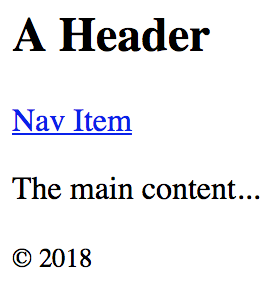
render(
<section>
<header>
<h1>A Header</h1>
</header>
<nav>
<a href="item">Nav Item</a>
</nav>
<main>
<p>The main content...</p>
</main>
<footer>
<small>© 2018</small>
</footer>
</section>,
document.getElementById('root')
);
As you can see, there are a lot of semantic elements in this markup, describing the structure of the UI. The key is that this type of complex structure is easy to reason about, and we don't need to think about rendering specific parts of it. But before we start implementing dynamic JSX markup, let's create some of our own JSX components.
Here is what the rendered content looks like:
Components are the fundamental building blocks of React. In fact, components are the vocabulary of JSX markup. In this section, we'll see how to encapsulate HTML markup within a component. We'll build examples that show you how to nest custom JSX elements and how to namespace your components.
The reason that you want to create new JSX elements is so that we can encapsulate larger structures. This means that instead of having to type out complex markup, you can use your custom tag. The React component returns the JSX that replaces the element. Let's look at an example now:
// We also need "Component" so that we can
// extend it and make a new JSX tag.
import React, { Component } from 'react';
import { render } from 'react-dom';

// "MyComponent" extends "Compoennt", which means that
// we can now use it in JSX markup.
class MyComponent extends Component {
  render() {
    // All components have a "render()" method, which
    // retunrns some JSX markup. In this case, "MyComponent"
    // encapsulates a larger HTML structure.
    return (
      <section>
        <h1>My Component</h1>
        <p>Content in my component...</p>
      </section>
    );
  }
}

// Now when we render "<MyComponent>" tags, the encapsulated
// HTML structure is actually rendered. These are the
// building blocks of our UI.
render(<MyComponent />, document.getElementById('root'));
Here's what the rendered output looks like:

This is the first React component that you've implemented, so let's take a moment to dissect what's going on here. You've created a class called MyComponent that extends the Component class from React. This is how you create a new JSX element. As you can see in the call to render(), you're rendering a <MyComponent> element.
The HTML that this component encapsulates is returned by the render() method. In this case, when the JSX <MyComponent> is rendered by react-dom, it's replaced by a <section> element, and everything within it.
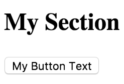
Using JSX markup is useful for describing UI structures that have parent-child relationships. For example, a <li> tag is only useful as the child of a <ul> or <ol> tag—you're probably going to make similar nested structures with your own React components. For this, you need to use the children property. Let's see how this works. Here's the JSX markup:
import React from 'react';
import { render } from 'react-dom';

// Imports our two components that render children...
import MySection from './MySection';
import MyButton from './MyButton';

// Renders the "MySection" element, which has a child
// component of "MyButton", which in turn has child text.
render(
  <MySection>
    <MyButton>My Button Text</MyButton>
  </MySection>,
  document.getElementById('root')
);
You're importing two of your own React components: MySection and MyButton. Now, if you look at the JSX markup, you'll notice that <MyButton> is a child of <MySection>. You'll also notice that the MyButton component accepts text as its child, instead of more JSX elements. Let's see how these components work, starting with MySection:
import React, { Component } from 'react';

// Renders a "<section>" element. The section has
// a heading element and this is followed by
// "this.props.children".
export default class MySection extends Component {
  render() {
    return (
      <section>
        <h2>My Section</h2>
        {this.props.children}
      </section>
    );
  }
}
This component renders a standard <section> HTML element, a heading, and then {this.props.children}. It's this last construct that allows components to access nested elements or text, and to render it.
Now, let's look at the MyButton component:
import React, { Component } from 'react';

// Renders a "<button>" element, using
// "this.props.children" as the text.
export default class MyButton extends Component {
  render() {
    return <button>{this.props.children}</button>;
  }
}
This component is using the exact same pattern as MySection; take the {this.props.children} value, and surround it with meaningful markup. React handles the messy details for you. In this example, the button text is a child of MyButton, which is, in turn, a child of MySection. However, the button text is transparently passed through MySection. In other words, we didn't have to write any code in MySection to make sure that MyButton got its text. Pretty cool, right? Here's what the rendered output looks like:
The custom elements that you've created so far have used simple names. Sometimes, you might want to give a component a namespace. Instead of writing <MyComponent> in your JSX markup, you would write <MyNamespace.MyComponent>. This makes it clear to anyone that MyComponent is part of MyNamespace.
Typically, MyNamespace would also be a component. The idea with namespacing is to have a namespace component render its child components using the namespace syntax. Let's take a look at an example:
import React from 'react';
import { render } from 'react-dom';

// We only need to import "MyComponent" since
// the "First" and "Second" components are part
// of this "namespace".
import MyComponent from './MyComponent';

// Now we can render "MyComponent" elements,
// and it's "namespaced" elements as children.
// We don't actually have to use the namespaced
// syntax here, we could import the "First" and
// "Second" components and render them without the
// "namespace" syntax. It's a matter of readability
// and personal taste.
render(
  <MyComponent>
    <MyComponent.First />
    <MyComponent.Second />
  </MyComponent>,
  document.getElementById('root')
);
This markup renders a <MyComponent> element with two children. The key here is that instead of writing <First>, we write <MyComponent.First>, and the same with <MyComponent.Second>. The idea is that we want to explicitly show that First and Second belong to MyComponent, within the markup.
Now, let's take a look at the MyComponent module:
import React, { Component } from 'react';
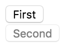
// The "First" component, renders some basic JSX...
class First extends Component {
render() {
return <p>First...</p>;
}
}
// The "Second" component, renders some basic JSX...
class Second extends Component {
render() {
return <p>Second...</p>;
}
}
// The "MyComponent" component renders it's children
// in a "<section>" element.
class MyComponent extends Component {
render() {
return <section>{this.props.children}</section>;
}
}
// Here is where we "namespace" the "First" and
// "Second" components, by assigning them to
// "MyComponent" as class properties. This is how
// other modules can render them as "<MyComponent.First>"
// elements.
MyComponent.First = First;
MyComponent.Second = Second;
export default MyComponent;
// This isn't actually necessary. If we want to be able
// to use the "First" and "Second" components independent
// of "MyComponent", we would leave this in. Otherwise,
// we would only export "MyComponent".
export { First, Second };
This module declares MyComponent as well as the other components that fall under this namespace (First and Second). The idea is to assign the components to the namespace component (MyComponent) as class properties. There are a number of things that you could change in this module. For example, you don't have to directly export First and Second since they're accessible through MyComponent. You also don't need to define everything in the same module; you could import First and Second and assign them as class properties. Using namespaces is completely optional, and if you use them, you should use them consistently.
As you saw in the preceding section, JSX has special syntax that allows you to embed JavaScript expressions. Any time React renders JSX content, expressions in the markup are evaluated. This is the dynamic aspect of JSX, and in this section, you'll learn how to use expressions to set property values and element text content. You'll also learn how to map collections of data to JSX elements.
Some HTML property or text values are static, meaning that they don't change as the JSX is re-rendered. Other values, the values of properties or text, are based on data that's found elsewhere in the application. Remember, React is just the view layer. Let's look at an example so that you can get a feel for what the JavaScript expression syntax looks like in JSX markup:
import React from 'react';
import { render } from 'react-dom';

// These constants are passed into the JSX
// markup using the JavaScript expression syntax.
const enabled = false;
const text = 'A Button';
const placeholder = 'input value...';
const size = 50;

// We're rendering a "<button>" and an "<input>"
// element, both of which use the "{}" JavaScript
// expression syntax to fill in property, and text
// values.
render(
  <section>
    <button disabled={!enabled}>{text}</button>
    <input placeholder={placeholder} size={size} />
  </section>,
  document.getElementById('root')
);
Anything that is a valid JavaScript expression, including nested JSX, can go in between the braces: {}. For properties and text, this is often a variable name or object property. Notice in this example that the !enabled expression computes a Boolean value. Here's what the rendered output looks like:

Sometimes, you need to write JavaScript expressions that change the structure of your markup. In the preceding section, you learned how to use JavaScript expression syntax to dynamically change the property values of JSX elements. What about when you need to add or remove elements based on JavaScript collections?
The best way to dynamically control JSX elements is to map them from a collection. Let's look at an example of how this is done:
import React from 'react';
import { render } from 'react-dom';
// An array that we want to render as s list...
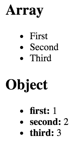
const array = ['First', 'Second', 'Third'];
// An object that we want to render as a list...
const object = {
first: 1,
second: 2,
third: 3
};
render(
<section>
<h1>Array</h1>
{/* Maps "array" to an array of "<li>"s.
Note the "key" property on "<li>".
This is necessary for performance reasons,
and React will warn us if it's missing. */}
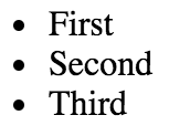
<ul>{array.map(i => <li key={i}>{i}</li>)}</ul>
<h1>Object</h1>
{/* Maps "object" to an array of "<li>"s.
Note that we have to use "Object.keys()"
before calling "map()" and that we have
to lookup the value using the key "i". */}
<ul>
{Object.keys(object).map(i => (
<li key={i}>
<strong>{i}: </strong>
{object[i]}
</li>
))}
</ul>
</section>,
document.getElementById('root')
);
The first collection is an array called array, populated with string values. Moving down to the JSX markup, you can see the call to array.map(), which will return a new array. The mapping function is actually returning a JSX element (<li>), meaning that each item in the array is now represented in the markup.
The object collection uses the same technique, except you have to call Object.keys() and then map this array. What's nice about mapping collections to JSX elements on the page is that you can drive the structure of React components based on collection data. This means that you don't have to rely on imperative logic to control the UI.
Here's what the rendered output looks like:
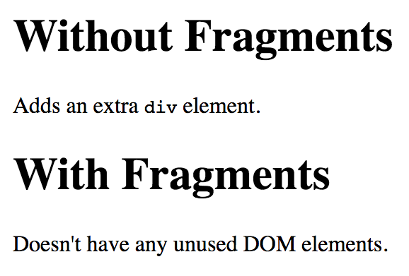
React 16 introduces the concept of JSX fragments. Fragments are a way to group together chunks of markup without having to add unnecessary structure to your page. For example, a common approach is to have a React component return content wrapped in a <div> element. This element serves no real purpose and adds clutter to the DOM.
Let's look at an example. Here are two versions of a component. One uses a wrapper element and one uses the new fragment feature:
import React from 'react';
import { render } from 'react-dom';

import WithoutFragments from './WithoutFragments';
import WithFragments from './WithFragments';

render(
  <div>
    <WithoutFragments />
    <WithFragments />
  </div>,
  document.getElementById('root')
);
The two elements rendered are <WithoutFragments> and <WithFragments>. Here's what they look like when rendered:
Let's compare the two approaches now.
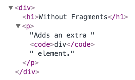
The first approach is to wrap sibling elements in a <div>. Here's what the source looks like:
import React, { Component } from 'react';

class WithoutFragments extends Component {
  render() {
    return (
      <div>
        <h1>Without Fragments</h1>
        <p>
          Adds an extra <code>div</code> element.
        </p>
      </div>
    );
  }
}

export default WithoutFragments;
The essence of this component are the <h1> and the <p> tags. Yet, in order to return them from render(), you have to wrap them with a <div>. Indeed, inspecting the DOM using your browser dev tools reveals that this <div> does nothing but add another level of structure:
Now, imagine an app with lots of these components—that's a lot of pointless elements!
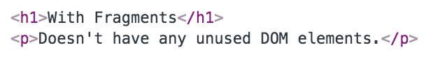
Let's take a look at the WithFragments component now:
import React, { Component, Fragment } from 'react';

class WithFragments extends Component {
  render() {
    return (
      <Fragment>
        <h1>With Fragments</h1>
        <p>Doesn't have any unused DOM elements.</p>
      </Fragment>
    );
  }
}

export default WithFragments;
Instead of wrapping the component content in a <div>, the <Fragment> element is used. This is a special type of element that indicates that only its children need to be rendered. You can see the difference compared to the WithoutFragments component if you inspect the DOM:
In this chapter, you learned the basics of JSX, including its declarative structure and why this is a good thing. Then, you wrote some code to render some basic HTML and learned about describing complex structures using JSX.
Next, you spent some time learning about extending the vocabulary of JSX markup by implementing your own React components, the fundamental building blocks of your UI. Then, you learned how to bring dynamic content into JSX element properties, and how to map JavaScript collections to JSX elements, eliminating the need for imperative logic to control the UI display. Finally, you learned how to render fragments of JSX content using new React 16 functionality.
Now that you have a feel for what it's like to render UIs by embedding declarative XML in your JavaScript modules, it's time to move on to the next chapter, where we'll take a deeper look at component properties and state.
Check out the following links for more information:
React components rely on JSX syntax, which is used to describe the structure of the UI. JSX will only get you so far—you need data to fill in the structure of your React components. The focus of this chapter is component data, which comes in two main varieties: properties and state. Another option for passing data to components is via a context.
I'll start things off by defining what is meant by properties and state. Then, I'll walk through some examples that show you the mechanics of setting component state, and passing component properties. Toward the end of this chapter, we'll build on your new-found knowledge of props and state and introduce functional components and the container pattern. Finally, you'll learn about context and when it makes a better choice than properties for passing data to components.
React components declare the structure of UI elements using JSX. But, components need data if they are to be useful. For example, your component JSX might declare a <ul> that maps a JavaScript collection to <li> elements. Where does this collection come from?
State is the dynamic part of a React component. You can declare the initial state of a component, which changes over time.
Imagine that you're rendering a component where a piece of its state is initialized to an empty array. Later on, this array is populated with data. This is called a change in state, and whenever you tell a React component to change its state, the component will automatically re-render itself. The process is visualized here:
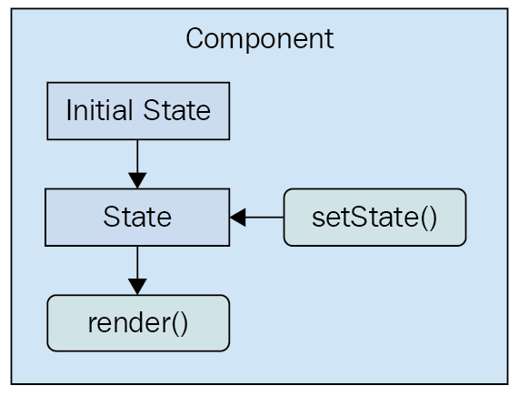
The state of a component is something that either the component itself can set, or other pieces of code, outside of the component. Now we'll look at component properties and how they differ from component state.
Properties are used to pass data into your React components. Instead of calling a method with new state as the argument, properties are passed only when the component is rendered. That is, you pass property values to JSX elements.
Properties are different than state because they don't change after the initial render of the component. If a property value has changed, and you want to re-render the component, then we have to re-render the JSX that was used to render it in the first place. The React internals take care of making sure this is done efficiently. Here's a diagram of rendering and re-rendering a component using properties:
This looks a lot different than a stateful component. The real difference is that with properties, it's often a parent component that decides when to render the JSX. The component doesn't actually know how to re-render itself. As you'll see throughout this book, this type of top-down flow is easier to predict than state that changes all over the place.
Let's make sense of these two concepts by writing some code.
In this section, you're going to write some React code that sets the state of components. First, you'll learn about the initial state—this is, the default state of a component. Next, you'll learn how to change the state of a component, causing it to re-render itself. Finally, you'll see how a new state is merged with an existing state.
The initial state of a component isn't actually required, but if your component uses state, it should be set. This is because if the component expects certain state properties to be there and they aren't, then the component will either fail or render something unexpected. Thankfully, it's easy to set the initial component state.
The initial state of a component should always be an object with one or more properties. For example, you might have a component that uses a single array as its state. This is fine, but just make sure that you set the initial array as a property of the state object. Don't use an array as the state. The reason for this is simple: consistency. Every React component uses a plain object as its state.
Let's turn our attention to some code now. Here's a component that sets an initial state object:
import React, { Component } from 'react';

export default class MyComponent extends Component {
 // The initial state is set as a simple property
  // of the component instance.
  state = {
    first: false,
    second: true
  };

  render() {
    // Gets the "first" and "second" state properties
    // into constants, making our JSX less verbose.
    const { first, second } = this.state;

    // The returned JSX uses the "first" and "second"
    // state properties as the "disabled" property
    // value for their respective buttons.
    return (
      <main>
        <section>
          <button disabled={first}>First</button>
        </section>
        <section>
          <button disabled={second}>Second</button>
        </section>
      </main>
    );
  }
}
If you look at the JSX that's returned by render(), you can actually see the state values that this component depends on—first and second. Since you've set these properties up in the initial state, you're safe to render the component, and there won't be any surprises. For example, you could render this component only once, and it would render as expected, thanks to the initial state:
import React from 'react';
import { render } from 'react-dom';

import MyComponent from './MyComponent';

// "MyComponent" has an initial state, nothing is passed
// as a property when it's rendered.
render(<MyComponent />, document.getElementById('root'));
Here's what the rendered output looks like:
Setting the initial state isn't very exciting, but it's important nonetheless. Let's make the component re-render itself when the state is changed.
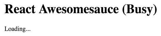
Let's create a component that has some initial state. You'll then render this component, and update its state. This means that the component will be rendered twice. Let's take a look at the component:
import React, { Component } from 'react';

export default class MyComponent extends Component {
  // The initial state is used, until something
  // calls "setState()", at which point the state is
  // merged with this state.
  state = {
    heading: 'React Awesomesauce (Busy)',
    content: 'Loading...'
  };

  render() {
    const { heading, content } = this.state;

    return (
      <main>
        <h1>{heading}</h1>
        <p>{content}</p>
      </main>
    );
  }
}
The JSX of this component depends on two state values—heading and content. The component also sets the initial values of these two state values, which means that it can be rendered without any unexpected gotchas. Now, let's look at some code that renders the component, and then re-renders it by changing the state:
import React from 'react';
import { render } from 'react-dom';

import MyComponent from './MyComponent';

// The "render()" function returns a reference to the
// rendered component. In this case, it's an instance
// of "MyComponent". Now that we have the reference,
// we can call "setState()" on it whenever we want.
const myComponent = render(
  <MyComponent />,
  document.getElementById('root')
);

// After 3 seconds, set the state of "myComponent",
// which causes it to re-render itself.
setTimeout(() => {
  myComponent.setState({
    heading: 'React Awesomesauce',
    content: 'Done!'
  });
}, 3000);
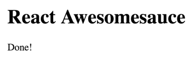
The component is first rendered with its default state. However, the interesting spot in this code is the setTimeout() call. After 3 seconds, it uses setState() to change the two state property values. Sure enough, this change is reflected in the UI. Here's what the initial state looks like when rendered:
Here's what the rendered output looks like after the state change:
In this example, you replaced the entire component state. That is, the call to setState() passed in the same object properties found in the initial state. But, what if you only want to update part of the component state?
When you set the state of a React component, you're actually merging the state of the component with the object that you pass to setState(). This is useful because it means that you can set part of the component state while leaving the rest of the state as it is. Let's look at an example now. First, a component with some state:
import React, { Component } from 'react';

export default class MyComponent extends Component {
  // The initial state...
  state = {
    first: 'loading...',
    second: 'loading...',
    third: 'loading...',
    fourth: 'loading...',
    doneMessage: 'finished!'
  };

  render() {
    const { state } = this;

    // Renders a list of items from the
    // component state.
    return (
      <ul>
        {Object.keys(state)
          .filter(key => key !== 'doneMessage')
          .map(key => (
            <li key={key}>
              <strong>{key}: </strong>
              {state[key]}
            </li>
          ))}
      </ul>
    );
  }
}
This component renders the keys and values of its state—except for doneMessage. Each value defaults to loading.... Let's write some code that sets the state of each state property individually:
import React from 'react';
import { render } from 'react-dom';

import MyComponent from './MyComponent';

// Stores a reference to the rendered component...
const myComponent = render(
  <MyComponent />,
  document.getElementById('root')
);

// Change part of the state after 1 second...
setTimeout(() => {
  myComponent.setState({ first: 'done!' });
}, 1000);

// Change another part of the state after 2 seconds...
setTimeout(() => {
  myComponent.setState({ second: 'done!' });
}, 2000);

// Change another part of the state after 3 seconds...
setTimeout(() => {
  myComponent.setState({ third: 'done!' });
}, 3000);

// Change another part of the state after 4 seconds...
setTimeout(() => {
  myComponent.setState(state => ({
    ...state,
    fourth: state.doneMessage
  }));
}, 4000);
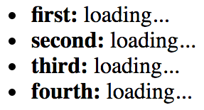
The takeaway from this example is that you can set individual state properties on components. It will efficiently re-render itself. Here's what the rendered output looks like for the initial component state:
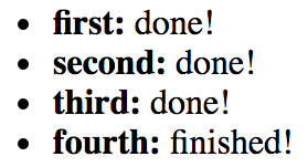
Here's what the output looks like after two of the setTimeout() callbacks have run:
The fourth call to setState() looks different from the first three. Instead of passing a new object to merge into the existing state, you can pass a function. This function takes a state argument—the current state of the component. This is useful when you need to base state changes on current state values. In this example, the doneMessage value is used to set the value of fourth. The function then returns the new state of the component. It's up to you to merge existing state values into the new state. You can use the spread operator to do this (...state).
Properties are like state data that gets passed into components. However, properties are different from state in that they're only set once, when the component is rendered. In this section, you'll learn about default property values. Then, we'll look at setting property values. After this section, you should be able to grasp the differences between component state and properties.
Default property values work a little differently than default state values. They're set as a class attribute called defaultProps. Let's take a look at a component that declares default property values:
import React, { Component } from 'react';

export default class MyButton extends Component {
  // The "defaultProps" values are used when the
  // same property isn't passed to the JSX element.
  static defaultProps = {
    disabled: false,
    text: 'My Button'
  };

  render() {
    // Get the property values we want to render.
    // In this case, it's the "defaultProps", since
    // nothing is passed in the JSX.
    const { disabled, text } = this.props;

    return <button disabled={disabled}>{text}</button>;
  }
}
Why not just set the default property values as an instance property, like you would with default state? The reason is that properties are immutable, and there's no need for them to be kept as an instance property value. State, on the other hand, changes all the time, so the component needs an instance level reference to it.
You can see that this component sets default property values for disabled and text. These values are only used if they're not passed in through the JSX markup used to render the component. Let's go ahead and render this component without any properties, to make sure that the defaultProps values are used:
import React from 'react';
import { render } from 'react-dom';

import MyButton from './MyButton';

// Renders the "MyButton" component, without
// passing any property values.
render(<MyButton />, document.getElementById('root'));
The same principle of always having default state applies with properties. You want to be able to render components without having to know in advance what the dynamic values of the component are.
First, let's create a couple of components that expect different types of property values:
import React, { Component } from 'react';

export default class MyButton extends Component {
  // Renders a "<button>" element using values
  // from "this.props".
  render() {
    const { disabled, text } = this.props;

    return <button disabled={disabled}>{text}</button>;
  }
}
This simple button component expects a boolean disabled property and a string text property. Let's create one more component that expects an array property value:
import React, { Component } from 'react';

export default class MyList extends Component {
  render() {
    // The "items" property is an array.
    const { items } = this.props;

    // Maps each item in the array to a list item.
    return <ul>{items.map(i => <li key={i}>{i}</li>)}</ul>;
  }
}
You can pass just about anything you want as a property value via JSX, just as long as it's a valid JavaScript expression. Now let's write some code to set these property values:
import React from 'react';
import { render as renderJSX } from 'react-dom';

// The two components we're to pass props to
// when they're rendered.
import MyButton from './MyButton';
import MyList from './MyList';

// This is the "application state". This data changes
// over time, and we can pass the application data to
// components as properties.
const appState = {
  text: 'My Button',
  disabled: true,
  items: ['First', 'Second', 'Third']
};

// Defines our own "render()" function. The "renderJSX()"
// function is from "react-dom" and does the actual
// rendering. The reason we're creating our own "render()"
// function is that it contains the JSX that we want to
// render, and so we can call it whenever there's new
// application data.
function render(props) {
  renderJSX(
    <main>
      {/* The "MyButton" component relies on the "text"
           and the "disabed" property. The "text" property
           is a string while the "disabled" property is a
           boolean. */}
      <MyButton text={props.text} disabled={props.disabled} />

      {/* The "MyList" component relies on the "items"
           property, which is an array. Any valid
           JavaScript data can be passed as a property. */}
      <MyList items={props.items} />
    </main>,
    document.getElementById('root')
  );
}

// Performs the initial rendering...
render(appState);

// After 1 second, changes some application data, then
// calls "render()" to re-render the entire structure.
setTimeout(() => {
  appState.disabled = false;
  appState.items.push('Fourth');

  render(appState);
}, 1000);
The render() function looks like it's creating new React component instances every time it's called. React is smart enough to figure out that these components already exist, and that it only needs to figure out what the difference in output will be with the new property values.
Another takeaway from this example is that you have an appState object that holds onto the state of the application. Pieces of this state are then passed into components as properties, when the components are rendered. State has to live somewhere, and in this case, it's outside of the component. I'll build on this topic in the next section, when you will learn how to implement stateless functional components.
The components you've seen so far in this book have been classes that extend the base Component class. It's time to learn about functional components in React. In this section, you'll learn what a functional component is by implementing one. Then, you'll learn how to set default property values for stateless functional components.
A functional React component is just what it sounds like—a function. Picture the render() method of any React component that you've seen. This method, in essence, is the component. The job of a functional React component is to return JSX, just like a class-based React component. The difference is that this is all a functional component can do. It has no state and no lifecycle methods.
Why would you want to use functional components? It's a matter of simplicity more than anything else. If your component renders some JSX and does nothing else, then why bother with a class when a function is simpler?
A pure function is a function without side effects. That is to say, called with a given set of arguments, the function always produces the same output. This is relevant for React components because, given a set of properties, it's easier to predict what the rendered content will be. Functions that always return the same value with a given argument values are easier to test as well.
Let's look at a functional component now:
import React from 'react';

// Exports an arrow function that returns a
// "<button>" element. This function is pure
// because it has no state, and will always
// produce the same output, given the same
// input.
export default ({ disabled, text }) => (
  <button disabled={disabled}>{text}</button>
);
Concise, isn't it? This function returns a <button> element, using the properties passed in as arguments (instead of accessing them through this.props). This function is pure because the same content is rendered if the same disabled and text property values are passed. Now, let's see how to render this component:
import React from 'react';
import { render as renderJSX } from 'react-dom';

// "MyButton" is a function, instead of a
// "Component" subclass.
import MyButton from './MyButton';

// Renders two "MyButton" components. We only need
// the "first" and "second" properties from the
// props argument by destructuring it.
function render({ first, second }) {
  renderJSX(
    <main>
      <MyButton text={first.text} disabled={first.disabled} />
      <MyButton text={second.text} disabled={second.disabled} />
    </main>,
    document.getElementById('root')
  );
}

// Reders the components, passing in property data.
render({
  first: {
    text: 'First Button',
    disabled: false
  },
  second: {
    text: 'Second Button',
    disabled: true
  }
});
There's zero difference between class-based and function-based React components, from a JSX point of view. The JSX looks exactly the same whether the component was declared using class or function syntax.
Here's what the rendered HTML looks like:

Functional components are lightweight; they don't have any state or lifecycle. They do, however, support some metadata options. For example, you can specify the default property values of functional components the same way you would with a class component. Here's an example of what this looks like:
import React from 'react';

// The functional component doesn't care if the property
// values are the defaults, or if they're passed in from
// JSX. The result is the same.
const MyButton = ({ disabled, text }) => (
  <button disabled={disabled}>{text}</button>
);

// The "MyButton" constant was created so that we could
// attach the "defaultProps" metadata here, before
// exporting it.
MyButton.defaultProps = {
  text: 'My Button',
  disabled: false
};

export default MyButton;
The defaultProps property is defined on a function instead of a class. When React encounters a functional component with this property, it knows to pass in the defaults if they're not provided via JSX.
In this section, you're going to learn the concept of container components. This is a common React pattern, and it brings together many of the concepts that you've learned about state and properties.
The basic premise of container components is simple: don't couple data fetching with the component that renders the data. The container is responsible for fetching the data and passing it to its child component. It contains the component responsible for rendering the data.
The idea is that you should be able to achieve some level of substitutability with this pattern. For example, a container could substitute its child component. Or, a child component could be used in a different container. Let's see the container pattern in action, starting with the container itself:
import React, { Component } from 'react';

import MyList from './MyList';

// Utility function that's intended to mock
// a service that this component uses to
// fetch it's data. It returns a promise, just
// like a real async API call would. In this case,
// the data is resolved after a 2 second delay.
function fetchData() {
  return new Promise(resolve => {
    setTimeout(() => {
      resolve(['First', 'Second', 'Third']);
    }, 2000);
  });
}

// Container components usually have state, so they
// can't be declared as functions.
export default class MyContainer extends Component {
  // The container should always have an initial state,
  // since this will be passed down to child components
  // as properties.
  state = { items: [] };

  // After the component has been rendered, make the
  // call to fetch the component data, and change the
  // state when the data arrives.
  componentDidMount() {
    fetchData().then(items => this.setState({ items }));
  }

  // Renders the container, passing the container
  // state as properties, using the spread operator: "...".
  render() {
    return <MyList {...this.state} />;
  }
}
The job of this component is to fetch data and to set its state. Any time the state is set, render() is called. This is where the child component comes in. The state of the container is passed to the child as properties. Let's take a look at the MyList component next:
import React from 'react';

// A stateless component that expects
// an "items" property so that it can render
// a "<ul>" element.
export default ({ items }) => (
  <ul>{items.map(i => <li key={i}>{i}</li>)}</ul>
);
MyList is a functional component that expects an items property. Let's see how the container component is actually used:
import React from 'react';
import { render } from 'react-dom';

import MyContainer from './MyContainer';

// All we have to do is render the "MyContainer"
// component, since it looks after providing props
// for it's children.
render(<MyContainer />, document.getElementById('root'));
Container component design will be covered in more depth in Chapter 5, Crafting Reusable Components. The idea of this example was to give you a feel for the interplay between state and properties in React components.
When you load the page, you'll see the following content rendered after the 3 seconds it takes to simulate an HTTP request:
As your React application grows, it will use more components. Not only will it have more components, but the structure of your application will change so that components are nested more deeply. The components that are nested at the deepest level still need to have data passed to them. Passing data from a parent component to a child component isn't a big deal. The challenge is when you have to start using components as indirection for passing data around your app.
For data that needs to make its way to any component in your app, you can create and use a context. There are two key concepts to remember when using contexts in React—providers and consumers. A context provider creates data and makes sure that it's available to any React components. A context consumer is a component that uses this data within the context.
You might be wondering whether or not context is just another way of saying global data in a React application. Essentially, this is exactly what contexts are used for. Using the React approach to wrapping components with a context works better than creating global data because you have better control of how your data flows down through your components. For example, you can have nested contexts and a number of other advanced use cases. But for now, let's just focus on simple usage.
Let's say that you have some application data that determines permissions for given application features. This data could be fetched from an API or it could be hardcoded. In either case, the requirement is that you don't want to have to pass all of this permission data through the component tree. It would be nice if the permission data were just there, for any component that needs it.
Starting at the very top of the component tree, let's look at index.js:
import React from 'react';
import { render } from 'react-dom';

import { PermissionProvider } from './PermissionContext';
import App from './App';

render(
  <PermissionProvider>
    <App />
  </PermissionProvider>,
  document.getElementById('root')
);
The <App> component is the child of the <PermissionProvider> component. This means that the permission context has been provided to the <App> component and any of its children, all the way down the tree. Let's take a look at the PermissionContext.js module where the permission context is defined:
import React, { Component, createContext } from 'react';

const { Provider, Consumer } = createContext('permissions');

export class PermissionProvider extends Component {
  state = {
    first: true,
    second: false,
    third: true
  };

  render() {
    return (
      <Provider value={this.state}>{this.props.children}</Provider>
    );
  }
}

const PermissionConsumer = ({ name, children }) => (
  <Consumer>{value => value[name] && children}</Consumer>
);

export { PermissionConsumer };
The createContext() function is used to create the actual context. The return value is an object containing two components—Provider and Consumer. Next, there's a simple abstraction for the permission provider that's to be used all throughout the app. The state contains the actual data that components might want to use. In this example, if the value is true, the feature should be displayed as normal. If it's false, then the feature doesn't have permission to render. Here, the state is only set once, but since this is a regular React component, you could set the state the same way you would set the state on any other component. The value that's rendered is the <Provider> component. This provides any children with context data, set via the value property.
Next, there's a small abstraction for permission consumers. Instead of having every component that needs to test for permissions implement the same logic over and over, the PermissionConsumer component can do it. The child of the <Consumer> component is always a function that takes the context data as an argument. In this example, the PermissionConsumer component has a name prop, for the name of the feature. This is compared with the value from the context and if it's false, nothing is rendered.
Now let's look at the App component:
import React, { Fragment } from 'react';

import First from './First';
import Second from './Second';
import Third from './Third';

export default () => (
  <Fragment>
    <First />
    <Second />
    <Third />
  </Fragment>
);
This component renders three components that are features and each need to check for permissions. Without the context functionality of React, you would have to pass this data as properties to each of these components through this component. If <First> had children or grandchildren that needed to check permissions, the same property-passing mechanism can get quite messy.
Now let's take a look at the <First> component (the <Second> and <Third> are almost exactly the same):
import React from 'react';
import { PermissionConsumer } from './PermissionContext';

export default () => (
  <PermissionConsumer name="first">
    <div>
      <button>First</button>
    </div>
  </PermissionConsumer>
);
This is where the PermissionConsumer component is put to use. You just need to supply it with a name property, and the child component is the component that is rendered if the permission check passes. The <PermissionConsumer> component can be used anywhere, and there's no need to pass data in order to use it. Here's what the rendered output of these three components looks like:
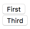
The second component isn't rendered because its permission in the PermissionProvider component is set to false.
In this chapter, you learned about state and properties in React components. You started off by defining and comparing the two concepts. Then, you implemented several React components and manipulated their state. Next, you learned about properties by implementing code that passed property values from JSX to the component. Next, you were introduced to the concept of a container component, used to decouple data fetching from rendering content. Finally, you learned about the new context API in React 16 and how to use it to avoid introducing indirection in your components.
In the next chapter, you'll learn about handling user events in React components.
Visit following links for more information:
The focus of this chapter is event handling. React has a unique approach to handling events: declaring event handlers in JSX. I'll get things going by looking at how event handlers for particular elements are declared in JSX. Then, you'll learn about binding handler context and parameter values. Next, we'll implement inline and higher-order event handler functions.
Then you'll learn how React actually maps event handlers to DOM elements under the hood. Finally, you'll learn about the synthetic events that React passes to event handler functions, and how they're pooled for performance purposes.
The differentiating factor with event handling in React components is that it's declarative. Contrast this with something like jQuery, where you have to write imperative code that selects the relevant DOM elements and attaches event handler functions to them.
The advantage with the declarative approach to event handlers in JSX markup is that they're part of the UI structure. Not having to track down code that assigns event handlers is mentally liberating.
In this section, you'll write a basic event handler, so you can get a feel for the declarative event handling syntax found in React applications. Then, you'll learn how to use generic event handler functions.
Let's take a look at a basic component that declares an event handler for the click event of an element:
import React, { Component } from 'react';

export default class MyButton extends Component {
  // The click event handler, there's nothing much
  // happening here other than a log of the event.
  onClick() {
    console.log('clicked');
  }

  // Renders a "<button>" element with the "onClick"
  // event handler set to the "onClick()" method of
  // this component.
  render() {
    return (
      <button onClick={this.onClick}>{this.props.children}</button>
    );
  }
}
The event handler function, this.onClick(), is passed to the onClick property of the <button> element. By looking at this markup, it's clear what code is going to run when the button is clicked.
What I really like about the declarative event handler syntax is that it's easy to read when there's more than one handler assigned to an element. Sometimes, for example, there are two or three handlers for an element. Imperative code is difficult to work with for a single event handler, let alone several of them. When an element needs more handlers, it's just another JSX attribute. This scales well from a code maintainability perspective:
import React, { Component } from 'react';

export default class MyInput extends Component {
  // Triggered when the value of the text input changes...
  onChange() {
    console.log('changed');
  }

  // Triggered when the text input loses focus...
  onBlur() {
    console.log('blured');
  }

  // JSX elements can have as many event handler
  // properties as necessary.
  render() {
    return <input onChange={this.onChange} onBlur={this.onBlur} />;
  }
}
This <input> element could have several more event handlers, and the code would be just as readable.
As you keep adding more event handlers to your components, you'll notice that a lot of them do the same thing. Next, you'll learn how to share generic handler functions across components.
Any React application is likely going to share the same event handling logic for different components. For example, in response to a button click, the component should sort a list of items. It's these types of generic behaviors that belong in their own modules so that several components can share them. Let's implement a component that uses a generic event handler function:
import React, { Component } from 'react';

// Import the generic event handler that
// manipulates the state of a component.
import reverse from './reverse';

export default class MyList extends Component {
  state = {
    items: ['Angular', 'Ember', 'React']
  };

  // Makes the generic function specific
  // to this component by calling "bind(this)".
  onReverseClick = reverse.bind(this);

  render() {
    const { state: { items }, onReverseClick } = this;

    return (
      <section>
        {/* Now we can attach the "onReverseClick" handler
            to the button, and the generic function will
            work with this component's state. */}
        <button onClick={onReverseClick}>Reverse</button>
        <ul>{items.map((v, i) => <li key={i}>{v}</li>)}</ul>
      </section>
    );
  }
}
Let's walk through what's going on here, starting with the imports. You're importing a function called reverse(). This is the generic event handler function that you're using with your <button> element. When it's clicked, the list should reverse its order.
The onReverseClick method actually calls the generic reverse() function. It is created using bind() to bind the context of the generic function to this component instance.
Finally, looking at the JSX markup, you can see that the onReverseClick() function is used as the handler for the button click.
So how does this work, exactly? You have a generic function that somehow changes the state of this component because you bound context to it? Well, pretty much, yes, that's it. Let's look at the generic function implementation now:
// Exports a generic function that changes the
// state of a component, causing it to re-render
// itself.
export default function reverse() {
  this.setState(this.state.items.reverse());
}
This function depends on a this.state property and an items array within the state. The key is that the state is generic; an application could have many components with an items array in its state.
Here's what our rendered list looks like:
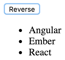
As expected, clicking the button causes the list to sort, using your generic reverse() event handler:
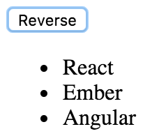
Next, you'll learn how to bind the context and the argument values of event handler functions.
In this section, you'll learn about React components that bind their event handler contexts and how you can pass data into event handlers. Having the right context is important for React event handler functions, because they usually need access to component properties or state. Being able to parameterize event handlers is also important, because they don't pull data out of DOM elements.
In this section, you'll learn about scenarios where the handler needs access to component properties, as well as argument values. You'll render a custom list component that has a click event handler for each item in the list. The component is passed an array of values as follows:
import React from 'react';
import { render } from 'react-dom';

import MyList from './MyList';

// The items to pass to "<MyList>" as a property.
const items = [
  { id: 0, name: 'First' },
  { id: 1, name: 'Second' },
  { id: 2, name: 'Third' }
];

// Renders "<MyList>" with an "items" property.
render(<MyList items={items} />, document.getElementById('root'));
Each item in the list has an id property, used to identify the item. You'll need to be able to access this ID when the item is clicked in the UI so that the event handler can work with the item. Here's what the MyList component implementation looks like:
import React, { Component } from 'react';

export default class MyList extends Component {
  constructor() {
    super();

    // We want to make sure that the "onClick()"
    // handler is explicitly bound to this component
    // as it's context.
    this.onClick = this.onClick.bind(this);
  }

  // When a list item is clicked, look up the name
  // of the item based on the "id" argument. This is
  // why we need access to the component through "this",
  // for the properties.
  onClick(id) {
    const { name } = this.props.items.find(i => i.id === id);
    console.log('clicked', `"${name}"`);
  }

  render() {
    return (
      <ul>
        {/* Creates a new handler function with
            the bound "id" argument. Notice that
            the context is left as null, since that
            has already been bound in the
            constructor. */}
        {this.props.items.map(({ id, name }) => (
          <li key={id} onClick={this.onClick.bind(null, id)}>
            {name}
          </li>
        ))}
      </ul>
    );
  }
}
Here is what the rendered list looks like:
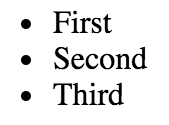
You have to bind the event handler context, which is done in the constructor. If you look at the onClick() event handler, you can see that it needs access to the component so that it can look up the clicked item in this.props.items. Also, the onClick() handler is expecting an id parameter. If you take a look at the JSX content of this component, you can see that calling bind() supplies the argument value for each item in the list. This means that when the handler is called in response to a click event, the id of the item is already provided.
This approach to parameterized event handling is quite different from prior approaches. For example, I used to rely on getting parameter data from the DOM element itself. This works well when you only need one event handler, and it can extract the data it needs from the event argument. This approach also doesn't require setting up several new functions by iterating over a collection and calling bind().
And therein lies the trade-off. React applications avoid touching the DOM, because the DOM is really just a render target for React components. If you can write code that doesn't introduce explicit dependencies to DOM elements, your code will be portable. This is what you've accomplished with the event handler in this example.
A higher-order function is a function that returns a new function. Sometimes, higher-order functions take functions as arguments too. In the preceding example, you used bind() to bind the context and argument values of your event handler functions. Higher-order functions that return event handler functions are another technique. The main advantage of this technique is that you don't call bind() several times. Instead, you just call the function where you want to bind parameters to the function. Let's look at an example component:
import React, { Fragment, Component } from 'react';

export default class App extends Component {
  state = {
    first: 0,
    second: 0,
    third: 0
  };

  // This function is defined as an arrow function, so "this" is
  // lexically-bound to this component. The name argument is used
  // by the function that's returned as the event handler in the
  // computed property name.
  onClick = name => () => {
    this.setState(state => ({
      ...state,
      [name]: state[name] + 1
    }));
  };

  render() {
    const { first, second, third } = this.state;

    return (
      <Fragment>
        {/* By calling this.onClick() and supplying an argument value,
            you're creating a new event handler function on the fly.
       */}
        <button onClick={this.onClick('first')}>First {first}</button>
        <button onClick={this.onClick('second')}>
          Second {second}
        </button>
        <button onClick={this.onClick('third')}>Third {third}</button>
      </Fragment>
    );
  }
}
This component renders three buttons and has three pieces of state—a counter for each button. The onClick() function is automatically bound to the component context because it's defined as an arrow function. It takes a name argument and returns a new function. The function that is returned uses this name value when called. It uses computed property syntax (variables inside []) to increment the state value for the given name. Here's what that component content looks like after each button has been clicked a few times:
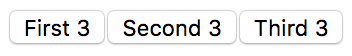
The typical approach to assigning handler functions to JSX properties is to use a named function. However, sometimes you might want to use an inline function. This is done by assigning an arrow function directly to the event property in the JSX markup:
import React, { Component } from 'react';

export default class MyButton extends Component {
  // Renders a button element with an "onClick()" handler.
  // This function is declared inline with the JSX, and is
  // useful in scenarios where you need to call another
  // function.
  render() {
    return (
      <button onClick={e => console.log('clicked', e)}>
        {this.props.children}
      </button>
    );
  }
}
The main use of inlining event handlers like this is when you have a static parameter value that you want to pass to another function. In this example, you're calling console.log() with the string clicked. You could have set up a special function for this purpose outside of the JSX markup by creating a new function using bind(), or by using a higher-order function. But then you would have to think of yet another name for yet another function. Inlining is just easier sometimes.
When you assign an event handler function to an element in JSX, React doesn't actually attach an event listener to the underlying DOM element. Instead, it adds the function to an internal mapping of functions. There's a single event listener on the document for the page. As events bubble up through the DOM tree to the document, the React handler checks to see whether any components have matching handlers. The process is illustrated here:
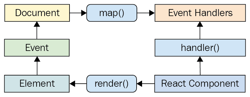
Why does React go to all of this trouble, you might ask? It's the same principle that I've been covering for the past few chapters; keep the declarative UI structures separated from the DOM as much as possible.
For example, when a new component is rendered, its event handler functions are simply added to the internal mapping maintained by React. When an event is triggered and it hits the document object, React maps the event to the handlers. If a match is found, it calls the handler. Finally, when the React component is removed, the handler is simply removed from the list of handlers.
None of these DOM operations actually touch the DOM. It's all abstracted by a single event listener. This is good for performance and the overall architecture (keep the render target separate from the application code).
When you attach an event handler function to a DOM element using the native addEventListener() function, the callback will get an event argument passed to it. Event handler functions in React are also passed an event argument, but it's not the standard Event instance. It's called SyntheticEvent, and it's a simple wrapper for native event instances.
Synthetic events serve two purposes in React:
Here's an illustration of the synthetic event in the context of a React component:
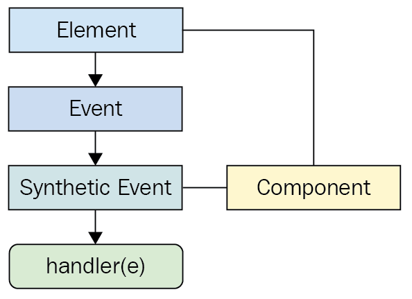
In the next section, you'll see how these synthetic events are pooled for performance reasons and the implications of this for asynchronous code.
One challenge with wrapping native event instances is that this can cause performance issues. Every synthetic event wrapper that's created will also need to be garbage collected at some point, which can be expensive in terms of CPU time.
For example, if your application only handles a few events, this wouldn't matter much. But even by modest standards, applications respond to many events, even if the handlers don't actually do anything with them. This is problematic if React constantly has to allocate new synthetic event instances.
React deals with this problem by allocating a synthetic instance pool. Whenever an event is triggered, it takes an instance from the pool and populates its properties. When the event handler has finished running, the synthetic event instance is released back into the pool, as shown here:
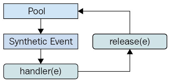
This prevents the garbage collector from running frequently when a lot of events are triggered. The pool keeps a reference to the synthetic event instances, so they're never eligible for garbage collection. React never has to allocate new instances either.
However, there is one gotcha that you need to be aware of. It involves accessing the synthetic event instances from asynchronous code in your event handlers. This is an issue because, as soon as the handler has finished running, the instance goes back into the pool. When it goes back into the pool, all of its properties are cleared. Here's an example that shows how this can go wrong:
import React, { Component } from 'react';

// Mock function, meant to simulate fetching
// data asynchronously from an API.
function fetchData() {
  return new Promise((resolve) => {
    setTimeout(() => {
      resolve();
    }, 1000);
  });
}

export default class MyButton extends Component {
  onClick(e) {
    // This works fine, we can access the DOM element
    // through the "currentTarget" property.
    console.log('clicked', e.currentTarget.style);

    fetchData().then(() => {
      // However, trying to access "currentTarget"
      // asynchronously fails, because it's properties
      // have all been nullified so that the instance
      // can be reused.
      console.log('callback', e.currentTarget.style);
    });
  }

  render() {
    return (
      <button onClick={this.onClick}>
        {this.props.children}
      </button>
    );
  }
}
The second call to console.log() is attempting to access a synthetic event property from an asynchronous callback that doesn't run until the event handler completes, which causes the event to empty its properties. This results in a warning and an undefined value.
This chapter introduced you to event handling in React. The key differentiator between React and other approaches to event handling is that handlers are declared in JSX markup. This makes tracking down which elements handle which events much simpler.
You learned that having multiple event handlers on a single element is a matter of adding new JSX properties. Next, you learned that it's a good idea to share event handling functions that handle generic behavior. Context can be important for event handler functions, if they need access to component properties or state. You learned about the various ways to bind event handler function context, and parameter values. These include calling bind() and using higher-order event handler functions.
Then, you learned about inline event handler functions and their potential use, as well as how React actually binds a single DOM event handler to the document object. Synthetic events are an abstraction that wraps the native event, and you learned why they're necessary and how they're pooled for efficient memory consumption.
In the next chapter, you'll learn how to create components that are reusable for a variety purposes.
Visit the following link for more information:
The focus of this chapter is to show you how to implement React components that serve more than just one purpose. After reading this chapter, you'll feel confident about how to compose application features.
The chapter starts with a brief look at HTML elements and how they work in terms of helping to implement features versus having a high level of utility. Then, you'll see the implementation of a monolithic component and discover the issues that it will cause down the road. The next section is devoted to re-implementing the monolithic component in such a way that the feature is composed of smaller components.
Finally, the chapter ends with a discussion of rendering trees of React components, and gives you some tips on how to avoid introducing too much complexity as a result of decomposing components. I'll close this final section by reiterating the concept of high-level feature components versus utility components.
Let's think about HTML elements for a moment. Depending on the type of HTML element, it's either feature-centric or utility-centric. Utility-centric HTML elements are more reusable than feature-centric HTML elements. For example, consider the <section> element. This is a generic element that can be used just about anywhere, but its primary purpose is to compose the structural aspects of a feature—the outer shell of the feature and the inner sections of the feature. This is where the <section> element is most useful.
On the other side of the fence, you have elements such as <p> and <span> and <button>. These elements provide a high level of utility because they're generic by design. You're supposed to use <button> elements whenever you have something that's clickable by the user, resulting in an action. This is a level lower than the concept of a feature.
While it's easy to talk about HTML elements that have a high level of utility versus those that are geared toward specific features, the discussion is more detailed when data is involved. HTML is static markup—React components combine static markup with data. The question is, how do you make sure that you're creating the right feature-centric and utility-centric components?
The aim of this chapter is to find out how to go from a monolithic React component that defines a feature, to a smaller feature-centric component combined with utility components.
If you could implement just one component for any given feature, it would simplify your job. At the very least, there wouldn't be many components to maintain, and there wouldn't be many communication paths for data to flow through, because everything would be internal to the component.
However, this idea doesn't work for a number of reasons. Having monolithic feature components makes it difficult to coordinate any kind of team development effort. The bigger monolithic components become, the more difficult they are to refactor into something better later on.
There's also the problem of feature overlap and feature communication. Overlap happens because of similarities between features—it's unlikely that an application will have a set of features that are completely unique to one another. That would make the application very difficult to learn and use. Component communication essentially means that the state of something in one feature will impact the state of something in another feature. State is difficult to deal with, and even more so when there is a lot of state packaged up into a monolithic component.
The best way to learn how to avoid monolithic components is to experience one first hand. You'll spend the remainder of this section implementing a monolithic component. In the following section, you'll see how this component can be refactored into something a little more sustainable.
The monolithic component we're going to implement is a feature that lists articles. It's just for illustrative purposes, so we don't want to go overboard on the size of the component. It'll be simple, yet monolithic. The user can add new items to the list, toggle the summary of items in the list, and remove items from the list. Here is the render method of the component:
render() {
const { articles, title, summary } = this.data.toJS();
return (
<section>
<header>
<h1>Articles</h1>
<input
placeholder="Title"
value={title}
onChange={this.onChangeTitle}
/>
<input
placeholder="Summary"
value={summary}
onChange={this.onChangeSummary}
/>
<button onClick={this.onClickAdd}>Add</button>
</header>
<article>
<ul>
{articles.map(i => (
<li key={i.id}>
<a
href={`#${i.id}`}
title="Toggle Summary"
onClick={this.onClickToggle.bind(null, i.id)}
>
{i.title}
</a>
<a
href={`#${i.id}`}
title="Remove"
onClick={this.onClickRemove.bind(null, i.id)}
>
✗
</a>
<p style={{ display: i.display }}>{i.summary}</p>
</li>
))}
</ul>
</article>
</section>
);
}
Definitely more JSX than is necessary in one place. You'll improve on this in the following section, but for now, let's implement the initial state for this component.
Now let's look at the initial state of this component:
// The state of this component is consists of
// three properties: a collection of articles,
// a title, and a summary. The "fromJS()" call
// is used to build an "Immutable.js" Map. Also
// note that this isn't set directly as the component
// state - it's in a "data" property of the state -
// otherwise, state updates won't work as expected.
state = {
  data: fromJS({
    articles: [
      {
        id: cuid(),
        title: 'Article 1',
        summary: 'Article 1 Summary',
        display: 'none'
      },
      {
        id: cuid(),
        title: 'Article 2',
        summary: 'Article 2 Summary',
        display: 'none'
      },
      {
        id: cuid(),
        title: 'Article 3',
        summary: 'Article 3 Summary',
        display: 'none'
      },
      {
        id: cuid(),
        title: 'Article 4',
        summary: 'Article 4 Summary',
        display: 'none'
      }
    ],
    title: '',
    summary: ''
  })
};
There are two interesting functions used to initialize the state. The first is cuid() from the cuid package—a useful tool for generating unique IDs. The second is fromJS() from the immutable package. Here are the imports that pull in these two dependencies:
// Utility for constructing unique IDs...
import cuid from 'cuid';

// For building immutable component states...
import { fromJS } from 'immutable';
As the name suggests, the fromJS() function is used to construct an immutable data structure. Immutable.js has very useful functionality for manipulating the state of React components. You'll be using Immutable.js throughout the remainder of the book, and you'll learn more of the specifics as you go, starting with this example.
You may remember from the previous chapter that the setState() method only works with plain objects. Well, Immutable.js objects aren't plain objects. If we want to use immutable data, you need to wrap them in a plain object. Let's implement a helper getter and setter for this:
// Getter for "Immutable.js" state data...
get data() {
  return this.state.data;
}

// Setter for "Immutable.js" state data...
set data(data) {
  this.setState({ data });
}
Now, you can use your immutable component state inside of our event handlers.
At this point, you have the initial state, state helper properties, and the JSX of the component. Now it's time to implement the event handlers themselves:
// When the title of a new article changes, update the state
// of the component with the new title value, by using "set()"
// to create a new map.
onChangeTitle = e => {
  this.data = this.data.set('title', e.target.value);
};

// When the summary of a new article changes, update the state
// of the component with the new summary value, by using "set()"
// to create a new map.
onChangeSummary = e => {
  this.data = this.data.set('summary', e.target.value);
};

// Creates a new article and empties the title
// and summary inputs. The "push()" method creates a new
// list and "update()" is used to update the list by
// creating a new map.
onClickAdd = () => {
  this.data = this.data
    .update('articles', a =>
      a.push(
        fromJS({
          id: cuid(),
          title: this.data.get('title'),
          summary: this.data.get('summary'),
          display: 'none'
        })
      )
    )
    .set('title', '')
    .set('summary', '');
};

// Removes an article from the list. Calling "delete()"
// creates a new list, and this is set in the new component
// state.
onClickRemove = id => {
  const index = this.data
    .get('articles')
    .findIndex(a => a.get('id') === id);

  this.data = this.data.update('articles', a => a.delete(index));
};

// Toggles the visibility of the article summary by
// setting the "display" state of the article. This
// state is dependent on the current state.
onClickToggle = id => {
  const index = this.data
    .get('articles')
    .findIndex(a => a.get('id') === id);

  this.data = this.data.update('articles', articles =>
    articles.update(index, a =>
      a.update('display', display => (display ? '' : 'none'))
    )
  );
};
Yikes! That's a lot of Immutable.js code! Not to worry, it's actually less code compared to trying to implement these transformations using plain JavaScript. Here are some pointers to help you understand this code:
If necessary, take all the time you need to understand what is happening here. As you progress through the book, you'll see ways that immutable state can be exploited by React components. These event handlers can only change the state of this component. That is, they can't accidentally change the state of other components. As you'll see in the following section, these handlers are actually in pretty good shape as they are.
Here's a screenshot of the rendered output:
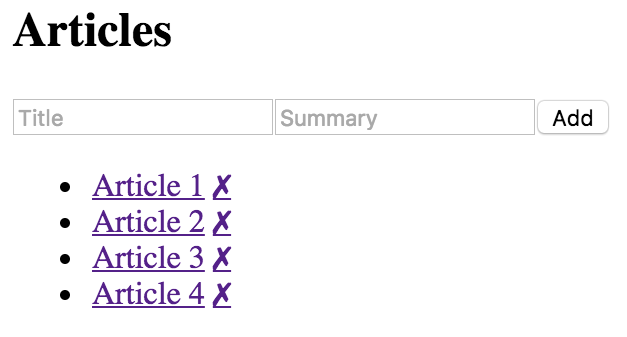
You have a monolithic feature component—now what? Let's make it better.
In this section, you'll learn how to take the feature component that you just implemented in the preceding section and split it into more maintainable components. You'll start with the JSX, as this is probably the best refactor starting point. Then, you'll implement new components for the feature.
Next, you'll make these new components functional, instead of class-based. Finally, you'll learn how to use render props to reduce the number of direct component dependencies in your application.
The JSX of any monolithic component is the best starting point for figuring out how to refactor it into smaller components. Let's visualize the structure of the component that we're currently refactoring:
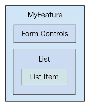
The top part of the JSX is form controls, so this could easily become its own component:
<header>
  <h1>Articles</h1>
  <input
    placeholder="Title"
    value={title}
    onChange={this.onChangeTitle}
  />
  <input
    placeholder="Summary"
    value={summary}
    onChange={this.onChangeSummary}
  />
  <button onClick={this.onClickAdd}>Add</button>
</header>
Next, you have the list of articles:
<ul>
{articles.map(i => (
<li key={i.id}>
<a
href="#"
onClick={
this.onClickToggle.bind(null, i.id)
}
>
{i.title}
</a>
<a
href="#"
onClick={this.onClickRemove.bind(null, i.id)}
>
✗
</a>
<p style={{ display: i.display }}>
{i.summary}
</p>
</li>
))}
</ul>
Within this list, there's potential for an article item, which would be everything in the <li> tag.
The JSX alone paints a picture of how the UI structure can be decomposed into smaller React components. This refactoring exercise would be difficult without declarative JSX markup.
Here's what the article list component implementation looks like:
import React, { Component } from 'react';
export default class ArticleList extends Component {
render() {
// The properties include things that are passed in
// from the feature component. This includes the list
// of articles to render, and the two event handlers
// that change state of the feature component.
const { articles, onClickToggle, onClickRemove } = this.props;
return (
<ul>
{articles.map(article => (
<li key={article.id}>
{/* The "onClickToggle()" callback changes
the state of the "MyFeature" component. */}
<a
href={`#${article.id}`}
title="Toggle Summary"
onClick={onClickToggle.bind(null, article.id)}
>
{article.title}
</a>
{/* The "onClickRemove()" callback changes
the state of the "MyFeature" component. */}
<a
href={`#${article.id}`}
title="Remove"
onClick={onClickRemove.bind(null, article.id)}
>
✗
</a>
<p style={{ display: article.display }}>
{article.summary}
</p>
</li>
))}
</ul>
);
}
}
You're just taking the relevant JSX out of the monolithic component and putting it here. Now let's see what the feature component JSX looks like:
render() {
  const { articles, title, summary } = this.data.toJS();

  return (
    <section>
      <header>
        <h1>Articles</h1>
        <input
          placeholder="Title"
          value={title}
          onChange={this.onChangeTitle}
        />
        <input
          placeholder="Summary"
          value={summary}
          onChange={this.onChangeSummary}
        />
        <button onClick={this.onClickAdd}>Add</button>
      </header>

      {/* Now the list of articles is rendered by the
           "ArticleList" component. This component can
           now be used in several other components. */}
      <ArticleList
        articles={articles}
        onClickToggle={this.onClickToggle}
        onClickRemove={this.onClickRemove}
      />
    </section>
  );
}
The list of articles is now rendered by the <ArticleList> component. The list of articles to render is passed to this component as a property as well as two of the event handlers.
After implementing the article list component, you might decide that it's a good idea to break this component down further, because the item might be rendered in another list on another page. Perhaps the most important aspect of implementing the article list item as its own component is that we don't know how the markup will change in the future.
Another way to look at it is this—if it turns out that we don't actually need the item as its own component, this new component doesn't introduce much indirection or complexity. Without further ado, here's the article item component:
import React, { Component } from 'react';
export default class ArticleItem extends Component {
render() {
// The "article" is mapped from the "ArticleList"
// component. The "onClickToggle()" and
// "onClickRemove()" event handlers are passed
// all the way down from the "MyFeature" component.
const { article, onClickToggle, onClickRemove } = this.props;
return (
<li>
{/* The "onClickToggle()" callback changes
the state of the "MyFeature" component. */}
<a
href={`#{article.id}`}
title="Toggle Summary"
onClick={onClickToggle.bind(null, article.id)}
>
{article.title}
</a>
{/* The "onClickRemove()" callback changes
the state of the "MyFeature" component. */}
<a
href={`#{article.id}`}
title="Remove"
onClick={onClickRemove.bind(null, article.id)}
>
✗
</a>
<p style={{ display: article.display }}>{article.summary}</p>
</li>
);
}
}
Here's the new ArticleItem component being rendered by the ArticleList component:
import React, { Component } from 'react';
import ArticleItem from './ArticleItem';

export default class ArticleList extends Component {
  render() {
    // The properties include things that are passed in
    // from the feature component. This includes the list
    // of articles to render, and the two event handlers
    // that change state of the feature component. These,
    // in turn, are passed to the "ArticleItem" component.
    const { articles, onClickToggle, onClickRemove } = this.props;

    // Now this component maps to an "<ArticleItem>" collection.
    return (
      <ul>
        {articles.map(i => (
          <ArticleItem
            key={i.id}
            article={i}
            onClickToggle={onClickToggle}
            onClickRemove={onClickRemove}
          />
        ))}
      </ul>
    );
  }
}
Do you see how this list just maps the list of articles? What if you wanted to implement another article list that does some filtering too? If so, it's beneficial to have a reusable ArticleItem component.
Now that you're done with the article list, it's time to think about the form controls used to add a new article. Let's implement a component for this aspect of the feature:
import React, { Component } from 'react';

export default class AddArticle extends Component {
  render() {
    const {
      name,
      title,
      summary,
      onChangeTitle,
      onChangeSummary,
      onClickAdd
    } = this.props;

    return (
      <section>
        <h1>{name}</h1>
        <input
          placeholder="Title"
          value={title}
          onChange={onChangeTitle}
        />
        <input
          placeholder="Summary"
          value={summary}
          onChange={onChangeSummary}
        />
        <button onClick={onClickAdd}>Add</button>
      </section>
    );
  }
}
Now, your feature component only needs to render <AddArticle> and <ArticleList> components:
render() {
  const {
    articles,
    title,
    summary,
  } = this.state.data.toJS();

  return (
    <section>
      { /* Now the add article form is rendered by the
           "AddArticle" component. This component can
           now be used in several other components. */ }
      <AddArticle
        name="Articles"
        title={title}
        summary={summary}
        onChangeTitle={this.onChangeTitle}
        onChangeSummary={this.onChangeSummary}
        onClickAdd={this.onClickAdd}
      />

      { /* Now the list of articles is rendered by the
           "ArticleList" component. This component can
           now be used in several other components. */ }
      <ArticleList
        articles={articles}
        onClickToggle={this.onClickToggle}
        onClickRemove={this.onClickRemove}
      />
    </section>
  );
}
The focus of this component is on the feature data while it defers to other components for rendering UI elements.
While implementing these new components, you might have noticed that they don't have any responsibilities other than rendering JSX using property values. These components are good candidates for pure function components. Whenever you come across components that only use property values, it's a good idea to make them functional. For one thing, it makes it explicit that the component doesn't rely on any state or lifecycle methods. It's also more efficient, because React doesn't perform as much work when it detects that a component is a function.
Here is the functional version of the article list component:
import React from 'react';
import ArticleItem from './ArticleItem';

export default ({ articles, onClickToggle, onClickRemove }) => (
  <ul>
    {articles.map(i => (
      <ArticleItem
        key={i.id}
        article={i}
        onClickToggle={onClickToggle}
        onClickRemove={onClickRemove}
      />
    ))}
  </ul>
);
Here is the functional version of the article item component:
import React from 'react';
export default ({ article, onClickToggle, onClickRemove }) => (
<li>
{/* The "onClickToggle()" callback changes
the state of the "MyFeature" component. */}
<a
href={`#${article.id}`}
title="Toggle Summary"
onClick={onClickToggle.bind(null, article.id)}
>
{article.title}
</a>
{/* The "onClickRemove()" callback changes
the state of the "MyFeature" component. */}
<a
href={`#${article.id}`}
title="Remove"
onClick={onClickRemove.bind(null, article.id)}
>
✗
</a>
<p style={{ display: article.display }}>{article.summary}</p>
</li>
);
Here is the functional version of the add article component:
import React from 'react';

export default ({
  name,
  title,
  summary,
  onChangeTitle,
  onChangeSummary,
  onClickAdd
}) => (
  <section>
    <h1>{name}</h1>
    <input
      placeholder="Title"
      value={title}
      onChange={onChangeTitle}
    />
    <input
      placeholder="Summary"
      value={summary}
      onChange={onChangeSummary}
    />
    <button onClick={onClickAdd}>Add</button>
  </section>
);
Another added benefit of making components functional is that there's less opportunity to introduce unnecessary methods or other data.
Imagine implementing a feature that is composed of several smaller components – like what you've been working on in this chapter. The MyFeature component depends on ArticleList and AddArticle. Now imagine using MyFeature in different parts of your application where it makes sense to use a different implementation of ArticleList or AddArticle. The fundamental challenge is substituting one component for another.
Render props are a nice way to address this challenge. The idea is that you pass a property to your component whose value is a function that returns a component to render. This way, instead of having the feature component directly depend on its child components, you can configure them as you like; they pass them in as render prop values.
// Now when <MyFeature> is rendered, it uses render props to
// render <ArticleList> and <AddArticle>. It no longer has
// a direct dependency to these components.
render() {
  const { articles, title, summary } = this.data.toJS();
  const {
    props: { addArticle, articleList },
    onClickAdd,
    onClickToggle,
    onClickRemove,
    onChangeTitle,
    onChangeSummary
  } = this;

  return (
    <section>
      {addArticle({
        title,
        summary,
        onChangeTitle,
        onChangeSummary,
        onClickAdd
      })}
      {articleList({ articles, onClickToggle, onClickRemove })}
    </section>
  );
}
The addArticle() and articleList() functions are called with the same property values that would have been passed to <AddArticle> and <ArticleList>, respectively. The difference now is that this module no longer imports AddArticle or ArticleList as dependencies.
Now let's take a look at the index.js where <MyFeature> is rendered:
// <MyFeature> is now passed a "addArticle" and a "articleList"
// property. These are functions that return components to render.
render(
  <MyFeature
    addArticle={({
      title,
      summary,
      onChangeTitle,
      onChangeSummary,
      onClickAdd
    }) => (
      <AddArticle
        name="Articles"
        title={title}
        summary={summary}
        onChangeTitle={onChangeTitle}
        onChangeSummary={onChangeSummary}
        onClickAdd={onClickAdd}
      />
    )}
    articleList={({ articles, onClickToggle, onClickRemove }) => (
      <ArticleList
        articles={articles}
        onClickToggle={onClickToggle}
        onClickRemove={onClickRemove}
      />
    )}
  />,
  document.getElementById('root')
);
There's a lot more going on here now than there was when it was just <MyFeature> being rendered. Let's break down why that is. Here is where you pass the addArticle and articleList render props. These prop values are functions that accept argument values from MyComponent. For example, the onClickToggle() function comes from MyFeature and is used to change the state of that component. You can use the render prop function to pass this to the component that will be rendered, along with any other values. The return value of these functions are what is ultimately rendered.
Let's take a moment and reflect on what we've accomplished so far in this chapter. The feature component that was once monolithic ended up focusing almost entirely on the state data. It handled the initial state and handled transforming the state, and it would handle network requests that fetch state, if there were any. This is a typical container component in a React application, and it's the starting point for data.
The new components that you implemented, to better compose the feature, were the recipients of this data. The difference between these components and their container is that they only care about the properties that are passed into them at the time they're rendered. In other words, they only care about data snapshots at a particular point in time. From here, these components might pass the property data into their own child components as properties. The generic pattern to composing React components is as follows:
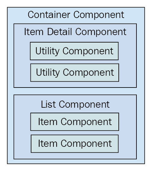
The container component will typically contain one direct child. In this diagram, you can see that the container has either an item detail component or a list component. Of course, there will be variations in these two categories, as every application is different. This generic pattern has three levels of component composition. Data flows in one direction from the container all the way down to the utility components.
Once you add more than three layers, the application architecture becomes difficult to comprehend. There will be the odd case where you'll need to add four layers of React components but, as a rule-of-thumb, you should avoid this.
In the monolithic component example, you started off with a single component that was entirely focused on a feature. This means that the component has very little utility elsewhere in the application.
The reason for this is because top-level components deal with application state. Stateful components are difficult to use in any other context. As you refactored the monolithic feature component, you created new components that moved further away from the data. The general rule is that the further your components move from stateful data, the more utility they have, because their property values could be passed in from anywhere in the application.
This chapter was about avoiding monolithic component design. However, monoliths are often a necessary starting point in the design of any React component.
You began by learning about how the different HTML elements have varying degrees of utility. Next, you learned about the issues with monolithic React components and walked through the implementation of a monolithic component.
Then, you spent several sections learning how to refactor the monolithic component into a more sustainable design. From this exercise, you learned that container components should only have to think in terms of handling state, while smaller components have more utility because their property values can be passed from anywhere. You also learned that you can use render props for better control over component dependencies and substitution.
In the next chapter, you'll learn about the React component lifecycle. This is an especially relevant topic for implementing container components.
Visit following links for more information:
The goal of this chapter is for you to learn about the lifecycle of React components and how to write code that responds to lifecycle events. You'll learn why components need a lifecycle in the first place. Then, you'll implement several components that initialize their properties and state using these methods.
Next, you'll learn about how to optimize the rendering efficiency of your components by avoiding rendering when it isn't necessary. Then, you'll see how to encapsulate imperative code in React components and how to clean up when components are unmounted. Finally, you'll learn how to capture and handle errors using new React 16 lifecycle methods.
React components go through a lifecycle. In fact, the render() method that you've implemented in your components so far in this book is actually a lifecycle method. Rendering is just one lifecycle event in a React component.
For example, there are lifecycle events for when the component is mounted to the DOM, when the component is updated, and so on. Lifecycle events are yet another moving part, so you'll want to keep them to a minimum. As you'll learn in this chapter, some components do need to respond to lifecycle events to perform initialization, render heuristics, clean up after the component when it's unmounted from the DOM, or to handle errors thrown by the component.
The following diagram gives you an idea of how a component flows through its lifecycle, calling the corresponding methods in turn:
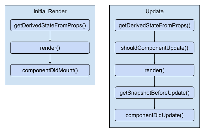
These are the two main lifecycle flows of a React component. The first happens when the component is initially rendered. The second happens whenever the component is updated. Here's a rough overview of each of the methods:
The other lifecycle method that isn't included in this diagram is componentWillUnmount(). This is the only lifecycle method that's called when a component is about to be removed. We'll see an example of how to use this method at the end of the chapter. On that note, let's get coding.
In this section, you'll see how to implement initialization code in React components. This involves using lifecycle methods that are called when the component is first created. First, you'll implement a basic example that sets the component up with data from the API. Then, you'll see how state can be initialized from properties, and also how state can be updated as properties change.
When your components are initialized you'll want to populate their state or properties. Otherwise, the component won't have anything to render other than its skeleton markup. For instance, let's say you want to render the following user list component:
import React from 'react';
import { Map } from 'immutable';

// This component displays the passed-in "error"
// property as bold text. If it's null, then
// nothing is rendered.
const ErrorMessage = ({ error }) =>
  Map([[null, null]]).get(error, <strong>{error}</strong>);

// This component displays the passed-in "loading"
// property as italic text. If it's null, then
// nothing is rendered.
const LoadingMessage = ({ loading }) =>
  Map([[null, null]]).get(loading, <em>{loading}</em>);

export default ({
  error,
  loading,
  users
}) => (
  <section>
    {/* Displays any error messages... */}
    <ErrorMessage error={error} />

    {/* Displays any loading messages, while
         waiting for the API... */}
    <LoadingMessage loading={loading} />

    {/* Renders the user list... */}
    <ul>{users.map(i => <li key={i.id}>{i.name}</li>)}</ul>
  </section>
);
There are three pieces of data that this JSX relies on:
There are two helper components used here: ErrorMessage and LoadingMessage. They're used to format the error and the loading state, respectively. However, if error or loading are null, you don't want to have to introduce imperative logic into your component to handle this scenario. This is why you're using a cool little trick with Immutable.js maps:
How should you go about making the API call and using the response to populate the users collection? The answer is to use a container component that makes the API call and then renders the UserList component:
import React, { Component } from 'react';
import { fromJS } from 'immutable';

import { users } from './api';
import UserList from './UserList';

export default class UserListContainer extends Component {
  state = {
    data: fromJS({
      error: null,
      loading: 'loading...',
      users: []
    })
  };

  // Getter for "Immutable.js" state data...
  get data() {
    return this.state.data;
  }

  // Setter for "Immutable.js" state data...
  set data(data) {
    this.setState({ data });
  }

  // When component has been rendered, "componentDidMount()"
  // is called. This is where we should perform asynchronous
  // behavior that will change the state of the component.
  // In this case, we're fetching a list of users from
  // the mock API.
  componentDidMount() {
    users().then(
      result => {
        // Populate the "users" state, but also
        // make sure the "error" and "loading"
        // states are cleared.
        this.data = this.data
          .set('loading', null)
          .set('error', null)
          .set('users', fromJS(result.users));
      },
      error => {
        // When an error occurs, we want to clear
        // the "loading" state and set the "error"
        // state.
        this.data = this.data
          .set('loading', null)
          .set('error', error);
      }
    );
  }

  render() {
    return <UserList {...this.data.toJS()} />;
  }
}
Let's take a look at the render() method. It's job is to render the <UserList> component, passing in this.state as properties. The actual API call happens in the componentDidMount() method. This method is called after the component is mounted into the DOM.
Once the API call returns with data, the users collection is populated, causing the UserList to re-render itself, only this time, it has the data it needs. Let's take a look at the users() mock API function call used here:
// Returns a promise that's resolved after 2
// seconds. By default, it will resolve an array
// of user data. If the "fail" argument is true,
// the promise is rejected.
export function users(fail) {
  return new Promise((resolve, reject) => {
    setTimeout(() => {
      if (fail) {
        reject('epic fail');
      } else {
        resolve({
          users: [
            { id: 0, name: 'First' },
            { id: 1, name: 'Second' },
            { id: 2, name: 'Third' },
          ],
        });
      }
    }, 2000);
  });
}
It returns a promise that's resolved with an array after 2 seconds. Promises are a good tool for mocking things like API calls because they enable you to use more than HTTP calls as a data source in your React components. For example, you might be reading from a local file or using a library that returns promises that resolve data from various sources.
Here's what the UserList component renders when the loading state is a string, and the users state is an empty array:
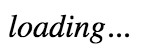
Here's what it renders when loading is null and users is non-empty:

I want to reiterate the separation of responsibilities between the UserListContainer and the UserList components. Because the container component handles the lifecycle management and the actual API communication, you can create a generic user list component. In fact, it's a functional component that doesn't require any state, which means you can reuse it in other container components throughout your application.
The preceding example showed you how to initialize the state of a container component by making an API call in the componentDidMount() lifecycle method. However, the only populated part of the component state is the users collection. You might want to populate other pieces of state that don't come from API endpoints.
For example, the error and loading state messages have default values set when the state is initialized. This is great, but what if the code that is rendering UserListContainer wants to use a different loading message? You can achieve this by allowing properties to override the default state. Let's build on the UserListContainer component:
import React, { Component } from 'react';
import { fromJS } from 'immutable';

import { users } from './api';
import UserList from './UserList';

class UserListContainer extends Component {
  state = {
    data: fromJS({
      error: null,
      users: []
    })
  };

  // Getter for "Immutable.js" state data...
  get data() {
    return this.state.data;
  }

  // Setter for "Immutable.js" state data...
  set data(data) {
    this.setState({ data });
  }

  // When component has been rendered, "componentDidMount()"
  // is called. This is where we should perform asynchronous
  // behavior that will change the state of the component.
  // In this case, we're fetching a list of users from
  // the mock API.
  componentDidMount() {
    users().then(
      result => {
        // Populate the "users" state, but also
        // make sure the "error" and "loading"
        // states are cleared.
        this.data = this.data
          .set('error', null)
          .set('users', fromJS(result.users));
      },
      error => {
        // When an error occurs, we want to clear
        // the "loading" state and set the "error"
        // state.
        this.data = this.data
          .set('loading', null)
          .set('error', error);
      }
    );
  }

  render() {
    return <UserList {...this.data.toJS()} />;
  }

  // Called right before render, you can use this method
  // to update the state of the component based on prop
  // values.
  static getDerivedStateFromProps(props, state) {
    return {
      ...state,
      data: state.data.set(
        'loading',
        state.data.get('users').size === 0 ? props.loading : null
      )
    };
  }
}

UserListContainer.defaultProps = {
  loading: 'loading...'
};

export default UserListContainer;
The loading property no longer has a default string value. Instead, defaultProps provides default values for properties. The new lifecycle method is getDerivedStateFromProps(). It uses the loading property to set the loading state the state. Since the loading property has a default value, it's safe to just change the state. The method is called before the component mounts and on subsequent re-renders of the component.
Let's see how we can pass state data to UserListContainer now:
import React from 'react';
import { render } from 'react-dom';

import UserListContainer from './UserListContainer';

// Renders the component with a "loading" property.
// This value ultimately ends up in the component state.
render(
  <UserListContainer loading="playing the waiting game..." />,
  document.getElementById('root')
);
Here's what the initial loading message looks like when UserList is first rendered:
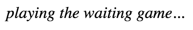
Just because the component has state doesn't mean that you can't allow for customization. Next, you'll learn a variation on this concept—updating component state with properties.
You've seen how the componentDidMount() and getDerivedStateFromProps() lifecycle methods help get your component the data it needs. There's one more scenario that you need to consider—re-rendering the component container.
Let's take a look at a simple button component that tracks the number of times it's been clicked:
import React from 'react';

export default ({
  clicks,
  disabled,
  text,
  onClick
}) => (
  <section>
    {/* Renders the number of button clicks,
         using the "clicks" property. */}
    <p>{clicks} clicks</p>

    {/* Renders the button. It's disabled state
         is based on the "disabled" property, and
         the "onClick()" handler comes from the
         container component. */}
    <button disabled={disabled} onClick={onClick}>
      {text}
    </button>
  </section>
);
Now, let's implement a container component for this feature:
import React, { Component } from 'react';
import { fromJS } from 'immutable';

import MyButton from './MyButton';

class MyFeature extends Component {
  state = {
    data: fromJS({
      clicks: 0,
      disabled: false,
      text: ''
    })
  };

  // Getter for "Immutable.js" state data...
  get data() {
    return this.state.data;
  }

  // Setter for "Immutable.js" state data...
  set data(data) {
    this.setState({ data });
  }

  // Click event handler, increments the "click" count.
  onClick = () => {
    this.data = this.data.update('clicks', c => c + 1);
  };

  // Renders the "<MyButton>" component, passing it the
  // "onClick()" handler, and the state as properties.
  render() {
    return <MyButton onClick={this.onClick} {...this.data.toJS()} />;
  }

  // If the component is re-rendered with new
  // property values, this method is called with the
  // new property values. If the "disabled" property
  // is provided, we use it to update the "disabled"
  // state. Calling "setState()" here will not
  // cause a re-render, because the component is already
  // in the middle of a re-render.
  static getDerivedStateFromProps({ disabled, text }, state) {
    return {
      ...state,
      data: state.data.set('disabled', disabled).set('text', text)
    };
  }
}

MyFeature.defaultProps = {
  text: 'A Button'
};

export default MyFeature;
The same approach as the preceding example is used here. The getDerivedStateFromProps() method is called before every render and this is where you can use prop values to figure out if and how the component state should be updated. Let's see how to re-render this component and whether or not the state behaves as expected:
import React from 'react';
import { render as renderJSX } from 'react-dom';

import MyFeature from './MyFeature';

// Determines the state of the button
// element in "MyFeature".
let disabled = true;

function render() {
  // Toggle the state of the "disabled" property.
  disabled = !disabled;

  renderJSX(
    <MyFeature {...{ disabled }} />,
    document.getElementById('root')
  );
}

// Re-render the "<MyFeature>" component every
// 3 seconds, toggling the "disabled" button
// property.
setInterval(render, 3000);

render();
Sure enough, everything goes as planned. Whenever the button is clicked, the click counter is updated. <MyFeature> is re-rendered every 3 seconds, toggling the disabled state of the button. When the button is re-enabled and clicking resumes, the counter continues from where it left off.
Here is what the MyButton component looks like when first rendered:
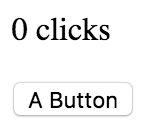
Here's what it looks like after it has been clicked a few times and the button has moved into a disabled state:
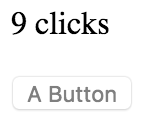
The next lifecycle method you're going to learn about is used to implement heuristics that improve component rendering performance. You'll see that if the state of a component hasn't changed, then there's no need to render. Then, you'll implement a component that uses specific metadata from the API to determine whether or not the component needs to be re-rendered.
The shouldComponentUpdate() lifecycle method is used to determine whether or not the component will render when asked to. For example, if this method were implemented, and returned false, the entire lifecycle of the component is short-circuited, and no render happens. This can be an important check to have in place if the component is rendering a lot of data and is re-rendered frequently. The trick is knowing whether or not the component state has changed.
This is the beauty of immutable data—you can easily check if it has changed. This is especially true if you're using a library such as Immutable.js to control the state of the component. Let's take a look at a simple list component:
import React, { Component } from 'react';
import { fromJS } from 'immutable';

export default class MyList extends Component {
  state = {
    data: fromJS({
      items: [...Array(5000).keys()]
    })
  };

  // Getter for "Immutable.js" state data...
  get data() {
    return this.state.data;
  }

  // Setter for "Immutable.js" state data...
  set data(data) {
    this.setState({ data });
  }

  // If this method returns false, the component
  // will not render. Since we're using an Immutable.js
  // data structure, we simply need to check for equality.
  // If "state.data" is the same, then there's no need to
  // render because nothing has changed since the last render.
  shouldComponentUpdate(props, state) {
    return this.data !== state.data;
  }

  // Renders the complete list of items, even if it's huge.
  render() {
    const items = this.data.get('items');

    return <ul>{items.map(i => <li key={i}>{i}</li>)}</ul>;
  }
}
The items state is initialized to an Immutable.js List with 5000 items in it. This is a fairly large collection, so you don't want the virtual DOM inside React to constantly diff this list. The virtual DOM is efficient at what it does, but not nearly as efficient as code that can perform a simple should or shouldn't render check. The shouldComponentRender() method that you've implemented here does exactly that. It compares the new state with the current state; if they're the same object, completely sidestep the virtual DOM.
Now, let's put this component to work and see what kind of efficiency gains you get:
import React from 'react';
import { render as renderJSX } from 'react-dom';

import MyList from './MyList';

// Renders the "<MyList>" component. Then, it sets
// the state of the component by changing the value
// of the first "items" element. However, the value
// didn't actually change, so the same Immutable.js
// structure is reused. This means that
// "shouldComponentUpdate()" will return false.
function render() {
  const myList = renderJSX(
    <MyList />,
    document.getElementById('root')
  );

  // Not actually changing the value of the first
  // "items" element. So, Immutable.js recognizes
  // that nothing changed, and instead of
  // returning a new object, it returns the same
  // "myList.data" reference.
  myList.data = myList.data.setIn(['items', 0], 0);
}

// Instead of performing 500,000 DOM operations,
// "shouldComponentUpdate()" turns this into
// 5000 DOM operations.
for (let i = 0; i < 100; i++) {
  render();
}
You're rendering <MyList>, over and over, in a loop. Each iteration has 5,000 list items to render. Since the state doesn't change, the call to shouldComponentUpdate() returns false on every one of these iterations. This is important for performance reasons, because there are a lot of them. You're not going to have code that re-renders a component in a tight loop, in a real application. This code is meant to stress the rendering capabilities of React. If you were to comment out the shouldComponentUpdate() method, you'd see what I mean. Here's what the performance profile looks like for this component:
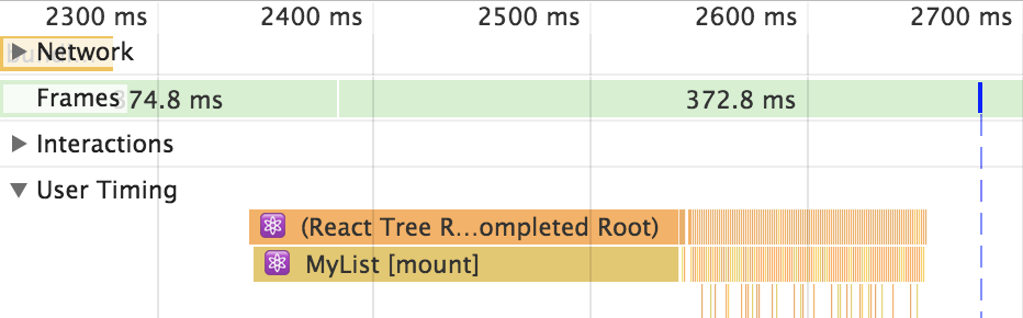
The initial render takes the longest—a few hundred milliseconds. But then you have all of these tiny time slices that are completely imperceptible to the user experience. These are the result of shouldComponentUpdate() returning false. Let's comment out this method now and see how this profile changes:
Without shouldComponentUpdate(), the end result is much larger time slices with a drastically negative impact on user experience.
In this section, you'll learn how to use metadata that's part of the API response to determine whether or not the component should re-render itself. Here's a simple user details component:
import React, { Component } from 'react';

export default class MyUser extends Component {
  state = {
    modified: new Date(),
    first: 'First',
    last: 'Last'
  };

  // The "modified" property is used to determine
  // whether or not the component should render.
  shouldComponentUpdate(props, state) {
    return Number(state).modified > Number(this.state.modified);
  }

  render() {
    const { modified, first, last } = this.state;

    return (
      <section>
        <p>{modified.toLocaleString()}</p>
        <p>{first}</p>
        <p>{last}</p>
      </section>
    );
  }
}
The shouldComponentUpdate() method is comparing the new modified state to the old modified state. This code makes the assumption that the modified value is a date that reflects when the data returned from the API was actually modified. The main downside to this approach is that the shouldComponentUpdate() method is now tightly coupled with the API data. The advantage is that you get a performance boost in the same way that you would with immutable data.
Here's how this heuristic looks in action:
import React from 'react';
import { render } from 'react-dom';

import MyUser from './MyUser';

// Performs the initial rendering of "<MyUser>".
const myUser = render(<MyUser />, document.getElementById('root'));

// Sets the state, with a new "modified" value.
// Since the modified state has changed, the
// component will re-render.
myUser.setState({
  modified: new Date(),
  first: 'First1',
  last: 'Last1'
});

// The "first" and "last" states have changed,
// but the "modified" state has not. This means
// that the "First2" and "Last2" values will
// not be rendered.
myUser.setState({
  first: 'First2',
  last: 'Last2'
});
The MyUser component is now entirely dependent on the modified state. If it's not greater than the previous modified value, no render happens.
Here's what the component looks like after it's been rendered twice:
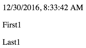
Everything you've rendered so far in this book has been straightforward declarative HTML. Life is never so simple: sometimes your React components need to implement some imperative code under the covers.
This is the key—hiding the imperative operations so that the code that renders your component doesn't have to touch it. In this section, you'll implement a simple jQuery UI button React component so that you can see how the relevant lifecycle methods help you to encapsulate imperative code.
The jQuery UI widget library implements several widgets on top of standard HTML. It uses a progressive enhancement technique whereby the basic HTML is enhanced in browsers that support newer features. To make these widgets work, you first need to render HTML into the DOM somehow; then, make imperative function calls to create and interact with the widgets.
In this example, you'll create a React button component that acts as a wrapper around the jQuery UI widget. Anyone using the React component shouldn't need to know that behind the scenes, it's making imperative calls to control the widget. Let's see what the button component looks like:
import React, { Component } from 'react';

// Import all the jQuery UI widget stuff...
import $ from 'jquery';
import 'jquery-ui/ui/widgets/button';
import 'jquery-ui/themes/base/all.css';

export default class MyButton extends Component {
  // When the component is mounted, we need to
  // call "button()" to initialize the widget.
  componentDidMount() {
    $(this.button).button(this.props);
  }

  // After the component updates, we need to use
  // "this.props" to update the options of the
  // jQuery UI button widget.
  componentDidUpdate() {
    $(this.button).button('option', this.props);
  }

  // Renders the "<button>" HTML element. The "onClick()"
  // handler will always be a assigned, even if it's a
  // noop function. The "ref" property is used to assign
  // "this.button". This is the DOM element itself, and
  // it's needed by the "componentDidMount()" and
  // "componentDidUpdate()" methods.
  render() {
    return (
      <button
        onClick={this.props.onClick}
        ref={button => {
          this.button = button;
        }}
      />
    );
  }
}
The jQuery UI button widget expects a <button> element, so this is what's rendered by the component. An onClick() handler from the component props is assigned as well. There's also a ref property used here, which assigns the button argument to this.button. The reason this is done is so that the component has direct access to the underlying DOM element of the component. Generally, components don't need access to any DOM elements, but here, you need to issue imperative commands to the element.
For example, in the componentDidMount() method, the button() function is called and passes it properties from the component. The componentDidUpdate() method does something similar, which is called when property values change. Now, let's take a look at the button container component:
import React, { Component } from 'react';
import { fromJS } from 'immutable';

import MyButton from './MyButton';

class MyButtonContainer extends Component {
  // The initial state is an empty Immutable map, because
  // by default, we won't pass anything to the jQuery UI
  // button widget.
  state = {
    data: fromJS({})
  };

  // Getter for "Immutable.js" state data...
  get data() {
    return this.state.data;
  }

  // Setter for "Immutable.js" state data...
  set data(data) {
    this.setState({ data });
  }

  // When the component is mounted for the first time,
  // we have to bind the "onClick()" handler to "this"
  // so that the handler can set the state.
  componentDidMount() {
    this.data = this.data.merge(this.props, {
      onClick: this.props.onClick.bind(this)
    });
  }

  // Renders the "<MyButton>" component with this
  // component's state as properties.
  render() {
    return <MyButton {...this.state.data.toJS()} />;
  }
}

// By default, the "onClick()" handler is a noop.
// This makes it easier because we can always assign
// the event handler to the "<button>".
MyButtonContainer.defaultProps = {
  onClick: () => {}
};

export default MyButtonContainer;
You have a container component that controls the state, which is then passed to <MyButton> as properties.
The component has a default onClick() handler function. But, you can pass a different click handler in as a property. Additionally, it's automatically bound to the component context, which is useful if the handler needs to change the button state. Let's look at an example of this:
import React from 'react';
import { render } from 'react-dom';

import MyButtonContainer from './MyButtonContainer';

// Simple button event handler that changes the
// "disabled" state when clicked.
function onClick() {
  this.data = this.data.set('disabled', true);
}

render(
  <section>
    {/* A simple button with a simple label. */}
    <MyButtonContainer label="Text" />

    {/* A button with an icon, and a hidden label. */}
    <MyButtonContainer
      label="My Button"
      icon="ui-icon-person"
      showLabel={false}
    />

    {/* A button with a click event handler. */}
    <MyButtonContainer label="Disable Me" onClick={onClick} />
  </section>,
  document.getElementById('root')
);
Here, you have three jQuery UI button widgets, each controlled by a React component with no imperative code in sight. Here's how the buttons look:
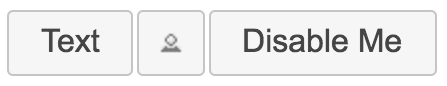
In this section, you'll learn how to clean up after components. You don't have to explicitly unmount components from the DOM—React handles that for you. There are some things that React doesn't know about and therefore cannot clean up for you after the component is removed.
It's for these types of cleanup tasks that the componentWillUnmount() lifecycle method exists. One use case for cleaning up after React components is asynchronous code.
For example, imagine a component that issues an API call to fetch some data when the component is first mounted. Now, imagine that this component is removed from the DOM before the API response arrives.
If your asynchronous code tries to set the state of a component that has been unmounted, nothing will happen. A warning will be logged, and the state isn't set. It's actually very important that this warning is logged; otherwise, you would have a hard time trying to solve subtle race condition bugs.
The correct approach is to create cancellable asynchronous actions. Here's a modified version of the users() API function that you implemented earlier in the chapter:
// Adapted from:
// https://facebook.github.io/react/blog/2015/12/16/ismounted-antipattern.html
function cancellable(promise) {
  let cancelled = false;

  // Creates a wrapper promise to return. This wrapper is
  // resolved or rejected based on the wrapped promise, and
  // on the "cancelled" value.
  const promiseWrapper = new Promise((resolve, reject) => {
    promise.then(
      value => {
        return cancelled ? reject({ cancelled: true }) : resolve(value);
      },
      error => {
        return cancelled
          ? reject({ cancelled: true })
          : reject(error);
      }
    );
  });

  // Adds a "cancel()" method to the promise, for
  // use by the React component in "componentWillUnmount()".
  promiseWrapper.cancel = function cancel() {
    cancelled = true;
  };

  return promiseWrapper;
}

export function users(fail) {
  // Make sure that the returned promise is "cancellable", by
  // wrapping it with "cancellable()".
  return cancellable(
    new Promise((resolve, reject) => {
      setTimeout(() => {
        if (fail) {
          reject(fail);
        } else {
          resolve({
            users: [
              { id: 0, name: 'First' },
              { id: 1, name: 'Second' },
              { id: 2, name: 'Third' }
            ]
          });
        }
      }, 4000);
    })
  );
}
The trick is the cancellable() function, which wraps a promise with a new promise. The new promise has a cancel() method, which rejects the promise if called. It doesn't alter the actual asynchronous behavior that the promise is synchronizing. However, it does provide a generic and consistent interface for use within React components.
Now let's take a look at a container component that has the ability to cancel asynchronous behavior:
import React, { Component } from 'react';
import { fromJS } from 'immutable';
import { render } from 'react-dom';

import { users } from './api';
import UserList from './UserList';

// When the "cancel" link is clicked, we want to render
// a new element in "#app". This will unmount the
// "<UserListContainer>" component.
const onClickCancel = e => {
  e.preventDefault();

  render(<p>Cancelled</p>, document.getElementById('root'));
};

export default class UserListContainer extends Component {
  state = {
    data: fromJS({
      error: null,
      loading: 'loading...',
      users: []
    })
  };

  // Getter for "Immutable.js" state data...
  get data() {
    return this.state.data;
  }

  // Setter for "Immutable.js" state data...
  set data(data) {
    this.setState({ data });
  }

  componentDidMount() {
    // We have to store a reference to any async promises,
    // so that we can cancel them later when the component
    // is unmounted.
    this.job = users();

    this.job.then(
      result => {
        this.data = this.data
          .set('loading', null)
          .set('error', null)
          .set('users', fromJS(result.users));
      },

      // The "job" promise is rejected when it's cancelled.
      // This means that we need to check for the "cancelled"
      // property, because if it's true, this is normal
      // behavior.
      error => {
        if (!error.cancelled) {
          this.data = this.data
            .set('loading', null)
            .set('error', error);
        }
      }
    );
  }

  // This method is called right before the component
  // is unmounted. It is here, that we want to make sure
  // that any asynchronous behavior is cleaned up so that
  // it doesn't try to interact with an unmounted component.
  componentWillUnmount() {
    this.job.cancel();
  }

  render() {
    return (
      <UserList onClickCancel={onClickCancel} {...this.data.toJS()} />
    );
  }
}
The onClickCancel() handler actually replaces the user list. This calls the componentWillUnmount() method, where you can cancel this.job. It's also worth noting that when the API call is made in componentDidMount(), a reference to the promise is stored in the component. This is necessary otherwise you would have no way to cancel the async call.
Here's what the component looks like when rendered during a pending API call:
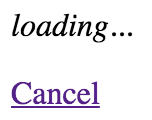
A new feature of React 16 – error boundaries – lets you handle unexpected component failures. Rather than have every component of your application know how to deal with any errors that it might encounter, error boundaries are a mechanism that you can use to wrap components with error-handling behavior. The best way to think of error boundaries is as try/catch syntax for JSX.
Let's revisit the first example from this chapter where you fetched component data using an API function. The users() function accepts a Boolean argument, which, when true, causes the promise to reject. This is something that you'll want to handle, but not necessarily in the component that made the API call. In fact, the UserListContainer and UserList components are already set up to handle API errors like this. The challenge is that if you have lots of components, this is a lot of error handling code. Further, the error handling is specific to that one API call – what if something else goes wrong?
Here's the modified source for UserListContainer that you can use for this example:
import React, { Component } from 'react';
import { fromJS } from 'immutable';

import { users } from './api';
import UserList from './UserList';

export default class UserListContainer extends Component {
  state = {
    data: fromJS({
      error: null,
      loading: 'loading...',
      users: []
    })
  };

  // Getter for "Immutable.js" state data...
  get data() {
    return this.state.data;
  }

  // Setter for "Immutable.js" state data...
  set data(data) {
    this.setState({ data });
  }

  // When component has been rendered, "componentDidMount()"
  // is called. This is where we should perform asynchronous
  // behavior that will change the state of the component.
  // In this case, we're fetching a list of users from
  // the mock API.
  componentDidMount() {
    users(true).then(
      result => {
        // Populate the "users" state, but also
        // make sure the "error" and "loading"
        // states are cleared.
        this.data = this.data
          .set('loading', null)
          .set('error', null)
          .set('users', fromJS(result.users));
      },
      error => {
        // When an error occurs, we want to clear
        // the "loading" state and set the "error"
        // state.
        this.data = this.data
          .set('loading', null)
          .set('error', error);
      }
    );
  }

  render() {
    // If the error state has a string value in it, it
    // means that something went wrong during the asynchronous
    // data fetching for this component. You can just throw an
    // error using this string instead of rendering.
    if (this.data.get('error') !== null) {
      throw new Error(this.data.get('error'));
    }
    return <UserList {...this.data.toJS()} />;
  }
}
This component is mostly the same as it was in the first example. The first difference is the call to users() where it's now passing true:
componentDidMount() {
  users(true).then(
    ...
This call will fail, resulting in the error state being set. The second difference is in the render() method:
if (this.data.get('error') !== null) {
  throw new Error(this.data.get('error'));
}
Instead of forwarding the error state onto the UserList component, it's passing the error back to the component tree by throwing an error instead of attempting to render more components. The key design change here is that this component is now making the assumption that there is some sort of error boundary in place further up in the component tree that will handle these errors accordingly.
Now let's create the error boundary itself:
import React, { Component } from 'react';

// A basic error boundary used to display error messages.
export default class ErrorBoundary extends Component {
  state = {
    error: null
  };

  // This lifecycle method is only called if a component
  // lower in the tree than this component throws an error.
  // You can handle the error however you like in this method,
  // including setting it as a state value so that it can be used
  // for rendering.
  componentDidCatch(error) {
    this.setState({ error });
  }

  // If there's no error, you can just render the boundary's
  // children as usual. If there's an error, you can render
  // the error message while ignoring the child components.
  render() {
    if (this.state.error === null) {
      return this.props.children;
    } else {
      return <strong>{this.state.error.toString()}</strong>;
    }
  }
}
This is where the componentDidCatch() lifecycle method is utilized by setting the error state of this component when it catches an error. When it's rendered, an error message is rendered if the error state is set. Otherwise, render the child components as usual.
Here's how you can use this ErrorBoundary component:
import React from 'react';
import { render } from 'react-dom';

import ErrorBoundary from './ErrorBoundary';
import UserListContainer from './UserListContainer';

// The <ErrorBoundary> component can wrap any component you need.
// You can also create different error boundary components that
// render errors differently.
render(
  <ErrorBoundary>
    <UserListContainer />
  </ErrorBoundary>,
  document.getElementById('root')
);
Any errors that are thrown by UserListContainer or any of its children will be caught and handled by ErrorBoundary:
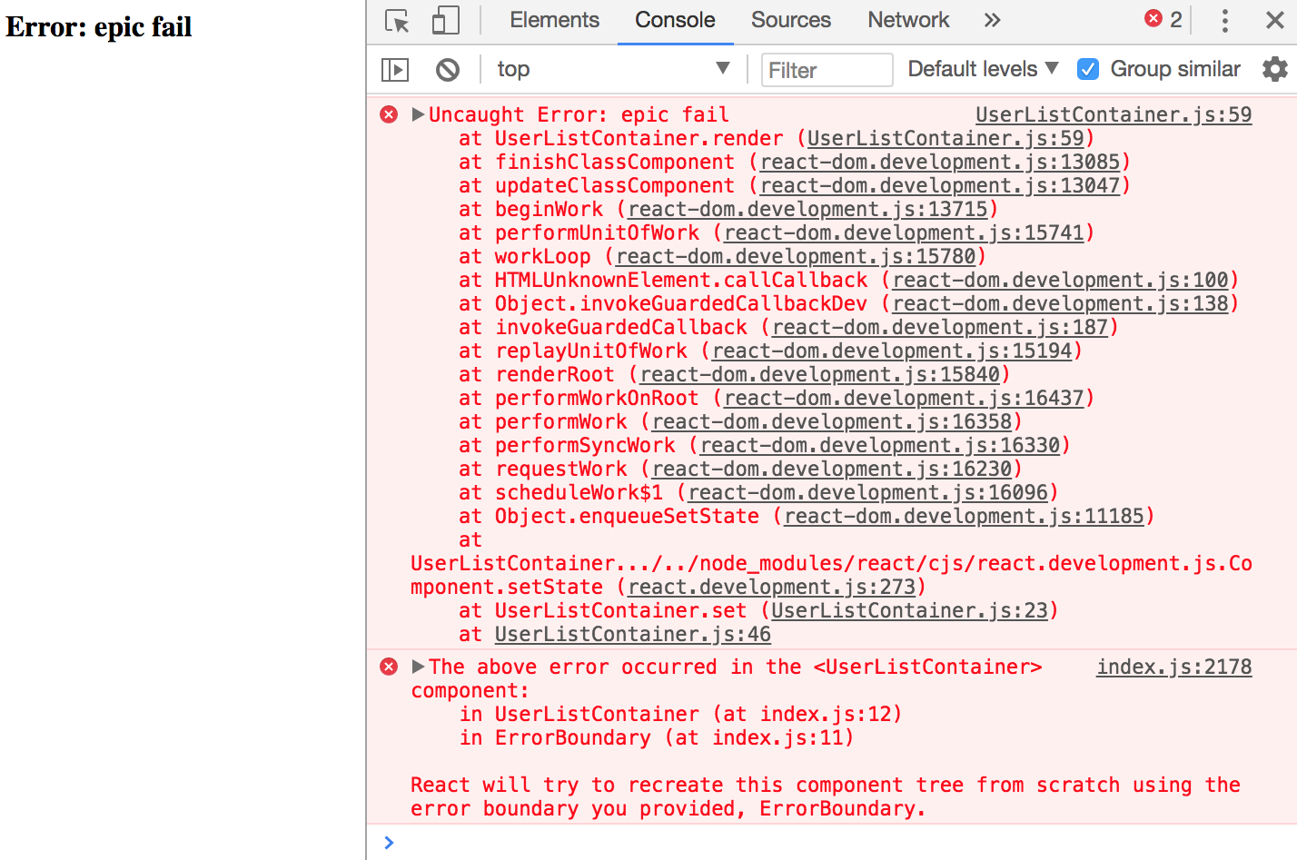
Now you can remove the argument that's passed to users() in UserListContainer to stop it from failing. In the UserList component, let's say that you have an error that tries to call toUpperCase() on a number:
import React from 'react';
import { Map } from 'immutable';

// This component displays the passed-in "loading"
// property as italic text. If it's null, then
// nothing is rendered.
const LoadingMessage = ({ loading }) =>
  Map([[null, null]]).get(loading, <em>{loading}</em>);

export default ({
  error, // eslint-disable-line react/prop-types
  loading, // eslint-disable-line react/prop-types
  users // eslint-disable-line react/prop-types
}) => (
  <section>
    {/* Displays any loading messages, while
         waiting for the API... */}
    <LoadingMessage loading={loading} />

    {/* Attempts to render the user list but throws an
        error by attempting to call toUpperCase() on a number. */}
    <ul>
      {users.map(i => <li key={i.id.toUpperCase()}>{i.name}</li>)}
    </ul>
  </section>
);
You'll get a different error thrown, but since it's under the same boundary as the previous error, it'll be handled the same way:
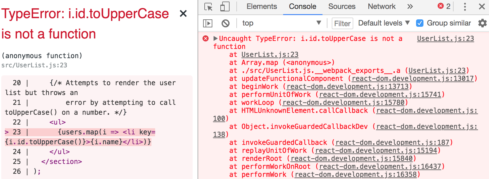
In this chapter, you learned a lot about the lifecycle of React components. We started things off with a discussion on why React components need a lifecycle in the first place. It turns out that React can't do everything automatically for us, so we need to write some code that's run at the appropriate time during the components' lifecycles.
Next, you implemented several components that were able to fetch their initial data and initialize their state from JSX properties. Then, you learned how to implement more efficient React components by providing a shouldComponentRender() method.
You learned how to hide the imperative code that some components need to implement and how to clean up after asynchronous behavior. Finally, you learned how to use the new error boundary functionality from React 16.
In the following chapter, you'll learn techniques that help to ensure that your components are being passed the right properties.
You can visit following links for more information:
In this chapter, you'll learn about property validation in React components. This might seem simple at first glance, but it's an important topic because it leads to bug-free components. I'll start things off with a discussion about predictable outcomes and how this leads to components that are portable throughout the application.
Next, you'll walk through examples of some of the type-checking property validators that come with React. Then, you'll walk through some more complex property-validation scenarios. Finally, I'll wrap the chapter up with an example of how to implement your own custom validators.
Property validation in React components is like field validation in HTML forms. The basic premise of validating form fields is letting the user know that they've provided a value that's not acceptable. Ideally, the validation error message is clear enough that the user can easily fix the situation. With React component property validation, you're doing the same thing—making it easy to fix a situation where an unexpected value was provided. Property validation enhances the developer experience, rather than the user experience.
The key aspect of property validation is knowing what's passed into the component as a property value. For example, if you're expecting an array and a boolean is passed instead, something will probably go wrong. If you validate the property values using the prop-types React validation package, then you know that something unexpected was passed. If the component is expecting an array so that it can call the map() method, it'll fail if a Boolean value is passed because it has no map() method. However, before this failure happens, you'll see the property validation warning.
The idea isn't to fail fast with property validation. It's to provide information to the developer. When property validation fails, you know that something was provided as a component property that shouldn't have been. It's a matter of finding where the value is passed in the code and fixing it.
When you know what to expect from your component properties, the context in which the component is used becomes less important. This means that as long as the component is able to validate its property values, it really shouldn't matter where the component is used; it could easily be used by any feature.
If you want a generic component that's portable across application features, you can either write component validation code or you can write defensive code that runs at render time. The challenge with programming defensively is that it dilutes the value of declarative React components. Using React-style property validation, you can avoid writing defensive code. Instead, the property validation mechanism emits a warning when something doesn't pass, informing you that you need to fix something.
In this section, you'll learn how to use the simple property type validators available in the prop-types package. Then, you'll learn how to accept any property value as well as make a property required instead of optional.
Let's take a look at validators that handle the most primitive types of JavaScript values. You will use these validators frequently, as you'll want to know that a property is a string or that it's a function, for example. This example will also introduce you to the mechanisms involved with setting up validation on a component. Here's the component; it just renders some properties using basic markup:
import React from 'react';
import PropTypes from 'prop-types';

const MyComponent = ({
  myString,
  myNumber,
  myBool,
  myFunc,
  myArray,
  myObject
}) => (
  <section>
    {/* Strings and numbers can be rendered
         just about anywhere. */}
    <p>{myString}</p>
    <p>{myNumber}</p>

    {/* Booleans are typically used as property values. */}
    <p>
      <input type="checkbox" defaultChecked={myBool} />
    </p>

    {/* Functions can return values, or be assigned as
         event handler property values. */}
    <p>{myFunc()}</p>

    {/* Arrays are typically mapped to produce new JSX elements. */}
    <ul>{myArray.map(i => <li key={i}>{i}</li>)}</ul>

    {/* Objects typically use their properties in some way. */}
    <p>{myObject.myProp}</p>
  </section>
);

// The "propTypes" specification for this component.
MyComponent.propTypes = {
  myString: PropTypes.string,
  myNumber: PropTypes.number,
  myBool: PropTypes.bool,
  myFunc: PropTypes.func,
  myArray: PropTypes.array,
  myObject: PropTypes.object
};

export default MyComponent;
There are two key pieces to the property validation mechanism. First, you have the static propTypes property. This is a class-level property, not an instance property. When React finds propTypes, it uses this object as the property specification of the component. Second, you have the PropTypes object from the prop-types package, which has several built-in validator functions.
In this example, MyComponent has six properties, each with their own type. When you look at the propTypes specification, you can see what type of values this component will accept. Let's render this component with some property values:
import React from 'react';
import { render as renderJSX } from 'react-dom';

import MyComponent from './MyComponent';

// The properties that we'll pass to the component.
// Each property is a different type, and corresponds
// to the "propTypes" spec of the component.
const validProps = {
  myString: 'My String',
  myNumber: 100,
  myBool: true,
  myFunc: () => 'My Return Value',
  myArray: ['One', 'Two', 'Three'],
  myObject: { myProp: 'My Prop' }
};

// These properties don't correspond to the "<MyComponent>"
// spec, and will cause warnings to be logged.
const invalidProps = {
  myString: 100,
  myNumber: 'My String',
  myBool: () => 'My Reaturn Value',
  myFunc: true,
  myArray: { myProp: 'My Prop' },
  myObject: ['One', 'Two', 'Three']
};

// Renders "<MyComponent>" with the given "props".
function render(props) {
  renderJSX(
    <MyComponent {...props} />,
    document.getElementById('root')
  );
}

render(validProps);
render(invalidProps);
The first time <MyComponent> is rendered, it uses the validProps properties. These values all meet the component property specification, so no warnings are logged in the console. The second time around, the invalidProps properties are used, and this fails the property validation, because the wrong type is used in every property. The console output should look something like the following:
Invalid prop `myString` of type `number` supplied to `MyComponent`, expected `string`
Invalid prop `myNumber` of type `string` supplied to `MyComponent`, expected `number`
Invalid prop `myBool` of type `function` supplied to `MyComponent`, expected `boolean`
Invalid prop `myFunc` of type `boolean` supplied to `MyComponent`, expected `function`
Invalid prop `myArray` of type `object` supplied to `MyComponent`, expected `array`
Invalid prop `myObject` of type `array` supplied to `MyComponent`, expected `object`
TypeError: myFunc is not a function
This last error is interesting. You can clearly see that the property validation is complaining about the invalid property types. This includes the invalid function that was passed to myFunc. So, despite the type checking that happens on the property, the component will still try to call the value as though it were a function.
Here's what the rendered output looks like:
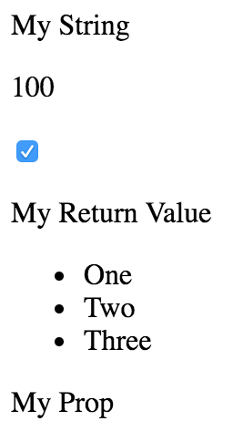
Let's make some adjustments to the preceding example. The component property specification required specific types for values, but these are only checked if the property is passed to the component as a JSX attribute. For example, you could have completely omitted the myFunc property and it would have validated. Thankfully, the PropTypes functions have a tool that lets you specify that a property must be provided and it must have a specific type. Here's the modified component:
import React from 'react';
import PropTypes from 'prop-types';

const MyComponent = ({
  myString,
  myNumber,
  myBool,
  myFunc,
  myArray,
  myObject
}) => (
  <section>
    <p>{myString}</p>
    <p>{myNumber}</p>
    <p>
      <input type="checkbox" defaultChecked={myBool} />
    </p>
    <p>{myFunc()}</p>
    <ul>{myArray.map(i => <li key={i}>{i}</li>)}</ul>
    <p>{myObject.myProp}</p>
  </section>
);

// The "propTypes" specification for this component. Every
// property is required, because they each have the
// "isRequired" property.
MyComponent.propTypes = {
  myString: PropTypes.string.isRequired,
  myNumber: PropTypes.number.isRequired,
  myBool: PropTypes.bool.isRequired,
  myFunc: PropTypes.func.isRequired,
  myArray: PropTypes.array.isRequired,
  myObject: PropTypes.object.isRequired
};

export default MyComponent;
Not much has changed between this component and the one that you implemented in the preceding section. The main difference is with the specs in propTypes. The isRequired value is appended to each of the type validators used. So, for instance, string.isRequired means that the property value must be a string, and the property cannot be missing. Let's put this component to the test now:
import React from 'react';
import { render as renderJSX } from 'react-dom';

import MyComponent from './MyComponent';

const validProps = {
  myString: 'My String',
  myNumber: 100,
  myBool: true,
  myFunc: () => 'My Return Value',
  myArray: ['One', 'Two', 'Three'],
  myObject: { myProp: 'My Prop' }
};

// The same as "validProps", except it's missing
// the "myObject" property. This will trigger a
// warning.
const missingProp = {
  myString: 'My String',
  myNumber: 100,
  myBool: true,
  myFunc: () => 'My Return Value',
  myArray: ['One', 'Two', 'Three']
};

// Renders "<MyComponent>" with the given "props".
function render(props) {
  renderJSX(
    <MyComponent {...props} />,
    document.getElementById('root')
  );
}

render(validProps);
render(missingProp);
The first time around, the component is rendered with all of the correct property types. The second time around, the component is rendered without the myObject property. The console errors should be as follows:
Required prop `myObject` was not specified in `MyComponent`.
Cannot read property 'myProp' of undefined
Thanks to the property specification and subsequent error message for myObject, it's clear that an object value needs to be provided to the myObject property. The last error is because the component assumes that there is an object with myProp as a property.
The final topic of this section is the any property validator. That is, it doesn't actually care what value it gets—anything is valid, including not passing a value at all. In fact, the isRequired validator can be combined with the any validator. For example, if you're working on a component and you just want to make sure that something is passed, but not sure exactly which type you're going to need yet, you could do something like myProp: PropTypes.any.isRequired.
Another reason to have the any property validator is for the sake of consistency. Every component should have property specifications. The any validator is useful in the beginning, when you're not exactly sure what the property type will be. You can at least begin the property spec, and then refine it later as things unfold.
Let's take a look at some code now:
import React from 'react';
import PropTypes from 'prop-types';

// Renders a component with a header and a simple
// progress bar, using the provided property
// values.
const MyComponent = ({ label, value, max }) => (
  <section>
    <h5>{label}</h5>
    <progress {...{ max, value }} />
  </section>
);

// These property values can be anything, as denoted by
// the "PropTypes.any" prop type.
MyComponent.propTypes = {
  label: PropTypes.any,
  value: PropTypes.any,
  max: PropTypes.any
};

export default MyComponent;
This component doesn't actually validate anything because the three properties in its property spec will accept anything. However, it's a good starting point, because at a glance, I can see the names of the three properties that this component uses. So later on, when I decide exactly which types these properties should have, the change is simple. Let's see this component in action now:
import React from 'react';
import { render } from 'react-dom';

import MyComponent from './MyComponent';

render(
  <section>
    {/* Passes a string and two numbers to
         "<MyComponent>". Everything works as
         expected. */}
    <MyComponent label="Regular Values" max={20} value={10} />

    {/* Passes strings instead of numbers to the
         progress bar, but they're correctly
         interpreted as numbers. */}
    <MyComponent label="String Values" max="20" value="10" />

    {/* The "label" has no issue displaying
         "MAX_SAFE_INTEGER", but the date that's
         passed to "max" causes the progress bar
         to break. */}
    <MyComponent
      label={Number.MAX_SAFE_INTEGER}
      max={new Date()}
      value="10"
    />
  </section>,
  document.getElementById('root')
);
Strings and numbers are interchangeable in several places. Allowing just one or the other seems overly restrictive. As you'll see in the next section, React has other property validators that allow you to further restrict property values allowed by your component.
Here's what our component looks like when rendered:
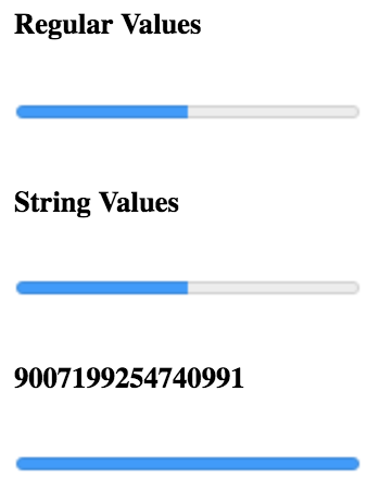
In this section, you'll learn about the more advanced validator functionality available in the React prop-types package. First, you'll learn about the element and node validators that check for values that can be rendered inside HTML markup. Then, you'll see how to check for specific types, beyond the primitive type checking that you just learned about. Finally, you'll implement validation that looks for specific values.
Sometimes, you just want to make sure that a property value is something that can be rendered by JSX markup. For example, if a property value is an array of plain objects, this can't be rendered by putting it in {}. You have to map the array items to JSX elements.
This sort of checking is especially useful if your component passes property values to other elements as children. Let's look at an example of what this looks like:
import React from 'react';
import PropTypes from 'prop-types';

const MyComponent = ({ myHeader, myContent }) => (
  <section>
    <header>{myHeader}</header>
    <main>{myContent}</main>
  </section>
);

// The "myHeader" property requires a React
// element. The "myContent" property requires
// a node that can be rendered. This includes
// React elements, but also strings.
MyComponent.propTypes = {
  myHeader: PropTypes.element.isRequired,
  myContent: PropTypes.node.isRequired
};

export default MyComponent;
This component has two properties that require values that can be rendered. The myHeader property wants an element. This can be any JSX element. The myContent property wants a node. This can be any JSX element or any string value. Let's pass this component some values and render it:
import React from 'react';
import { render } from 'react-dom';

import MyComponent from './MyComponent';

// Two React elements we'll use to pass to
// "<MyComponent>" as property values.
const myHeader = <h1>My Header</h1>;
const myContent = <p>My Content</p>;

render(
  <section>
    {/* Renders as expected, both properties are passed
         React elements as values. */}
    <MyComponent {...{ myHeader, myContent }} />

    {/* Triggers a warning because "myHeader" is expecting
         a React element instead of a string. */}
    <MyComponent myHeader="My Header" {...{ myContent }} />

    {/* Renders as expected. A string is a valid type for
         the "myContent" property. */}
    <MyComponent {...{ myHeader }} myContent="My Content" />

    {/* Renders as expected. An array of React elements
         is a valid type for the "myContent" property. */}
    <MyComponent
      {...{ myHeader }}
      myContent={[myContent, myContent, myContent]}
    />
  </section>,
  document.getElementById('root')
);
The myHeader property is more restrictive about the values it will accept. The myContent property will accept a string, an element, or an array of elements. These two validators are important when passing in child data from properties, as this component does. For example, trying to pass a plain object or a function as a child will not work, and it's best if you check for this situation using a validator.
Here's what this component looks like when rendered:

Sometimes, you need a property validator that checks for a type defined by your application. For example, let's say you have the following user class:
import cuid from 'cuid';

// Simple class the exposes an API that the
// React component expects.
export default class MyUser {
  constructor(first, last) {
    this.id = cuid();
    this.first = first;
    this.last = last;
  }

  get name() {
    return `${this.first} ${this.last}`;
  }
}
Now, suppose that you have a component that wants to use an instance of this class as a property value. You would need a validator that checks that the property value is an instance of MyUser. Let's implement a component that does just that:
import React from 'react';
import PropTypes from 'prop-types';

import MyUser from './MyUser';

const MyComponent = ({ myDate, myCount, myUsers }) => (
  <section>
    {/* Requires a specific "Date" method. */}
    <p>{myDate.toLocaleString()}</p>

    {/* Number or string works here. */}
    <p>{myCount}</p>
    <ul>
      {/* "myUsers" is expected to be an array of
           "MyUser" instances. So we know that it's
           safe to use the "id" and "name" property. */}
      {myUsers.map(i => <li key={i.id}>{i.name}</li>)}
    </ul>
  </section>
);

// The properties spec is looking for an instance of
// "Date", a choice between a string or a number, and
// an array filled with specific types.
MyComponent.propTypes = {
  myDate: PropTypes.instanceOf(Date),
  myCount: PropTypes.oneOfType([PropTypes.string, PropTypes.number]),
  myUsers: PropTypes.arrayOf(PropTypes.instanceOf(MyUser))
};

export default MyComponent;
This component has three properties that require specific types, each going beyond the basic type validators that you've seen so far in this chapter. Let's walk through these now:
This example illustrates the number of scenarios that you can handle by combining the property validators provided by React. Here's what the rendered output looks like:
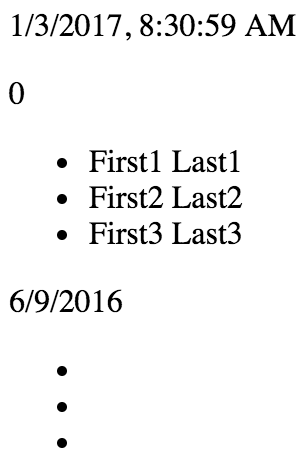
I've focused on validating the type of property values so far, but that's not always what you'll want to check for. Sometimes, specific values matter. Let's see how you can validate specific property values:
import React from 'react';
import PropTypes from 'prop-types';

// Any one of these is a valid "level"
// property value.
const levels = new Array(10).fill(null).map((v, i) => i + 1);

// This is the "shape" of the object we expect
// to find in the "user" property value.
const userShape = {
  name: PropTypes.string,
  age: PropTypes.number
};

const MyComponent = ({ level, user }) => (
  <section>
    <p>{level}</p>
    <p>{user.name}</p>
    <p>{user.age}</p>
  </section>
);

// The property spec for this component uses
// "oneOf()" and "shape()" to define the required
// property values.
MyComponent.propTypes = {
  level: PropTypes.oneOf(levels),
  user: PropTypes.shape(userShape)
};

export default MyComponent;
The level property is expected to be a number from the levels array. This is easy to validate using the oneOf() function. The user property is expecting a specific shape. A shape is the expected properties and types of an object. The userShape defined in this example requires a name string and an age number. The key difference between shape() and instanceOf() is that you don't necessarily care about the type. You might only care about the values that are used in the JSX of the component.
Let's take a look at how this component is used:
import React from 'react';
import { render } from 'react-dom';

import MyComponent from './MyComponent';

render(
  <section>
    {/* Works as expected. */}
    <MyComponent level={10} user={{ name: 'Name', age: 32 }} />

    {/* Works as expected, the "online"
         property is ignored. */}
    <MyComponent user={{ name: 'Name', age: 32, online: false }} />

    {/* Fails. The "level" value is out of range,
         and the "age" property is expecting a
         number, not a string. */}
    <MyComponent level={11} user={{ name: 'Name', age: '32' }} />
  </section>,
  document.getElementById('root')
);
Here's what the component looks like when it's rendered:
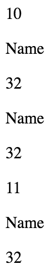
In this final section, you'll learn how to build your own custom property validation functions and apply them in the property specification. Generally speaking, you should only implement your own property validator if you absolutely have to. The default validators available in prop-types cover a wide range of scenarios.
However, sometimes, you need to make sure that very specific property values are passed to the component. Remember, these will not be run in production mode, so it's perfectly acceptable for a validator function to iterate over collections. Let's implement some custom validator functions now:
import React from 'react';

const MyComponent = ({ myArray, myNumber }) => (
  <section>
    <ul>{myArray.map(i => <li key={i}>{i}</li>)}</ul>
    <p>{myNumber}</p>
  </section>
);

MyComponent.propTypes = {
  // Expects a property named "myArray" with a non-zero
  // length. If this passes, we return null. Otherwise,
  // we return a new error.
  myArray: (props, name, component) =>
    Array.isArray(props[name]) && props[name].length
      ? null
      : new Error(`${component}.${name}: expecting non-empty array`),

  // Expects a property named "myNumber" that's
  // greater than 0 and less than 99. Otherwise,
  // we return a new error.
  myNumber: (props, name, component) =>
    Number.isFinite(props[name]) &&
    props[name] > 0 &&
    props[name] < 100
      ? null
      : new Error(
          `${component}.${name}: expecting number between 1 and 99`
        )
};

export default MyComponent;
The myArray property expects a non-empty array, and the myNumber property expects a number that's greater than 0 and less than 100. Let's try passing these validators some data:
import React from 'react';
import { render } from 'react-dom';

import MyComponent from './MyComponent';

render(
  <section>
    {/* Renders as expected... */}
    <MyComponent
      myArray={['first', 'second', 'third']}
      myNumber={99}
    />

    {/* Both custom validators fail... */}
    <MyComponent myArray={[]} myNumber={100} />
  </section>,
  document.getElementById('root')
);
The first element renders just fine, as both of the validators return null. However, the empty array and the number 100 cause both validators to return errors:
MyComponent.myArray: expecting non-empty array
MyComponent.myNumber: expecting number between 1 and 99
Here's what the rendered output looks like:
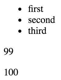
The focus of this chapter has been React component property validation. When you implement property validation, you know what to expect; this promotes portability. The component doesn't care how the property values are passed to it, just as long as they're valid.
Then, you worked on several examples that used the basic React validators that check primitive JavaScript types. You also learned that if a property is required, this must be made explicit. Next, you learned how to validate more complex property values by combining the built-in validators that come with React.
Finally, you implemented your own custom validator functions to perform validation that goes beyond what's possible with the prop-types validators. In the next chapter, you'll learn how to extend React components with new data and behavior.
In this chapter, you'll learn how to add new capabilities to existing components by extending them. There are two React mechanisms that you can use to extend a component:
You'll start by learning about basic component inheritance, just like object-oriented class inheritance. Then you'll implement some higher-order components used to compose React components.
Components are just classes. In fact, when you implement a component using ES2015 class syntax, you extend the base Component class from React. You can keep on extending your classes like this to create your own base components.
In this section, you'll see how your components can inherit state, properties, and just about anything else, including JSX markup and event handlers.
Sometimes, you have several React components that use the same initial state. You can implement a base component that sets this initial state. Then, any components that want to use this as their initial state can extend this component. Let's implement a base component that sets some basic state:
import { Component } from 'react';
import { fromJS } from 'immutable';

export default class BaseComponent extends Component {
  state = {
    data: fromJS({
      name: 'Mark',
      enabled: false,
      placeholder: ''
    })
  };

  // Getter for "Immutable.js" state data...
  get data() {
    return this.state.data;
  }

  // Setter for "Immutable.js" state data...
  set data(data) {
    this.setState({ data });
  }

  // The base component doesn't actually render anything,
  // but it still needs a render method.
  render() {
    return null;
  }
}
The state is an immutable Map. This base component also implements immutable data setter and getter methods. Let's implement a component that extends this one:
import React from 'react';
import BaseComponent from './BaseComponent';

// Extends "BaseComponent" to inherit the
// initial component state.
export default class MyComponent extends BaseComponent {
  // This is our chance to build on the initial state.
  // We change the "placeholder" text and mark it as
  // "enabled".
  componentDidMount() {
    this.data = this.data.merge({
      placeholder: 'Enter a name...',
      enabled: true
    });
  }

  // Used to set the name state whenever the input
  // value changes.
  onChange = ({ target: { value } }) => {
    this.data = this.data.set('name', value);
  };

  // Renders a simple input element, that uses the
  // state of this component as properties.
  render() {
    const { enabled, name, placeholder } = this.data.toJS();

    return (
      <label htmlFor="my-input">
        Name:
        <input
          type="text"
          id="my-input"
          disabled={!enabled}
          placeholder={placeholder}
          value={name}
          onChange={this.onChange}
        />
      </label>
    );
  }
}
This component doesn't actually have to set any initial state because it's already set by BaseComponent. Since the state is already an immutable Map, you can tweak the initial state in componentDidMount() using merge(). Here's what the rendered output looks like:
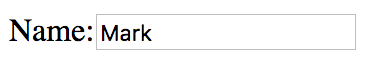
If you delete the default text in the input element, you can see that the placeholder text added by MyComponent to the initial state is applied as expected:
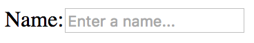
You can also change the text to something else and the onChange() event handler will set the name state accordingly.
Inheriting properties works by defining the default property values and the property types as static attributes of a base class. Any classes that inherit from this base class also inherit the property values and the property specs. Let's take a look at a base class implementation:
import { Component } from 'react';
import PropTypes from 'prop-types';

export default class BaseComponent extends Component {
  // The specifiction for these base properties.
  static propTypes = {
    users: PropTypes.array.isRequired,
    groups: PropTypes.array.isRequired
  };

  // The default values of these base properties.
  static defaultProps = {
    users: [],
    groups: []
  };

  render() {
    return null;
  }
}
The class itself doesn't actually do anything. The only reason to define it is so that there's a place to declare the default property values and their type constraints. Respectively, these are the defaultProps and the propTypes static class attributes.
Now, let's take a look at a component that inherits these properties:
import React from 'react';
import { Map } from 'immutable';

import BaseComponent from './BaseComponent';

// Renders the given "text" as a header, unless
// the given "length" is 0.
const SectionHeader = ({ text, length }) =>
  Map([[0, null]]).get(length, <h1>{text}>/h1>);

export default class MyComponent extends BaseComponent {
  render() {
    const { users, groups } = this.props;

    // Renders the "users" and "groups" arrays. There
    // are not property validators or default values
    // in this component, since these are declared in
    // "BaseComponent".
    return (
      <section>
        <SectionHeader text="Users" length={users.length} />
        <ul>{users.map(i => <li key={i}>{i}</li>)}</ul>

        <SectionHeader text="Groups" length={groups.length} />
        <ul>{groups.map(i => <li key={i}>{i}</li>)}</ul>
      </section>
    );
  }
}
Let's try rendering MyComponent to make sure that the inherited properties are working as expected:
import React from 'react';
import { render } from 'react-dom';

import ErrorBoundary from './ErrorBoundary';
import MyComponent from './MyComponent';

const users = ['User 1', 'User 2'];

const groups = ['Group 1', 'Group 2'];

render(
  <section>
    {/* Renders as expected, using the defaults. */}
    <ErrorBoundary>
      <MyComponent />
    </ErrorBoundary>

    {/* Renders as expected, using the "groups" default. */}
    <ErrorBoundary>
      <MyComponent users={users} />
      <hr />
    </ErrorBoundary>

    {/* Renders as expected, using the "users" default. */}
    <ErrorBoundary>
      <MyComponent groups={groups} />
      <hr />
    </ErrorBoundary>

    {/* Renders as expected, providing property values. */}
    <ErrorBoundary>
      <MyComponent users={users} groups={groups} />
    </ErrorBoundary>

    {/* Fails to render, the property validators in the base
         component detect the invalid number type. */}
    <ErrorBoundary>
      <MyComponent users={0} groups={0} />
    </ErrorBoundary>
  </section>,
  document.getElementById('root')
);
Despite the fact that MyComponent doesn't define any property defaults or types, you get the expected behavior. When you try to pass numbers to the users and groups properties, you don't see anything rendered. That's because MyComponent is expecting a map() method on these property values, and there isn't one.
The ErrorBoundary elements are used here to isolate errors. Without them, any of the MyComponent elements failing would cause other components on the page to fail as well, for example, by passing number values to users and groups. Here's what the ErrorBoundary component looks like:
import { Component } from 'react';

// Uses the componentDidCatch() method to set the
// error state of this component. When rendering,
// if there's an error it gets logged and nothing
// is rendered.
export default class ErrorBoundary extends Component {
  state = { error: null };

  componentDidCatch(error) {
    this.setState({ error });
  }

  render() {
    if (this.state.error === null) {
      return this.props.children;
    } else {
      console.error(this.state.error);
      return null;
    }
  }
}
This component uses the componentDidCatch() lifecycle method that you learned about in Chapter 6, The React Component Lifecycle. If it catches an error, it sets the error state so that the render() method knows to not render the component that caused the error again. Here's what the rendered content looks like:
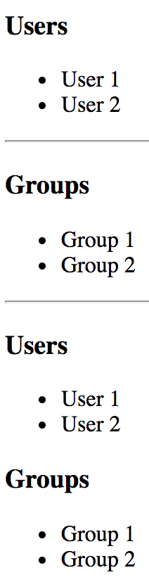
In this section, you'll learn about inheriting JSX and event handlers. You might want to use this approach if you have a single UI component that has the same UI elements and event handling logic, but there are differences in what the initial state should be, depending on where the component is used.
For example, a base class would define the JSX and event handler methods, while the more specific components define the initial state that's unique to the feature. Here's an example base class:
import React, { Component } from 'react';
import { fromJS } from 'immutable';

export default class BaseComponent extends Component {
  state = {
    data: fromJS({
      items: []
    })
  };

  // Getter for "Immutable.js" state data...
  get data() {
    return this.state.data;
  }

  // Setter for "Immutable.js" state data...
  set data(data) {
    this.setState({ data });
  }

  // The click event handler for each item in the
  // list. The context is the lexically-bound to
  // this component.
  onClick = id => () => {
    this.data = this.data.update('items', items =>
      items.update(
        items.indexOf(items.find(i => i.get('id') === id)),
        item => item.update('done', d => !d)
      )
    );
  };

  // Renders a list of items based on the state
  // of the component. The style of the item
  // depends on the "done" property of the item.
  // Each item is assigned an event handler that
  // toggles the "done" state.
  render() {
    const { items } = this.data.toJS();

    return (
      <ul>
        {items.map(i => (
          <li
            key={i.id}
            onClick={this.onClick(i.id)}
            style={{
              cursor: 'pointer',
              textDecoration: i.done ? 'line-through' : 'none'
            }}
          >
            {i.name}
          </li>
        ))}
      </ul>
    );
  }
}
This base component renders a list of items that, when clicked, toggles the style of the item text. By default, the state of this component has an empty item list. This means that it is safe to render this component without setting the component state. However, that's not very useful, so let's give this list some items by inheriting the base component and setting the state:
import BaseComponent from './BaseComponent';

export default class MyComponent extends BaseComponent {
  // Initializes the component state, by using the
  // "data" getter method from "BaseComponent".
  componentDidMount() {
    this.data = this.data.merge({
      items: [
        { id: 1, name: 'One', done: false },
        { id: 2, name: 'Two', done: false },
        { id: 3, name: 'Three', done: false }
      ]
    });
  }
}
The componentDidMount() lifecycle method can safely set the state of the component. The base component uses your data setter/getter to change the state of the component. Another thing that's handy about this approach is that if you want to override one of the event handlers of the base component, you can define the method in MyComponent.
Here's what the list looks like when rendered:
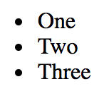
And here's what the list looks like when all of the items have been clicked:
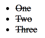
In this section, you'll learn about higher-order components. If you're familiar with higher-order functions in functional programming, higher-order components work the same way. A higher-order function is a function that takes another function as input, and returns a new function as output. This returned function calls the original function in some way. The idea is to compose new behavior out of existing behavior.
With higher-order React components, you have a function that takes a component as input, and returns a new component as output. This is the preferred way to compose new behavior in React applications, and it seems that many of the popular React libraries are moving in this direction, if they haven't already. You get more flexibility when composing functionality this way.
One use case for a higher-order component is conditional rendering. For example, depending on the outcome of a predicate, the component is rendered or nothing is rendered. The predicate could be anything that's specific to the application, such as permissions or something like that.
Let's say you have the following component:
import React from 'react';

// The world's simplest component...
export default () => <p>My component...</p>;
Now, to control the display of this component, you can wrap it with another component. Wrapping is handled by the higher-order function.
If you hear the term "wrapper" in the context of React, it's probably referring to a higher-order component. Essentially, this is what it does; it wraps the component that you pass to it.
Now, let's create a higher-order React component:
import React from 'react';

// A minimal higher-order function is all it
// takes to create a component repeater. Here, we're
// returning a function that calls "predicate()".
// If this returns true, then the rendered
// "<Component>" is returned.
export default (Component, predicate) => props =>
  predicate() && <Component {...props} />;
The two arguments to this function are Component, which is the component that you're wrapping, and the predicate to call. If the call to predicate() returns true, then <Component> is returned. Otherwise, nothing will be rendered.
Now, let's actually compose a new component using this function, and your component that renders a paragraph of text:
import React from 'react';
import { render } from 'react-dom';

import cond from './cond';
import MyComponent from './MyComponent';

// Two compositions of "MyComponent". The
// "ComposedVisible" version will render
// because the predicate returns true. The
// "ComposedHidden" version doesn't render.
const ComposedVisible = cond(MyComponent, () => true);
const ComposedHidden = cond(MyComponent, () => false);

render(
  <section>
    <h1>Visible</h1>
    <ComposedVisible />
    <h2>Hidden</h2>
    <ComposedHidden />
  </section>,
  document.getElementById('root')
);
You've just created two new components using MyComponent, cond(), and a predicate function. Here's the rendered output:

Let's finish the chapter by looking at a more involved higher-order component example. You'll implement a data store function that wraps a given component with a data source. This type of pattern is handy to know, because it's used by React libraries such as Redux. Here's the connect() function that's used to wrap components:
import React, { Component } from 'react';
import { fromJS } from 'immutable';

// The components that are connected to this store.
let components = fromJS([]);

// The state store itself, where application data is kept.
let store = fromJS({});

// Sets the state of the store, then sets the
// state of every connected component.
export function setState(state) {
  store = state;

  for (const component of components) {
    component.setState({
      data: store
    });
  }
}

// Returns the state of the store.
export function getState() {
  return store;
}

// Returns a higher-order component that's connected
// to the "store".
export function connect(ComposedComponent) {
  return class ConnectedComponent extends Component {
    state = { data: store };

    // When the component is mounted, add it to "components",
    // so that it will receive updates when the store state
    // changes.
    componentDidMount() {
      components = components.push(this);
    }

    // Deletes this component from "components" when it is
    // unmounted from the DOM.
    componentWillUnmount() {
      const index = components.findIndex(this);
      components = components.delete(index);
    }

    // Renders "ComposedComponent", using the "store" state
    // as properties.
    render() {
      return <ComposedComponent {...this.state.data.toJS()} />;
    }
  };
}
This module defines two internal immutable objects: components and store. The components list holds references to components that are listening to store changes. The store represents the entire application state.
The concept of a store stems from Flux, a set of architectural patterns used to build large-scale React applications. I'll touch on Flux ideas throughout this book, but Flux goes way beyond the scope of this book.
The important pieces of this module are the exported functions: setState(), getState(), and connect(). The getState() function simply returns a reference to the data store. The setState() function sets the state of the store, and then notifies all components that the state of the application has changed. The connect() function is the higher-order function that wraps the given component with a new one. When the component is mounted, it registers itself with the store so that it will receive updates when the store changes state. It renders the composed component by passing the store as properties.
Now, let's use this utility to build a simple filter and list. First, the list component:
import React from 'react';
import PropTypes from 'prop-types';

// Renders an item list...
const MyList = ({ filterValue, items }) => {
  const filter = new RegExp(filterValue, 'i');

  return (
    <ul>
      {items
        .filter(item => filter.test(item))
        .map(item => <li key={item}>{item}>/li>)}
    </ul>
  );
};

MyList.propTypes = {
  items: PropTypes.array.isRequired
};

export default MyList;
There are two pieces of state that are passed to this component as properties. The first is the filterValue string that comes from the filter text input. The second is the items array of values to filter. It is filtered by constructing a case-insensitive regular expression and using it with test() inside filter(). Then, only items that match the filterValue are part of the JSX output of this component. Next, let's look at MyInput:
import React from 'react';
import PropTypes from 'prop-types';
import { getState, setState } from './store';

// When the filter input value changes.
function onChange(e) {
  // Updates the state of the store.
  setState(getState().set('filterValue', e.target.value));
}

// Renders a simple input element to filter a list.
const MyInput = ({ value, placeholder }) => (
  <input
    autoFocus
    value={value}
    placeholder={placeholder}
    onChange={onChange}
  />
);

MyInput.propTypes = {
  value: PropTypes.string,
  placeholder: PropTypes.string
};

export default MyInput;
The MyInput component renders an <input> element. The goal of the onChange() handler is to filter the user list so that only items that contain the current input text are displayed. It does this by setting the filterValue state whenever the text input changes. This will cause the MyList component to re-render with the new filter value to filter items with.
Here's what the rendered filter input and item list looks like:
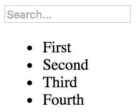
In this chapter, you learned about the different ways to extend existing components. The first mechanism you learned about was inheritance. This is done using ES2015 class syntax and is useful for implementing common methods or JSX markup.
Then, you learned about higher-order components, where you use a function to wrap one component with another to provide it with new capabilities. This is the direction that new React applications are moving in, instead of inheritance.
In the next chapter, you'll learn how to render components based on the current URL.
Almost every web application requires routing: the process of responding to a URL, based on a set of route handler declarations. In other words, a mapping from the URL to rendered content. However, this task is more involved than it seems at first. This is why you're going to leverage the react-router package in this chapter, the de facto routing tool for React.
First, you'll learn the basics of declaring routes using JSX syntax. Then, you'll learn about the dynamic aspects of routing, such as dynamic path segments and query parameters. Next, you'll implement links using components from react-router.
With react-router, you can collocate routes with the content that they render. In this section, you'll see that this is done using JSX syntax to define routes.
You'll create a basic hello world example route so that you can see what routes look like in React applications. Then, you'll learn how you can organize your route declarations by feature instead of in a monolithic module. Finally, you'll implement a common parent-child routing pattern.
Let's create a simple route that renders a simple component. First, you have a small React component that you want to render when the route is activated:
import React from 'react';

export default () => <p>Hello Route!</p>;
Next, let's look at the route definition:
import React from 'react';
import { render } from 'react-dom';
import { BrowserRouter as Router, Route } from 'react-router-dom';

import MyComponent from './MyComponent';

// The "<Router>" is the root element of the app.
render(
  <Router>
    <Route exact path="/" component={MyComponent} />
  </Router>,
  document.getElementById('root')
);
The Router component is the top-level component of the application. Let's break it down to know what's happening within the router.
You have the actual routes declared as <Route> elements. There are two key properties of any route: path and component. When the path is matched against the active URL, the component is rendered. But where is it rendered, exactly? The Router component doesn't actually render anything itself; it's responsible for managing how other components are rendered based on the current URL. Sure enough, when you look at this example in a browser, <MyComponent> is rendered as expected:

When the path property matches the current URL, the <Route> is replaced by the component property value. In this example, the route is replaced with <MyComponent>. If a given route doesn't match, nothing is rendered.
The difficulty with routing happens when your application has dozens of routes declared within a single module, because it's more difficult to mentally map routes to features.
To help with this, each top-level feature of the application can define its own routes. This way, it's clear which routes belong to which feature. So, let's start with the App component:
import React, { Fragment } from 'react';
import {
  BrowserRouter as Router,
  Route,
  Redirect
} from 'react-router-dom';

// Import the routes from our features.
import One from './one';
import Two from './two';

// The feature routes are rendered as children of
// the main router.
export default () => (
  <Router>
    <Fragment>
      <Route exact path="/" render={() => <Redirect to="one" />} />
      <One />
      <Two />
    </Fragment>
  </Router>
);
In this example, the application has two features: one and two. These are imported as components and rendered inside <Router>. You have to include the <Fragment> element because <Router> doesn't like having multiple children. By using a fragment, you're passing one child without having to use an unnecessary DOM element. The first child in this router is actually a redirect. This means that when the app first loads the URL /, the <Redirect> component will send the user to /one. The render property is an alternative to the component property when you need to call a function to render content. You're using it here because you need to pass the property to <Redirect>.
This module will only get as big as the number of application features, instead of the number of routes, which could be substantially larger. Let's take a look at one of the feature routes:
import React, { Fragment } from 'react';
import { Route, Redirect } from 'react-router';

// The pages that make up feature "one".
import First from './First';
import Second from './Second';

// The routes of our feature. The "<Redirect>"
// handles "/one" requests by redirecting to "/one/1".
export default () => (
  <Fragment>
    <Route
      exact
      path="/one"
      render={() => <Redirect to="/one/1" />}
    />
    <Route exact path="/one/1" component={First} />
    <Route exact path="/one/2" component={Second} />
  </Fragment>
);
This module, one/index.js, exports a component that renders a fragment with three routes:
This follows the same pattern as the App component for the path /. Often, your application doesn't actually have content to render at the root of a feature or at the root of the application itself. This pattern allows you to send the user to the appropriate route and the appropriate content. Here's what you'll see when you first load the app:
The second feature follows the exact same pattern as the first. Here's what the component first looks like:
import React from 'react';

export default () => (
  <p>Feature 1, page 1</p>
);
Each feature in this example uses the same minimal rendered content. These components are ultimately what the user needs to see when they navigate to a given route. By organizing routes this way, you've made your features self-contained with regard to routing.
The App component in the preceding example was the main component of the application. This is because it defined the root URL: /. However, once the user navigated to a specific feature URL, the App component was no longer relevant.
In versions of react-router prior to version 4, you could nest your <Route> elements so that as the path continues to match the current URL, the relevant component is rendered. For example, the path /users/8462 would have nested <Route> elements. In version 4 and above, react-router no longer uses nested routes for handling child content. Instead, you have your App component as you normally would. Then, <Route> elements are used to then match paths against the current URL in order to render specific content in App.
Let's take a look at a parent App component that uses <Route> elements to render child components:
import React from 'react';
import {
  BrowserRouter as Router,
  Route,
  NavLink
} from 'react-router-dom';

// The "User" components rendered with the "/users"
// route.
import UsersHeader from './users/UsersHeader';
import UsersMain from './users/UsersMain';

// The "Groups" components rendered with the "/groups"
// route.
import GroupsHeader from './groups/GroupsHeader';
import GroupsMain from './groups/GroupsMain';

// The "header" and "main" properties are the rendered
// components specified in the route. They're placed
// in the JSX of this component - "App".
const App = () => (
  <Router>
    <section>
      <nav>
        <NavLink
          exact
          to="/"
          style={{ padding: '0 10px' }}
          activeStyle={{ fontWeight: 'bold' }}
        >
          Home
        </NavLink>
        <NavLink
          exact
          to="/users"
          style={{ padding: '0 10px' }}
          activeStyle={{ fontWeight: 'bold' }}
        >
          Users
        </NavLink>
        <NavLink
          exact
          to="/groups"
          style={{ padding: '0 10px' }}
          activeStyle={{ fontWeight: 'bold' }}
        >
          Groups
        </NavLink>
      </nav>
      <header>
        <Route exact path="/" render={() => <h1>Home</h1>} />
        <Route exact path="/users" component={UsersHeader} />
        <Route exact path="/groups" component={GroupsHeader} />
      </header>
      <main>
        <Route exact path="/users" component={UsersMain} />
        <Route exact path="/groups" component={GroupsMain} />
      </main>
    </section>
  </Router>
);

export default App;
First, the App component renders some navigation links. These will always be visible. Since these links point to pages in your app, you can use the NavLink component instead of the Link component. The only difference is that you can use the activeStyle property to change the look of the link when its URL matches the current URL.
Next, you have the header and main sections. This is where you use the Route component to determine what is rendered in this part of the App component. For example, the first route in <header> uses the render property to render the title when the user is at the root of the app. The next two Route components use the component property to render other header content. The same pattern is used in <main>.
Nested routes can get messy fast. With this flat structure of declaring routes, it's easier to scan the routes in your code to figure out what's happening.
This application has two features—users and groups. Each of them has its own App components defined. For example, UsersHeader is used in <header> and UsersMain is used in <main>.
Here's what the UsersHeader component looks like:
import React from 'react';

export default () => <h1>Users Header</h1>;
And here's what the UsersMain component looks like:
import React from 'react';

export default () => <p>Users content...</p>;
The components used in the groups feature look almost exactly the same as these. If you run this example and navigate to /users, here's what you can expect to see:
The URLs that you've seen so far in this chapter have all been static. Most applications will use both static and dynamic routes. In this section, you'll learn how to pass dynamic URL segments into your components, how to make these segments optional, and how to get query string parameters.
One common use case is to make the ID of a resource part of the URL. This makes it easy for your code to get the ID, then make an API call that fetches the relevant resource data. Let's implement a route that renders a user detail page. This will require a route that includes the user ID, which then needs to somehow be passed to the component so that it can fetch the user.
Let's start with the App component that declares the routes:
import React, { Fragment } from 'react';
import { BrowserRouter as Router, Route } from 'react-router-dom';

import UsersContainer from './UsersContainer';
import UserContainer from './UserContainer';

export default () => (
  <Router>
    <Fragment>
      <Route exact path="/" component={UsersContainer} />
      <Route path="/users/:id" component={UserContainer} />
    </Fragment>
  </Router>
);
The : syntax marks the beginning of a URL variable. The id variable will be passed to the UserContainer component—here's how it's implemented:
import React, { Component } from 'react';
import PropTypes from 'prop-types';
import { fromJS } from 'immutable';

import User from './User';
import { fetchUser } from './api';

export default class UserContainer extends Component {
  state = {
    data: fromJS({
      error: null,
      first: null,
      last: null,
      age: null
    })
  };

  // Getter for "Immutable.js" state data...
  get data() {
    return this.state.data;
  }

  // Setter for "Immutable.js" state data...
  set data(data) {
    this.setState({ data });
  }

  componentDidMount() {
    // The dynamic URL segment we're interested in, "id",
    // is stored in the "params" property.
    const { match: { params: { id } } } = this.props;

    // Fetches a user based on the "id". Note that it's
    // converted to a number first.
    fetchUser(Number(id)).then(
      // If the user was successfully fetched, then
      // merge the user properties into the state. Also,
      // make sure that "error" is cleared.
      user => {
        this.data = this.data.merge(user, { error: null });
      },

      // If the user fetch failed, set the "error" state
      // to the resolved error value. Also, make sure the
      // other user properties are restored to their defaults
      // since the component is now in an error state.
      error => {
        this.data = this.data.merge({
          error,
          first: null,
          last: null,
          age: null
        });
      }
    );
  }

  render() {
    return <User {...this.data.toJS()} />;
  }
}

// Params should always be there...
UserContainer.propTypes = {
  match: PropTypes.object.isRequired
};
The match.params property contains any dynamic parts of the URL. In this case, you're interested in the id parameter. Then, you pass the number version of this value to the fetchUser() API call. If the URL is missing the segment completely, then this code won't run at all; the router will revert back to the / route. However, there's no type-checking done at the route level, which means it's up to you to handle non-numbers being passed where numbers are expected, and so on.
In this example, the type cast operation will result in a 500 error if the user navigates to, for example, /users/one. You could write a function that type-checks parameters and, instead of failing with an exception, responds with a 404: Not found error. In any case, it's up to the application, not the react-router library, to provide a meaningful failure mode.
Now let's take a look at the API functions used in this example:
// Mock data...
const users = [
  { first: 'First 1', last: 'Last 1', age: 1 },
  { first: 'First 2', last: 'Last 2', age: 2 }
];

// Returns a promise that resolves the users array.
export function fetchUsers() {
  return new Promise((resolve, reject) => {
    resolve(users);
  });
}

// Returns a promise that resolves to a
// user from the "users" array, using the
// given "id" index. If nothing is found,
// the promise is rejected.
export function fetchUser(id) {
  const user = users[id];

  if (user === undefined) {
    return Promise.reject(`User ${id} not found`);
  } else {
    return Promise.resolve(user);
  }
}
The fetchUsers() function is used by the UsersContainer component to populate the list of user links. The fetchUser() function will find and resolve a value from the users array of mock data or the promise is rejected. If rejected, the error-handling behavior of the UserContainer component is invoked.
Here is the User component, responsible for rendering the user details:
import React from 'react';
import PropTypes from 'prop-types';
import { Map } from 'immutable';

// Renders "error" text, unless "error" is
// null - then nothing is rendered.
const Error = ({ error }) =>
  Map([[null, null]]).get(
    error,
    <p>
      <strong>{error}</strong>
    </p>
  );

// Renders "children" text, unless "children"
// is null - then nothing is rendered.
const Text = ({ children }) =>
  Map([[null, null]]).get(children, <p>{children}</p>);

const User = ({ error, first, last, age }) => (
  <section>
    {/* If there's an API error, display it. */}
    <Error error={error} />

    {/* If there's a first, last, or age value,
         display it. */}
    <Text>{first}</Text>
    <Text>{last}</Text>
    <Text>{age}</Text>
  </section>
);

// Every property is optional, since we might
// have have to render them.
User.propTypes = {
  error: PropTypes.string,
  first: PropTypes.string,
  last: PropTypes.string,
  age: PropTypes.number
};

export default User;
When you run this app and navigate to /, you should see a list of users that looks like this:
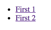
Clicking on the first link should take you to /users/0, which looks like this:
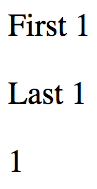
And if you navigate to a user that doesn't exist, /users/2, here's what you'll see:
The reason that you see this error message instead of a 500 error is because the API endpoint knows how to deal with missing resources:
if (user === undefined) {
  reject(`User ${id} not found`);
}
This results in the UserContainer setting its error state:
fetchUser(Number(id)).then(
  user => {
    this.data = this.data.merge(user, { error: null });
  },
  error => {
    this.data = this.data.merge({
      error,
      first: null,
      last: null,
      age: null
    });
  }
);
This then results in the User component rendering the error message:
const Error = ({ error }) =>
  Map([[null, null]]).get(
    error,
    <p>
      <strong>{error}</strong>
    </p>
  );

const User = ({ error, first, last, age }) => (
  <section>
    <Error error={error} />
    ...
  </section>
);
Sometimes, you need optional URL path values and query parameters. URLs work best for simple options, and query parameters work best if there are many values that the component can use.
Let's implement a user list component that renders a list of users. Optionally, you want to be able to sort the list in descending order. Let's make this an optional path segment in the route definition for this page:
import React from 'react';
import { render } from 'react-dom';
import { BrowserRouter as Router, Route } from 'react-router-dom';

import UsersContainer from './UsersContainer';

render(
  <Router>
    <Route path="/users/:desc?" component={UsersContainer} />
  </Router>,
  document.getElementById('root')
);
The: syntax marks a variable which the ? suffix marks the variable as optional. This means that the user can provide anything they want after /users/. This also means that the component needs to make sure that the string desc is provided, and that everything else is ignored.
It's also up to the component to handle any query strings provided to it. So while the route declaration doesn't provide any mechanism to define accepted query strings, the router will still pass the raw query string to the component. Let's take a look at the user list container component now:
import React, { Component } from 'react';
import PropTypes from 'prop-types';
import { fromJS } from 'immutable';

import Users from './Users';
import { fetchUsers } from './api';

export default class UsersContainer extends Component {
  // The "users" state is an empty immutable list
  // by default.
  state = {
    data: fromJS({
      users: []
    })
  };

  // Getter for "Immutable.js" state data...
  get data() {
    return this.state.data;
  }

  // Setter for "Immutable.js" state data...
  set data(data) {
    this.setState({ data });
  }

  componentDidMount() {
    // The URL and query string data we need...
    const { match: { params }, location: { search } } = this.props;

    // If the "params.desc" value is "desc", it means that
    // "desc" is a URL segment. If "search.desc" is true, it
    // means "desc" was provided as a query parameter.
    const desc =
      params.desc === 'desc' ||
      !!new URLSearchParams(search).get('desc');

    // Tell the "fetchUsers()" API to sort in descending
    // order if the "desc" value is true.
    fetchUsers(desc).then(users => {
      this.data = this.data.set('users', users);
    });
  }

  render() {
    return <Users {...this.data.toJS()} />;
  }
}

UsersContainer.propTypes = {
  params: PropTypes.object.isRequired,
  location: PropTypes.object.isRequired
};
In the componentDidMount() method, this component looks for either params.desc or search.desc. It uses this as an argument to the fetchUsers() API, to determine the sort order.
Here's what the Users component looks like:
import React from 'react';
import PropTypes from 'prop-types';

// Renders a list of users...
const Users = ({ users }) => (
  <ul>{users.map(i => <li key={i}>{i}</li>)}</ul>
);

Users.propTypes = {
  users: PropTypes.array.isRequired
};

export default Users;
Here's what's rendered when you navigate to /users:
And if you include the descending parameter by navigating to /users/desc, here's what we get:
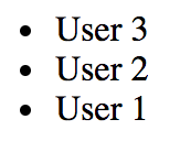
In this section, you'll learn how to create links. You might be tempted to use the standard <a> elements to link to pages controlled by react-router. The problem with this approach is that these links will try to locate the page on the backend by sending a GET request. This isn't what you want, because the route configuration is already in the browser.
First, you'll see an example that illustrates how <Link> elements are just like <a> elements in most ways. Then, you'll see how to build links that use URL parameters and query parameters.
The idea with links in React apps is that they point to routes that point to components that render new content. The Link component also takes care of the browser history API and looking up route/component mappings. Here's an application component that renders two links:
import React from 'react';
import {
  BrowserRouter as Router,
  Route,
  Link
} from 'react-router-dom';

import First from './First';
import Second from './Second';

const App = () => (
  <Router>
    <section>
      <nav>
        <p>
          <Link to="first">First</Link>
        </p>
        <p>
          <Link to="second">Second</Link>
        </p>
      </nav>
      <section>
        <Route path="/first" component={First} />
        <Route path="/second" component={Second} />
      </section>
    </section>
  </Router>
);

export default App;
The to property specifies the route to activate when clicked. In this case, the application has two routes—/first and /second. Here is what the rendered links look like:
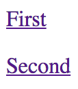
When you click the first link, the page content changes to look like this:

Constructing the dynamic segments of a path that is passed to <Link> involves string manipulation. Everything that's part of the path goes in the to property. This means that you have to write more code to construct the string, but it also means less behind-the-scenes magic happening in the router.
Let's create a simple component that will echo back whatever is passed to the echo URL segment or the echo query parameter:
import React from 'react';
import { withRouter } from 'react-router';

// Simple component that expects either an "echo"
// URL segment parameter, or an "echo" query parameter.
export default withRouter(
  ({ match: { params }, location: { search } }) => (
    <h1>{params.msg || new URLSearchParams(search).get('msg')}</h1>
  )
);
The withRouter() utility function is a higher-order function that returns a new component. This new component will have router-related properties passed to it, which you need if you want to work with path segment variables or the query string. The two properties used by your Echo component are match.params for the URL path variables and location.search for the query string.
Now, let's take a look at the App component that renders two links. The first will build a string that uses a dynamic value as a URL parameter. The second will use URLSearchParams to build the query string portion of the URL:
import React from 'react';
import PropTypes from 'prop-types';
import { Link } from 'react-router-dom';

const App = ({ children }) => <section>{children}</section>;

App.propTypes = {
  children: PropTypes.node.isRequired
};

// Link parameter and query data...
const param = 'From Param';
const query = new URLSearchParams({ msg: 'From Query' });

App.defaultProps = {
  children: (
    <section>
      {/* This "<Link>" uses a paramter as part of
           the "to" property. */}
      <p>
        <Link to={`echo/${param}`}>Echo param</Link>
      </p>

      {/* This "<Link>" uses the "query" property
           to add query parameters to the link URL. */}
      <p>
        <Link to={`echo?${query.toString()}`} query={query}>
          Echo query
        </Link>
      </p>
    </section>
  )
};

export default App;
Here's what the two links look like when they're rendered:

The param link takes you to /echo/From Param, which looks like this:

The query link takes you to /echo?echo=From+Query, which looks like this:

In this chapter, you learned about routing in React applications. The job of a router is to render content that corresponds to a URL. The react-router package is the standard tool for the job.
You learned how routes are JSX elements, just like the components they render. Sometimes, you need to split routes into feature-based modules. A common pattern for structuring page content is to have a parent component that renders the dynamic parts as the URL changes.
You learned how to handle the dynamic parts of URL segments and query strings. You also learned how to build links throughout your application using the <Link> element.
In the next chapter, you'll learn how to render React components in Node.js.
Refer to the following links for more information:
Everything that you've learned so far in this book has been React code that runs in web browsers. React isn't confined to the browser for rendering, and in this chapter, you'll learn how to render components from a Node.js server.
The first section of this chapter briefly touches upon high-level server rendering concepts. The next four sections go into depth, teaching you how to implement the most crucial aspects of server-side rendering with React and Next.js.
Another term for server-side rendering is isomorphic JavaScript. This is a fancy way of saying JavaScript code that can run in the browser and in Node.js without modification. In this section, you'll learn the basic concepts of isomorphic JavaScript before diving into code.
The beauty of React is that it's a small abstraction layer that sits on top of a rendering target. So far, the target has been the browser, but it can also be the server. The render target can be anything, just as long as the correct translation calls are implemented behind the scenes.
In the case of rendering on the server, components are rendered to strings. The server can't actually display rendered HTML; all it can do is send the rendered markup to the browser. The idea is illustrated in the following diagram:
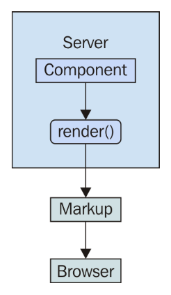
It's possible to render a React component on the server and send the rendered output to the browser. The question is, why would you want to do this on the server instead of in the browser?
The main motivation behind server-side rendering, for me personally, is improved performance. In particular, the initial rendering just feels faster for the user and this translates to an overall better user experience. It doesn't matter how fast your application is once it's loaded and ready to go; it's the initial load time that leaves a lasting impression on your users.
There are three reasons that this approach means better performance for the initial load:
The following diagram illustrates these performance ideas:
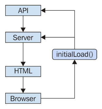
There's a good chance that your application will need to talk to API endpoints that are out of your control, for example, an application that is composed from many different microservice endpoints. It's rare that you can use data from these services without modification. Rather, you have to write code that transforms data so that it's usable by your React components.
If you're rendering your components on a Node.js server, then this data transformation code will be used by both the client and the server, because on the initial load, the server will need to talk to the API, and later on, the component in the browser will need to talk to the API.
It's not just about transforming the data that's returned from these services either. For example, you have to think about providing input to them as well, like when creating or modifying resources.
The fundamental adjustment that you'll need to make as a React programmer is to assume that any given component that you implement will need to be rendered on the server. This may seem like a minor adjustment, but the devil is in the detail. Speaking of which, let's jump into some code examples now.
Rendering components in Node.js means rendering to strings, instead of trying to figure out the best way to insert them into the DOM. The string content is then returned to the browser, which displays this to the user immediately. Let's look at an example. First, the component to render:
import React from 'react';
import PropTypes from 'prop-types';

const App = ({ items }) => (
  <ul>{items.map(i => <li key={i}>{i}</li>)}</ul>
);

App.propTypes = {
  items: PropTypes.arrayOf(PropTypes.string).isRequired
};

export default App;
Next, let's implement the server that will render this component when the browser asks for it:
import React from 'react';

// The "renderToString()" function is like "render()",
// except it returns a rendered HTML string instead of
// manipulating the DOM.
import { renderToString } from 'react-dom/server';
import express from 'express';

// The component that we're going to render as a string.
import App from './App';

// The "doc()" function takes the rendered "content"
// of a React component and inserts it into an
// HTML document skeleton.
const doc = content =>
  `
  <!doctype html>
  <html>
    <head>
      <title>Rendering to strings</title>
    </head>
    <body>
      <div id="app">${content}</div>
    </body>
  </html>
  `;

const app = express();

// The root URL of the APP, returns the rendered
// React component.
app.get('/', (req, res) => {
  // Some properties to render...
  const props = {
    items: ['One', 'Two', 'Three']
  };

  // Render the "App" component using
  // "renderToString()"
  const rendered = renderToString(<App {...props} />);

  // Use the "doc()" function to build the final
  // HTML that is sent to the browser.
  res.send(doc(rendered));
});

app.listen(8080, () => {
  console.log('Listening on 127.0.0.1:8080');
});
Now if you visit http://127.0.0.1:8080 in your browser, you'll see the rendered component content:
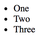
There are two things to pay attention to with this example. First, there's the doc() function. This creates the basic HTML document template with a placeholder for rendered React content. The second is the call to renderToString() , which is just like the render() call that you're used to. This is called in the server request handler and the rendered string is sent to the browser.
In the preceding example, you implemented a single request handler in the server that responded to requests for the root URL (/). Your application is going to need to handle more than a single route. You learned how to use the react-router package for routing in the previous chapter. Now, you're going to see how to use the same package in Node.js.
First, let's take a look at the main App component:
import React from 'react';
import { Route, Link } from 'react-router-dom';

import FirstHeader from './first/FirstHeader';
import FirstContent from './first/FirstContent';
import SecondHeader from './second/SecondHeader';
import SecondContent from './second/SecondContent';

export default () => (
  <section>
    <header>
      <Route exact path="/" render={() => <h1>App</h1>} />
      <Route exact path="/first" component={FirstHeader} />
      <Route exact path="/second" component={SecondHeader} />
    </header>
    <main>
      <Route
        exact
        path="/"
        render={() => (
          <ul>
            <li>
              <Link to="first">First</Link>
            </li>
            <li>
              <Link to="second">Second</Link>
            </li>
          </ul>
        )}
      />
      <Route exact path="/first" component={FirstContent} />
      <Route exact path="/second" component={SecondContent} />
    </main>
  </section>
);
There are three routes that this application handles:
The App content is divided into <header> and <main> elements. In each of these sections, there is a <Route> component that handles the appropriate content. For example, the main content for the / route is handled by a render() function that renders links to /first and /second.
This component will work fine on the client, but will it work on the server? Let's implement that now:
import React from 'react';
import { renderToString } from 'react-dom/server';
import { StaticRouter } from 'react-router';
import express from 'express';

import App from './App';

const app = express();

app.get('/*', (req, res) => {
  const context = {};
  const html = renderToString(
    <StaticRouter location={req.url} context={context}>
      <App />
    </StaticRouter>
  );

  if (context.url) {
    res.writeHead(301, {
      Location: context.url
    });
    res.end();
  } else {
    res.write(`
      <!doctype html>
      <div id="app">${html}</div>
    `);
    res.end();
  }
});

app.listen(8080, () => {
  console.log('Listening on 127.0.0.1:8080');
});
You now have both frontend and backend routing! How does this work exactly? Let's start with the request handler path. This has changed this so that it's now a wildcard (/*). Now this handler is called for every request.
On the server, the <StaticRouter> component is used instead of the <BrowserRouter> component. The <App> component is the child, which means that the <Route> components within will be passed data from <StaticRouter>. This is how <App> knows to render the correct content based on the URL. The resulting html value that results from calling renderToString() can then be used as part of the document that's sent to the browser as a response.
Now your application is starting to look like a real end-to-end React rendering solution. This is what the server renders if you hit the root URL /:
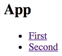
If you hit the /second URL, the Node.js server will render the correct component:
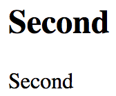
If you navigate from the main page to the first page, the request goes back to the server. We need to figure out how to get the frontend code to the browser so that it can take over after the initial render.
The only thing that was missing from the last example was the client JavaScript code. The user wants to use the application and the server needs to deliver the client code bundle. How would this work? Routing has to work in the browser and on the server, without modification to the routes. In other words, the server handles routing in the initial request, then the browser takes over as the user starts clicking things and moving around in the application.
Let's create the index.js module for this example:
import React from 'react';
import { hydrate } from 'react-dom';

import App from './App';

hydrate(<App />, document.getElementById('root'));
This looks like most other index.js files that you've seen so far in this book. You render the <App> component in the root element in the HTML document. In this case, you're using the hydrate() function instead of the render() function. The two functions have the same end result — rendered JSX content in the browser window. The hydrate() function is different because it expects rendered component content to already be in place. This means that it will perform less work, because it will assume that the markup is correct and doesn't need to be updated on the initial render.
Only in development mode will React examine the entire DOM tree of the server-rendered content to make sure that the correct content is displayed. If there's a mismatch between the existing content and the output of the React components, you'll see warnings that show you where these mismatches happened so that you can go fix them.
Here is the App component that your app will render in the browser and on the Node.js server:
import React, { Component } from 'react';

export default class App extends Component {
  state = { clicks: 0 };

  render() {
    return (
      <section>
        <header>
          <h1>Hydrating The Client</h1>
        </header>
        <main>
          <p>Clicks {this.state.clicks}</p>
          <button
            onClick={() =>
              this.setState(state => ({ clicks: state.clicks + 1 }))
            }
          >
            Click Me
          </button>
        </main>
      </section>
    );
  }
}
The component renders a button that, when clicked, will update the clicks state. This state is rendered in a label above the button. When this component is rendered on the server, the default clicks value of 0 is used, and the onClick handler is ignored since it's just rendering static markup. Let's take a look at the server code next:
import fs from 'fs';
import React from 'react';
import { renderToString } from 'react-dom/server';
import express from 'express';

import App from './App';

const app = express();
const doc = fs.readFileSync('./build/index.html');

app.use(express.static('./build', { index: false }));

app.get('/*', (req, res) => {
  const context = {};
  const html = renderToString(<App />);

  if (context.url) {
    res.writeHead(301, {
      Location: context.url
    });
    res.end();
  } else {
    res.write(
      doc
        .toString()
        .replace('<div id="root">', `<div id="root">${html}`)
    );
    res.end();
  }
});

app.listen(8080, () => {
  console.log('Listening on 127.0.0.1:8080');
});
Let's walk through this source and see what's going on:
const doc = fs.readFileSync('./build/index.html');
This reads the index.html file that's created by your React build tool, such as create-react-app/react-scripts, and stores it in doc:
app.use(express.static('./build', { index: false }));
This tells the Express server to serve files under the ./build as static files, except for index.html. Instead, you're going to write a handler that responds to requests for the root of the site:
app.get('/*', (req, res) => {
  const context = {};
  const html = renderToString(<App />);

  if (context.url) {
    res.writeHead(301, {
      Location: context.url
    });
    res.end();
  } else {
    res.write(
      doc
        .toString()
        .replace('<div id="root">', `<div id="root">${html}`)
    );
    res.end();
  }
});
This is where the html constant is populated with rendered React content. Then, it gets interpolated into the HTML string using replace() and is sent as the response. Because you've used the index.html file based on your build, it contains a link to the bundled React app that will run when loaded in the browser.
What if one of your components needs to fetch API data before it can fully render its content? This presents a challenge for rendering on the server because there's no easy way to define a component that knows when to fetch data on the server as well as in the browser.
This is where a minimal framework like Next.js comes into play. Next.js treats server rendering and browser rendering as equals. This means that the headache of fetching data for your components is abstracted—you can use the same code in the browser and on the server.
To handle routing, Next.js uses the concept of pages. A page is a JavaScript module that exports a React component. The rendered content of the component turns into the page content. Here's what the pages directory looks like:
└── pages
    ├── first.js
    ├── index.js
    └── second.js
The index.js module is the root page of the app: Next.js knows this based on the filename. Here's what the source looks like:
import Layout from '../components/MyLayout.js';

export default () => (
  <Layout>
    <p>Fetching component data on the server and on the client...</p>
  </Layout>
);
This page uses a <Layout> component to ensure that common components are rendered without the need to duplicate code. Here's what the page looks like when rendered:
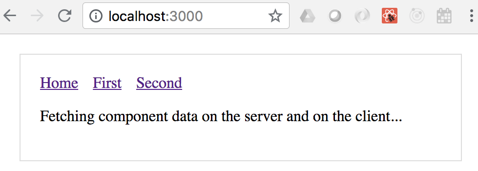
In addition to the paragraph, you have the overall application layout includes the navigation links to other pages. Here's what the Layout source looks like:
import Header from './Header';

const layoutStyle = {
  margin: 20,
  padding: 20,
  border: '1px solid #DDD'
};

const Layout = props => (
  <div style={layoutStyle}>
    <Header />
    {props.children}
  </div>
);

export default Layout;
The Layout component renders a Header component, and props.children. The children prop is the value that you pass to the Layout component in your pages. Let's take a look at the Header component now:
import Link from 'next/link';

const linkStyle = {
  marginRight: 15
};

const Header = () => (
  <div>
    <Link href="/">
      <a style={linkStyle}>Home</a>
    </Link>
    <Link href="/first">
      <a style={linkStyle}>First</a>
    </Link>
    <Link href="/second">
      <a style={linkStyle}>Second</a>
    </Link>
  </div>
);

export default Header;
The Link component used here comes from Next.js. This is so that the links work as expected with the routing that Next.js sets up automatically. Now let's look at a page that has data fetching requirements - pages/first.js:
import fetch from 'isomorphic-unfetch';
import Layout from '../components/MyLayout.js';
import { fetchFirstItems } from '../api';

const First = ({ items }) => (
  <Layout>{items.map(i => <li key={i}>{i}</li>)}</Layout>
);

First.getInitialProps = async () => {
  const res = await fetchFirstItems();
  const items = await res.json();

  return { items };
};

export default First;
The fetch() function that's used to fetch data comes from the isomorphic-unfetch package. This version of fetch() works on the server and in the browser—there's no need for you to check anything. Once again, the Layout component is used to wrap the page content for consistency with other pages.
The getInitialProps() function is how Next.js fetches data—in the browser and on the server. This is an async function, meaning that you can take as long as you need to fetch data for the component properties, and Next.js will make sure not to render any markup until the data is ready. Let's take a look at the fetchFirstItems() API function:
export default () =>
  new Promise(resolve =>
    setTimeout(() => {
      resolve({
        json: () => Promise.resolve(['One', 'Two', 'Three'])
      });
    }, 1000)
  );
This function is mimicking API behavior by returning a promise that's resolved after 1 second with data for the component. If you navigate to /first, you'll see the following after 1 second:
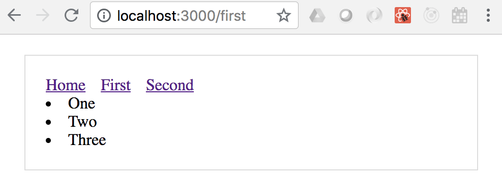
By clicking on the first link, you caused the getInitialProps() function to be called in the browser since the app has already been delivered. If you reload the page while at /first, you'll trigger getInitialProps() to be called on the server since this is the page that Next.js is handling on the server.
In this chapter, you learned that React can be rendered on the server, in addition to the client. There are a number of reasons for doing this, such as sharing common code between the frontend and the backend. The main advantage to server-side rendering is the performance boost that you get on the initial page load. This translates to a better user experience and therefore a better product.
You then progressively improved on a server-side React application, starting with a single page render. Then you were introduced to routing, client-side reconciliation, and component data fetching to produce a complete backend rendering solution using Next.js.
In the following chapter, you'll learn how to implement React Bootstrap components to implement a mobile-first design.
Check out the following links for more information:
In this chapter, you'll learn how to use the react-bootstrap package. This package provides mobile-first React components by leveraging the Bootstrap CSS framework. It's not the only option available for doing mobile-first React, but it's a good choice, and it brings together two of the most popular technologies on the web.
I'll start with the motivation for adopting a mobile-first design strategy. Then you'll spend the rest of this chapter implementing a few react-bootstrap components.
Mobile-first design is a strategy that treats mobile devices as the primary target for user interfaces. Larger screens, such as laptops or big monitors, are secondary targets. This doesn't necessarily mean that the majority of users are accessing your app on their phones. It simply means that mobile is the starting point for scaling the user interface geometrically.
For example, when mobile browsers first appeared it was customary to design the UI for normal desktop screens, and then to scale down to smaller screens when necessary. The approach is illustrated here:
The idea here is that you design the UI with larger screens in mind so that you can fit as much functionality as possible onto the screen at once. When smaller devices are used, your code has to either use a different layout or different components on the fly.
This is very limiting for a number of reasons. First, it's very difficult to maintain code that has lots of special-case handling for different screen resolutions. Second, and the more compelling argument against this approach, is that it's next to impossible to provide a similar user experience across devices. If large screens have a ton of functionality displayed all at once, you simply cannot replicate this on smaller screens. Not only is there less real estate, but the processing power and network bandwidth of smaller devices are limiting factors as well.
The mobile-first approach to UI design tackles these issues by scaling the UI up, instead of trying to scale it down, as shown here:
This approach never used to make sense because you would be limiting the capabilities of your application; there weren't many tablets or phones around. This is not the case today, where the expectation is that users can interact with applications on their mobile devices without any issues. There are a lot more of them now, and mobile browsers are quite capable of handling anything you throw at them.
Once you've implemented your application functionality in a mobile context, scaling it up to larger screen sizes is a relatively easy problem to solve. Now, let's take a look at how to approach mobile-first in React applications.
While it's possible to implement mobile-first React user interfaces by rolling your own CSS, I would recommend against doing this. There are a number of CSS libraries that handle the seemingly endless edge cases for you. In this section, I'll introduce the react-bootstrap package—React components for Bootstrap.
The react-bootstrap package exposes a number of components that serve as a thin abstraction layer between your application and Bootstrap HTML/CSS.
Let's implement some examples now. Another reason I'm showing you how to work with react-bootstrap components is that they're similar to react-native components, which you'll learn about starting in the next chapter.
The most important aspect of a mobile-first design is the navigation. It's especially difficult to get this right on mobile devices because there's barely enough room for feature content, let alone tools to move from feature to feature. Thankfully, Bootstrap handles much of the difficulty for you.
In this section, you'll learn how to implement two types of navigation. You'll start with toolbar navigation, and then you'll build a sidebar navigation section. This makes up part of the UI skeleton that you'll start with. What I find really useful about this approach is that, once the navigation mechanisms are in place, it's easy to add new pages and to move around in the app as I build it.
Let's start with the Navbar. This is a component found in most applications and is statically positioned at the top of the screen. Within this bar, you'll add some navigation links. Here's what the JSX for this looks like:
{/* The "NavBar" is statically-placed across the
   top of every page. It contains things like the
   title of the application, and menu items. */}
<Navbar className="navbar-top" fluid>
  <Navbar.Header>
    <Navbar.Brand>
      <Link to="/">Mobile-First React</Link>
    </Navbar.Brand>

    {/* The "<Navbar.Taggle>" coponent is used to replace any
       navigation links with a drop-down menu for smaller
       screens. */}
    <Navbar.Toggle />
  </Navbar.Header>

  {/* The actual menu with links to makes. It's wrapped
     in the "<Navbar.Collapse>"" component so that it
     work properly when the links have been collapsed. */}
  <Navbar.Collapse>
    <Nav pullRight>
      <IndexLinkContainer to="/">
        <MenuItem>Home</MenuItem>
      </IndexLinkContainer>
      <LinkContainer to="forms">
        <MenuItem>Forms</MenuItem>
      </LinkContainer>
      <LinkContainer to="lists">
        <MenuItem>Lists</MenuItem>
      </LinkContainer>
    </Nav>
  </Navbar.Collapse>
</Navbar>
Here's what the navigation bar looks like:

The <Navbar.Header> component defines the title of the application and is placed to the left of the navigation bar. The links themselves are placed in the <Nav> element and the pullRight property aligns them to the right side of the navigation bar. You can see that, instead of using <Link> from the react-router package, you're using <LinkContainer> and <IndexLinkContainer>. These components come from the react-router-bootstrap package. They're necessary to make Bootstrap links work properly with the router.
The <Nav> element is wrapped in a <Navbar.Collapse> element and the header contains a <Navbar.Toggle> button. These components are necessary to collapse the links into a drop-down menu for smaller screens. Since it's based on the browser's width, you can just resize your browser window to see it in action:
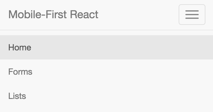
The links that were displayed are now collapsed into a standard menu button. When this button is clicked, the same links are displayed in a vertical fashion. This works much better on smaller devices. But with larger screens, having all navigation displayed in the top navigation bar might not be ideal. The standard approach is to implement a left-hand sidebar with navigation links stacked vertically. Let's implement this now:
{/* This navigation menu has the same links
   as the top navbar. The difference is that
   this navigation is a sidebar. It's completely
   hidden on smaller screens. */}
<Col sm={3} md={2} className="sidebar">
  <Nav stacked>
    <IndexLinkContainer to="/">
      <NavItem>Home</NavItem>
    </IndexLinkContainer>
    <LinkContainer to="forms">
      <NavItem>Forms</NavItem>
    </LinkContainer>
    <LinkContainer to="lists">
      <NavItem>Lists</NavItem>
    </LinkContainer>
  </Nav>
</Col>
The <Col> element is the container for the <Nav> and you've added your own class name to it. You'll see why in a moment. Inside the <Nav> element, things look exactly the same as they do in the navigation toolbar, with link containers and menu items. Here's what the sidebar looks like:
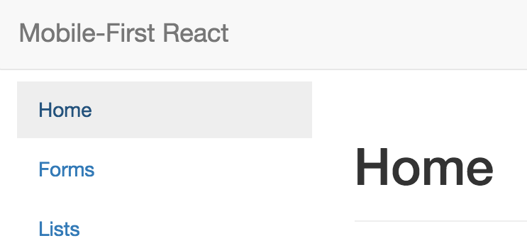
Now, the reason that we needed to add that custom sidebar class name to the containing element was so that we can hide it completely on smaller devices. Let's take a look at the CSS involved:
.sidebar {
  display: none;
}

@media (min-width: 768px) {
  .sidebar {
    display: block;
    position: fixed;
    top: 60px;
  }
}
This CSS, along with the overall structure of this example, is adapted from this Bootstrap example: http://getbootstrap.com/examples/dashboard/. The idea behind this media query is that if the minimum browser width is 768px, then show the sidebar in a fixed position. Otherwise, hide it completely because we're on a smaller screen.
At this point, you have two navigation components collaborating with one another to change how they're displayed based on the screen resolution.
A common UI element in both mobile and desktop contexts is rendering lists of items. This is easy enough to do without the support of a CSS library, but libraries help keep the look and feel consistent. Let's implement a list that's controlled by a set of filters. First, you have the component that renders the react-bootstrap components:
import React from 'react';
import PropTypes from 'prop-types';

import {
  Button,
  ButtonGroup,
  ListGroupItem,
  ListGroup,
  Glyphicon
} from 'react-bootstrap';

import './FilteredList.css';

// Utility function to get the bootstrap style
// for an item, based on the "done" value.
const itemStyle = done => (done ? { bsStyle: 'success' } : {});

// Utility component for rendering a bootstrap
// icon based on the value of "done".
const ItemIcon = ({ done }) =>
  done ? <Glyphicon glyph="ok" className="item-done" /> : null;

// Renders a list of items, and a set of filter
// controls to change what's displayed in the
// list.
const FilteredList = props => (
  <section>
    {/* Three buttons that control what's displayed
         in the list below. Clicking one of these
         buttons will toggle the state of the others. */}
    <ButtonGroup className="filters">
      <Button active={props.todoFilter} onClick={props.todoClick}>
        Todo
      </Button>
      <Button active={props.doneFilter} onClick={props.doneClick}>
        Done
      </Button>
      <Button active={props.allFilter} onClick={props.allClick}>
        All
      </Button>
    </ButtonGroup>

    {/* Renders the list of items. It passes the
         "props.filter()" function to "items.filter()".
         When the buttons above are clicked, the "filter"
         function is changed. */}
    <ListGroup>
      {props.items.filter(props.filter).map(i => (
        <ListGroupItem
          key={i.name}
          onClick={props.itemClick(i)}
          href="#"
          {...itemStyle(i.done)}
        >
          {i.name}
          <ItemIcon done={i.done} />
        </ListGroupItem>
      ))}
    </ListGroup>
  </section>
);

FilteredList.propTypes = {
  todoFilter: PropTypes.bool.isRequired,
  doneFilter: PropTypes.bool.isRequired,
  allFilter: PropTypes.bool.isRequired,
  todoClick: PropTypes.func.isRequired,
  doneClick: PropTypes.func.isRequired,
  allClick: PropTypes.func.isRequired,
  itemClick: PropTypes.func.isRequired,
  filter: PropTypes.func.isRequired,
  items: PropTypes.array.isRequired
};

export default FilteredList;
First, you have the <ButtonGroup> and the <Button> elements. These are the filters that the user can apply to the list. By default, only todo items are displayed. But, they can choose to filter by done items, or to show all items.
The list itself is a <ListGroup> element with <ListGroupItem> elements as children. The item renders differently, depending on the done state of the item. The end result looks like this:
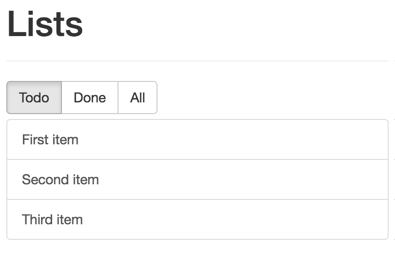
You can toggle the done state of a list item simply by clicking on the Done button. What's nice about the way this component works is that if you're viewing todo items and mark one as done, it's taken off the list because it no longer meets the current filter criteria. The filter is re-evaluated because the component is re-rendered. Here's what an item that's marked as done looks like:
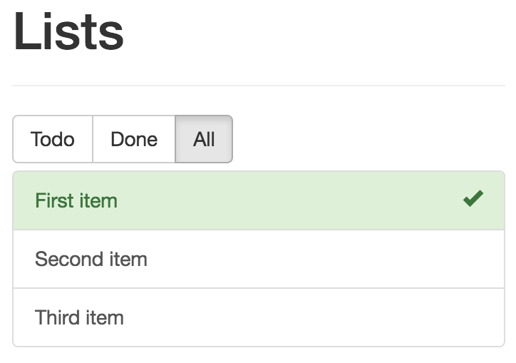
Now let's take a look at the container component that handles the state of the filter buttons and the item list:
import React, { Component } from 'react';
import { fromJS } from 'immutable';

import FilteredList from './FilteredList';

class FilteredListContainer extends Component {
  // Controls the state of the the filter buttons
  // as well as the state of the function that
  // filters the item list.
  state = {
    data: fromJS({
      // The items...
      items: [
        { name: 'First item', done: false },
        { name: 'Second item', done: false },
        { name: 'Third item', done: false }
      ],

      // The filter button states...
      todoFilter: true,
      doneFilter: false,
      allFilter: false,

      // The default filter...
      filter: i => !i.done,

      // The "todo" filter button was clicked.
      todoClick: () => {
        this.data = this.data.merge({
          todoFilter: true,
          doneFilter: false,
          allFilter: false,
          filter: i => !i.done
        });
      },

      // The "done" filter button was clicked.
      doneClick: () => {
        this.data = this.data.merge({
          todoFilter: false,
          doneFilter: true,
          allFilter: false,
          filter: i => i.done
        });
      },

      // The "all" filter button was clicked.
      allClick: () => {
        this.data = this.data.merge({
          todoFilter: false,
          doneFilter: false,
          allFilter: true,
          filter: () => true
        });
      },

      // When the item is clicked, toggle it's
      // "done" state.
      itemClick: item => e => {
        e.preventDefault();

        this.data = this.data.update('items', items =>
          items.update(
            items.findIndex(i => i.get('name') === item.name),
            i => i.update('done', done => !done)
          )
        );
      }
    })
  };

  // Getter for "Immutable.js" state data...
  get data() {
    return this.state.data;
  }

  // Setter for "Immutable.js" state data...
  set data(data) {
    this.setState({ data });
  }

  render() {
    return <FilteredList {...this.state.data.toJS()} />;
  }
}

export default FilteredListContainer;
This component has four pieces of state and four event handler functions. Three pieces of state do nothing more than track which filter button is selected. The filter state is the callback function that's used by <FilteredList> to filter the items. The tactic is to pass a different filter function to the child view, based on the filter selection.
In this final section of the chapter, you'll implement some form components from react-bootstrap. Just like the filter buttons you created in the preceding section, form components have state that needs to be passed down from a container component.
However, even simple form controls have many moving parts. First, you'll learn about text inputs. There's the input itself, but there's also the label, the placeholder, the error text, the validation function, and so on. To help glue all these pieces together, let's create a generic component that encapsulates all of the Bootstrap parts:
import React from 'react';
import PropTypes from 'prop-types';
import {
  FormGroup,
  FormControl,
  ControlLabel,
  HelpBlock
} from 'react-bootstrap';

// A generic input element that encapsulates several
// of the react-bootstrap components that are necessary
// for event simple scenarios.
const Input = ({
  type,
  label,
  value,
  placeholder,
  onChange,
  validationState,
  validationText
}) => (
  <FormGroup validationState={validationState}>
    <ControlLabel>{label}</ControlLabel>
    <FormControl
      type={type}
      value={value}
      placeholder={placeholder}
      onChange={onChange}
    />
    <FormControl.Feedback />
    <HelpBlock>{validationText}</HelpBlock>
  </FormGroup>
);

Input.propTypes = {
  type: PropTypes.string.isRequired,
  label: PropTypes.string,
  value: PropTypes.any,
  placeholder: PropTypes.string,
  onChange: PropTypes.func,
  validationState: PropTypes.oneOf([
    undefined,
    'success',
    'warning',
    'error'
  ]),
  validationText: PropTypes.string
};

export default Input;
There are two key advantages to this approach. One is that, instead of having to use <FormGroup>, <FormControl>, <HelpBlock>, and so on, you just need your <Input> element. Another advantage is that only the type property is required, meaning that <Input> can be used for simple and complex controls.
Let's see this component in action now:
import React from 'react';
import PropTypes from 'prop-types';
import { Panel } from 'react-bootstrap';

import Input from './Input';

const InputsForm = props => (
  <Panel header={<h3>Inputs</h3>}>
    <form>
      {/* Uses the <Input> element to render
           a simple name field. There's a lot of
           properties passed here, many of them
           come from the container component. */}
      <Input
        type="text"
        label="Name"
        placeholder="First and last..."
        value={props.nameValue}
        onChange={props.nameChange}
        validationState={props.nameValidationState}
        validationText={props.nameValidationText}
      />

      {/* Uses the "<Input>" element to render a
           password input. */}
      <Input
        type="password"
        label="Password"
        value={props.passwordValue}
        onChange={props.passwordChange}
      />
    </form>
  </Panel>
);

InputsForm.propTypes = {
  nameValue: PropTypes.any,
  nameChange: PropTypes.func,
  nameValidationState: PropTypes.oneOf([
    undefined,
    'success',
    'warning',
    'error'
  ]),
  nameValidationText: PropTypes.string,
  passwordValue: PropTypes.any,
  passwordChange: PropTypes.func
};

export default InputsForm;
There's only one component used to create all of the necessary Bootstrap pieces underneath. Everything is passed in through a property. Here's what this form looks like:
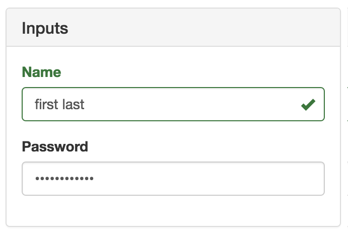
Now let's look at the container component that controls the state of these inputs:
import React, { Component } from 'react';
import { fromJS } from 'immutable';

import InputsForm from './InputsForm';

// Validates the given "name". It should have a space,
// and it should have more than 3 characters. There are
// many scenarios not accounted for here, but are easy
// to add.
function validateName(name) {
  if (name.search(/ /) === -1) {
    return 'First and last name, separated with a space';
  } else if (name.length < 4) {
    return 'Less than 4 characters? Srsly?';
  }

  return null;
}

class InputsFormContainer extends Component {
  state = {
    data: fromJS({
      // "Name" value and change handler.
      nameValue: '',
      // When the name changes, we use "validateName()"
      // to set "nameValidationState" and
      // "nameValidationText".
      nameChange: e => {
        this.data = this.data.merge({
          nameValue: e.target.value,
          nameValidationState:
            validateName(e.target.value) === null
              ? 'success'
              : 'error',
          nameValidationText: validateName(e.target.value)
        });
      },
      // "Password" value and change handler.
      passwordValue: '',
      passwordChange: e => {
        this.data = this.data.set('passwordValue', e.target.value);
      }
    })
  };

  // Getter for "Immutable.js" state data...
  get data() {
    return this.state.data;
  }

  // Setter for "Immutable.js" state data...
  set data(data) {
    this.setState({ data });
  }

  render() {
    return <InputsForm {...this.data.toJS()} />;
  }
}

export default InputsFormContainer;
The event handlers for the inputs are part of the state that get passed to InputsForm as properties. Now let's take a look at some checkboxes and radio buttons. You'll use the <Radio> and the <Checkbox> react-bootstrap components:
import React from 'react';
import PropTypes from 'prop-types';
import { Panel, Radio, Checkbox, FormGroup } from 'react-bootstrap';

const RadioForm = props => (
  <Panel header={<h3>Radios & Checkboxes</h3>}>
    {/* Renders a group of related radio buttons. Note
         that each radio needs to hae the same "name"
         property, otherwise, the user will be able to
         select multiple radios in the same group. The
         "checked", "disabled", and "onChange" properties
         all come from the container component. */}
    <FormGroup>
      <Radio
        name="radio"
        onChange={props.checkboxEnabledChange}
        checked={props.checkboxEnabled}
        disabled={!props.radiosEnabled}
      >
        Checkbox enabled
      </Radio>
      <Radio
        name="radio"
        onChange={props.checkboxDisabledChange}
        checked={!props.checkboxEnabled}
        disabled={!props.radiosEnabled}
      >
        Checkbox disabled
      </Radio>
    </FormGroup>

    {/* Reanders a checkbox and uses the same approach
         as the radios above: setting it's properties from
         state that's passed in from the container. */}
    <FormGroup>
      <Checkbox
        onChange={props.checkboxChange}
        checked={props.radiosEnabled}
        disabled={!props.checkboxEnabled}
      >
        Radios enabled
      </Checkbox>
    </FormGroup>
  </Panel>
);

RadioForm.propTypes = {
  checkboxEnabled: PropTypes.bool.isRequired,
  radiosEnabled: PropTypes.bool.isRequired,
  checkboxEnabledChange: PropTypes.func.isRequired,
  checkboxDisabledChange: PropTypes.func.isRequired,
  checkboxChange: PropTypes.func.isRequired
};

export default RadioForm;
The radio buttons toggle the enabled state of the checkbox and the checkbox toggles the enabled state of the radios. Note that, although the two <Radio> elements are in the same <FormGroup>, they need to have the same name property value. Otherwise, you'll be able to select both radios at the same time. Here's what this form looks like:
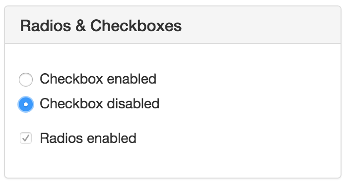
Finally, let's look at the container component that handles the state of the radios and the checkbox:
import React, { Component } from 'react';
import { fromJS } from 'immutable';

import RadioForm from './RadioForm';

class RadioFormContainer extends Component {
  // Controls the enabled state of a group of
  // radio buttons and a checkbox. The radios
  // toggle the state of the checkbox while the
  // checkbox toggles the state of the radios.
  state = {
    data: fromJS({
      checkboxEnabled: false,
      radiosEnabled: true,
      checkboxEnabledChange: () => {
        this.data = this.data.set('checkboxEnabled', true);
      },
      checkboxDisabledChange: () => {
        this.data = this.data.set('checkboxEnabled', false);
      },
      checkboxChange: () => {
        this.data = this.data.update(
          'radiosEnabled',
          enabled => !enabled
        );
      }
    })
  };

  // Getter for "Immutable.js" state data...
  get data() {
    return this.state.data;
  }

  // Setter for "Immutable.js" state data...
  set data(data) {
    this.setState({ data });
  }

  render() {
    return <RadioForm {...this.data.toJS()} />;
  }
}

export default RadioFormContainer;
This chapter introduced you to the concept of mobile-first design. You had a brief overview of why you might want to use the mobile-first strategy. It boils down to the fact that scaling mobile designs up to larger devices is much easier than scaling in the opposite direction.
Next, you learned what this means in the context of a React application. In particular, you want to use a framework such as Bootstrap that handles the scaling details for us. You then implemented several examples using components from the react-bootstrap package.
This concludes the first part of this book. You're now ready to tackle React projects that live on the web, including mobile browsers! Mobile browsers are getting better, but they're no match for the native capabilities of mobile platforms. Part 2 of this book teaches you how to use React Native.
For more information you can check out the following links:
Facebook created React Native to build its mobile applications. The motivation to do so originated from the fact that React for the web was so successful. If React is such a good tool for UI development, and you need a native application, then why fight it? Just make React work with native mobile OS UI elements!
In this chapter, you'll learn about the motivations for using React Native to build native mobile web applications.
Earlier in this book, I introduced the notion of a render target—the thing that React components render to. The render target is abstract as far as the React programmer is concerned. For example, in React, the render target can be a string or it could be the DOM. This is why your components never directly interface with the render target, because you can never make assumptions about where the rendering is taking place.
A mobile platform has UI widget libraries that developers can leverage to build apps for that platform. On Android, developers implement Java apps, while on iOS, developers implement Swift apps. If you want a functional mobile app, you're going to have to pick one. However, you'll need to learn both languages, as supporting only one of two major platforms isn't realistic for success.
For React developers, this isn't a problem. The same React components that you build work all over the place, even on mobile browsers! Having to learn two more programming languages to build and ship a mobile application is cost and time prohibitive. The solution to this is to introduce a new React that supports a new render target—native mobile UI widgets.
React Native uses a technique that makes asynchronous calls to the underlying mobile OS, which calls the native widget APIs. There's a JavaScript engine, and the React API is mostly the same as React for the web. The difference is with the target; instead of a DOM, there are asynchronous API calls. The concept is visualized here:
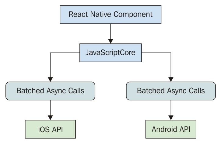
This oversimplifies everything that's happening under the covers, but the basic ideas are as follows:
Implementing a new render target for React is not straightforward. It's essentially the same thing as inventing a new DOM that runs on iOS and Android. So why go through all the trouble?
First, there's a huge demand for mobile apps. The reason is that the mobile web browser user experience isn't as good as the native app experience. Second, JSX is a fantastic tool for building user interfaces. Rather than having to learn a new technology, it's much easier to use what you know.
It's the latter point that's the most relevant to you. If you're reading this book, you're probably interested in using React for both web applications and native mobile applications. I can't put into words how valuable React is from a development resource perspective. Instead of having a team that does web UIs, a team that does iOS, a team that does Android, and so on, there's just the UI team that understands React.
Mobile browsers lack many capabilities of mobile applications. This is due to the fact that browsers cannot replicate the same native platform widgets as HTML elements. You can try to do this, but it's often better to just use the native widget, rather than try to replicate it. Partly because this requires less maintenance effort on your part, and partly because using widgets that are native to the platform means that they're consistent with the rest of the platform. For example, if a date picker in your application looks different from all the date pickers the user interacts with on their phone, this isn't a good thing. Familiarity is key, and using native platform widgets makes familiarity possible.
User interactions on mobile devices are fundamentally different from the interactions that you typically design for the web. Web applications assume the presence of a mouse, for example, and that the click event on a button is just one phase. But, things become more complicated when the user uses their fingers to interact with the screen. Mobile platforms have what's called a gesture system to deal with these. React Native is a much better candidate for handling gestures than React for the web, because it handles these types of things that you don't have to think about much in a web app.
As the mobile platform is updated, you want the components of your app to stay updated too. This isn't a problem with React Native because they're using actual components from the platform. Once again, consistency and familiarity are important for a good user experience. So, when the buttons in your app look and behave in exactly the same way as the buttons in every other app on the device, your app feels like part of the device.
When I first heard about React Native, I automatically thought that it would be some cross-platform solution that lets you write a single React application that will run natively on any device. Do yourself a favor and get out of this mindset before you start working with React Native. iOS and Android are different on many fundamental levels. Even their user experience philosophies are different, so trying to write a single app that runs on both platforms is categorically misguided.
Besides, this is not the goal of React Native. The goal is React components everywhere, not write once, run anywhere. In some cases, you'll want your app to take advantage of an iOS-specific widget or an Android-specific widget. This provides a better user experience for that particular platform and should trump the portability of a component library.
There are several areas that overlap between iOS and Android where the differences are trivial. The two widgets aim to accomplish the same thing for the user, in roughly the same way. In these cases, React Native will handle the difference for you and provide a unified component.
In the previous chapter, you learned how to implement mobile-first React components. Not every one of your users is going to be willing to install an app, especially if you don't yet have a high download count and rating. The barrier to entry is much lower with web applications—the user only needs a browser.
Despite not being able to replicate everything that native platform UIs have to offer, you can still implement awesome things in a mobile web UI. Maybe having a good web UI is the first step toward getting those download counts and ratings up for your mobile app.
Ideally, what you should aim for is the following:
Putting an equal amount of effort into all three of these spaces probably doesn't make much sense, as your users probably favor one area over another. Once you know, for example, that there's a really high demand for your mobile app compared to the web versions, that's when you allocate more effort there.
In this chapter, you learned that React Native is an effort by Facebook to reuse React to create native mobile applications. React and JSX are really good at declaring UI components, and since there's now a huge demand for mobile applications, it makes sense to use what you already know for the Web.
The reason there's such a demand for mobile applications over mobile browsers is that they just feel better. Web applications lack the ability to handle mobile gestures the same way apps can, and they generally don't feel like part of the mobile experience from a look and feel perspective.
React Native isn't trying to implement a component library that lets you build a single React app that runs on any mobile platform. iOS and Android are fundamentally different in many important ways. Where there's overlap, React Native does try to implement common components. Will you do away with mobile web apps now that we can build natively using React? This will probably never happen, because the user can only install so many apps.
Now that you know what React Native is and what its strengths are, you'll learn how to get started with new React Native projects in the following chapter.
Visit the following links for more information:
In this chapter, you'll get up and running with React Native. Thankfully, much of the boilerplate involved with the creation of a new project is handled for you by the create-react-native-app command-line tool. I'll explain what's actually created for you when you initialize an empty project. Then, I'll show you how to run the project on iOS and on Android simulators.
The preferred tool for creating React Native projects is create-react-native-app. This command-line tool was created by the React Native developer community and follows in the footsteps of the create-react-app tool. The goal of both create-react-app and create-react-native-app is to enable developers to hit the ground running with their projects. You should be able to issue a command that generates all of the boilerplate that's necessary for running your React or React Native app.
Without this type of tool, you end up spending an unnecessarily large amount of time configuring various aspects of your projects. First and foremost, developers want to build applications. You can get fancy with configuration and optimization later on.
You'll want to install create-react-native-app globally because this tool isn't specific to any one project that you're working on—it gets the project started for you. Here's how you can do this:
npm install -g create-react-native-app
Once the installation is complete, you'll have a new create-react-native-app command available within your terminal. You can use this command to kickstart your new React Native project.
Using create-react-native-app to start a new React Native project involves calling the create-react-native-app command, and passing in the name of the app as an argument. For example:
create-react-native-app my-project
This will result in the creation of a my-project directory. This is where you'll have all of the boilerplate code and other files that create-react-native-app takes care of creating for you. This is also where you'll find the node_modules directory where all of your dependencies are installed.
When you run this command, you'll see output that looks like this:
Creating a new React Native app in Chapter13/my-project.
Using package manager as npm with npm interface.
Installing packages. This might take a couple minutes.
Installing react-native-scripts...
+ react-native-scripts@1.14.0
added 442 packages from 477 contributors and audited 1178 packages in 19.128s
Installing dependencies using npm...
Success! Created my-project at Chapter13/my-project
Inside that directory, you can run several commands:
  npm start
    Starts the development server so you can open your app in the Expo
    app on your phone.
  npm run ios
    (Mac only, requires Xcode)
    Starts the development server and loads your app in an iOS simulator.
  npm run android
    (Requires Android build tools)
    Starts the development server and loads your app on a connected Android
    device or emulator.
  npm test
    Starts the test runner.
  npm run eject
    Removes this tool and copies build dependencies, configuration files
    and scripts into the app directory. If you do this, you can’t go back!
We suggest that you begin by typing:
  cd my-project
  npm start
Happy hacking!
The output shows you what it's doing as it installs dependencies for you, and the commands that are ready for you to run right away. At this point, you're ready to launch your app.
When you use create-react-native-app to bootstrap your React Native project, several commands are added to your package.json file. These are listed as part of the command output (refer to the previous section to see what this output looks like). The most common command that you'll use is start:
npm start
This command will start the packager process. This process will build native UI components as you update their source. It doesn't perform a native build for the actual target platform, as this would be too expensive performance-wise. Instead, it will efficiently build your app for use with a variety of simulators for development:
Here's what the output of npm start looks like:
Starting packager...
Packager started!
Your app is now running at URL: exp://192.168.86.21:19000
View your app with live reloading:
  Android device:
    -> Point the Expo app to the QR code above.
       (You'll find the QR scanner on the Projects tab of the app.)
  iOS device:
    -> Press s to email/text the app URL to your phone.
  Emulator:
    -> Press a (Android) or i (iOS) to start an emulator.
Your phone will need to be on the same local network as this computer.
For links to install the Expo app, please visit https://expo.io.
Logs from serving your app will appear here. Press Ctrl+C at any time to stop.
 › Press a to open Android device or emulator, or i to open iOS emulator.
 › Press s to send the app URL to your phone number or email address
 › Press q to display QR code.
 › Press r to restart packager, or R to restart packager and clear cache.
 › Press d to toggle development mode. (current mode: development)
There are number of options for you to simulate your native application. By default, you're in development mode—you'll likely stay in development mode. Not pictured in the preceding output, the output also includes a QR code that you can scan with the Expo mobile app.
The Expo mobile app is a tool that you can use to assist with React Native development. The npm start command launches the React Native package, which integrates seamlessly with Expo (provided the device is on the same network as the packager). This enables you to view and interact with your application on real mobile devices during development. It even supports live reloading as you make changes to your source.
Expo is set apart from the mobile device emulators in that it enables you to experience the application the same way your users will experience it. Virtual device emulators give you a rough approximation, but it isn't the same thing as holding a device in your hand. Furthermore, not everyone has a Macbook, which is a requirement for simulating iOS devices.
You can find the Expo app by searching the Play Store on Android devices or the App Store on iOS devices:

When you launch Expo, you'll see an option to scan a QR code:

When you select Scan QR Code, your phones camera can scan the QR code that's printed in your terminal. This is how you connect the React Native packager running on your computer with your device. If you can't scan the QR code, you can open the app in Expo by emailing the Expo link to your phone. Clicking on it from your phone is the same thing as scanning the QR code.
Here's what the my-project app should look like when opened in Expo:
Let's take a look at the App.js module that was created by create-react-native-app for you:
import React from 'react';
import { StyleSheet, Text, View } from 'react-native';

export default class App extends React.Component {
  render() {
    return (
      <View style={styles.container}>
        <Text>Open up App.js to start working on your app!</Text>
        <Text>Changes you make will automatically reload.</Text>
        <Text>Shake your phone to open the developer menu.</Text>
      </View>
    );
  }
}

const styles = StyleSheet.create({
  container: {
    flex: 1,
    backgroundColor: '#fff',
    alignItems: 'center',
    justifyContent: 'center'
  }
});
This App component will render three lines of text on the screen, with some styles applied to the View component. Let's make a change to the first line to make the text bold:
import React from 'react';
import { StyleSheet, Text, View } from 'react-native';

export default class App extends React.Component {
  render() {
    return (
      <View style={styles.container}>
        <Text style={styles.bold}>
          Open up App.js to start working on your app!
        </Text>
        <Text>Changes you make will automatically reload.</Text>
        <Text>Shake your phone to open the developer menu.</Text>
      </View>
    );
  }
}

const styles = StyleSheet.create({
  container: {
    flex: 1,
    backgroundColor: '#fff',
    alignItems: 'center',
    justifyContent: 'center'
  },
  bold: {
    fontWeight: 'bold'
  }
});
There's now a bold style in the styles and this is applied to the style property of the first Text component. If you look at your phone again, you'll notice that the application is updated:
The change is immediately reflected in the app on your device.
You don't always have your phone with you, indeed, you don't always need to view your app on a physical mobile device during development. The other option is to use a virtual device emulator that simulates physical mobile devices. The React Native packager communicates with simulators the same way that it communicates with the Expo app to support live reloading.
After you start the React Native packager, you can start the iOS simulator by pressing "i". You'll see output that looks like this:
2:06:04 p.m.: Starting iOS...
2:06:22 p.m.: Finished building JavaScript bundle in 1873ms
2:06:23 p.m.: Running app on Adam in development mode
You'll then see a new window open with the emulated device running your app:
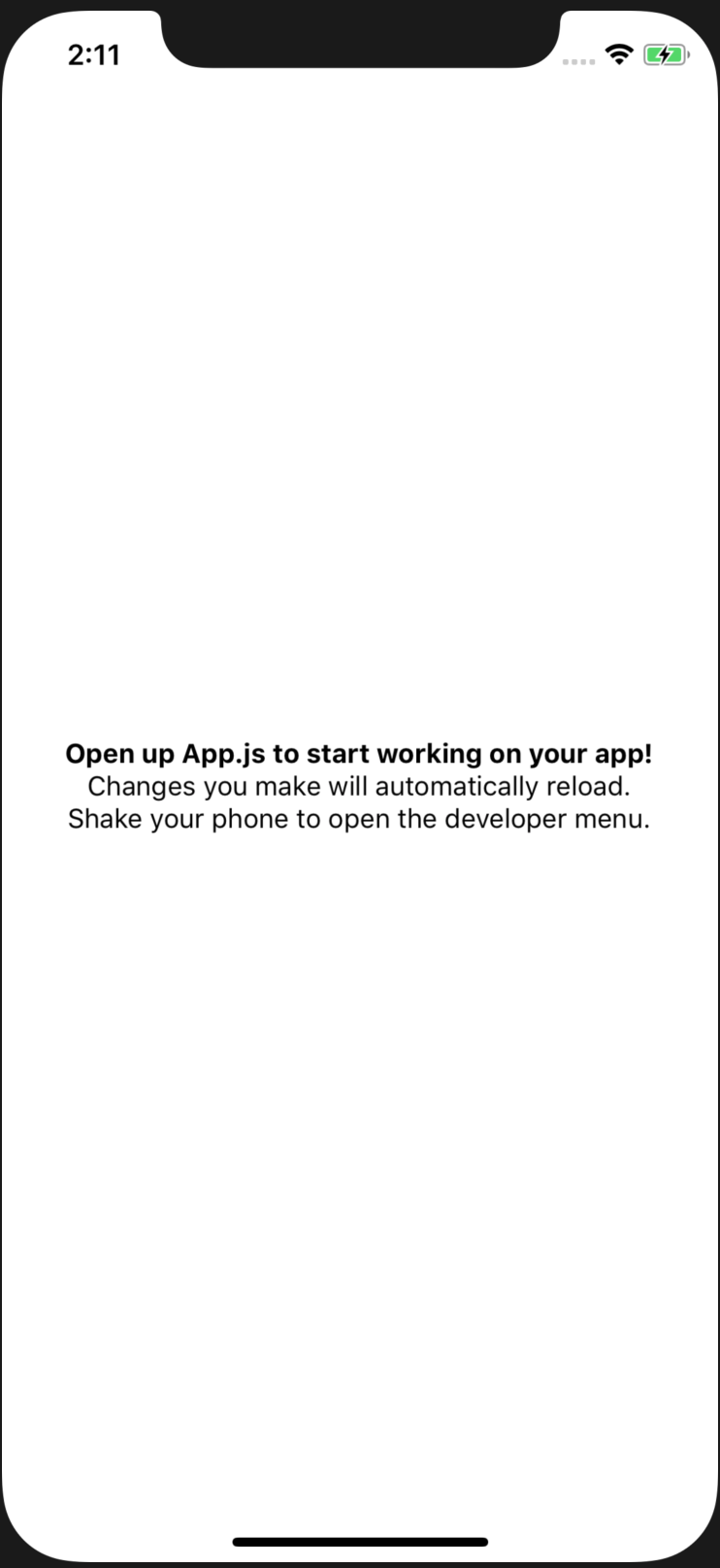
Live updates to the source of your app work the same way as with the Expo app. Changes are automatically reflected in the simulator as they're made.
Android simulators are launched in the same way as the iOS simulators. In the terminal where the React Native packager is running, press "A". However, there's a caveat - you have to start the Android device emulator before starting the app within the React Native package. If you don't, you'll see a message that looks like this when you press "A":
2:37:02 p.m.: Starting Android...
Error running adb: No Android device found.
This has been historically difficult to do with Android. Getting Android device emulators up and running is much simpler now, with the help of Android Studio. Once you have Android Studio installed, you can open the Android Virtual Device manager and add any device you like:
You can click on the Create Virtual Device button to create a new device:
Once you've created the device that you want to test your React Native app on, you can click the green play button. This will start the emulator:

If you go back to the terminal where the React Native packager is running and press "a", you should see the following output:
2:49:07 p.m.: Starting Android...
2:49:08 p.m.: Finished building JavaScript bundle in 17ms
2:49:10 p.m.: Running app on Android SDK built for x86 in development mode
And if you go back to your Android emulator, your React Native app should be up and running:
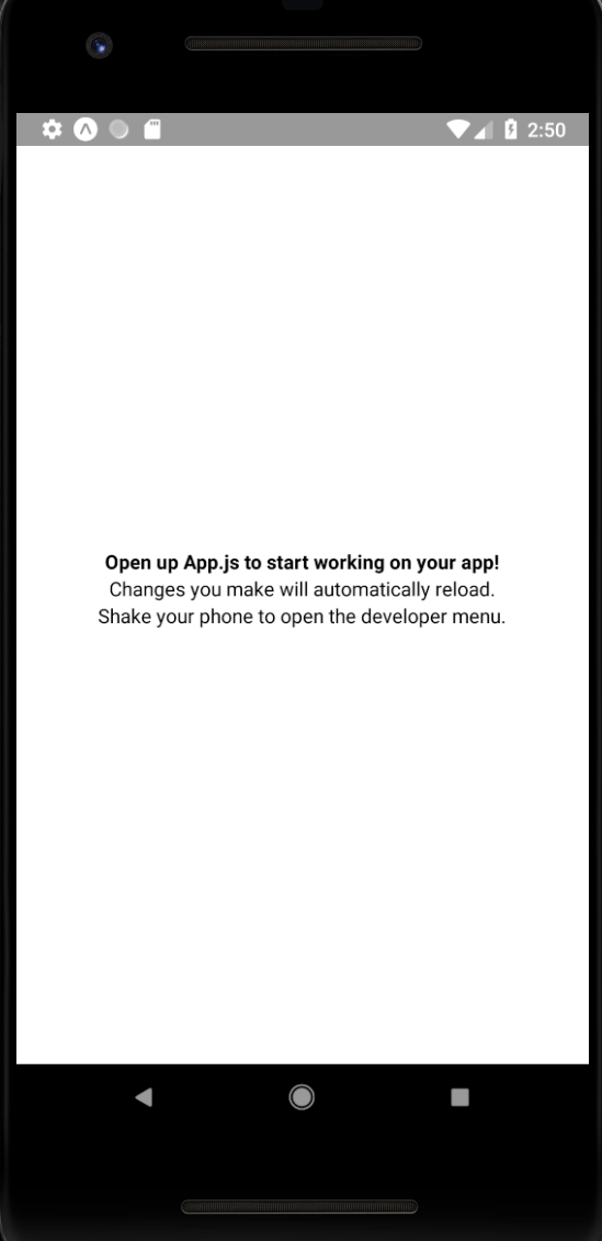
Like the Expo app and the iOS simulators, this simulator will live reload as the source of your application changes, thanks to the React Native packager.
In this chapter, you learned how to kickstart your React using the create-react-native-app tool. You learned how to install the tool on your system and make the create-react-native-app command available for any React Native projects that you create. Then, you used the command to start a basic project. Next, you started the React Native packager process within your project.
You learned how to install the Expo app on your mobile device and how to connect it with the React Native packager. You then made a code change to demonstrate how live reloading works. Lastly, you saw how to launch iOS and Android simulators using the React Native packager.
In the next chapter, you'll learn how to build flexible layouts in React Native apps.
Check out the following links to learn more:
In this chapter, you'll get a feel for what it's like to lay out components on the screen of mobile devices. Thankfully, React Native polyfills many CSS properties that you might have used in the past to implement page layouts in web applications. You'll learn how to use the flexbox model to layout our React Native screens.
Before you dive into implementing layouts, you'll get a brief primer on flexbox and using CSS style properties in React Native apps—it's not quite what you're used to with regular CSS stylesheets. Then, you'll implement several React Native layouts using flexbox.
Before the flexible box layout model was introduced to CSS, the various approaches used to build layouts felt hacky and were prone to errors. Flexbox fixes this by abstracting many of the properties that you would normally have to provide in order to make the layout work.
In essence, the flexbox is exactly what it sounds like—a box model that's flexible. That's the beauty of flexbox—its simplicity. You have a box that acts as a container, and you have child elements within that box. Both the container and the child elements are flexible in how they're rendered on the screen, as illustrated here:
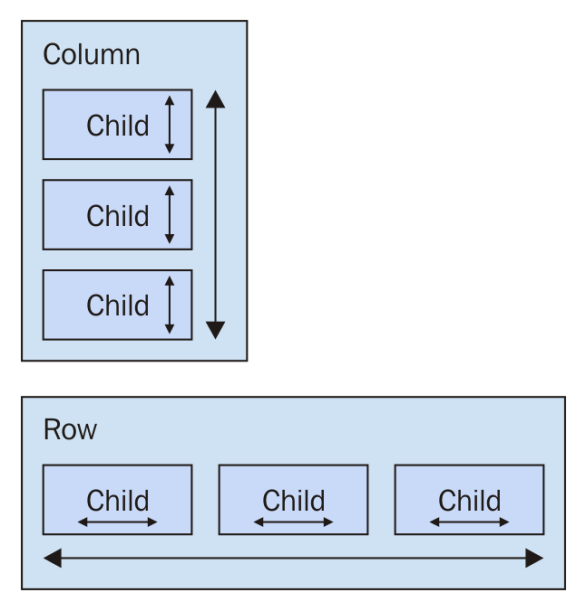
Flexbox containers have a direction, either column (up/down) or row (left/right). This actually confused me when I was first learning flexbox: my brain refused to believe that rows move from left to right. Rows stack on top of one another! The key thing to remember is that it's the direction that the box flexes, not the direction that boxes are placed on the screen.
It's time to implement your first React Native app, beyond the boilerplate that's generated by create-react-native-app. I want to make sure that you feel comfortable using React Native stylesheets before you start implementing flexbox layouts in the next section. Here's what a React Native stylesheet looks like:
import { Platform, StyleSheet, StatusBar } from 'react-native';

// Exports a "stylesheet" that can be used
// by React Native components. The structure is
// familiar for CSS authors.
const styles = StyleSheet.create({
  container: {
    flex: 1,
    justifyContent: 'center',
    alignItems: 'center',
    backgroundColor: 'ghostwhite',
    ...Platform.select({
      ios: { paddingTop: 20 },
      android: { paddingTop: StatusBar.currentHeight }
    })
  },

  box: {
    width: 100,
    height: 100,
    justifyContent: 'center',
    alignItems: 'center',
    backgroundColor: 'lightgray'
  },

  boxText: {
    color: 'darkslategray',
    fontWeight: 'bold'
  }
});

export default styles;
This is a JavaScript module, not a CSS module. If you want to declare React Native styles, you need to use plain objects. Then, you call StyleSheet.create() and export this from the style module.
As you can see, this stylesheet has three styles: container, box, and boxText. Within the container style, there's a call to Platform.select():
...Platform.select({
  ios: { paddingTop: 20 },
  android: { paddingTop: StatusBar.currentHeight }
})
This function will return different styles based on the platform of the mobile device. Here, you're handling the top padding of the top-level container view. You'll probably use this code in most of your apps to make sure that your React components don't render underneath the status bar of the device. Depending on the platform, the padding will require different values. If it's iOS, paddingTop is 20. If it's Android, paddingTop will be the value of StatusBar.currentHeight.
Let's see how these styles are imported and applied to React Native components:
import React from 'react';
import { Text, View } from 'react-native';

// Imports the "styles" stylesheet from the
// "styles" module.
import styles from './styles';

// Renders a view with a square in the middle, and
// some text in the middle of that. The "style" property
// is passed a value from the "styles" stylesheet.
export default () => (
  <View style={styles.container}>
    <View style={styles.box}>
      <Text style={styles.boxText}>I'm in a box</Text>
    </View>
  </View>
);
The styles are assigned to each component via the style property. You're trying to render a box with some text in the middle of the screen. Let's make sure that this looks as we expect:

Perfect! Now that you have an idea of how to set styles on React Native elements, it's time to start creating some screen layouts.
In this section, you'll learn about several potential layouts that you can use in your React Native applications. I want to stay away from the idea that one layout is better than others. Instead, I'll show you how powerful the flexbox layout model is for mobile screens so that you can design the layout that best suits your application.
To start things off, let's implement a simple layout with three sections that flex in the direction of the column (top to bottom). Let's start by taking a look at the resulting screen:
The idea with this example is that you've styled and labeled the three screen sections so that they stand out. In other words, these components wouldn't necessarily have any styling in a real application since they're used to arrange other components on the screen.
Let's take a look at the components used to create this screen layout:
import React from 'react';
import { Text, View } from 'react-native';

import styles from './styles';

// Renders three "column" sections. The "container"
// view is styled so that it's children flow from
// the top of the screen, to the bottom of the screen.
export default () => (
  <View style={styles.container}>
    <View style={styles.box}>
      <Text style={styles.boxText}>#1</Text>
    </View>
    <View style={styles.box}>
      <Text style={styles.boxText}>#2</Text>
    </View>
    <View style={styles.box}>
      <Text style={styles.boxText}>#3</Text>
    </View>
  </View>
);
The container view (the outermost <View> component) is the column and the child views are the rows. The <Text> component is used to label each row. In terms of HTML elements, <View> is similar to a <div> while <Text> is similar to a <p>.
Now let's take a look at the styles used to create this layout:
import { Platform, StyleSheet, StatusBar } from 'react-native';

// Exports a "stylesheet" that can be used
// by React Native components. The structure is
// familiar for CSS authors.
export default StyleSheet.create({
  // The "container" for the whole screen.
  container: {
    // Enables the flexbox layout model...
    flex: 1,
    // Tells the flexbox to render children from
    // top to bottom...
    flexDirection: 'column',
    // Aligns children to the center on the container...
    alignItems: 'center',
    // Defines the spacing relative to other children...
    justifyContent: 'space-around',
    backgroundColor: 'ghostwhite',
    ...Platform.select({
      ios: { paddingTop: 20 },
      android: { paddingTop: StatusBar.currentHeight }
    })
  },

  box: {
    width: 300,
    height: 100,
    justifyContent: 'center',
    alignItems: 'center',
    backgroundColor: 'lightgray',
    borderWidth: 1,
    borderStyle: 'dashed',
    borderColor: 'darkslategray'
  },

  boxText: {
    color: 'darkslategray',
    fontWeight: 'bold'
  }
});
The flex and flexDirection properties of container enable the layout of the rows to flow from top to bottom. The alignItems and justifyContent properties align the child elements to the center of the container and add space around them, respectively.
Let's see how this layout looks when you rotate the device from a portrait orientation to a landscape orientation:

The flexbox automatically figured out how to preserve the layout for you. However, you can improve on this a little bit. For example, the landscape orientation has a lot of wasted space to the left and right now. You could create your own abstraction for the boxes that you're rendering.
There are a few things that I think you can improve upon from the last example. Let's fix the styles so that the children of the flexbox stretch to take advantage of the available space. Remember in the last example, when you rotated the device from portrait to landscape orientation? There was a lot of wasted space. It would be nice to have the components automatically adjust themselves. Here's what the new styles module looks like:
import { Platform, StyleSheet, StatusBar } from 'react-native';

const styles = StyleSheet.create({
  container: {
    flex: 1,
    flexDirection: 'column',
    backgroundColor: 'ghostwhite',
    alignItems: 'center',
    justifyContent: 'space-around',
    ...Platform.select({
      ios: { paddingTop: 20 },
      android: { paddingTop: StatusBar.currentHeight }
    })
  },

  box: {
    height: 100,
    justifyContent: 'center',
    // Instead of given the flexbox child a width, we
    // tell it to "stretch" to fill all available space.
    alignSelf: 'stretch',
    alignItems: 'center',
    backgroundColor: 'lightgray',
    borderWidth: 1,
    borderStyle: 'dashed',
    borderColor: 'darkslategray'
  },

  boxText: {
    color: 'darkslategray',
    fontWeight: 'bold'
  }
});

export default styles;
The key change here is the alignSelf property. This tells elements with the box style to change their width or height (depending on the flexDirection of their container) to fill space. Also, the box style no longer defines a width property because this will be computed on the fly now. Here's what the sections look like in portrait mode:
Now each section takes the full width of the screen, which is exactly what you want to happen. The issue of wasted space was actually more prevalent in landscape orientation, so let's rotate the device and see what happens to these sections now:

Now your layout is utilizing the entire width of the screen, regardless of orientation. Lastly, let's implement a proper Box component that can be used by App.js instead of having repetitive style properties in place. Here's what the Box component looks like:
import React from 'react';
import { PropTypes } from 'prop-types';
import { View, Text } from 'react-native';

import styles from './styles';

// Exports a React Native component that
// renders a "<View>" with the "box" style
// and a "<Text>" component with the "boxText"
// style.
const Box = ({ children }) => (
  <View style={styles.box}>
    <Text style={styles.boxText}>{children}</Text>
  </View>
);

Box.propTypes = {
  children: PropTypes.node.isRequired
};

export default Box;
You now have the beginnings of a nice layout. Next, you'll learn about flexing in the other direction—left to right.
In this section, you'll learn how to make screen layout sections stretch from top to bottom. To do this, you need a flexible row. Here are what the styles for this screen look like:
import { Platform, StyleSheet, StatusBar } from 'react-native';

const styles = StyleSheet.create({
  container: {
    flex: 1,
    // Tells the child elements to flex from left to
    // right...
    flexDirection: 'row',
    backgroundColor: 'ghostwhite',
    alignItems: 'center',
    justifyContent: 'space-around',
    ...Platform.select({
      ios: { paddingTop: 20 },
      android: { paddingTop: StatusBar.currentHeight }
    })
  },

  box: {
    width: 100,
    justifyContent: 'center',
    alignSelf: 'stretch',
    alignItems: 'center',
    backgroundColor: 'lightgray',
    borderWidth: 1,
    borderStyle: 'dashed',
    borderColor: 'darkslategray'
  },

  boxText: {
    color: 'darkslategray',
    fontWeight: 'bold'
  }
});

export default styles;
Here's the App component, using the same Box component that you implemented in the previous section:
import React from 'react';
import { Text, View, StatusBar } from 'react-native';

import styles from './styles';
import Box from './Box';

// Renders a single row with two boxes that stretch
// from top to bottom.
export default () => (
  <View style={styles.container}>
    <Box>#1</Box>
    <Box>#2</Box>
  </View>
);
Here's what the resulting screen looks like in portrait mode:
The two columns stretch all the way from the top of the screen to the bottom of the screen because of the alignSelf property, which doesn't actually say which direction to stretch in. The two Box components stretch from top to bottom because they're displayed in a flex row. Note how the spacing between these two sections goes from left to right? This is because of the container's flexDirection property, which has a value of row.
Now let's see how this flex direction impacts the layout when the screen is rotated into a landscape orientation:
Since the flexbox has a justifyContent style property value of space-around, space is proportionally added to the left, the right, and in-between the sections.
Sometimes, you need a screen layout that flows like a grid. For example, what if you have several sections that are the same width and height, but you're not sure how many of these sections will be rendered? The flexbox makes it easy to build a row that flows from left to right until the end of the screen is reached. Then, it automatically continues rendering elements from left to right on the next row.
Here's an example layout in portrait mode:
The beauty of this approach is that you don't need to know in advance how many columns are in a given row. The dimensions of each child determine what will fit in a given row. Let's take a look at the styles used to create this layout:
import { Platform, StyleSheet, StatusBar } from 'react-native';

export default StyleSheet.create({
  container: {
    flex: 1,
    flexDirection: 'row',
    flexWrap: 'wrap',
    backgroundColor: 'ghostwhite',
    alignItems: 'center',
    ...Platform.select({
      ios: { paddingTop: 20 },
      android: { paddingTop: StatusBar.currentHeight }
    })
  },

  box: {
    height: 100,
    width: 100,
    justifyContent: 'center',
    alignItems: 'center',
    backgroundColor: 'lightgray',
    borderWidth: 1,
    borderStyle: 'dashed',
    borderColor: 'darkslategray',
    margin: 10
  },

  boxText: {
    color: 'darkslategray',
    fontWeight: 'bold'
  }
});
Here's the App component that renders each section:
import React from 'react';
import { View, StatusBar } from 'react-native';

import styles from './styles';
import Box from './Box';

// An array of 10 numbers, representing the grid
// sections to render.
const boxes = new Array(10).fill(null).map((v, i) => i + 1);

export default () => (
  <View style={styles.container}>
    <StatusBar hidden={false} />
    {/* Renders 10 "<Box>" sections */}
    {boxes.map(i => <Box key={i}>#{i}</Box>)}
  </View>
);
Lastly, let's make sure that the landscape orientation works with this layout:
In this final section of the chapter, you'll learn how to combine rows and columns to create a sophisticated layout for your app. For example, sometimes you need the ability to nest columns within rows or rows within columns. Let's take a look at the App component of an application that nests columns within rows:
import React from 'react';
import { View, StatusBar } from 'react-native';

import styles from './styles';
import Row from './Row';
import Column from './Column';
import Box from './Box';

export default () => (
  <View style={styles.container}>
    <StatusBar hidden={false} />
    {/* This row contains two columns. The first column
        has boxes "#1" and "#2". They will be stacked on
        top of one another. The next column has boxes "#3"
        and "#4", which are also stacked on top of one
        another */}
    <Row>
      <Column>
        <Box>#1</Box>
        <Box>#2</Box>
      </Column>
      <Column>
        <Box>#3</Box>
        <Box>#4</Box>
      </Column>
    </Row>
    <Row>
      <Column>
        <Box>#5</Box>
        <Box>#6</Box>
      </Column>
      <Column>
        <Box>#7</Box>
        <Box>#8</Box>
      </Column>
    </Row>
    <Row>
      <Column>
        <Box>#9</Box>
        <Box>#10</Box>
      </Column>
      <Column>
        <Box>#11</Box>
        <Box>#12</Box>
      </Column>
    </Row>
  </View>
);
You've created abstractions for the layout pieces (<Row> and <Column>) and the content piece (<Box>). Let's see what this screen looks like:
This layout probably looks familiar, because you've done it already in this chapter. The key difference is in how these content sections are ordered. For example, #2 doesn't go to the left of #1, it goes below it. This is because we've placed #1 and #2 in a <Column>. The same with #3 and #4. These two columns are placed in a row. Then the next row begins, and so on.
This is just one of many possible layouts that you can achieve by nesting row flexboxes and column flexboxes. Let's take a look at the Row component now:
import React from 'react';
import PropTypes from 'prop-types';
import { View } from 'react-native';

import styles from './styles';

// Renders a "View" with the "row" style applied to
// it. It's "children" will flow from left to right.
const Row = ({ children }) => (
  <View style={styles.row}>{children}</View>
);

Row.propTypes = {
  children: PropTypes.node.isRequired
};

export default Row;
This component applies the row style to the <View> component. The end result is cleaner JSX markup in the App component when creating a complex layout. Finally, let's look at the Column component:
import React from 'react';
import PropTypes from 'prop-types';
import { View } from 'react-native';

import styles from './styles';

// Renders a "View" with the "column" style applied
// to it. It's children will flow from top-to-bottom.
const Column = ({ children }) => (
  <View style={styles.column}>{children}</View>
);

Column.propTypes = {
  children: PropTypes.node.isRequired
};

export default Column;
This looks just like the Row component, only with a different style applied to it. It also serves the same purpose as Row - to enable simpler JSX markup for layouts in other components.
This chapter introduced you to styles in React Native. Though you can use many of the same CSS style properties that you're used to, the CSS stylesheets used in web applications look very different. Namely, they're composed of plain JavaScript objects.
Then, you learned how to work with the main React Native layout mechanism—the flexbox. This is the preferred way to layout most web applications these days, so it makes sense to be able to reuse this approach in a native app. You created several different layouts, and you saw how they looked in portrait and in landscape orientation.
In the following chapter, you'll start implementing navigation for your app.
Go to the following links for more information:
The focus of this chapter is navigating between the screens that make up your React Native application. Navigation in native apps is slightly different than navigation in web apps—mainly because there isn't any notion of a URL that the user is aware of. In prior versions of React Native, there were primitive navigator components that you could use to control the navigation between screens. There were a number of challenges with these components that resulted in more code to accomplish basic navigation tasks.
More recent versions of React Native encourage you to use the react-navigation package, which will be the focus of this chapter, even though there are several other options. You'll learn navigation basics, passing parameters to screens, changing the header content, using tab and drawer navigation, and handling state with navigation.
Let's start off with the basics of moving from one page to another using react-navigation. Here's what the App component looks like:
import { createStackNavigator } from 'react-navigation';
import Home from './Home';
import Settings from './Settings';

export default createStackNavigator(
  {
    Home,
    Settings
  },
  { initialRouteName: 'Home' }
);
The createStackNavigator() function is all you need to set up your navigation. The first argument to this function is a mapping to the screen components that can be navigated. The second argument is for more general navigation options—in this case, you're telling the navigator that Home should be the default screen component that's rendered.
Here's what the Home component looks like:
import React from 'react';
import { View, Text, Button } from 'react-native';

import styles from './styles';

export default ({ navigation }) => (
  <View style={styles.container}>
    <Text>Home Screen</Text>
    <Button
      title="Settings"
      onPress={() => navigation.navigate('Settings')}
    />
  </View>
);
This is your typical functional React component. You could use a class-based component here, but there's no need since there are no life cycle methods or state. It renders a View component where the container style is applied. This is followed by a Text component that labels the screen followed by a Button component. A screen can be anything you want - it's just a regular React Native component. The navigator component handles the routing and the transitions between screens for you.
The onPress handler for this button navigates to the Settings screen when clicked. This is done by calling navigation.navigate('Settings'). The navigation property is passed to your screen component by react-navigation and contains all of the routing functionality you need. In contrast to working with URLs in React web apps, here you call navigator API functions and pass them the names of screens.
Next, let's take a look at the Settings component:
import React from 'react';
import { View, Text, Button } from 'react-native';

import styles from './styles';

export default ({ navigation }) => (
  <View style={styles.container}>
    <Text>Settings Screen</Text>
    <Button
      title="Home"
      onPress={() => navigation.navigate('Home')}
    />
  </View>
);
This component is just like the Home component, except with different text and when the button is clicked on, you're taken back to the Home screen.
Here's what the home screen looks like:
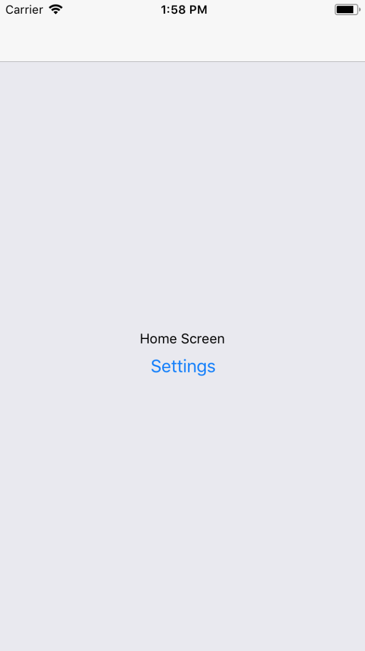
You can click the Settings button and you'll be taken to the Settings screen, which looks like this:
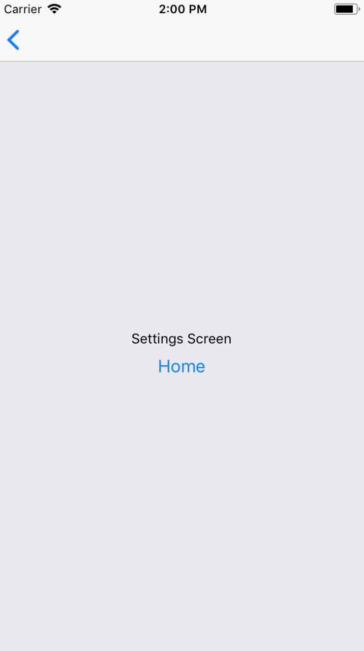
This screen looks almost identical to the Home screen. It has different text and a different button that will take you back to the Home screen when clicked. However, there's another way to get back to the Home screen. Take a look at the top of the screen and you'll notice a white navigation bar. On the left side of the navigation bar, there's a back arrow. This works just like the back button in a web browser and will take you back to the previous screen. What's nice about react-navigation is that it takes care of rendering this navigation bar for you.
If you run this app in Android, you'll see the same back button in the navigation bar. But you can also use the standard back button found outside of the app on most Android devices.
When you develop React web applications, some of your routes have dynamic data in them. For example, you can link to a details page and within that URL, you would have some sort of identifier. The component then has what it needs to render specific detailed information. The same concept exists within react-navigation. Instead of just specifying the name of the screen that you want to navigate to, you can pass along additional data.
Let's take a look at route parameters in action, starting with the App component:
import { createStackNavigator } from 'react-navigation';
import Home from './Home';
import Details from './Details';

export default createStackNavigator(
  {
    Home,
    Details
  },
  { initialRouteName: 'Home' }
);
This looks just like the preceding example, except instead of a Settings page, there's a Details page. This is the page that you want to pass data to dynamically so it can render the appropriate information. First, let's take a look at the Home screen component:
import React from 'react';
import { View, Text, Button } from 'react-native';

import styles from './styles';

export default ({ navigation }) => (
  <View style={styles.container}>
    <Text>Home Screen</Text>
    <Button
      title="First Item"
      onPress={() =>
        navigation.navigate('Details', { title: 'First Item' })
      }
    />
    <Button
      title="Second Item"
      onPress={() =>
        navigation.navigate('Details', { title: 'Second Item' })
      }
    />
    <Button
      title="Third Item"
      onPress={() =>
        navigation.navigate('Details', { title: 'Third Item' })
      }
    />
  </View>
);
The Home screen has three Button components that each navigate to the Details screen. Pay attention to the navigation.navigate() calls. In addition to the screen name, they each have a second argument. These are objects that contain specific data that is passed to the Details screen. Next, let's take a look at the Details screen and see how it consumes these route parameters:
import React from 'react';
import { View, Text, Button } from 'react-native';

import styles from './styles';

export default ({ navigation }) => (
  <View style={styles.container}>
    <Text>{navigation.getParam('title')}</Text>
  </View>
);
Although this example is only passing one parameter—title—you can pass as many parameters to the screen as you need to. You can access these parameters using the navigator.getParam() function to look up the value.
Here's what the home screen looks like when rendered:
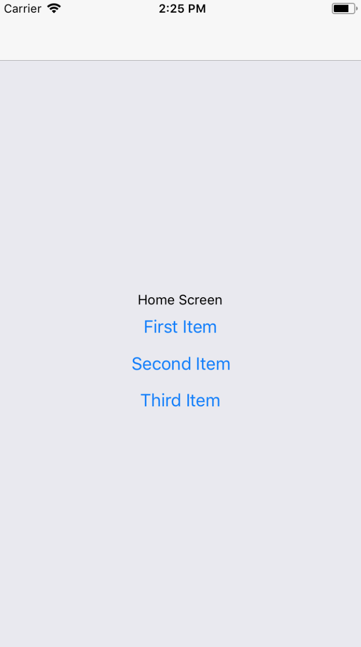
And if you click on the First Item button, you'll be taken to the Details screen that is rendered using route parameter data:
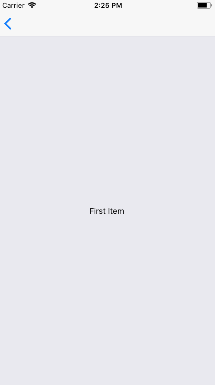
You can click the back button in the navigation bar to get back to the home screen. If you click on any of the other buttons on the Home screen, you'll be taken back to the Details screen with updated data. Route parameters are necessary to avoid having to write duplicate components. You can think of passing parameters to navigator.navigate() as passing props to a React component.
The navigation bars that you've created so far in this chapter have been sort of plain. That's because you haven't configured them to do anything, so react-navigation will just render a plain bar with a back button. Each screen component that you create can configure specific navigation header content.
Let's build on the previous example that used buttons to navigate to a details page. The App component stays the same, so let's take a look at the Home component first:
import React from 'react';
import { View, Button } from 'react-native';

import styles from './styles';

const Home = ({ navigation }) => (
  <View style={styles.container}>
    <Button
      title="First Item"
      onPress={() =>
        navigation.navigate('Details', {
          title: 'First Item',
          content: 'First Item Content',
          stock: 1
        })
      }
    />
    <Button
      title="Second Item"
      onPress={() =>
        navigation.navigate('Details', {
          title: 'Second Item',
          content: 'Second Item Content',
          stock: 0
        })
      }
    />
    <Button
      title="Third Item"
      onPress={() =>
        navigation.navigate('Details', {
          title: 'Third Item',
          content: 'Third Item Content',
          stock: 200
        })
      }
    />
  </View>
);

Home.navigationOptions = {
  title: 'Home'
};

export default Home;
The first thing you'll notice is that each button is passing more route parameters to the Details component: content and stock. You'll see why in a moment. It's the Home.navigationOptions value that configures the navigation header for you. In this case, the Home screen is setting the title.
Next, let's take a look at the Details component:
import React from 'react';
import { View, Text, Button } from 'react-native';

import styles from './styles';

const Details = ({ navigation }) => (
  <View style={styles.container}>
    <Text>{navigation.getParam('content')}</Text>
  </View>
);

Details.navigationOptions = ({ navigation }) => ({
  title: navigation.getParam('title'),
  headerRight: (
    <Button
      title="Buy"
      onPress={() => {}}
      disabled={navigation.getParam('stock') === 0}
    />
  )
});

export default Details;
This time, the Details component renders the content route parameter. Like the Home component, it also has a navigationOptions property. In this case, it's a function instead of an object. This is because you're dynamically changing navigation header content based on the parameters that are passed to the screen. The function is passed a navigation property - this is the same value that's passed to the Details component. You can call navigation.getParam() to get the title to change the navigation header based on a route parameter.
Next, the headerRight option is used to add a Button component to the right side of the navigation bar. This is where the stock parameter comes into play. If this value is 0 because there isn't anything in stock, you want to disable the Buy button.
Let's see how all of this works now, starting with the Home screen:
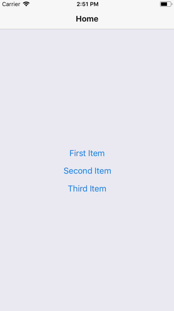
There is how header text in the navigation bar, is set by the Home screen component. Next, try clicking on the First Item button:
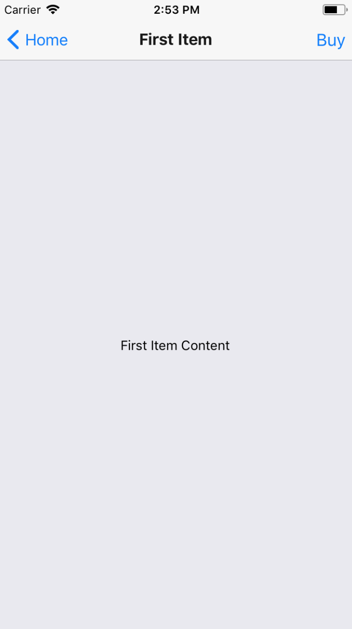
The title in the navigation bar is set based on the title parameter that's passed to the Details component. The Buy button that's rendered on the right side of the navigation bar is rendered by the Details component as well. It's enabled because the stock parameter value is 1. Now try returning to the Home screen and clicking on the Second Item button:
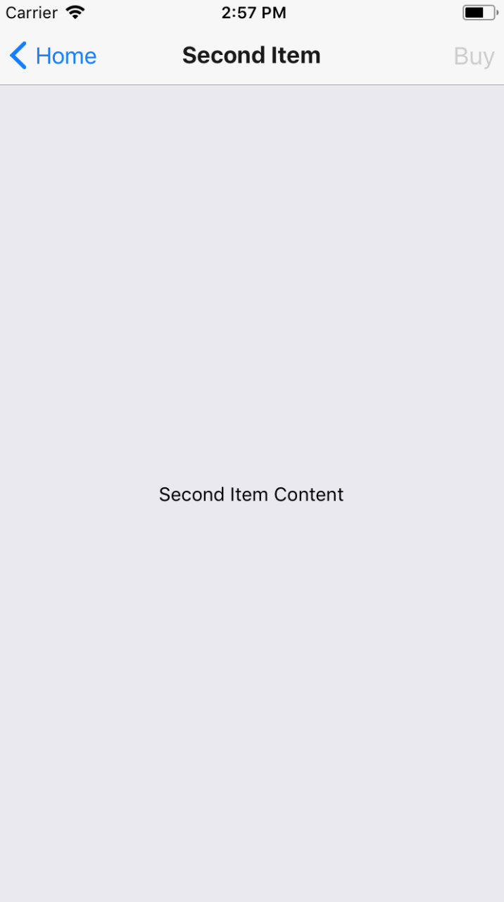
The title and the page content both reflect the new parameter values passed to Details. But so does the Buy button. It is in a disabled state because the stock parameter value was 0, meaning that it can't be bought.
Each example so far in this chapter has used Button components to link to other screens in the app. You can use functions from react-navigation that will create tab or drawer navigation for you automatically based on the screen components that you give it.
Let's create an example that uses bottom tab navigation on iOS and drawer navigation on Android.
import {
  createBottomTabNavigator,
  createDrawerNavigator
} from 'react-navigation';
import { Platform } from 'react-native';
import Home from './Home';
import News from './News';
import Settings from './Settings';

const { createNavigator } = Platform.select({
  ios: { createNavigator: createBottomTabNavigator },
  android: { createNavigator: createDrawerNavigator }
});

export default createNavigator(
  {
    Home,
    News,
    Settings
  },
  { initialRouteName: 'Home' }
);
Instead of using the createStackNavigator() function to create your navigator, you're importing the createBottomTabNavigator() and createDrawerNavigator() functions from react-navigation:
import {
  createBottomTabNavigator,
  createDrawerNavigator
} from 'react-navigation';
Then you're using the Platform utility from react-native to decide which of these two functions to use. The result, depending on the platform, is assigned to createNavigator():
const { createNavigator } = Platform.select({
  ios: { createNavigator: createBottomTabNavigator },
  android: { createNavigator: createDrawerNavigator }
});
Now you can call createNavigator() and pass it to your screens. The resulting tab or drawer navigation will be created and rendered for you:
export default createNavigator(
  {
    Home,
    News,
    Settings
  },
  { initialRouteName: 'Home' }
);
Next, let's take a look at the Home screen component:
import React from 'react';
import { View, Text } from 'react-native';

import styles from './styles';

const Home = ({ navigation }) => (
  <View style={styles.container}>
    <Text>Home Content</Text>
  </View>
);

Home.navigationOptions = {
  title: 'Home'
};

export default Home;
It sets the title in the navigation bar and renders some basic content. The News and Settings components are essentially the same as Home.
Here's what the bottom tab navigation looks like on iOS:
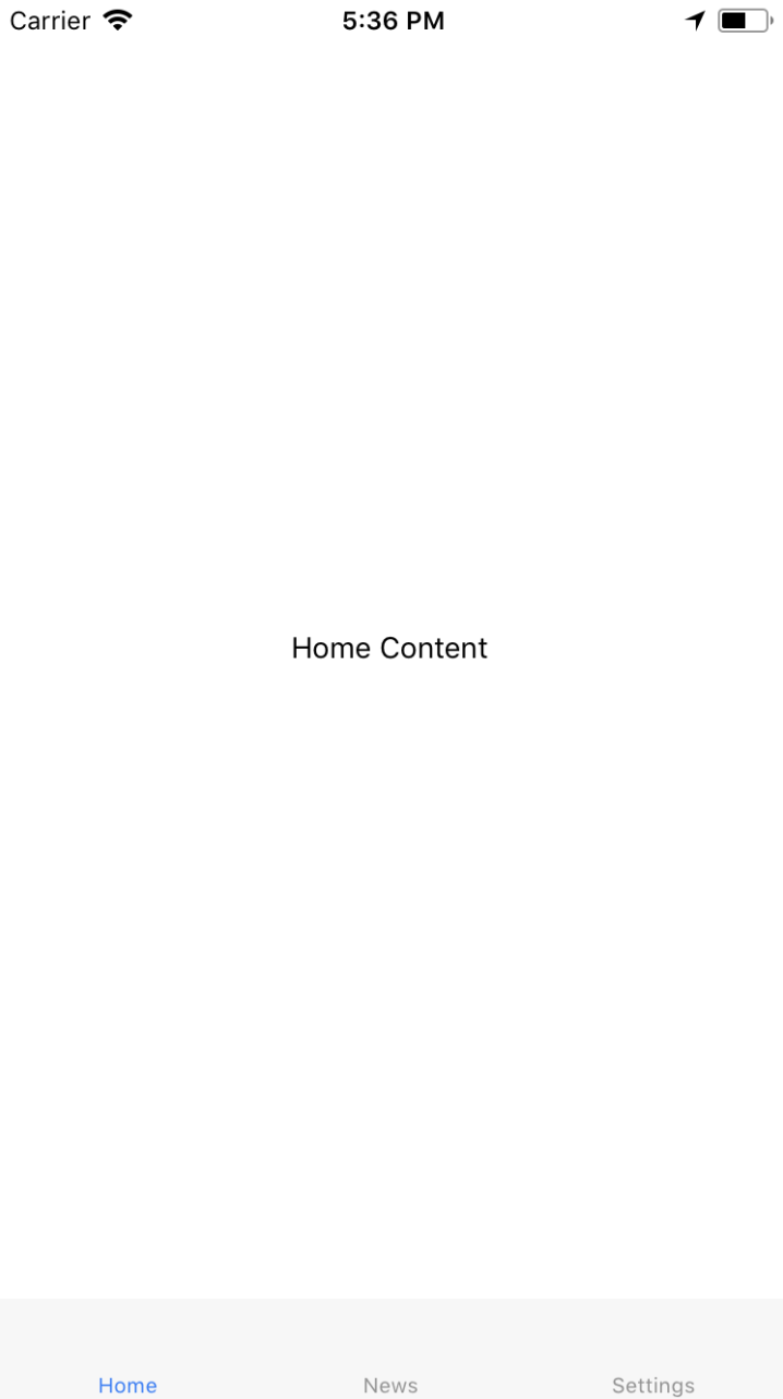
The three screens that make up your app are listed at the bottom. The current screen is marked as active and you can click on the other tabs to move around.
Now, let's see what the drawer layout looks like on Android:

To open the drawer, you need to swipe from the left side of the screen. Once open, you'll see buttons that will take you to the various screens of your app.
React applications have state that gets passed down to components that render features and require state data. For example, imagine that you're designing an app that uses react-navigation and different screens depend on the same state data. How do you get state data into these screen components? How do they update the application state?
To start with, let's think about where to put your application state. The most natural place to put it would be the App component. So far in this chapter, the examples have directly exported calls to createStackNavigator(). This function is a higher-order function - it returns a new React component. This means that you can wrap your own stateful component around the navigation component that's returned by createStackNavigator().
To illustrate this idea, let's revisit the example from earlier where you have a Home screen that lists item buttons that navigate to a Details screen. Here's what the new App component looks like:
import React, { Component } from 'react';
import { createStackNavigator } from 'react-navigation';
import Home from './Home';
import Details from './Details';

const Nav = createStackNavigator(
  {
    Home,
    Details
  },
  { initialRouteName: 'Home' }
);

export default class App extends Component {
  state = {
    stock: {
      first: 1,
      second: 0,
      third: 200
    }
  };

  updateStock = id => {
    this.setState(({ stock }) => ({
      stock: {
        ...stock,
        [id]: stock[id] === 0 ? 0 : stock[id] - 1
      }
    }));
  };

  render() {
    const props = {
      ...this.state,
      updateStock: this.updateStock
    };

    return <Nav screenProps={props} />;
  }
}
First, you use the createStackNavigator() function to create your navigator component:
const Nav = createStackNavigator(
  {
    Home,
    Details
  },
  { initialRouteName: 'Home' }
);
Now you have a Nav component that you can render. Next, you can create a regular React component with state:
export default class App extends Component {
state = {
stock: {
first: 1,
second: 0,
third: 200
}
};
...
}
The state used in this component represents the number quantity of each item that is available to buy. Next, you have the updateStock() function that is used to update the stock state for a given item ID:
updateStock = id => {
this.setState(({ stock }) => ({
stock: {
...stock,
[id]: stock[id] === 0 ? 0 : stock[id] - 1
}
}));
};
The ID that's passed to this function has its stock state decremented by 1, unless it's already at 0. This function can be used when the Buy button is clicked for the item to check its stuck quantity by 1. Finally, you have the render() method, which can render the Nav component:
render() {
const props = {
...this.state,
updateStock: this.updateStock
};
return <Nav screenProps={props} />;
}
The state of App is passed to Nav as props. The updateStock() function is also passed as a prop so that it can be used by the screen components. Now let's take a look at the Home screen:
import React from 'react';
import { View, Button } from 'react-native';
import styles from './styles';
const Home = ({ navigation, screenProps: { stock } }) => (
<View style={styles.container}>
<Button
title={`First Item (${stock.first})`}
onPress={() =>
navigation.navigate('Details', {
id: 'first',
title: 'First Item',
content: 'First Item Content'
})
}
/>
<Button
title={`Second Item (${stock.second})`}
onPress={() =>
navigation.navigate('Details', {
id: 'second',
title: 'Second Item',
content: 'Second Item Content'
})
}
/>
<Button
title={`Third Item (${stock.third})`}
onPress={() =>
navigation.navigate('Details', {
id: 'third',
title: 'Third Item',
content: 'Third Item Content'
})
}
/>
</View>
);
Home.navigationOptions = {
title: 'Home'
};
export default Home;
Once again, you have the three Button components that navigate to the Details screen and pass route parameters. There's a new parameter added in this version: id. The title of each button reflects the stock count of the given item. This value is part of the application state and is passed to the screen component via properties. However, these properties are all accessed through the screenProps property.
Let's take a look at the Details component next:
import React from 'react';
import { View, Text, Button } from 'react-native';
import styles from './styles';
const Details = ({ navigation }) => (
<View style={styles.container}>
<Text>{navigation.getParam('content')}</Text>
</View>
);
Details.navigationOptions = ({
navigation,
screenProps: { stock, updateStock }
}) => {
const id = navigation.getParam('id');
const title = navigation.getParam('title');
return {
title,
headerRight: (
<Button
title="Buy"
onPress={() => updateStock(id)}
disabled={stock[id] === 0}
/>
)
};
};
export default Details;
The id and the title route parameters are used to manipulate content in the navigation bar. The title parameter sets the title. The id is used by the onPress handler of the Buy button, by passing it to updateStock(), and the appropriate item stock count is updated when the button is pressed. The disabled property also relies on the id parameter to look up the stock quantity. Just like the Home screen, the stock and updateStock() props that are passed down from the App component are accessible through the screenProps app.
Here's what the Home screen looks like when it's first rendered:
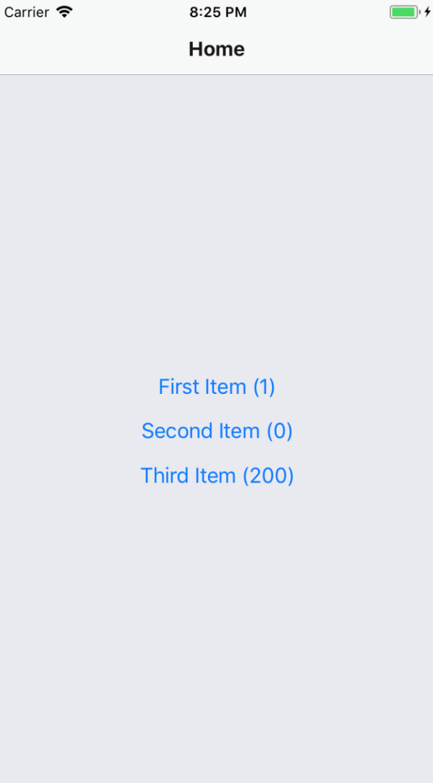
The stock quantity is reflected in each item button as a number. Let's press the First Item button and navigate to the Details page:
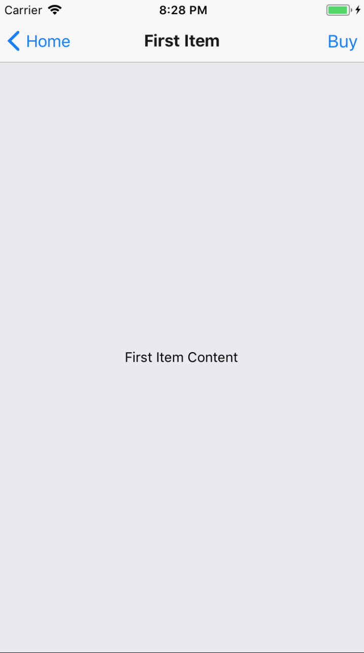
The Buy button in the navigation bar is enabled because the stock quantity is 1. Let's go ahead and press the Buy button and see what happens:
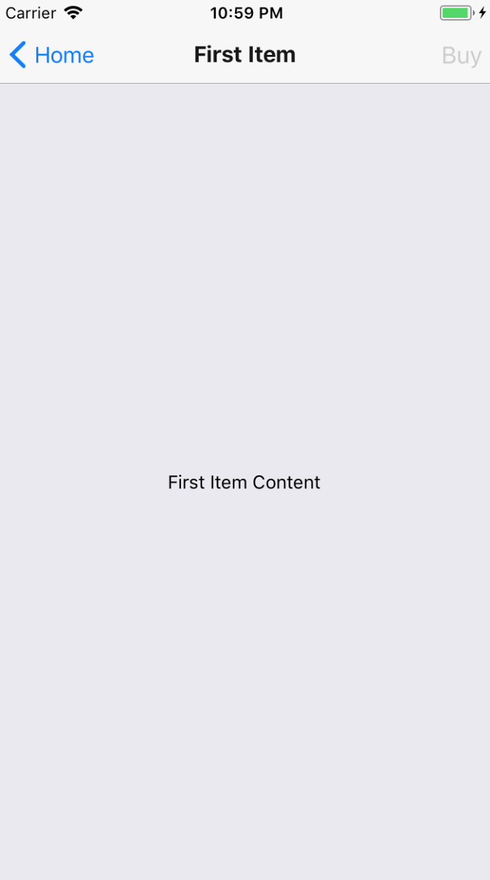
After pressing the Buy button, it becomes disabled. This is because the stock value for this item was 1. By pressing Buy, you caused the updateStock() function to be called, which updated this value to 0. As a result of the state change, the App component re-rendered the Nav component, which, in turn re-rendered your Details screen component with new prop values.
Let's go back to the Home screen and see what's changed there as a result of the state update:
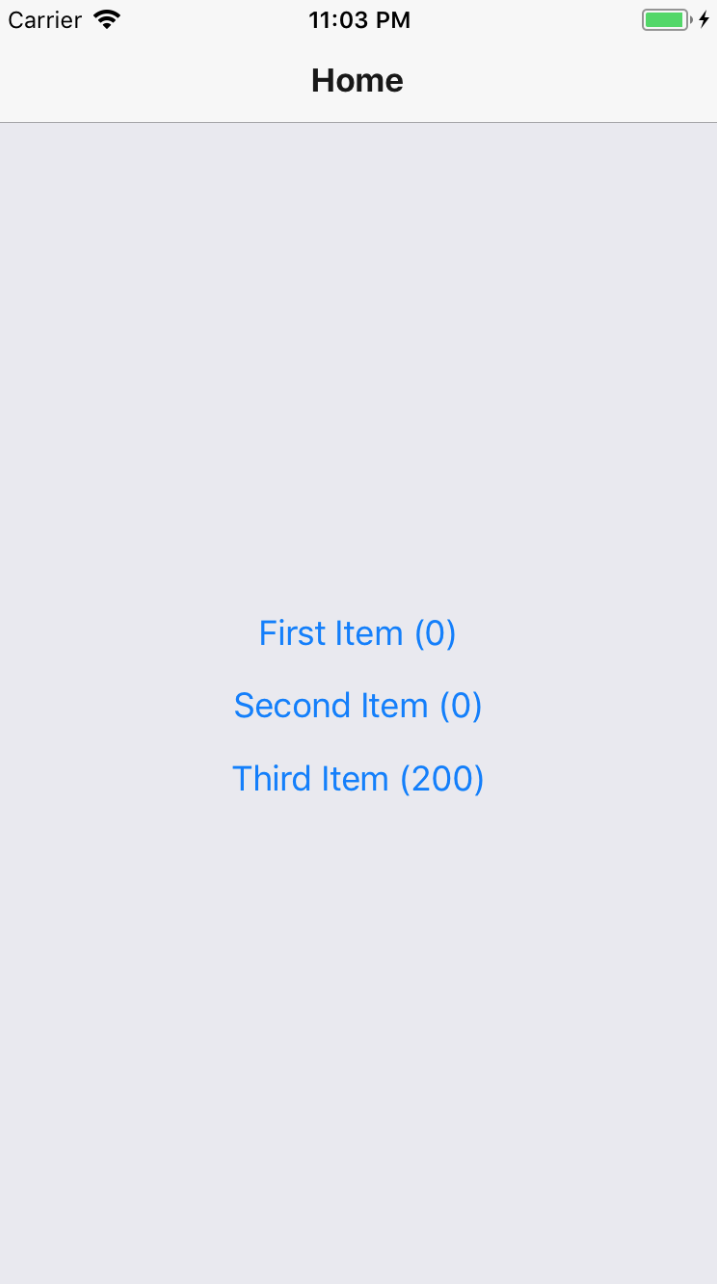
As expected, the stock quantity that is rendered beside the First Item button text is 0, reflective of the state change that just happened.
This example shows that you can have a top-level App component handle the application state while passing it down to the individual app screens, along with the functions that issue state updates.
In this chapter, you learned that mobile web applications require navigation just like web applications do. Although different, web application and mobile application navigation have enough conceptual similarities that mobile app routing and navigation doesn't have to be a nuisance.
Older versions of React Native made attempts to provide components to help manage navigation within mobile apps, but these never really took hold. Instead, the React Native community has dominated this area. One example of this is the react-navigation library, the focus of this chapter.
You learned how basic navigation works with react-navigation. You then learned how to control the header components within the navigation bar. Next, you learned about tab and drawer navigation. These two navigation components can automatically render the navigation buttons for your app based on the screen components. Finally, you learned how to maintain navigation while still being able to pass state data down to screen components from the top level app.
In the next chapter, you'll learn how to render lists of data.
Check out the following link for more information:
In this chapter, you'll learn how to work with item lists. Lists are a common web application component. While it's relatively straightforward to build lists using the <ul> and <li> elements, doing something similar on native mobile platforms is much more involved.
Thankfully, React Native provides an item list interface that hides all of the complexity. First, you'll get a feel for how item lists work by walking through an example. Then, you'll learn how to build controls that change the data displayed in lists. Lastly, you'll see a couple of examples that fetch items from the network.
Let's start with an example. The React Native component you'll use to render lists is FlatList, which works the same way on iOS and Android. List views accepts a data property, which is an array of objects. These objects can have any properties you like, but they do require a key property. This is similar to the key property requirement for rendering <li> elements inside of a <ul> element. This helps the list to efficiently render the list when changes are made to the list data.
Let's implement a basic list now. Here's the code to render a basic 100-item list:
import React from 'react';
import { Text, View, FlatList } from 'react-native';
import styles from './styles';
const data = new Array(100)
.fill(null)
.map((v, i) => ({ key: i.toString(), value: `Item ${i}` }));
export default () => (
<View style={styles.container}>
<FlatList
data={data}
renderItem={({ item }) => (
<Text style={styles.item}>{item.value}</Text>
)}
/>
</View>
);
Let's walk through what's going on here, starting with the data constant. This is an array of 100 items in it. It is created by filling a new array with 100 null values and then mapping this to a new array with the objects that you want to pass to <FlatList>. Each object has a key property because this is a requirement. Anything else is optional. In this case, you've decided to add a value property that value be used later or when the list is rendered.
Next, you render the <FlatList> component. It's within a <View> container because list views need a height in order to make scrolling work correctly. The data and the renderItem properties are passed to <FlatList>, which ultimately determines the rendered content.
At first glance, it would seem that the FlatList component doesn't do too much. You have to figure out how the items look? Well, yes, the FlatList component is supposed to be generic. It's supposed to excel at handling updates, and embeds scrolling capabilities into lists for us. Here are the styles that were used to render the list:
import { StyleSheet } from 'react-native';
export default StyleSheet.create({
container: {
// Flexing from top to bottom gives the
// container a height, which is necessary
// to enable scrollable content.
flex: 1,
flexDirection: 'column',
paddingTop: 20,
},
item: {
margin: 5,
padding: 5,
color: 'slategrey',
backgroundColor: 'ghostwhite',
textAlign: 'center',
},
});
Here, you're styling each item in your list. Otherwise, each item would be text-only and would be difficult to differentiate between other list items. The container style gives the list a height by setting the flexDirection to column. Without a height, you won't be able to scroll properly.
Let's see what this thing looks like now:
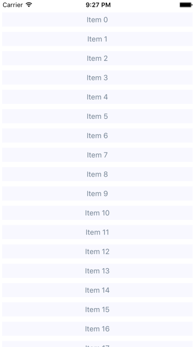
If you're running this example in a simulator, you can click and hold down the mouse button anywhere on the screen, like a finger, then scroll up or down through the items.
Now that you have learned the basics of FlatList components, including how to pass them data, let's add some controls to the list that you just implemented in the previous section. The FlatList component helps you render fixed-position content for list controls. You'll also see how to manipulate the data source, which ultimately drives what's rendered on the screen.
Before implementing list control components, it might be helpful to review the high-level structure of these components so that the code has more context. Here's an illustration of the component structure that you're going to implement:
Here's what each of these components is responsible for:
In some cases, splitting apart the implementation of a list like this is overkill. However, I think that if your list needs controls in the first place, you're probably implementing something that will stand to benefit from having a well-thought-out component architecture.
Now, let's drill down into the implementation of this list, starting with the ListContainer component:
import React, { Component } from 'react';
import List from './List';
const mapItems = items =>
items.map((value, i) => ({ key: i.toString(), value }));
// Performs sorting and filtering on the given "data".
const filterAndSort = (data, text, asc) =>
data
.filter(
i =>
// Items that include the filter "text" are returned.
// Unless the "text" argument is an empty string,
// then everything is included.
text.length === 0 || i.includes(text)
)
.sort(
// Sorts either ascending or descending based on "asc".
asc
? (a, b) => (b > a ? -1 : a === b ? 0 : 1)
: (a, b) => (a > b ? -1 : a === b ? 0 : 1)
);
class ListContainer extends Component {
state = {
data: filterAndSort(
new Array(100).fill(null).map((v, i) => `Item ${i}`),
'',
true
),
asc: true,
filter: ''
};
render() {
return (
<List
data={mapItems(this.state.data)}
asc={this.state.asc}
onFilter={text => {
// Updates the "filter" state, the actualy filter text,
// and the "source" of the list. The "data" state is
// never actually touched - "filterAndSort()" doesn't
// mutate anything.
this.setState({
filter: text,
data: filterAndSort(this.state.data, text, this.state.asc)
});
}}
onSort={() => {
this.setState({
// Updates the "asc" state in order to change the
// order of the list. The same principles as used
// in the "onFilter()" handler are applied here,
// only with diferent arguments passed to
// "filterAndSort()"
asc: !this.state.asc,
data: filterAndSort(
this.state.data,
this.state.filter,
!this.state.asc
)
});
}}
/>
);
}
}
export default ListContainer;
If this seems like a bit much, it's because it is. This container component has a lot of state to handle. It also has some nontrivial behavior that it needs to make available to its children. If you look at it from the perspective of encapsulating state, it will be more approachable. Its job is to populate the list with state data and provide functions that operate on this state.
In an ideal world, child components of this container should be nice and simple since they don't have to directly interface with state. Let's take a look at the List component next:
import React from 'react';
import PropTypes from 'prop-types';
import { Text, FlatList } from 'react-native';
import styles from './styles';
import ListControls from './ListControls';
const List = ({ Controls, data, onFilter, onSort, asc }) => (
<FlatList
data={data}
ListHeaderComponent={<Controls {...{ onFilter, onSort, asc }} />}
renderItem={({ item }) => (
<Text style={styles.item}>{item.value}</Text>
)}
/>
);
List.propTypes = {
Controls: PropTypes.func.isRequired,
data: PropTypes.array.isRequired,
onFilter: PropTypes.func.isRequired,
onSort: PropTypes.func.isRequired,
asc: PropTypes.bool.isRequired
};
List.defaultProps = {
Controls: ListControls
};
export default List;
This component takes state from the ListContainer component as properties and renders a FlatList component. The main difference here, relative to the previous example, is the ListHeaderComponent property. This renders the controls for your list. What's especially useful about this property is that it renders the controls outside the scrollable list content, ensuring that the controls are always visible.
Also, notice that you're specifying your own ListControls component as a default value for the controls property. This makes it easy for others to pass in their own list controls. Let's take a look at the ListControls component next:
import React from 'react';
import PropTypes from 'prop-types';
import { View } from 'react-native';
import styles from './styles';
import ListFilter from './ListFilter';
import ListSort from './ListSort';
// Renders the "<ListFilter>" and "<ListSort>"
// components within a "<View>". The
// "styles.controls" style lays out the controls
// horizontally.
const ListControls = ({ onFilter, onSort, asc }) => (
<View style={styles.controls}>
<ListFilter onFilter={onFilter} />
<ListSort onSort={onSort} asc={asc} />
</View>
);
ListControls.propTypes = {
onFilter: PropTypes.func.isRequired,
onSort: PropTypes.func.isRequired,
asc: PropTypes.bool.isRequired
};
export default ListControls;
This component brings together the ListFilter and ListSort controls. So, if you were to add another list control, you would add it here. Let's take a look at the ListFilter implementation now:
import React from 'react';
import PropTypes from 'prop-types';
import { View, TextInput } from 'react-native';
import styles from './styles';
// Renders a "<TextInput>" component which allows the
// user to type in their filter text. This causes
// the "onFilter()" event handler to be called.
// This handler comes from "ListContainer" and changes
// the state of the list data source.
const ListFilter = ({ onFilter }) => (
<View>
<TextInput
autoFocus
placeholder="Search"
style={styles.filter}
onChangeText={onFilter}
/>
</View>
);
ListFilter.propTypes = {
onFilter: PropTypes.func.isRequired
};
export default ListFilter;
The filter control is a simple text input that filters the list of items as user types. The onChange function that handles this comes from the ListContainer component.
Let's look at the ListSort component next:
import React from 'react';
import PropTypes from 'prop-types';
import { Text } from 'react-native';
// The arrows to render based on the state of
// the "asc" property. Using a Map let's us
// stay declarative, rather than introducing
// logic into the JSX.
const arrows = new Map([[true, '▼'], [false, '▲']]);
// Renders the arrow text. When clicked, the
// "onSort()" function that's passed down from
// the container.
const ListSort = ({ onSort, asc }) => (
<Text onPress={onSort}>{arrows.get(asc)}</Text>
);
ListSort.propTypes = {
onSort: PropTypes.func.isRequired,
asc: PropTypes.bool.isRequired
};
export default ListSort;
Here's a look at the resulting list:
By default, the entire list is rendered in ascending order. You can see the placeholder text Search when the user hasn't provided anything yet. Let's see how this looks when you enter a filter and change the sort order:
This search includes items with a 1 in it, and sorts the results in descending order. Note that you can either change the order first or enter the filter first. Both the filter and the sort order are part of the ListContainer state.
Often, you'll fetch your list data from some API endpoint. In this section, you'll learn about making API requests from React Native components. The good news is that the fetch() API is pollyfilled by React Native, so the networking code in your mobile applications should look and feel a lot like it does in your web applications.
To start things off, let's build a mock API for our list items using functions that return promises just like fetch() does:
import fetchMock from 'fetch-mock';
import querystring from 'querystring';
// A mock item list...
const items = new Array(100).fill(null).map((v, i) => `Item ${i}`);
// The same filter and sort functionality
// as the previous example, only it's part of the
// API now, instead of part of the React component.
const filterAndSort = (data, text, asc) =>
data
.filter(i => text.length === 0 || i.includes(text))
.sort(
asc
? (a, b) => (b > a ? -1 : a === b ? 0 : 1)
: (a, b) => (a > b ? -1 : a === b ? 0 : 1)
);
export const fetchItems = (filter, asc) =>
new Promise(resolve => {
resolve({
json: () =>
Promise.resolve({
items: filterAndSort(items, filter, asc)
})
});
});
With the mock API function in place, let's make some changes to the list container component. Instead of using local data sources, you can now use the fetchItems() function to load data from the API mock:
import React, { Component } from 'react';
import { fetchItems } from './api';
import List from './List';
const mapItems = items =>
items.map((value, i) => ({ key: i.toString(), value }));
class ListContainer extends Component {
// The "source" state is empty because we need
// to fetch the data from the API.
state = {
asc: true,
filter: '',
data: []
};
// When the component is first mounted, fetch the initial
// items from the API, then
componentDidMount() {
fetchItems(this.state.filter, this.state.asc)
.then(resp => resp.json())
.then(({ items }) => {
this.setState({ data: mapItems(items) });
});
}
render() {
return (
<List
data={this.state.data}
asc={this.state.asc}
onFilter={text => {
// Makes an API call when the filter changes...
fetchItems(text, this.state.asc)
.then(resp => resp.json())
.then(({ items }) =>
this.setState({
filter: text,
data: mapItems(items)
})
);
}}
onSort={() => {
// Makes an API call when the sort order changes...
fetchItems(this.state.filter, !this.state.asc)
.then(resp => resp.json())
.then(({ items }) =>
this.setState({
asc: !this.state.asc,
data: mapItems(items)
})
);
}}
/>
);
}
}
export default ListContainer;
Any action that modifies the state of the list needs to call fetchItems(), and set the appropriate state once the promise resolves.
In this section, you'll implement a different kind of list, one that scrolls infinitely. Sometimes, users don't actually know what they're looking for, so filtering or sorting isn't going to help. Think about the Facebook news feed you see when you log into your account; it's the main feature of the application and rarely are you looking for something specific. You'll need to see what's going on by scrolling through the list.
To do this using a FlatList component, you need to be able to fetch more API data when the user scrolls to the end of the list. To get an idea of how this works, you need a lot of API data to work with. Generators are great at this! So let's modify the mock that you created in the previous example so that it just keeps responding with new data:
// Items...keep'em coming!
function* genItems() {
let cnt = 0;
while (true) {
yield `Item ${cnt++}`;
}
}
const items = genItems();
export const fetchItems = () =>
Promise.resolve({
json: () =>
Promise.resolve({
items: new Array(20).fill(null).map(() => items.next().value)
})
});
With this in place, you can now make an API request for new data every time the end of the list is reached. Well, eventually this will fail when you run out of memory, but I'm just trying to show you in general terms the approach you can take to implement infinite scrolling in React Native. Here's what the ListContainer component looks like:
import React, { Component } from 'react';
import * as api from './api';
import List from './List';
class ListContainer extends Component {
state = {
data: [],
asc: true,
filter: ''
};
fetchItems = () =>
api
.fetchItems()
.then(resp => resp.json())
.then(({ items }) =>
this.setState(state => ({
data: [...state.data, ...items.map((value, i) => ({
key: i.toString(),
value
}))]
})
);
// Fetches the first batch of items once the
// component is mounted.
componentDidMount() {
this.fetchItems();
}
render() {
return (
<List data={this.state.data} fetchItems={this.fetchItems} />
);
}
}
export default ListContainer;
Each time fetchItems() is called, the response is concatenated with the data array. This becomes the new list data source, instead of replacing it as you did in earlier examples. Now, let's take a look at the List component to see how to respond to the end of the list being reached:
import React from 'react';
import PropTypes from 'prop-types';
import { Text, FlatList } from 'react-native';
import styles from './styles';
// Renders a "<FlatList>" component, and
// calls "fetchItems()" and the user scrolls
// to the end of the list.
const List = ({ data, fetchItems }) => (
<FlatList
data={data}
renderItem={({ item }) => (
<Text style={styles.item}>{item.value}</Text>
)}
onEndReached={fetchItems}
/>
);
List.propTypes = {
data: PropTypes.array.isRequired,
fetchItems: PropTypes.func.isRequired
};
export default List;
If you run this example, you'll see that, as you approach the bottom of the screen while scrolling, the list just keeps growing.
In this chapter, you learned about the FlatList component in React Native. This component is general-purpose in that it doesn't impose any specific look for items that get rendered. Instead, the appearance of the list is up to you, while the FlatList component helps with efficiently rendering a data source. The FlatList component also provides a scrollable region for the items it renders.
You implemented an example that took advantage of section headers in list views. This is a good place to render static content such as list controls. You then learned about making network calls in React Native; it's just like using fetch() in any other web application. Finally, you implemented lazy lists that scroll infinitely, by only loading new items after they've scrolled to the bottom of what's already been rendered.
In the next chapter, you'll learn how to show the progress of things such as network calls.
Take a look at the following link for more information:
This chapter is all about communicating progress to the user. React Native has different components to handle the different types of progress that you want to communicate. First, you'll learn why you need to communicate progress like this in the first place. Then, you'll learn how to implement progress indicators and progress bars. After that, you'll see specific examples that show you how to use progress indicators with navigation while data loads, and how to use progress bars to communicate the current position in a series of steps.
Imagine that you have a microwave oven that has no window and makes no sound. The only way to interact with it, is by pressing a button labeled cook. As absurd as this device sounds, it's what many software users are faced with—there's no indication of progress. Is the microwave cooking anything? If so, how do we know when it will be done?
One way to improve the microwave situation is to add sound. This way, the user gets feedback after pressing the cook button. You've overcome one hurdle, but the user is still left guessing—where's my food? Before you go out of business, you had better add some sort of progress measurement display, such as a timer.
It's not that UI programmers don't understand the basic principles of this usability concern; it's just that we have stuff to get done and this sort of thing simply slips through the cracks in terms of priority. In React Native, there are components for giving the user indeterminate progress feedback, and for giving precise progress measurements. It's always a good idea to make these things a top priority if you want a good user experience.
In this section, you'll learn how to use the ActivityIndicator component. As the name suggests, you render this component when you need to indicate to the user that something is happening. The actual progress may be indeterminate, but at least you have a standardized way to show that something is happening, despite there being no results to display yet.
Let's create an example so that you can see what this component looks like. Here's the App component:
import React from 'react';
import { View, ActivityIndicator } from 'react-native';
import styles from './styles';
// Renders an "<ActivityIndicator>" component in the
// middle of the screen. It will animate on it's own
// while displayed.
export default () => (
<View style={styles.container}>
<ActivityIndicator size="large" />
</View>
);
The <ActivityIndicator> component is platform agnostic. Here's how it looks on iOS:

It renders an animated spinner in the middle of the screen. This is the large spinner, as specified in the size property. The ActivityIndicator spinner can also be small, which makes more sense if you're rendering it inside another smaller element. Now let's take a look at how this looks on an Android device:
The spinner looks different, as it should, but your app conveys the same thing on both platforms—you're waiting for something.
The downside of indicating that progress is being made is that there's no end in sight for the user. This leads to a feeling of unease, like when waiting for food in a microwave with no timer. When you know how much progress has been made, and how much is left to go, you feel better. This is why it's always better to use a deterministic progress bar whenever possible.
Unlike the ActivityIndicator component, there's no platform-agnostic component in React Native for progress bars. So, we'll have to make one ourselves. We'll create a component that uses ProgressViewIOS on iOS and ProgressBarAndroid on Android.
Let's handle the cross-platform issues first. React Native knows to import the correct module based on its file extension. Here's what the ProgressBarComponent.ios.js module looks like:
// Exports the "ProgressViewIOS" as the
// "ProgressBarComponent" component that
// our "ProgressBar" expects.
export {
ProgressViewIOS as ProgressBarComponent,
} from 'react-native';
// There are no custom properties needed.
export const progressProps = {};
You're directly exporting the ProgressViewIOS component from React Native. You're also exporting properties for the component that are specific to the platform. In this case, it's an empty object because there are no properties that are specific to <ProgressViewIOS>. Now, let's take a look at the ProgressBarComponent.android.js module:
// Exports the "ProgressBarAndroid" component as
// "ProgressBarComponent" that our "ProgressBar"
// expects.
export {
ProgressBarAndroid as ProgressBarComponent,
} from 'react-native';
// The "styleAttr" and "indeterminate" props are
// necessary to make "ProgressBarAndroid" look like
// "ProgressViewIOS".
export const progressProps = {
styleAttr: 'Horizontal',
indeterminate: false,
};
This module uses the exact same approach as the ProgressBarComponent.ios.js module. It exports the Android-specific component as well as Android-specific properties to pass to it. Now, let's build the ProgressBar component that the application will use:
import React from 'react';
import PropTypes from 'prop-types';
import { View, Text } from 'react-native';
// Imports the "ProgressBarComponent" which is the
// actual react-native implementation. The actual
// component that's imported is platform-specific.
// The custom props in "progressProps" is also
// platform-specific.
import {
ProgressBarComponent,
progressProps
} from './ProgressBarComponent';
import styles from './styles';
// The "ProgressLabel" component determines what to
// render as a label, based on the boolean "label"
// prop. If true, then we render some text that shows
// the progress percentage. If false, we render nothing.
const ProgressLabel = ({ show, progress }) =>
show && (
<Text style={styles.progressText}>
{Math.round(progress * 100)}%
</Text>
);
// Our generic progress bar component...
const ProgressBar = ({ progress, label }) => (
<View style={styles.progress}>
<ProgressLabel show={label} progress={progress} />
{/* "<ProgressBarComponent>" is really a ""<ProgressViewIOS>"
or a "<ProgressBarAndroid>". */}
<ProgressBarComponent
{...progressProps}
style={styles.progress}
progress={progress}
/>
</View>
);
ProgressBar.propTypes = {
progress: PropTypes.number.isRequired,
label: PropTypes.bool.isRequired
};
ProgressBar.defaultProps = {
progress: 0,
label: true
};
export default ProgressBar;
Let's walk through what's going on in this module, starting with the imports. The ProgressBarComponent and progressProps values are imported from our ProgressBarComponent module. React Native determines which module to import this from.
Next, you have the ProgressLabel utility component. It figures out what label is rendered for the progress bar based on the show property. If false, nothing is rendered. If true, it renders a <Text> component that displays the progress as a percentage.
Lastly, you have the ProgressBar component itself, when our application will import and use. This renders the label and the appropriate progress bar component. It takes a progress property, which is a value between 0 and 1. Now let's put this component to use in the App component:
import React, { Component } from 'react';
import { View } from 'react-native';
import styles from './styles';
import ProgressBar from './ProgressBar';
export default class MeasuringProgress extends Component {
// Initially at 0% progress. Changing this state
// updates the progress bar.
state = {
progress: 0
};
componentDidMount() {
// Continuously increments the "progress" state
// every 300MS, until we're at 100%.
const updateProgress = () => {
this.setState({
progress: this.state.progress + 0.01
});
if (this.state.progress < 1) {
setTimeout(updateProgress, 300);
}
};
updateProgress();
}
render() {
return (
<View style={styles.container}>
{/* This is awesome. A simple generic
"<ProgressBar>" component that works
on Android and on iOS. */}
<ProgressBar progress={this.state.progress} />
</View>
);
}
}
Initially, the <ProgressBar> component is rendered at 0%. In the componentDidMount() method, the updateProgress() function uses a timer to simulate a real process that you want to show progress for. Here's what the iOS screen looks like:
Here's what the same progress bar looks like on Android:
Earlier in the chapter, you were introduced to the ActivityIndicator component. In this section, you'll learn how it can be used when navigating an application that loads data. For example, the user navigates from page (screen) one to page two. However, page two needs to fetch data from the API to display for the user. So while this network call is happening, it makes more sense to display a progress indicator instead of a screen devoid of useful information.
Doing this is actually kind of tricky because you have to make sure that the data required by the screen is fetched from the API each time the user navigates to the screen. Your goals should be the following:
Since your components probably don't care about whether or not a spinner is displayed, let's implement this as a generic higher-order component:
import React, { Component } from 'react';
import PropTypes from 'prop-types';
import { View, ActivityIndicator } from 'react-native';
import styles from './styles';
// Wraps the "Wrapped" component with a stateful component
// that renders an "<ActivityIndicator>" when the "loading"
// state is true.
const loading = Wrapped =>
class LoadingWrapper extends Component {
static propTypes = {
promise: PropTypes.instanceOf(Promise)
};
state = {
loading: true
};
// Adds a callback to the "promise" that was
// passed in. When the promise resolves, we set
// the "loading" state to false.
componentDidMount() {
this.props.promise.then(
() => this.setState({ loading: false }),
() => this.setState({ loading: false })
);
}
// If "loading" is true, render the "<ActivityIndicator>"
// component. Otherwise, render the "<Wrapped>" component.
render() {
return new Map([
[
true,
<View style={styles.container}>
<ActivityIndicator size="large" />
</View>
],
[false, <Wrapped {...this.props} />]
]).get(this.state.loading);
}
};
export default loading;
This loading() function takes a component—the Wrapped argumentand returns a LoadingWrapper component. The returned wrapper accepts a promise property, and when it resolves or rejects, it changes the loading state to false. As you can see in the render() method, the loading state determines whether the spinner is rendered or the Wrapped component.
With the loading() higher-order function in place, let's take a look at the first screen component that you'll use with react-navigation:
import React from 'react';
import { View, Text } from 'react-native';
import styles from './styles';
import loading from './loading';
const First = loading(({ navigation }) => (
<View style={styles.container}>
<Text
style={styles.item}
onPress={() => navigation.navigate('Second')}
>
Second
</Text>
<Text
style={styles.item}
onPress={() => navigation.navigate('Third')}
>
Third
</Text>
</View>
));
export default First;
This module exports a component that's wrapped with the loading() function created earlier. It wraps the First component so that a spinner is displayed while the promise property is pending. The last step is getting that promise into the component whenever the user navigates to a given page. This happens in the route configuration in the App component:
import React from 'react';
import { createStackNavigator } from 'react-navigation';
import First from './First';
import Second from './Second';
import Third from './Third';
export default createStackNavigator(
{
First: {
screen: props => (
<First
promise={new Promise(resolve => setTimeout(resolve, 1000))}
{...props}
/>
)
},
Second: {
screen: props => (
<Second
promise={new Promise(resolve => setTimeout(resolve, 1000))}
{...props}
/>
)
},
Third: {
screen: props => (
<First
promise={new Promise(resolve => setTimeout(resolve, 1000))}
{...props}
/>
)
}
},
{ initialRouteName: 'First' }
);
Instead of just passing the screen components directly to the router config argument of createStackNavigator(), you're passing an object for each screen. The screen property allows you to provide the actual screen component to render. In this case, you're passing it a promise property by calling an API function that resolves data needed by the component. This is how the loading() function is able to display a spinner while waiting for the promise to resolve. The first screen doesn't have to worry about displaying a loading screen.
In this final example, you'll build an app that displays the user's progress through a predefined number of steps. For example, it might make sense to split a form into several logical sections and organize them in such a way that as the user completes one section, they move to the next step. A progress bar would be helpful feedback for the user.
You'll insert a progress bar into the navigation bar, just below the title, so that the user knows how far they've gone and how far is left to go. You'll also reuse the ProgressBar component that you implemented earlier in this chapter.
Let's take a look at the result first. There are four screens in this app that the user can navigate to. Here's what the first page (scene) looks like:

The progress bar below the title reflects the fact that the user is 25% through the navigation. Let's see what the third screen looks like:

The progress is updated to reflect where the user is in the route stack. Let's take a look at the App component:
import React from 'react';
import { createStackNavigator } from 'react-navigation';
import First from './First';
import Second from './Second';
import Third from './Third';
import Fourth from './Fourth';
const routes = [First, Second, Third, Fourth];
export default createStackNavigator(
routes.reduce(
(result, route) => ({
...result,
[route.name]: route
}),
{}
),
{
initialRouteName: 'First',
initialRouteParams: {
progress: route =>
(routes.map(r => r.name).indexOf(route) + 1) / routes.length
}
}
);
This app has four screens. The components that render each of these screens is stored in the routes constant, which is then used to configure the stack navigator using createStackNavigator(). The reason for creating the routes array is so that it can be used by the progress() function that is passed to the initial route (First) as a route parameter. This function takes the current route name as an argument and looks up its index position in routes. For example, Second is in the number 2 position (index of 1 + 1) and the length of the array is 4. This will set the progress bar to 50%.
Let's see how the progress function is used by the First component:
import React from 'react';
import { View, Text } from 'react-native';
import styles from './styles';
import ProgressBar from './ProgressBar';
const First = () => (
<View style={styles.container}>
<Text style={styles.content}>First Content</Text>
</View>
);
First.navigationOptions = ({ navigation }) => ({
headerTitle: (
<View style={styles.progress}>
<Text style={styles.title}>First</Text>
<ProgressBar
label={false}
progress={navigation.state.params.progress(
navigation.state.routeName
)}
/>
</View>
),
headerLeft: (
<Text
onPress={() =>
navigation.navigate('Fourth', navigation.state.params)
}
>
Fourth
</Text>
),
headerRight: (
<Text
onPress={() =>
navigation.navigate('Second', navigation.state.params)
}
>
Second
</Text>
)
});
export default First;
The function is accessed as navigation.state.params.progress(). It's passed the value of navigation.state.routeName to get the progress value for the current page. Also, the calls to navigation.navigate() have to pass navigation.state.params so that the progress() function is available to the screen. If you don't do this, then progress() will only be available to the first screen because it's set using the initialRouteParams option within the App component.
In this chapter, you learned about how to show your users that something is happening behind the scenes. First, we discussed why showing progress is important for the usability of an application. Then, you implemented a basic screen that indicated progress was being made. You then implemented a ProgressBar component, used to measure specific progress amounts.
Indicators are good for indeterminate progress, and you implemented navigation that showed progress indicators while network calls were pending. In the final section, you implemented a progress bar that showed the user where they were in a predefined number of steps.
In the following chapter, you'll see React Native maps and geolocation data in action.
Check out the following links for more information:
In this chapter, you'll learn about the geolocation and mapping capabilities of React Native. You'll start learning how to use the geolocation API; then you'll move on to using the MapView component to plot points of interest and regions.
You'll use the react-native-maps package to implement maps. The goal of this chapter is to go over what's available in React Native for geolocation and React Native Maps for maps.
The geolocation API that web applications use to figure out where the user is located can also be used by React Native applications because the same API has been polyfilled. Outside of maps, this API is useful for getting precise coordinates from the GPS on mobile devices. You can then use this information to display meaningful location data to the user.
Unfortunately, the data that's returned by the geolocation API is of little use on its own; your code has to do the legwork to transform it into something useful. For example, latitude and longitude don't mean anything to the user, but you can use this data to look up something that is of use to the user. This might be as simple as displaying where the user is currently located.
Let's implement an example that uses the geolocation API of React Native to look up coordinates and then use those coordinates to look up human-readable location information from the Google Maps API:
import React, { Component } from 'react';
import { Text, View } from 'react-native';
import { fromJS } from 'immutable';
import styles from './styles';
// For fetching human-readable address info.
const URL = 'https://maps.google.com/maps/api/geocode/json?latlng=';
export default class WhereAmI extends Component {
// The "address" state is "loading..." initially because
// it takes the longest to fetch.
state = {
data: fromJS({
address: 'loading...'
})
};
// Getter for "Immutable.js" state data...
get data() {
return this.state.data;
}
// Setter for "Immutable.js" state data...
set data(data) {
this.setState({ data });
}
// We don't setup any geo data till the component
// mounts.
componentDidMount() {
const setPosition = pos => {
// This component renders the "coords" data from
// a geolocation response. This can simply be merged
// into the state map.
this.data = this.data.merge(pos.coords);
// We need the "latitude" and the "longitude"
// in order to lookup the "address" from the
// Google maps API.
const {
coords: { latitude, longitude }
} = pos;
// Fetches data from the Google Maps API then sets
// the "address" state based on the response.
fetch(`${URL}${latitude},${longitude}`)
.then(resp => resp.json(), e => console.error(e))
.then(({ results: [{ formatted_address }] }) => {
this.data = this.data.set('address', formatted_address);
});
};
// First, we try to lookup the current position
// data and update the component state.
navigator.geolocation.getCurrentPosition(setPosition);
// Then, we setup a high accuracy watcher, that
// issues a callback whenever the position changes.
this.watcher = navigator.geolocation.watchPosition(
setPosition,
err => console.error(err),
{ enableHighAccuracy: true }
);
}
// It's always a good idea to make sure that this
// "watcher" is cleared when the component is removed.
componentWillUnmount() {
navigator.geolocation.clearWatch(this.watcher);
}
render() {
// Since we want to iterate over the properties
// in the state map, we need to convert the map
// to pairs using "entries()". Then we need to
// use the spread operator to make the map iterator
// into a plain array. The "sort()" method simply
// sorts the map based on it's keys.
const state = [...this.data.sortBy((v, k) => k).entries()];
// Iterates over the state properties and renders them.
return (
<View style={styles.container}>
{state.map(([k, v]) => (
<Text key={k} style={styles.label}>
{`${k[0].toUpperCase()}${k.slice(1)}`}: {v}
</Text>
))}
</View>
);
}
}
The goal of this component is to render the properties returned by the geolocation API on the screen, as well as look up the user's specific location, and display it. If you take a look at the componentDidMount() method, you'll see that this is where most of the interesting code is. The setPosition() function is used as a callback in a couple of places. Its job is to set the state of your component.
First, it sets the coords properties. Normally, you wouldn't display this data directly, but this is an example that's showing the data that's available as part of the geolocation API. Second, it uses the latitude and longitude values to look up the name of where the user is currently, using the Google Maps API.
The setPosition() callback is used with getCurrentPosition(), which is only called once when the component is mounted. You're also using setPosition() with watchPosition(), which calls the callback any time the user's position changes.
Let's see what this screen looks like once the location data has loaded:

The address information that was fetched is probably more useful in an application than latitude and longitude data. Even better than physical address text is visualizing the user's physical location on a map; you'll learn how to do this in the next section.
The MapView component from react-native-maps is the main tool you'll use to render maps in your React Native applications.
Let's implement a basic MapView component to see what you get out of the box:
import React from 'react';
import { View } from 'react-native';
import MapView from 'react-native-maps';
import styles from './styles';
export default () => (
<View style={styles.container}>
<MapView
style={styles.mapView}
showsUserLocation
followUserLocation
/>
</View>
);
The two Boolean properties that you've passed to MapView do a lot of work for you. The showsUserLocation property will activate the marker on the map, which denotes the physical location of the device running this application. The followUserLocation property tells the map to update the location marker as the device moves around. Let's see the resulting map:
The current location of the device is clearly marked on the map. By default, points of interest are also rendered on the map. These are things in close proximity to the user so that they can see what's around them.
It's generally a good idea to use the followUserLocation property whenever using showsUserLocation. This makes the map zoom to the region where the user is located.
So far, you've seen how the MapView component can render the user's current location and points of interest around the user. The challenge here is that you probably want to show points of interest that are relevant to your application, instead of the points of interest that are rendered by default.
In this section, you'll learn how to render markers for specific locations on the map, as well as render regions on the map.
Let's plot some local breweries! Here's how you pass annotations to the MapView component:
import React from 'react';
import { View } from 'react-native';
import MapView from 'react-native-maps';
import styles from './styles';
export default () => (
<View style={styles.container}>
<MapView
style={styles.mapView}
showsPointsOfInterest={false}
showsUserLocation
followUserLocation
>
<MapView.Marker
title="Duff Brewery"
description="Duff beer for me, Duff beer for you"
coordinate={{
latitude: 43.8418728,
longitude: -79.086082
}}
/>
<MapView.Marker
title="Pawtucket Brewery"
description="New! Patriot Light!"
coordinate={{
latitude: 43.8401328,
longitude: -79.085407
}}
/>
</MapView>
</View>
);
Annotations are exactly what they sound like; additional information rendered on top of the basic map geography. In fact, you get annotations by default when you render MapView components because they will show points of interest. In this example, you've opted out of this capability by setting the showsPointsOfInterest property to false. Let's see where these breweries are located:
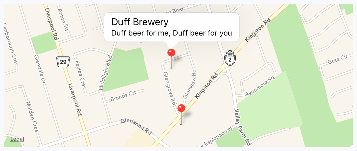
The callout is displayed when you press the marker that shows the location of the brewery on the map. The title and the description property values that you give to <MapView.Marker> are used to render this text.
In this last section of this chapter, you'll learn how to render region overlays. A point is a single latitude/longitude coordinate. Think of a region as a connect-the-dots drawing of several coordinates. Regions can serve many purposes, such as showing where we're more likely to find IPA drinkers versus stout drinkers. Here's what the code looks like:
import React, { Component } from 'react';
import { View, Text } from 'react-native';
import MapView from 'react-native-maps';
import { fromJS } from 'immutable';
import styles from './styles';
// The "IPA" region coordinates and color...
const ipaRegion = {
coordinates: [
{ latitude: 43.8486744, longitude: -79.0695283 },
{ latitude: 43.8537168, longitude: -79.0700046 },
{ latitude: 43.8518394, longitude: -79.0725697 },
{ latitude: 43.8481651, longitude: -79.0716377 },
{ latitude: 43.8486744, longitude: -79.0695283 }
],
strokeColor: 'coral',
strokeWidth: 4
};
// The "stout" region coordinates and color...
const stoutRegion = {
coordinates: [
{ latitude: 43.8486744, longitude: -79.0693283 },
{ latitude: 43.8517168, longitude: -79.0710046 },
{ latitude: 43.8518394, longitude: -79.0715697 },
{ latitude: 43.8491651, longitude: -79.0716377 },
{ latitude: 43.8486744, longitude: -79.0693283 }
],
strokeColor: 'firebrick',
strokeWidth: 4
};
export default class PlottingOverlays extends Component {
// The "IPA" region is rendered first. So the "ipaStyles"
// list has "boldText" in it, to show it as selected. The
// "overlays" list has the "ipaRegion" in it.
state = {
data: fromJS({
ipaStyles: [styles.ipaText, styles.boldText],
stoutStyles: [styles.stoutText],
overlays: [ipaRegion]
})
};
// Getter for "Immutable.js" state data...
get data() {
return this.state.data;
}
// Setter for "Immutable.js" state data...
set data(data) {
this.setState({ data });
}
// The "IPA" text was clicked...
onClickIpa = () => {
this.data = this.data
// Makes the IPA text bold...
.update('ipaStyles', i => i.push(styles.boldText))
// Removes the bold from the stout text...
.update('stoutStyles', i => i.pop())
// Replaces the stout overlay with the IPA overlay...
.update('overlays', i => i.set(0, ipaRegion));
};
// The "stout" text was clicked...
onClickStout = () => {
this.data = this.data
// Makes the stout text bold...
.update('stoutStyles', i => i.push(styles.boldText))
// Removes the bold from the IPA text...
.update('ipaStyles', i => i.pop())
// Replaces the IPA overlay with the stout overlay...
.update('overlays', i => i.set(0, stoutRegion));
};
render() {
const { ipaStyles, stoutStyles, overlays } = this.data.toJS();
return (
<View style={styles.container}>
<View>
{/* Text that when clicked, renders the IPA
map overlay. */}
<Text style={ipaStyles} onPress={this.onClickIpa}>
IPA Fans
</Text>
{/* Text that when clicked, renders the stout
map overlay. */}
<Text style={stoutStyles} onPress={this.onClickStout}>
Stout Fans
</Text>
</View>
{/* Renders the map with the "overlays" array. There
will only ever be a single overlay in this
array. */}
<MapView
style={styles.mapView}
showsPointsOfInterest={false}
showsUserLocation
followUserLocation
>
{overlays.map((v, i) => (
<MapView.Polygon
key={i}
coordinates={v.coordinates}
strokeColor={v.strokeColor}
strokeWidth={v.strokeWidth}
/>
))}
</MapView>
</View>
);
}
}
The region data consists of several latitude/longitude coordinates that define the shape and location of the region. The rest of this code is mostly about handling state when the two text links are pressed. By default, the IPA region is rendered:
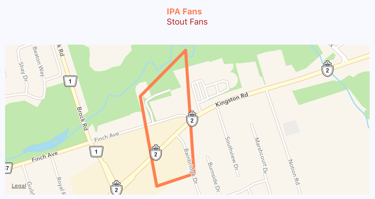
When the stout text is pressed, the IPA overlay is removed from the map and the stout region is added:

In this chapter, you learned about geolocation and mapping in React Native. The geolocation API works the same as its web counterpart. The only reliable way to use maps in React Native applications is to install the third-party react-native-maps package.
You saw the basic configuration MapView components, and how it can track the user's location, and show relevant points of interest. Then, you saw how to plot your own points of interest and regions of interest.
In the next chapter, you'll learn how to collect user input using React Native components that resemble HTML form controls.
Take look at the following URLs to get more information:
In web applications, you can collect user input from standard HTML form elements that look and behave similarly on all browsers. With native UI platforms, collecting user input is more nuanced.
In this chapter, you'll learn how to work with the various React Native components that are used to collect user input. These include text input, selecting from a list of options, checkboxes, and date/time selectors. You'll see the differences between iOS and Android, and how to implement the appropriate abstractions for your app.
It turns out that there's a lot to think about when implementing text inputs. For example, should it have placeholder text? Is this sensitive data that shouldn't be displayed on screen? Should you process text as it's entered, or when the user moves to another field?
The noticeable difference with mobile text input versus traditional web text input is that the former has its own built-in virtual keyboard that you can configure and respond to. Let's build an example that renders several instances of the <TextInput> component:
import React, { Component } from 'react';
import PropTypes from 'prop-types';
import { Text, TextInput, View } from 'react-native';
import { fromJS } from 'immutable';
import styles from './styles';
// A Generic "<Input>" component that we can use in our app.
// It's job is to wrap the "<TextInput>" component in a "<View>"
// so that we can render a label, and to apply styles to the
// appropriate components.
const Input = props => (
<View style={styles.textInputContainer}>
<Text style={styles.textInputLabel}>{props.label}</Text>
<TextInput style={styles.textInput} {...props} />
</View>
);
Input.propTypes = {
label: PropTypes.string
};
export default class CollectingTextInput extends Component {
// This state is only relevant for the "input events"
// component. The "changedText" state is updated as
// the user types while the "submittedText" state is
// updated when they're done.
state = {
data: fromJS({
changedText: '',
submittedText: ''
})
};
// Getter for "Immutable.js" state data...
get data() {
return this.state.data;
}
// Setter for "Immutable.js" state data...
set data(data) {
this.setState({ data });
}
render() {
const { changedText, submittedText } = this.data.toJS();
return (
<View style={styles.container}>
{/* The simplest possible text input. */}
<Input label="Basic Text Input:" />
{/* The "secureTextEntry" property turns
the text entry into a password input
field. */}
<Input label="Password Input:" secureTextEntry />
{/* The "returnKeyType" property changes
the return key that's displayed on the
virtual keyboard. In this case, we want
a "search" button. */}
<Input label="Return Key:" returnKeyType="search" />
{/* The "placeholder" property works just
like it does with web text inputs. */}
<Input label="Placeholder Text:" placeholder="Search" />
{/* The "onChangeText" event is triggered as
the user enters text. The "onSubmitEditing"
event is triggered when they click "search". */}
<Input
label="Input Events:"
onChangeText={e => {
this.data = this.data.set('changedText', e);
}}
onSubmitEditing={e => {
this.data = this.data.set(
'submittedText',
e.nativeEvent.text
);
}}
onFocus={() => {
this.data = this.data
.set('changedText', '')
.set('submittedText', '');
}}
/>
{/* Displays the captured state from the
"input events" text input component. */}
<Text>Changed: {changedText}</Text>
<Text>Submitted: {submittedText}</Text>
</View>
);
}
}
I won't go into depth on what each of these <TextInput> components is doing—there are comments in the code. Let's see what these components look like on screen:
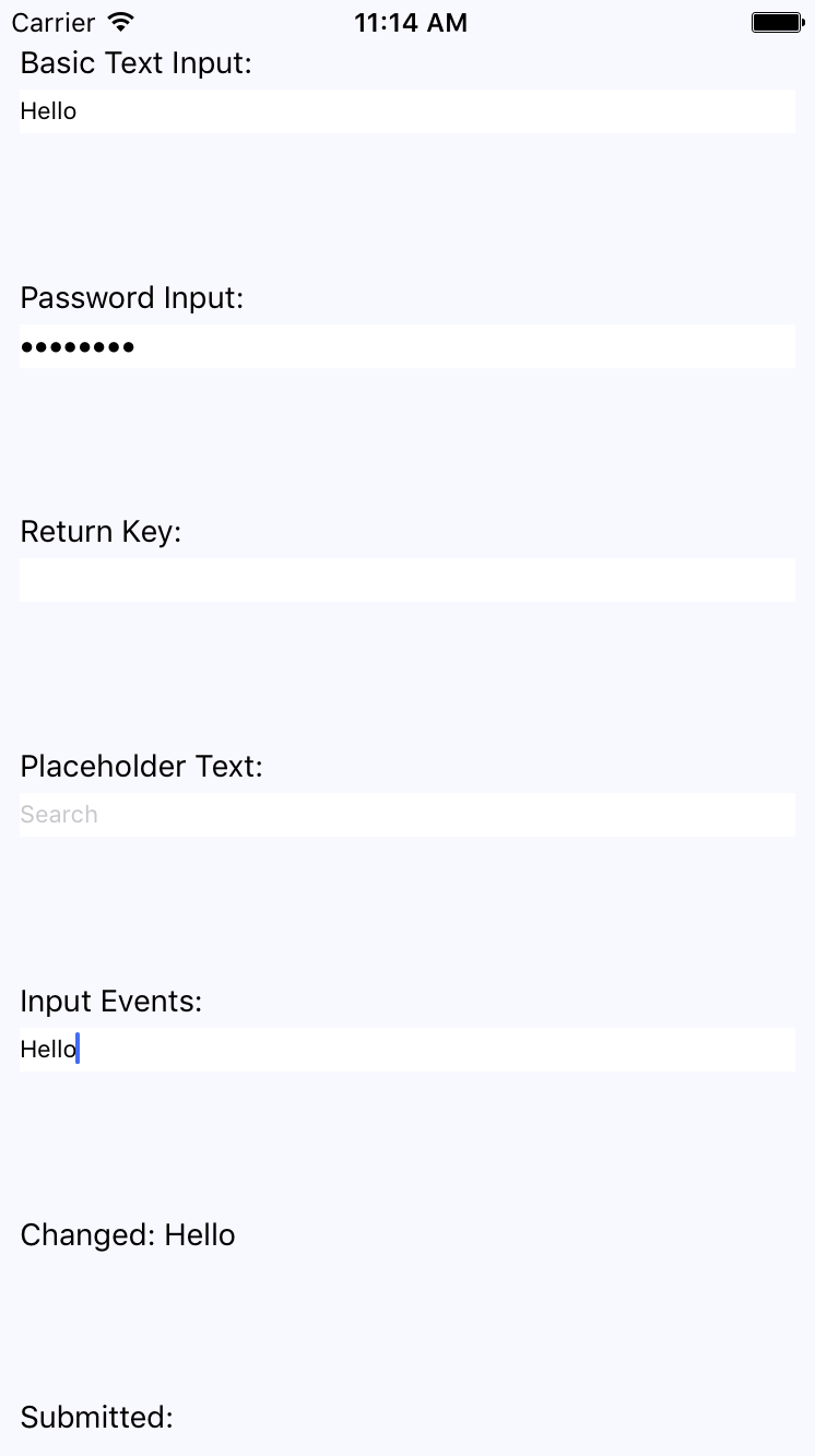
The plain text input shows the text that's been entered. The password field doesn't reveal any characters. The Placeholder Text is displayed when the input is empty. The Changed text state is also displayed. You're not seeing the submitted text state because I didn't press the Submitted button on the virtual keyboard before I took the screenshot.
Let's take a look at the virtual keyboard for the input element where you changed the return key text via the returnKeyType prop:
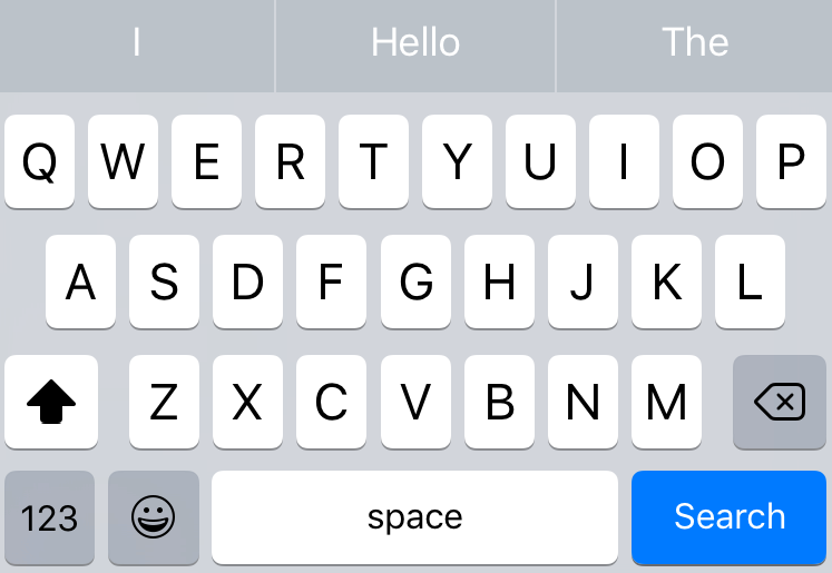
When the keyboard Return Key reflects what's going to happen when they press it, the user feels more in tune with the application.
In web applications, you typically use the <select> element to let the user choose from a list of options. React Native comes with a <Picker> component, which works on both iOS and Android. There is some trickery involved with styling this component based on which platform the user is on, so let's hide all of this inside of a generic Select component. Here's the Select.ios.js module:
import React from 'react';
import PropTypes from 'prop-types';
import { View, Picker, Text } from 'react-native';
import styles from './styles';
// The "<Select>" component provides an
// abstraction around the "<Picker>" component.
// It actually has two outer views that are
// needed to get the styling right.
const Select = props => (
<View style={styles.pickerHeight}>
<View style={styles.pickerContainer}>
{/* The label for the picker... */}
<Text style={styles.pickerLabel}>{props.label}</Text>
<Picker style={styles.picker} {...props}>
{/* Maps each "items" value to a
"<Picker.Item>" component. */}
{props.items.map(i => <Picker.Item key={i.label} {...i} />)}
</Picker>
</View>
</View>
);
Select.propTypes = {
items: PropTypes.array,
label: PropTypes.string
};
export default Select;
That's a lot of overhead for a simple Select component. Well, it turns out that it's actually quite hard to style the React Native <Picker> component. Here's the Select.android.js module:
import React from 'react';
import PropTypes from 'prop-types';
import { View, Picker, Text } from 'react-native';
import styles from './styles';
// The "<Select>" component provides an
// abstraction around the "<Picker>" component.
// It actually has two outer views that are
// needed to get the styling right.
const Select = props => (
<View>
{/* The label for the picker... */}
<Text style={styles.pickerLabel}>{props.label}</Text>
<Picker {...props}>
{/* Maps each "items" value to a
"<Picker.Item>" component. */}
{props.items.map(i => <Picker.Item key={i.label} {...i} />)}
</Picker>
</View>
);
Select.propTypes = {
items: PropTypes.array,
label: PropTypes.string
};
export default Select;
Here are what the styles look like:
import { StyleSheet } from 'react-native';
export default StyleSheet.create({
container: {
flex: 1,
flexDirection: 'row',
flexWrap: 'wrap',
justifyContent: 'space-around',
alignItems: 'center',
backgroundColor: 'ghostwhite',
},
// The outtermost container, needs a height.
pickerHeight: {
height: 175,
},
// The inner container lays out the picker
// components and sets the background color.
pickerContainer: {
flex: 1,
flexDirection: 'column',
alignItems: 'center',
marginTop: 40,
backgroundColor: 'white',
padding: 6,
height: 240,
},
pickerLabel: {
fontSize: 14,
fontWeight: 'bold',
},
picker: {
width: 100,
backgroundColor: 'white',
},
selection: {
width: 200,
marginTop: 230,
textAlign: 'center',
},
});
Now you can render your <Select> component:
import React, { Component } from 'react';
import { View, Text } from 'react-native';
import { fromJS } from 'immutable';
import styles from './styles';
import Select from './Select';
export default class SelectingOptions extends Component {
// The state is a collection of "sizes" and
// "garments". At any given time there can be
// selected size and garment.
state = {
data: fromJS({
sizes: [
{ label: '', value: null },
{ label: 'S', value: 'S' },
{ label: 'M', value: 'M' },
{ label: 'L', value: 'L' },
{ label: 'XL', value: 'XL' }
],
selectedSize: null,
garments: [
{ label: '', value: null, sizes: ['S', 'M', 'L', 'XL'] },
{ label: 'Socks', value: 1, sizes: ['S', 'L'] },
{ label: 'Shirt', value: 2, sizes: ['M', 'XL'] },
{ label: 'Pants', value: 3, sizes: ['S', 'L'] },
{ label: 'Hat', value: 4, sizes: ['M', 'XL'] }
],
availableGarments: [],
selectedGarment: null,
selection: ''
})
};
// Getter for "Immutable.js" state data...
get data() {
return this.state.data;
}
// Setter for "Immutable.js" state data...
set data(data) {
this.setState({ data });
}
render() {
const {
sizes,
selectedSize,
availableGarments,
selectedGarment,
selection
} = this.data.toJS();
// Renders two "<Select>" components. The first
// one is a "size" selector, and this changes
// the available garments to select from.
// The second selector changes the "selection"
// state to include the selected size
// and garment.
return (
<View style={styles.container}>
<Select
label="Size"
items={sizes}
selectedValue={selectedSize}
onValueChange={size => {
this.data = this.data
.set('selectedSize', size)
.set('selectedGarment', null)
.set(
'availableGarments',
this.data
.get('garments')
.filter(i => i.get('sizes').includes(size))
);
}}
/>
<Select
label="Garment"
items={availableGarments}
selectedValue={selectedGarment}
onValueChange={garment => {
this.data = this.data.set('selectedGarment', garment).set(
'selection',
this.data.get('selectedSize') +
' ' +
this.data
.get('garments')
.find(i => i.get('value') === garment)
.get('label')
);
}}
/>
<Text style={styles.selection}>{selection}</Text>
</View>
);
}
}
The basic idea of this example is that the selected option in the first selector changes the available options in the second selector. When the second selector changes, the label shows the selected size and garment as a string. Here's how the screen looks:
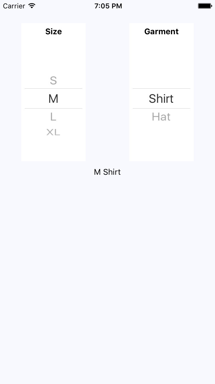
Another common element you'll see in web forms is checkboxes. React Native has a Switch component that works on both iOS and Android. Thankfully, this component is a little easier to style than the Picker component. Here's a look at a simple abstraction you can implement to provide labels for your switches:
import React from 'react';
import PropTypes from 'prop-types';
import { View, Text, Switch } from 'react-native';
import styles from './styles';
// A fairly straightforward wrapper component
// that adds a label to the React Native
// "<Switch>" component.
const CustomSwitch = props => (
<View style={styles.customSwitch}>
<Text>{props.label}</Text>
<Switch {...props} />
</View>
);
CustomSwitch.propTypes = {
label: PropTypes.string
};
export default CustomSwitch;
Now, let's see how we can use a couple of switches to control application state:
import React, { Component } from 'react';
import { View } from 'react-native';
import { fromJS } from 'immutable';
import styles from './styles';
import Switch from './Switch';
export default class TogglingOnAndOff extends Component {
state = {
data: fromJS({
first: false,
second: false
})
};
// Getter for "Immutable.js" state data...
get data() {
return this.state.data;
}
// Setter for "Immutable.js" state data...
set data(data) {
this.setState({ data });
}
render() {
const { first, second } = this.state.data.toJS();
return (
<View style={styles.container}>
{/* When this switch is turned on, the
second switch is disabled. */}
<Switch
label="Disable Next Switch"
value={first}
disabled={second}
onValueChange={v => {
this.data = this.data.set('first', v);
}}
/>
{/* When this switch is turned on, the
first switch is disabled. */}
<Switch
label="Disable Previous Switch"
value={second}
disabled={first}
onValueChange={v => {
this.data = this.data.set('second', v);
}}
/>
</View>
);
}
}
These two switches simply toggle the disabled property of one another. Here's what the screen looks like in iOS:
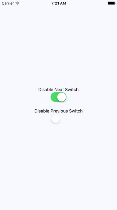
Here's what the same screen looks like on Android:
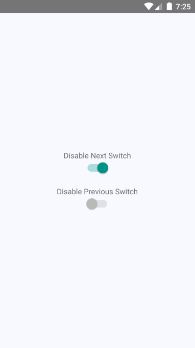
In this final section of the chapter, you'll learn how to implement date/time pickers. React Native has independent date/time picker components for iOS and Android, which means that it is up to you to handle the cross-platform differences between the components.
So, let's start with a date picker component for iOS:
import React from 'react';
import PropTypes from 'prop-types';
import { Text, View, DatePickerIOS } from 'react-native';
import styles from './styles';
// A simple abstraction that adds a label to
// the "<DatePickerIOS>" component.
const DatePicker = props => (
<View style={styles.datePickerContainer}>
<Text style={styles.datePickerLabel}>{props.label}</Text>
<DatePickerIOS mode="date" {...props} />
</View>
);
DatePicker.propTypes = {
label: PropTypes.string
};
export default DatePicker;
There's not a lot to this component; it simply adds a label to the DatePickerIOS component. The Android version of the date picker needs a little more work. Let's take a look at the implementation:
import React from 'react';
import PropTypes from 'prop-types';
import { Text, View, DatePickerAndroid } from 'react-native';
import styles from './styles';
// Opens the "DatePickerAndroid" dialog and handles
// the response. The "onDateChange" function is
// a callback that's passed in from the container
// component and expects a "Date" instance.
const pickDate = (options, onDateChange) => {
DatePickerAndroid.open(options).then(date =>
onDateChange(new Date(date.year, date.month, date.day))
);
};
// Renders a "label" and the "date" properties.
// When the date text is clicked, the "pickDate()"
// function is used to render the Android
// date picker dialog.
const DatePicker = ({ label, date, onDateChange }) => (
<View style={styles.datePickerContainer}>
<Text style={styles.datePickerLabel}>{label}</Text>
<Text onPress={() => pickDate({ date }, onDateChange)}>
{date.toLocaleDateString()}
</Text>
</View>
);
DatePicker.propTypes = {
label: PropTypes.string,
date: PropTypes.instanceOf(Date),
onDateChange: PropTypes.func.isRequired
};
export default DatePicker;
The key difference between the two date pickers is that the Android version doesn't use a React Native component, such as DatePickerIOS. Instead, we have to use the imperative DatePickerAndroid.open() API. This is triggered when the user presses the date text that our component renders, and opens a date picker dialog. The good news is that this component of ours hides this API behind a declarative component.
Now, let's see how to use our date and time picker components:
import React, { Component } from 'react';
import { View } from 'react-native';
import styles from './styles';
// Imports our own platform-independent "DatePicker"
// and "TimePicker" components.
import DatePicker from './DatePicker';
import TimePicker from './TimePicker';
export default class CollectingDateTimeInput extends Component {
state = {
date: new Date(),
time: new Date()
};
render() {
return (
<View style={styles.container}>
<DatePicker
label="Pick a date, any date:"
date={this.state.date}
onDateChange={date => this.setState({ date })}
/>
<TimePicker
label="Pick a time, any time:"
date={this.state.time}
onTimeChange={time => this.setState({ time })}
/>
</View>
);
}
}
Awesome! Now we have two simple components that work on iOS and Android. Let's see how the pickers look on iOS:
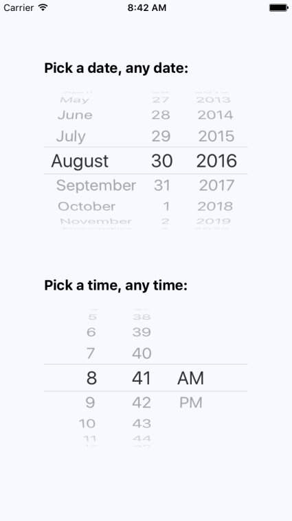
As you can see, the iOS date and time pickers use the Picker component that you learned about earlier in this chapter. The Android picker looks a lot different—let's look at it now:
In this chapter, you learned about the various React Native components that resemble the form elements from the web that you're used to. You started off by learning about text input, and how each text input has its own virtual keyboard to take into consideration. Next, you learned about Picker components that allow the user to select an item from a list of options. Then, you learned about Switch component,which are kind of like checkboxes.
In the final section, you learned how to implement generic date/time pickers that work on both iOS and Android. In the next chapter, you'll learn about modal dialogs in React Native.
Visit the following links for more information:
The goal of this chapter is to show you how to present information to the user in ways that don't disrupt the current page. Pages use a View component, and render it directly on the screen. There are times, however, when there's important information that the user needs to see, but you don't necessarily want to kick them off of the current page.
You'll start by learning how to display important information. Knowing what important information is and when to use it, you'll see how to get user acknowledgement—both for error and success scenarios. Then, you'll implement passive notifications that show the user that something has happened. Finally, you'll implement modal views that show the user that something is happening in the background.
Before you dive into implementing alerts, notifications, and confirmations, let's take a few minutes and think about what each of these items mean. I think this is important, because if you end up passively notifying the user about an error, it can easily get missed. Here are my definitions of the types of information that you'll want to display:
Confirmation is actually part of an alert. For example, if the user has just performed an action, and then wants to make sure that it was successful before carrying on, they would have to confirm that they've seen the information in order to close the modal. A confirmation could also exist within an alert, warning the user about an action that they're about to perform.
The trick is to try to use notifications where the information is good to know, but not critical. Use confirmations only when the workflow of the feature cannot continue without the user acknowledging what's going on. In the following sections, you'll see examples of alerts and notifications used for different purposes.
In this section, you'll learn how to show modal views in order to get confirmation from the user. First, you'll learn how to implement the successful scenario, where an action generates a successful outcome that you want the user to be aware of. Then, you'll learn how to implement the error scenario, where something went wrong and you don't want the user to move forward without acknowledging the issue.
Let's start by implementing a modal view that's displayed as the result of the user successfully performing an action. Here's the Modal component, which is used to show the user a success confirmation:
import React from 'react';
import PropTypes from 'prop-types';
import { View, Text, Modal } from 'react-native';
import styles from './styles';
// Uses "<Modal>" to display the underlying view
// on top of the current view. Properties passed to
// this component are also passed to the modal.
const ConfirmationModal = props => (
<Modal {...props}>
{/* Slightly confusing, but we need an inner and
an outer "<View>" to style the height of the
modal correctly. */}
<View style={styles.modalContainer}>
<View style={styles.modalInner}>
{/* The confirmation message... */}
<Text style={styles.modalText}>Dude, srsly?</Text>
{/* The confirmation and the cancel buttons. Each
button triggers a different callback function
that's passed in from the container
component. */}
<Text
style={styles.modalButton}
onPress={props.onPressConfirm}
>
Yep
</Text>
<Text
style={styles.modalButton}
onPress={props.onPressCancel}
>
Nope
</Text>
</View>
</View>
</Modal>
);
ConfirmationModal.propTypes = {
visible: PropTypes.bool.isRequired,
onPressConfirm: PropTypes.func.isRequired,
onPressCancel: PropTypes.func.isRequired
};
ConfirmationModal.defaultProps = {
transparent: true,
onRequestClose: () => {}
};
export default ConfirmationModal;
The properties that are passed to ConfirmationModal are forwarded to the React Native Modal component. You'll see why in a moment. First, let's see what this confirmation modal looks like:
The modal that's displayed once the user completes an action has our own styling and confirmation message. It also has two actions, but it might only need one, depending on whether this confirmation is pre- or post-action. Here are the styles used for this modal:
modalContainer: {
flex: 1,
justifyContent: 'center',
alignItems: 'center',
},
modalInner: {
backgroundColor: 'azure',
padding: 20,
borderWidth: 1,
borderColor: 'lightsteelblue',
borderRadius: 2,
alignItems: 'center',
},
modalText: {
fontSize: 16,
margin: 5,
color: 'slategrey',
},
modalButton: {
fontWeight: 'bold',
margin: 5,
color: 'slategrey',
},
With the React Native Modal component, it's pretty much up to you how you want your confirmation modal view to look. Think of them as regular views, with the only difference being that they're rendered on top of other views.
A lot of the time, you might not care to style your own modal views. For example, in web browsers, you can simply call the alert() function, which shows text in a window that's styled by the browser. React Native has something similar: Alert.alert(). The tricky part here is that this is an imperative API, and you don't necessarily want to expose it directly in your application.
Instead, let's implement an alert confirmation component that hides the details of this particular React Native API so that your app can just treat this like any other component:
import React, { Component } from 'react';
import PropTypes from 'prop-types';
import { Alert } from 'react-native';
// The "actions" Map will map the "visible"
// property to the "Alert.alert()" function,
// or to a noop function.
const actions = new Map([[true, Alert.alert], [false, () => {}]]);
class ConfirmationAlert extends Component {
state = { visible: false, title: '', message: '', buttons: [] };
static getDerivedStateFromProps(props) {
return props;
}
render() {
actions.get(this.state.visible)(
this.state.title,
this.state.message,
this.state.buttons
);
return null;
}
}
ConfirmationAlert.propTypes = {
visible: PropTypes.bool.isRequired,
title: PropTypes.string,
message: PropTypes.string,
buttons: PropTypes.array
};
export default ConfirmationAlert;
There are two important aspects to this component. First, take a look at the actions map. Its keys—true and false—correspond to the visible state value. The values correspond to the imperative alert() API and a noop function. This is the key to translating the declarative React component interface we know and love into something that's hidden from view.
Second, note that the render() method doesn't need to render anything, since this component deals exclusively with imperative React Native calls. But, it feels like something is being rendered to the person that's using ConfirmationAlert.
Here's what the alert looks like on iOS:

In terms of functionality, there's nothing really different here. There's a title and text beneath it, but that's something that could easily be added to a modal view if you wanted. The real difference is that this modal looks like an iOS modal, instead of something that's styled by the app. Let's see how this alert appears on Android:

This modal looks like an Android modal, and you didn't have to style it. I think using alerts over modals is a better choice most of the time. It makes sense to have something styled to look like it's part of iOS or part of Android. However, there are times when you need more control over how the modal looks, such as when displaying error confirmations. Here's the code that's used to display both the modal and the alert confirmation dialogs:
import React, { Component } from 'react';
import { View, Text } from 'react-native';
import { fromJS } from 'immutable';
import styles from './styles';
import ConfirmationModal from './ConfirmationModal';
import ConfirmationAlert from './ConfirmationAlert';
export default class SuccessConfirmation extends Component {
// The two pieces of state used to control
// the display of the modal and the alert
// views.
state = {
data: fromJS({
modalVisible: false,
alertVisible: false
})
};
// Getter for "Immutable.js" state data...
get data() {
return this.state.data;
}
// Setter for "Immutable.js" state data...
set data(data) {
this.setState({ data });
}
// A "modal" button was pressed. So show
// or hide the modal based on its current state.
toggleModal = () => {
this.data = this.data.update('modalVisible', v => !v);
};
// A "alert" button was pressed. So show
// or hide the alert based on its current state.
toggleAlert = () => {
this.data = this.data.update('alertVisible', v => !v);
};
render() {
const { modalVisible, alertVisible } = this.data.toJS();
const { toggleModal, toggleAlert } = this;
return (
<View style={styles.container}>
{/* Renders the "<ConfirmationModal>" component,
which is hidden by default and controlled
by the "modalVisible" state. */}
<ConfirmationModal
animationType="fade"
visible={modalVisible}
onPressConfirm={toggleModal}
onPressCancel={toggleModal}
/>
{/* Renders the "<ConfirmationAlert>" component,
which doesn't actually render anything since
it controls an imperative API under the hood.
The "alertVisible" state controls this API. */}
<ConfirmationAlert
title="Are you sure?"
message="For realz?"
visible={alertVisible}
buttons={[
{
text: 'Nope',
onPress: toggleAlert
},
{
text: 'Yep',
onPress: toggleAlert
}
]}
/>
{/* Shows the "<ConfirmationModal>" component
by changing the "modalVisible" state. */}
<Text style={styles.text} onPress={toggleModal}>
Show Confirmation Modal
</Text>
{/* Shows the "<ConfirmationAlert>" component
by changing the "alertVisible" state. */}
<Text style={styles.text} onPress={toggleAlert}>
Show Confimation Alert
</Text>
</View>
);
}
}
The approach to rendering modals is different to the approach to rendering alerts. However, they're both still declarative components that change based on changing property values.
All of the principles you learned about in the preceding section are applicable when you need the user to acknowledge an error. If you need more control of the display, use a modal. For example, you might want the modal to be red and scary looking:
Here are the styles used to create this look. Maybe you want something a little more subtle, but the point is that you can make this look however you want:
import { StyleSheet } from 'react-native';
export default StyleSheet.create({
container: {
flex: 1,
justifyContent: 'center',
alignItems: 'center',
backgroundColor: 'ghostwhite',
},
text: {
color: 'slategrey',
},
modalContainer: {
flex: 1,
justifyContent: 'center',
alignItems: 'center',
},
modalInner: {
backgroundColor: 'azure',
padding: 20,
borderWidth: 1,
borderColor: 'lightsteelblue',
borderRadius: 2,
alignItems: 'center',
},
modalInnerError: {
backgroundColor: 'lightcoral',
borderColor: 'darkred',
},
modalText: {
fontSize: 16,
margin: 5,
color: 'slategrey',
},
modalTextError: {
fontSize: 18,
color: 'darkred',
},
modalButton: {
fontWeight: 'bold',
margin: 5,
color: 'slategrey',
},
modalButtonError: {
color: 'black',
},
});
The same modal styles that you used for the success confirmations are still here. That's because the error confirmation modal needs many of the same styles. Here's how you apply both to the Modal component:
import React from 'react';
import PropTypes from 'prop-types';
import { View, Text, Modal } from 'react-native';
import styles from './styles';
// Declares styles for the error modal by
// combining regular modal styles with
// error styles.
const innerViewStyle = [styles.modalInner, styles.modalInnerError];
const textStyle = [styles.modalText, styles.modalTextError];
const buttonStyle = [styles.modalButton, styles.modalButtonError];
// Just like a success modal, accept for the addition of
// error styles.
const ErrorModal = props => (
<Modal {...props}>
<View style={styles.modalContainer}>
<View style={innerViewStyle}>
<Text style={textStyle}>Epic fail!</Text>
<Text style={buttonStyle} onPress={props.onPressConfirm}>
Fix it
</Text>
<Text style={buttonStyle} onPress={props.onPressCancel}>
Ignore it
</Text>
</View>
</View>
</Modal>
);
ErrorModal.propTypes = {
visible: PropTypes.bool.isRequired,
onPressConfirm: PropTypes.func.isRequired,
onPressCancel: PropTypes.func.isRequired
};
ErrorModal.defaultProps = {
transparent: true,
onRequestClose: () => {}
};
export default ErrorModal;
The styles are combined as arrays before they're passed to the style property. The error styles always come last since conflicting style properties, such as backgroundColor, will be overridden by whatever comes later in the array.
In addition to styles in error confirmations, you can include whatever advanced controls you want. It really depends on how your application lets users cope with errors; for example, maybe there are several courses of action that can be taken.
However, the more common case is that something went wrong and there's nothing you can do about it, besides making sure that the user is aware of the situation. In these cases, you can probably get away with just displaying an alert:
The notifications you've examined so far in this chapter all have required input from the user. This is by design because it's important information that you're forcing the user to look at. You don't want to over-do this, however. For notifications that are important but not life-altering if ignored, you can use passive notifications. These are displayed in a less obtrusive way than modals, and don't require any user action to dismiss.
In this section, you'll create a Notification component, which uses the Toast API for Android, and creates a custom modal for iOS. It's called the Toast API because the information that's displayed looks like a piece of toast popping up. Here's what the Android component looks like:
import React from 'react';
import PropTypes from 'prop-types';
import { ToastAndroid } from 'react-native';
import { Map } from 'immutable';
// Toast helper. Always returns "null" so that the
// output can be rendered as a React element.
const show = (message, duration) => {
ToastAndroid.show(message, duration);
return null;
};
// This component will always return null,
// since it's using an imperative React Native
// interface to display popup text. If the
// "message" property was provided, then
// we display a message.
const Notification = ({ message, duration }) =>
Map([[null, null], [undefined, null]]).get(
message,
show(message, duration)
);
Notification.propTypes = {
message: PropTypes.string,
duration: PropTypes.number.isRequired
};
Notification.defaultProps = {
duration: ToastAndroid.LONG
};
export default Notification;
Once again, you're dealing with an imperative React Native API that you don't want to expose to the rest of your app. Instead, this component hides the imperative ToastAndroid.show() function behind a declarative React component. No matter what, this component returns null, because it doesn't actually render anything. Here's what the ToastAndroid notification looks like:

The notification that something has happened is displayed at the bottom of the screen and is removed after a short delay. The key is that the notification is unobtrusive.
The iOS notification component is a little more involved, because it needs state and lifecycle events to make a modal view behave like a transient notification. Here's the code:
import React, { Component } from 'react';
import PropTypes from 'prop-types';
import { View, Modal, Text } from 'react-native';
import { Map } from 'immutable';
import styles from './styles';
class Notification extends Component {
static propTypes = {
message: PropTypes.string,
duration: PropTypes.number.isRequired
};
static defaultProps = {
duration: 1500
};
static getDerivedStateFromProps(props) {
// Update the "visible" state, based on whether
// or not there's a "message" value.
return {
...this.state,
visible: Map([[null, false], [undefined, false]]).get(
props.message,
true
)
};
}
// The modal component is either "visible", or not.
// The "timer" is used to hide the notification
// after some predetermined amount of time.
state = { visible: false };
timer = null;
componentWillUnmount() {
clearTimeout(this.timer);
}
render() {
const modalProps = {
animationType: 'fade',
transparent: true,
visible: this.state.visible
};
this.timer = Map([
[null, () => null],
[undefined, () => null]
]).get(this.props.message, () =>
setTimeout(
() => this.setState({ visible: false }),
this.props.duration
)
)();
return (
<Modal {...modalProps}>
<View style={styles.notificationContainer}>
<View style={styles.notificationInner}>
<Text>{this.props.message}</Text>
</View>
</View>
</Modal>
);
}
}
Notification.propTypes = {
message: PropTypes.string,
duration: PropTypes.number.isRequired
};
Notification.defaultProps = {
duration: 1500
};
export default Notification;
You have to style the modal to display the notification text, as well as the state that's used to hide the notification after a delay. Here's what the end result looks like for iOS:
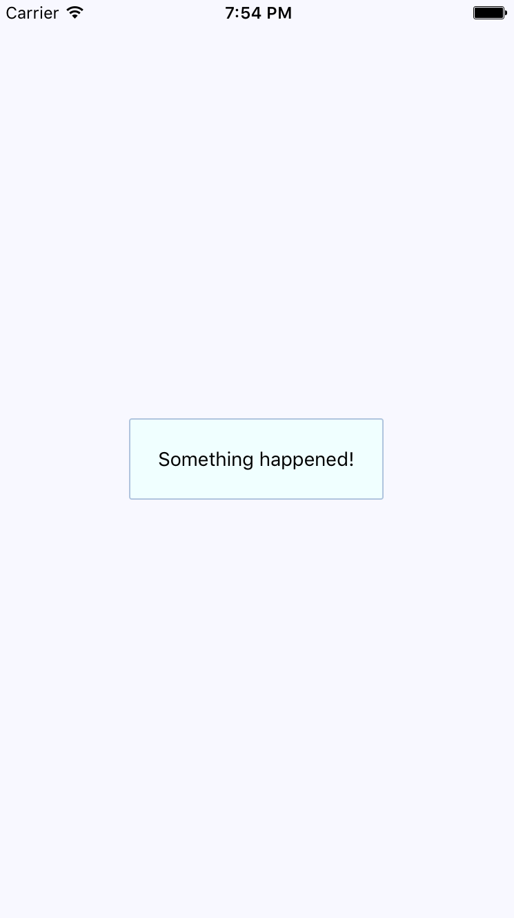
The same principle with the ToastAndroid API applies here. You might have noticed that there's another button in addition to the Show Notification button. This is a simple counter that re-renders the view. There's actually a reason for demonstrating this seemingly obtuse feature, as you'll see momentarily. Here's the code for the main application view:
import React, { Component } from 'react';
import { Text, View } from 'react-native';
import { fromJS } from 'immutable';
import styles from './styles';
import Notification from './Notification';
export default class PassiveNotifications extends Component {
// The initial state is the number of times
// the counter button has been clicked, and
// the notification message.
state = {
data: fromJS({
count: 0,
message: null
})
};
// Getter for "Immutable.js" state data...
get data() {
return this.state.data;
}
// Setter for "Immutable.js" state data...
set data(data) {
this.setState({ data });
}
render() {
const { count, message } = this.data.toJS();
return (
<View style={styles.container}>
{/* The "Notification" component is
only displayed if the "message" state
has something in it. */}
<Notification message={message} />
{/* Updates the count. Also needs to make
sure that the "message" state is null,
even if the message has been hidden
already. */}
<Text
onPress={() => {
this.data = this.data
.update('count', c => c + 1)
.set('message', null);
}}
>
Pressed {count}
</Text>
{/* Displays the notification by
setting the "message" state. */}
<Text
onPress={() => {
this.data = this.data.set(
'message',
'Something happened!'
);
}}
>
Show Notification
</Text>
</View>
);
}
}
The whole point of the press counter is to demonstrate that, even though the Notification component is declarative and accepts new property values when the state changes, you still have to set the message state to null when changing other state values. The reason for this is that if you re-render the component and the message state still has a string in it, it will display the same notification, over and over.
In this final section of the chapter, you'll implement a modal that shows a progress indicator. The idea is to display the modal, and then hide it when the promise resolves. Here's the code for the generic Activity component that shows a modal with an activity indicator:
import React from 'react';
import PropTypes from 'prop-types';
import { View, Modal, ActivityIndicator } from 'react-native';
import styles from './styles';
// The "Activity" component will only display
// if the "visible" property is try. The modal
// content is an "<ActivityIndicator>" component.
const Activity = props => (
<Modal visible={props.visible} transparent>
<View style={styles.modalContainer}>
<ActivityIndicator size={props.size} />
</View>
</Modal>
);
Activity.propTypes = {
visible: PropTypes.bool.isRequired,
size: PropTypes.string.isRequired
};
Activity.defaultProps = {
visible: false,
size: 'large'
};
export default Activity;
You might be tempted to pass the promise to the component so that it automatically hides itself when the promise resolves. I don't think this is a good idea, because then you would have to introduce the state into this component. Furthermore, it would depend on a promise in order to function. With the way you've implemented this component, you can show or hide the modal based on the visible property alone. Here's what the activity modal looks like on iOS:

There's a semi-transparent background on the modal that's placed over the main view with the Fetch Stuff... link. Here's how this effect is created in styles.js:
modalContainer: {
flex: 1,
justifyContent: 'center',
alignItems: 'center',
backgroundColor: 'rgba(0, 0, 0, 0.2)',
},
Instead of setting the actual Modal component to be transparent, you set the transparency in backgroundColor, which gives the look of an overlay. Now, let's take a look at the code that controls this component:
import React, { Component } from 'react';
import { Text, View } from 'react-native';
import { fromJS } from 'immutable';
import styles from './styles';
import Activity from './Activity';
export default class ActivityModals extends Component {
// The state is a "fetching" boolean value,
// and a "promise" that is used to determine
// when the fetching is done.
state = {
data: fromJS({
fetching: false,
promise: Promise.resolve()
})
};
// Getter for "Immutable.js" state data...
get data() {
return this.state.data;
}
// Setter for "Immutable.js" state data...
set data(data) {
this.setState({ data });
}
// When the fetch button is pressed, the
// promise that simulates async activity
// is set, along with the "fetching" state.
// When the promise resolves, the "fetching"
// state goes back to false, hiding the modal.
onPress = () => {
this.data = this.data.merge({
promise: new Promise(resolve => setTimeout(resolve, 3000)).then(
() => {
this.data = this.data.set('fetching', false);
}
),
fetching: true
});
};
render() {
return (
<View style={styles.container}>
{/* The "<Activity>" modal is only visible
when the "fetching" state is true. */}
<Activity visible={this.data.get('fetching')} />
<Text onPress={this.onPress}>Fetch Stuff...</Text>
</View>
);
}
}
When the fetch link is pressed, a new promise is created that simulates async network activity. Then, when the promise resolves, you change the fetching state back to false so that the activity dialog is hidden.
In this chapter, you learned about the need to show mobile users important information. This sometimes involves explicit feedback from the user, even if that just means acknowledgement of the message. In other cases, passive notifications work better, since they're less obtrusive than the confirmation modals.
There are two tools that you can use to display messages to users: modals and alerts. Modals are more flexible, because they're just like regular views. Alerts are good for displaying plain text and they take care of styling concerns for you. On Android, you have the additional ToastAndroid interface. You saw that it's also possible to do this on iOS, but it just requires more work.
In the next chapter, we'll dig deeper into the gesture response system inside React Native, which makes for a better mobile experience than browsers are able to provide.
Check out the following links for more information:
All of the examples that you've implemented so far in this book have relied on user gestures. In traditional web applications, you mostly deal with mouse events. However, touchscreens rely on the user manipulating elements with their fingers—fundamentally different from the mouse.
The goal of this chapter is to show you how the gesture response system inside React Native works and some of the ways this system is exposed via components.
First you'll learn about scrolling. This is probably the most common gesture, besides touch. Then, you'll learn about giving the user the appropriate level of feedback when they interact with your components. Finally, you'll implement components that can be swiped.
Scrolling in web applications is done by using the mouse pointer to drag the scrollbar back and forth or up and down, or by spinning the mousewheel. This doesn't work on a mobile device because there's no mouse. Everything is controlled by gestures on the screen. For example, if you want to scroll down, you use your thumb or index finger to pull the content up by physically moving your finger on the screen.
Scrolling like this is difficult to implement, but it gets more complicated. When you scroll on a mobile screen, the velocity of the dragging motion is taken into consideration. You drag the screen fast, then let go, and the screen will continue to scroll based on how fast you moved. You can also touch the screen while this is happening to stop it from scrolling.
Thankfully, you don't have to handle most of this stuff. The ScrollView component handles much of the scrolling complexity for you. In fact, you've already used the ScrollView component, back in Chapter 16, Rendering Item Lists. The ListView component has ScrollView baked into it.
You can use the ScrollView outside ListView. For example, if you're just rendering arbitrary content such as text and other widgets—not a list, in other words—you can just wrap it in a <ScrollView>. Here's an example:
import React from 'react';
import {
Text,
ScrollView,
ActivityIndicator,
Switch,
View
} from 'react-native';
import styles from './styles';
export default () => (
<View style={styles.container}>
{/* The "<ScrollView>" can wrap any
other component to make it scrollable.
Here, we're repeating an arbitrary group
of components to create some scrollable
content */}
<ScrollView style={styles.scroll}>
{new Array(6).fill(null).map((v, i) => (
<View key={i}>
{/* Abitrary "<Text>" component... */}
<Text style={[styles.scrollItem, styles.text]}>
Some text
</Text>
{/* Arbitrary "<ActivityIndicator>"... */}
<ActivityIndicator style={styles.scrollItem} size="large" />
{/* Arbitrary "<Switch>" component... */}
<Switch style={styles.scrollItem} />
</View>
))}
</ScrollView>
</View>
);
The ScrollView component isn't of much use on it's own—its there to wrap other components. It does need a height in order to function correctly. Here's what the scroll style looks like:
scroll: {
height: 1,
alignSelf: 'stretch',
},
The height is set to 1, but the stretch value of alignSelf allows the items to display properly. Here's what the end result looks like:
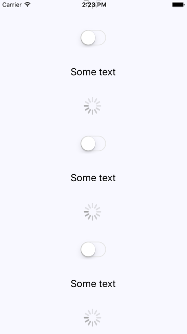
There's a vertical scrollbar on the right side of the screen as you drag the content down. If you run this example, you can play around with making various gestures, such as making content scroll on its own and then making it stop.
The React Native examples you've worked with so far in this book have used plain text to act as buttons or links. In web applications, to make text look like something that can be clicked, you just wrap it with the appropriate link. There's no such thing as mobile links, so you can style your text to look like a button.
Let's style some text as a button. This is a great first step, making the text look touchable. But you also want to give visual feedback to the user when they start interacting with the button. React Native provides two components to help with this: TouchableOpacity and TouchableHighlight. But before diving into the code, let's take a look at what these components look like visually when users interact with them, starting with TouchableOpacity:
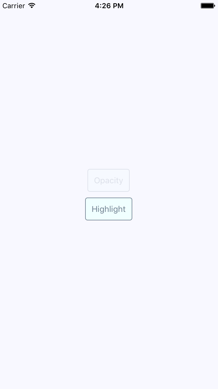
There's two buttons rendered here, and the top one labeled Opacity is currently being pressed by the user. The opacity of the button is dimmed when pressed, which provides important visual feedback for the user. Let's see what the Highlight button looks like when pressed, as follows:
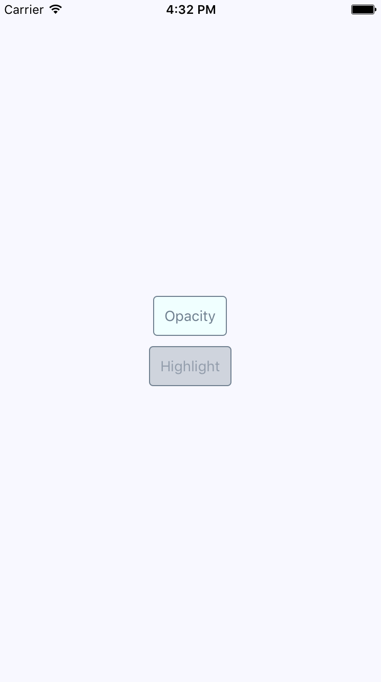
Instead of changing the opacity when pressed, the TouchableHighlight component adds a highlight layer over the button. In this case, it's highlighted using a more transparent version of the slate gray used in the font and border colors.
Which approach you use doesn't really matter. The important thing is that you provide the appropriate touch feedback for your users as they interact with your buttons. In fact, you might want to use the two approaches in the same app, but for different things. Let's create a Button component, which makes it easy to use either approach:
import React from 'react';
import PropTypes from 'prop-types';
import {
Text,
TouchableOpacity,
TouchableHighlight
} from 'react-native';
import styles from './styles';
// The "touchables" map is used to get the right
// component to wrap around the button. The
// "undefined" key represents the default.
const touchables = new Map([
['opacity', TouchableOpacity],
['highlight', TouchableHighlight],
[undefined, TouchableOpacity]
]);
const Button = ({ label, onPress, touchable }) => {
// Get's the "Touchable" component to use,
// based on the "touchable" property value.
const Touchable = touchables.get(touchable);
// Properties to pass to the "Touchable"
// component.
const touchableProps = {
style: styles.button,
underlayColor: 'rgba(112,128,144,0.3)',
onPress
};
// Renders the "<Text>" component that's
// styled to look like a button, and is
// wrapped in a "<Touchable>" component
// to properly handle user interactions.
return (
<Touchable {...touchableProps}>
<Text style={styles.buttonText}> {label} </Text>
</Touchable>
);
};
Button.propTypes = {
onPress: PropTypes.func.isRequired,
label: PropTypes.string.isRequired,
touchable: PropTypes.oneOf(['opacity', 'highlight'])
};
export default Button;
The touchables map is used to determine which React Native touchable component wraps the text, based on the touchable property value. Here's the styles used to create this button are as follows:
button: {
padding: 10,
margin: 5,
backgroundColor: 'azure',
borderWidth: 1,
borderRadius: 4,
borderColor: 'slategrey',
},
buttonText: {
color: 'slategrey',
}
Here's how you can put those buttons to use in the main app module:
import React from 'react';
import { View } from 'react-native';
import styles from './styles';
import Button from './Button';
export default () => (
<View style={styles.container}>
{/* Renders a "<Button>" that uses
"TouchableOpacity" to handle user
gestures, since that is the default */}
<Button onPress={() => {}} label="Opacity" />
{/* Renders a "<Button>" that uses
"TouchableHighlight" to handle
user gestures. */}
<Button
onPress={() => {}}
label="Highlight"
touchable="highlight"
/>
</View>
);
Note that the onPress callbacks don't actually do anything,—we're passing them because they're a required property.
Part of what makes native mobile applications easier to use than mobile web applications is that they feel more intuitive. Using gestures, you can quickly get a handle on how things work. For example, swiping an element across the screen with your finger is a common gesture, but the gesture has to be discoverable.
Let's say that you're using an app, and you're not exactly sure what something on the screen does. So, you press down with your finger, and try dragging the element. It starts to move. Unsure of what will happen, you lift your finger up, and the element moves back into place. You've just discovered how part of this application works.
You'll use the Scrollable component to implement swipeable and cancelable behavior like this. You can create a somewhat generic component that allows the user to swipe text off the screen and, when that happens, call a callback function. Let's look at the code to render the swipeables before we look at the generic component itself:
import React, { Component } from 'react';
import { View } from 'react-native';
import { fromJS } from 'immutable';
import styles from './styles';
import Swipeable from './Swipeable';
export default class SwipableAndCancellable extends Component {
// The initial state is an immutable list of
// 8 swipable items.
state = {
data: fromJS(
new Array(8)
.fill(null)
.map((v, id) => ({ id, name: 'Swipe Me' }))
)
};
// Getter for "Immutable.js" state data...
get data() {
return this.state.data;
}
// Setter for "Immutable.js" state data...
set data(data) {
this.setState({ data });
}
// The swipe handler passed to "<Swipeable>".
// The swiped item is removed from the state.
// This is a higher-order function that returns
// the real handler so that the "id" context
// can be set.
onSwipe = id => () => {
this.data = this.data.filterNot(v => v.get('id') === id);
};
render() {
return (
<View style={styles.container}>
{this.data
.toJS()
.map(i => (
<Swipeable
key={i.id}
onSwipe={this.onSwipe(i.id)}
name={i.name}
/>
))}
</View>
);
}
}
This will render eight <Swipeable> components on the screen. Let's see what this looks like:
Now, if you start to swipe one of these items to the left, it will move. Here's what it looks like:
If you don't swipe far enough, the gesture is canceled and the item moves back into place as expected. If you swipe it all the way, the item is removed from the list completely and the items on the screen fill the empty space like this:
Now let's take a look at the Swipeable component itself:
import React from 'react';
import PropTypes from 'prop-types';
import {
View,
ScrollView,
Text,
TouchableOpacity
} from 'react-native';
import styles from './styles';
// The "onScroll" handler. This is actually
// a higher-order function that returns the
// actual handler. When the x offset is 200,
// when know that the component has been
// swiped and can call "onSwipe()".
const onScroll = onSwipe => e =>
e.nativeEvent.contentOffset.x === 200 && onSwipe();
// The static properties used by the "<ScrollView>"
// component.
const scrollProps = {
horizontal: true,
pagingEnabled: true,
showsHorizontalScrollIndicator: false,
scrollEventThrottle: 10
};
const Swipeable = ({ onSwipe, name }) => (
<View style={styles.swipeContainer}>
{/* The "<View>" that wraps this "<ScrollView>"
is necessary to make scrolling work properly. */}
<ScrollView {...scrollProps} onScroll={onScroll(onSwipe)}>
{/* Not strictly necessary, but "<TouchableOpacity>"
does provide the user with meaningful feedback
when they initially press down on the text. */}
<TouchableOpacity>
<View style={styles.swipeItem}>
<Text style={styles.swipeItemText}>{name}</Text>
</View>
</TouchableOpacity>
<View style={styles.swipeBlank} />
</ScrollView>
</View>
);
Swipeable.propTypes = {
onSwipe: PropTypes.func.isRequired,
name: PropTypes.string.isRequired
};
export default Swipeable;
Note that the <ScrollView> component is set to be horizontal and that pagingEnabled is true. It's the paging behavior that snaps the components into place, and provides the cancelable behavior. This is why there's a blank component beside the component with text in it. Here are the styles used for this component:
swipeContainer: {
flex: 1,
flexDirection: 'row',
width: 200,
height: 30,
marginTop: 50,
},
swipeItem: {
width: 200,
height: 30,
backgroundColor: 'azure',
justifyContent: 'center',
borderWidth: 1,
borderRadius: 4,
borderColor: 'slategrey',
},
swipeItemText: {
textAlign: 'center',
color: 'slategrey',
},
swipeBlank: {
width: 200,
height: 30,
},
The swipeBlank style has the same dimensions as swipeItem, but nothing else. It's invisible.
In this chapter, you were introduced to the idea that gestures on native platforms are the difference maker when compared to mobile web platforms. We started off by looking at the ScrollView component, and how it makes life much simpler by providing native scrolling behavior for wrapped components.
Next, we spent some time implementing buttons with touch feedback. This is another area that's tricky to get right on the mobile web. You learned how to use the TouchableOpacity and TouchableHighlight components.
Finally, you implemented a generic Swipeable component. Swiping is a common mobile pattern, and it allows for the user to discover how things work without feeling intimidated. In the next chapter, you'll learn how to control image display using React Native.
Take a look at the following links for more information:
So far, the examples in this book haven't rendered any images on mobile screens. This doesn't reflect the reality of mobile applications. Web applications display lots of images. If anything, native mobile applications rely on images even more than web applications because images are a powerful tool when you have a limited amount of space.
You'll learn how to use the React Native Image component in this chapter, starting with loading images from different sources. Then, you'll see how you can use the Image component to resize images, and how you can set placeholders for lazily loaded images. Finally, you'll learn how to implement icons using the react-native-vector-icons package.
Let's get things started by figuring out how to load images. You can render the <Image> component and pass it properties just like any other React component. But this particular component needs image blob data to be of any use. Let's look at some code:
import React from 'react';
import PropTypes from 'prop-types';
import { View, Image } from 'react-native';
import styles from './styles';
// Renders two "<Image>" components, passing the
// properties of this component to the "source"
// property of each image.
const LoadingImages = ({ reactSource, relaySource }) => (
<View style={styles.container}>
<Image style={styles.image} source={reactSource} />
<Image style={styles.image} source={relaySource} />
</View>
);
// The "source" property can be either
// an object with a "uri" string, or a number
// represending a local "require()" resource.
const sourceProp = PropTypes.oneOfType([
PropTypes.shape({
uri: PropTypes.string.isRequired
}),
PropTypes.number
]).isRequired;
LoadingImages.propTypes = {
reactSource: sourceProp,
relaySource: sourceProp
};
LoadingImages.defaultProps = {
// The "reactSource" image comes from a remote
// location.
reactSource: {
uri:
'https://facebook.github.io/react-native/docs/assets/favicon.png'
},
// The "relaySource" image comes from a local
// source.
relaySource: require('./images/relay.png')
};
export default LoadingImages;
There are two ways to load the blob data into an <Image> component. The first approach loads the image data from the network. This is done by passing an object with a uri property to source. The second <Image> component in this example is using a local image file, by calling require() and passing the result to source.
Take a look at the sourceProp property type validator. This gives you an idea of what can be passed to the source property. It's either an object with a uri string property or a number. It expects a number because require() returns a number.
Now, let's see what the rendered result looks like as follows:

Here's the style that was used with these images:
image: {
width: 100,
height: 100,
margin: 20,
},
Note that without width and height style properties, images will not render. In the next section, you'll learn how image resizing works when width and height values are set.
The width and height style properties of Image components determine the size of what's rendered on the screen. For example, you'll probably have to work with images at some point that have a larger resolution than you want displayed in your React Native application. Simply setting the width and height style properties on the Image is enough to properly scale the image.
Let's look at some code that lets you dynamically adjust the dimensions of an image using a control as follows:
import React, { Component } from 'react';
import { View, Text, Image, Slider } from 'react-native';
import { fromJS } from 'immutable';
import styles from './styles';
export default class ResizingImages extends Component {
// The initial state of this component includes
// a local image source, and the width/height
// image dimensions.
state = {
data: fromJS({
source: require('./images/flux.png'),
width: 100,
height: 100
})
};
// Getter for "Immutable.js" state data...
get data() {
return this.state.data;
}
// Setter for "Immutable.js" state data...
set data(data) {
this.setState({ data });
}
render() {
// The state values we need...
const { source, width, height } = this.data.toJS();
return (
<View style={styles.container}>
{/* The image is rendered using the
"source", "width", and "height"
state values. */}
<Image source={source} style={{ width, height }} />
{/* The current "width" and "height"
values are displayed. */}
<Text>Width: {width}</Text>
<Text>Height: {height}</Text>
{/* This slider scales the image size
up or down by changing the "width"
and "height" states. */}
<Slider
style={styles.slider}
minimumValue={50}
maximumValue={150}
value={width}
onValueChange={v => {
this.data = this.data.merge({
width: v,
height: v
});
}}
/>
</View>
);
}
}
Here's what the image looks like if you're using the default 100 x 100 dimensions:
Here's a scaled-down version of the image:
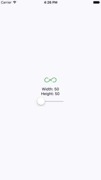
Lastly, here's a scaled-up version of the image:
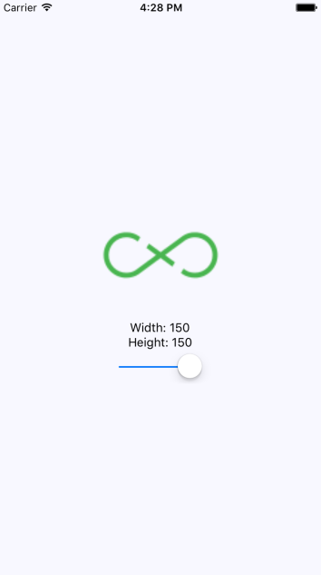
Sometimes, you don't necessarily want an image to load at the exact moment that it's rendered. For example, you might be rendering something that's not yet visible on the screen. Most of the time, it's perfectly fine to fetch the image source from the network before it's actually visible. But if you're fine-tuning your application and discover that loading lots of images over the network causes performance issues, you can lazily—load the source.
I think the more common use case in a mobile context is handling a scenario where you've rendered one or more images where they're visible, but the network is slow to respond. In this case, you will probably want to render a placeholder image so that the user sees something right away, rather than empty space.
To do this, you can implement an abstraction that wraps the actual image that you want to show once it's loaded. Here's the code:
import React, { Component } from 'react';
import PropTypes from 'prop-types';
import { View, Image } from 'react-native';
// The local placeholder image source.
const placeholder = require('./images/placeholder.png');
// The mapping to the "loaded" state that gets us
// the appropriate image component.
const Placeholder = props =>
new Map([
[true, null],
[false, <Image {...props} source={placeholder} />]
]).get(props.loaded);
class LazyImage extends Component {
// The "width" and "height" properties
// are required. All other properties are
// forwarded to the actual "<Image>"
// component.
static propTypes = {
style: PropTypes.shape({
width: PropTypes.number.isRequired,
height: PropTypes.number.isRequired
})
};
constructor() {
super();
// We assume that the source hasn't finished
// loading yet.
this.state = {
loaded: false
};
}
render() {
// The props and state this component
// needs in order to render...
const {
props: {
style: { width, height }
},
state: { loaded }
} = this;
return (
<View style={{ width, height }}>
{/* The placeholder image is just a standard
"<Image>" component with a predefined
source. It isn't rendered if "loaded" is
true. */}
<Placeholder loaded={loaded} {...this.props} />
{/* The actual image is forwarded props that
are passed to "<LazyImage>". The "onLoad"
handler ensures the "loaded" state is true,
removing the placeholder image. */}
<Image
{...this.props}
onLoad={() =>
this.setState({
loaded: true
})
}
/>
</View>
);
}
}
export default LazyImage;
This component renders a View with two Image components inside. It also has a loaded state, which is initially false. When loaded is false, the placeholder image is rendered. The loaded state is set to true when the onLoad() handler is called. This means that the placeholder image is removed, and the main image is displayed.
Now let's use the LazyImage component that you've just implemented. You'll render the image without a source, and the placeholder image should be displayed. Let's add a button that gives the lazy image a source, and when it loads, the placeholder image should be replaced. Here's what the main app module looks like:
import React, { Component } from 'react';
import { View } from 'react-native';
import styles from './styles';
import LazyImage from './LazyImage';
import Button from './Button';
// The remote image to load...
const remote =
'https://facebook.github.io/react-native/docs/assets/favicon.png';
export default class LazyLoading extends Component {
state = {
source: null
};
render() {
return (
<View style={styles.container}>
{/* Renders the lazy image. Since there's
no "source" value initially, the placeholder
image will be rendered. */}
<LazyImage
style={{ width: 200, height: 100 }}
resizeMode="contain"
source={this.state.source}
/>
{/* When pressed, this button changes the
"source" of the lazy image. When the new
source loads, the placeholder image is
replaced. */}
<Button
label="Load Remote"
onPress={() =>
this.setState({
source: { uri: remote }
})
}
/>
</View>
);
}
}
This is what the screen looks like initially:

Then, if you click the Load Remote button, you'll eventually see the image that we actually want:
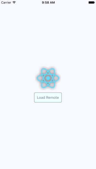
You might notice that, depending on your network speed, the placeholder image remains visible even after you click the Load Remote button. This is by design, because you don't want to remove the placeholder image until you know for sure that the actual image is ready to be displayed.
In the final section of this chapter, you'll learn how to render icons in React Native components. Using icons to indicate meaning makes web applications more usable. So, why should native mobile applications be any different?
You'll want to use the react-native-vector-icons package to pull in various vector font packages into your React Native project:
npm install --save @expo/vector-icons
Now you can import the Icon component and render them. Let's implement an example that renders several FontAwesome icons based on a selected icon category:
import React, { Component } from 'react';
import { View, Picker, FlatList, Text } from 'react-native';
import Icon from 'react-native-vector-icons/FontAwesome';
import { fromJS } from 'immutable';
import styles from './styles';
import iconNames from './icon-names.json';
export default class RenderingIcons extends Component {
// The initial state consists of the "selected"
// category, the "icons" JSON object, and the
// "listSource" used to render the list view.
state = {
data: fromJS({
selected: 'Web Application Icons',
icons: iconNames,
listSource: []
})
};
// Getter for "Immutable.js" state data...
get data() {
return this.state.data;
}
// Setter for "Immutable.js" state data...
set data(data) {
this.setState({ data });
}
// Sets the "listSource" state based on the
// "selected" icon state. Also sets the "selected"
// state.
updateListSource = selected => {
this.data = this.data
.update('listSource', listSource =>
this.data.getIn(['icons', selected])
)
.set('selected', selected);
};
// Make sure the "listSource" is populated
// before the first render.
componentDidMount() {
this.updateListSource(this.data.get('selected'));
}
render() {
const { updateListSource } = this;
// Get the state that we need to render the icon
// category picker and the list view with icons.
const selected = this.data.get('selected');
const categories = this.data
.get('icons')
.keySeq()
.toJS();
const listSource = this.data.get('listSource');
return (
<View style={styles.container}>
<View style={styles.picker}>
{/* Lets the user select a FontAwesome icon
category. When the selection is changed,
the list view is changed. */}
<Picker
selectedValue={selected}
onValueChange={updateListSource}
>
{categories.map(c => (
<Picker.Item key={c} label={c} value={c} />
))}
</Picker>
</View>
<FlatList
style={styles.icons}
data={listSource
.map((value, key) => ({ key: key.toString(), value }))
.toJS()}
renderItem={({ item }) => (
<View style={styles.item}>
{/* The "<Icon>" component is used
to render the FontAwesome icon */}
<Icon name={item.value} style={styles.itemIcon} />
{/* Shows the icon class used */}
<Text style={styles.itemText}>{item.value}</Text>
</View>
)}
/>
</View>
);
}
}
When you run the example, you should see something that looks like the following:

The color of each icon is specified in the same way you would specify the color of text, via styles.
In this chapter, you learned about handling images in your React Native applications. Images in a native application are just as important in a native mobile context as they are in a web context—they improve the user experience.
You learned the different approaches to loading images, and then how to resize them. You also learned how to implement a lazy image that uses a placeholder image to display while the actual image is loading. Finally, you learned how to use icons in a React Native app.
In the next chapter, you'll learn about local storage in React Native, which is handy when your app goes offline.
Check out the following links for more information:
Users expect applications to operate seamlessly with unreliable network connections. If your mobile application can't cope with transient network issues, then your users will use a different app. When there's no network, you have to persist data locally on the device. Or, perhaps your app doesn't even require network access, in which case you'll still need to store data locally.
In this chapter, you'll learn how to do the following three things with React Native. First, you'll learn how to detect the state of the network connection. Second, you'll learn how to store data locally. Lastly, you'll learn how to synchronize local data that's been stored due to network problems, once it comes back online.
If your code tries to make a request over the network while disconnected, using fetch(), for example, an error will occur. You probably have error-handling code in place for these scenarios already, since the server could return some other type of error. However, in the case of connectivity trouble, you might want to detect this issue before the user attempts to make network requests.
There are two potential reasons for proactively detecting the network state. You might display a friendly message to the user stating that, since the network is disconnected, they can't do anything. You would then prevent the user from performing any network requests until you detect that it's back online. The other possible benefit of early network state detection is that you can prepare to perform actions offline and sync the app state when the network is connected again.
Let's look at some code that uses the NetInfo utility to handle changes in network state:
import React, { Component } from 'react';
import { Text, View, NetInfo } from 'react-native';
import { fromJS } from 'immutable';
import styles from './styles';
// Maps the state returned from "NetInfo" to
// a string that we want to display in the UI.
const connectedMap = {
none: 'Disconnected',
unknown: 'Disconnected',
wifi: 'Connected',
cell: 'Connected',
mobile: 'Connected'
};
export default class NetworkState extends Component {
// The "connected" state is a simple
// string that stores the state of the
// network.
state = {
data: fromJS({
connected: ''
})
};
// Getter for "Immutable.js" state data...
get data() {
return this.state.data;
}
// Setter for "Immutable.js" state data...
set data(data) {
this.setState({ data });
}
// When the network state changes, use the
// "connectedMap" to find the string to display.
onNetworkChange = connection => {
this.data = this.data.set(
'connected',
connectedMap[connection.type]
);
};
// When the component is mounted, we add a listener
// that changes the "connected" state when the
// network state changes.
componentDidMount() {
NetInfo.addEventListener(
'connectionChange',
this.onNetworkChange
);
}
// Make sure the listener is removed...
componentWillUnmount() {
NetInfo.removeEventListener(
'connectionChange',
this.onNetworkChange
);
}
// Simply renders the "connected" state as
// it changes.
render() {
return (
<View style={styles.container}>
<Text>{this.data.get('connected')}</Text>
</View>
);
}
}
This component will render the state of the network, based on the string values in connectedMap. The connectionChange event of the NetInfo object will cause the connected state to change. For example, when you first run this app, the screen might look like this:

Then, if you turn off networking on your host machine, the network state will change on the emulated device as well, causing the state of our application to change as follows:

The AsyncStorage API works the same on both the iOS and Android platforms. You would use this API for applications that don't require any network connectivity in the first place, or to store data that's eventually synchronized using an API endpoint once a network becomes available.
Let's look at some code that allows the user to enter a key and a value, and then stores them:
import React, { Component } from 'react';
import {
Text,
TextInput,
View,
FlatList,
AsyncStorage
} from 'react-native';
import { fromJS } from 'immutable';
import styles from './styles';
import Button from './Button';
export default class StoringData extends Component {
// The initial state of this component
// consists of the current "key" and "value"
// that the user is entering. It also has
// a "source" for the list view to display
// everything that's been stored.
state = {
data: fromJS({
key: null,
value: null,
source: []
})
};
// Getter for "Immutable.js" state data...
get data() {
return this.state.data;
}
// Setter for "Immutable.js" state data...
set data(data) {
this.setState({ data });
}
// Uses "AsyncStorage.setItem()" to store
// the current "key" and "value" states.
// When this completes, we can delete
// "key" and "value" and reload the item list.
setItem = () =>
AsyncStorage.setItem(this.data.get('key'), this.data.get('value'))
.then(() => {
this.data = this.data.delete('key').delete('value');
})
.then(() => this.loadItems());
// Uses "AsyncStorage.clear()" to empty any stored
// values. Then, it loads the empty list of
// items to clear the item list on the screen.
clearItems = () =>
AsyncStorage.clear().then(() => this.loadItems());
// This method is async because awaits on the
// data store keys and values, which are two
// dependent async calls.
async loadItems() {
const keys = await AsyncStorage.getAllKeys();
const values = await AsyncStorage.multiGet(keys);
this.data = this.data.set('source', fromJS(values));
}
// Load any existing items that have
// already been stored when the app starts.
componentDidMount() {
this.loadItems();
}
render() {
// The state that we need...
const { source, key, value } = this.data.toJS();
return (
<View style={styles.container}>
<Text>Key:</Text>
<TextInput
style={styles.input}
value={key}
onChangeText={v => {
this.data = this.data.set('key', v);
}}
/>
<Text>Value:</Text>
<TextInput
style={styles.input}
value={value}
onChangeText={v => {
this.data = this.data.set('value', v);
}}
/>
<View style={styles.controls}>
<Button label="Add" onPress={this.setItem} />
<Button label="Clear" onPress={this.clearItems} />
</View>
<View style={styles.list}>
<FlatList
data={source.map(([key, value]) => ({
key: key.toString(),
value
}))}
renderItem={({ item: { value, key } }) => (
<Text>
{value} ({key})
</Text>
)}
/>
</View>
</View>
);
}
}
Before I walk through what this code is doing, let's first take a look at the following screen, since it'll provide most of the explanation you need:
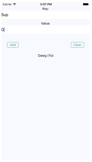
As you can see, there are two input fields and two buttons. The fields allow the user to enter a new key and value. The Add button allows the user to store this key-value pair locally on their device, while the Clear button clears any existing items that have been stored previously.
The AsyncStorage API works the same for both iOS and Android. Under the hood, AsyncStorage works very differently depending on which platform it's running on. The reason React Native is able to expose the same storage API on both platforms is due to its simplicity—it's just key-value pairs. Anything more complex than that is left up to the application developer.
The abstractions that you've created around AsyncStorage in this example are minimal. The idea is to set and get items. However, even straightforward actions like this deserve an abstraction layer. For example, the setItem() method you've implemented here will make the asynchronous call to AsyncStorage and update the items state once that has completed. Loading items is even more complicated because you need to get the keys and values as two separate asynchronous operations.
The reason is to keep the UI responsive. If there are pending screen repaints that need to happen while data is being written to disk, preventing those from happening by blocking them would lead to a sub-optimal user experience.
So far in this chapter, you've learned how to detect the state of a network connection, and how to store data locally in a React Native application. Now it's time to combine these two concepts and implement an app that can detect network outages and continue to function.
The basic idea is to only make network requests when you know for sure that the device is online. If you know that it isn't, you can store any changes in state locally. Then, when you're back online, you can synchronize those stored changes with the remote API.
Let's implement a simplified React Native app that does this. The first step is implementing an abstraction that sits between the React components and the network calls that store data. We'll call this module store.js:
import { NetInfo, AsyncStorage } from 'react-native';
import { Map as ImmutableMap } from 'immutable';
// Mock data that would otherwise come from a real
// networked API endpoint.
const fakeNetworkData = {
first: false,
second: false,
third: false
};
// We'll assume that the device isn't "connected"
// by default.
let connected = false;
// There's nothing to sync yet...
const unsynced = [];
// Sets the given "key" and "value". The idea
// is that application that uses this function
// shouldn't care if the network is connected
// or not.
export const set = (key, value) =>
// The returned promise resolves to true
// if the network is connected, false otherwise.
new Promise((resolve, reject) => {
if (connected) {
// We're online - make the proper request (or fake
// it in this case) and resolve the promise.
fakeNetworkData[key] = value;
resolve(true);
} else {
// We're offline - save the item using "AsyncStorage"
// and add the key to "unsynced" so that we remember
// to sync it when we're back online.
AsyncStorage.setItem(key, value.toString()).then(
() => {
unsynced.push(key);
resolve(false);
},
err => reject(err)
);
}
});
// Gets the given key/value. The idea is that the application
// shouldn't care whether or not there is a network connection.
// If we're offline and the item hasn't been synced, read it
// from local storage.
export const get = key =>
new Promise((resolve, reject) => {
if (connected) {
// We're online. Resolve the requested data.
resolve(key ? fakeNetworkData[key] : fakeNetworkData);
} else if (key) {
// We've offline and they're asking for a specific key.
// We need to look it up using "AsyncStorage".
AsyncStorage.getItem(key).then(
item => resolve(item),
err => reject(err)
);
} else {
// We're offline and they're asking for all values.
// So we grab all keys, then all values, then we
// resolve a plain JS object.
AsyncStorage.getAllKeys().then(
keys =>
AsyncStorage.multiGet(keys).then(
items => resolve(ImmutableMap(items).toJS()),
err => reject(err)
),
err => reject(err)
);
}
});
// Check the network state when the module first
// loads so that we have an accurate value for "connected".
NetInfo.getConnectionInfo().then(
connection => {
connected = ['wifi', 'unknown'].includes(connection.type);
},
() => {
connected = false;
}
);
// Register a handler for when the state of the network changes.
NetInfo.addEventListener('connectionChange', connection => {
// Update the "connected" state...
connected = ['wifi', 'unknown'].includes(connection.type);
// If we're online and there's unsynced values,
// load them from the store, and call "set()"
// on each of them.
if (connected && unsynced.length) {
AsyncStorage.multiGet(unsynced).then(items => {
items.forEach(([key, val]) => set(key, val));
unsynced.length = 0;
});
}
});
This module exports two functions—set() and get(). Their jobs are to set and get data, respectively. Since this is just a demonstration of how to sync between local storage and network endpoints, this module just mocks the actual network with the fakeNetworkData object.
Let's start by looking at the set() function. It's an asynchronous function that will always return a promise that resolves to a Boolean value. If it's true, it means that you're online, and that the call over the network was successful. If it's false, it means that you're offline, and AsyncStorage was used to save the data.
The same approach is used with the get() function. It returns a promise that resolves a Boolean value that indicates the state of the network. If a key argument is provided, then the value for that key is looked up. Otherwise, all values are returned, either from the network or from AsyncStorage.
In addition to these two functions, this module does two other things. It uses NetInfo.getConnectionInfo() to set the connected state. Then, it adds a listener for changes in the network state. This is how items that have been saved locally when you're offline become synced with the network when it's connected again.
Now let's check out the main application that uses these functions as follows:
import React, { Component } from 'react';
import { Text, View, Switch, NetInfo } from 'react-native';
import { fromJS } from 'immutable';
import styles from './styles';
import { set, get } from './store';
// Used to provide consistent boolean values
// for actual booleans and their string representations.
const boolMap = {
true: true,
false: false
};
export default class SynchronizingData extends Component {
// The message state is used to indicate that
// the user has gone offline. The other state
// items are things that the user wants to change
// and sync.
state = {
data: fromJS({
message: null,
first: false,
second: false,
third: false
})
};
// Getter for "Immutable.js" state data...
get data() {
return this.state.data;
}
// Setter for "Immutable.js" state data...
set data(data) {
this.setState({ data });
}
// Generates a handler function bound to a given key.
save = key => value => {
// Calls "set()" and depending on the resolved value,
// sets the user message.
set(key, value).then(
connected => {
this.data = this.data
.set('message', connected ? null : 'Saved Offline')
.set(key, value);
},
err => {
this.data = this.data.set('message', err);
}
);
};
componentDidMount() {
// We have to call "NetInfo.fetch()" before
// calling "get()" to ensure that the
// connection state is accurate. This will
// get the initial state of each item.
NetInfo.getConnectionInfo().then(() =>
get().then(
items => {
this.data = this.data.merge(items);
},
err => {
this.data = this.data.set('message', err);
}
)
);
}
render() {
// Bound methods...
const { save } = this;
// State...
const { message, first, second, third } = this.data.toJS();
return (
<View style={styles.container}>
<Text>{message}</Text>
<View>
<Text>First</Text>
<Switch
value={boolMap[first.toString()]}
onValueChange={save('first')}
/>
</View>
<View>
<Text>Second</Text>
<Switch
value={boolMap[second.toString()]}
onValueChange={save('second')}
/>
</View>
<View>
<Text>Third</Text>
<Switch
value={boolMap[third.toString()]}
onValueChange={save('third')}
/>
</View>
</View>
);
}
}
The job of the App component is to save the state of three checkboxes, which is difficult when you're providing the user with a seamless transition between online and offline modes. Thankfully, your set() and get() abstractions, implemented in another module, hide most of the details from the application functionality.
You will notice, however, that you need to check the state of the network in this module before you attempt to load any items. If you don't do this, then the get() function will assume that you're offline, even if the connection is fine. Here's what the app looks like:
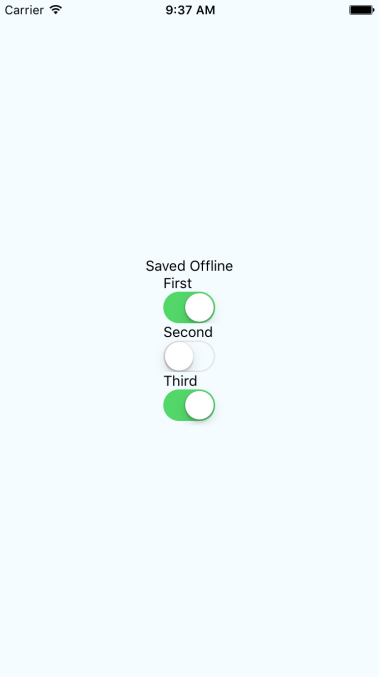
Note that you won't actually see the Saved Offline message until you change something in the UI.
This chapter introduced you to storing data offline in React Native applications. The main reason you would want to store data locally is when the device goes offline and your app can't communicate with a remote API. However, not all applications require API calls and AsyncStorage can be used as a general purpose storage mechanism. You just need to implement the appropriate abstractions around it.
You learned how to detect changes in network state in React Native apps as well. It's important to know when the device has gone offline so that your storage layer doesn't make pointless attempts at network calls. Instead, you can let the user know that the device is offline, and then synchronize the application state when a connection is available.
That wraps up the second part of this book. You've seen how to build React components for the Web, and React components for mobile platforms. At the beginning of this book, I posited that the beauty of React lies in the notion of rendering targets. The declarative programming interface of React never has to change. The underlying mechanisms that translate JSX elements are completely replaceable—in theory, you can render React to anything.
In the final part of this book, I'll talk about state in React applications. State and the policies that govern how it flows through an application can make or break the React architecture.
Visit the following links for more information:
From early on in this book, you've been using state to control your React components. State is an important concept in any React application because it controls what the user can see and interact with. Without state, you just have a bunch of empty React components.
In this chapter, you'll learn about Flux and how it can serve as the basis of your information architecture. Then, you'll learn how to build an architecture that best serves web and mobile architectures. You'll also be introduced to the Redux library, followed by a discussion on the limitations of React architectures and how you might overcome them.
It can be difficult to think of user interfaces as information architectures. More often, you get a rough idea of how the UI should look and behave, and then you implement it. I do this all the time, and it's a great way to get the ball rolling, to discover issues with your approach early, and so on. But then I like to take a step back and picture what's happening without any widgets. Inevitably, what I've built is flawed in terms of how state flows through the various components. This is fine; at least I have something to work with now. I just have to make sure that I address the information architecture before building too much.
Flux is a set of patterns created by Facebook that helps developers think about their information architecture in a way that fits in naturally with their apps. I'll go over the key concepts of Flux next so that you can apply these ideas to a unified React architecture.
Earlier in this book, I introduced the container pattern for React components. The container component has state, but it doesn't actually render any UI elements. Instead, it renders other React components and passes in its state as properties. Whenever the container state changes, the child components are re-rendered with new property values. This is unidirectional data flow.
Flux takes this idea and applies it to something called a store. A store is an abstract concept that holds application state. As far as I'm concerned, a React container is a perfectly valid Flux store. I'll have more to say about stores in a moment. First, I want you to understand why unidirectional data flows are advantageous.
There's a good chance that you've implemented a UI component that changes state, but you're not always sure how it happens. Was it the result of some event in another component? Was it a side-effect from some network call completing? When that happens, you spend lots of time chasing down where the update came from. The effect is often a cascading game of whack-a-mole. When changes can only come from one direction, you can eliminate a number of other possibilities, thus, making the architecture as a whole more predictable.
When you change the state of a React container, it will re-render its children, who re-render their children, and so on. In Flux terminology, this is called an update round. From the time state changes to the time that the UI elements reflect this change, this is the boundary of the round. It's nice to be able to group the dynamic parts of application behavior into larger chunks like this because it's easier to reason about cause and effect.
A potential problem with React container components is that they can interweave with one another and render in a non-deterministic order. For example, what if some API call completes and causes a state update to happen before the rendering has completed in another update round? The side effects of asynchronicity can accumulate and morph into unsustainable architectures if not taken seriously.
The solution in Flux architectures is to enforce synchronous update rounds, and to treat attempts to sidestep the update round order as an error. JavaScript is a single-threaded, run-to-completion environment that should be embraced by working with it rather than against it. Update the whole UI, and then update the whole UI again. It turns out that React is a really good tool for this job.
In a Flux architecture, you havea store used to hold application state. You know that, when state changes, it happens synchronously and unidirectionally, making the system as a whole more predictable and easy to reason about. However, there's still one more thing you can do to ensure that side effects aren't introduced.
You're keeping all your application state in a store, which is great, but you can still break things by mutating data in other places. These mutations might seem innocent at first glance, but they're toxic to your architecture. For example, the callback function that handles a fetch() call might manipulate the data before passing it to the store. An event handler might generate some structure and pass it to the store. There are limitless possibilities.
The problem with performing these state transformations outside the store is that you don't necessarily know that they're happening. Think of mutating data as the butterfly effect: one small change has far-reaching consequences that aren't obvious at first. The solution is to only mutate state in the store, without exception. It's predictable and easy to trace the cause and effect of your React architecture this way.
I've been using Immutable.js for state in most of the examples throughout the book. This will come in handy when you're thinking about state transformations in Flux architecture on a large scale. Controlling where state transformations take place is important, but so is state immutability. It helps to enforce the ideas of Flux architecture, and you'll learn about these ideas in more depth momentarily when we look at Redux.
Let's take a moment to recap the ingredients of our application architecture so far:
Remember, React is just an abstraction that sits on top of a render target. The two main render targets are browsers and mobile native. This list will likely grow, so it's up to you to design your architecture in a way that doesn't exclude future possibilities. The challenge is that you're not porting a web application to a native mobile application; they're different applications, but they serve the same purpose.
Having said that, is there a way that you can still have some kind of unified information architecture based on ideas from Flux that can be used by these different applications? The best answer I can come up with, unfortunately, is: sort of. You don't want to let the different web and mobile user experiences lead to drastically different approaches in handling state. If the goals of the applications are the same, then there has to be some common information that you can share, using the same Flux concepts.
The difficult part is the fact that web and native mobile are different experiences, which means that the shape of your application state will be different. It has to be different; otherwise, you would just be porting from one platform to the other, which defeats the purpose of using React Native to leverage capabilities that don't exist in browsers.
You'll use a library called Redux to implement a basic application that demonstrates the Flux architecture. Redux doesn't strictly follow the patterns set forth by Flux. Instead, it borrows key ideas from Flux, and implements a small API to make it easy to implement Flux.
The application itself will be a newsreader, a specialized reader for hipsters that you probably haven't heard of. It's a simple app, but I want to highlight the architectural challenges as I walk through the implementation. Even simple apps get complex when you're paying attention to what's going on with the data.
You're going to implement two versions of this app. You'll start with the web version, and then you'll implement mobile—native apps for iOS and Android. You'll see how you can share architectural concepts between your apps. This lowers the conceptual overhead when you need to implement the same application on several platforms. You're implementing two apps right now, but this will likely be more in the future as React expands its rendering capabilities.
Let's start by looking at the initial state of the Flux store. In Redux, the entire state of the application is represented by a single store. Here's what it looks like:
import { fromJS } from 'immutable';
// The state of the application is contained
// within an Immutable.js Map. Each key represents
// a "slice" of state.
export default fromJS({
// The "App" state is the generic state that's
// always visible. This state is not specific to
// one particular feature, in other words. It has
// the app title, and links to various article
// sections.
App: {
title: 'Neckbeard News',
links: [
{ name: 'All', url: '/' },
{ name: 'Local', url: '/local' },
{ name: 'Global', url: '/global' },
{ name: 'Tech', url: '/tech' },
{ name: 'Sports', url: '/sports' }
]
},
// The "Home" state is where lists of articles are
// rendered. Initially, there are no articles, so
// the "articles" list is empty until they're fetched
// from the API.
Home: {
articles: []
},
// The "Article" state represents the full article. The
// assumption is that the user has navigated to a full
// article page and we need the entire article text here.
Article: {
full: ''
}
});
This module exports an Immutable.js Map instance. You'll see why later on. But for now, let's look at the organization of this state. In Redux, you divide up application state by slices. In this case, it's a simple application, so the store only has three slices of state. Each slice of state is mapped to a major application feature.
For example, the Home key represents a state that's used by the Home component of your app. It's important to initialize any state, even if it's an empty object or array, so that your components have initial properties. Now let's use some Redux functions to create a store that's used to get data to your React components.
The initial state is useful when the application first starts. This is enough to render components, but that's about it. Once the user starts interacting with the UI, you need a way to change the state of the store. In Redux, you assign a reducer function to each slice of state in your store. So, for example, your app would have a Home reducer, an App reducer, and an Article reducer.
The key concept of a reducer in Redux is that it's pure and side-effect free. This is where having Immutable.js structures as state comes in handy. Let's see how to tie your initial state to the reducer functions that will eventually change the state of our store:
import { createStore } from 'redux';
import { combineReducers } from 'redux-immutable';
// So build a Redux store, we need the "initialState"
// and all of our reducer functions that return
// new state.
import initialState from './initialState';
import App from './App';
import Home from './Home';
import Article from './Article';
// The "createStore()" and "combineReducers()" functions
// perform all of the heavy-lifting.
export default createStore(
combineReducers({
App,
Home,
Article
}),
initialState
);
The App, Home, and Article functions are named in exactly the same way as the slice of state that they manipulate. This makes it easier to add new states and reducer functions as the application grows.
You now have a Redux store that's ready to go. But you still haven't hooked it up to the React components that actually render state. Let's take a look at how to do this now.
Redux has a Provider component (technically, it's the react-redux package that provides it) that's used to wrap the top-level components of your application. This will ensure that Redux store data is available to every component in your application.
In the hipster newsreader app you're developing, you'll wrap the Router component with a Provider component. Then, as you build your components, you know that store data will be available. Here's what the Root component looks like:
import React from 'react';
import { Provider } from 'react-redux';
import store from '../store';
import App from './App';
export default () => (
<Provider store={store}>
<App />
</Provider>
);
The store that you created by taking initial state and combining it with reducer functions is passed to <Provider>. This means that, when your reducers cause the Redux store to change, the store data is automatically passed to each application component. We'll take a look at the App component next.
The App component includes the page heading and a list of links to various article categories. When the user moves around the user interface, the App component is always rendered, but each <Route> element renders different content based on the current route. Let's take a look at the component, and then we'll break down how it works:
import React from 'react';
import {
BrowserRouter as Router,
Route,
NavLink
} from 'react-router-dom';
import { connect } from 'react-redux';
// Components that render application state.
import Home from './Home';
import Article from './Article';
// Higher order component for making the
// various article section components out of
// the "Home" component. The only difference
// is the "filter" property. Having unique JSX
// element names is easier to read than a bunch
// of different property values.
const articleList = filter => props => (
<Home {...props} filter={filter} />
);
const categoryListStyle = {
listStyle: 'none',
margin: 0,
padding: 0,
display: 'flex'
};
const categoryItemStyle = {
padding: '5px'
};
const Local = articleList('local');
const Global = articleList('global');
const Tech = articleList('tech');
const Sports = articleList('sports');
// Routes to the home page, the different
// article sections, and the article details page.
// The "<Provider>" element is how we pass Redux
// store data to each of our components.
export default connect(state => state.get('App').toJS())(
({ title, links }) => (
<Router>
<main>
<h1>{title}</h1>
<ul style={categoryListStyle}>
{/* Renders a link for each article category.
The key thing to note is that the "links"
value comes from a Redux store. */}
{links.map(l => (
<li key={l.url} style={categoryItemStyle}>
<NavLink
exact
to={l.url}
activeStyle={{ fontWeight: 'bold' }}
>
{l.name}
</NavLink>
</li>
))}
</ul>
<section>
<Route exact path="/" component={Home} />
<Route exact path="/local" component={Local} />
<Route exact path="/global" component={Global} />
<Route exact path="/tech" component={Tech} />
<Route exact path="/sports" component={Sports} />
<Route exact path="/articles/:id" component={Article} />
</section>
</main>
</Router>
)
);
This component requires a title property and a links property. Both of these values are actually states that come from the Redux store. Note that it's exporting a higher-order component, created using the connect() function. This function accepts a callback function that transforms the store state into properties that the component needs.
In this example, you need the App state. Turning this map into a plain JavaScript object is done using the toJS() method. This is how Redux state is passed to components. Here's what the rendered content of the App component looks like:
Ignore the amazing article titles for a moment; we'll return to these briefly. The title and the category links are rendered by the App component. The article titles are rendered by a one of the <Route> elements.
Notice how the All category is bold? This is because it's the currently selected category. If the Local category is selected, the All text will go back to regular font, and the Local text will be emboldened. This is all controlled through the Redux state. Let's take a look at the App reducer function now as follows:
import { fromJS } from 'immutable';
import initialState from './initialState';
// The initial page heading.
const title = initialState.getIn(['App', 'title']);
// Links to display when an article is displayed.
const articleLinks = fromJS([
{
name: 'Home',
url: '/'
}
]);
// Links to display when we're on the home page.
const homeLinks = initialState.getIn(['App', 'links']);
// Maps the action type to a function
// that returns new state.
const typeMap = fromJS({
// The article is being fetched, adjust
// the "title" and "links" state.
FETCHING_ARTICLE: state =>
state.set('title', '...').set('links', articleLinks),
// The article has been fetched. Set the title
// of the article.
FETCH_ARTICLE: (state, payload) =>
state.set('title', payload.title),
// The list of articles are being fetched. Set
// the "title" and the "links".
FETCHING_ARTICLES: state =>
state.set('title', title).set('links', homeLinks),
// The articles have been fetched, update the
// "title" state.
FETCH_ARTICLES: state => state.set('title', title)
});
// This reducer relies on the "typeMap" and the
// "type" of action that was dispatched. If it's
// not found, then the state is simply returned.
export default (state, { type, payload }) =>
typeMap.get(type, () => state)(state, payload);
There are two points I'd like to make about this reducer logic. First, you can now see how having immutable data structures in place makes this code concise and easy to follow. Second, a lot of state handling happens here in response to simple actions. Take the FETCHING_ARTICLE and FETCHING_ARTICLES actions, for example. You want to change the UI before actually issuing a network request. I think this type of explicitness is the real value of Flux and Redux. You know exactly why something changes. It's explicit, but not verbose.
The last major piece of the Redux architecture that's missing from this picture is the action creator functions. These are called by components in order to dispatch payloads to the Redux store. The end result of dispatching any action is a change in state. However, some actions need to go and fetch state before they can be dispatched to the store as a payload.
Let's look at the Home component of the Neckbeard News app. It'll show you how you can pass along action creator functions when wiring up components to the Redux store. Here's the code:
import React, { Component } from 'react';
import PropTypes from 'prop-types';
import { connect } from 'react-redux';
import { Link } from 'react-router-dom';
import { Map } from 'immutable';
// Various styles...
const listStyle = {
listStyle: 'none',
margin: 0,
padding: 0
};
const listItemStyle = {
margin: '0 5px'
};
const titleStyle = {
background: 'transparent',
border: 'none',
font: 'inherit',
cursor: 'pointer',
padding: '5px 0'
};
// What to render when the article list is empty
// (true/false). When it's empty, a single elipses
// is displayed.
const emptyMap = Map()
.set(true, <li style={listItemStyle}>...</li>)
.set(false, null);
class Home extends Component {
static propTypes = {
articles: PropTypes.arrayOf(PropTypes.object).isRequired,
fetchingArticles: PropTypes.func.isRequired,
fetchArticles: PropTypes.func.isRequired,
toggleArticle: PropTypes.func.isRequired,
filter: PropTypes.string.isRequired
};
static defaultProps = {
filter: ''
};
// When the component is mounted, there's two actions
// to dispatch. First, we want to tell the world that
// we're fetching articles before they're actually
// fetched. Then, we call "fetchArticles()" to perform
// the API call.
componentWillMount() {
this.props.fetchingArticles();
this.props.fetchArticles(this.props.filter);
}
// When an article title is clicked, toggle the state of
// the article by dispatching the toggle article action.
onTitleClick = id => () => this.props.toggleArticle(id);
render() {
const { onTitleClick } = this;
const { articles } = this.props;
return (
<ul style={listStyle}>
{emptyMap.get(articles.length === 0)}
{articles.map(a => (
<li key={a.id} style={listItemStyle}>
<button onClick={onTitleClick(a.id)} style={titleStyle}>
{a.title}
</button>
{/* The summary of the article is displayed
based on the "display" property. This state
is toggled when the user clicks the title. */}
<p style={{ display: a.display }}>
<small>
<span>{a.summary} </span>
<Link to={`articles/${a.id}`}>More...</Link>
</small>
</p>
</li>
))}
</ul>
);
}
}
// The "connect()" function connects this component
// to the Redux store. It accepts two functions as
// arguments...
export default connect(
// Maps the immutable "state" object to a JavaScript
// object. The "ownProps" are plain JSX props that
// are merged into Redux store data.
(state, ownProps) =>
Object.assign(state.get('Home').toJS(), ownProps),
// Sets the action creator functions as props. The
// "dispatch()" function is when actually invokes
// store reducer functions that change the state
// of the store, and cause new prop values to be passed
// to this component.
dispatch => ({
fetchingArticles: () =>
dispatch({
type: 'FETCHING_ARTICLES'
}),
fetchArticles: filter => {
const headers = new Headers();
headers.append('Accept', 'application/json');
fetch(`/api/articles/${filter}`, { headers })
.then(resp => resp.json())
.then(json =>
dispatch({
type: 'FETCH_ARTICLES',
payload: json
})
);
},
toggleArticle: payload =>
dispatch({
type: 'TOGGLE_ARTICLE',
payload
})
})
)(Home);
Let's focus on the connect() function, which is used to connect the Home component to the store. The first argument is a function that takes relevant state from the store and returns it as props for this component. It's using ownProps so that you can pass props directly to the component and override anything from the store. The filter property is why we need this capability.
The second argument is a function that returns action creator functions as props. The dispatch() function is how these action creator functions are able to deliver payloads to the store. For example, the toggleArticle() function is a call directly to dispatch(), and is called in response to the user clicking the article title. However, the fetchingArticles() call involves asynchronous behavior. This means that dispatch() isn't called until the fetch() promise resolves. It's up to you to make sure that nothing unexpected happens in between.
Let's wrap things up by looking at the reducer function used with the Home component:
import { fromJS } from 'immutable';
const typeMap = fromJS({
// Clear any old articles right before
// we fetch new articles.
FETCHING_ARTICLES: state =>
state.update('articles', a => a.clear()),
// Articles have been fetched. Update the
// "articles" state, and make sure that the
// summary display is "none".
FETCH_ARTICLES: (state, payload) =>
state.set(
'articles',
fromJS(payload)
.map(a => a.set('display', 'none'))
),
// Toggles the state of the selected article
// "id". First we have to find the index of
// the article so that we can update it's
// "display" state. If it's already hidden,
// we show it, and vice-versa.
TOGGLE_ARTICLE: (state, id) =>
state.updateIn([
'articles',
state
.get('articles')
.findIndex(a => a.get('id') === id),
'display',
], display =>
display === 'none' ?
'block' : 'none'
),
});
export default (state, { type, payload }) =>
typeMap.get(type, s => s)(state, payload);
The same technique of using a type map to change state based on the action type is used here. Once again, this code is easy to reason about, yet everything that can change in the system is explicit.
What about using Redux in React Native mobile apps? Of course you should, if you're developing the same application for the web and for native platforms. In fact, I've implemented Neckbeard News in React Native for both iOS and Android. I encourage you to download the code for this book and get this application running for both web and native mobile.
There really is no difference in how you actually use Redux in a mobile app. The only difference is in the shape of state that's used. In other words, don't think that you can use the exact same Redux store and reducer functions in the web and native versions of your app. Think about React Native components. There's no one-size-fits-all component for many things. You have some components that are optimized for the iOS platform while others are optimized for the Android platform. It's the same idea with Redux state. Here's what the initial state looks like for mobile Neckbeard News:
import { fromJS } from 'immutable';
export default fromJS({
Main: {
title: 'All',
component: 'articles',
},
Categories: {
items: [
{
title: 'All',
filter: '',
selected: true,
},
{
title: 'Local',
filter: 'local',
selected: false,
},
{
title: 'Global',
filter: 'global',
selected: false,
},
{
title: 'Tech',
filter: 'tech',
selected: false,
},
{
title: 'Sports',
filter: 'sports',
selected: false,
},
],
},
Articles: {
filter: '',
items: [],
},
Article: {
full: '',
},
});
As you can see, the same principles that apply in a Web context apply here in a mobile context. It's just the state itself that differs, in order to support the given components we're using and the unique ways that you're using them to implement your application.
By now, you probably have a pretty good hands on Flux concepts, the mechanisms of Redux, and how they're used to implement sound information architectures for React applications. The question then becomes, How sustainable is this approach, and can it handle arbitrarily large and complex applications?
I think Redux is a great way to implement large-scale React applications. You can predict what's going to happen as the result of any given action because everything is explicit. It's declarative. It's unidirectional and without side effects. But it isn't without challenges.
The limiting factor with Redux is also its bread and butter; because everything is explicit, applications that need to scale up, in terms of feature count and complexity, ultimately end up with more moving parts. There's nothing wrong with this; it's just the nature of the game. The unavoidable consequence of scaling up is slowing down. You simply cannot grasp enough of the big picture in order to implement things quickly.
In the final two chapters of this book, we're going to look at a related but different approach to Flux: Relay/GraphQL. I think this technology can scale in ways that Redux cannot.
In this chapter, you learned about Flux, a set of architectural patterns that aid in building information architecture for your React application. The key ideas with Flux involve unidirectional data flow, synchronous update rounds, and predictable state transformations.
Next, I walked through a detailed implementation of a Redux / React application. Redux provides a simplified implementation of Flux ideas. The benefit is predictability everywhere.
Then, you learned whether or not Redux has what it takes to build scalable architectures for our React applications. The answer is yes, for the most part. For the remainder of this book, however, you're going to explore Relay and GraphQL to see whether these technologies can scale your applications to the next level.
For more information, check out the following links:
In the preceding chapter, you learned about the architectural principles of Flux. In particular, you used the Redux library to implement concrete Flux concepts in a React application. Having a framework of patterns like Flux in place, to help you reason about how state changes and flows through your application, is a good thing. At the end of the chapter, you learned about the potential limitations in terms of scale.
In this chapter, we are going to walk you through yet another approach to handling state in a React application. Like Redux, Relay is used with both web and mobile React applications. Relay relies on a language called GraphQL used to fetch resources and to mutate those resources.
The premise of Relay is that it can be scaled in ways that Redux and other approaches to handling state are limiting. It does this by eliminating them, and keeping the focus on the data requirements of the component.
In the final chapter of this book, you'll work on a React Native implementation of the ever popular Todo MVC application.
This was the exact question I had when I learned of Relay and GraphQL. Then I reminded myself that the beauty of React is that it's just the view abstraction of the UI; of course there are going to be many approaches to handling data. So, the real question is, what makes Relay better or worse than something like Redux?
At a high level, you can think of Relay as an implementation of Flux architecture patterns, and you can think of GraphQL as the interface that describes how the Flux stores within Relay work. At a more practical level, the value of Relay is ease of implementation. For example, with Redux, you have a lot of implementation work to do, just to populate the stores with data. This gets verbose over time. It's this verbosity that makes Redux difficult to scale beyond a certain point.
It's not the individual data points that are difficult to scale. It's the aggregate effect of having lots of fetch requests that end up building very complicated stores. Relay changes this by allowing you to declare the data that a given component needs and letting Relay figure out the best way to fetch this data and synchronize it with the local store.
Is the Relay approach better than Redux and other approaches for handling data in React applications? In some respects, yes, it is. Is it perfect? Far from it. There is a learning curve involved, and not everyone is able to grok it. It's immutable, and parts of it are difficult to use. However, just knowing the premise of the Relay approach and seeing it in action is worth your while, even if you decide against it.
Now, let's pick apart some vocabulary.
Before I start going into more depth on data dependencies and mutations, I think it makes sense for me to throw some general Relay and GraphQL terminology definitions out there:
Let's quickly talk about data dependencies and mutations so that we can look at some application code.
Relay uses the term collocation to describe declarative data dependencies that live beside the component that uses the data. This means that you don't have to go digging around for action creator functions that actually get the component data that is scattered across several modules. With collocation, you can see exactly what the component needs.
Let's get a taste of what this looks like. If you want to display the first and last name of a user, you need to tell Relay that your component needs this data. Then, you can rest assured that the data will always be there for your component. Here's an example:
const User = ({ first, last }) => (
<section>
<p>{first}</p>
<p>{last}</p>
</section>
);
const UserContainer = Relay.createFragmentContainer(User, {
user: () => graphql`
fragment on User {
first,
last,
}
`
});
You have two components here. First, there's the User component. This is the application component that actually renders the UI elements for the first and last name data. Note that this is just a plain old React component, rendering props that are passed to it. With the UserContainer component that you've created, Relay follows the container pattern that you learned about earlier in this book. It's in the createFragmentContainer() function that you specify the data dependencies that this component needs by passing a fragment of GraphQL syntax.
Once again, don't dwell on the Relay/GraphQL specifics just yet. The idea here is to simply illustrate that this is all the code that you need to write to get your component the data it needs. The rest is just bootstrapping the Relay query mechanism, which you'll see in the next chapter.
Relay mutations are the actions that cause side effects in your systems, because they change the state of some resource that your UI cares about. What's interesting about Relay mutations is that they care about side effects that happen to your data as a result of a change in the state of something. For example, if you change the name of a user, this will certainly impact a screen that displays the user details. But, it could also impact a listing screen that shows several users.
Let's see what a mutation looks like:
const mutation = graphql`
mutation ChangeAgeMutation($input: ChangeAgeInput!) {
changeTodoStatus(input: $input) {
viewer {
users
}
user {
age
}
}
}
`;
This is how Relay is able to determine what might be affected as a side effect of performing this mutation. For example, the user might change, but also the viewer.users collection. You'll see more mutations in action in the following chapter.
Everything I've covered so far about Relay is stuff that's in the browser. Relay needs to send it's GraphQL queries somewhere. For this, you need a GraphQL backend. You can implement this using Node.js and a handful of GraphQL libraries. You create what's called a schema, describing all the datatypes, queries, and mutations that will be used.
In the browser, Relay helps you scale your applications by reducing data-flow complexity. You have a means to declare what data is needed, without worrying about how it is fetched. It's the schema in the backend that actually needs to resolve this data.
This is another scaling problem that GraphQL helps address. Modern web applications are composed out of microservices. These are smaller, self-contained API endpoints that serve some particular purpose that's smaller than an entire app (hence the term micro). It's the job of our application to stitch together these microservices and provide the frontend with meaningful data.
Again, you're faced with a scalability issue—how do you maintain a backend that's composed out of many microservices without introducing insurmountable complexity? This is something that GraphQL types excel at. In the following chapter, you'll begin the implementation of your Todo application with the backend GraphQL service.
The goal of this chapter was to quickly introduce you to the concepts of Relay and GraphQL prior to the final chapter of this book, where you're going to implement some Relay/GraphQL code.
Relay is yet another approach to the state management problem in React applications. It's different in the sense that it reduces the complexities associated with the data fetching code that we have to write with other approaches to Flux, such as Redux.
The two key aspects of Relay are declarative data dependencies and explicit mutation side effect handling. All of this is expressed through GraphQL syntax. In order to have a Relay application, you need a GraphQL backend where the data schema lives. Now, onto the final chapter, where you'll examine Relay/GraphQL concepts in more detail.
Visit the following link for more information:
In the previous chapter, you got a ten thousand foot introduction to Relay/GraphQL, and learned why you should use the approach for your React application. Now you can build your Todo React Native application using Relay. By the end of this chapter, you should feel comfortable about how data moves around in a GraphQL centric architecture.
I had originally planned to extend the Neckbeard News app that we worked on earlier in this chapter. Instead, I decided that the TodoMVC example for Relay (https://github.com/taion/relay-todomvc) is a robust yet concise example that I would have trouble beating.
I'm going to walk you through an example React Native implementation of a Todo app. The key is that it'll use the same GraphQL backend as the web UI. I think this is a win for React developers that want to build both web and native versions of their apps; they can share the same schema!
I've included the web version of the TodoMVC app in the code that ships with this book, but I won't dwell on the details of how it works. If you've worked on web development in the past 5 years, you've probably come across a sample Todo app. Here's what the web version looks like:
Even if you haven't used any of the TodoMVC apps before, I would recommend playing with this one before trying to implement the native version, which is what you'll be doing for the remainder of the chapter.
The goal of the native version that you're about to implement isn't functional parity. In fact, you're shooting for a very minimal subset of todo functionality. The aim is to show you that Relay works mostly the same on native platforms as it does on web platforms and that the GraphQL backend can be shared between web and native apps.
The schema is the vocabulary used by GraphQL backend server, and the Relay components in the frontend. The GraphQL type system enables the schema to describe the data that's available, and how to put it all together when a query request comes in. This is what makes the whole approach so scalable, the fact that the GraphQL runtime figures out how to put data together. All you need to supply are functions that tell GraphQL where the data is; for example, in a database or in some remote service endpoint.
Let's take a look at the types used in the GraphQL schema for the TodoMVC app, as follows:
import {
GraphQLBoolean,
GraphQLID,
GraphQLInt,
GraphQLList,
GraphQLNonNull,
GraphQLObjectType,
GraphQLSchema,
GraphQLString
} from 'graphql';
import {
connectionArgs,
connectionDefinitions,
connectionFromArray,
cursorForObjectInConnection,
fromGlobalId,
globalIdField,
mutationWithClientMutationId,
nodeDefinitions,
toGlobalId
} from 'graphql-relay';
import {
Todo,
User,
addTodo,
changeTodoStatus,
getTodo,
getTodos,
getUser,
getViewer,
markAllTodos,
removeCompletedTodos,
removeTodo,
renameTodo
} from './database';
const { nodeInterface, nodeField } = nodeDefinitions(
globalId => {
const { type, id } = fromGlobalId(globalId);
if (type === 'Todo') {
return getTodo(id);
}
if (type === 'User') {
return getUser(id);
}
return null;
},
obj => {
if (obj instanceof Todo) {
return GraphQLTodo;
}
if (obj instanceof User) {
return GraphQLUser;
}
return null;
}
);
const GraphQLTodo = new GraphQLObjectType({
name: 'Todo',
fields: {
id: globalIdField(),
complete: { type: GraphQLBoolean },
text: { type: GraphQLString }
},
interfaces: [nodeInterface]
});
const {
connectionType: TodosConnection,
edgeType: GraphQLTodoEdge
} = connectionDefinitions({ nodeType: GraphQLTodo });
const GraphQLUser = new GraphQLObjectType({
name: 'User',
fields: {
id: globalIdField(),
todos: {
type: TodosConnection,
args: {
status: {
type: GraphQLString,
defaultValue: 'any'
},
...connectionArgs
},
resolve: (obj, { status, ...args }) =>
connectionFromArray(getTodos(status), args)
},
numTodos: {
type: GraphQLInt,
resolve: () => getTodos().length
},
numCompletedTodos: {
type: GraphQLInt,
resolve: () => getTodos('completed').length
}
},
interfaces: [nodeInterface]
});
const GraphQLRoot = new GraphQLObjectType({
name: 'Root',
fields: {
viewer: {
type: GraphQLUser,
resolve: getViewer
},
node: nodeField
}
});
const GraphQLAddTodoMutation = mutationWithClientMutationId({
name: 'AddTodo',
inputFields: {
text: { type: new GraphQLNonNull(GraphQLString) }
},
outputFields: {
viewer: {
type: GraphQLUser,
resolve: getViewer
},
todoEdge: {
type: GraphQLTodoEdge,
resolve: ({ todoId }) => {
const todo = getTodo(todoId);
return {
cursor: cursorForObjectInConnection(getTodos(), todo),
node: todo
};
}
}
},
mutateAndGetPayload: ({ text }) => {
const todoId = addTodo(text);
return { todoId };
}
});
const GraphQLChangeTodoStatusMutation = mutationWithClientMutationId({
name: 'ChangeTodoStatus',
inputFields: {
id: { type: new GraphQLNonNull(GraphQLID) },
complete: { type: new GraphQLNonNull(GraphQLBoolean) }
},
outputFields: {
viewer: {
type: GraphQLUser,
resolve: getViewer
},
todo: {
type: GraphQLTodo,
resolve: ({ todoId }) => getTodo(todoId)
}
},
mutateAndGetPayload: ({ id, complete }) => {
const { id: todoId } = fromGlobalId(id);
changeTodoStatus(todoId, complete);
return { todoId };
}
});
const GraphQLMarkAllTodosMutation = mutationWithClientMutationId({
name: 'MarkAllTodos',
inputFields: {
complete: { type: new GraphQLNonNull(GraphQLBoolean) }
},
outputFields: {
viewer: {
type: GraphQLUser,
resolve: getViewer
},
changedTodos: {
type: new GraphQLList(GraphQLTodo),
resolve: ({ changedTodoIds }) => changedTodoIds.map(getTodo)
}
},
mutateAndGetPayload: ({ complete }) => {
const changedTodoIds = markAllTodos(complete);
return { changedTodoIds };
}
});
const GraphQLRemoveCompletedTodosMutation = mutationWithClientMutationId(
{
name: 'RemoveCompletedTodos',
outputFields: {
viewer: {
type: GraphQLUser,
resolve: getViewer
},
deletedIds: {
type: new GraphQLList(GraphQLString),
resolve: ({ deletedIds }) => deletedIds
}
},
mutateAndGetPayload: () => {
const deletedTodoIds = removeCompletedTodos();
const deletedIds = deletedTodoIds.map(
toGlobalId.bind(null, 'Todo')
);
return { deletedIds };
}
}
);
const GraphQLRemoveTodoMutation = mutationWithClientMutationId({
name: 'RemoveTodo',
inputFields: {
id: { type: new GraphQLNonNull(GraphQLID) }
},
outputFields: {
viewer: {
type: GraphQLUser,
resolve: getViewer
},
deletedId: {
type: GraphQLID,
resolve: ({ id }) => id
}
},
mutateAndGetPayload: ({ id }) => {
const { id: todoId } = fromGlobalId(id);
removeTodo(todoId);
return { id };
}
});
const GraphQLRenameTodoMutation = mutationWithClientMutationId({
name: 'RenameTodo',
inputFields: {
id: { type: new GraphQLNonNull(GraphQLID) },
text: { type: new GraphQLNonNull(GraphQLString) }
},
outputFields: {
todo: {
type: GraphQLTodo,
resolve: ({ todoId }) => getTodo(todoId)
}
},
mutateAndGetPayload: ({ id, text }) => {
const { id: todoId } = fromGlobalId(id);
renameTodo(todoId, text);
return { todoId };
}
});
const GraphQLMutation = new GraphQLObjectType({
name: 'Mutation',
fields: {
addTodo: GraphQLAddTodoMutation,
changeTodoStatus: GraphQLChangeTodoStatusMutation,
markAllTodos: GraphQLMarkAllTodosMutation,
removeCompletedTodos: GraphQLRemoveCompletedTodosMutation,
removeTodo: GraphQLRemoveTodoMutation,
renameTodo: GraphQLRenameTodoMutation
}
});
export default new GraphQLSchema({
query: GraphQLRoot,
mutation: GraphQLMutation
});
There are a lot of things being imported here, so I'll start with the imports. I wanted to include all of these imports because I think they're contextually relevant for this discussion. First, there's the primitive GraphQL types from the the graphql library. Next, you have helpers from the graphql-relay library that simplify defining a GraphQL schema. Lastly, there's imports from your own database module. This isn't necessarily a database, in fact, in this case, it's just mock data. You could replace database with api for instance, if you needed to talk to remote API endpoints, or we could combine the two; it's all GraphQL as far as your React components are concerned.
Then, you define some of your own GraphQL types. For example, the GraphQLTodo type has two fields—text and complete. One is a Boolean and one is a string. The important thing to note about GraphQL fields is the resolve() function. This is how you tell the GraphQL runtime how to populate these fields when they're required. These two fields simply return property values.
Then, there's the GraphQLUser type. This field represents the user's entire universe within the UI, hence the name. The todos field, for example, is how you query for todo items from Relay components. It's resolved using the connectionFromArray() function, which is a shortcut that removes the need for more verbose field definitions. Then, there's the GraphQLRoot type. This has a single viewer field that's used as the root of all queries.
Now let's take a closer look at the add todo mutation, as follows. I'm not going to go over every mutation that's used by the web version of this app, in the interests of space:
const GraphQLAddTodoMutation = mutationWithClientMutationId({
name: 'AddTodo',
inputFields: {
text: { type: new GraphQLNonNull(GraphQLString) }
},
outputFields: {
viewer: {
type: GraphQLUser,
resolve: getViewer
},
todoEdge: {
type: GraphQLTodoEdge,
resolve: ({ todoId }) => {
const todo = getTodo(todoId);
return {
cursor: cursorForObjectInConnection(getTodos(), todo),
node: todo
};
}
}
},
mutateAndGetPayload: ({ text }) => {
const todoId = addTodo(text);
return { todoId };
}
});
All mutations have a mutateAndGetPayload() method, which is how the mutation actually makes a call to some external service to change the data. The returned payload can be the changed entity, but it can also include data that's changed as a side-effect. This is where the outputFields come into play. This is the information that's handed back to Relay in the browser so that it has enough information to properly update components based on the side effects of the mutation. Don't worry, you'll see what this looks like from Relay's perspective shortly.
The mutation type that you've created here is used to hold all application mutations. Lastly, here's how the entire schema is put together and exported from the module:
export default new GraphQLSchema({
query: GraphQLRoot,
mutation: GraphQLMutation
});
Don't worry about how this schema is fed into the GraphQL server for now.
At this point, you have the GraphQL backend up and running. Now, you can focus on your React components in the frontend. In particular, you're going to look at Relay in a React Native context, which really only has minor differences. For example, in web apps, it's usually react-router that bootstraps Relay. In React Native, it's a little different. Let's look at the App.js file that serves as the entry point for your native app:
import React from 'react';
import { View, Text } from 'react-native';
import { Network } from 'relay-local-schema';
import { Environment, RecordSource, Store } from 'relay-runtime';
import { QueryRenderer, graphql } from 'react-relay';
import schema from './data/schema';
import styles from './styles';
import TodoInput from './TodoInput';
import TodoList from './TodoList';
if (typeof Buffer === 'undefined')
global.Buffer = require('buffer').Buffer;
const environment = new Environment({
network: Network.create({ schema }),
store: new Store(new RecordSource())
});
export default () => (
<QueryRenderer
environment={environment}
query={graphql`
query App_Query($status: String!) {
viewer {
...TodoList_viewer
}
}
`}
variables={{ status: 'any' }}
render={({ error, props }) => {
if (error) {
return <Text>Error!</Text>;
}
if (!props) {
return <Text>Loading...</Text>;
}
return (
<View style={styles.container}>
<TodoInput environment={environment} {...props} />
<TodoList {...props} />
</View>
);
}}
/>
);
Let's break down what's happening here, starting with the environment constant:
const environment = new Environment({
network: Network.create({ schema }),
store: new Store(new RecordSource())
});
This is how you communicate with the GraphQL backend, by configuring a network. In this example, you're importing Network from relay-local-schema, which means that no network requests are being made. This is really handy for when you're getting started—especially building a React Native app.
Next, there's the QueryRenderer component. This Relay component is used to render other components that depend on GraphQL queries. It expects a query property:
query={graphql`
query App_Query($status: String!) {
viewer {
...TodoList_viewer
}
}
`}
Note that queries are prefixed by the module that they're in. In this case, App. This query uses a GraphQL fragment from another module, TodoList, and is named TodoList_viewer. You can pass variables to the query:
variables={{ status: 'any' }}
Then, the render property is a function that renders your components when the GraphQL data is ready:
render={({ error, props }) => {
if (error) {
return <Text>Error!</Text>;
}
if (!props) {
return <Text>Loading...</Text>;
}
return (
<View style={styles.container}>
<TodoInput environment={environment} {...props} />
<TodoList {...props} />
</View>
);
}}
If something went wrong, error will contain information about the error. If there's no error and no props, it's safe to assume that the GraphQL data is still loading.
In the TodoInput component, there's a text input that allows the user to enter new todo items. When they're done entering the todo, Relay will need to send a mutation to the backend GraphQL server. Here's what the component code looks like:
import React, { Component } from 'react';
import { TextInput } from 'react-native';
import styles from './styles';
import AddTodoMutation from './mutations/AddTodoMutation';
export default class App extends Component {
onSubmitEditing = ({ nativeEvent: { text } }) => {
const { environment, viewer } = this.props;
AddTodoMutation.commit(environment, viewer, text);
};
render() {
return (
<TextInput
style={styles.textInput}
placeholder="What needs to be done?"
onSubmitEditing={this.onSubmitEditing}
/>
);
}
}
It doesn't look that different from your typical React Native component. The piece that stands out is the mutation—AddTodoMutation. This is how you tell the GraphQL backend that you want a new todo node created.
Let's see what the application looks like so far:
The textbox for adding new todo items is just above the list of todo items. Now, let's look at the TodoList component, which is responsible for rendering the todo item list.
It's the job of the TodoList component to render the todo list items. When AddTodoMutation takes place, the TodoList component needs to be able to render this new item. Relay takes care of updating the internal data stores where all of our GraphQL data lives. Here's a look at the item list again, with several more todos added:
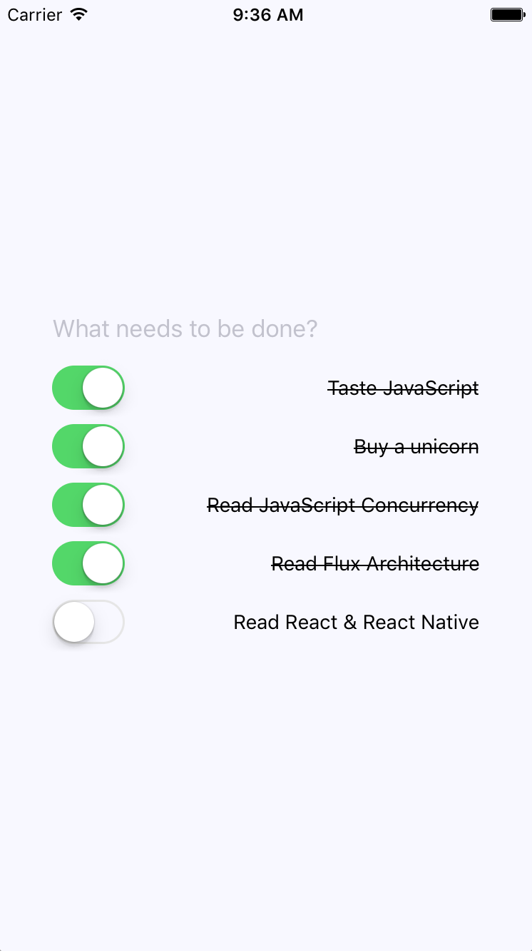
Here's the TodoList component itself:
import React, { Component } from 'react';
import PropTypes from 'prop-types';
import { View } from 'react-native';
import { createFragmentContainer, graphql } from 'react-relay';
import Todo from './Todo';
class TodoList extends Component {
static propTypes = {
viewer: PropTypes.object.isRequired,
relay: PropTypes.object.isRequired
};
static contextTypes = {
relay: PropTypes.shape({
variables: PropTypes.shape({
status: PropTypes.string.isRequired
}).isRequired
}).isRequired
};
render() {
const { viewer } = this.props;
return (
<View>
{viewer.todos.edges.map(edge => (
<Todo key={edge.node.id} viewer={viewer} todo={edge.node} />
))}
</View>
);
}
}
export default createFragmentContainer(
TodoList,
graphql`
fragment TodoList_viewer on User {
todos(status: $status, first: 2147483647)
@connection(key: "TodoList_todos") {
edges {
node {
id
complete
...Todo_todo
}
}
}
id
numTodos
numCompletedTodos
...Todo_viewer
}
`
);
The relevant GraphQL to get the data you need is passed as a second argument to createFragmentContainer(). This is the declarative data dependency for the component. When you you render the <Todo> component, you're passing it the edge.todo data. Now, let's see what the Todo component itself looks like.
The last piece of this application is rendering each todo item and providing the ability to change the status of the todo. Let's take a look at this code:
import React, { Component } from 'react';
import classNames from 'classnames';
import PropTypes from 'prop-types';
import { createFragmentContainer, graphql } from 'react-relay';
import { Text, View, Switch } from 'react-native';
import ChangeTodoStatusMutation from './mutations/ChangeTodoStatusMutation';
import styles from './styles';
const completeStyleMap = new Map([
[true, { textDecorationLine: 'line-through' }],
[false, {}]
]);
class Todo extends Component {
static propTypes = {
viewer: PropTypes.object.isRequired,
todo: PropTypes.object.isRequired,
relay: PropTypes.object.isRequired
};
onValueChange = value => {
const { relay, viewer, todo } = this.props;
ChangeTodoStatusMutation.commit(
relay.environment,
viewer,
todo,
value
);
};
render() {
const {
todo: { text, complete }
} = this.props;
return (
<View style={styles.todoItem}>
<Switch value={complete} onValueChange={this.onValueChange} />
<Text style={completeStyleMap.get(complete)}>{text}</Text>
</View>
);
}
}
export default createFragmentContainer(Todo, {
viewer: graphql`
fragment Todo_viewer on User {
id
}
`,
todo: graphql`
fragment Todo_todo on Todo {
id
complete
text
}
`
});
The actual component that's rendered is a switch control and the item text. When the user marks the todo as complete, the item text is styled as crossed off. The user can also uncheck items. The ChangeTodoStatusMutation mutation sends the request to the GraphQL backend to change the todo state. The GraphQL backend then talks to any microservices that are needed to make this happen. Then, it responds with the fields that this component depends on.
The important part of this code that I want to point out is the fragments used in the Relay container. This container doesn't actually use them directly. Instead, they're used by the todos query in the TodoList component (Todo.getFrament()). This is useful because it means that you can use the Todo component in another context, with another query, and its data dependencies will always be satisfied.
In this chapter, you implemented some specific Relay and GraphQL ideas. Starting with the GraphQL schema, you learned how to declare the data that's used by the application and how these data types resolve to specific data sources, such as microservice endpoints. Then, you learned about bootstrapping GraphQL queries from Relay in your React Native app. Next, you walked through the specifics of adding, changing, and listing todo items. The application itself uses the same schema as the web version of the Todo application, which makes things much easier when you're developing web and native React applications.
Well, that's a wrap for this book. We've gone over a lot of material together, and I hope that you've learned from reading it as much as I have from writing it. If there was one theme from this book that you should walk away with, it's that React is simply a rendering abstraction. As new rendering targets emerge, new React libraries will emerge as well. As developers think of novel ways to deal with state at scale, you'll see new techniques and libraries released. My hope is that you're now well prepared to work in this rapidly evolving React ecosystem.
If you enjoyed this book, you may be interested in these other books by Packt:
If you enjoyed this book, you may be interested in these other books by Packt:

React Cookbook
Carlos Santana Roldan
ISBN: 9781783980727

React Native Blueprints
Emilio Rodriguez Martinez
ISBN: 9781787288096
Please share your thoughts on this book with others by leaving a review on the site that you bought it from. If you purchased the book from Amazon, please leave us an honest review on this book's Amazon page. This is vital so that other potential readers can see and use your unbiased opinion to make purchasing decisions, we can understand what our customers think about our products, and our authors can see your feedback on the title that they have worked with Packt to create. It will only take a few minutes of your time, but is valuable to other potential customers, our authors, and Packt. Thank you!
Copyright © 2018 Packt Publishing
All rights reserved. No part of this book may be reproduced, stored in a retrieval system, or transmitted in any form or by any means, without the prior written permission of the publisher, except in the case of brief quotations embedded in critical articles or reviews.
Every effort has been made in the preparation of this book to ensure the accuracy of the information presented. However, the information contained in this book is sold without warranty, either express or implied. Neither the author, nor Packt Publishing or its dealers and distributors, will be held liable for any damages caused or alleged to have been caused directly or indirectly by this book.
Packt Publishing has endeavored to provide trademark information about all of the companies and products mentioned in this book by the appropriate use of capitals. However, Packt Publishing cannot guarantee the accuracy of this information.
Commissioning Editor: Kunal Chaudhari
Acquisition Editor: Devanshi Doshi
Content Development Editor: Onkar Wani
Technical Editor: Diksha Wakode
Copy Editor: Safis Editing
Project Coordinator: Sheejal Shah
Proofreader: Safis Editing
Indexer: Aishwarya Gangawane
Production Coordinator: Arvindkumar Gupta
First published: March 2017
Second edition: September 2018
Production reference: 1260918
Published by Packt Publishing Ltd.
Livery Place
35 Livery Street
Birmingham
B3 2PB, UK.
ISBN 978-1-78934-679-4
Mapt is an online digital library that gives you full access to over 5,000 books and videos, as well as industry leading tools to help you plan your personal development and advance your career. For more information, please visit our website.
Spend less time learning and more time coding with practical eBooks and Videos from over 4,000 industry professionals
Improve your learning with Skill Plans built especially for you
Get a free eBook or video every month
Mapt is fully searchable
Copy and paste, print, and bookmark content
Did you know that Packt offers eBook versions of every book published, with PDF and ePub files available? You can upgrade to the eBook version at www.packt.com and as a print book customer, you are entitled to a discount on the eBook copy. Get in touch with us at customercare@packtpub.com for more details.
At www.packt.com, you can also read a collection of free technical articles, sign up for a range of free newsletters, and receive exclusive discounts and offers on Packt books and eBooks.
Adam Boduch is a seasoned web application developer with a breadth of experience ranging from jQuery to React and everything in between. He is the author of over 10 books, including React Tooling and React Essentials.
Piotr Sroczkowski is a JavaScript developer, focused mainly on the backend with Node.js and NoSQL databases. He started amateur programming in 2009 and professional programming in 2014. In 2017, he graduated with an MSc in computer science from the Silesian University of Technology in Gliwice with a thesis entitled "Application of Heuristic Algorithms in Exploration of the Gene Mutations." As that title suggests, he's excited by heuristic algorithms and bioinformatics too. Beside his backend-focused job, in his free time, he’s interested in the web frontend with React and the mobile frontend with React Native. Moreover, one of his hobbies is data mining with JavaScript. Beside programming, he loves running long distances such as marathons and half-marathons.
Carlos Santana Roldan is a Senior Web Developer (frontend and backend); with more than 11 years of experience in the market. Currently he is working as a React Technical Lead in Disney ABC Television Group. He is the founder of Codejobs, one of the most popular Developers Communities in Latin America, training people in different web technologies such React, Node.js & JS (@codejobs).
If you're interested in becoming an author for Packt, please visit authors.packtpub.com and apply today. We have worked with thousands of developers and tech professionals, just like you, to help them share their insight with the global tech community. You can make a general application, apply for a specific hot topic that we are recruiting an author for, or submit your own idea.
I never had any interest in developing mobile apps. I used to believe strongly that it was the web, or nothing, that there was no need for more yet more applications to install on devices that are already overflowing with apps. Then React Native happened. I was already writing React code for web applications and loving it. It turns out that I wasn’t the only developer that balked at the idea of maintaining several versions of the same app using different tooling, environments, and programming languages. React Native was created out of a natural desire to take what works well from a web development experience standpoint (React), and apply it to native app development. Native mobile apps offer better user experiences than web browsers. It turns out I was wrong, we do need mobile apps for the time being. But that’s okay, because React Native is a fantastic tool. This book is essentially my experience as a React developer for the web and as a less experienced mobile app developer. React Native is meant to be an easy transition for developers who already understand React for the Web. With this book, you’ll learn the subtleties of doing React development in both environments. You’ll also learn the conceptual theme of React, a simple rendering abstraction that can target anything. Today, it’s web browsers and mobile devices. Tomorrow, it could be anything.
The second edition of this book was written to address the rapidly evolving React project - including the state-of-the-art best practices for implementing React components as well as the ecosystem surrounding React. I think it's important for React developers to appreciate how React works and how the implementation of React changes to better support the people who rely on it. I've done my best to capture the essence of React as it is today and the direction it's moving, in this edition of React and React Native.
This book is written for any JavaScript developer—beginner or expert—who wants to start learning how to put both of Facebook’s UI libraries to work. No knowledge of React is needed, though a working knowledge of ES2017 will help you follow along better.
This book covers the following three parts:
Chapter 1, Why React?, covers the basics of what React really is, and why you want to use it.
Chapter 2, Rendering with JSX, explains that JSX is the syntax used by React to render content. HTML is the most common output, but JSX can be used to render many things, such as native UI components.
Chapter 3, Component Properties, State, and Context, shows how properties are passed to components, how state re-renders components when it changes, and the role of context in components.
Chapter 4, Event Handling—The React Way, explains that events in React are specified in JSX. There are subtleties with how React processes events, and how your code should respond to them.
Chapter 5, Crafting Reusable Components, shows that components are often composed using smaller components. This means that you have to properly pass data and behavior to child components.
Chapter 6, The React Component Lifecycle, explains how React components are created and destroyed all the time. There are several other lifecycle events that take place in between where you do things such as fetch data from the network.
Chapter 7, Validating Component Properties, shows that React has a mechanism that allows you to validate the types of properties that are passed to components. This ensures that there are no unexpected values passed to your component.
Chapter 8, Extending Components, provides an introduction to the mechanisms used to extend React components. These include inheritance and higher-order components.
Chapter 9, Handling Navigation with Routes, explains that navigation is an essential part of any web application. React handles routes declaratively using the react-router package.
Chapter 10, Server-Side React Components, discusses how React renders components to the DOM when rendered in the browser. It can also render components to strings, which is useful for rendering pages on the server and sending static content to the browser.
Chapter 11, Mobile-First React Components, explains that mobile web applications are fundamentally different from web applications designed for desktop screen resolutions. The react-bootstrap package can be used to build UIs in a mobile-first fashion.
Chapter 12, Why React Native?, shows that React Native is React for mobile apps. If you’ve already invested in React for web applications, then why not leverage the same technology to provide a better mobile experience?
Chapter 13, Kickstarting React Native Projects, discusses that nobody likes writing boilerplate code or setting up project directories. React Native has tools to automate these mundane tasks.
Chapter 14, Building Responsive Layouts with Flexbox, explains why the Flexbox layout model is popular with web UI layouts using CSS. React Native uses the same mechanism to layout screens.
Chapter 15, Navigating Between Screens, discusses the fact that while navigation is an important part of web applications, mobile applications also need tools to handle how a user moves from screen to screen.
Chapter 16, Rendering Item Lists, shows that React Native has a list view component that’s perfect for rendering lists of items. You simply provide it with a data source, and it handles the rest.
Chapter 17, Showing Progress, explains that progress bars are great for showing a determinate amount of progress. When you don’t know how long something will take, you use a progress indicator. React Native has both of these components.
Chapter 18, Geolocation and Maps, shows that the react-native-maps package provides React Native with mapping capabilities. The Geolocation API that’s used in web applications is provided directly by React Native.
Chapter 19, Collecting User Input, shows that most applications need to collect input from the user. Mobile applications are no different, and React Native provides a variety of controls that are not unlike HTML form elements.
Chapter 20, Alerts, Notifications, and Confirmation, explains that alerts are for interrupting the user to let them know something important has happened, notifications are unobtrusive updates, and confirmation is used for getting an immediate answer.
Chapter 21, Responding to User Gestures, discusses how gestures on mobile devices are something that’s difficult to get right in the browser. Native apps, on the other hand, provide a much better experience for swiping, touching, and so on. React Native handles a lot of the details for you.
Chapter 22, Controlling Image Display, shows how images play a big role in most applications, either as icons, logos, or photographs of things. React Native has tools for loading images, scaling them, and placing them appropriately.
Chapter 23, Going Offline, explains that mobile devices tend to have volatile network connectivity. Therefore, mobile apps need to be able to handle temporary offline conditions. For this, React Native has local storage APIs.
Chapter 24, Handling Application State, discusses how application state is important for any React application, web or mobile. This is why understanding libraries such as Redux and Immutable.js is important.
Chapter 25, Why Relay and GraphQL?, explains that Relay and GraphQL, used together, is a novel approach to handling state at scale. It’s a query and mutation language, plus a library for wrapping React components.
Chapter 26, Building a Relay React App, shows that the real advantage of Relay and GraphQL is that your state schema is shared between web and native versions of your application.
You can download the example code files for this book from your account at www.packt.com. If you purchased this book elsewhere, you can visit www.packt.com/support and register to have the files emailed directly to you.
You can download the code files by following these steps:
Once the file is downloaded, please make sure that you unzip or extract the folder using the latest version of:
The code bundle for the book is also hosted on GitHub at https://github.com/PacktPublishing/React-and-React-Native-Second-Edition. In case there's an update to the code, it will be updated on the existing GitHub repository.
We also have other code bundles from our rich catalog of books and videos available at https://github.com/PacktPublishing/. Check them out!
There are a number of text conventions used throughout this book.
CodeInText: Indicates code words in text, database table names, folder names, filenames, file extensions, pathnames, dummy URLs, user input, and Twitter handles. Here is an example: "Mount the downloaded WebStorm-10*.dmg disk image file as another disk in your system."
A block of code is set as follows:
import React, { Component } from 'react';
// Renders a "<button>" element, using
// "this.props.children" as the text.
export default class MyButton extends Component {
render() {
return <button>{this.props.children}</button>;
}
}
Any command-line input or output is written as follows:
$ npm install -g create-react-native-app
$ create-react-native-app my-project
Bold: Indicates a new term, an important word, or words that you see onscreen. For example, words in menus or dialog boxes appear in the text like this. Here is an example: "Select System info from the Administration panel."
Feedback from our readers is always welcome.
General feedback: Email feedback@packtpub.com and mention the book title in the subject of your message. If you have questions about any aspect of this book, please email us at questions@packtpub.com.
Errata: Although we have taken every care to ensure the accuracy of our content, mistakes do happen. If you have found a mistake in this book, we would be grateful if you would report this to us. Please visit www.packt.com/submit-errata, selecting your book, clicking on the Errata Submission Form link, and entering the details.
Piracy: If you come across any illegal copies of our works in any form on the Internet, we would be grateful if you would provide us with the location address or website name. Please contact us at copyright@packtpub.com with a link to the material.
If you are interested in becoming an author: If there is a topic that you have expertise in and you are interested in either writing or contributing to a book, please visit authors.packtpub.com.
Please leave a review. Once you have read and used this book, why not leave a review on the site that you purchased it from? Potential readers can then see and use your unbiased opinion to make purchase decisions, we at Packt can understand what you think about our products, and our authors can see your feedback on their book. Thank you!
For more information about Packt, please visit packt.com.
If you're reading this book, you might already have some idea of what React is. You also might have heard a React success story or two. If not, don't worry. I'll do my best to spare you from additional marketing literature in this opening chapter. However, this is a large book, with a lot of content, so I feel that setting the tone is an appropriate first step. Yes, the goal is to learn React and React Native. But, it's also to put together a lasting architecture that can handle everything we want to build with React today, and in the future.
This chapter starts with a brief explanation of why React exists. Then, we'll talk about the simplicity that makes React an appealing technology and how React is able to handle many of the typical performance issues faced by web developers. Next, we'll go over the declarative philosophy of React and the level of abstraction that React programmers can expect to work with. Finally, we'll touch on some of the major new features of React 16.
Let's go!
I think the one-line description of React on its home page (https://facebook.github.io/react) is brilliant:
It's a library for building user interfaces. This is perfect because as it turns out, this is all we want most of the time. I think the best part about this description is everything that it leaves out. It's not a mega framework. It's not a full-stack solution that's going to handle everything from the database to real-time updates over web socket connections. We don't actually want most of these pre-packaged solutions, because in the end, they usually cause more problems than they solve.
React is generally thought of as the view layer in an application. You might have used a library such as Handlebars or jQuery in the past. Just like jQuery manipulates UI elements, or Handlebars templates are inserted onto the page, React components change what the user sees. The following diagram illustrates where React fits in our frontend code:
This is literally all there is to React—the core concept. Of course there will be subtle variations to this theme as we make our way through the book, but the flow is more or less the same. We have some application logic that generates some data. We want to render this data to the UI, so we pass it to a React component, which handles the job of getting the HTML into the page.
You may wonder what the big deal is, especially since at the surface, React appears to be yet another rendering technology. We'll touch on some of the key areas where React can simplify application development in the remaining sections of the chapter.
React doesn't have many moving parts to learn about and understand. Internally, there's a lot going on, and we'll touch on these things here and there throughout the book. The advantage to having a small API to work with is that you can spend more time familiarizing yourself with it, experimenting with it, and so on. The opposite is true of large frameworks, where all your time is devoted to figuring out how everything works. The following diagram gives a rough idea of the APIs that we have to think about when programming with React:
React is divided into two major APIs. First, there's the React DOM. This is the API that's used to perform the actual rendering on a web page. Second, there's the React component API. These are the parts of the page that are actually rendered by React DOM. Within a React component, we have the following areas to think about:
Don't fixate on what these different areas of the React API represent just yet. The takeaway here is that React, by nature, is simple. Just look at how little there is to figure out! This means that we don't have to spend a ton of time going through API details here. Instead, once you pick up on the basics, we can spend more time on nuanced React usage patterns.
React newcomers have a hard time coming to grips with the idea that components mix markup in with their JavaScript. If you've looked at React examples and had the same adverse reaction, don't worry. Initially, we're all skeptical of this approach, and I think the reason is that we've been conditioned for decades by the separation of concerns principle. Now, whenever we see things mixed together, we automatically assume that this is bad and shouldn't happen.
The syntax used by React components is called JSX (JavaScript XML). A component renders content by returning some JSX. The JSX itself is usually HTML markup, mixed with custom tags for the React components. The specifics don't matter at this point; we'll get into details in the coming chapters. What's absolutely groundbreaking here is that we don't have to perform little micro-operations to change the content of a component.
For example, think about using something like jQuery to build your application. You have a page with some content on it, and you want to add a class to a paragraph when a button is clicked. Performing these steps is easy enough. This is called imperative programming, and it's problematic for UI development. While this example of changing the class of an element in response to an event is simple, real applications tend to involve more than three or four steps to make something happen.
React components don't require executing steps in an imperative way to render content. This is why JSX is so central to React components. The XML-style syntax makes it easy to describe what the UI should look like. That is, what are the HTML elements that this component is going to render? This is called declarative programming, and is very well suited for UI development.
Another area that's difficult for React newcomers to grasp is the idea that JSX is like a static string, representing a chunk of rendered output. This is where time and data come into play. React components rely on data being passed into them. This data represents the dynamic aspects of the UI. For example, a UI element that's rendered based on a Boolean value could change the next time the component is rendered. Here's an illustration of the idea:
Each time the React component is rendered, it's like taking a snapshot of the JSX at that exact moment in time. As your application moves forward through time, you have an ordered collection of rendered user interface components. In addition to declaratively describing what a UI should be, re-rendering the same JSX content makes things much easier for developers. The challenge is making sure that React can handle the performance demands of this approach.
Using React to build user interfaces means that we can declare the structure of the UI with JSX. This is less error-prone than the imperative approach to assembling the UI piece by piece. However, the declarative approach does present us with one challenge: performance.
For example, having a declarative UI structure is fine for the initial rendering, because there's nothing on the page yet. So, the React renderer can look at the structure declared in JSX, and render it into the DOM browser.
This concept is illustrated in the following diagram:
On the initial render, React components and their JSX are no different from other template libraries. For instance, Handlebars will render a template to HTML markup as a string, which is then inserted into the browser DOM. Where React is different from libraries such as Handlebars is when data changes and we need to re-render the component. Handlebars will just rebuild the entire HTML string, the same way it did on the initial render. Since this is problematic for performance, we often end up implementing imperative workarounds that manually update tiny bits of the DOM. We end up with a tangled mess of declarative templates and imperative code to handle the dynamic aspects of the UI.
We don't do this in React. This is what sets React apart from other view libraries. Components are declarative for the initial render, and they stay this way even as they're re-rendered. It's what React does under the hood that makes re-rendering declarative UI structures possible.
React has something called the virtual DOM, which is used to keep a representation of the real DOM elements in memory. It does this so that each time we re-render a component, it can compare the new content to the content that's already displayed on the page. Based on the difference, the virtual DOM can execute the imperative steps necessary to make the changes. So not only do we get to keep our declarative code when we need to update the UI, React will also make sure that it's done in a performant way. Here's what this process looks like:
Like any other JavaScript library, React is constrained by the run-to-completion nature of the main thread. For example, if the React internals are busy diffing content and patching the DOM, the browser can't respond to user input. As you'll see in the last section of this chapter, changes were made to the internal rendering algorithms in React 16 to mitigate these performance pitfalls.
Another topic I want to cover at a high level before we dive into React code is abstraction. React doesn't have a lot of it, and yet the abstractions that React implements are crucial to its success.
In the preceding section, you saw how JSX syntax translates to low-level operations that we have no interest in maintaining. The more important way to look at how React translates our declarative UI components is the fact that we don't necessarily care what the render target is. The render target happens to be the browser DOM with React, but it isn't restricted to the browser DOM.
React has the potential to be used for any user interface we want to create, on any conceivable device. We're only just starting to see this with React Native, but the possibilities are endless. I personally will not be surprised when React Toast becomes a thing, targeting toasters that can singe the rendered output of JSX on to bread. The abstraction level with React is at the right level, and it's in the right place.
The following diagram gives you an idea of how React can target more than just the browser:
From left to right, we have React Web (just plain React), React Native, React Desktop, and React Toast. As you can see, to target something new, the same pattern applies:
This is obviously an oversimplification of what's actually implemented for any given React environment. But the details aren't so important to us. What's important is that we can use our React knowledge to focus on describing the structure of our user interface on any platform.
In this section, I want to highlight the major changes and the new features of React 16. I'll go into more detail about the given changes as we encounter them in the subsequent chapters throughout the book.
Perhaps the biggest change in React 16 is to the internal reconciliation code. These changes don't impact the way that you interact with the React API. Instead, these changes were made to address some pain points that were preventing React from scaling up in certain situations. For example, one of the main concepts from this new architecture is that of a fiber. Instead of rendering every component on the page in a run-to-compilation way, React renders fibers—smaller chunks of the page that can be prioritized and rendered asynchronously.
For a more in depth look at this new architecture, these resources should be helpful:
React 16 had to revamp some of the lifecycle methods that are available to class components. Some lifecycle methods are deprecated and will eventually be removed. There are new lifecycle methods to replace them. The main issue is that the deprecated lifecycle methods encourage coding in ways that doesn't work well with the new async React core.
For more on these lifecycle methods, visit this page: https://reactjs.org/blog/2018/03/27/update-on-async-rendering.html.
React has always provided a context API for developers, but it was always considered experimental. Context is an alternative approach to passing data from one component to the next. For example, using properties, you can pass data through a tree of components that is several layers deep. The components in the middle of this tree don't actually use any of these properties—they're just acting as intermediaries. This becomes problematic as your application grows because you have lots of props in your source that add to the complexity.
The new context API in React 16.3 is more official and provides a way for you to supply your components with data at any tree level. You can read more about the new context API here: https://reactjs.org/docs/context.html.
If your React component renders several sibling elements, say three <p> elements for instance, you would have to wrap them in a <div> because React would only allow components to return a single element. The only problem with this approach is that it leads to a lot of unnecessary DOM structure. Wrapping your elements with <Fragment> is the same idea as wrapping them with a <div>, except there won't be any superfluous DOM elements.
You can read more about fragments here: https://reactjs.org/docs/fragments.html.
When a React component returns content, it gets rendered into its parent component. Then, that parent's content gets rendered into its parent component and so on, all the way to the tree root. There are times when you want to render something that specifically targets a DOM element. For example, a component that should be rendered as a dialog probably doesn't need to be mounted at the parent. Using a portal, you can control specifically where your component's content is rendered.
You can read more about portals here: https://reactjs.org/docs/portals.html.
Prior to React 16, components had to return either an HTML element or another React component as its content. This can restrict how you compose your application. For example, you might have a component that is responsible for generating an error message. You used to have to wrap these strings in HTML tags in order to be considered valid React component output. Now you can just return the string. Similarly, you can just return a list of strings or a list of elements.
The blog post introducing React 16 has more details on this new functionality: https://reactjs.org/blog/2017/09/26/react-v16.0.html.
Error handling in React can be difficult. Where exactly do you handle errors? If a component handles a JavaScript exception and sets an error state on the component to true, how do you reset this state? In React 16, there are error boundaries. Error boundaries are created by implementing the componentDidCatch() lifecycle method in a component. This component can then serve as the error boundary by wrapping other components. If any of the wrapped components throws an exception, the error boundary component can render alternative content.
Having error boundaries in place like this allows you to structure your components in a way that best suits your application. You can read more about error boundaries here: https://reactjs.org/docs/error-boundaries.html.
Server-side rendering (SSR) in React can be difficult to wrap your head around. You're rendering on the server, then rendering on the client too? Since the SSR pattern has become more prevalent, the React team has made it easier to work with in React 16. In addition, there are a number of internal performance gains as well as efficiency gains by enabling streaming rendered content to the client.
If you want to read more about SSR in React 16, I recommend the following resources:
In this chapter, you were introduced to React at a high level. React is a library, with a small API, used to build user interfaces. Next, you were introduced to some of the key concepts of React. First, we discussed the fact that React is simple, because it doesn't have a lot of moving parts. Next, we looked at the declarative nature of React components and JSX. Then, you learned that React takes performance seriously, and that this is how we're able to write declarative code that can be re-rendered over and over. Next, you learned about the idea of render targets and how React can easily become the UI tool of choice for all of them. Lastly, I gave a rough overview of what's new in React 16.
That's enough introductory and conceptual stuff for now. As we make our way toward the end of the book, we'll revisit these ideas. For now, let's take a step back and nail down the basics, starting with JSX.
Take a look at the following links for more information:
This chapter will introduce you to JSX. We'll start by covering the basics: what is JSX? Then, you'll see that JSX has built-in support for HTML tags, as you would expect, so we'll run through a few examples here. After having looked at some JSX code, we'll discuss how it makes describing the structure of UIs easy for us. Then, we'll jump into building our own JSX elements, and using JavaScript expressions for dynamic content. Finally, you'll learn how to use fragments to produce less HTML—a new React 16 feature.
Ready?
In this section, we'll implement the obligatory hello world JSX application. At this point, we're just dipping our toes into the water; more in-depth examples will follow. We'll also discuss what makes this syntax work well for declarative UI structures.
Without further ado, here's your first JSX application:
// The "render()" function will render JSX markup and
// place the resulting content into a DOM node. The "React"
// object isn't explicitly used here, but it's used
// by the transpiled JSX source.
import React from 'react';
import { render } from 'react-dom';
// Renders the JSX markup. Notice the XML syntax
// mixed with JavaScript? This is replaced by the
// transpiler before it reaches the browser.
render(
<p>
Hello, <strong>JSX</strong>
</p>,
document.getElementById('root')
);
Let's walk through what's happening here. First, we need to import the relevant bits. The render() function is what really matters in this example, as it takes JSX as the first argument and renders it to the DOM node passed as the second argument.
The actual JSX content in this example renders a paragraph with some bold text inside. There's nothing fancy going on here, so we could have just inserted this markup into the DOM directly as a plain string. However, there's a lot more to JSX than what's shown here. The aim of this example was to show the basic steps involved in getting JSX rendered onto the page. Now, let's talk a little bit about declarative UI structure.
Before we continue forward with our code examples, let's take a moment to reflect on our hello world example. The JSX content was short and simple. It was also declarative, because it described what to render, not how to render it. Specifically, by looking at the JSX, you can see that this component will render a paragraph, and some bold text within it. If this were done imperatively, there would probably be some more steps involved, and they would probably need to be performed in a specific order.
The example we just implemented should give you a feel for what declarative React is all about. As we move forward in this chapter and throughout the book, the JSX markup will grow more elaborate. However, it's always going to describe what is in the user interface. Let's move on.
At the end of the day, the job of a React component is to render HTML into the DOM browser. This is why JSX has support for HTML tags, out of the box. In this section, we'll look at some code that renders a few of the available HTML tags. Then, we'll cover some of the conventions that are typically followed in React projects when HTML tags are used.
When we render JSX, element tags are referencing React components. Since it would be tedious to have to create components for HTML elements, React comes with HTML components. We can render any HTML tag in our JSX, and the output will be just as we'd expect. Now, let's try rendering some of these tags:
import React from 'react';
import { render } from 'react-dom';
// The render() function will only complain if the browser doesn't
// recognize the tag
render(
<div>
<button />
<code />
<input />
<label />
<p />
<pre />
<select />
<table />
<ul />
</div>,
document.getElementById('root')
);
Don't worry about the rendered output for this example; it doesn't make sense. All we're doing here is making sure that we can render arbitrary HTML tags, and they render as expected.
When you render HTML tags in JSX markup, the expectation is that you'll use lowercase for the tag name. In fact, capitalizing the name of an HTML tag will fail. Tag names are case sensitive and non-HTML elements are capitalized. This way, it's easy to scan the markup and spot the built-in HTML elements versus everything else.
You can also pass HTML elements any of their standard properties. When you pass them something unexpected, a warning about the unknown property is logged. Here's an example that illustrates these ideas:
import React from 'react';
import { render } from 'react-dom';
// This renders as expected, except for the "foo"
// property, since this is not a recognized button
// property.
render(
<button title="My Button" foo="bar">
My Button
</button>,
document.getElementById('root')
);
// This fails with a "ReferenceError", because
// tag names are case-sensitive. This goes against
// the convention of using lower-case for HTML tag names.
render(<Button />, document.getElementById('root'));
JSX is the best way to describe complex UI structures. Let's look at some JSX markup that declares a more elaborate structure than a single paragraph:
import React from 'react';
import { render } from 'react-dom';
// This JSX markup describes some fairly-sophisticated
// markup. Yet, it's easy to read, because it's XML and
// XML is good for concisely-expressing hierarchical
// structure. This is how we want to think of our UI,
// when it needs to change, not as an individual element
// or property.
render(
<section>
<header>
<h1>A Header</h1>
</header>
<nav>
<a href="item">Nav Item</a>
</nav>
<main>
<p>The main content...</p>
</main>
<footer>
<small>© 2018</small>
</footer>
</section>,
document.getElementById('root')
);
As you can see, there are a lot of semantic elements in this markup, describing the structure of the UI. The key is that this type of complex structure is easy to reason about, and we don't need to think about rendering specific parts of it. But before we start implementing dynamic JSX markup, let's create some of our own JSX components.
Here is what the rendered content looks like:
Components are the fundamental building blocks of React. In fact, components are the vocabulary of JSX markup. In this section, we'll see how to encapsulate HTML markup within a component. We'll build examples that show you how to nest custom JSX elements and how to namespace your components.
The reason that you want to create new JSX elements is so that we can encapsulate larger structures. This means that instead of having to type out complex markup, you can use your custom tag. The React component returns the JSX that replaces the element. Let's look at an example now:
// We also need "Component" so that we can
// extend it and make a new JSX tag.
import React, { Component } from 'react';
import { render } from 'react-dom';
// "MyComponent" extends "Compoennt", which means that
// we can now use it in JSX markup.
class MyComponent extends Component {
render() {
// All components have a "render()" method, which
// retunrns some JSX markup. In this case, "MyComponent"
// encapsulates a larger HTML structure.
return (
<section>
<h1>My Component</h1>
<p>Content in my component...</p>
</section>
);
}
}
// Now when we render "<MyComponent>" tags, the encapsulated
// HTML structure is actually rendered. These are the
// building blocks of our UI.
render(<MyComponent />, document.getElementById('root'));
Here's what the rendered output looks like:
This is the first React component that you've implemented, so let's take a moment to dissect what's going on here. You've created a class called MyComponent that extends the Component class from React. This is how you create a new JSX element. As you can see in the call to render(), you're rendering a <MyComponent> element.
The HTML that this component encapsulates is returned by the render() method. In this case, when the JSX <MyComponent> is rendered by react-dom, it's replaced by a <section> element, and everything within it.
Using JSX markup is useful for describing UI structures that have parent-child relationships. For example, a <li> tag is only useful as the child of a <ul> or <ol> tag—you're probably going to make similar nested structures with your own React components. For this, you need to use the children property. Let's see how this works. Here's the JSX markup:
import React from 'react';
import { render } from 'react-dom';
// Imports our two components that render children...
import MySection from './MySection';
import MyButton from './MyButton';
// Renders the "MySection" element, which has a child
// component of "MyButton", which in turn has child text.
render(
<MySection>
<MyButton>My Button Text</MyButton>
</MySection>,
document.getElementById('root')
);
You're importing two of your own React components: MySection and MyButton. Now, if you look at the JSX markup, you'll notice that <MyButton> is a child of <MySection>. You'll also notice that the MyButton component accepts text as its child, instead of more JSX elements. Let's see how these components work, starting with MySection:
import React, { Component } from 'react';
// Renders a "<section>" element. The section has
// a heading element and this is followed by
// "this.props.children".
export default class MySection extends Component {
render() {
return (
<section>
<h2>My Section</h2>
{this.props.children}
</section>
);
}
}
This component renders a standard <section> HTML element, a heading, and then {this.props.children}. It's this last construct that allows components to access nested elements or text, and to render it.
Now, let's look at the MyButton component:
import React, { Component } from 'react';
// Renders a "<button>" element, using
// "this.props.children" as the text.
export default class MyButton extends Component {
render() {
return <button>{this.props.children}</button>;
}
}
This component is using the exact same pattern as MySection; take the {this.props.children} value, and surround it with meaningful markup. React handles the messy details for you. In this example, the button text is a child of MyButton, which is, in turn, a child of MySection. However, the button text is transparently passed through MySection. In other words, we didn't have to write any code in MySection to make sure that MyButton got its text. Pretty cool, right? Here's what the rendered output looks like:
The custom elements that you've created so far have used simple names. Sometimes, you might want to give a component a namespace. Instead of writing <MyComponent> in your JSX markup, you would write <MyNamespace.MyComponent>. This makes it clear to anyone that MyComponent is part of MyNamespace.
Typically, MyNamespace would also be a component. The idea with namespacing is to have a namespace component render its child components using the namespace syntax. Let's take a look at an example:
import React from 'react';
import { render } from 'react-dom';
// We only need to import "MyComponent" since
// the "First" and "Second" components are part
// of this "namespace".
import MyComponent from './MyComponent';
// Now we can render "MyComponent" elements,
// and it's "namespaced" elements as children.
// We don't actually have to use the namespaced
// syntax here, we could import the "First" and
// "Second" components and render them without the
// "namespace" syntax. It's a matter of readability
// and personal taste.
render(
<MyComponent>
<MyComponent.First />
<MyComponent.Second />
</MyComponent>,
document.getElementById('root')
);
This markup renders a <MyComponent> element with two children. The key here is that instead of writing <First>, we write <MyComponent.First>, and the same with <MyComponent.Second>. The idea is that we want to explicitly show that First and Second belong to MyComponent, within the markup.
Now, let's take a look at the MyComponent module:
import React, { Component } from 'react';
// The "First" component, renders some basic JSX...
class First extends Component {
render() {
return <p>First...</p>;
}
}
// The "Second" component, renders some basic JSX...
class Second extends Component {
render() {
return <p>Second...</p>;
}
}
// The "MyComponent" component renders it's children
// in a "<section>" element.
class MyComponent extends Component {
render() {
return <section>{this.props.children}</section>;
}
}
// Here is where we "namespace" the "First" and
// "Second" components, by assigning them to
// "MyComponent" as class properties. This is how
// other modules can render them as "<MyComponent.First>"
// elements.
MyComponent.First = First;
MyComponent.Second = Second;
export default MyComponent;
// This isn't actually necessary. If we want to be able
// to use the "First" and "Second" components independent
// of "MyComponent", we would leave this in. Otherwise,
// we would only export "MyComponent".
export { First, Second };
This module declares MyComponent as well as the other components that fall under this namespace (First and Second). The idea is to assign the components to the namespace component (MyComponent) as class properties. There are a number of things that you could change in this module. For example, you don't have to directly export First and Second since they're accessible through MyComponent. You also don't need to define everything in the same module; you could import First and Second and assign them as class properties. Using namespaces is completely optional, and if you use them, you should use them consistently.
As you saw in the preceding section, JSX has special syntax that allows you to embed JavaScript expressions. Any time React renders JSX content, expressions in the markup are evaluated. This is the dynamic aspect of JSX, and in this section, you'll learn how to use expressions to set property values and element text content. You'll also learn how to map collections of data to JSX elements.
Some HTML property or text values are static, meaning that they don't change as the JSX is re-rendered. Other values, the values of properties or text, are based on data that's found elsewhere in the application. Remember, React is just the view layer. Let's look at an example so that you can get a feel for what the JavaScript expression syntax looks like in JSX markup:
import React from 'react';
import { render } from 'react-dom';
// These constants are passed into the JSX
// markup using the JavaScript expression syntax.
const enabled = false;
const text = 'A Button';
const placeholder = 'input value...';
const size = 50;
// We're rendering a "<button>" and an "<input>"
// element, both of which use the "{}" JavaScript
// expression syntax to fill in property, and text
// values.
render(
<section>
<button disabled={!enabled}>{text}</button>
<input placeholder={placeholder} size={size} />
</section>,
document.getElementById('root')
);
Anything that is a valid JavaScript expression, including nested JSX, can go in between the braces: {}. For properties and text, this is often a variable name or object property. Notice in this example that the !enabled expression computes a Boolean value. Here's what the rendered output looks like:
Sometimes, you need to write JavaScript expressions that change the structure of your markup. In the preceding section, you learned how to use JavaScript expression syntax to dynamically change the property values of JSX elements. What about when you need to add or remove elements based on JavaScript collections?
The best way to dynamically control JSX elements is to map them from a collection. Let's look at an example of how this is done:
import React from 'react';
import { render } from 'react-dom';
// An array that we want to render as s list...
const array = ['First', 'Second', 'Third'];
// An object that we want to render as a list...
const object = {
first: 1,
second: 2,
third: 3
};
render(
<section>
<h1>Array</h1>
{/* Maps "array" to an array of "<li>"s.
Note the "key" property on "<li>".
This is necessary for performance reasons,
and React will warn us if it's missing. */}
<ul>{array.map(i => <li key={i}>{i}</li>)}</ul>
<h1>Object</h1>
{/* Maps "object" to an array of "<li>"s.
Note that we have to use "Object.keys()"
before calling "map()" and that we have
to lookup the value using the key "i". */}
<ul>
{Object.keys(object).map(i => (
<li key={i}>
<strong>{i}: </strong>
{object[i]}
</li>
))}
</ul>
</section>,
document.getElementById('root')
);
The first collection is an array called array, populated with string values. Moving down to the JSX markup, you can see the call to array.map(), which will return a new array. The mapping function is actually returning a JSX element (<li>), meaning that each item in the array is now represented in the markup.
The object collection uses the same technique, except you have to call Object.keys() and then map this array. What's nice about mapping collections to JSX elements on the page is that you can drive the structure of React components based on collection data. This means that you don't have to rely on imperative logic to control the UI.
Here's what the rendered output looks like:
React 16 introduces the concept of JSX fragments. Fragments are a way to group together chunks of markup without having to add unnecessary structure to your page. For example, a common approach is to have a React component return content wrapped in a <div> element. This element serves no real purpose and adds clutter to the DOM.
Let's look at an example. Here are two versions of a component. One uses a wrapper element and one uses the new fragment feature:
import React from 'react';
import { render } from 'react-dom';
import WithoutFragments from './WithoutFragments';
import WithFragments from './WithFragments';
render(
<div>
<WithoutFragments />
<WithFragments />
</div>,
document.getElementById('root')
);
The two elements rendered are <WithoutFragments> and <WithFragments>. Here's what they look like when rendered:
Let's compare the two approaches now.
The first approach is to wrap sibling elements in a <div>. Here's what the source looks like:
import React, { Component } from 'react';
class WithoutFragments extends Component {
render() {
return (
<div>
<h1>Without Fragments</h1>
<p>
Adds an extra <code>div</code> element.
</p>
</div>
);
}
}
export default WithoutFragments;
The essence of this component are the <h1> and the <p> tags. Yet, in order to return them from render(), you have to wrap them with a <div>. Indeed, inspecting the DOM using your browser dev tools reveals that this <div> does nothing but add another level of structure:
Now, imagine an app with lots of these components—that's a lot of pointless elements!
Let's take a look at the WithFragments component now:
import React, { Component, Fragment } from 'react';
class WithFragments extends Component {
render() {
return (
<Fragment>
<h1>With Fragments</h1>
<p>Doesn't have any unused DOM elements.</p>
</Fragment>
);
}
}
export default WithFragments;
Instead of wrapping the component content in a <div>, the <Fragment> element is used. This is a special type of element that indicates that only its children need to be rendered. You can see the difference compared to the WithoutFragments component if you inspect the DOM:
In this chapter, you learned the basics of JSX, including its declarative structure and why this is a good thing. Then, you wrote some code to render some basic HTML and learned about describing complex structures using JSX.
Next, you spent some time learning about extending the vocabulary of JSX markup by implementing your own React components, the fundamental building blocks of your UI. Then, you learned how to bring dynamic content into JSX element properties, and how to map JavaScript collections to JSX elements, eliminating the need for imperative logic to control the UI display. Finally, you learned how to render fragments of JSX content using new React 16 functionality.
Now that you have a feel for what it's like to render UIs by embedding declarative XML in your JavaScript modules, it's time to move on to the next chapter, where we'll take a deeper look at component properties and state.
Check out the following links for more information:
React components rely on JSX syntax, which is used to describe the structure of the UI. JSX will only get you so far—you need data to fill in the structure of your React components. The focus of this chapter is component data, which comes in two main varieties: properties and state. Another option for passing data to components is via a context.
I'll start things off by defining what is meant by properties and state. Then, I'll walk through some examples that show you the mechanics of setting component state, and passing component properties. Toward the end of this chapter, we'll build on your new-found knowledge of props and state and introduce functional components and the container pattern. Finally, you'll learn about context and when it makes a better choice than properties for passing data to components.
React components declare the structure of UI elements using JSX. But, components need data if they are to be useful. For example, your component JSX might declare a <ul> that maps a JavaScript collection to <li> elements. Where does this collection come from?
State is the dynamic part of a React component. You can declare the initial state of a component, which changes over time.
Imagine that you're rendering a component where a piece of its state is initialized to an empty array. Later on, this array is populated with data. This is called a change in state, and whenever you tell a React component to change its state, the component will automatically re-render itself. The process is visualized here:
The state of a component is something that either the component itself can set, or other pieces of code, outside of the component. Now we'll look at component properties and how they differ from component state.
Properties are used to pass data into your React components. Instead of calling a method with new state as the argument, properties are passed only when the component is rendered. That is, you pass property values to JSX elements.
Properties are different than state because they don't change after the initial render of the component. If a property value has changed, and you want to re-render the component, then we have to re-render the JSX that was used to render it in the first place. The React internals take care of making sure this is done efficiently. Here's a diagram of rendering and re-rendering a component using properties:
This looks a lot different than a stateful component. The real difference is that with properties, it's often a parent component that decides when to render the JSX. The component doesn't actually know how to re-render itself. As you'll see throughout this book, this type of top-down flow is easier to predict than state that changes all over the place.
Let's make sense of these two concepts by writing some code.
In this section, you're going to write some React code that sets the state of components. First, you'll learn about the initial state—this is, the default state of a component. Next, you'll learn how to change the state of a component, causing it to re-render itself. Finally, you'll see how a new state is merged with an existing state.
The initial state of a component isn't actually required, but if your component uses state, it should be set. This is because if the component expects certain state properties to be there and they aren't, then the component will either fail or render something unexpected. Thankfully, it's easy to set the initial component state.
The initial state of a component should always be an object with one or more properties. For example, you might have a component that uses a single array as its state. This is fine, but just make sure that you set the initial array as a property of the state object. Don't use an array as the state. The reason for this is simple: consistency. Every React component uses a plain object as its state.
Let's turn our attention to some code now. Here's a component that sets an initial state object:
import React, { Component } from 'react';
export default class MyComponent extends Component {
// The initial state is set as a simple property
// of the component instance.
state = {
first: false,
second: true
};
render() {
// Gets the "first" and "second" state properties
// into constants, making our JSX less verbose.
const { first, second } = this.state;
// The returned JSX uses the "first" and "second"
// state properties as the "disabled" property
// value for their respective buttons.
return (
<main>
<section>
<button disabled={first}>First</button>
</section>
<section>
<button disabled={second}>Second</button>
</section>
</main>
);
}
}
If you look at the JSX that's returned by render(), you can actually see the state values that this component depends on—first and second. Since you've set these properties up in the initial state, you're safe to render the component, and there won't be any surprises. For example, you could render this component only once, and it would render as expected, thanks to the initial state:
import React from 'react';
import { render } from 'react-dom';
import MyComponent from './MyComponent';
// "MyComponent" has an initial state, nothing is passed
// as a property when it's rendered.
render(<MyComponent />, document.getElementById('root'));
Here's what the rendered output looks like:
Setting the initial state isn't very exciting, but it's important nonetheless. Let's make the component re-render itself when the state is changed.
Let's create a component that has some initial state. You'll then render this component, and update its state. This means that the component will be rendered twice. Let's take a look at the component:
import React, { Component } from 'react';
export default class MyComponent extends Component {
// The initial state is used, until something
// calls "setState()", at which point the state is
// merged with this state.
state = {
heading: 'React Awesomesauce (Busy)',
content: 'Loading...'
};
render() {
const { heading, content } = this.state;
return (
<main>
<h1>{heading}</h1>
<p>{content}</p>
</main>
);
}
}
The JSX of this component depends on two state values—heading and content. The component also sets the initial values of these two state values, which means that it can be rendered without any unexpected gotchas. Now, let's look at some code that renders the component, and then re-renders it by changing the state:
import React from 'react';
import { render } from 'react-dom';
import MyComponent from './MyComponent';
// The "render()" function returns a reference to the
// rendered component. In this case, it's an instance
// of "MyComponent". Now that we have the reference,
// we can call "setState()" on it whenever we want.
const myComponent = render(
<MyComponent />,
document.getElementById('root')
);
// After 3 seconds, set the state of "myComponent",
// which causes it to re-render itself.
setTimeout(() => {
myComponent.setState({
heading: 'React Awesomesauce',
content: 'Done!'
});
}, 3000);
The component is first rendered with its default state. However, the interesting spot in this code is the setTimeout() call. After 3 seconds, it uses setState() to change the two state property values. Sure enough, this change is reflected in the UI. Here's what the initial state looks like when rendered:
Here's what the rendered output looks like after the state change:
In this example, you replaced the entire component state. That is, the call to setState() passed in the same object properties found in the initial state. But, what if you only want to update part of the component state?
When you set the state of a React component, you're actually merging the state of the component with the object that you pass to setState(). This is useful because it means that you can set part of the component state while leaving the rest of the state as it is. Let's look at an example now. First, a component with some state:
import React, { Component } from 'react';
export default class MyComponent extends Component {
// The initial state...
state = {
first: 'loading...',
second: 'loading...',
third: 'loading...',
fourth: 'loading...',
doneMessage: 'finished!'
};
render() {
const { state } = this;
// Renders a list of items from the
// component state.
return (
<ul>
{Object.keys(state)
.filter(key => key !== 'doneMessage')
.map(key => (
<li key={key}>
<strong>{key}: </strong>
{state[key]}
</li>
))}
</ul>
);
}
}
This component renders the keys and values of its state—except for doneMessage. Each value defaults to loading.... Let's write some code that sets the state of each state property individually:
import React from 'react';
import { render } from 'react-dom';
import MyComponent from './MyComponent';
// Stores a reference to the rendered component...
const myComponent = render(
<MyComponent />,
document.getElementById('root')
);
// Change part of the state after 1 second...
setTimeout(() => {
myComponent.setState({ first: 'done!' });
}, 1000);
// Change another part of the state after 2 seconds...
setTimeout(() => {
myComponent.setState({ second: 'done!' });
}, 2000);
// Change another part of the state after 3 seconds...
setTimeout(() => {
myComponent.setState({ third: 'done!' });
}, 3000);
// Change another part of the state after 4 seconds...
setTimeout(() => {
myComponent.setState(state => ({
...state,
fourth: state.doneMessage
}));
}, 4000);
The takeaway from this example is that you can set individual state properties on components. It will efficiently re-render itself. Here's what the rendered output looks like for the initial component state:
Here's what the output looks like after two of the setTimeout() callbacks have run:
The fourth call to setState() looks different from the first three. Instead of passing a new object to merge into the existing state, you can pass a function. This function takes a state argument—the current state of the component. This is useful when you need to base state changes on current state values. In this example, the doneMessage value is used to set the value of fourth. The function then returns the new state of the component. It's up to you to merge existing state values into the new state. You can use the spread operator to do this (...state).
Properties are like state data that gets passed into components. However, properties are different from state in that they're only set once, when the component is rendered. In this section, you'll learn about default property values. Then, we'll look at setting property values. After this section, you should be able to grasp the differences between component state and properties.
Default property values work a little differently than default state values. They're set as a class attribute called defaultProps. Let's take a look at a component that declares default property values:
import React, { Component } from 'react';
export default class MyButton extends Component {
// The "defaultProps" values are used when the
// same property isn't passed to the JSX element.
static defaultProps = {
disabled: false,
text: 'My Button'
};
render() {
// Get the property values we want to render.
// In this case, it's the "defaultProps", since
// nothing is passed in the JSX.
const { disabled, text } = this.props;
return <button disabled={disabled}>{text}</button>;
}
}
Why not just set the default property values as an instance property, like you would with default state? The reason is that properties are immutable, and there's no need for them to be kept as an instance property value. State, on the other hand, changes all the time, so the component needs an instance level reference to it.
You can see that this component sets default property values for disabled and text. These values are only used if they're not passed in through the JSX markup used to render the component. Let's go ahead and render this component without any properties, to make sure that the defaultProps values are used:
import React from 'react';
import { render } from 'react-dom';
import MyButton from './MyButton';
// Renders the "MyButton" component, without
// passing any property values.
render(<MyButton />, document.getElementById('root'));
The same principle of always having default state applies with properties. You want to be able to render components without having to know in advance what the dynamic values of the component are.
First, let's create a couple of components that expect different types of property values:
import React, { Component } from 'react';
export default class MyButton extends Component {
// Renders a "<button>" element using values
// from "this.props".
render() {
const { disabled, text } = this.props;
return <button disabled={disabled}>{text}</button>;
}
}
This simple button component expects a boolean disabled property and a string text property. Let's create one more component that expects an array property value:
import React, { Component } from 'react';
export default class MyList extends Component {
render() {
// The "items" property is an array.
const { items } = this.props;
// Maps each item in the array to a list item.
return <ul>{items.map(i => <li key={i}>{i}</li>)}</ul>;
}
}
You can pass just about anything you want as a property value via JSX, just as long as it's a valid JavaScript expression. Now let's write some code to set these property values:
import React from 'react';
import { render as renderJSX } from 'react-dom';
// The two components we're to pass props to
// when they're rendered.
import MyButton from './MyButton';
import MyList from './MyList';
// This is the "application state". This data changes
// over time, and we can pass the application data to
// components as properties.
const appState = {
text: 'My Button',
disabled: true,
items: ['First', 'Second', 'Third']
};
// Defines our own "render()" function. The "renderJSX()"
// function is from "react-dom" and does the actual
// rendering. The reason we're creating our own "render()"
// function is that it contains the JSX that we want to
// render, and so we can call it whenever there's new
// application data.
function render(props) {
renderJSX(
<main>
{/* The "MyButton" component relies on the "text"
and the "disabed" property. The "text" property
is a string while the "disabled" property is a
boolean. */}
<MyButton text={props.text} disabled={props.disabled} />
{/* The "MyList" component relies on the "items"
property, which is an array. Any valid
JavaScript data can be passed as a property. */}
<MyList items={props.items} />
</main>,
document.getElementById('root')
);
}
// Performs the initial rendering...
render(appState);
// After 1 second, changes some application data, then
// calls "render()" to re-render the entire structure.
setTimeout(() => {
appState.disabled = false;
appState.items.push('Fourth');
render(appState);
}, 1000);
The render() function looks like it's creating new React component instances every time it's called. React is smart enough to figure out that these components already exist, and that it only needs to figure out what the difference in output will be with the new property values.
Another takeaway from this example is that you have an appState object that holds onto the state of the application. Pieces of this state are then passed into components as properties, when the components are rendered. State has to live somewhere, and in this case, it's outside of the component. I'll build on this topic in the next section, when you will learn how to implement stateless functional components.
The components you've seen so far in this book have been classes that extend the base Component class. It's time to learn about functional components in React. In this section, you'll learn what a functional component is by implementing one. Then, you'll learn how to set default property values for stateless functional components.
A functional React component is just what it sounds like—a function. Picture the render() method of any React component that you've seen. This method, in essence, is the component. The job of a functional React component is to return JSX, just like a class-based React component. The difference is that this is all a functional component can do. It has no state and no lifecycle methods.
Why would you want to use functional components? It's a matter of simplicity more than anything else. If your component renders some JSX and does nothing else, then why bother with a class when a function is simpler?
A pure function is a function without side effects. That is to say, called with a given set of arguments, the function always produces the same output. This is relevant for React components because, given a set of properties, it's easier to predict what the rendered content will be. Functions that always return the same value with a given argument values are easier to test as well.
Let's look at a functional component now:
import React from 'react';
// Exports an arrow function that returns a
// "<button>" element. This function is pure
// because it has no state, and will always
// produce the same output, given the same
// input.
export default ({ disabled, text }) => (
<button disabled={disabled}>{text}</button>
);
Concise, isn't it? This function returns a <button> element, using the properties passed in as arguments (instead of accessing them through this.props). This function is pure because the same content is rendered if the same disabled and text property values are passed. Now, let's see how to render this component:
import React from 'react';
import { render as renderJSX } from 'react-dom';
// "MyButton" is a function, instead of a
// "Component" subclass.
import MyButton from './MyButton';
// Renders two "MyButton" components. We only need
// the "first" and "second" properties from the
// props argument by destructuring it.
function render({ first, second }) {
renderJSX(
<main>
<MyButton text={first.text} disabled={first.disabled} />
<MyButton text={second.text} disabled={second.disabled} />
</main>,
document.getElementById('root')
);
}
// Reders the components, passing in property data.
render({
first: {
text: 'First Button',
disabled: false
},
second: {
text: 'Second Button',
disabled: true
}
});
There's zero difference between class-based and function-based React components, from a JSX point of view. The JSX looks exactly the same whether the component was declared using class or function syntax.
Here's what the rendered HTML looks like:
Functional components are lightweight; they don't have any state or lifecycle. They do, however, support some metadata options. For example, you can specify the default property values of functional components the same way you would with a class component. Here's an example of what this looks like:
import React from 'react';
// The functional component doesn't care if the property
// values are the defaults, or if they're passed in from
// JSX. The result is the same.
const MyButton = ({ disabled, text }) => (
<button disabled={disabled}>{text}</button>
);
// The "MyButton" constant was created so that we could
// attach the "defaultProps" metadata here, before
// exporting it.
MyButton.defaultProps = {
text: 'My Button',
disabled: false
};
export default MyButton;
The defaultProps property is defined on a function instead of a class. When React encounters a functional component with this property, it knows to pass in the defaults if they're not provided via JSX.
In this section, you're going to learn the concept of container components. This is a common React pattern, and it brings together many of the concepts that you've learned about state and properties.
The basic premise of container components is simple: don't couple data fetching with the component that renders the data. The container is responsible for fetching the data and passing it to its child component. It contains the component responsible for rendering the data.
The idea is that you should be able to achieve some level of substitutability with this pattern. For example, a container could substitute its child component. Or, a child component could be used in a different container. Let's see the container pattern in action, starting with the container itself:
import React, { Component } from 'react';
import MyList from './MyList';
// Utility function that's intended to mock
// a service that this component uses to
// fetch it's data. It returns a promise, just
// like a real async API call would. In this case,
// the data is resolved after a 2 second delay.
function fetchData() {
return new Promise(resolve => {
setTimeout(() => {
resolve(['First', 'Second', 'Third']);
}, 2000);
});
}
// Container components usually have state, so they
// can't be declared as functions.
export default class MyContainer extends Component {
// The container should always have an initial state,
// since this will be passed down to child components
// as properties.
state = { items: [] };
// After the component has been rendered, make the
// call to fetch the component data, and change the
// state when the data arrives.
componentDidMount() {
fetchData().then(items => this.setState({ items }));
}
// Renders the container, passing the container
// state as properties, using the spread operator: "...".
render() {
return <MyList {...this.state} />;
}
}
The job of this component is to fetch data and to set its state. Any time the state is set, render() is called. This is where the child component comes in. The state of the container is passed to the child as properties. Let's take a look at the MyList component next:
import React from 'react';
// A stateless component that expects
// an "items" property so that it can render
// a "<ul>" element.
export default ({ items }) => (
<ul>{items.map(i => <li key={i}>{i}</li>)}</ul>
);
MyList is a functional component that expects an items property. Let's see how the container component is actually used:
import React from 'react';
import { render } from 'react-dom';
import MyContainer from './MyContainer';
// All we have to do is render the "MyContainer"
// component, since it looks after providing props
// for it's children.
render(<MyContainer />, document.getElementById('root'));
Container component design will be covered in more depth in Chapter 5, Crafting Reusable Components. The idea of this example was to give you a feel for the interplay between state and properties in React components.
When you load the page, you'll see the following content rendered after the 3 seconds it takes to simulate an HTTP request:
As your React application grows, it will use more components. Not only will it have more components, but the structure of your application will change so that components are nested more deeply. The components that are nested at the deepest level still need to have data passed to them. Passing data from a parent component to a child component isn't a big deal. The challenge is when you have to start using components as indirection for passing data around your app.
For data that needs to make its way to any component in your app, you can create and use a context. There are two key concepts to remember when using contexts in React—providers and consumers. A context provider creates data and makes sure that it's available to any React components. A context consumer is a component that uses this data within the context.
You might be wondering whether or not context is just another way of saying global data in a React application. Essentially, this is exactly what contexts are used for. Using the React approach to wrapping components with a context works better than creating global data because you have better control of how your data flows down through your components. For example, you can have nested contexts and a number of other advanced use cases. But for now, let's just focus on simple usage.
Let's say that you have some application data that determines permissions for given application features. This data could be fetched from an API or it could be hardcoded. In either case, the requirement is that you don't want to have to pass all of this permission data through the component tree. It would be nice if the permission data were just there, for any component that needs it.
Starting at the very top of the component tree, let's look at index.js:
import React from 'react';
import { render } from 'react-dom';
import { PermissionProvider } from './PermissionContext';
import App from './App';
render(
<PermissionProvider>
<App />
</PermissionProvider>,
document.getElementById('root')
);
The <App> component is the child of the <PermissionProvider> component. This means that the permission context has been provided to the <App> component and any of its children, all the way down the tree. Let's take a look at the PermissionContext.js module where the permission context is defined:
import React, { Component, createContext } from 'react';
const { Provider, Consumer } = createContext('permissions');
export class PermissionProvider extends Component {
state = {
first: true,
second: false,
third: true
};
render() {
return (
<Provider value={this.state}>{this.props.children}</Provider>
);
}
}
const PermissionConsumer = ({ name, children }) => (
<Consumer>{value => value[name] && children}</Consumer>
);
export { PermissionConsumer };
The createContext() function is used to create the actual context. The return value is an object containing two components—Provider and Consumer. Next, there's a simple abstraction for the permission provider that's to be used all throughout the app. The state contains the actual data that components might want to use. In this example, if the value is true, the feature should be displayed as normal. If it's false, then the feature doesn't have permission to render. Here, the state is only set once, but since this is a regular React component, you could set the state the same way you would set the state on any other component. The value that's rendered is the <Provider> component. This provides any children with context data, set via the value property.
Next, there's a small abstraction for permission consumers. Instead of having every component that needs to test for permissions implement the same logic over and over, the PermissionConsumer component can do it. The child of the <Consumer> component is always a function that takes the context data as an argument. In this example, the PermissionConsumer component has a name prop, for the name of the feature. This is compared with the value from the context and if it's false, nothing is rendered.
Now let's look at the App component:
import React, { Fragment } from 'react';
import First from './First';
import Second from './Second';
import Third from './Third';
export default () => (
<Fragment>
<First />
<Second />
<Third />
</Fragment>
);
This component renders three components that are features and each need to check for permissions. Without the context functionality of React, you would have to pass this data as properties to each of these components through this component. If <First> had children or grandchildren that needed to check permissions, the same property-passing mechanism can get quite messy.
Now let's take a look at the <First> component (the <Second> and <Third> are almost exactly the same):
import React from 'react';
import { PermissionConsumer } from './PermissionContext';
export default () => (
<PermissionConsumer name="first">
<div>
<button>First</button>
</div>
</PermissionConsumer>
);
This is where the PermissionConsumer component is put to use. You just need to supply it with a name property, and the child component is the component that is rendered if the permission check passes. The <PermissionConsumer> component can be used anywhere, and there's no need to pass data in order to use it. Here's what the rendered output of these three components looks like:
The second component isn't rendered because its permission in the PermissionProvider component is set to false.
In this chapter, you learned about state and properties in React components. You started off by defining and comparing the two concepts. Then, you implemented several React components and manipulated their state. Next, you learned about properties by implementing code that passed property values from JSX to the component. Next, you were introduced to the concept of a container component, used to decouple data fetching from rendering content. Finally, you learned about the new context API in React 16 and how to use it to avoid introducing indirection in your components.
In the next chapter, you'll learn about handling user events in React components.
Visit following links for more information:
The focus of this chapter is event handling. React has a unique approach to handling events: declaring event handlers in JSX. I'll get things going by looking at how event handlers for particular elements are declared in JSX. Then, you'll learn about binding handler context and parameter values. Next, we'll implement inline and higher-order event handler functions.
Then you'll learn how React actually maps event handlers to DOM elements under the hood. Finally, you'll learn about the synthetic events that React passes to event handler functions, and how they're pooled for performance purposes.
The differentiating factor with event handling in React components is that it's declarative. Contrast this with something like jQuery, where you have to write imperative code that selects the relevant DOM elements and attaches event handler functions to them.
The advantage with the declarative approach to event handlers in JSX markup is that they're part of the UI structure. Not having to track down code that assigns event handlers is mentally liberating.
In this section, you'll write a basic event handler, so you can get a feel for the declarative event handling syntax found in React applications. Then, you'll learn how to use generic event handler functions.
Let's take a look at a basic component that declares an event handler for the click event of an element:
import React, { Component } from 'react';
export default class MyButton extends Component {
// The click event handler, there's nothing much
// happening here other than a log of the event.
onClick() {
console.log('clicked');
}
// Renders a "<button>" element with the "onClick"
// event handler set to the "onClick()" method of
// this component.
render() {
return (
<button onClick={this.onClick}>{this.props.children}</button>
);
}
}
The event handler function, this.onClick(), is passed to the onClick property of the <button> element. By looking at this markup, it's clear what code is going to run when the button is clicked.
What I really like about the declarative event handler syntax is that it's easy to read when there's more than one handler assigned to an element. Sometimes, for example, there are two or three handlers for an element. Imperative code is difficult to work with for a single event handler, let alone several of them. When an element needs more handlers, it's just another JSX attribute. This scales well from a code maintainability perspective:
import React, { Component } from 'react';
export default class MyInput extends Component {
// Triggered when the value of the text input changes...
onChange() {
console.log('changed');
}
// Triggered when the text input loses focus...
onBlur() {
console.log('blured');
}
// JSX elements can have as many event handler
// properties as necessary.
render() {
return <input onChange={this.onChange} onBlur={this.onBlur} />;
}
}
This <input> element could have several more event handlers, and the code would be just as readable.
As you keep adding more event handlers to your components, you'll notice that a lot of them do the same thing. Next, you'll learn how to share generic handler functions across components.
Any React application is likely going to share the same event handling logic for different components. For example, in response to a button click, the component should sort a list of items. It's these types of generic behaviors that belong in their own modules so that several components can share them. Let's implement a component that uses a generic event handler function:
import React, { Component } from 'react';
// Import the generic event handler that
// manipulates the state of a component.
import reverse from './reverse';
export default class MyList extends Component {
state = {
items: ['Angular', 'Ember', 'React']
};
// Makes the generic function specific
// to this component by calling "bind(this)".
onReverseClick = reverse.bind(this);
render() {
const { state: { items }, onReverseClick } = this;
return (
<section>
{/* Now we can attach the "onReverseClick" handler
to the button, and the generic function will
work with this component's state. */}
<button onClick={onReverseClick}>Reverse</button>
<ul>{items.map((v, i) => <li key={i}>{v}</li>)}</ul>
</section>
);
}
}
Let's walk through what's going on here, starting with the imports. You're importing a function called reverse(). This is the generic event handler function that you're using with your <button> element. When it's clicked, the list should reverse its order.
The onReverseClick method actually calls the generic reverse() function. It is created using bind() to bind the context of the generic function to this component instance.
Finally, looking at the JSX markup, you can see that the onReverseClick() function is used as the handler for the button click.
So how does this work, exactly? You have a generic function that somehow changes the state of this component because you bound context to it? Well, pretty much, yes, that's it. Let's look at the generic function implementation now:
// Exports a generic function that changes the
// state of a component, causing it to re-render
// itself.
export default function reverse() {
this.setState(this.state.items.reverse());
}
This function depends on a this.state property and an items array within the state. The key is that the state is generic; an application could have many components with an items array in its state.
Here's what our rendered list looks like:
As expected, clicking the button causes the list to sort, using your generic reverse() event handler:
Next, you'll learn how to bind the context and the argument values of event handler functions.
In this section, you'll learn about React components that bind their event handler contexts and how you can pass data into event handlers. Having the right context is important for React event handler functions, because they usually need access to component properties or state. Being able to parameterize event handlers is also important, because they don't pull data out of DOM elements.
In this section, you'll learn about scenarios where the handler needs access to component properties, as well as argument values. You'll render a custom list component that has a click event handler for each item in the list. The component is passed an array of values as follows:
import React from 'react';
import { render } from 'react-dom';
import MyList from './MyList';
// The items to pass to "<MyList>" as a property.
const items = [
{ id: 0, name: 'First' },
{ id: 1, name: 'Second' },
{ id: 2, name: 'Third' }
];
// Renders "<MyList>" with an "items" property.
render(<MyList items={items} />, document.getElementById('root'));
Each item in the list has an id property, used to identify the item. You'll need to be able to access this ID when the item is clicked in the UI so that the event handler can work with the item. Here's what the MyList component implementation looks like:
import React, { Component } from 'react';
export default class MyList extends Component {
constructor() {
super();
// We want to make sure that the "onClick()"
// handler is explicitly bound to this component
// as it's context.
this.onClick = this.onClick.bind(this);
}
// When a list item is clicked, look up the name
// of the item based on the "id" argument. This is
// why we need access to the component through "this",
// for the properties.
onClick(id) {
const { name } = this.props.items.find(i => i.id === id);
console.log('clicked', `"${name}"`);
}
render() {
return (
<ul>
{/* Creates a new handler function with
the bound "id" argument. Notice that
the context is left as null, since that
has already been bound in the
constructor. */}
{this.props.items.map(({ id, name }) => (
<li key={id} onClick={this.onClick.bind(null, id)}>
{name}
</li>
))}
</ul>
);
}
}
Here is what the rendered list looks like:
You have to bind the event handler context, which is done in the constructor. If you look at the onClick() event handler, you can see that it needs access to the component so that it can look up the clicked item in this.props.items. Also, the onClick() handler is expecting an id parameter. If you take a look at the JSX content of this component, you can see that calling bind() supplies the argument value for each item in the list. This means that when the handler is called in response to a click event, the id of the item is already provided.
This approach to parameterized event handling is quite different from prior approaches. For example, I used to rely on getting parameter data from the DOM element itself. This works well when you only need one event handler, and it can extract the data it needs from the event argument. This approach also doesn't require setting up several new functions by iterating over a collection and calling bind().
And therein lies the trade-off. React applications avoid touching the DOM, because the DOM is really just a render target for React components. If you can write code that doesn't introduce explicit dependencies to DOM elements, your code will be portable. This is what you've accomplished with the event handler in this example.
A higher-order function is a function that returns a new function. Sometimes, higher-order functions take functions as arguments too. In the preceding example, you used bind() to bind the context and argument values of your event handler functions. Higher-order functions that return event handler functions are another technique. The main advantage of this technique is that you don't call bind() several times. Instead, you just call the function where you want to bind parameters to the function. Let's look at an example component:
import React, { Fragment, Component } from 'react';
export default class App extends Component {
state = {
first: 0,
second: 0,
third: 0
};
// This function is defined as an arrow function, so "this" is
// lexically-bound to this component. The name argument is used
// by the function that's returned as the event handler in the
// computed property name.
onClick = name => () => {
this.setState(state => ({
...state,
[name]: state[name] + 1
}));
};
render() {
const { first, second, third } = this.state;
return (
<Fragment>
{/* By calling this.onClick() and supplying an argument value,
you're creating a new event handler function on the fly.
*/}
<button onClick={this.onClick('first')}>First {first}</button>
<button onClick={this.onClick('second')}>
Second {second}
</button>
<button onClick={this.onClick('third')}>Third {third}</button>
</Fragment>
);
}
}
This component renders three buttons and has three pieces of state—a counter for each button. The onClick() function is automatically bound to the component context because it's defined as an arrow function. It takes a name argument and returns a new function. The function that is returned uses this name value when called. It uses computed property syntax (variables inside []) to increment the state value for the given name. Here's what that component content looks like after each button has been clicked a few times:
The typical approach to assigning handler functions to JSX properties is to use a named function. However, sometimes you might want to use an inline function. This is done by assigning an arrow function directly to the event property in the JSX markup:
import React, { Component } from 'react';
export default class MyButton extends Component {
// Renders a button element with an "onClick()" handler.
// This function is declared inline with the JSX, and is
// useful in scenarios where you need to call another
// function.
render() {
return (
<button onClick={e => console.log('clicked', e)}>
{this.props.children}
</button>
);
}
}
The main use of inlining event handlers like this is when you have a static parameter value that you want to pass to another function. In this example, you're calling console.log() with the string clicked. You could have set up a special function for this purpose outside of the JSX markup by creating a new function using bind(), or by using a higher-order function. But then you would have to think of yet another name for yet another function. Inlining is just easier sometimes.
When you assign an event handler function to an element in JSX, React doesn't actually attach an event listener to the underlying DOM element. Instead, it adds the function to an internal mapping of functions. There's a single event listener on the document for the page. As events bubble up through the DOM tree to the document, the React handler checks to see whether any components have matching handlers. The process is illustrated here:
Why does React go to all of this trouble, you might ask? It's the same principle that I've been covering for the past few chapters; keep the declarative UI structures separated from the DOM as much as possible.
For example, when a new component is rendered, its event handler functions are simply added to the internal mapping maintained by React. When an event is triggered and it hits the document object, React maps the event to the handlers. If a match is found, it calls the handler. Finally, when the React component is removed, the handler is simply removed from the list of handlers.
None of these DOM operations actually touch the DOM. It's all abstracted by a single event listener. This is good for performance and the overall architecture (keep the render target separate from the application code).
When you attach an event handler function to a DOM element using the native addEventListener() function, the callback will get an event argument passed to it. Event handler functions in React are also passed an event argument, but it's not the standard Event instance. It's called SyntheticEvent, and it's a simple wrapper for native event instances.
Synthetic events serve two purposes in React:
Here's an illustration of the synthetic event in the context of a React component:
In the next section, you'll see how these synthetic events are pooled for performance reasons and the implications of this for asynchronous code.
One challenge with wrapping native event instances is that this can cause performance issues. Every synthetic event wrapper that's created will also need to be garbage collected at some point, which can be expensive in terms of CPU time.
For example, if your application only handles a few events, this wouldn't matter much. But even by modest standards, applications respond to many events, even if the handlers don't actually do anything with them. This is problematic if React constantly has to allocate new synthetic event instances.
React deals with this problem by allocating a synthetic instance pool. Whenever an event is triggered, it takes an instance from the pool and populates its properties. When the event handler has finished running, the synthetic event instance is released back into the pool, as shown here:
This prevents the garbage collector from running frequently when a lot of events are triggered. The pool keeps a reference to the synthetic event instances, so they're never eligible for garbage collection. React never has to allocate new instances either.
However, there is one gotcha that you need to be aware of. It involves accessing the synthetic event instances from asynchronous code in your event handlers. This is an issue because, as soon as the handler has finished running, the instance goes back into the pool. When it goes back into the pool, all of its properties are cleared. Here's an example that shows how this can go wrong:
import React, { Component } from 'react';
// Mock function, meant to simulate fetching
// data asynchronously from an API.
function fetchData() {
return new Promise((resolve) => {
setTimeout(() => {
resolve();
}, 1000);
});
}
export default class MyButton extends Component {
onClick(e) {
// This works fine, we can access the DOM element
// through the "currentTarget" property.
console.log('clicked', e.currentTarget.style);
fetchData().then(() => {
// However, trying to access "currentTarget"
// asynchronously fails, because it's properties
// have all been nullified so that the instance
// can be reused.
console.log('callback', e.currentTarget.style);
});
}
render() {
return (
<button onClick={this.onClick}>
{this.props.children}
</button>
);
}
}
The second call to console.log() is attempting to access a synthetic event property from an asynchronous callback that doesn't run until the event handler completes, which causes the event to empty its properties. This results in a warning and an undefined value.
This chapter introduced you to event handling in React. The key differentiator between React and other approaches to event handling is that handlers are declared in JSX markup. This makes tracking down which elements handle which events much simpler.
You learned that having multiple event handlers on a single element is a matter of adding new JSX properties. Next, you learned that it's a good idea to share event handling functions that handle generic behavior. Context can be important for event handler functions, if they need access to component properties or state. You learned about the various ways to bind event handler function context, and parameter values. These include calling bind() and using higher-order event handler functions.
Then, you learned about inline event handler functions and their potential use, as well as how React actually binds a single DOM event handler to the document object. Synthetic events are an abstraction that wraps the native event, and you learned why they're necessary and how they're pooled for efficient memory consumption.
In the next chapter, you'll learn how to create components that are reusable for a variety purposes.
Visit the following link for more information:
The focus of this chapter is to show you how to implement React components that serve more than just one purpose. After reading this chapter, you'll feel confident about how to compose application features.
The chapter starts with a brief look at HTML elements and how they work in terms of helping to implement features versus having a high level of utility. Then, you'll see the implementation of a monolithic component and discover the issues that it will cause down the road. The next section is devoted to re-implementing the monolithic component in such a way that the feature is composed of smaller components.
Finally, the chapter ends with a discussion of rendering trees of React components, and gives you some tips on how to avoid introducing too much complexity as a result of decomposing components. I'll close this final section by reiterating the concept of high-level feature components versus utility components.
Let's think about HTML elements for a moment. Depending on the type of HTML element, it's either feature-centric or utility-centric. Utility-centric HTML elements are more reusable than feature-centric HTML elements. For example, consider the <section> element. This is a generic element that can be used just about anywhere, but its primary purpose is to compose the structural aspects of a feature—the outer shell of the feature and the inner sections of the feature. This is where the <section> element is most useful.
On the other side of the fence, you have elements such as <p> and <span> and <button>. These elements provide a high level of utility because they're generic by design. You're supposed to use <button> elements whenever you have something that's clickable by the user, resulting in an action. This is a level lower than the concept of a feature.
While it's easy to talk about HTML elements that have a high level of utility versus those that are geared toward specific features, the discussion is more detailed when data is involved. HTML is static markup—React components combine static markup with data. The question is, how do you make sure that you're creating the right feature-centric and utility-centric components?
The aim of this chapter is to find out how to go from a monolithic React component that defines a feature, to a smaller feature-centric component combined with utility components.
If you could implement just one component for any given feature, it would simplify your job. At the very least, there wouldn't be many components to maintain, and there wouldn't be many communication paths for data to flow through, because everything would be internal to the component.
However, this idea doesn't work for a number of reasons. Having monolithic feature components makes it difficult to coordinate any kind of team development effort. The bigger monolithic components become, the more difficult they are to refactor into something better later on.
There's also the problem of feature overlap and feature communication. Overlap happens because of similarities between features—it's unlikely that an application will have a set of features that are completely unique to one another. That would make the application very difficult to learn and use. Component communication essentially means that the state of something in one feature will impact the state of something in another feature. State is difficult to deal with, and even more so when there is a lot of state packaged up into a monolithic component.
The best way to learn how to avoid monolithic components is to experience one first hand. You'll spend the remainder of this section implementing a monolithic component. In the following section, you'll see how this component can be refactored into something a little more sustainable.
The monolithic component we're going to implement is a feature that lists articles. It's just for illustrative purposes, so we don't want to go overboard on the size of the component. It'll be simple, yet monolithic. The user can add new items to the list, toggle the summary of items in the list, and remove items from the list. Here is the render method of the component:
render() {
const { articles, title, summary } = this.data.toJS();
return (
<section>
<header>
<h1>Articles</h1>
<input
placeholder="Title"
value={title}
onChange={this.onChangeTitle}
/>
<input
placeholder="Summary"
value={summary}
onChange={this.onChangeSummary}
/>
<button onClick={this.onClickAdd}>Add</button>
</header>
<article>
<ul>
{articles.map(i => (
<li key={i.id}>
<a
href={`#${i.id}`}
title="Toggle Summary"
onClick={this.onClickToggle.bind(null, i.id)}
>
{i.title}
</a>
<a
href={`#${i.id}`}
title="Remove"
onClick={this.onClickRemove.bind(null, i.id)}
>
✗
</a>
<p style={{ display: i.display }}>{i.summary}</p>
</li>
))}
</ul>
</article>
</section>
);
}
Definitely more JSX than is necessary in one place. You'll improve on this in the following section, but for now, let's implement the initial state for this component.
Now let's look at the initial state of this component:
// The state of this component is consists of
// three properties: a collection of articles,
// a title, and a summary. The "fromJS()" call
// is used to build an "Immutable.js" Map. Also
// note that this isn't set directly as the component
// state - it's in a "data" property of the state -
// otherwise, state updates won't work as expected.
state = {
data: fromJS({
articles: [
{
id: cuid(),
title: 'Article 1',
summary: 'Article 1 Summary',
display: 'none'
},
{
id: cuid(),
title: 'Article 2',
summary: 'Article 2 Summary',
display: 'none'
},
{
id: cuid(),
title: 'Article 3',
summary: 'Article 3 Summary',
display: 'none'
},
{
id: cuid(),
title: 'Article 4',
summary: 'Article 4 Summary',
display: 'none'
}
],
title: '',
summary: ''
})
};
There are two interesting functions used to initialize the state. The first is cuid() from the cuid package—a useful tool for generating unique IDs. The second is fromJS() from the immutable package. Here are the imports that pull in these two dependencies:
// Utility for constructing unique IDs...
import cuid from 'cuid';
// For building immutable component states...
import { fromJS } from 'immutable';
As the name suggests, the fromJS() function is used to construct an immutable data structure. Immutable.js has very useful functionality for manipulating the state of React components. You'll be using Immutable.js throughout the remainder of the book, and you'll learn more of the specifics as you go, starting with this example.
You may remember from the previous chapter that the setState() method only works with plain objects. Well, Immutable.js objects aren't plain objects. If we want to use immutable data, you need to wrap them in a plain object. Let's implement a helper getter and setter for this:
// Getter for "Immutable.js" state data...
get data() {
return this.state.data;
}
// Setter for "Immutable.js" state data...
set data(data) {
this.setState({ data });
}
Now, you can use your immutable component state inside of our event handlers.
At this point, you have the initial state, state helper properties, and the JSX of the component. Now it's time to implement the event handlers themselves:
// When the title of a new article changes, update the state
// of the component with the new title value, by using "set()"
// to create a new map.
onChangeTitle = e => {
this.data = this.data.set('title', e.target.value);
};
// When the summary of a new article changes, update the state
// of the component with the new summary value, by using "set()"
// to create a new map.
onChangeSummary = e => {
this.data = this.data.set('summary', e.target.value);
};
// Creates a new article and empties the title
// and summary inputs. The "push()" method creates a new
// list and "update()" is used to update the list by
// creating a new map.
onClickAdd = () => {
this.data = this.data
.update('articles', a =>
a.push(
fromJS({
id: cuid(),
title: this.data.get('title'),
summary: this.data.get('summary'),
display: 'none'
})
)
)
.set('title', '')
.set('summary', '');
};
// Removes an article from the list. Calling "delete()"
// creates a new list, and this is set in the new component
// state.
onClickRemove = id => {
const index = this.data
.get('articles')
.findIndex(a => a.get('id') === id);
this.data = this.data.update('articles', a => a.delete(index));
};
// Toggles the visibility of the article summary by
// setting the "display" state of the article. This
// state is dependent on the current state.
onClickToggle = id => {
const index = this.data
.get('articles')
.findIndex(a => a.get('id') === id);
this.data = this.data.update('articles', articles =>
articles.update(index, a =>
a.update('display', display => (display ? '' : 'none'))
)
);
};
Yikes! That's a lot of Immutable.js code! Not to worry, it's actually less code compared to trying to implement these transformations using plain JavaScript. Here are some pointers to help you understand this code:
If necessary, take all the time you need to understand what is happening here. As you progress through the book, you'll see ways that immutable state can be exploited by React components. These event handlers can only change the state of this component. That is, they can't accidentally change the state of other components. As you'll see in the following section, these handlers are actually in pretty good shape as they are.
Here's a screenshot of the rendered output:
You have a monolithic feature component—now what? Let's make it better.
In this section, you'll learn how to take the feature component that you just implemented in the preceding section and split it into more maintainable components. You'll start with the JSX, as this is probably the best refactor starting point. Then, you'll implement new components for the feature.
Next, you'll make these new components functional, instead of class-based. Finally, you'll learn how to use render props to reduce the number of direct component dependencies in your application.
The JSX of any monolithic component is the best starting point for figuring out how to refactor it into smaller components. Let's visualize the structure of the component that we're currently refactoring:
The top part of the JSX is form controls, so this could easily become its own component:
<header>
<h1>Articles</h1>
<input
placeholder="Title"
value={title}
onChange={this.onChangeTitle}
/>
<input
placeholder="Summary"
value={summary}
onChange={this.onChangeSummary}
/>
<button onClick={this.onClickAdd}>Add</button>
</header>
Next, you have the list of articles:
<ul>
{articles.map(i => (
<li key={i.id}>
<a
href="#"
onClick={
this.onClickToggle.bind(null, i.id)
}
>
{i.title}
</a>
<a
href="#"
onClick={this.onClickRemove.bind(null, i.id)}
>
✗
</a>
<p style={{ display: i.display }}>
{i.summary}
</p>
</li>
))}
</ul>
Within this list, there's potential for an article item, which would be everything in the <li> tag.
The JSX alone paints a picture of how the UI structure can be decomposed into smaller React components. This refactoring exercise would be difficult without declarative JSX markup.
Here's what the article list component implementation looks like:
import React, { Component } from 'react';
export default class ArticleList extends Component {
render() {
// The properties include things that are passed in
// from the feature component. This includes the list
// of articles to render, and the two event handlers
// that change state of the feature component.
const { articles, onClickToggle, onClickRemove } = this.props;
return (
<ul>
{articles.map(article => (
<li key={article.id}>
{/* The "onClickToggle()" callback changes
the state of the "MyFeature" component. */}
<a
href={`#${article.id}`}
title="Toggle Summary"
onClick={onClickToggle.bind(null, article.id)}
>
{article.title}
</a>
{/* The "onClickRemove()" callback changes
the state of the "MyFeature" component. */}
<a
href={`#${article.id}`}
title="Remove"
onClick={onClickRemove.bind(null, article.id)}
>
✗
</a>
<p style={{ display: article.display }}>
{article.summary}
</p>
</li>
))}
</ul>
);
}
}
You're just taking the relevant JSX out of the monolithic component and putting it here. Now let's see what the feature component JSX looks like:
render() {
const { articles, title, summary } = this.data.toJS();
return (
<section>
<header>
<h1>Articles</h1>
<input
placeholder="Title"
value={title}
onChange={this.onChangeTitle}
/>
<input
placeholder="Summary"
value={summary}
onChange={this.onChangeSummary}
/>
<button onClick={this.onClickAdd}>Add</button>
</header>
{/* Now the list of articles is rendered by the
"ArticleList" component. This component can
now be used in several other components. */}
<ArticleList
articles={articles}
onClickToggle={this.onClickToggle}
onClickRemove={this.onClickRemove}
/>
</section>
);
}
The list of articles is now rendered by the <ArticleList> component. The list of articles to render is passed to this component as a property as well as two of the event handlers.
After implementing the article list component, you might decide that it's a good idea to break this component down further, because the item might be rendered in another list on another page. Perhaps the most important aspect of implementing the article list item as its own component is that we don't know how the markup will change in the future.
Another way to look at it is this—if it turns out that we don't actually need the item as its own component, this new component doesn't introduce much indirection or complexity. Without further ado, here's the article item component:
import React, { Component } from 'react';
export default class ArticleItem extends Component {
render() {
// The "article" is mapped from the "ArticleList"
// component. The "onClickToggle()" and
// "onClickRemove()" event handlers are passed
// all the way down from the "MyFeature" component.
const { article, onClickToggle, onClickRemove } = this.props;
return (
<li>
{/* The "onClickToggle()" callback changes
the state of the "MyFeature" component. */}
<a
href={`#{article.id}`}
title="Toggle Summary"
onClick={onClickToggle.bind(null, article.id)}
>
{article.title}
</a>
{/* The "onClickRemove()" callback changes
the state of the "MyFeature" component. */}
<a
href={`#{article.id}`}
title="Remove"
onClick={onClickRemove.bind(null, article.id)}
>
✗
</a>
<p style={{ display: article.display }}>{article.summary}</p>
</li>
);
}
}
Here's the new ArticleItem component being rendered by the ArticleList component:
import React, { Component } from 'react';
import ArticleItem from './ArticleItem';
export default class ArticleList extends Component {
render() {
// The properties include things that are passed in
// from the feature component. This includes the list
// of articles to render, and the two event handlers
// that change state of the feature component. These,
// in turn, are passed to the "ArticleItem" component.
const { articles, onClickToggle, onClickRemove } = this.props;
// Now this component maps to an "<ArticleItem>" collection.
return (
<ul>
{articles.map(i => (
<ArticleItem
key={i.id}
article={i}
onClickToggle={onClickToggle}
onClickRemove={onClickRemove}
/>
))}
</ul>
);
}
}
Do you see how this list just maps the list of articles? What if you wanted to implement another article list that does some filtering too? If so, it's beneficial to have a reusable ArticleItem component.
Now that you're done with the article list, it's time to think about the form controls used to add a new article. Let's implement a component for this aspect of the feature:
import React, { Component } from 'react';
export default class AddArticle extends Component {
render() {
const {
name,
title,
summary,
onChangeTitle,
onChangeSummary,
onClickAdd
} = this.props;
return (
<section>
<h1>{name}</h1>
<input
placeholder="Title"
value={title}
onChange={onChangeTitle}
/>
<input
placeholder="Summary"
value={summary}
onChange={onChangeSummary}
/>
<button onClick={onClickAdd}>Add</button>
</section>
);
}
}
Now, your feature component only needs to render <AddArticle> and <ArticleList> components:
render() {
const {
articles,
title,
summary,
} = this.state.data.toJS();
return (
<section>
{ /* Now the add article form is rendered by the
"AddArticle" component. This component can
now be used in several other components. */ }
<AddArticle
name="Articles"
title={title}
summary={summary}
onChangeTitle={this.onChangeTitle}
onChangeSummary={this.onChangeSummary}
onClickAdd={this.onClickAdd}
/>
{ /* Now the list of articles is rendered by the
"ArticleList" component. This component can
now be used in several other components. */ }
<ArticleList
articles={articles}
onClickToggle={this.onClickToggle}
onClickRemove={this.onClickRemove}
/>
</section>
);
}
The focus of this component is on the feature data while it defers to other components for rendering UI elements.
While implementing these new components, you might have noticed that they don't have any responsibilities other than rendering JSX using property values. These components are good candidates for pure function components. Whenever you come across components that only use property values, it's a good idea to make them functional. For one thing, it makes it explicit that the component doesn't rely on any state or lifecycle methods. It's also more efficient, because React doesn't perform as much work when it detects that a component is a function.
Here is the functional version of the article list component:
import React from 'react';
import ArticleItem from './ArticleItem';
export default ({ articles, onClickToggle, onClickRemove }) => (
<ul>
{articles.map(i => (
<ArticleItem
key={i.id}
article={i}
onClickToggle={onClickToggle}
onClickRemove={onClickRemove}
/>
))}
</ul>
);
Here is the functional version of the article item component:
import React from 'react';
export default ({ article, onClickToggle, onClickRemove }) => (
<li>
{/* The "onClickToggle()" callback changes
the state of the "MyFeature" component. */}
<a
href={`#${article.id}`}
title="Toggle Summary"
onClick={onClickToggle.bind(null, article.id)}
>
{article.title}
</a>
{/* The "onClickRemove()" callback changes
the state of the "MyFeature" component. */}
<a
href={`#${article.id}`}
title="Remove"
onClick={onClickRemove.bind(null, article.id)}
>
✗
</a>
<p style={{ display: article.display }}>{article.summary}</p>
</li>
);
Here is the functional version of the add article component:
import React from 'react';
export default ({
name,
title,
summary,
onChangeTitle,
onChangeSummary,
onClickAdd
}) => (
<section>
<h1>{name}</h1>
<input
placeholder="Title"
value={title}
onChange={onChangeTitle}
/>
<input
placeholder="Summary"
value={summary}
onChange={onChangeSummary}
/>
<button onClick={onClickAdd}>Add</button>
</section>
);
Another added benefit of making components functional is that there's less opportunity to introduce unnecessary methods or other data.
Imagine implementing a feature that is composed of several smaller components – like what you've been working on in this chapter. The MyFeature component depends on ArticleList and AddArticle. Now imagine using MyFeature in different parts of your application where it makes sense to use a different implementation of ArticleList or AddArticle. The fundamental challenge is substituting one component for another.
Render props are a nice way to address this challenge. The idea is that you pass a property to your component whose value is a function that returns a component to render. This way, instead of having the feature component directly depend on its child components, you can configure them as you like; they pass them in as render prop values.
// Now when <MyFeature> is rendered, it uses render props to
// render <ArticleList> and <AddArticle>. It no longer has
// a direct dependency to these components.
render() {
const { articles, title, summary } = this.data.toJS();
const {
props: { addArticle, articleList },
onClickAdd,
onClickToggle,
onClickRemove,
onChangeTitle,
onChangeSummary
} = this;
return (
<section>
{addArticle({
title,
summary,
onChangeTitle,
onChangeSummary,
onClickAdd
})}
{articleList({ articles, onClickToggle, onClickRemove })}
</section>
);
}
The addArticle() and articleList() functions are called with the same property values that would have been passed to <AddArticle> and <ArticleList>, respectively. The difference now is that this module no longer imports AddArticle or ArticleList as dependencies.
Now let's take a look at the index.js where <MyFeature> is rendered:
// <MyFeature> is now passed a "addArticle" and a "articleList"
// property. These are functions that return components to render.
render(
<MyFeature
addArticle={({
title,
summary,
onChangeTitle,
onChangeSummary,
onClickAdd
}) => (
<AddArticle
name="Articles"
title={title}
summary={summary}
onChangeTitle={onChangeTitle}
onChangeSummary={onChangeSummary}
onClickAdd={onClickAdd}
/>
)}
articleList={({ articles, onClickToggle, onClickRemove }) => (
<ArticleList
articles={articles}
onClickToggle={onClickToggle}
onClickRemove={onClickRemove}
/>
)}
/>,
document.getElementById('root')
);
There's a lot more going on here now than there was when it was just <MyFeature> being rendered. Let's break down why that is. Here is where you pass the addArticle and articleList render props. These prop values are functions that accept argument values from MyComponent. For example, the onClickToggle() function comes from MyFeature and is used to change the state of that component. You can use the render prop function to pass this to the component that will be rendered, along with any other values. The return value of these functions are what is ultimately rendered.
Let's take a moment and reflect on what we've accomplished so far in this chapter. The feature component that was once monolithic ended up focusing almost entirely on the state data. It handled the initial state and handled transforming the state, and it would handle network requests that fetch state, if there were any. This is a typical container component in a React application, and it's the starting point for data.
The new components that you implemented, to better compose the feature, were the recipients of this data. The difference between these components and their container is that they only care about the properties that are passed into them at the time they're rendered. In other words, they only care about data snapshots at a particular point in time. From here, these components might pass the property data into their own child components as properties. The generic pattern to composing React components is as follows:
The container component will typically contain one direct child. In this diagram, you can see that the container has either an item detail component or a list component. Of course, there will be variations in these two categories, as every application is different. This generic pattern has three levels of component composition. Data flows in one direction from the container all the way down to the utility components.
Once you add more than three layers, the application architecture becomes difficult to comprehend. There will be the odd case where you'll need to add four layers of React components but, as a rule-of-thumb, you should avoid this.
In the monolithic component example, you started off with a single component that was entirely focused on a feature. This means that the component has very little utility elsewhere in the application.
The reason for this is because top-level components deal with application state. Stateful components are difficult to use in any other context. As you refactored the monolithic feature component, you created new components that moved further away from the data. The general rule is that the further your components move from stateful data, the more utility they have, because their property values could be passed in from anywhere in the application.
This chapter was about avoiding monolithic component design. However, monoliths are often a necessary starting point in the design of any React component.
You began by learning about how the different HTML elements have varying degrees of utility. Next, you learned about the issues with monolithic React components and walked through the implementation of a monolithic component.
Then, you spent several sections learning how to refactor the monolithic component into a more sustainable design. From this exercise, you learned that container components should only have to think in terms of handling state, while smaller components have more utility because their property values can be passed from anywhere. You also learned that you can use render props for better control over component dependencies and substitution.
In the next chapter, you'll learn about the React component lifecycle. This is an especially relevant topic for implementing container components.
Visit following links for more information:
The goal of this chapter is for you to learn about the lifecycle of React components and how to write code that responds to lifecycle events. You'll learn why components need a lifecycle in the first place. Then, you'll implement several components that initialize their properties and state using these methods.
Next, you'll learn about how to optimize the rendering efficiency of your components by avoiding rendering when it isn't necessary. Then, you'll see how to encapsulate imperative code in React components and how to clean up when components are unmounted. Finally, you'll learn how to capture and handle errors using new React 16 lifecycle methods.
React components go through a lifecycle. In fact, the render() method that you've implemented in your components so far in this book is actually a lifecycle method. Rendering is just one lifecycle event in a React component.
For example, there are lifecycle events for when the component is mounted to the DOM, when the component is updated, and so on. Lifecycle events are yet another moving part, so you'll want to keep them to a minimum. As you'll learn in this chapter, some components do need to respond to lifecycle events to perform initialization, render heuristics, clean up after the component when it's unmounted from the DOM, or to handle errors thrown by the component.
The following diagram gives you an idea of how a component flows through its lifecycle, calling the corresponding methods in turn:
These are the two main lifecycle flows of a React component. The first happens when the component is initially rendered. The second happens whenever the component is updated. Here's a rough overview of each of the methods:
The other lifecycle method that isn't included in this diagram is componentWillUnmount(). This is the only lifecycle method that's called when a component is about to be removed. We'll see an example of how to use this method at the end of the chapter. On that note, let's get coding.
In this section, you'll see how to implement initialization code in React components. This involves using lifecycle methods that are called when the component is first created. First, you'll implement a basic example that sets the component up with data from the API. Then, you'll see how state can be initialized from properties, and also how state can be updated as properties change.
When your components are initialized you'll want to populate their state or properties. Otherwise, the component won't have anything to render other than its skeleton markup. For instance, let's say you want to render the following user list component:
import React from 'react';
import { Map } from 'immutable';
// This component displays the passed-in "error"
// property as bold text. If it's null, then
// nothing is rendered.
const ErrorMessage = ({ error }) =>
Map([[null, null]]).get(error, <strong>{error}</strong>);
// This component displays the passed-in "loading"
// property as italic text. If it's null, then
// nothing is rendered.
const LoadingMessage = ({ loading }) =>
Map([[null, null]]).get(loading, <em>{loading}</em>);
export default ({
error,
loading,
users
}) => (
<section>
{/* Displays any error messages... */}
<ErrorMessage error={error} />
{/* Displays any loading messages, while
waiting for the API... */}
<LoadingMessage loading={loading} />
{/* Renders the user list... */}
<ul>{users.map(i => <li key={i.id}>{i.name}</li>)}</ul>
</section>
);
There are three pieces of data that this JSX relies on:
There are two helper components used here: ErrorMessage and LoadingMessage. They're used to format the error and the loading state, respectively. However, if error or loading are null, you don't want to have to introduce imperative logic into your component to handle this scenario. This is why you're using a cool little trick with Immutable.js maps:
How should you go about making the API call and using the response to populate the users collection? The answer is to use a container component that makes the API call and then renders the UserList component:
import React, { Component } from 'react';
import { fromJS } from 'immutable';
import { users } from './api';
import UserList from './UserList';
export default class UserListContainer extends Component {
state = {
data: fromJS({
error: null,
loading: 'loading...',
users: []
})
};
// Getter for "Immutable.js" state data...
get data() {
return this.state.data;
}
// Setter for "Immutable.js" state data...
set data(data) {
this.setState({ data });
}
// When component has been rendered, "componentDidMount()"
// is called. This is where we should perform asynchronous
// behavior that will change the state of the component.
// In this case, we're fetching a list of users from
// the mock API.
componentDidMount() {
users().then(
result => {
// Populate the "users" state, but also
// make sure the "error" and "loading"
// states are cleared.
this.data = this.data
.set('loading', null)
.set('error', null)
.set('users', fromJS(result.users));
},
error => {
// When an error occurs, we want to clear
// the "loading" state and set the "error"
// state.
this.data = this.data
.set('loading', null)
.set('error', error);
}
);
}
render() {
return <UserList {...this.data.toJS()} />;
}
}
Let's take a look at the render() method. It's job is to render the <UserList> component, passing in this.state as properties. The actual API call happens in the componentDidMount() method. This method is called after the component is mounted into the DOM.
Once the API call returns with data, the users collection is populated, causing the UserList to re-render itself, only this time, it has the data it needs. Let's take a look at the users() mock API function call used here:
// Returns a promise that's resolved after 2
// seconds. By default, it will resolve an array
// of user data. If the "fail" argument is true,
// the promise is rejected.
export function users(fail) {
return new Promise((resolve, reject) => {
setTimeout(() => {
if (fail) {
reject('epic fail');
} else {
resolve({
users: [
{ id: 0, name: 'First' },
{ id: 1, name: 'Second' },
{ id: 2, name: 'Third' },
],
});
}
}, 2000);
});
}
It returns a promise that's resolved with an array after 2 seconds. Promises are a good tool for mocking things like API calls because they enable you to use more than HTTP calls as a data source in your React components. For example, you might be reading from a local file or using a library that returns promises that resolve data from various sources.
Here's what the UserList component renders when the loading state is a string, and the users state is an empty array:
Here's what it renders when loading is null and users is non-empty:
I want to reiterate the separation of responsibilities between the UserListContainer and the UserList components. Because the container component handles the lifecycle management and the actual API communication, you can create a generic user list component. In fact, it's a functional component that doesn't require any state, which means you can reuse it in other container components throughout your application.
The preceding example showed you how to initialize the state of a container component by making an API call in the componentDidMount() lifecycle method. However, the only populated part of the component state is the users collection. You might want to populate other pieces of state that don't come from API endpoints.
For example, the error and loading state messages have default values set when the state is initialized. This is great, but what if the code that is rendering UserListContainer wants to use a different loading message? You can achieve this by allowing properties to override the default state. Let's build on the UserListContainer component:
import React, { Component } from 'react';
import { fromJS } from 'immutable';
import { users } from './api';
import UserList from './UserList';
class UserListContainer extends Component {
state = {
data: fromJS({
error: null,
users: []
})
};
// Getter for "Immutable.js" state data...
get data() {
return this.state.data;
}
// Setter for "Immutable.js" state data...
set data(data) {
this.setState({ data });
}
// When component has been rendered, "componentDidMount()"
// is called. This is where we should perform asynchronous
// behavior that will change the state of the component.
// In this case, we're fetching a list of users from
// the mock API.
componentDidMount() {
users().then(
result => {
// Populate the "users" state, but also
// make sure the "error" and "loading"
// states are cleared.
this.data = this.data
.set('error', null)
.set('users', fromJS(result.users));
},
error => {
// When an error occurs, we want to clear
// the "loading" state and set the "error"
// state.
this.data = this.data
.set('loading', null)
.set('error', error);
}
);
}
render() {
return <UserList {...this.data.toJS()} />;
}
// Called right before render, you can use this method
// to update the state of the component based on prop
// values.
static getDerivedStateFromProps(props, state) {
return {
...state,
data: state.data.set(
'loading',
state.data.get('users').size === 0 ? props.loading : null
)
};
}
}
UserListContainer.defaultProps = {
loading: 'loading...'
};
export default UserListContainer;
The loading property no longer has a default string value. Instead, defaultProps provides default values for properties. The new lifecycle method is getDerivedStateFromProps(). It uses the loading property to set the loading state the state. Since the loading property has a default value, it's safe to just change the state. The method is called before the component mounts and on subsequent re-renders of the component.
Let's see how we can pass state data to UserListContainer now:
import React from 'react';
import { render } from 'react-dom';
import UserListContainer from './UserListContainer';
// Renders the component with a "loading" property.
// This value ultimately ends up in the component state.
render(
<UserListContainer loading="playing the waiting game..." />,
document.getElementById('root')
);
Here's what the initial loading message looks like when UserList is first rendered:
Just because the component has state doesn't mean that you can't allow for customization. Next, you'll learn a variation on this concept—updating component state with properties.
You've seen how the componentDidMount() and getDerivedStateFromProps() lifecycle methods help get your component the data it needs. There's one more scenario that you need to consider—re-rendering the component container.
Let's take a look at a simple button component that tracks the number of times it's been clicked:
import React from 'react';
export default ({
clicks,
disabled,
text,
onClick
}) => (
<section>
{/* Renders the number of button clicks,
using the "clicks" property. */}
<p>{clicks} clicks</p>
{/* Renders the button. It's disabled state
is based on the "disabled" property, and
the "onClick()" handler comes from the
container component. */}
<button disabled={disabled} onClick={onClick}>
{text}
</button>
</section>
);
Now, let's implement a container component for this feature:
import React, { Component } from 'react';
import { fromJS } from 'immutable';
import MyButton from './MyButton';
class MyFeature extends Component {
state = {
data: fromJS({
clicks: 0,
disabled: false,
text: ''
})
};
// Getter for "Immutable.js" state data...
get data() {
return this.state.data;
}
// Setter for "Immutable.js" state data...
set data(data) {
this.setState({ data });
}
// Click event handler, increments the "click" count.
onClick = () => {
this.data = this.data.update('clicks', c => c + 1);
};
// Renders the "<MyButton>" component, passing it the
// "onClick()" handler, and the state as properties.
render() {
return <MyButton onClick={this.onClick} {...this.data.toJS()} />;
}
// If the component is re-rendered with new
// property values, this method is called with the
// new property values. If the "disabled" property
// is provided, we use it to update the "disabled"
// state. Calling "setState()" here will not
// cause a re-render, because the component is already
// in the middle of a re-render.
static getDerivedStateFromProps({ disabled, text }, state) {
return {
...state,
data: state.data.set('disabled', disabled).set('text', text)
};
}
}
MyFeature.defaultProps = {
text: 'A Button'
};
export default MyFeature;
The same approach as the preceding example is used here. The getDerivedStateFromProps() method is called before every render and this is where you can use prop values to figure out if and how the component state should be updated. Let's see how to re-render this component and whether or not the state behaves as expected:
import React from 'react';
import { render as renderJSX } from 'react-dom';
import MyFeature from './MyFeature';
// Determines the state of the button
// element in "MyFeature".
let disabled = true;
function render() {
// Toggle the state of the "disabled" property.
disabled = !disabled;
renderJSX(
<MyFeature {...{ disabled }} />,
document.getElementById('root')
);
}
// Re-render the "<MyFeature>" component every
// 3 seconds, toggling the "disabled" button
// property.
setInterval(render, 3000);
render();
Sure enough, everything goes as planned. Whenever the button is clicked, the click counter is updated. <MyFeature> is re-rendered every 3 seconds, toggling the disabled state of the button. When the button is re-enabled and clicking resumes, the counter continues from where it left off.
Here is what the MyButton component looks like when first rendered:
Here's what it looks like after it has been clicked a few times and the button has moved into a disabled state:
The next lifecycle method you're going to learn about is used to implement heuristics that improve component rendering performance. You'll see that if the state of a component hasn't changed, then there's no need to render. Then, you'll implement a component that uses specific metadata from the API to determine whether or not the component needs to be re-rendered.
The shouldComponentUpdate() lifecycle method is used to determine whether or not the component will render when asked to. For example, if this method were implemented, and returned false, the entire lifecycle of the component is short-circuited, and no render happens. This can be an important check to have in place if the component is rendering a lot of data and is re-rendered frequently. The trick is knowing whether or not the component state has changed.
This is the beauty of immutable data—you can easily check if it has changed. This is especially true if you're using a library such as Immutable.js to control the state of the component. Let's take a look at a simple list component:
import React, { Component } from 'react';
import { fromJS } from 'immutable';
export default class MyList extends Component {
state = {
data: fromJS({
items: [...Array(5000).keys()]
})
};
// Getter for "Immutable.js" state data...
get data() {
return this.state.data;
}
// Setter for "Immutable.js" state data...
set data(data) {
this.setState({ data });
}
// If this method returns false, the component
// will not render. Since we're using an Immutable.js
// data structure, we simply need to check for equality.
// If "state.data" is the same, then there's no need to
// render because nothing has changed since the last render.
shouldComponentUpdate(props, state) {
return this.data !== state.data;
}
// Renders the complete list of items, even if it's huge.
render() {
const items = this.data.get('items');
return <ul>{items.map(i => <li key={i}>{i}</li>)}</ul>;
}
}
The items state is initialized to an Immutable.js List with 5000 items in it. This is a fairly large collection, so you don't want the virtual DOM inside React to constantly diff this list. The virtual DOM is efficient at what it does, but not nearly as efficient as code that can perform a simple should or shouldn't render check. The shouldComponentRender() method that you've implemented here does exactly that. It compares the new state with the current state; if they're the same object, completely sidestep the virtual DOM.
Now, let's put this component to work and see what kind of efficiency gains you get:
import React from 'react';
import { render as renderJSX } from 'react-dom';
import MyList from './MyList';
// Renders the "<MyList>" component. Then, it sets
// the state of the component by changing the value
// of the first "items" element. However, the value
// didn't actually change, so the same Immutable.js
// structure is reused. This means that
// "shouldComponentUpdate()" will return false.
function render() {
const myList = renderJSX(
<MyList />,
document.getElementById('root')
);
// Not actually changing the value of the first
// "items" element. So, Immutable.js recognizes
// that nothing changed, and instead of
// returning a new object, it returns the same
// "myList.data" reference.
myList.data = myList.data.setIn(['items', 0], 0);
}
// Instead of performing 500,000 DOM operations,
// "shouldComponentUpdate()" turns this into
// 5000 DOM operations.
for (let i = 0; i < 100; i++) {
render();
}
You're rendering <MyList>, over and over, in a loop. Each iteration has 5,000 list items to render. Since the state doesn't change, the call to shouldComponentUpdate() returns false on every one of these iterations. This is important for performance reasons, because there are a lot of them. You're not going to have code that re-renders a component in a tight loop, in a real application. This code is meant to stress the rendering capabilities of React. If you were to comment out the shouldComponentUpdate() method, you'd see what I mean. Here's what the performance profile looks like for this component:
The initial render takes the longest—a few hundred milliseconds. But then you have all of these tiny time slices that are completely imperceptible to the user experience. These are the result of shouldComponentUpdate() returning false. Let's comment out this method now and see how this profile changes:
Without shouldComponentUpdate(), the end result is much larger time slices with a drastically negative impact on user experience.
In this section, you'll learn how to use metadata that's part of the API response to determine whether or not the component should re-render itself. Here's a simple user details component:
import React, { Component } from 'react';
export default class MyUser extends Component {
state = {
modified: new Date(),
first: 'First',
last: 'Last'
};
// The "modified" property is used to determine
// whether or not the component should render.
shouldComponentUpdate(props, state) {
return Number(state).modified > Number(this.state.modified);
}
render() {
const { modified, first, last } = this.state;
return (
<section>
<p>{modified.toLocaleString()}</p>
<p>{first}</p>
<p>{last}</p>
</section>
);
}
}
The shouldComponentUpdate() method is comparing the new modified state to the old modified state. This code makes the assumption that the modified value is a date that reflects when the data returned from the API was actually modified. The main downside to this approach is that the shouldComponentUpdate() method is now tightly coupled with the API data. The advantage is that you get a performance boost in the same way that you would with immutable data.
Here's how this heuristic looks in action:
import React from 'react';
import { render } from 'react-dom';
import MyUser from './MyUser';
// Performs the initial rendering of "<MyUser>".
const myUser = render(<MyUser />, document.getElementById('root'));
// Sets the state, with a new "modified" value.
// Since the modified state has changed, the
// component will re-render.
myUser.setState({
modified: new Date(),
first: 'First1',
last: 'Last1'
});
// The "first" and "last" states have changed,
// but the "modified" state has not. This means
// that the "First2" and "Last2" values will
// not be rendered.
myUser.setState({
first: 'First2',
last: 'Last2'
});
The MyUser component is now entirely dependent on the modified state. If it's not greater than the previous modified value, no render happens.
Here's what the component looks like after it's been rendered twice:
Everything you've rendered so far in this book has been straightforward declarative HTML. Life is never so simple: sometimes your React components need to implement some imperative code under the covers.
This is the key—hiding the imperative operations so that the code that renders your component doesn't have to touch it. In this section, you'll implement a simple jQuery UI button React component so that you can see how the relevant lifecycle methods help you to encapsulate imperative code.
The jQuery UI widget library implements several widgets on top of standard HTML. It uses a progressive enhancement technique whereby the basic HTML is enhanced in browsers that support newer features. To make these widgets work, you first need to render HTML into the DOM somehow; then, make imperative function calls to create and interact with the widgets.
In this example, you'll create a React button component that acts as a wrapper around the jQuery UI widget. Anyone using the React component shouldn't need to know that behind the scenes, it's making imperative calls to control the widget. Let's see what the button component looks like:
import React, { Component } from 'react';
// Import all the jQuery UI widget stuff...
import $ from 'jquery';
import 'jquery-ui/ui/widgets/button';
import 'jquery-ui/themes/base/all.css';
export default class MyButton extends Component {
// When the component is mounted, we need to
// call "button()" to initialize the widget.
componentDidMount() {
$(this.button).button(this.props);
}
// After the component updates, we need to use
// "this.props" to update the options of the
// jQuery UI button widget.
componentDidUpdate() {
$(this.button).button('option', this.props);
}
// Renders the "<button>" HTML element. The "onClick()"
// handler will always be a assigned, even if it's a
// noop function. The "ref" property is used to assign
// "this.button". This is the DOM element itself, and
// it's needed by the "componentDidMount()" and
// "componentDidUpdate()" methods.
render() {
return (
<button
onClick={this.props.onClick}
ref={button => {
this.button = button;
}}
/>
);
}
}
The jQuery UI button widget expects a <button> element, so this is what's rendered by the component. An onClick() handler from the component props is assigned as well. There's also a ref property used here, which assigns the button argument to this.button. The reason this is done is so that the component has direct access to the underlying DOM element of the component. Generally, components don't need access to any DOM elements, but here, you need to issue imperative commands to the element.
For example, in the componentDidMount() method, the button() function is called and passes it properties from the component. The componentDidUpdate() method does something similar, which is called when property values change. Now, let's take a look at the button container component:
import React, { Component } from 'react';
import { fromJS } from 'immutable';
import MyButton from './MyButton';
class MyButtonContainer extends Component {
// The initial state is an empty Immutable map, because
// by default, we won't pass anything to the jQuery UI
// button widget.
state = {
data: fromJS({})
};
// Getter for "Immutable.js" state data...
get data() {
return this.state.data;
}
// Setter for "Immutable.js" state data...
set data(data) {
this.setState({ data });
}
// When the component is mounted for the first time,
// we have to bind the "onClick()" handler to "this"
// so that the handler can set the state.
componentDidMount() {
this.data = this.data.merge(this.props, {
onClick: this.props.onClick.bind(this)
});
}
// Renders the "<MyButton>" component with this
// component's state as properties.
render() {
return <MyButton {...this.state.data.toJS()} />;
}
}
// By default, the "onClick()" handler is a noop.
// This makes it easier because we can always assign
// the event handler to the "<button>".
MyButtonContainer.defaultProps = {
onClick: () => {}
};
export default MyButtonContainer;
You have a container component that controls the state, which is then passed to <MyButton> as properties.
The component has a default onClick() handler function. But, you can pass a different click handler in as a property. Additionally, it's automatically bound to the component context, which is useful if the handler needs to change the button state. Let's look at an example of this:
import React from 'react';
import { render } from 'react-dom';
import MyButtonContainer from './MyButtonContainer';
// Simple button event handler that changes the
// "disabled" state when clicked.
function onClick() {
this.data = this.data.set('disabled', true);
}
render(
<section>
{/* A simple button with a simple label. */}
<MyButtonContainer label="Text" />
{/* A button with an icon, and a hidden label. */}
<MyButtonContainer
label="My Button"
icon="ui-icon-person"
showLabel={false}
/>
{/* A button with a click event handler. */}
<MyButtonContainer label="Disable Me" onClick={onClick} />
</section>,
document.getElementById('root')
);
Here, you have three jQuery UI button widgets, each controlled by a React component with no imperative code in sight. Here's how the buttons look:
In this section, you'll learn how to clean up after components. You don't have to explicitly unmount components from the DOM—React handles that for you. There are some things that React doesn't know about and therefore cannot clean up for you after the component is removed.
It's for these types of cleanup tasks that the componentWillUnmount() lifecycle method exists. One use case for cleaning up after React components is asynchronous code.
For example, imagine a component that issues an API call to fetch some data when the component is first mounted. Now, imagine that this component is removed from the DOM before the API response arrives.
If your asynchronous code tries to set the state of a component that has been unmounted, nothing will happen. A warning will be logged, and the state isn't set. It's actually very important that this warning is logged; otherwise, you would have a hard time trying to solve subtle race condition bugs.
The correct approach is to create cancellable asynchronous actions. Here's a modified version of the users() API function that you implemented earlier in the chapter:
// Adapted from:
// https://facebook.github.io/react/blog/2015/12/16/ismounted-antipattern.html
function cancellable(promise) {
let cancelled = false;
// Creates a wrapper promise to return. This wrapper is
// resolved or rejected based on the wrapped promise, and
// on the "cancelled" value.
const promiseWrapper = new Promise((resolve, reject) => {
promise.then(
value => {
return cancelled ? reject({ cancelled: true }) : resolve(value);
},
error => {
return cancelled
? reject({ cancelled: true })
: reject(error);
}
);
});
// Adds a "cancel()" method to the promise, for
// use by the React component in "componentWillUnmount()".
promiseWrapper.cancel = function cancel() {
cancelled = true;
};
return promiseWrapper;
}
export function users(fail) {
// Make sure that the returned promise is "cancellable", by
// wrapping it with "cancellable()".
return cancellable(
new Promise((resolve, reject) => {
setTimeout(() => {
if (fail) {
reject(fail);
} else {
resolve({
users: [
{ id: 0, name: 'First' },
{ id: 1, name: 'Second' },
{ id: 2, name: 'Third' }
]
});
}
}, 4000);
})
);
}
The trick is the cancellable() function, which wraps a promise with a new promise. The new promise has a cancel() method, which rejects the promise if called. It doesn't alter the actual asynchronous behavior that the promise is synchronizing. However, it does provide a generic and consistent interface for use within React components.
Now let's take a look at a container component that has the ability to cancel asynchronous behavior:
import React, { Component } from 'react';
import { fromJS } from 'immutable';
import { render } from 'react-dom';
import { users } from './api';
import UserList from './UserList';
// When the "cancel" link is clicked, we want to render
// a new element in "#app". This will unmount the
// "<UserListContainer>" component.
const onClickCancel = e => {
e.preventDefault();
render(<p>Cancelled</p>, document.getElementById('root'));
};
export default class UserListContainer extends Component {
state = {
data: fromJS({
error: null,
loading: 'loading...',
users: []
})
};
// Getter for "Immutable.js" state data...
get data() {
return this.state.data;
}
// Setter for "Immutable.js" state data...
set data(data) {
this.setState({ data });
}
componentDidMount() {
// We have to store a reference to any async promises,
// so that we can cancel them later when the component
// is unmounted.
this.job = users();
this.job.then(
result => {
this.data = this.data
.set('loading', null)
.set('error', null)
.set('users', fromJS(result.users));
},
// The "job" promise is rejected when it's cancelled.
// This means that we need to check for the "cancelled"
// property, because if it's true, this is normal
// behavior.
error => {
if (!error.cancelled) {
this.data = this.data
.set('loading', null)
.set('error', error);
}
}
);
}
// This method is called right before the component
// is unmounted. It is here, that we want to make sure
// that any asynchronous behavior is cleaned up so that
// it doesn't try to interact with an unmounted component.
componentWillUnmount() {
this.job.cancel();
}
render() {
return (
<UserList onClickCancel={onClickCancel} {...this.data.toJS()} />
);
}
}
The onClickCancel() handler actually replaces the user list. This calls the componentWillUnmount() method, where you can cancel this.job. It's also worth noting that when the API call is made in componentDidMount(), a reference to the promise is stored in the component. This is necessary otherwise you would have no way to cancel the async call.
Here's what the component looks like when rendered during a pending API call:
A new feature of React 16 – error boundaries – lets you handle unexpected component failures. Rather than have every component of your application know how to deal with any errors that it might encounter, error boundaries are a mechanism that you can use to wrap components with error-handling behavior. The best way to think of error boundaries is as try/catch syntax for JSX.
Let's revisit the first example from this chapter where you fetched component data using an API function. The users() function accepts a Boolean argument, which, when true, causes the promise to reject. This is something that you'll want to handle, but not necessarily in the component that made the API call. In fact, the UserListContainer and UserList components are already set up to handle API errors like this. The challenge is that if you have lots of components, this is a lot of error handling code. Further, the error handling is specific to that one API call – what if something else goes wrong?
Here's the modified source for UserListContainer that you can use for this example:
import React, { Component } from 'react';
import { fromJS } from 'immutable';
import { users } from './api';
import UserList from './UserList';
export default class UserListContainer extends Component {
state = {
data: fromJS({
error: null,
loading: 'loading...',
users: []
})
};
// Getter for "Immutable.js" state data...
get data() {
return this.state.data;
}
// Setter for "Immutable.js" state data...
set data(data) {
this.setState({ data });
}
// When component has been rendered, "componentDidMount()"
// is called. This is where we should perform asynchronous
// behavior that will change the state of the component.
// In this case, we're fetching a list of users from
// the mock API.
componentDidMount() {
users(true).then(
result => {
// Populate the "users" state, but also
// make sure the "error" and "loading"
// states are cleared.
this.data = this.data
.set('loading', null)
.set('error', null)
.set('users', fromJS(result.users));
},
error => {
// When an error occurs, we want to clear
// the "loading" state and set the "error"
// state.
this.data = this.data
.set('loading', null)
.set('error', error);
}
);
}
render() {
// If the error state has a string value in it, it
// means that something went wrong during the asynchronous
// data fetching for this component. You can just throw an
// error using this string instead of rendering.
if (this.data.get('error') !== null) {
throw new Error(this.data.get('error'));
}
return <UserList {...this.data.toJS()} />;
}
}
This component is mostly the same as it was in the first example. The first difference is the call to users() where it's now passing true:
componentDidMount() {
users(true).then(
...
This call will fail, resulting in the error state being set. The second difference is in the render() method:
if (this.data.get('error') !== null) {
throw new Error(this.data.get('error'));
}
Instead of forwarding the error state onto the UserList component, it's passing the error back to the component tree by throwing an error instead of attempting to render more components. The key design change here is that this component is now making the assumption that there is some sort of error boundary in place further up in the component tree that will handle these errors accordingly.
Now let's create the error boundary itself:
import React, { Component } from 'react';
// A basic error boundary used to display error messages.
export default class ErrorBoundary extends Component {
state = {
error: null
};
// This lifecycle method is only called if a component
// lower in the tree than this component throws an error.
// You can handle the error however you like in this method,
// including setting it as a state value so that it can be used
// for rendering.
componentDidCatch(error) {
this.setState({ error });
}
// If there's no error, you can just render the boundary's
// children as usual. If there's an error, you can render
// the error message while ignoring the child components.
render() {
if (this.state.error === null) {
return this.props.children;
} else {
return <strong>{this.state.error.toString()}</strong>;
}
}
}
This is where the componentDidCatch() lifecycle method is utilized by setting the error state of this component when it catches an error. When it's rendered, an error message is rendered if the error state is set. Otherwise, render the child components as usual.
Here's how you can use this ErrorBoundary component:
import React from 'react';
import { render } from 'react-dom';
import ErrorBoundary from './ErrorBoundary';
import UserListContainer from './UserListContainer';
// The <ErrorBoundary> component can wrap any component you need.
// You can also create different error boundary components that
// render errors differently.
render(
<ErrorBoundary>
<UserListContainer />
</ErrorBoundary>,
document.getElementById('root')
);
Any errors that are thrown by UserListContainer or any of its children will be caught and handled by ErrorBoundary:
Now you can remove the argument that's passed to users() in UserListContainer to stop it from failing. In the UserList component, let's say that you have an error that tries to call toUpperCase() on a number:
import React from 'react';
import { Map } from 'immutable';
// This component displays the passed-in "loading"
// property as italic text. If it's null, then
// nothing is rendered.
const LoadingMessage = ({ loading }) =>
Map([[null, null]]).get(loading, <em>{loading}</em>);
export default ({
error, // eslint-disable-line react/prop-types
loading, // eslint-disable-line react/prop-types
users // eslint-disable-line react/prop-types
}) => (
<section>
{/* Displays any loading messages, while
waiting for the API... */}
<LoadingMessage loading={loading} />
{/* Attempts to render the user list but throws an
error by attempting to call toUpperCase() on a number. */}
<ul>
{users.map(i => <li key={i.id.toUpperCase()}>{i.name}</li>)}
</ul>
</section>
);
You'll get a different error thrown, but since it's under the same boundary as the previous error, it'll be handled the same way:
In this chapter, you learned a lot about the lifecycle of React components. We started things off with a discussion on why React components need a lifecycle in the first place. It turns out that React can't do everything automatically for us, so we need to write some code that's run at the appropriate time during the components' lifecycles.
Next, you implemented several components that were able to fetch their initial data and initialize their state from JSX properties. Then, you learned how to implement more efficient React components by providing a shouldComponentRender() method.
You learned how to hide the imperative code that some components need to implement and how to clean up after asynchronous behavior. Finally, you learned how to use the new error boundary functionality from React 16.
In the following chapter, you'll learn techniques that help to ensure that your components are being passed the right properties.
You can visit following links for more information:
In this chapter, you'll learn about property validation in React components. This might seem simple at first glance, but it's an important topic because it leads to bug-free components. I'll start things off with a discussion about predictable outcomes and how this leads to components that are portable throughout the application.
Next, you'll walk through examples of some of the type-checking property validators that come with React. Then, you'll walk through some more complex property-validation scenarios. Finally, I'll wrap the chapter up with an example of how to implement your own custom validators.
Property validation in React components is like field validation in HTML forms. The basic premise of validating form fields is letting the user know that they've provided a value that's not acceptable. Ideally, the validation error message is clear enough that the user can easily fix the situation. With React component property validation, you're doing the same thing—making it easy to fix a situation where an unexpected value was provided. Property validation enhances the developer experience, rather than the user experience.
The key aspect of property validation is knowing what's passed into the component as a property value. For example, if you're expecting an array and a boolean is passed instead, something will probably go wrong. If you validate the property values using the prop-types React validation package, then you know that something unexpected was passed. If the component is expecting an array so that it can call the map() method, it'll fail if a Boolean value is passed because it has no map() method. However, before this failure happens, you'll see the property validation warning.
The idea isn't to fail fast with property validation. It's to provide information to the developer. When property validation fails, you know that something was provided as a component property that shouldn't have been. It's a matter of finding where the value is passed in the code and fixing it.
When you know what to expect from your component properties, the context in which the component is used becomes less important. This means that as long as the component is able to validate its property values, it really shouldn't matter where the component is used; it could easily be used by any feature.
If you want a generic component that's portable across application features, you can either write component validation code or you can write defensive code that runs at render time. The challenge with programming defensively is that it dilutes the value of declarative React components. Using React-style property validation, you can avoid writing defensive code. Instead, the property validation mechanism emits a warning when something doesn't pass, informing you that you need to fix something.
In this section, you'll learn how to use the simple property type validators available in the prop-types package. Then, you'll learn how to accept any property value as well as make a property required instead of optional.
Let's take a look at validators that handle the most primitive types of JavaScript values. You will use these validators frequently, as you'll want to know that a property is a string or that it's a function, for example. This example will also introduce you to the mechanisms involved with setting up validation on a component. Here's the component; it just renders some properties using basic markup:
import React from 'react';
import PropTypes from 'prop-types';
const MyComponent = ({
myString,
myNumber,
myBool,
myFunc,
myArray,
myObject
}) => (
<section>
{/* Strings and numbers can be rendered
just about anywhere. */}
<p>{myString}</p>
<p>{myNumber}</p>
{/* Booleans are typically used as property values. */}
<p>
<input type="checkbox" defaultChecked={myBool} />
</p>
{/* Functions can return values, or be assigned as
event handler property values. */}
<p>{myFunc()}</p>
{/* Arrays are typically mapped to produce new JSX elements. */}
<ul>{myArray.map(i => <li key={i}>{i}</li>)}</ul>
{/* Objects typically use their properties in some way. */}
<p>{myObject.myProp}</p>
</section>
);
// The "propTypes" specification for this component.
MyComponent.propTypes = {
myString: PropTypes.string,
myNumber: PropTypes.number,
myBool: PropTypes.bool,
myFunc: PropTypes.func,
myArray: PropTypes.array,
myObject: PropTypes.object
};
export default MyComponent;
There are two key pieces to the property validation mechanism. First, you have the static propTypes property. This is a class-level property, not an instance property. When React finds propTypes, it uses this object as the property specification of the component. Second, you have the PropTypes object from the prop-types package, which has several built-in validator functions.
In this example, MyComponent has six properties, each with their own type. When you look at the propTypes specification, you can see what type of values this component will accept. Let's render this component with some property values:
import React from 'react';
import { render as renderJSX } from 'react-dom';
import MyComponent from './MyComponent';
// The properties that we'll pass to the component.
// Each property is a different type, and corresponds
// to the "propTypes" spec of the component.
const validProps = {
myString: 'My String',
myNumber: 100,
myBool: true,
myFunc: () => 'My Return Value',
myArray: ['One', 'Two', 'Three'],
myObject: { myProp: 'My Prop' }
};
// These properties don't correspond to the "<MyComponent>"
// spec, and will cause warnings to be logged.
const invalidProps = {
myString: 100,
myNumber: 'My String',
myBool: () => 'My Reaturn Value',
myFunc: true,
myArray: { myProp: 'My Prop' },
myObject: ['One', 'Two', 'Three']
};
// Renders "<MyComponent>" with the given "props".
function render(props) {
renderJSX(
<MyComponent {...props} />,
document.getElementById('root')
);
}
render(validProps);
render(invalidProps);
The first time <MyComponent> is rendered, it uses the validProps properties. These values all meet the component property specification, so no warnings are logged in the console. The second time around, the invalidProps properties are used, and this fails the property validation, because the wrong type is used in every property. The console output should look something like the following:
Invalid prop `myString` of type `number` supplied to `MyComponent`, expected `string` Invalid prop `myNumber` of type `string` supplied to `MyComponent`, expected `number` Invalid prop `myBool` of type `function` supplied to `MyComponent`, expected `boolean` Invalid prop `myFunc` of type `boolean` supplied to `MyComponent`, expected `function` Invalid prop `myArray` of type `object` supplied to `MyComponent`, expected `array` Invalid prop `myObject` of type `array` supplied to `MyComponent`, expected `object` TypeError: myFunc is not a function
This last error is interesting. You can clearly see that the property validation is complaining about the invalid property types. This includes the invalid function that was passed to myFunc. So, despite the type checking that happens on the property, the component will still try to call the value as though it were a function.
Here's what the rendered output looks like:
Let's make some adjustments to the preceding example. The component property specification required specific types for values, but these are only checked if the property is passed to the component as a JSX attribute. For example, you could have completely omitted the myFunc property and it would have validated. Thankfully, the PropTypes functions have a tool that lets you specify that a property must be provided and it must have a specific type. Here's the modified component:
import React from 'react';
import PropTypes from 'prop-types';
const MyComponent = ({
myString,
myNumber,
myBool,
myFunc,
myArray,
myObject
}) => (
<section>
<p>{myString}</p>
<p>{myNumber}</p>
<p>
<input type="checkbox" defaultChecked={myBool} />
</p>
<p>{myFunc()}</p>
<ul>{myArray.map(i => <li key={i}>{i}</li>)}</ul>
<p>{myObject.myProp}</p>
</section>
);
// The "propTypes" specification for this component. Every
// property is required, because they each have the
// "isRequired" property.
MyComponent.propTypes = {
myString: PropTypes.string.isRequired,
myNumber: PropTypes.number.isRequired,
myBool: PropTypes.bool.isRequired,
myFunc: PropTypes.func.isRequired,
myArray: PropTypes.array.isRequired,
myObject: PropTypes.object.isRequired
};
export default MyComponent;
Not much has changed between this component and the one that you implemented in the preceding section. The main difference is with the specs in propTypes. The isRequired value is appended to each of the type validators used. So, for instance, string.isRequired means that the property value must be a string, and the property cannot be missing. Let's put this component to the test now:
import React from 'react';
import { render as renderJSX } from 'react-dom';
import MyComponent from './MyComponent';
const validProps = {
myString: 'My String',
myNumber: 100,
myBool: true,
myFunc: () => 'My Return Value',
myArray: ['One', 'Two', 'Three'],
myObject: { myProp: 'My Prop' }
};
// The same as "validProps", except it's missing
// the "myObject" property. This will trigger a
// warning.
const missingProp = {
myString: 'My String',
myNumber: 100,
myBool: true,
myFunc: () => 'My Return Value',
myArray: ['One', 'Two', 'Three']
};
// Renders "<MyComponent>" with the given "props".
function render(props) {
renderJSX(
<MyComponent {...props} />,
document.getElementById('root')
);
}
render(validProps);
render(missingProp);
The first time around, the component is rendered with all of the correct property types. The second time around, the component is rendered without the myObject property. The console errors should be as follows:
Required prop `myObject` was not specified in `MyComponent`. Cannot read property 'myProp' of undefined
Thanks to the property specification and subsequent error message for myObject, it's clear that an object value needs to be provided to the myObject property. The last error is because the component assumes that there is an object with myProp as a property.
The final topic of this section is the any property validator. That is, it doesn't actually care what value it gets—anything is valid, including not passing a value at all. In fact, the isRequired validator can be combined with the any validator. For example, if you're working on a component and you just want to make sure that something is passed, but not sure exactly which type you're going to need yet, you could do something like myProp: PropTypes.any.isRequired.
Another reason to have the any property validator is for the sake of consistency. Every component should have property specifications. The any validator is useful in the beginning, when you're not exactly sure what the property type will be. You can at least begin the property spec, and then refine it later as things unfold.
Let's take a look at some code now:
import React from 'react';
import PropTypes from 'prop-types';
// Renders a component with a header and a simple
// progress bar, using the provided property
// values.
const MyComponent = ({ label, value, max }) => (
<section>
<h5>{label}</h5>
<progress {...{ max, value }} />
</section>
);
// These property values can be anything, as denoted by
// the "PropTypes.any" prop type.
MyComponent.propTypes = {
label: PropTypes.any,
value: PropTypes.any,
max: PropTypes.any
};
export default MyComponent;
This component doesn't actually validate anything because the three properties in its property spec will accept anything. However, it's a good starting point, because at a glance, I can see the names of the three properties that this component uses. So later on, when I decide exactly which types these properties should have, the change is simple. Let's see this component in action now:
import React from 'react';
import { render } from 'react-dom';
import MyComponent from './MyComponent';
render(
<section>
{/* Passes a string and two numbers to
"<MyComponent>". Everything works as
expected. */}
<MyComponent label="Regular Values" max={20} value={10} />
{/* Passes strings instead of numbers to the
progress bar, but they're correctly
interpreted as numbers. */}
<MyComponent label="String Values" max="20" value="10" />
{/* The "label" has no issue displaying
"MAX_SAFE_INTEGER", but the date that's
passed to "max" causes the progress bar
to break. */}
<MyComponent
label={Number.MAX_SAFE_INTEGER}
max={new Date()}
value="10"
/>
</section>,
document.getElementById('root')
);
Strings and numbers are interchangeable in several places. Allowing just one or the other seems overly restrictive. As you'll see in the next section, React has other property validators that allow you to further restrict property values allowed by your component.
Here's what our component looks like when rendered:
In this section, you'll learn about the more advanced validator functionality available in the React prop-types package. First, you'll learn about the element and node validators that check for values that can be rendered inside HTML markup. Then, you'll see how to check for specific types, beyond the primitive type checking that you just learned about. Finally, you'll implement validation that looks for specific values.
Sometimes, you just want to make sure that a property value is something that can be rendered by JSX markup. For example, if a property value is an array of plain objects, this can't be rendered by putting it in {}. You have to map the array items to JSX elements.
This sort of checking is especially useful if your component passes property values to other elements as children. Let's look at an example of what this looks like:
import React from 'react';
import PropTypes from 'prop-types';
const MyComponent = ({ myHeader, myContent }) => (
<section>
<header>{myHeader}</header>
<main>{myContent}</main>
</section>
);
// The "myHeader" property requires a React
// element. The "myContent" property requires
// a node that can be rendered. This includes
// React elements, but also strings.
MyComponent.propTypes = {
myHeader: PropTypes.element.isRequired,
myContent: PropTypes.node.isRequired
};
export default MyComponent;
This component has two properties that require values that can be rendered. The myHeader property wants an element. This can be any JSX element. The myContent property wants a node. This can be any JSX element or any string value. Let's pass this component some values and render it:
import React from 'react';
import { render } from 'react-dom';
import MyComponent from './MyComponent';
// Two React elements we'll use to pass to
// "<MyComponent>" as property values.
const myHeader = <h1>My Header</h1>;
const myContent = <p>My Content</p>;
render(
<section>
{/* Renders as expected, both properties are passed
React elements as values. */}
<MyComponent {...{ myHeader, myContent }} />
{/* Triggers a warning because "myHeader" is expecting
a React element instead of a string. */}
<MyComponent myHeader="My Header" {...{ myContent }} />
{/* Renders as expected. A string is a valid type for
the "myContent" property. */}
<MyComponent {...{ myHeader }} myContent="My Content" />
{/* Renders as expected. An array of React elements
is a valid type for the "myContent" property. */}
<MyComponent
{...{ myHeader }}
myContent={[myContent, myContent, myContent]}
/>
</section>,
document.getElementById('root')
);
The myHeader property is more restrictive about the values it will accept. The myContent property will accept a string, an element, or an array of elements. These two validators are important when passing in child data from properties, as this component does. For example, trying to pass a plain object or a function as a child will not work, and it's best if you check for this situation using a validator.
Here's what this component looks like when rendered:
Sometimes, you need a property validator that checks for a type defined by your application. For example, let's say you have the following user class:
import cuid from 'cuid';
// Simple class the exposes an API that the
// React component expects.
export default class MyUser {
constructor(first, last) {
this.id = cuid();
this.first = first;
this.last = last;
}
get name() {
return `${this.first} ${this.last}`;
}
}
Now, suppose that you have a component that wants to use an instance of this class as a property value. You would need a validator that checks that the property value is an instance of MyUser. Let's implement a component that does just that:
import React from 'react';
import PropTypes from 'prop-types';
import MyUser from './MyUser';
const MyComponent = ({ myDate, myCount, myUsers }) => (
<section>
{/* Requires a specific "Date" method. */}
<p>{myDate.toLocaleString()}</p>
{/* Number or string works here. */}
<p>{myCount}</p>
<ul>
{/* "myUsers" is expected to be an array of
"MyUser" instances. So we know that it's
safe to use the "id" and "name" property. */}
{myUsers.map(i => <li key={i.id}>{i.name}</li>)}
</ul>
</section>
);
// The properties spec is looking for an instance of
// "Date", a choice between a string or a number, and
// an array filled with specific types.
MyComponent.propTypes = {
myDate: PropTypes.instanceOf(Date),
myCount: PropTypes.oneOfType([PropTypes.string, PropTypes.number]),
myUsers: PropTypes.arrayOf(PropTypes.instanceOf(MyUser))
};
export default MyComponent;
This component has three properties that require specific types, each going beyond the basic type validators that you've seen so far in this chapter. Let's walk through these now:
This example illustrates the number of scenarios that you can handle by combining the property validators provided by React. Here's what the rendered output looks like:
I've focused on validating the type of property values so far, but that's not always what you'll want to check for. Sometimes, specific values matter. Let's see how you can validate specific property values:
import React from 'react';
import PropTypes from 'prop-types';
// Any one of these is a valid "level"
// property value.
const levels = new Array(10).fill(null).map((v, i) => i + 1);
// This is the "shape" of the object we expect
// to find in the "user" property value.
const userShape = {
name: PropTypes.string,
age: PropTypes.number
};
const MyComponent = ({ level, user }) => (
<section>
<p>{level}</p>
<p>{user.name}</p>
<p>{user.age}</p>
</section>
);
// The property spec for this component uses
// "oneOf()" and "shape()" to define the required
// property values.
MyComponent.propTypes = {
level: PropTypes.oneOf(levels),
user: PropTypes.shape(userShape)
};
export default MyComponent;
The level property is expected to be a number from the levels array. This is easy to validate using the oneOf() function. The user property is expecting a specific shape. A shape is the expected properties and types of an object. The userShape defined in this example requires a name string and an age number. The key difference between shape() and instanceOf() is that you don't necessarily care about the type. You might only care about the values that are used in the JSX of the component.
Let's take a look at how this component is used:
import React from 'react';
import { render } from 'react-dom';
import MyComponent from './MyComponent';
render(
<section>
{/* Works as expected. */}
<MyComponent level={10} user={{ name: 'Name', age: 32 }} />
{/* Works as expected, the "online"
property is ignored. */}
<MyComponent user={{ name: 'Name', age: 32, online: false }} />
{/* Fails. The "level" value is out of range,
and the "age" property is expecting a
number, not a string. */}
<MyComponent level={11} user={{ name: 'Name', age: '32' }} />
</section>,
document.getElementById('root')
);
Here's what the component looks like when it's rendered:
In this final section, you'll learn how to build your own custom property validation functions and apply them in the property specification. Generally speaking, you should only implement your own property validator if you absolutely have to. The default validators available in prop-types cover a wide range of scenarios.
However, sometimes, you need to make sure that very specific property values are passed to the component. Remember, these will not be run in production mode, so it's perfectly acceptable for a validator function to iterate over collections. Let's implement some custom validator functions now:
import React from 'react';
const MyComponent = ({ myArray, myNumber }) => (
<section>
<ul>{myArray.map(i => <li key={i}>{i}</li>)}</ul>
<p>{myNumber}</p>
</section>
);
MyComponent.propTypes = {
// Expects a property named "myArray" with a non-zero
// length. If this passes, we return null. Otherwise,
// we return a new error.
myArray: (props, name, component) =>
Array.isArray(props[name]) && props[name].length
? null
: new Error(`${component}.${name}: expecting non-empty array`),
// Expects a property named "myNumber" that's
// greater than 0 and less than 99. Otherwise,
// we return a new error.
myNumber: (props, name, component) =>
Number.isFinite(props[name]) &&
props[name] > 0 &&
props[name] < 100
? null
: new Error(
`${component}.${name}: expecting number between 1 and 99`
)
};
export default MyComponent;
The myArray property expects a non-empty array, and the myNumber property expects a number that's greater than 0 and less than 100. Let's try passing these validators some data:
import React from 'react';
import { render } from 'react-dom';
import MyComponent from './MyComponent';
render(
<section>
{/* Renders as expected... */}
<MyComponent
myArray={['first', 'second', 'third']}
myNumber={99}
/>
{/* Both custom validators fail... */}
<MyComponent myArray={[]} myNumber={100} />
</section>,
document.getElementById('root')
);
The first element renders just fine, as both of the validators return null. However, the empty array and the number 100 cause both validators to return errors:
MyComponent.myArray: expecting non-empty array MyComponent.myNumber: expecting number between 1 and 99
Here's what the rendered output looks like:
The focus of this chapter has been React component property validation. When you implement property validation, you know what to expect; this promotes portability. The component doesn't care how the property values are passed to it, just as long as they're valid.
Then, you worked on several examples that used the basic React validators that check primitive JavaScript types. You also learned that if a property is required, this must be made explicit. Next, you learned how to validate more complex property values by combining the built-in validators that come with React.
Finally, you implemented your own custom validator functions to perform validation that goes beyond what's possible with the prop-types validators. In the next chapter, you'll learn how to extend React components with new data and behavior.
In this chapter, you'll learn how to add new capabilities to existing components by extending them. There are two React mechanisms that you can use to extend a component:
You'll start by learning about basic component inheritance, just like object-oriented class inheritance. Then you'll implement some higher-order components used to compose React components.
Components are just classes. In fact, when you implement a component using ES2015 class syntax, you extend the base Component class from React. You can keep on extending your classes like this to create your own base components.
In this section, you'll see how your components can inherit state, properties, and just about anything else, including JSX markup and event handlers.
Sometimes, you have several React components that use the same initial state. You can implement a base component that sets this initial state. Then, any components that want to use this as their initial state can extend this component. Let's implement a base component that sets some basic state:
import { Component } from 'react';
import { fromJS } from 'immutable';
export default class BaseComponent extends Component {
state = {
data: fromJS({
name: 'Mark',
enabled: false,
placeholder: ''
})
};
// Getter for "Immutable.js" state data...
get data() {
return this.state.data;
}
// Setter for "Immutable.js" state data...
set data(data) {
this.setState({ data });
}
// The base component doesn't actually render anything,
// but it still needs a render method.
render() {
return null;
}
}
The state is an immutable Map. This base component also implements immutable data setter and getter methods. Let's implement a component that extends this one:
import React from 'react';
import BaseComponent from './BaseComponent';
// Extends "BaseComponent" to inherit the
// initial component state.
export default class MyComponent extends BaseComponent {
// This is our chance to build on the initial state.
// We change the "placeholder" text and mark it as
// "enabled".
componentDidMount() {
this.data = this.data.merge({
placeholder: 'Enter a name...',
enabled: true
});
}
// Used to set the name state whenever the input
// value changes.
onChange = ({ target: { value } }) => {
this.data = this.data.set('name', value);
};
// Renders a simple input element, that uses the
// state of this component as properties.
render() {
const { enabled, name, placeholder } = this.data.toJS();
return (
<label htmlFor="my-input">
Name:
<input
type="text"
id="my-input"
disabled={!enabled}
placeholder={placeholder}
value={name}
onChange={this.onChange}
/>
</label>
);
}
}
This component doesn't actually have to set any initial state because it's already set by BaseComponent. Since the state is already an immutable Map, you can tweak the initial state in componentDidMount() using merge(). Here's what the rendered output looks like:
If you delete the default text in the input element, you can see that the placeholder text added by MyComponent to the initial state is applied as expected:
You can also change the text to something else and the onChange() event handler will set the name state accordingly.
Inheriting properties works by defining the default property values and the property types as static attributes of a base class. Any classes that inherit from this base class also inherit the property values and the property specs. Let's take a look at a base class implementation:
import { Component } from 'react';
import PropTypes from 'prop-types';
export default class BaseComponent extends Component {
// The specifiction for these base properties.
static propTypes = {
users: PropTypes.array.isRequired,
groups: PropTypes.array.isRequired
};
// The default values of these base properties.
static defaultProps = {
users: [],
groups: []
};
render() {
return null;
}
}
The class itself doesn't actually do anything. The only reason to define it is so that there's a place to declare the default property values and their type constraints. Respectively, these are the defaultProps and the propTypes static class attributes.
Now, let's take a look at a component that inherits these properties:
import React from 'react';
import { Map } from 'immutable';
import BaseComponent from './BaseComponent';
// Renders the given "text" as a header, unless
// the given "length" is 0.
const SectionHeader = ({ text, length }) =>
Map([[0, null]]).get(length, <h1>{text}>/h1>);
export default class MyComponent extends BaseComponent {
render() {
const { users, groups } = this.props;
// Renders the "users" and "groups" arrays. There
// are not property validators or default values
// in this component, since these are declared in
// "BaseComponent".
return (
<section>
<SectionHeader text="Users" length={users.length} />
<ul>{users.map(i => <li key={i}>{i}</li>)}</ul>
<SectionHeader text="Groups" length={groups.length} />
<ul>{groups.map(i => <li key={i}>{i}</li>)}</ul>
</section>
);
}
}
Let's try rendering MyComponent to make sure that the inherited properties are working as expected:
import React from 'react';
import { render } from 'react-dom';
import ErrorBoundary from './ErrorBoundary';
import MyComponent from './MyComponent';
const users = ['User 1', 'User 2'];
const groups = ['Group 1', 'Group 2'];
render(
<section>
{/* Renders as expected, using the defaults. */}
<ErrorBoundary>
<MyComponent />
</ErrorBoundary>
{/* Renders as expected, using the "groups" default. */}
<ErrorBoundary>
<MyComponent users={users} />
<hr />
</ErrorBoundary>
{/* Renders as expected, using the "users" default. */}
<ErrorBoundary>
<MyComponent groups={groups} />
<hr />
</ErrorBoundary>
{/* Renders as expected, providing property values. */}
<ErrorBoundary>
<MyComponent users={users} groups={groups} />
</ErrorBoundary>
{/* Fails to render, the property validators in the base
component detect the invalid number type. */}
<ErrorBoundary>
<MyComponent users={0} groups={0} />
</ErrorBoundary>
</section>,
document.getElementById('root')
);
Despite the fact that MyComponent doesn't define any property defaults or types, you get the expected behavior. When you try to pass numbers to the users and groups properties, you don't see anything rendered. That's because MyComponent is expecting a map() method on these property values, and there isn't one.
The ErrorBoundary elements are used here to isolate errors. Without them, any of the MyComponent elements failing would cause other components on the page to fail as well, for example, by passing number values to users and groups. Here's what the ErrorBoundary component looks like:
import { Component } from 'react';
// Uses the componentDidCatch() method to set the
// error state of this component. When rendering,
// if there's an error it gets logged and nothing
// is rendered.
export default class ErrorBoundary extends Component {
state = { error: null };
componentDidCatch(error) {
this.setState({ error });
}
render() {
if (this.state.error === null) {
return this.props.children;
} else {
console.error(this.state.error);
return null;
}
}
}
This component uses the componentDidCatch() lifecycle method that you learned about in Chapter 6, The React Component Lifecycle. If it catches an error, it sets the error state so that the render() method knows to not render the component that caused the error again. Here's what the rendered content looks like:
In this section, you'll learn about inheriting JSX and event handlers. You might want to use this approach if you have a single UI component that has the same UI elements and event handling logic, but there are differences in what the initial state should be, depending on where the component is used.
For example, a base class would define the JSX and event handler methods, while the more specific components define the initial state that's unique to the feature. Here's an example base class:
import React, { Component } from 'react';
import { fromJS } from 'immutable';
export default class BaseComponent extends Component {
state = {
data: fromJS({
items: []
})
};
// Getter for "Immutable.js" state data...
get data() {
return this.state.data;
}
// Setter for "Immutable.js" state data...
set data(data) {
this.setState({ data });
}
// The click event handler for each item in the
// list. The context is the lexically-bound to
// this component.
onClick = id => () => {
this.data = this.data.update('items', items =>
items.update(
items.indexOf(items.find(i => i.get('id') === id)),
item => item.update('done', d => !d)
)
);
};
// Renders a list of items based on the state
// of the component. The style of the item
// depends on the "done" property of the item.
// Each item is assigned an event handler that
// toggles the "done" state.
render() {
const { items } = this.data.toJS();
return (
<ul>
{items.map(i => (
<li
key={i.id}
onClick={this.onClick(i.id)}
style={{
cursor: 'pointer',
textDecoration: i.done ? 'line-through' : 'none'
}}
>
{i.name}
</li>
))}
</ul>
);
}
}
This base component renders a list of items that, when clicked, toggles the style of the item text. By default, the state of this component has an empty item list. This means that it is safe to render this component without setting the component state. However, that's not very useful, so let's give this list some items by inheriting the base component and setting the state:
import BaseComponent from './BaseComponent';
export default class MyComponent extends BaseComponent {
// Initializes the component state, by using the
// "data" getter method from "BaseComponent".
componentDidMount() {
this.data = this.data.merge({
items: [
{ id: 1, name: 'One', done: false },
{ id: 2, name: 'Two', done: false },
{ id: 3, name: 'Three', done: false }
]
});
}
}
The componentDidMount() lifecycle method can safely set the state of the component. The base component uses your data setter/getter to change the state of the component. Another thing that's handy about this approach is that if you want to override one of the event handlers of the base component, you can define the method in MyComponent.
Here's what the list looks like when rendered:
And here's what the list looks like when all of the items have been clicked:
In this section, you'll learn about higher-order components. If you're familiar with higher-order functions in functional programming, higher-order components work the same way. A higher-order function is a function that takes another function as input, and returns a new function as output. This returned function calls the original function in some way. The idea is to compose new behavior out of existing behavior.
With higher-order React components, you have a function that takes a component as input, and returns a new component as output. This is the preferred way to compose new behavior in React applications, and it seems that many of the popular React libraries are moving in this direction, if they haven't already. You get more flexibility when composing functionality this way.
One use case for a higher-order component is conditional rendering. For example, depending on the outcome of a predicate, the component is rendered or nothing is rendered. The predicate could be anything that's specific to the application, such as permissions or something like that.
Let's say you have the following component:
import React from 'react';
// The world's simplest component...
export default () => <p>My component...</p>;
Now, to control the display of this component, you can wrap it with another component. Wrapping is handled by the higher-order function.
If you hear the term "wrapper" in the context of React, it's probably referring to a higher-order component. Essentially, this is what it does; it wraps the component that you pass to it.
Now, let's create a higher-order React component:
import React from 'react';
// A minimal higher-order function is all it
// takes to create a component repeater. Here, we're
// returning a function that calls "predicate()".
// If this returns true, then the rendered
// "<Component>" is returned.
export default (Component, predicate) => props =>
predicate() && <Component {...props} />;
The two arguments to this function are Component, which is the component that you're wrapping, and the predicate to call. If the call to predicate() returns true, then <Component> is returned. Otherwise, nothing will be rendered.
Now, let's actually compose a new component using this function, and your component that renders a paragraph of text:
import React from 'react';
import { render } from 'react-dom';
import cond from './cond';
import MyComponent from './MyComponent';
// Two compositions of "MyComponent". The
// "ComposedVisible" version will render
// because the predicate returns true. The
// "ComposedHidden" version doesn't render.
const ComposedVisible = cond(MyComponent, () => true);
const ComposedHidden = cond(MyComponent, () => false);
render(
<section>
<h1>Visible</h1>
<ComposedVisible />
<h2>Hidden</h2>
<ComposedHidden />
</section>,
document.getElementById('root')
);
You've just created two new components using MyComponent, cond(), and a predicate function. Here's the rendered output:
Let's finish the chapter by looking at a more involved higher-order component example. You'll implement a data store function that wraps a given component with a data source. This type of pattern is handy to know, because it's used by React libraries such as Redux. Here's the connect() function that's used to wrap components:
import React, { Component } from 'react';
import { fromJS } from 'immutable';
// The components that are connected to this store.
let components = fromJS([]);
// The state store itself, where application data is kept.
let store = fromJS({});
// Sets the state of the store, then sets the
// state of every connected component.
export function setState(state) {
store = state;
for (const component of components) {
component.setState({
data: store
});
}
}
// Returns the state of the store.
export function getState() {
return store;
}
// Returns a higher-order component that's connected
// to the "store".
export function connect(ComposedComponent) {
return class ConnectedComponent extends Component {
state = { data: store };
// When the component is mounted, add it to "components",
// so that it will receive updates when the store state
// changes.
componentDidMount() {
components = components.push(this);
}
// Deletes this component from "components" when it is
// unmounted from the DOM.
componentWillUnmount() {
const index = components.findIndex(this);
components = components.delete(index);
}
// Renders "ComposedComponent", using the "store" state
// as properties.
render() {
return <ComposedComponent {...this.state.data.toJS()} />;
}
};
}
This module defines two internal immutable objects: components and store. The components list holds references to components that are listening to store changes. The store represents the entire application state.
The concept of a store stems from Flux, a set of architectural patterns used to build large-scale React applications. I'll touch on Flux ideas throughout this book, but Flux goes way beyond the scope of this book.
The important pieces of this module are the exported functions: setState(), getState(), and connect(). The getState() function simply returns a reference to the data store. The setState() function sets the state of the store, and then notifies all components that the state of the application has changed. The connect() function is the higher-order function that wraps the given component with a new one. When the component is mounted, it registers itself with the store so that it will receive updates when the store changes state. It renders the composed component by passing the store as properties.
Now, let's use this utility to build a simple filter and list. First, the list component:
import React from 'react';
import PropTypes from 'prop-types';
// Renders an item list...
const MyList = ({ filterValue, items }) => {
const filter = new RegExp(filterValue, 'i');
return (
<ul>
{items
.filter(item => filter.test(item))
.map(item => <li key={item}>{item}>/li>)}
</ul>
);
};
MyList.propTypes = {
items: PropTypes.array.isRequired
};
export default MyList;
There are two pieces of state that are passed to this component as properties. The first is the filterValue string that comes from the filter text input. The second is the items array of values to filter. It is filtered by constructing a case-insensitive regular expression and using it with test() inside filter(). Then, only items that match the filterValue are part of the JSX output of this component. Next, let's look at MyInput:
import React from 'react';
import PropTypes from 'prop-types';
import { getState, setState } from './store';
// When the filter input value changes.
function onChange(e) {
// Updates the state of the store.
setState(getState().set('filterValue', e.target.value));
}
// Renders a simple input element to filter a list.
const MyInput = ({ value, placeholder }) => (
<input
autoFocus
value={value}
placeholder={placeholder}
onChange={onChange}
/>
);
MyInput.propTypes = {
value: PropTypes.string,
placeholder: PropTypes.string
};
export default MyInput;
The MyInput component renders an <input> element. The goal of the onChange() handler is to filter the user list so that only items that contain the current input text are displayed. It does this by setting the filterValue state whenever the text input changes. This will cause the MyList component to re-render with the new filter value to filter items with.
Here's what the rendered filter input and item list looks like:
In this chapter, you learned about the different ways to extend existing components. The first mechanism you learned about was inheritance. This is done using ES2015 class syntax and is useful for implementing common methods or JSX markup.
Then, you learned about higher-order components, where you use a function to wrap one component with another to provide it with new capabilities. This is the direction that new React applications are moving in, instead of inheritance.
In the next chapter, you'll learn how to render components based on the current URL.
Almost every web application requires routing: the process of responding to a URL, based on a set of route handler declarations. In other words, a mapping from the URL to rendered content. However, this task is more involved than it seems at first. This is why you're going to leverage the react-router package in this chapter, the de facto routing tool for React.
First, you'll learn the basics of declaring routes using JSX syntax. Then, you'll learn about the dynamic aspects of routing, such as dynamic path segments and query parameters. Next, you'll implement links using components from react-router.
With react-router, you can collocate routes with the content that they render. In this section, you'll see that this is done using JSX syntax to define routes.
You'll create a basic hello world example route so that you can see what routes look like in React applications. Then, you'll learn how you can organize your route declarations by feature instead of in a monolithic module. Finally, you'll implement a common parent-child routing pattern.
Let's create a simple route that renders a simple component. First, you have a small React component that you want to render when the route is activated:
import React from 'react';
export default () => <p>Hello Route!</p>;
Next, let's look at the route definition:
import React from 'react';
import { render } from 'react-dom';
import { BrowserRouter as Router, Route } from 'react-router-dom';
import MyComponent from './MyComponent';
// The "<Router>" is the root element of the app.
render(
<Router>
<Route exact path="/" component={MyComponent} />
</Router>,
document.getElementById('root')
);
The Router component is the top-level component of the application. Let's break it down to know what's happening within the router.
You have the actual routes declared as <Route> elements. There are two key properties of any route: path and component. When the path is matched against the active URL, the component is rendered. But where is it rendered, exactly? The Router component doesn't actually render anything itself; it's responsible for managing how other components are rendered based on the current URL. Sure enough, when you look at this example in a browser, <MyComponent> is rendered as expected:
When the path property matches the current URL, the <Route> is replaced by the component property value. In this example, the route is replaced with <MyComponent>. If a given route doesn't match, nothing is rendered.
The difficulty with routing happens when your application has dozens of routes declared within a single module, because it's more difficult to mentally map routes to features.
To help with this, each top-level feature of the application can define its own routes. This way, it's clear which routes belong to which feature. So, let's start with the App component:
import React, { Fragment } from 'react';
import {
BrowserRouter as Router,
Route,
Redirect
} from 'react-router-dom';
// Import the routes from our features.
import One from './one';
import Two from './two';
// The feature routes are rendered as children of
// the main router.
export default () => (
<Router>
<Fragment>
<Route exact path="/" render={() => <Redirect to="one" />} />
<One />
<Two />
</Fragment>
</Router>
);
In this example, the application has two features: one and two. These are imported as components and rendered inside <Router>. You have to include the <Fragment> element because <Router> doesn't like having multiple children. By using a fragment, you're passing one child without having to use an unnecessary DOM element. The first child in this router is actually a redirect. This means that when the app first loads the URL /, the <Redirect> component will send the user to /one. The render property is an alternative to the component property when you need to call a function to render content. You're using it here because you need to pass the property to <Redirect>.
This module will only get as big as the number of application features, instead of the number of routes, which could be substantially larger. Let's take a look at one of the feature routes:
import React, { Fragment } from 'react';
import { Route, Redirect } from 'react-router';
// The pages that make up feature "one".
import First from './First';
import Second from './Second';
// The routes of our feature. The "<Redirect>"
// handles "/one" requests by redirecting to "/one/1".
export default () => (
<Fragment>
<Route
exact
path="/one"
render={() => <Redirect to="/one/1" />}
/>
<Route exact path="/one/1" component={First} />
<Route exact path="/one/2" component={Second} />
</Fragment>
);
This module, one/index.js, exports a component that renders a fragment with three routes:
This follows the same pattern as the App component for the path /. Often, your application doesn't actually have content to render at the root of a feature or at the root of the application itself. This pattern allows you to send the user to the appropriate route and the appropriate content. Here's what you'll see when you first load the app:
The second feature follows the exact same pattern as the first. Here's what the component first looks like:
import React from 'react';
export default () => (
<p>Feature 1, page 1</p>
);
Each feature in this example uses the same minimal rendered content. These components are ultimately what the user needs to see when they navigate to a given route. By organizing routes this way, you've made your features self-contained with regard to routing.
The App component in the preceding example was the main component of the application. This is because it defined the root URL: /. However, once the user navigated to a specific feature URL, the App component was no longer relevant.
In versions of react-router prior to version 4, you could nest your <Route> elements so that as the path continues to match the current URL, the relevant component is rendered. For example, the path /users/8462 would have nested <Route> elements. In version 4 and above, react-router no longer uses nested routes for handling child content. Instead, you have your App component as you normally would. Then, <Route> elements are used to then match paths against the current URL in order to render specific content in App.
Let's take a look at a parent App component that uses <Route> elements to render child components:
import React from 'react';
import {
BrowserRouter as Router,
Route,
NavLink
} from 'react-router-dom';
// The "User" components rendered with the "/users"
// route.
import UsersHeader from './users/UsersHeader';
import UsersMain from './users/UsersMain';
// The "Groups" components rendered with the "/groups"
// route.
import GroupsHeader from './groups/GroupsHeader';
import GroupsMain from './groups/GroupsMain';
// The "header" and "main" properties are the rendered
// components specified in the route. They're placed
// in the JSX of this component - "App".
const App = () => (
<Router>
<section>
<nav>
<NavLink
exact
to="/"
style={{ padding: '0 10px' }}
activeStyle={{ fontWeight: 'bold' }}
>
Home
</NavLink>
<NavLink
exact
to="/users"
style={{ padding: '0 10px' }}
activeStyle={{ fontWeight: 'bold' }}
>
Users
</NavLink>
<NavLink
exact
to="/groups"
style={{ padding: '0 10px' }}
activeStyle={{ fontWeight: 'bold' }}
>
Groups
</NavLink>
</nav>
<header>
<Route exact path="/" render={() => <h1>Home</h1>} />
<Route exact path="/users" component={UsersHeader} />
<Route exact path="/groups" component={GroupsHeader} />
</header>
<main>
<Route exact path="/users" component={UsersMain} />
<Route exact path="/groups" component={GroupsMain} />
</main>
</section>
</Router>
);
export default App;
First, the App component renders some navigation links. These will always be visible. Since these links point to pages in your app, you can use the NavLink component instead of the Link component. The only difference is that you can use the activeStyle property to change the look of the link when its URL matches the current URL.
Next, you have the header and main sections. This is where you use the Route component to determine what is rendered in this part of the App component. For example, the first route in <header> uses the render property to render the title when the user is at the root of the app. The next two Route components use the component property to render other header content. The same pattern is used in <main>.
Nested routes can get messy fast. With this flat structure of declaring routes, it's easier to scan the routes in your code to figure out what's happening.
This application has two features—users and groups. Each of them has its own App components defined. For example, UsersHeader is used in <header> and UsersMain is used in <main>.
Here's what the UsersHeader component looks like:
import React from 'react';
export default () => <h1>Users Header</h1>;
And here's what the UsersMain component looks like:
import React from 'react';
export default () => <p>Users content...</p>;
The components used in the groups feature look almost exactly the same as these. If you run this example and navigate to /users, here's what you can expect to see:
The URLs that you've seen so far in this chapter have all been static. Most applications will use both static and dynamic routes. In this section, you'll learn how to pass dynamic URL segments into your components, how to make these segments optional, and how to get query string parameters.
One common use case is to make the ID of a resource part of the URL. This makes it easy for your code to get the ID, then make an API call that fetches the relevant resource data. Let's implement a route that renders a user detail page. This will require a route that includes the user ID, which then needs to somehow be passed to the component so that it can fetch the user.
Let's start with the App component that declares the routes:
import React, { Fragment } from 'react';
import { BrowserRouter as Router, Route } from 'react-router-dom';
import UsersContainer from './UsersContainer';
import UserContainer from './UserContainer';
export default () => (
<Router>
<Fragment>
<Route exact path="/" component={UsersContainer} />
<Route path="/users/:id" component={UserContainer} />
</Fragment>
</Router>
);
The : syntax marks the beginning of a URL variable. The id variable will be passed to the UserContainer component—here's how it's implemented:
import React, { Component } from 'react';
import PropTypes from 'prop-types';
import { fromJS } from 'immutable';
import User from './User';
import { fetchUser } from './api';
export default class UserContainer extends Component {
state = {
data: fromJS({
error: null,
first: null,
last: null,
age: null
})
};
// Getter for "Immutable.js" state data...
get data() {
return this.state.data;
}
// Setter for "Immutable.js" state data...
set data(data) {
this.setState({ data });
}
componentDidMount() {
// The dynamic URL segment we're interested in, "id",
// is stored in the "params" property.
const { match: { params: { id } } } = this.props;
// Fetches a user based on the "id". Note that it's
// converted to a number first.
fetchUser(Number(id)).then(
// If the user was successfully fetched, then
// merge the user properties into the state. Also,
// make sure that "error" is cleared.
user => {
this.data = this.data.merge(user, { error: null });
},
// If the user fetch failed, set the "error" state
// to the resolved error value. Also, make sure the
// other user properties are restored to their defaults
// since the component is now in an error state.
error => {
this.data = this.data.merge({
error,
first: null,
last: null,
age: null
});
}
);
}
render() {
return <User {...this.data.toJS()} />;
}
}
// Params should always be there...
UserContainer.propTypes = {
match: PropTypes.object.isRequired
};
The match.params property contains any dynamic parts of the URL. In this case, you're interested in the id parameter. Then, you pass the number version of this value to the fetchUser() API call. If the URL is missing the segment completely, then this code won't run at all; the router will revert back to the / route. However, there's no type-checking done at the route level, which means it's up to you to handle non-numbers being passed where numbers are expected, and so on.
In this example, the type cast operation will result in a 500 error if the user navigates to, for example, /users/one. You could write a function that type-checks parameters and, instead of failing with an exception, responds with a 404: Not found error. In any case, it's up to the application, not the react-router library, to provide a meaningful failure mode.
Now let's take a look at the API functions used in this example:
// Mock data...
const users = [
{ first: 'First 1', last: 'Last 1', age: 1 },
{ first: 'First 2', last: 'Last 2', age: 2 }
];
// Returns a promise that resolves the users array.
export function fetchUsers() {
return new Promise((resolve, reject) => {
resolve(users);
});
}
// Returns a promise that resolves to a
// user from the "users" array, using the
// given "id" index. If nothing is found,
// the promise is rejected.
export function fetchUser(id) {
const user = users[id];
if (user === undefined) {
return Promise.reject(`User ${id} not found`);
} else {
return Promise.resolve(user);
}
}
The fetchUsers() function is used by the UsersContainer component to populate the list of user links. The fetchUser() function will find and resolve a value from the users array of mock data or the promise is rejected. If rejected, the error-handling behavior of the UserContainer component is invoked.
Here is the User component, responsible for rendering the user details:
import React from 'react';
import PropTypes from 'prop-types';
import { Map } from 'immutable';
// Renders "error" text, unless "error" is
// null - then nothing is rendered.
const Error = ({ error }) =>
Map([[null, null]]).get(
error,
<p>
<strong>{error}</strong>
</p>
);
// Renders "children" text, unless "children"
// is null - then nothing is rendered.
const Text = ({ children }) =>
Map([[null, null]]).get(children, <p>{children}</p>);
const User = ({ error, first, last, age }) => (
<section>
{/* If there's an API error, display it. */}
<Error error={error} />
{/* If there's a first, last, or age value,
display it. */}
<Text>{first}</Text>
<Text>{last}</Text>
<Text>{age}</Text>
</section>
);
// Every property is optional, since we might
// have have to render them.
User.propTypes = {
error: PropTypes.string,
first: PropTypes.string,
last: PropTypes.string,
age: PropTypes.number
};
export default User;
When you run this app and navigate to /, you should see a list of users that looks like this:
Clicking on the first link should take you to /users/0, which looks like this:
And if you navigate to a user that doesn't exist, /users/2, here's what you'll see:
The reason that you see this error message instead of a 500 error is because the API endpoint knows how to deal with missing resources:
if (user === undefined) {
reject(`User ${id} not found`);
}
This results in the UserContainer setting its error state:
fetchUser(Number(id)).then(
user => {
this.data = this.data.merge(user, { error: null });
},
error => {
this.data = this.data.merge({
error,
first: null,
last: null,
age: null
});
}
);
This then results in the User component rendering the error message:
const Error = ({ error }) =>
Map([[null, null]]).get(
error,
<p>
<strong>{error}</strong>
</p>
);
const User = ({ error, first, last, age }) => (
<section>
<Error error={error} />
...
</section>
);
Sometimes, you need optional URL path values and query parameters. URLs work best for simple options, and query parameters work best if there are many values that the component can use.
Let's implement a user list component that renders a list of users. Optionally, you want to be able to sort the list in descending order. Let's make this an optional path segment in the route definition for this page:
import React from 'react';
import { render } from 'react-dom';
import { BrowserRouter as Router, Route } from 'react-router-dom';
import UsersContainer from './UsersContainer';
render(
<Router>
<Route path="/users/:desc?" component={UsersContainer} />
</Router>,
document.getElementById('root')
);
The: syntax marks a variable which the ? suffix marks the variable as optional. This means that the user can provide anything they want after /users/. This also means that the component needs to make sure that the string desc is provided, and that everything else is ignored.
It's also up to the component to handle any query strings provided to it. So while the route declaration doesn't provide any mechanism to define accepted query strings, the router will still pass the raw query string to the component. Let's take a look at the user list container component now:
import React, { Component } from 'react';
import PropTypes from 'prop-types';
import { fromJS } from 'immutable';
import Users from './Users';
import { fetchUsers } from './api';
export default class UsersContainer extends Component {
// The "users" state is an empty immutable list
// by default.
state = {
data: fromJS({
users: []
})
};
// Getter for "Immutable.js" state data...
get data() {
return this.state.data;
}
// Setter for "Immutable.js" state data...
set data(data) {
this.setState({ data });
}
componentDidMount() {
// The URL and query string data we need...
const { match: { params }, location: { search } } = this.props;
// If the "params.desc" value is "desc", it means that
// "desc" is a URL segment. If "search.desc" is true, it
// means "desc" was provided as a query parameter.
const desc =
params.desc === 'desc' ||
!!new URLSearchParams(search).get('desc');
// Tell the "fetchUsers()" API to sort in descending
// order if the "desc" value is true.
fetchUsers(desc).then(users => {
this.data = this.data.set('users', users);
});
}
render() {
return <Users {...this.data.toJS()} />;
}
}
UsersContainer.propTypes = {
params: PropTypes.object.isRequired,
location: PropTypes.object.isRequired
};
In the componentDidMount() method, this component looks for either params.desc or search.desc. It uses this as an argument to the fetchUsers() API, to determine the sort order.
Here's what the Users component looks like:
import React from 'react';
import PropTypes from 'prop-types';
// Renders a list of users...
const Users = ({ users }) => (
<ul>{users.map(i => <li key={i}>{i}</li>)}</ul>
);
Users.propTypes = {
users: PropTypes.array.isRequired
};
export default Users;
Here's what's rendered when you navigate to /users:
And if you include the descending parameter by navigating to /users/desc, here's what we get:
In this section, you'll learn how to create links. You might be tempted to use the standard <a> elements to link to pages controlled by react-router. The problem with this approach is that these links will try to locate the page on the backend by sending a GET request. This isn't what you want, because the route configuration is already in the browser.
First, you'll see an example that illustrates how <Link> elements are just like <a> elements in most ways. Then, you'll see how to build links that use URL parameters and query parameters.
The idea with links in React apps is that they point to routes that point to components that render new content. The Link component also takes care of the browser history API and looking up route/component mappings. Here's an application component that renders two links:
import React from 'react';
import {
BrowserRouter as Router,
Route,
Link
} from 'react-router-dom';
import First from './First';
import Second from './Second';
const App = () => (
<Router>
<section>
<nav>
<p>
<Link to="first">First</Link>
</p>
<p>
<Link to="second">Second</Link>
</p>
</nav>
<section>
<Route path="/first" component={First} />
<Route path="/second" component={Second} />
</section>
</section>
</Router>
);
export default App;
The to property specifies the route to activate when clicked. In this case, the application has two routes—/first and /second. Here is what the rendered links look like:
When you click the first link, the page content changes to look like this:
Constructing the dynamic segments of a path that is passed to <Link> involves string manipulation. Everything that's part of the path goes in the to property. This means that you have to write more code to construct the string, but it also means less behind-the-scenes magic happening in the router.
Let's create a simple component that will echo back whatever is passed to the echo URL segment or the echo query parameter:
import React from 'react';
import { withRouter } from 'react-router';
// Simple component that expects either an "echo"
// URL segment parameter, or an "echo" query parameter.
export default withRouter(
({ match: { params }, location: { search } }) => (
<h1>{params.msg || new URLSearchParams(search).get('msg')}</h1>
)
);
The withRouter() utility function is a higher-order function that returns a new component. This new component will have router-related properties passed to it, which you need if you want to work with path segment variables or the query string. The two properties used by your Echo component are match.params for the URL path variables and location.search for the query string.
Now, let's take a look at the App component that renders two links. The first will build a string that uses a dynamic value as a URL parameter. The second will use URLSearchParams to build the query string portion of the URL:
import React from 'react';
import PropTypes from 'prop-types';
import { Link } from 'react-router-dom';
const App = ({ children }) => <section>{children}</section>;
App.propTypes = {
children: PropTypes.node.isRequired
};
// Link parameter and query data...
const param = 'From Param';
const query = new URLSearchParams({ msg: 'From Query' });
App.defaultProps = {
children: (
<section>
{/* This "<Link>" uses a paramter as part of
the "to" property. */}
<p>
<Link to={`echo/${param}`}>Echo param</Link>
</p>
{/* This "<Link>" uses the "query" property
to add query parameters to the link URL. */}
<p>
<Link to={`echo?${query.toString()}`} query={query}>
Echo query
</Link>
</p>
</section>
)
};
export default App;
Here's what the two links look like when they're rendered:
The param link takes you to /echo/From Param, which looks like this:
The query link takes you to /echo?echo=From+Query, which looks like this:
In this chapter, you learned about routing in React applications. The job of a router is to render content that corresponds to a URL. The react-router package is the standard tool for the job.
You learned how routes are JSX elements, just like the components they render. Sometimes, you need to split routes into feature-based modules. A common pattern for structuring page content is to have a parent component that renders the dynamic parts as the URL changes.
You learned how to handle the dynamic parts of URL segments and query strings. You also learned how to build links throughout your application using the <Link> element.
In the next chapter, you'll learn how to render React components in Node.js.
Refer to the following links for more information:
Everything that you've learned so far in this book has been React code that runs in web browsers. React isn't confined to the browser for rendering, and in this chapter, you'll learn how to render components from a Node.js server.
The first section of this chapter briefly touches upon high-level server rendering concepts. The next four sections go into depth, teaching you how to implement the most crucial aspects of server-side rendering with React and Next.js.
Another term for server-side rendering is isomorphic JavaScript. This is a fancy way of saying JavaScript code that can run in the browser and in Node.js without modification. In this section, you'll learn the basic concepts of isomorphic JavaScript before diving into code.
The beauty of React is that it's a small abstraction layer that sits on top of a rendering target. So far, the target has been the browser, but it can also be the server. The render target can be anything, just as long as the correct translation calls are implemented behind the scenes.
In the case of rendering on the server, components are rendered to strings. The server can't actually display rendered HTML; all it can do is send the rendered markup to the browser. The idea is illustrated in the following diagram:
It's possible to render a React component on the server and send the rendered output to the browser. The question is, why would you want to do this on the server instead of in the browser?
The main motivation behind server-side rendering, for me personally, is improved performance. In particular, the initial rendering just feels faster for the user and this translates to an overall better user experience. It doesn't matter how fast your application is once it's loaded and ready to go; it's the initial load time that leaves a lasting impression on your users.
There are three reasons that this approach means better performance for the initial load:
The following diagram illustrates these performance ideas:
There's a good chance that your application will need to talk to API endpoints that are out of your control, for example, an application that is composed from many different microservice endpoints. It's rare that you can use data from these services without modification. Rather, you have to write code that transforms data so that it's usable by your React components.
If you're rendering your components on a Node.js server, then this data transformation code will be used by both the client and the server, because on the initial load, the server will need to talk to the API, and later on, the component in the browser will need to talk to the API.
It's not just about transforming the data that's returned from these services either. For example, you have to think about providing input to them as well, like when creating or modifying resources.
The fundamental adjustment that you'll need to make as a React programmer is to assume that any given component that you implement will need to be rendered on the server. This may seem like a minor adjustment, but the devil is in the detail. Speaking of which, let's jump into some code examples now.
Rendering components in Node.js means rendering to strings, instead of trying to figure out the best way to insert them into the DOM. The string content is then returned to the browser, which displays this to the user immediately. Let's look at an example. First, the component to render:
import React from 'react';
import PropTypes from 'prop-types';
const App = ({ items }) => (
<ul>{items.map(i => <li key={i}>{i}</li>)}</ul>
);
App.propTypes = {
items: PropTypes.arrayOf(PropTypes.string).isRequired
};
export default App;
Next, let's implement the server that will render this component when the browser asks for it:
import React from 'react';
// The "renderToString()" function is like "render()",
// except it returns a rendered HTML string instead of
// manipulating the DOM.
import { renderToString } from 'react-dom/server';
import express from 'express';
// The component that we're going to render as a string.
import App from './App';
// The "doc()" function takes the rendered "content"
// of a React component and inserts it into an
// HTML document skeleton.
const doc = content =>
`
<!doctype html>
<html>
<head>
<title>Rendering to strings</title>
</head>
<body>
<div id="app">${content}</div>
</body>
</html>
`;
const app = express();
// The root URL of the APP, returns the rendered
// React component.
app.get('/', (req, res) => {
// Some properties to render...
const props = {
items: ['One', 'Two', 'Three']
};
// Render the "App" component using
// "renderToString()"
const rendered = renderToString(<App {...props} />);
// Use the "doc()" function to build the final
// HTML that is sent to the browser.
res.send(doc(rendered));
});
app.listen(8080, () => {
console.log('Listening on 127.0.0.1:8080');
});
Now if you visit http://127.0.0.1:8080 in your browser, you'll see the rendered component content:
There are two things to pay attention to with this example. First, there's the doc() function. This creates the basic HTML document template with a placeholder for rendered React content. The second is the call to renderToString() , which is just like the render() call that you're used to. This is called in the server request handler and the rendered string is sent to the browser.
In the preceding example, you implemented a single request handler in the server that responded to requests for the root URL (/). Your application is going to need to handle more than a single route. You learned how to use the react-router package for routing in the previous chapter. Now, you're going to see how to use the same package in Node.js.
First, let's take a look at the main App component:
import React from 'react';
import { Route, Link } from 'react-router-dom';
import FirstHeader from './first/FirstHeader';
import FirstContent from './first/FirstContent';
import SecondHeader from './second/SecondHeader';
import SecondContent from './second/SecondContent';
export default () => (
<section>
<header>
<Route exact path="/" render={() => <h1>App</h1>} />
<Route exact path="/first" component={FirstHeader} />
<Route exact path="/second" component={SecondHeader} />
</header>
<main>
<Route
exact
path="/"
render={() => (
<ul>
<li>
<Link to="first">First</Link>
</li>
<li>
<Link to="second">Second</Link>
</li>
</ul>
)}
/>
<Route exact path="/first" component={FirstContent} />
<Route exact path="/second" component={SecondContent} />
</main>
</section>
);
There are three routes that this application handles:
The App content is divided into <header> and <main> elements. In each of these sections, there is a <Route> component that handles the appropriate content. For example, the main content for the / route is handled by a render() function that renders links to /first and /second.
This component will work fine on the client, but will it work on the server? Let's implement that now:
import React from 'react';
import { renderToString } from 'react-dom/server';
import { StaticRouter } from 'react-router';
import express from 'express';
import App from './App';
const app = express();
app.get('/*', (req, res) => {
const context = {};
const html = renderToString(
<StaticRouter location={req.url} context={context}>
<App />
</StaticRouter>
);
if (context.url) {
res.writeHead(301, {
Location: context.url
});
res.end();
} else {
res.write(`
<!doctype html>
<div id="app">${html}</div>
`);
res.end();
}
});
app.listen(8080, () => {
console.log('Listening on 127.0.0.1:8080');
});
You now have both frontend and backend routing! How does this work exactly? Let's start with the request handler path. This has changed this so that it's now a wildcard (/*). Now this handler is called for every request.
On the server, the <StaticRouter> component is used instead of the <BrowserRouter> component. The <App> component is the child, which means that the <Route> components within will be passed data from <StaticRouter>. This is how <App> knows to render the correct content based on the URL. The resulting html value that results from calling renderToString() can then be used as part of the document that's sent to the browser as a response.
Now your application is starting to look like a real end-to-end React rendering solution. This is what the server renders if you hit the root URL /:
If you hit the /second URL, the Node.js server will render the correct component:
If you navigate from the main page to the first page, the request goes back to the server. We need to figure out how to get the frontend code to the browser so that it can take over after the initial render.
The only thing that was missing from the last example was the client JavaScript code. The user wants to use the application and the server needs to deliver the client code bundle. How would this work? Routing has to work in the browser and on the server, without modification to the routes. In other words, the server handles routing in the initial request, then the browser takes over as the user starts clicking things and moving around in the application.
Let's create the index.js module for this example:
import React from 'react';
import { hydrate } from 'react-dom';
import App from './App';
hydrate(<App />, document.getElementById('root'));
This looks like most other index.js files that you've seen so far in this book. You render the <App> component in the root element in the HTML document. In this case, you're using the hydrate() function instead of the render() function. The two functions have the same end result — rendered JSX content in the browser window. The hydrate() function is different because it expects rendered component content to already be in place. This means that it will perform less work, because it will assume that the markup is correct and doesn't need to be updated on the initial render.
Only in development mode will React examine the entire DOM tree of the server-rendered content to make sure that the correct content is displayed. If there's a mismatch between the existing content and the output of the React components, you'll see warnings that show you where these mismatches happened so that you can go fix them.
Here is the App component that your app will render in the browser and on the Node.js server:
import React, { Component } from 'react';
export default class App extends Component {
state = { clicks: 0 };
render() {
return (
<section>
<header>
<h1>Hydrating The Client</h1>
</header>
<main>
<p>Clicks {this.state.clicks}</p>
<button
onClick={() =>
this.setState(state => ({ clicks: state.clicks + 1 }))
}
>
Click Me
</button>
</main>
</section>
);
}
}
The component renders a button that, when clicked, will update the clicks state. This state is rendered in a label above the button. When this component is rendered on the server, the default clicks value of 0 is used, and the onClick handler is ignored since it's just rendering static markup. Let's take a look at the server code next:
import fs from 'fs';
import React from 'react';
import { renderToString } from 'react-dom/server';
import express from 'express';
import App from './App';
const app = express();
const doc = fs.readFileSync('./build/index.html');
app.use(express.static('./build', { index: false }));
app.get('/*', (req, res) => {
const context = {};
const html = renderToString(<App />);
if (context.url) {
res.writeHead(301, {
Location: context.url
});
res.end();
} else {
res.write(
doc
.toString()
.replace('<div id="root">', `<div id="root">${html}`)
);
res.end();
}
});
app.listen(8080, () => {
console.log('Listening on 127.0.0.1:8080');
});
Let's walk through this source and see what's going on:
const doc = fs.readFileSync('./build/index.html');
This reads the index.html file that's created by your React build tool, such as create-react-app/react-scripts, and stores it in doc:
app.use(express.static('./build', { index: false }));
This tells the Express server to serve files under the ./build as static files, except for index.html. Instead, you're going to write a handler that responds to requests for the root of the site:
app.get('/*', (req, res) => {
const context = {};
const html = renderToString(<App />);
if (context.url) {
res.writeHead(301, {
Location: context.url
});
res.end();
} else {
res.write(
doc
.toString()
.replace('<div id="root">', `<div id="root">${html}`)
);
res.end();
}
});
This is where the html constant is populated with rendered React content. Then, it gets interpolated into the HTML string using replace() and is sent as the response. Because you've used the index.html file based on your build, it contains a link to the bundled React app that will run when loaded in the browser.
What if one of your components needs to fetch API data before it can fully render its content? This presents a challenge for rendering on the server because there's no easy way to define a component that knows when to fetch data on the server as well as in the browser.
This is where a minimal framework like Next.js comes into play. Next.js treats server rendering and browser rendering as equals. This means that the headache of fetching data for your components is abstracted—you can use the same code in the browser and on the server.
To handle routing, Next.js uses the concept of pages. A page is a JavaScript module that exports a React component. The rendered content of the component turns into the page content. Here's what the pages directory looks like:
└── pages
├── first.js
├── index.js
└── second.js
The index.js module is the root page of the app: Next.js knows this based on the filename. Here's what the source looks like:
import Layout from '../components/MyLayout.js';
export default () => (
<Layout>
<p>Fetching component data on the server and on the client...</p>
</Layout>
);
This page uses a <Layout> component to ensure that common components are rendered without the need to duplicate code. Here's what the page looks like when rendered:
In addition to the paragraph, you have the overall application layout includes the navigation links to other pages. Here's what the Layout source looks like:
import Header from './Header';
const layoutStyle = {
margin: 20,
padding: 20,
border: '1px solid #DDD'
};
const Layout = props => (
<div style={layoutStyle}>
<Header />
{props.children}
</div>
);
export default Layout;
The Layout component renders a Header component, and props.children. The children prop is the value that you pass to the Layout component in your pages. Let's take a look at the Header component now:
import Link from 'next/link';
const linkStyle = {
marginRight: 15
};
const Header = () => (
<div>
<Link href="/">
<a style={linkStyle}>Home</a>
</Link>
<Link href="/first">
<a style={linkStyle}>First</a>
</Link>
<Link href="/second">
<a style={linkStyle}>Second</a>
</Link>
</div>
);
export default Header;
The Link component used here comes from Next.js. This is so that the links work as expected with the routing that Next.js sets up automatically. Now let's look at a page that has data fetching requirements - pages/first.js:
import fetch from 'isomorphic-unfetch';
import Layout from '../components/MyLayout.js';
import { fetchFirstItems } from '../api';
const First = ({ items }) => (
<Layout>{items.map(i => <li key={i}>{i}</li>)}</Layout>
);
First.getInitialProps = async () => {
const res = await fetchFirstItems();
const items = await res.json();
return { items };
};
export default First;
The fetch() function that's used to fetch data comes from the isomorphic-unfetch package. This version of fetch() works on the server and in the browser—there's no need for you to check anything. Once again, the Layout component is used to wrap the page content for consistency with other pages.
The getInitialProps() function is how Next.js fetches data—in the browser and on the server. This is an async function, meaning that you can take as long as you need to fetch data for the component properties, and Next.js will make sure not to render any markup until the data is ready. Let's take a look at the fetchFirstItems() API function:
export default () =>
new Promise(resolve =>
setTimeout(() => {
resolve({
json: () => Promise.resolve(['One', 'Two', 'Three'])
});
}, 1000)
);
This function is mimicking API behavior by returning a promise that's resolved after 1 second with data for the component. If you navigate to /first, you'll see the following after 1 second:
By clicking on the first link, you caused the getInitialProps() function to be called in the browser since the app has already been delivered. If you reload the page while at /first, you'll trigger getInitialProps() to be called on the server since this is the page that Next.js is handling on the server.
In this chapter, you learned that React can be rendered on the server, in addition to the client. There are a number of reasons for doing this, such as sharing common code between the frontend and the backend. The main advantage to server-side rendering is the performance boost that you get on the initial page load. This translates to a better user experience and therefore a better product.
You then progressively improved on a server-side React application, starting with a single page render. Then you were introduced to routing, client-side reconciliation, and component data fetching to produce a complete backend rendering solution using Next.js.
In the following chapter, you'll learn how to implement React Bootstrap components to implement a mobile-first design.
Check out the following links for more information:
In this chapter, you'll learn how to use the react-bootstrap package. This package provides mobile-first React components by leveraging the Bootstrap CSS framework. It's not the only option available for doing mobile-first React, but it's a good choice, and it brings together two of the most popular technologies on the web.
I'll start with the motivation for adopting a mobile-first design strategy. Then you'll spend the rest of this chapter implementing a few react-bootstrap components.
Mobile-first design is a strategy that treats mobile devices as the primary target for user interfaces. Larger screens, such as laptops or big monitors, are secondary targets. This doesn't necessarily mean that the majority of users are accessing your app on their phones. It simply means that mobile is the starting point for scaling the user interface geometrically.
For example, when mobile browsers first appeared it was customary to design the UI for normal desktop screens, and then to scale down to smaller screens when necessary. The approach is illustrated here:
The idea here is that you design the UI with larger screens in mind so that you can fit as much functionality as possible onto the screen at once. When smaller devices are used, your code has to either use a different layout or different components on the fly.
This is very limiting for a number of reasons. First, it's very difficult to maintain code that has lots of special-case handling for different screen resolutions. Second, and the more compelling argument against this approach, is that it's next to impossible to provide a similar user experience across devices. If large screens have a ton of functionality displayed all at once, you simply cannot replicate this on smaller screens. Not only is there less real estate, but the processing power and network bandwidth of smaller devices are limiting factors as well.
The mobile-first approach to UI design tackles these issues by scaling the UI up, instead of trying to scale it down, as shown here:
This approach never used to make sense because you would be limiting the capabilities of your application; there weren't many tablets or phones around. This is not the case today, where the expectation is that users can interact with applications on their mobile devices without any issues. There are a lot more of them now, and mobile browsers are quite capable of handling anything you throw at them.
Once you've implemented your application functionality in a mobile context, scaling it up to larger screen sizes is a relatively easy problem to solve. Now, let's take a look at how to approach mobile-first in React applications.
While it's possible to implement mobile-first React user interfaces by rolling your own CSS, I would recommend against doing this. There are a number of CSS libraries that handle the seemingly endless edge cases for you. In this section, I'll introduce the react-bootstrap package—React components for Bootstrap.
The react-bootstrap package exposes a number of components that serve as a thin abstraction layer between your application and Bootstrap HTML/CSS.
Let's implement some examples now. Another reason I'm showing you how to work with react-bootstrap components is that they're similar to react-native components, which you'll learn about starting in the next chapter.
The most important aspect of a mobile-first design is the navigation. It's especially difficult to get this right on mobile devices because there's barely enough room for feature content, let alone tools to move from feature to feature. Thankfully, Bootstrap handles much of the difficulty for you.
In this section, you'll learn how to implement two types of navigation. You'll start with toolbar navigation, and then you'll build a sidebar navigation section. This makes up part of the UI skeleton that you'll start with. What I find really useful about this approach is that, once the navigation mechanisms are in place, it's easy to add new pages and to move around in the app as I build it.
Let's start with the Navbar. This is a component found in most applications and is statically positioned at the top of the screen. Within this bar, you'll add some navigation links. Here's what the JSX for this looks like:
{/* The "NavBar" is statically-placed across the
top of every page. It contains things like the
title of the application, and menu items. */}
<Navbar className="navbar-top" fluid>
<Navbar.Header>
<Navbar.Brand>
<Link to="/">Mobile-First React</Link>
</Navbar.Brand>
{/* The "<Navbar.Taggle>" coponent is used to replace any
navigation links with a drop-down menu for smaller
screens. */}
<Navbar.Toggle />
</Navbar.Header>
{/* The actual menu with links to makes. It's wrapped
in the "<Navbar.Collapse>"" component so that it
work properly when the links have been collapsed. */}
<Navbar.Collapse>
<Nav pullRight>
<IndexLinkContainer to="/">
<MenuItem>Home</MenuItem>
</IndexLinkContainer>
<LinkContainer to="forms">
<MenuItem>Forms</MenuItem>
</LinkContainer>
<LinkContainer to="lists">
<MenuItem>Lists</MenuItem>
</LinkContainer>
</Nav>
</Navbar.Collapse>
</Navbar>
Here's what the navigation bar looks like:
The <Navbar.Header> component defines the title of the application and is placed to the left of the navigation bar. The links themselves are placed in the <Nav> element and the pullRight property aligns them to the right side of the navigation bar. You can see that, instead of using <Link> from the react-router package, you're using <LinkContainer> and <IndexLinkContainer>. These components come from the react-router-bootstrap package. They're necessary to make Bootstrap links work properly with the router.
The <Nav> element is wrapped in a <Navbar.Collapse> element and the header contains a <Navbar.Toggle> button. These components are necessary to collapse the links into a drop-down menu for smaller screens. Since it's based on the browser's width, you can just resize your browser window to see it in action:
The links that were displayed are now collapsed into a standard menu button. When this button is clicked, the same links are displayed in a vertical fashion. This works much better on smaller devices. But with larger screens, having all navigation displayed in the top navigation bar might not be ideal. The standard approach is to implement a left-hand sidebar with navigation links stacked vertically. Let's implement this now:
{/* This navigation menu has the same links
as the top navbar. The difference is that
this navigation is a sidebar. It's completely
hidden on smaller screens. */}
<Col sm={3} md={2} className="sidebar">
<Nav stacked>
<IndexLinkContainer to="/">
<NavItem>Home</NavItem>
</IndexLinkContainer>
<LinkContainer to="forms">
<NavItem>Forms</NavItem>
</LinkContainer>
<LinkContainer to="lists">
<NavItem>Lists</NavItem>
</LinkContainer>
</Nav>
</Col>
The <Col> element is the container for the <Nav> and you've added your own class name to it. You'll see why in a moment. Inside the <Nav> element, things look exactly the same as they do in the navigation toolbar, with link containers and menu items. Here's what the sidebar looks like:
Now, the reason that we needed to add that custom sidebar class name to the containing element was so that we can hide it completely on smaller devices. Let's take a look at the CSS involved:
.sidebar {
display: none;
}
@media (min-width: 768px) {
.sidebar {
display: block;
position: fixed;
top: 60px;
}
}
This CSS, along with the overall structure of this example, is adapted from this Bootstrap example: http://getbootstrap.com/examples/dashboard/. The idea behind this media query is that if the minimum browser width is 768px, then show the sidebar in a fixed position. Otherwise, hide it completely because we're on a smaller screen.
At this point, you have two navigation components collaborating with one another to change how they're displayed based on the screen resolution.
A common UI element in both mobile and desktop contexts is rendering lists of items. This is easy enough to do without the support of a CSS library, but libraries help keep the look and feel consistent. Let's implement a list that's controlled by a set of filters. First, you have the component that renders the react-bootstrap components:
import React from 'react';
import PropTypes from 'prop-types';
import {
Button,
ButtonGroup,
ListGroupItem,
ListGroup,
Glyphicon
} from 'react-bootstrap';
import './FilteredList.css';
// Utility function to get the bootstrap style
// for an item, based on the "done" value.
const itemStyle = done => (done ? { bsStyle: 'success' } : {});
// Utility component for rendering a bootstrap
// icon based on the value of "done".
const ItemIcon = ({ done }) =>
done ? <Glyphicon glyph="ok" className="item-done" /> : null;
// Renders a list of items, and a set of filter
// controls to change what's displayed in the
// list.
const FilteredList = props => (
<section>
{/* Three buttons that control what's displayed
in the list below. Clicking one of these
buttons will toggle the state of the others. */}
<ButtonGroup className="filters">
<Button active={props.todoFilter} onClick={props.todoClick}>
Todo
</Button>
<Button active={props.doneFilter} onClick={props.doneClick}>
Done
</Button>
<Button active={props.allFilter} onClick={props.allClick}>
All
</Button>
</ButtonGroup>
{/* Renders the list of items. It passes the
"props.filter()" function to "items.filter()".
When the buttons above are clicked, the "filter"
function is changed. */}
<ListGroup>
{props.items.filter(props.filter).map(i => (
<ListGroupItem
key={i.name}
onClick={props.itemClick(i)}
href="#"
{...itemStyle(i.done)}
>
{i.name}
<ItemIcon done={i.done} />
</ListGroupItem>
))}
</ListGroup>
</section>
);
FilteredList.propTypes = {
todoFilter: PropTypes.bool.isRequired,
doneFilter: PropTypes.bool.isRequired,
allFilter: PropTypes.bool.isRequired,
todoClick: PropTypes.func.isRequired,
doneClick: PropTypes.func.isRequired,
allClick: PropTypes.func.isRequired,
itemClick: PropTypes.func.isRequired,
filter: PropTypes.func.isRequired,
items: PropTypes.array.isRequired
};
export default FilteredList;
First, you have the <ButtonGroup> and the <Button> elements. These are the filters that the user can apply to the list. By default, only todo items are displayed. But, they can choose to filter by done items, or to show all items.
The list itself is a <ListGroup> element with <ListGroupItem> elements as children. The item renders differently, depending on the done state of the item. The end result looks like this:
You can toggle the done state of a list item simply by clicking on the Done button. What's nice about the way this component works is that if you're viewing todo items and mark one as done, it's taken off the list because it no longer meets the current filter criteria. The filter is re-evaluated because the component is re-rendered. Here's what an item that's marked as done looks like:
Now let's take a look at the container component that handles the state of the filter buttons and the item list:
import React, { Component } from 'react';
import { fromJS } from 'immutable';
import FilteredList from './FilteredList';
class FilteredListContainer extends Component {
// Controls the state of the the filter buttons
// as well as the state of the function that
// filters the item list.
state = {
data: fromJS({
// The items...
items: [
{ name: 'First item', done: false },
{ name: 'Second item', done: false },
{ name: 'Third item', done: false }
],
// The filter button states...
todoFilter: true,
doneFilter: false,
allFilter: false,
// The default filter...
filter: i => !i.done,
// The "todo" filter button was clicked.
todoClick: () => {
this.data = this.data.merge({
todoFilter: true,
doneFilter: false,
allFilter: false,
filter: i => !i.done
});
},
// The "done" filter button was clicked.
doneClick: () => {
this.data = this.data.merge({
todoFilter: false,
doneFilter: true,
allFilter: false,
filter: i => i.done
});
},
// The "all" filter button was clicked.
allClick: () => {
this.data = this.data.merge({
todoFilter: false,
doneFilter: false,
allFilter: true,
filter: () => true
});
},
// When the item is clicked, toggle it's
// "done" state.
itemClick: item => e => {
e.preventDefault();
this.data = this.data.update('items', items =>
items.update(
items.findIndex(i => i.get('name') === item.name),
i => i.update('done', done => !done)
)
);
}
})
};
// Getter for "Immutable.js" state data...
get data() {
return this.state.data;
}
// Setter for "Immutable.js" state data...
set data(data) {
this.setState({ data });
}
render() {
return <FilteredList {...this.state.data.toJS()} />;
}
}
export default FilteredListContainer;
This component has four pieces of state and four event handler functions. Three pieces of state do nothing more than track which filter button is selected. The filter state is the callback function that's used by <FilteredList> to filter the items. The tactic is to pass a different filter function to the child view, based on the filter selection.
In this final section of the chapter, you'll implement some form components from react-bootstrap. Just like the filter buttons you created in the preceding section, form components have state that needs to be passed down from a container component.
However, even simple form controls have many moving parts. First, you'll learn about text inputs. There's the input itself, but there's also the label, the placeholder, the error text, the validation function, and so on. To help glue all these pieces together, let's create a generic component that encapsulates all of the Bootstrap parts:
import React from 'react';
import PropTypes from 'prop-types';
import {
FormGroup,
FormControl,
ControlLabel,
HelpBlock
} from 'react-bootstrap';
// A generic input element that encapsulates several
// of the react-bootstrap components that are necessary
// for event simple scenarios.
const Input = ({
type,
label,
value,
placeholder,
onChange,
validationState,
validationText
}) => (
<FormGroup validationState={validationState}>
<ControlLabel>{label}</ControlLabel>
<FormControl
type={type}
value={value}
placeholder={placeholder}
onChange={onChange}
/>
<FormControl.Feedback />
<HelpBlock>{validationText}</HelpBlock>
</FormGroup>
);
Input.propTypes = {
type: PropTypes.string.isRequired,
label: PropTypes.string,
value: PropTypes.any,
placeholder: PropTypes.string,
onChange: PropTypes.func,
validationState: PropTypes.oneOf([
undefined,
'success',
'warning',
'error'
]),
validationText: PropTypes.string
};
export default Input;
There are two key advantages to this approach. One is that, instead of having to use <FormGroup>, <FormControl>, <HelpBlock>, and so on, you just need your <Input> element. Another advantage is that only the type property is required, meaning that <Input> can be used for simple and complex controls.
Let's see this component in action now:
import React from 'react';
import PropTypes from 'prop-types';
import { Panel } from 'react-bootstrap';
import Input from './Input';
const InputsForm = props => (
<Panel header={<h3>Inputs</h3>}>
<form>
{/* Uses the <Input> element to render
a simple name field. There's a lot of
properties passed here, many of them
come from the container component. */}
<Input
type="text"
label="Name"
placeholder="First and last..."
value={props.nameValue}
onChange={props.nameChange}
validationState={props.nameValidationState}
validationText={props.nameValidationText}
/>
{/* Uses the "<Input>" element to render a
password input. */}
<Input
type="password"
label="Password"
value={props.passwordValue}
onChange={props.passwordChange}
/>
</form>
</Panel>
);
InputsForm.propTypes = {
nameValue: PropTypes.any,
nameChange: PropTypes.func,
nameValidationState: PropTypes.oneOf([
undefined,
'success',
'warning',
'error'
]),
nameValidationText: PropTypes.string,
passwordValue: PropTypes.any,
passwordChange: PropTypes.func
};
export default InputsForm;
There's only one component used to create all of the necessary Bootstrap pieces underneath. Everything is passed in through a property. Here's what this form looks like:
Now let's look at the container component that controls the state of these inputs:
import React, { Component } from 'react';
import { fromJS } from 'immutable';
import InputsForm from './InputsForm';
// Validates the given "name". It should have a space,
// and it should have more than 3 characters. There are
// many scenarios not accounted for here, but are easy
// to add.
function validateName(name) {
if (name.search(/ /) === -1) {
return 'First and last name, separated with a space';
} else if (name.length < 4) {
return 'Less than 4 characters? Srsly?';
}
return null;
}
class InputsFormContainer extends Component {
state = {
data: fromJS({
// "Name" value and change handler.
nameValue: '',
// When the name changes, we use "validateName()"
// to set "nameValidationState" and
// "nameValidationText".
nameChange: e => {
this.data = this.data.merge({
nameValue: e.target.value,
nameValidationState:
validateName(e.target.value) === null
? 'success'
: 'error',
nameValidationText: validateName(e.target.value)
});
},
// "Password" value and change handler.
passwordValue: '',
passwordChange: e => {
this.data = this.data.set('passwordValue', e.target.value);
}
})
};
// Getter for "Immutable.js" state data...
get data() {
return this.state.data;
}
// Setter for "Immutable.js" state data...
set data(data) {
this.setState({ data });
}
render() {
return <InputsForm {...this.data.toJS()} />;
}
}
export default InputsFormContainer;
The event handlers for the inputs are part of the state that get passed to InputsForm as properties. Now let's take a look at some checkboxes and radio buttons. You'll use the <Radio> and the <Checkbox> react-bootstrap components:
import React from 'react';
import PropTypes from 'prop-types';
import { Panel, Radio, Checkbox, FormGroup } from 'react-bootstrap';
const RadioForm = props => (
<Panel header={<h3>Radios & Checkboxes</h3>}>
{/* Renders a group of related radio buttons. Note
that each radio needs to hae the same "name"
property, otherwise, the user will be able to
select multiple radios in the same group. The
"checked", "disabled", and "onChange" properties
all come from the container component. */}
<FormGroup>
<Radio
name="radio"
onChange={props.checkboxEnabledChange}
checked={props.checkboxEnabled}
disabled={!props.radiosEnabled}
>
Checkbox enabled
</Radio>
<Radio
name="radio"
onChange={props.checkboxDisabledChange}
checked={!props.checkboxEnabled}
disabled={!props.radiosEnabled}
>
Checkbox disabled
</Radio>
</FormGroup>
{/* Reanders a checkbox and uses the same approach
as the radios above: setting it's properties from
state that's passed in from the container. */}
<FormGroup>
<Checkbox
onChange={props.checkboxChange}
checked={props.radiosEnabled}
disabled={!props.checkboxEnabled}
>
Radios enabled
</Checkbox>
</FormGroup>
</Panel>
);
RadioForm.propTypes = {
checkboxEnabled: PropTypes.bool.isRequired,
radiosEnabled: PropTypes.bool.isRequired,
checkboxEnabledChange: PropTypes.func.isRequired,
checkboxDisabledChange: PropTypes.func.isRequired,
checkboxChange: PropTypes.func.isRequired
};
export default RadioForm;
The radio buttons toggle the enabled state of the checkbox and the checkbox toggles the enabled state of the radios. Note that, although the two <Radio> elements are in the same <FormGroup>, they need to have the same name property value. Otherwise, you'll be able to select both radios at the same time. Here's what this form looks like:
Finally, let's look at the container component that handles the state of the radios and the checkbox:
import React, { Component } from 'react';
import { fromJS } from 'immutable';
import RadioForm from './RadioForm';
class RadioFormContainer extends Component {
// Controls the enabled state of a group of
// radio buttons and a checkbox. The radios
// toggle the state of the checkbox while the
// checkbox toggles the state of the radios.
state = {
data: fromJS({
checkboxEnabled: false,
radiosEnabled: true,
checkboxEnabledChange: () => {
this.data = this.data.set('checkboxEnabled', true);
},
checkboxDisabledChange: () => {
this.data = this.data.set('checkboxEnabled', false);
},
checkboxChange: () => {
this.data = this.data.update(
'radiosEnabled',
enabled => !enabled
);
}
})
};
// Getter for "Immutable.js" state data...
get data() {
return this.state.data;
}
// Setter for "Immutable.js" state data...
set data(data) {
this.setState({ data });
}
render() {
return <RadioForm {...this.data.toJS()} />;
}
}
export default RadioFormContainer;
This chapter introduced you to the concept of mobile-first design. You had a brief overview of why you might want to use the mobile-first strategy. It boils down to the fact that scaling mobile designs up to larger devices is much easier than scaling in the opposite direction.
Next, you learned what this means in the context of a React application. In particular, you want to use a framework such as Bootstrap that handles the scaling details for us. You then implemented several examples using components from the react-bootstrap package.
This concludes the first part of this book. You're now ready to tackle React projects that live on the web, including mobile browsers! Mobile browsers are getting better, but they're no match for the native capabilities of mobile platforms. Part 2 of this book teaches you how to use React Native.
For more information you can check out the following links:
Facebook created React Native to build its mobile applications. The motivation to do so originated from the fact that React for the web was so successful. If React is such a good tool for UI development, and you need a native application, then why fight it? Just make React work with native mobile OS UI elements!
In this chapter, you'll learn about the motivations for using React Native to build native mobile web applications.
Earlier in this book, I introduced the notion of a render target—the thing that React components render to. The render target is abstract as far as the React programmer is concerned. For example, in React, the render target can be a string or it could be the DOM. This is why your components never directly interface with the render target, because you can never make assumptions about where the rendering is taking place.
A mobile platform has UI widget libraries that developers can leverage to build apps for that platform. On Android, developers implement Java apps, while on iOS, developers implement Swift apps. If you want a functional mobile app, you're going to have to pick one. However, you'll need to learn both languages, as supporting only one of two major platforms isn't realistic for success.
For React developers, this isn't a problem. The same React components that you build work all over the place, even on mobile browsers! Having to learn two more programming languages to build and ship a mobile application is cost and time prohibitive. The solution to this is to introduce a new React that supports a new render target—native mobile UI widgets.
React Native uses a technique that makes asynchronous calls to the underlying mobile OS, which calls the native widget APIs. There's a JavaScript engine, and the React API is mostly the same as React for the web. The difference is with the target; instead of a DOM, there are asynchronous API calls. The concept is visualized here:
This oversimplifies everything that's happening under the covers, but the basic ideas are as follows:
Implementing a new render target for React is not straightforward. It's essentially the same thing as inventing a new DOM that runs on iOS and Android. So why go through all the trouble?
First, there's a huge demand for mobile apps. The reason is that the mobile web browser user experience isn't as good as the native app experience. Second, JSX is a fantastic tool for building user interfaces. Rather than having to learn a new technology, it's much easier to use what you know.
It's the latter point that's the most relevant to you. If you're reading this book, you're probably interested in using React for both web applications and native mobile applications. I can't put into words how valuable React is from a development resource perspective. Instead of having a team that does web UIs, a team that does iOS, a team that does Android, and so on, there's just the UI team that understands React.
Mobile browsers lack many capabilities of mobile applications. This is due to the fact that browsers cannot replicate the same native platform widgets as HTML elements. You can try to do this, but it's often better to just use the native widget, rather than try to replicate it. Partly because this requires less maintenance effort on your part, and partly because using widgets that are native to the platform means that they're consistent with the rest of the platform. For example, if a date picker in your application looks different from all the date pickers the user interacts with on their phone, this isn't a good thing. Familiarity is key, and using native platform widgets makes familiarity possible.
User interactions on mobile devices are fundamentally different from the interactions that you typically design for the web. Web applications assume the presence of a mouse, for example, and that the click event on a button is just one phase. But, things become more complicated when the user uses their fingers to interact with the screen. Mobile platforms have what's called a gesture system to deal with these. React Native is a much better candidate for handling gestures than React for the web, because it handles these types of things that you don't have to think about much in a web app.
As the mobile platform is updated, you want the components of your app to stay updated too. This isn't a problem with React Native because they're using actual components from the platform. Once again, consistency and familiarity are important for a good user experience. So, when the buttons in your app look and behave in exactly the same way as the buttons in every other app on the device, your app feels like part of the device.
When I first heard about React Native, I automatically thought that it would be some cross-platform solution that lets you write a single React application that will run natively on any device. Do yourself a favor and get out of this mindset before you start working with React Native. iOS and Android are different on many fundamental levels. Even their user experience philosophies are different, so trying to write a single app that runs on both platforms is categorically misguided.
Besides, this is not the goal of React Native. The goal is React components everywhere, not write once, run anywhere. In some cases, you'll want your app to take advantage of an iOS-specific widget or an Android-specific widget. This provides a better user experience for that particular platform and should trump the portability of a component library.
There are several areas that overlap between iOS and Android where the differences are trivial. The two widgets aim to accomplish the same thing for the user, in roughly the same way. In these cases, React Native will handle the difference for you and provide a unified component.
In the previous chapter, you learned how to implement mobile-first React components. Not every one of your users is going to be willing to install an app, especially if you don't yet have a high download count and rating. The barrier to entry is much lower with web applications—the user only needs a browser.
Despite not being able to replicate everything that native platform UIs have to offer, you can still implement awesome things in a mobile web UI. Maybe having a good web UI is the first step toward getting those download counts and ratings up for your mobile app.
Ideally, what you should aim for is the following:
Putting an equal amount of effort into all three of these spaces probably doesn't make much sense, as your users probably favor one area over another. Once you know, for example, that there's a really high demand for your mobile app compared to the web versions, that's when you allocate more effort there.
In this chapter, you learned that React Native is an effort by Facebook to reuse React to create native mobile applications. React and JSX are really good at declaring UI components, and since there's now a huge demand for mobile applications, it makes sense to use what you already know for the Web.
The reason there's such a demand for mobile applications over mobile browsers is that they just feel better. Web applications lack the ability to handle mobile gestures the same way apps can, and they generally don't feel like part of the mobile experience from a look and feel perspective.
React Native isn't trying to implement a component library that lets you build a single React app that runs on any mobile platform. iOS and Android are fundamentally different in many important ways. Where there's overlap, React Native does try to implement common components. Will you do away with mobile web apps now that we can build natively using React? This will probably never happen, because the user can only install so many apps.
Now that you know what React Native is and what its strengths are, you'll learn how to get started with new React Native projects in the following chapter.
Visit the following links for more information:
In this chapter, you'll get up and running with React Native. Thankfully, much of the boilerplate involved with the creation of a new project is handled for you by the create-react-native-app command-line tool. I'll explain what's actually created for you when you initialize an empty project. Then, I'll show you how to run the project on iOS and on Android simulators.
The preferred tool for creating React Native projects is create-react-native-app. This command-line tool was created by the React Native developer community and follows in the footsteps of the create-react-app tool. The goal of both create-react-app and create-react-native-app is to enable developers to hit the ground running with their projects. You should be able to issue a command that generates all of the boilerplate that's necessary for running your React or React Native app.
Without this type of tool, you end up spending an unnecessarily large amount of time configuring various aspects of your projects. First and foremost, developers want to build applications. You can get fancy with configuration and optimization later on.
You'll want to install create-react-native-app globally because this tool isn't specific to any one project that you're working on—it gets the project started for you. Here's how you can do this:
npm install -g create-react-native-app
Once the installation is complete, you'll have a new create-react-native-app command available within your terminal. You can use this command to kickstart your new React Native project.
Using create-react-native-app to start a new React Native project involves calling the create-react-native-app command, and passing in the name of the app as an argument. For example:
create-react-native-app my-project
This will result in the creation of a my-project directory. This is where you'll have all of the boilerplate code and other files that create-react-native-app takes care of creating for you. This is also where you'll find the node_modules directory where all of your dependencies are installed.
When you run this command, you'll see output that looks like this:
Creating a new React Native app in Chapter13/my-project.
Using package manager as npm with npm interface.
Installing packages. This might take a couple minutes.
Installing react-native-scripts...
+ react-native-scripts@1.14.0
added 442 packages from 477 contributors and audited 1178 packages in 19.128s
Installing dependencies using npm...
Success! Created my-project at Chapter13/my-project
Inside that directory, you can run several commands:
npm start
Starts the development server so you can open your app in the Expo
app on your phone.
npm run ios
(Mac only, requires Xcode)
Starts the development server and loads your app in an iOS simulator.
npm run android
(Requires Android build tools)
Starts the development server and loads your app on a connected Android
device or emulator.
npm test
Starts the test runner.
npm run eject
Removes this tool and copies build dependencies, configuration files
and scripts into the app directory. If you do this, you can’t go back!
We suggest that you begin by typing:
cd my-project
npm start
Happy hacking!
The output shows you what it's doing as it installs dependencies for you, and the commands that are ready for you to run right away. At this point, you're ready to launch your app.
When you use create-react-native-app to bootstrap your React Native project, several commands are added to your package.json file. These are listed as part of the command output (refer to the previous section to see what this output looks like). The most common command that you'll use is start:
npm start
This command will start the packager process. This process will build native UI components as you update their source. It doesn't perform a native build for the actual target platform, as this would be too expensive performance-wise. Instead, it will efficiently build your app for use with a variety of simulators for development:
Here's what the output of npm start looks like:
Starting packager...
Packager started!
Your app is now running at URL: exp://192.168.86.21:19000
View your app with live reloading:
Android device:
-> Point the Expo app to the QR code above.
(You'll find the QR scanner on the Projects tab of the app.)
iOS device:
-> Press s to email/text the app URL to your phone.
Emulator:
-> Press a (Android) or i (iOS) to start an emulator.
Your phone will need to be on the same local network as this computer.
For links to install the Expo app, please visit https://expo.io.
Logs from serving your app will appear here. Press Ctrl+C at any time to stop.
› Press a to open Android device or emulator, or i to open iOS emulator.
› Press s to send the app URL to your phone number or email address
› Press q to display QR code.
› Press r to restart packager, or R to restart packager and clear cache.
› Press d to toggle development mode. (current mode: development)
There are number of options for you to simulate your native application. By default, you're in development mode—you'll likely stay in development mode. Not pictured in the preceding output, the output also includes a QR code that you can scan with the Expo mobile app.
The Expo mobile app is a tool that you can use to assist with React Native development. The npm start command launches the React Native package, which integrates seamlessly with Expo (provided the device is on the same network as the packager). This enables you to view and interact with your application on real mobile devices during development. It even supports live reloading as you make changes to your source.
Expo is set apart from the mobile device emulators in that it enables you to experience the application the same way your users will experience it. Virtual device emulators give you a rough approximation, but it isn't the same thing as holding a device in your hand. Furthermore, not everyone has a Macbook, which is a requirement for simulating iOS devices.
You can find the Expo app by searching the Play Store on Android devices or the App Store on iOS devices:
When you launch Expo, you'll see an option to scan a QR code:
When you select Scan QR Code, your phones camera can scan the QR code that's printed in your terminal. This is how you connect the React Native packager running on your computer with your device. If you can't scan the QR code, you can open the app in Expo by emailing the Expo link to your phone. Clicking on it from your phone is the same thing as scanning the QR code.
Here's what the my-project app should look like when opened in Expo:
Let's take a look at the App.js module that was created by create-react-native-app for you:
import React from 'react';
import { StyleSheet, Text, View } from 'react-native';
export default class App extends React.Component {
render() {
return (
<View style={styles.container}>
<Text>Open up App.js to start working on your app!</Text>
<Text>Changes you make will automatically reload.</Text>
<Text>Shake your phone to open the developer menu.</Text>
</View>
);
}
}
const styles = StyleSheet.create({
container: {
flex: 1,
backgroundColor: '#fff',
alignItems: 'center',
justifyContent: 'center'
}
});
This App component will render three lines of text on the screen, with some styles applied to the View component. Let's make a change to the first line to make the text bold:
import React from 'react';
import { StyleSheet, Text, View } from 'react-native';
export default class App extends React.Component {
render() {
return (
<View style={styles.container}>
<Text style={styles.bold}>
Open up App.js to start working on your app!
</Text>
<Text>Changes you make will automatically reload.</Text>
<Text>Shake your phone to open the developer menu.</Text>
</View>
);
}
}
const styles = StyleSheet.create({
container: {
flex: 1,
backgroundColor: '#fff',
alignItems: 'center',
justifyContent: 'center'
},
bold: {
fontWeight: 'bold'
}
});
There's now a bold style in the styles and this is applied to the style property of the first Text component. If you look at your phone again, you'll notice that the application is updated:
The change is immediately reflected in the app on your device.
You don't always have your phone with you, indeed, you don't always need to view your app on a physical mobile device during development. The other option is to use a virtual device emulator that simulates physical mobile devices. The React Native packager communicates with simulators the same way that it communicates with the Expo app to support live reloading.
After you start the React Native packager, you can start the iOS simulator by pressing "i". You'll see output that looks like this:
2:06:04 p.m.: Starting iOS...
2:06:22 p.m.: Finished building JavaScript bundle in 1873ms
2:06:23 p.m.: Running app on Adam in development mode
You'll then see a new window open with the emulated device running your app:
Live updates to the source of your app work the same way as with the Expo app. Changes are automatically reflected in the simulator as they're made.
Android simulators are launched in the same way as the iOS simulators. In the terminal where the React Native packager is running, press "A". However, there's a caveat - you have to start the Android device emulator before starting the app within the React Native package. If you don't, you'll see a message that looks like this when you press "A":
2:37:02 p.m.: Starting Android...
Error running adb: No Android device found.
This has been historically difficult to do with Android. Getting Android device emulators up and running is much simpler now, with the help of Android Studio. Once you have Android Studio installed, you can open the Android Virtual Device manager and add any device you like:
You can click on the Create Virtual Device button to create a new device:
Once you've created the device that you want to test your React Native app on, you can click the green play button. This will start the emulator:
If you go back to the terminal where the React Native packager is running and press "a", you should see the following output:
2:49:07 p.m.: Starting Android...
2:49:08 p.m.: Finished building JavaScript bundle in 17ms
2:49:10 p.m.: Running app on Android SDK built for x86 in development mode
And if you go back to your Android emulator, your React Native app should be up and running:
Like the Expo app and the iOS simulators, this simulator will live reload as the source of your application changes, thanks to the React Native packager.
In this chapter, you learned how to kickstart your React using the create-react-native-app tool. You learned how to install the tool on your system and make the create-react-native-app command available for any React Native projects that you create. Then, you used the command to start a basic project. Next, you started the React Native packager process within your project.
You learned how to install the Expo app on your mobile device and how to connect it with the React Native packager. You then made a code change to demonstrate how live reloading works. Lastly, you saw how to launch iOS and Android simulators using the React Native packager.
In the next chapter, you'll learn how to build flexible layouts in React Native apps.
Check out the following links to learn more:
In this chapter, you'll get a feel for what it's like to lay out components on the screen of mobile devices. Thankfully, React Native polyfills many CSS properties that you might have used in the past to implement page layouts in web applications. You'll learn how to use the flexbox model to layout our React Native screens.
Before you dive into implementing layouts, you'll get a brief primer on flexbox and using CSS style properties in React Native apps—it's not quite what you're used to with regular CSS stylesheets. Then, you'll implement several React Native layouts using flexbox.
Before the flexible box layout model was introduced to CSS, the various approaches used to build layouts felt hacky and were prone to errors. Flexbox fixes this by abstracting many of the properties that you would normally have to provide in order to make the layout work.
In essence, the flexbox is exactly what it sounds like—a box model that's flexible. That's the beauty of flexbox—its simplicity. You have a box that acts as a container, and you have child elements within that box. Both the container and the child elements are flexible in how they're rendered on the screen, as illustrated here:
Flexbox containers have a direction, either column (up/down) or row (left/right). This actually confused me when I was first learning flexbox: my brain refused to believe that rows move from left to right. Rows stack on top of one another! The key thing to remember is that it's the direction that the box flexes, not the direction that boxes are placed on the screen.
It's time to implement your first React Native app, beyond the boilerplate that's generated by create-react-native-app. I want to make sure that you feel comfortable using React Native stylesheets before you start implementing flexbox layouts in the next section. Here's what a React Native stylesheet looks like:
import { Platform, StyleSheet, StatusBar } from 'react-native';
// Exports a "stylesheet" that can be used
// by React Native components. The structure is
// familiar for CSS authors.
const styles = StyleSheet.create({
container: {
flex: 1,
justifyContent: 'center',
alignItems: 'center',
backgroundColor: 'ghostwhite',
...Platform.select({
ios: { paddingTop: 20 },
android: { paddingTop: StatusBar.currentHeight }
})
},
box: {
width: 100,
height: 100,
justifyContent: 'center',
alignItems: 'center',
backgroundColor: 'lightgray'
},
boxText: {
color: 'darkslategray',
fontWeight: 'bold'
}
});
export default styles;
This is a JavaScript module, not a CSS module. If you want to declare React Native styles, you need to use plain objects. Then, you call StyleSheet.create() and export this from the style module.
As you can see, this stylesheet has three styles: container, box, and boxText. Within the container style, there's a call to Platform.select():
...Platform.select({
ios: { paddingTop: 20 },
android: { paddingTop: StatusBar.currentHeight }
})
This function will return different styles based on the platform of the mobile device. Here, you're handling the top padding of the top-level container view. You'll probably use this code in most of your apps to make sure that your React components don't render underneath the status bar of the device. Depending on the platform, the padding will require different values. If it's iOS, paddingTop is 20. If it's Android, paddingTop will be the value of StatusBar.currentHeight.
Let's see how these styles are imported and applied to React Native components:
import React from 'react';
import { Text, View } from 'react-native';
// Imports the "styles" stylesheet from the
// "styles" module.
import styles from './styles';
// Renders a view with a square in the middle, and
// some text in the middle of that. The "style" property
// is passed a value from the "styles" stylesheet.
export default () => (
<View style={styles.container}>
<View style={styles.box}>
<Text style={styles.boxText}>I'm in a box</Text>
</View>
</View>
);
The styles are assigned to each component via the style property. You're trying to render a box with some text in the middle of the screen. Let's make sure that this looks as we expect:
Perfect! Now that you have an idea of how to set styles on React Native elements, it's time to start creating some screen layouts.
In this section, you'll learn about several potential layouts that you can use in your React Native applications. I want to stay away from the idea that one layout is better than others. Instead, I'll show you how powerful the flexbox layout model is for mobile screens so that you can design the layout that best suits your application.
To start things off, let's implement a simple layout with three sections that flex in the direction of the column (top to bottom). Let's start by taking a look at the resulting screen:
The idea with this example is that you've styled and labeled the three screen sections so that they stand out. In other words, these components wouldn't necessarily have any styling in a real application since they're used to arrange other components on the screen.
Let's take a look at the components used to create this screen layout:
import React from 'react';
import { Text, View } from 'react-native';
import styles from './styles';
// Renders three "column" sections. The "container"
// view is styled so that it's children flow from
// the top of the screen, to the bottom of the screen.
export default () => (
<View style={styles.container}>
<View style={styles.box}>
<Text style={styles.boxText}>#1</Text>
</View>
<View style={styles.box}>
<Text style={styles.boxText}>#2</Text>
</View>
<View style={styles.box}>
<Text style={styles.boxText}>#3</Text>
</View>
</View>
);
The container view (the outermost <View> component) is the column and the child views are the rows. The <Text> component is used to label each row. In terms of HTML elements, <View> is similar to a <div> while <Text> is similar to a <p>.
Now let's take a look at the styles used to create this layout:
import { Platform, StyleSheet, StatusBar } from 'react-native';
// Exports a "stylesheet" that can be used
// by React Native components. The structure is
// familiar for CSS authors.
export default StyleSheet.create({
// The "container" for the whole screen.
container: {
// Enables the flexbox layout model...
flex: 1,
// Tells the flexbox to render children from
// top to bottom...
flexDirection: 'column',
// Aligns children to the center on the container...
alignItems: 'center',
// Defines the spacing relative to other children...
justifyContent: 'space-around',
backgroundColor: 'ghostwhite',
...Platform.select({
ios: { paddingTop: 20 },
android: { paddingTop: StatusBar.currentHeight }
})
},
box: {
width: 300,
height: 100,
justifyContent: 'center',
alignItems: 'center',
backgroundColor: 'lightgray',
borderWidth: 1,
borderStyle: 'dashed',
borderColor: 'darkslategray'
},
boxText: {
color: 'darkslategray',
fontWeight: 'bold'
}
});
The flex and flexDirection properties of container enable the layout of the rows to flow from top to bottom. The alignItems and justifyContent properties align the child elements to the center of the container and add space around them, respectively.
Let's see how this layout looks when you rotate the device from a portrait orientation to a landscape orientation:
The flexbox automatically figured out how to preserve the layout for you. However, you can improve on this a little bit. For example, the landscape orientation has a lot of wasted space to the left and right now. You could create your own abstraction for the boxes that you're rendering.
There are a few things that I think you can improve upon from the last example. Let's fix the styles so that the children of the flexbox stretch to take advantage of the available space. Remember in the last example, when you rotated the device from portrait to landscape orientation? There was a lot of wasted space. It would be nice to have the components automatically adjust themselves. Here's what the new styles module looks like:
import { Platform, StyleSheet, StatusBar } from 'react-native';
const styles = StyleSheet.create({
container: {
flex: 1,
flexDirection: 'column',
backgroundColor: 'ghostwhite',
alignItems: 'center',
justifyContent: 'space-around',
...Platform.select({
ios: { paddingTop: 20 },
android: { paddingTop: StatusBar.currentHeight }
})
},
box: {
height: 100,
justifyContent: 'center',
// Instead of given the flexbox child a width, we
// tell it to "stretch" to fill all available space.
alignSelf: 'stretch',
alignItems: 'center',
backgroundColor: 'lightgray',
borderWidth: 1,
borderStyle: 'dashed',
borderColor: 'darkslategray'
},
boxText: {
color: 'darkslategray',
fontWeight: 'bold'
}
});
export default styles;
The key change here is the alignSelf property. This tells elements with the box style to change their width or height (depending on the flexDirection of their container) to fill space. Also, the box style no longer defines a width property because this will be computed on the fly now. Here's what the sections look like in portrait mode:
Now each section takes the full width of the screen, which is exactly what you want to happen. The issue of wasted space was actually more prevalent in landscape orientation, so let's rotate the device and see what happens to these sections now:
Now your layout is utilizing the entire width of the screen, regardless of orientation. Lastly, let's implement a proper Box component that can be used by App.js instead of having repetitive style properties in place. Here's what the Box component looks like:
import React from 'react';
import { PropTypes } from 'prop-types';
import { View, Text } from 'react-native';
import styles from './styles';
// Exports a React Native component that
// renders a "<View>" with the "box" style
// and a "<Text>" component with the "boxText"
// style.
const Box = ({ children }) => (
<View style={styles.box}>
<Text style={styles.boxText}>{children}</Text>
</View>
);
Box.propTypes = {
children: PropTypes.node.isRequired
};
export default Box;
You now have the beginnings of a nice layout. Next, you'll learn about flexing in the other direction—left to right.
In this section, you'll learn how to make screen layout sections stretch from top to bottom. To do this, you need a flexible row. Here are what the styles for this screen look like:
import { Platform, StyleSheet, StatusBar } from 'react-native';
const styles = StyleSheet.create({
container: {
flex: 1,
// Tells the child elements to flex from left to
// right...
flexDirection: 'row',
backgroundColor: 'ghostwhite',
alignItems: 'center',
justifyContent: 'space-around',
...Platform.select({
ios: { paddingTop: 20 },
android: { paddingTop: StatusBar.currentHeight }
})
},
box: {
width: 100,
justifyContent: 'center',
alignSelf: 'stretch',
alignItems: 'center',
backgroundColor: 'lightgray',
borderWidth: 1,
borderStyle: 'dashed',
borderColor: 'darkslategray'
},
boxText: {
color: 'darkslategray',
fontWeight: 'bold'
}
});
export default styles;
Here's the App component, using the same Box component that you implemented in the previous section:
import React from 'react';
import { Text, View, StatusBar } from 'react-native';
import styles from './styles';
import Box from './Box';
// Renders a single row with two boxes that stretch
// from top to bottom.
export default () => (
<View style={styles.container}>
<Box>#1</Box>
<Box>#2</Box>
</View>
);
Here's what the resulting screen looks like in portrait mode:
The two columns stretch all the way from the top of the screen to the bottom of the screen because of the alignSelf property, which doesn't actually say which direction to stretch in. The two Box components stretch from top to bottom because they're displayed in a flex row. Note how the spacing between these two sections goes from left to right? This is because of the container's flexDirection property, which has a value of row.
Now let's see how this flex direction impacts the layout when the screen is rotated into a landscape orientation:
Since the flexbox has a justifyContent style property value of space-around, space is proportionally added to the left, the right, and in-between the sections.
Sometimes, you need a screen layout that flows like a grid. For example, what if you have several sections that are the same width and height, but you're not sure how many of these sections will be rendered? The flexbox makes it easy to build a row that flows from left to right until the end of the screen is reached. Then, it automatically continues rendering elements from left to right on the next row.
Here's an example layout in portrait mode:
The beauty of this approach is that you don't need to know in advance how many columns are in a given row. The dimensions of each child determine what will fit in a given row. Let's take a look at the styles used to create this layout:
import { Platform, StyleSheet, StatusBar } from 'react-native';
export default StyleSheet.create({
container: {
flex: 1,
flexDirection: 'row',
flexWrap: 'wrap',
backgroundColor: 'ghostwhite',
alignItems: 'center',
...Platform.select({
ios: { paddingTop: 20 },
android: { paddingTop: StatusBar.currentHeight }
})
},
box: {
height: 100,
width: 100,
justifyContent: 'center',
alignItems: 'center',
backgroundColor: 'lightgray',
borderWidth: 1,
borderStyle: 'dashed',
borderColor: 'darkslategray',
margin: 10
},
boxText: {
color: 'darkslategray',
fontWeight: 'bold'
}
});
Here's the App component that renders each section:
import React from 'react';
import { View, StatusBar } from 'react-native';
import styles from './styles';
import Box from './Box';
// An array of 10 numbers, representing the grid
// sections to render.
const boxes = new Array(10).fill(null).map((v, i) => i + 1);
export default () => (
<View style={styles.container}>
<StatusBar hidden={false} />
{/* Renders 10 "<Box>" sections */}
{boxes.map(i => <Box key={i}>#{i}</Box>)}
</View>
);
Lastly, let's make sure that the landscape orientation works with this layout:
In this final section of the chapter, you'll learn how to combine rows and columns to create a sophisticated layout for your app. For example, sometimes you need the ability to nest columns within rows or rows within columns. Let's take a look at the App component of an application that nests columns within rows:
import React from 'react';
import { View, StatusBar } from 'react-native';
import styles from './styles';
import Row from './Row';
import Column from './Column';
import Box from './Box';
export default () => (
<View style={styles.container}>
<StatusBar hidden={false} />
{/* This row contains two columns. The first column
has boxes "#1" and "#2". They will be stacked on
top of one another. The next column has boxes "#3"
and "#4", which are also stacked on top of one
another */}
<Row>
<Column>
<Box>#1</Box>
<Box>#2</Box>
</Column>
<Column>
<Box>#3</Box>
<Box>#4</Box>
</Column>
</Row>
<Row>
<Column>
<Box>#5</Box>
<Box>#6</Box>
</Column>
<Column>
<Box>#7</Box>
<Box>#8</Box>
</Column>
</Row>
<Row>
<Column>
<Box>#9</Box>
<Box>#10</Box>
</Column>
<Column>
<Box>#11</Box>
<Box>#12</Box>
</Column>
</Row>
</View>
);
You've created abstractions for the layout pieces (<Row> and <Column>) and the content piece (<Box>). Let's see what this screen looks like:
This layout probably looks familiar, because you've done it already in this chapter. The key difference is in how these content sections are ordered. For example, #2 doesn't go to the left of #1, it goes below it. This is because we've placed #1 and #2 in a <Column>. The same with #3 and #4. These two columns are placed in a row. Then the next row begins, and so on.
This is just one of many possible layouts that you can achieve by nesting row flexboxes and column flexboxes. Let's take a look at the Row component now:
import React from 'react';
import PropTypes from 'prop-types';
import { View } from 'react-native';
import styles from './styles';
// Renders a "View" with the "row" style applied to
// it. It's "children" will flow from left to right.
const Row = ({ children }) => (
<View style={styles.row}>{children}</View>
);
Row.propTypes = {
children: PropTypes.node.isRequired
};
export default Row;
This component applies the row style to the <View> component. The end result is cleaner JSX markup in the App component when creating a complex layout. Finally, let's look at the Column component:
import React from 'react';
import PropTypes from 'prop-types';
import { View } from 'react-native';
import styles from './styles';
// Renders a "View" with the "column" style applied
// to it. It's children will flow from top-to-bottom.
const Column = ({ children }) => (
<View style={styles.column}>{children}</View>
);
Column.propTypes = {
children: PropTypes.node.isRequired
};
export default Column;
This looks just like the Row component, only with a different style applied to it. It also serves the same purpose as Row - to enable simpler JSX markup for layouts in other components.
This chapter introduced you to styles in React Native. Though you can use many of the same CSS style properties that you're used to, the CSS stylesheets used in web applications look very different. Namely, they're composed of plain JavaScript objects.
Then, you learned how to work with the main React Native layout mechanism—the flexbox. This is the preferred way to layout most web applications these days, so it makes sense to be able to reuse this approach in a native app. You created several different layouts, and you saw how they looked in portrait and in landscape orientation.
In the following chapter, you'll start implementing navigation for your app.
Go to the following links for more information:
The focus of this chapter is navigating between the screens that make up your React Native application. Navigation in native apps is slightly different than navigation in web apps—mainly because there isn't any notion of a URL that the user is aware of. In prior versions of React Native, there were primitive navigator components that you could use to control the navigation between screens. There were a number of challenges with these components that resulted in more code to accomplish basic navigation tasks.
More recent versions of React Native encourage you to use the react-navigation package, which will be the focus of this chapter, even though there are several other options. You'll learn navigation basics, passing parameters to screens, changing the header content, using tab and drawer navigation, and handling state with navigation.
Let's start off with the basics of moving from one page to another using react-navigation. Here's what the App component looks like:
import { createStackNavigator } from 'react-navigation';
import Home from './Home';
import Settings from './Settings';
export default createStackNavigator(
{
Home,
Settings
},
{ initialRouteName: 'Home' }
);
The createStackNavigator() function is all you need to set up your navigation. The first argument to this function is a mapping to the screen components that can be navigated. The second argument is for more general navigation options—in this case, you're telling the navigator that Home should be the default screen component that's rendered.
Here's what the Home component looks like:
import React from 'react';
import { View, Text, Button } from 'react-native';
import styles from './styles';
export default ({ navigation }) => (
<View style={styles.container}>
<Text>Home Screen</Text>
<Button
title="Settings"
onPress={() => navigation.navigate('Settings')}
/>
</View>
);
This is your typical functional React component. You could use a class-based component here, but there's no need since there are no life cycle methods or state. It renders a View component where the container style is applied. This is followed by a Text component that labels the screen followed by a Button component. A screen can be anything you want - it's just a regular React Native component. The navigator component handles the routing and the transitions between screens for you.
The onPress handler for this button navigates to the Settings screen when clicked. This is done by calling navigation.navigate('Settings'). The navigation property is passed to your screen component by react-navigation and contains all of the routing functionality you need. In contrast to working with URLs in React web apps, here you call navigator API functions and pass them the names of screens.
Next, let's take a look at the Settings component:
import React from 'react';
import { View, Text, Button } from 'react-native';
import styles from './styles';
export default ({ navigation }) => (
<View style={styles.container}>
<Text>Settings Screen</Text>
<Button
title="Home"
onPress={() => navigation.navigate('Home')}
/>
</View>
);
This component is just like the Home component, except with different text and when the button is clicked on, you're taken back to the Home screen.
Here's what the home screen looks like:
You can click the Settings button and you'll be taken to the Settings screen, which looks like this:
This screen looks almost identical to the Home screen. It has different text and a different button that will take you back to the Home screen when clicked. However, there's another way to get back to the Home screen. Take a look at the top of the screen and you'll notice a white navigation bar. On the left side of the navigation bar, there's a back arrow. This works just like the back button in a web browser and will take you back to the previous screen. What's nice about react-navigation is that it takes care of rendering this navigation bar for you.
If you run this app in Android, you'll see the same back button in the navigation bar. But you can also use the standard back button found outside of the app on most Android devices.
When you develop React web applications, some of your routes have dynamic data in them. For example, you can link to a details page and within that URL, you would have some sort of identifier. The component then has what it needs to render specific detailed information. The same concept exists within react-navigation. Instead of just specifying the name of the screen that you want to navigate to, you can pass along additional data.
Let's take a look at route parameters in action, starting with the App component:
import { createStackNavigator } from 'react-navigation';
import Home from './Home';
import Details from './Details';
export default createStackNavigator(
{
Home,
Details
},
{ initialRouteName: 'Home' }
);
This looks just like the preceding example, except instead of a Settings page, there's a Details page. This is the page that you want to pass data to dynamically so it can render the appropriate information. First, let's take a look at the Home screen component:
import React from 'react';
import { View, Text, Button } from 'react-native';
import styles from './styles';
export default ({ navigation }) => (
<View style={styles.container}>
<Text>Home Screen</Text>
<Button
title="First Item"
onPress={() =>
navigation.navigate('Details', { title: 'First Item' })
}
/>
<Button
title="Second Item"
onPress={() =>
navigation.navigate('Details', { title: 'Second Item' })
}
/>
<Button
title="Third Item"
onPress={() =>
navigation.navigate('Details', { title: 'Third Item' })
}
/>
</View>
);
The Home screen has three Button components that each navigate to the Details screen. Pay attention to the navigation.navigate() calls. In addition to the screen name, they each have a second argument. These are objects that contain specific data that is passed to the Details screen. Next, let's take a look at the Details screen and see how it consumes these route parameters:
import React from 'react';
import { View, Text, Button } from 'react-native';
import styles from './styles';
export default ({ navigation }) => (
<View style={styles.container}>
<Text>{navigation.getParam('title')}</Text>
</View>
);
Although this example is only passing one parameter—title—you can pass as many parameters to the screen as you need to. You can access these parameters using the navigator.getParam() function to look up the value.
Here's what the home screen looks like when rendered:
And if you click on the First Item button, you'll be taken to the Details screen that is rendered using route parameter data:
You can click the back button in the navigation bar to get back to the home screen. If you click on any of the other buttons on the Home screen, you'll be taken back to the Details screen with updated data. Route parameters are necessary to avoid having to write duplicate components. You can think of passing parameters to navigator.navigate() as passing props to a React component.
The navigation bars that you've created so far in this chapter have been sort of plain. That's because you haven't configured them to do anything, so react-navigation will just render a plain bar with a back button. Each screen component that you create can configure specific navigation header content.
Let's build on the previous example that used buttons to navigate to a details page. The App component stays the same, so let's take a look at the Home component first:
import React from 'react';
import { View, Button } from 'react-native';
import styles from './styles';
const Home = ({ navigation }) => (
<View style={styles.container}>
<Button
title="First Item"
onPress={() =>
navigation.navigate('Details', {
title: 'First Item',
content: 'First Item Content',
stock: 1
})
}
/>
<Button
title="Second Item"
onPress={() =>
navigation.navigate('Details', {
title: 'Second Item',
content: 'Second Item Content',
stock: 0
})
}
/>
<Button
title="Third Item"
onPress={() =>
navigation.navigate('Details', {
title: 'Third Item',
content: 'Third Item Content',
stock: 200
})
}
/>
</View>
);
Home.navigationOptions = {
title: 'Home'
};
export default Home;
The first thing you'll notice is that each button is passing more route parameters to the Details component: content and stock. You'll see why in a moment. It's the Home.navigationOptions value that configures the navigation header for you. In this case, the Home screen is setting the title.
Next, let's take a look at the Details component:
import React from 'react';
import { View, Text, Button } from 'react-native';
import styles from './styles';
const Details = ({ navigation }) => (
<View style={styles.container}>
<Text>{navigation.getParam('content')}</Text>
</View>
);
Details.navigationOptions = ({ navigation }) => ({
title: navigation.getParam('title'),
headerRight: (
<Button
title="Buy"
onPress={() => {}}
disabled={navigation.getParam('stock') === 0}
/>
)
});
export default Details;
This time, the Details component renders the content route parameter. Like the Home component, it also has a navigationOptions property. In this case, it's a function instead of an object. This is because you're dynamically changing navigation header content based on the parameters that are passed to the screen. The function is passed a navigation property - this is the same value that's passed to the Details component. You can call navigation.getParam() to get the title to change the navigation header based on a route parameter.
Next, the headerRight option is used to add a Button component to the right side of the navigation bar. This is where the stock parameter comes into play. If this value is 0 because there isn't anything in stock, you want to disable the Buy button.
Let's see how all of this works now, starting with the Home screen:
There is how header text in the navigation bar, is set by the Home screen component. Next, try clicking on the First Item button:
The title in the navigation bar is set based on the title parameter that's passed to the Details component. The Buy button that's rendered on the right side of the navigation bar is rendered by the Details component as well. It's enabled because the stock parameter value is 1. Now try returning to the Home screen and clicking on the Second Item button:
The title and the page content both reflect the new parameter values passed to Details. But so does the Buy button. It is in a disabled state because the stock parameter value was 0, meaning that it can't be bought.
Each example so far in this chapter has used Button components to link to other screens in the app. You can use functions from react-navigation that will create tab or drawer navigation for you automatically based on the screen components that you give it.
Let's create an example that uses bottom tab navigation on iOS and drawer navigation on Android.
import {
createBottomTabNavigator,
createDrawerNavigator
} from 'react-navigation';
import { Platform } from 'react-native';
import Home from './Home';
import News from './News';
import Settings from './Settings';
const { createNavigator } = Platform.select({
ios: { createNavigator: createBottomTabNavigator },
android: { createNavigator: createDrawerNavigator }
});
export default createNavigator(
{
Home,
News,
Settings
},
{ initialRouteName: 'Home' }
);
Instead of using the createStackNavigator() function to create your navigator, you're importing the createBottomTabNavigator() and createDrawerNavigator() functions from react-navigation:
import {
createBottomTabNavigator,
createDrawerNavigator
} from 'react-navigation';
Then you're using the Platform utility from react-native to decide which of these two functions to use. The result, depending on the platform, is assigned to createNavigator():
const { createNavigator } = Platform.select({
ios: { createNavigator: createBottomTabNavigator },
android: { createNavigator: createDrawerNavigator }
});
Now you can call createNavigator() and pass it to your screens. The resulting tab or drawer navigation will be created and rendered for you:
export default createNavigator(
{
Home,
News,
Settings
},
{ initialRouteName: 'Home' }
);
Next, let's take a look at the Home screen component:
import React from 'react';
import { View, Text } from 'react-native';
import styles from './styles';
const Home = ({ navigation }) => (
<View style={styles.container}>
<Text>Home Content</Text>
</View>
);
Home.navigationOptions = {
title: 'Home'
};
export default Home;
It sets the title in the navigation bar and renders some basic content. The News and Settings components are essentially the same as Home.
Here's what the bottom tab navigation looks like on iOS:
The three screens that make up your app are listed at the bottom. The current screen is marked as active and you can click on the other tabs to move around.
Now, let's see what the drawer layout looks like on Android:
To open the drawer, you need to swipe from the left side of the screen. Once open, you'll see buttons that will take you to the various screens of your app.
React applications have state that gets passed down to components that render features and require state data. For example, imagine that you're designing an app that uses react-navigation and different screens depend on the same state data. How do you get state data into these screen components? How do they update the application state?
To start with, let's think about where to put your application state. The most natural place to put it would be the App component. So far in this chapter, the examples have directly exported calls to createStackNavigator(). This function is a higher-order function - it returns a new React component. This means that you can wrap your own stateful component around the navigation component that's returned by createStackNavigator().
To illustrate this idea, let's revisit the example from earlier where you have a Home screen that lists item buttons that navigate to a Details screen. Here's what the new App component looks like:
import React, { Component } from 'react';
import { createStackNavigator } from 'react-navigation';
import Home from './Home';
import Details from './Details';
const Nav = createStackNavigator(
{
Home,
Details
},
{ initialRouteName: 'Home' }
);
export default class App extends Component {
state = {
stock: {
first: 1,
second: 0,
third: 200
}
};
updateStock = id => {
this.setState(({ stock }) => ({
stock: {
...stock,
[id]: stock[id] === 0 ? 0 : stock[id] - 1
}
}));
};
render() {
const props = {
...this.state,
updateStock: this.updateStock
};
return <Nav screenProps={props} />;
}
}
First, you use the createStackNavigator() function to create your navigator component:
const Nav = createStackNavigator(
{
Home,
Details
},
{ initialRouteName: 'Home' }
);
Now you have a Nav component that you can render. Next, you can create a regular React component with state:
export default class App extends Component {
state = {
stock: {
first: 1,
second: 0,
third: 200
}
};
...
}
The state used in this component represents the number quantity of each item that is available to buy. Next, you have the updateStock() function that is used to update the stock state for a given item ID:
updateStock = id => {
this.setState(({ stock }) => ({
stock: {
...stock,
[id]: stock[id] === 0 ? 0 : stock[id] - 1
}
}));
};
The ID that's passed to this function has its stock state decremented by 1, unless it's already at 0. This function can be used when the Buy button is clicked for the item to check its stuck quantity by 1. Finally, you have the render() method, which can render the Nav component:
render() {
const props = {
...this.state,
updateStock: this.updateStock
};
return <Nav screenProps={props} />;
}
The state of App is passed to Nav as props. The updateStock() function is also passed as a prop so that it can be used by the screen components. Now let's take a look at the Home screen:
import React from 'react';
import { View, Button } from 'react-native';
import styles from './styles';
const Home = ({ navigation, screenProps: { stock } }) => (
<View style={styles.container}>
<Button
title={`First Item (${stock.first})`}
onPress={() =>
navigation.navigate('Details', {
id: 'first',
title: 'First Item',
content: 'First Item Content'
})
}
/>
<Button
title={`Second Item (${stock.second})`}
onPress={() =>
navigation.navigate('Details', {
id: 'second',
title: 'Second Item',
content: 'Second Item Content'
})
}
/>
<Button
title={`Third Item (${stock.third})`}
onPress={() =>
navigation.navigate('Details', {
id: 'third',
title: 'Third Item',
content: 'Third Item Content'
})
}
/>
</View>
);
Home.navigationOptions = {
title: 'Home'
};
export default Home;
Once again, you have the three Button components that navigate to the Details screen and pass route parameters. There's a new parameter added in this version: id. The title of each button reflects the stock count of the given item. This value is part of the application state and is passed to the screen component via properties. However, these properties are all accessed through the screenProps property.
Let's take a look at the Details component next:
import React from 'react';
import { View, Text, Button } from 'react-native';
import styles from './styles';
const Details = ({ navigation }) => (
<View style={styles.container}>
<Text>{navigation.getParam('content')}</Text>
</View>
);
Details.navigationOptions = ({
navigation,
screenProps: { stock, updateStock }
}) => {
const id = navigation.getParam('id');
const title = navigation.getParam('title');
return {
title,
headerRight: (
<Button
title="Buy"
onPress={() => updateStock(id)}
disabled={stock[id] === 0}
/>
)
};
};
export default Details;
The id and the title route parameters are used to manipulate content in the navigation bar. The title parameter sets the title. The id is used by the onPress handler of the Buy button, by passing it to updateStock(), and the appropriate item stock count is updated when the button is pressed. The disabled property also relies on the id parameter to look up the stock quantity. Just like the Home screen, the stock and updateStock() props that are passed down from the App component are accessible through the screenProps app.
Here's what the Home screen looks like when it's first rendered:
The stock quantity is reflected in each item button as a number. Let's press the First Item button and navigate to the Details page:
The Buy button in the navigation bar is enabled because the stock quantity is 1. Let's go ahead and press the Buy button and see what happens:
After pressing the Buy button, it becomes disabled. This is because the stock value for this item was 1. By pressing Buy, you caused the updateStock() function to be called, which updated this value to 0. As a result of the state change, the App component re-rendered the Nav component, which, in turn re-rendered your Details screen component with new prop values.
Let's go back to the Home screen and see what's changed there as a result of the state update:
As expected, the stock quantity that is rendered beside the First Item button text is 0, reflective of the state change that just happened.
This example shows that you can have a top-level App component handle the application state while passing it down to the individual app screens, along with the functions that issue state updates.
In this chapter, you learned that mobile web applications require navigation just like web applications do. Although different, web application and mobile application navigation have enough conceptual similarities that mobile app routing and navigation doesn't have to be a nuisance.
Older versions of React Native made attempts to provide components to help manage navigation within mobile apps, but these never really took hold. Instead, the React Native community has dominated this area. One example of this is the react-navigation library, the focus of this chapter.
You learned how basic navigation works with react-navigation. You then learned how to control the header components within the navigation bar. Next, you learned about tab and drawer navigation. These two navigation components can automatically render the navigation buttons for your app based on the screen components. Finally, you learned how to maintain navigation while still being able to pass state data down to screen components from the top level app.
In the next chapter, you'll learn how to render lists of data.
Check out the following link for more information:
In this chapter, you'll learn how to work with item lists. Lists are a common web application component. While it's relatively straightforward to build lists using the <ul> and <li> elements, doing something similar on native mobile platforms is much more involved.
Thankfully, React Native provides an item list interface that hides all of the complexity. First, you'll get a feel for how item lists work by walking through an example. Then, you'll learn how to build controls that change the data displayed in lists. Lastly, you'll see a couple of examples that fetch items from the network.
Let's start with an example. The React Native component you'll use to render lists is FlatList, which works the same way on iOS and Android. List views accepts a data property, which is an array of objects. These objects can have any properties you like, but they do require a key property. This is similar to the key property requirement for rendering <li> elements inside of a <ul> element. This helps the list to efficiently render the list when changes are made to the list data.
Let's implement a basic list now. Here's the code to render a basic 100-item list:
import React from 'react';
import { Text, View, FlatList } from 'react-native';
import styles from './styles';
const data = new Array(100)
.fill(null)
.map((v, i) => ({ key: i.toString(), value: `Item ${i}` }));
export default () => (
<View style={styles.container}>
<FlatList
data={data}
renderItem={({ item }) => (
<Text style={styles.item}>{item.value}</Text>
)}
/>
</View>
);
Let's walk through what's going on here, starting with the data constant. This is an array of 100 items in it. It is created by filling a new array with 100 null values and then mapping this to a new array with the objects that you want to pass to <FlatList>. Each object has a key property because this is a requirement. Anything else is optional. In this case, you've decided to add a value property that value be used later or when the list is rendered.
Next, you render the <FlatList> component. It's within a <View> container because list views need a height in order to make scrolling work correctly. The data and the renderItem properties are passed to <FlatList>, which ultimately determines the rendered content.
At first glance, it would seem that the FlatList component doesn't do too much. You have to figure out how the items look? Well, yes, the FlatList component is supposed to be generic. It's supposed to excel at handling updates, and embeds scrolling capabilities into lists for us. Here are the styles that were used to render the list:
import { StyleSheet } from 'react-native';
export default StyleSheet.create({
container: {
// Flexing from top to bottom gives the
// container a height, which is necessary
// to enable scrollable content.
flex: 1,
flexDirection: 'column',
paddingTop: 20,
},
item: {
margin: 5,
padding: 5,
color: 'slategrey',
backgroundColor: 'ghostwhite',
textAlign: 'center',
},
});
Here, you're styling each item in your list. Otherwise, each item would be text-only and would be difficult to differentiate between other list items. The container style gives the list a height by setting the flexDirection to column. Without a height, you won't be able to scroll properly.
Let's see what this thing looks like now:
If you're running this example in a simulator, you can click and hold down the mouse button anywhere on the screen, like a finger, then scroll up or down through the items.
Now that you have learned the basics of FlatList components, including how to pass them data, let's add some controls to the list that you just implemented in the previous section. The FlatList component helps you render fixed-position content for list controls. You'll also see how to manipulate the data source, which ultimately drives what's rendered on the screen.
Before implementing list control components, it might be helpful to review the high-level structure of these components so that the code has more context. Here's an illustration of the component structure that you're going to implement:
Here's what each of these components is responsible for:
In some cases, splitting apart the implementation of a list like this is overkill. However, I think that if your list needs controls in the first place, you're probably implementing something that will stand to benefit from having a well-thought-out component architecture.
Now, let's drill down into the implementation of this list, starting with the ListContainer component:
import React, { Component } from 'react';
import List from './List';
const mapItems = items =>
items.map((value, i) => ({ key: i.toString(), value }));
// Performs sorting and filtering on the given "data".
const filterAndSort = (data, text, asc) =>
data
.filter(
i =>
// Items that include the filter "text" are returned.
// Unless the "text" argument is an empty string,
// then everything is included.
text.length === 0 || i.includes(text)
)
.sort(
// Sorts either ascending or descending based on "asc".
asc
? (a, b) => (b > a ? -1 : a === b ? 0 : 1)
: (a, b) => (a > b ? -1 : a === b ? 0 : 1)
);
class ListContainer extends Component {
state = {
data: filterAndSort(
new Array(100).fill(null).map((v, i) => `Item ${i}`),
'',
true
),
asc: true,
filter: ''
};
render() {
return (
<List
data={mapItems(this.state.data)}
asc={this.state.asc}
onFilter={text => {
// Updates the "filter" state, the actualy filter text,
// and the "source" of the list. The "data" state is
// never actually touched - "filterAndSort()" doesn't
// mutate anything.
this.setState({
filter: text,
data: filterAndSort(this.state.data, text, this.state.asc)
});
}}
onSort={() => {
this.setState({
// Updates the "asc" state in order to change the
// order of the list. The same principles as used
// in the "onFilter()" handler are applied here,
// only with diferent arguments passed to
// "filterAndSort()"
asc: !this.state.asc,
data: filterAndSort(
this.state.data,
this.state.filter,
!this.state.asc
)
});
}}
/>
);
}
}
export default ListContainer;
If this seems like a bit much, it's because it is. This container component has a lot of state to handle. It also has some nontrivial behavior that it needs to make available to its children. If you look at it from the perspective of encapsulating state, it will be more approachable. Its job is to populate the list with state data and provide functions that operate on this state.
In an ideal world, child components of this container should be nice and simple since they don't have to directly interface with state. Let's take a look at the List component next:
import React from 'react';
import PropTypes from 'prop-types';
import { Text, FlatList } from 'react-native';
import styles from './styles';
import ListControls from './ListControls';
const List = ({ Controls, data, onFilter, onSort, asc }) => (
<FlatList
data={data}
ListHeaderComponent={<Controls {...{ onFilter, onSort, asc }} />}
renderItem={({ item }) => (
<Text style={styles.item}>{item.value}</Text>
)}
/>
);
List.propTypes = {
Controls: PropTypes.func.isRequired,
data: PropTypes.array.isRequired,
onFilter: PropTypes.func.isRequired,
onSort: PropTypes.func.isRequired,
asc: PropTypes.bool.isRequired
};
List.defaultProps = {
Controls: ListControls
};
export default List;
This component takes state from the ListContainer component as properties and renders a FlatList component. The main difference here, relative to the previous example, is the ListHeaderComponent property. This renders the controls for your list. What's especially useful about this property is that it renders the controls outside the scrollable list content, ensuring that the controls are always visible.
Also, notice that you're specifying your own ListControls component as a default value for the controls property. This makes it easy for others to pass in their own list controls. Let's take a look at the ListControls component next:
import React from 'react';
import PropTypes from 'prop-types';
import { View } from 'react-native';
import styles from './styles';
import ListFilter from './ListFilter';
import ListSort from './ListSort';
// Renders the "<ListFilter>" and "<ListSort>"
// components within a "<View>". The
// "styles.controls" style lays out the controls
// horizontally.
const ListControls = ({ onFilter, onSort, asc }) => (
<View style={styles.controls}>
<ListFilter onFilter={onFilter} />
<ListSort onSort={onSort} asc={asc} />
</View>
);
ListControls.propTypes = {
onFilter: PropTypes.func.isRequired,
onSort: PropTypes.func.isRequired,
asc: PropTypes.bool.isRequired
};
export default ListControls;
This component brings together the ListFilter and ListSort controls. So, if you were to add another list control, you would add it here. Let's take a look at the ListFilter implementation now:
import React from 'react';
import PropTypes from 'prop-types';
import { View, TextInput } from 'react-native';
import styles from './styles';
// Renders a "<TextInput>" component which allows the
// user to type in their filter text. This causes
// the "onFilter()" event handler to be called.
// This handler comes from "ListContainer" and changes
// the state of the list data source.
const ListFilter = ({ onFilter }) => (
<View>
<TextInput
autoFocus
placeholder="Search"
style={styles.filter}
onChangeText={onFilter}
/>
</View>
);
ListFilter.propTypes = {
onFilter: PropTypes.func.isRequired
};
export default ListFilter;
The filter control is a simple text input that filters the list of items as user types. The onChange function that handles this comes from the ListContainer component.
Let's look at the ListSort component next:
import React from 'react';
import PropTypes from 'prop-types';
import { Text } from 'react-native';
// The arrows to render based on the state of
// the "asc" property. Using a Map let's us
// stay declarative, rather than introducing
// logic into the JSX.
const arrows = new Map([[true, '▼'], [false, '▲']]);
// Renders the arrow text. When clicked, the
// "onSort()" function that's passed down from
// the container.
const ListSort = ({ onSort, asc }) => (
<Text onPress={onSort}>{arrows.get(asc)}</Text>
);
ListSort.propTypes = {
onSort: PropTypes.func.isRequired,
asc: PropTypes.bool.isRequired
};
export default ListSort;
Here's a look at the resulting list:
By default, the entire list is rendered in ascending order. You can see the placeholder text Search when the user hasn't provided anything yet. Let's see how this looks when you enter a filter and change the sort order:
This search includes items with a 1 in it, and sorts the results in descending order. Note that you can either change the order first or enter the filter first. Both the filter and the sort order are part of the ListContainer state.
Often, you'll fetch your list data from some API endpoint. In this section, you'll learn about making API requests from React Native components. The good news is that the fetch() API is pollyfilled by React Native, so the networking code in your mobile applications should look and feel a lot like it does in your web applications.
To start things off, let's build a mock API for our list items using functions that return promises just like fetch() does:
import fetchMock from 'fetch-mock';
import querystring from 'querystring';
// A mock item list...
const items = new Array(100).fill(null).map((v, i) => `Item ${i}`);
// The same filter and sort functionality
// as the previous example, only it's part of the
// API now, instead of part of the React component.
const filterAndSort = (data, text, asc) =>
data
.filter(i => text.length === 0 || i.includes(text))
.sort(
asc
? (a, b) => (b > a ? -1 : a === b ? 0 : 1)
: (a, b) => (a > b ? -1 : a === b ? 0 : 1)
);
export const fetchItems = (filter, asc) =>
new Promise(resolve => {
resolve({
json: () =>
Promise.resolve({
items: filterAndSort(items, filter, asc)
})
});
});
With the mock API function in place, let's make some changes to the list container component. Instead of using local data sources, you can now use the fetchItems() function to load data from the API mock:
import React, { Component } from 'react';
import { fetchItems } from './api';
import List from './List';
const mapItems = items =>
items.map((value, i) => ({ key: i.toString(), value }));
class ListContainer extends Component {
// The "source" state is empty because we need
// to fetch the data from the API.
state = {
asc: true,
filter: '',
data: []
};
// When the component is first mounted, fetch the initial
// items from the API, then
componentDidMount() {
fetchItems(this.state.filter, this.state.asc)
.then(resp => resp.json())
.then(({ items }) => {
this.setState({ data: mapItems(items) });
});
}
render() {
return (
<List
data={this.state.data}
asc={this.state.asc}
onFilter={text => {
// Makes an API call when the filter changes...
fetchItems(text, this.state.asc)
.then(resp => resp.json())
.then(({ items }) =>
this.setState({
filter: text,
data: mapItems(items)
})
);
}}
onSort={() => {
// Makes an API call when the sort order changes...
fetchItems(this.state.filter, !this.state.asc)
.then(resp => resp.json())
.then(({ items }) =>
this.setState({
asc: !this.state.asc,
data: mapItems(items)
})
);
}}
/>
);
}
}
export default ListContainer;
Any action that modifies the state of the list needs to call fetchItems(), and set the appropriate state once the promise resolves.
In this section, you'll implement a different kind of list, one that scrolls infinitely. Sometimes, users don't actually know what they're looking for, so filtering or sorting isn't going to help. Think about the Facebook news feed you see when you log into your account; it's the main feature of the application and rarely are you looking for something specific. You'll need to see what's going on by scrolling through the list.
To do this using a FlatList component, you need to be able to fetch more API data when the user scrolls to the end of the list. To get an idea of how this works, you need a lot of API data to work with. Generators are great at this! So let's modify the mock that you created in the previous example so that it just keeps responding with new data:
// Items...keep'em coming!
function* genItems() {
let cnt = 0;
while (true) {
yield `Item ${cnt++}`;
}
}
const items = genItems();
export const fetchItems = () =>
Promise.resolve({
json: () =>
Promise.resolve({
items: new Array(20).fill(null).map(() => items.next().value)
})
});
With this in place, you can now make an API request for new data every time the end of the list is reached. Well, eventually this will fail when you run out of memory, but I'm just trying to show you in general terms the approach you can take to implement infinite scrolling in React Native. Here's what the ListContainer component looks like:
import React, { Component } from 'react';
import * as api from './api';
import List from './List';
class ListContainer extends Component {
state = {
data: [],
asc: true,
filter: ''
};
fetchItems = () =>
api
.fetchItems()
.then(resp => resp.json())
.then(({ items }) =>
this.setState(state => ({
data: [...state.data, ...items.map((value, i) => ({
key: i.toString(),
value
}))]
})
);
// Fetches the first batch of items once the
// component is mounted.
componentDidMount() {
this.fetchItems();
}
render() {
return (
<List data={this.state.data} fetchItems={this.fetchItems} />
);
}
}
export default ListContainer;
Each time fetchItems() is called, the response is concatenated with the data array. This becomes the new list data source, instead of replacing it as you did in earlier examples. Now, let's take a look at the List component to see how to respond to the end of the list being reached:
import React from 'react';
import PropTypes from 'prop-types';
import { Text, FlatList } from 'react-native';
import styles from './styles';
// Renders a "<FlatList>" component, and
// calls "fetchItems()" and the user scrolls
// to the end of the list.
const List = ({ data, fetchItems }) => (
<FlatList
data={data}
renderItem={({ item }) => (
<Text style={styles.item}>{item.value}</Text>
)}
onEndReached={fetchItems}
/>
);
List.propTypes = {
data: PropTypes.array.isRequired,
fetchItems: PropTypes.func.isRequired
};
export default List;
If you run this example, you'll see that, as you approach the bottom of the screen while scrolling, the list just keeps growing.
In this chapter, you learned about the FlatList component in React Native. This component is general-purpose in that it doesn't impose any specific look for items that get rendered. Instead, the appearance of the list is up to you, while the FlatList component helps with efficiently rendering a data source. The FlatList component also provides a scrollable region for the items it renders.
You implemented an example that took advantage of section headers in list views. This is a good place to render static content such as list controls. You then learned about making network calls in React Native; it's just like using fetch() in any other web application. Finally, you implemented lazy lists that scroll infinitely, by only loading new items after they've scrolled to the bottom of what's already been rendered.
In the next chapter, you'll learn how to show the progress of things such as network calls.
Take a look at the following link for more information:
This chapter is all about communicating progress to the user. React Native has different components to handle the different types of progress that you want to communicate. First, you'll learn why you need to communicate progress like this in the first place. Then, you'll learn how to implement progress indicators and progress bars. After that, you'll see specific examples that show you how to use progress indicators with navigation while data loads, and how to use progress bars to communicate the current position in a series of steps.
Imagine that you have a microwave oven that has no window and makes no sound. The only way to interact with it, is by pressing a button labeled cook. As absurd as this device sounds, it's what many software users are faced with—there's no indication of progress. Is the microwave cooking anything? If so, how do we know when it will be done?
One way to improve the microwave situation is to add sound. This way, the user gets feedback after pressing the cook button. You've overcome one hurdle, but the user is still left guessing—where's my food? Before you go out of business, you had better add some sort of progress measurement display, such as a timer.
It's not that UI programmers don't understand the basic principles of this usability concern; it's just that we have stuff to get done and this sort of thing simply slips through the cracks in terms of priority. In React Native, there are components for giving the user indeterminate progress feedback, and for giving precise progress measurements. It's always a good idea to make these things a top priority if you want a good user experience.
In this section, you'll learn how to use the ActivityIndicator component. As the name suggests, you render this component when you need to indicate to the user that something is happening. The actual progress may be indeterminate, but at least you have a standardized way to show that something is happening, despite there being no results to display yet.
Let's create an example so that you can see what this component looks like. Here's the App component:
import React from 'react';
import { View, ActivityIndicator } from 'react-native';
import styles from './styles';
// Renders an "<ActivityIndicator>" component in the
// middle of the screen. It will animate on it's own
// while displayed.
export default () => (
<View style={styles.container}>
<ActivityIndicator size="large" />
</View>
);
The <ActivityIndicator> component is platform agnostic. Here's how it looks on iOS:
It renders an animated spinner in the middle of the screen. This is the large spinner, as specified in the size property. The ActivityIndicator spinner can also be small, which makes more sense if you're rendering it inside another smaller element. Now let's take a look at how this looks on an Android device:
The spinner looks different, as it should, but your app conveys the same thing on both platforms—you're waiting for something.
The downside of indicating that progress is being made is that there's no end in sight for the user. This leads to a feeling of unease, like when waiting for food in a microwave with no timer. When you know how much progress has been made, and how much is left to go, you feel better. This is why it's always better to use a deterministic progress bar whenever possible.
Unlike the ActivityIndicator component, there's no platform-agnostic component in React Native for progress bars. So, we'll have to make one ourselves. We'll create a component that uses ProgressViewIOS on iOS and ProgressBarAndroid on Android.
Let's handle the cross-platform issues first. React Native knows to import the correct module based on its file extension. Here's what the ProgressBarComponent.ios.js module looks like:
// Exports the "ProgressViewIOS" as the
// "ProgressBarComponent" component that
// our "ProgressBar" expects.
export {
ProgressViewIOS as ProgressBarComponent,
} from 'react-native';
// There are no custom properties needed.
export const progressProps = {};
You're directly exporting the ProgressViewIOS component from React Native. You're also exporting properties for the component that are specific to the platform. In this case, it's an empty object because there are no properties that are specific to <ProgressViewIOS>. Now, let's take a look at the ProgressBarComponent.android.js module:
// Exports the "ProgressBarAndroid" component as
// "ProgressBarComponent" that our "ProgressBar"
// expects.
export {
ProgressBarAndroid as ProgressBarComponent,
} from 'react-native';
// The "styleAttr" and "indeterminate" props are
// necessary to make "ProgressBarAndroid" look like
// "ProgressViewIOS".
export const progressProps = {
styleAttr: 'Horizontal',
indeterminate: false,
};
This module uses the exact same approach as the ProgressBarComponent.ios.js module. It exports the Android-specific component as well as Android-specific properties to pass to it. Now, let's build the ProgressBar component that the application will use:
import React from 'react';
import PropTypes from 'prop-types';
import { View, Text } from 'react-native';
// Imports the "ProgressBarComponent" which is the
// actual react-native implementation. The actual
// component that's imported is platform-specific.
// The custom props in "progressProps" is also
// platform-specific.
import {
ProgressBarComponent,
progressProps
} from './ProgressBarComponent';
import styles from './styles';
// The "ProgressLabel" component determines what to
// render as a label, based on the boolean "label"
// prop. If true, then we render some text that shows
// the progress percentage. If false, we render nothing.
const ProgressLabel = ({ show, progress }) =>
show && (
<Text style={styles.progressText}>
{Math.round(progress * 100)}%
</Text>
);
// Our generic progress bar component...
const ProgressBar = ({ progress, label }) => (
<View style={styles.progress}>
<ProgressLabel show={label} progress={progress} />
{/* "<ProgressBarComponent>" is really a ""<ProgressViewIOS>"
or a "<ProgressBarAndroid>". */}
<ProgressBarComponent
{...progressProps}
style={styles.progress}
progress={progress}
/>
</View>
);
ProgressBar.propTypes = {
progress: PropTypes.number.isRequired,
label: PropTypes.bool.isRequired
};
ProgressBar.defaultProps = {
progress: 0,
label: true
};
export default ProgressBar;
Let's walk through what's going on in this module, starting with the imports. The ProgressBarComponent and progressProps values are imported from our ProgressBarComponent module. React Native determines which module to import this from.
Next, you have the ProgressLabel utility component. It figures out what label is rendered for the progress bar based on the show property. If false, nothing is rendered. If true, it renders a <Text> component that displays the progress as a percentage.
Lastly, you have the ProgressBar component itself, when our application will import and use. This renders the label and the appropriate progress bar component. It takes a progress property, which is a value between 0 and 1. Now let's put this component to use in the App component:
import React, { Component } from 'react';
import { View } from 'react-native';
import styles from './styles';
import ProgressBar from './ProgressBar';
export default class MeasuringProgress extends Component {
// Initially at 0% progress. Changing this state
// updates the progress bar.
state = {
progress: 0
};
componentDidMount() {
// Continuously increments the "progress" state
// every 300MS, until we're at 100%.
const updateProgress = () => {
this.setState({
progress: this.state.progress + 0.01
});
if (this.state.progress < 1) {
setTimeout(updateProgress, 300);
}
};
updateProgress();
}
render() {
return (
<View style={styles.container}>
{/* This is awesome. A simple generic
"<ProgressBar>" component that works
on Android and on iOS. */}
<ProgressBar progress={this.state.progress} />
</View>
);
}
}
Initially, the <ProgressBar> component is rendered at 0%. In the componentDidMount() method, the updateProgress() function uses a timer to simulate a real process that you want to show progress for. Here's what the iOS screen looks like:
Here's what the same progress bar looks like on Android:
Earlier in the chapter, you were introduced to the ActivityIndicator component. In this section, you'll learn how it can be used when navigating an application that loads data. For example, the user navigates from page (screen) one to page two. However, page two needs to fetch data from the API to display for the user. So while this network call is happening, it makes more sense to display a progress indicator instead of a screen devoid of useful information.
Doing this is actually kind of tricky because you have to make sure that the data required by the screen is fetched from the API each time the user navigates to the screen. Your goals should be the following:
Since your components probably don't care about whether or not a spinner is displayed, let's implement this as a generic higher-order component:
import React, { Component } from 'react';
import PropTypes from 'prop-types';
import { View, ActivityIndicator } from 'react-native';
import styles from './styles';
// Wraps the "Wrapped" component with a stateful component
// that renders an "<ActivityIndicator>" when the "loading"
// state is true.
const loading = Wrapped =>
class LoadingWrapper extends Component {
static propTypes = {
promise: PropTypes.instanceOf(Promise)
};
state = {
loading: true
};
// Adds a callback to the "promise" that was
// passed in. When the promise resolves, we set
// the "loading" state to false.
componentDidMount() {
this.props.promise.then(
() => this.setState({ loading: false }),
() => this.setState({ loading: false })
);
}
// If "loading" is true, render the "<ActivityIndicator>"
// component. Otherwise, render the "<Wrapped>" component.
render() {
return new Map([
[
true,
<View style={styles.container}>
<ActivityIndicator size="large" />
</View>
],
[false, <Wrapped {...this.props} />]
]).get(this.state.loading);
}
};
export default loading;
This loading() function takes a component—the Wrapped argumentand returns a LoadingWrapper component. The returned wrapper accepts a promise property, and when it resolves or rejects, it changes the loading state to false. As you can see in the render() method, the loading state determines whether the spinner is rendered or the Wrapped component.
With the loading() higher-order function in place, let's take a look at the first screen component that you'll use with react-navigation:
import React from 'react';
import { View, Text } from 'react-native';
import styles from './styles';
import loading from './loading';
const First = loading(({ navigation }) => (
<View style={styles.container}>
<Text
style={styles.item}
onPress={() => navigation.navigate('Second')}
>
Second
</Text>
<Text
style={styles.item}
onPress={() => navigation.navigate('Third')}
>
Third
</Text>
</View>
));
export default First;
This module exports a component that's wrapped with the loading() function created earlier. It wraps the First component so that a spinner is displayed while the promise property is pending. The last step is getting that promise into the component whenever the user navigates to a given page. This happens in the route configuration in the App component:
import React from 'react';
import { createStackNavigator } from 'react-navigation';
import First from './First';
import Second from './Second';
import Third from './Third';
export default createStackNavigator(
{
First: {
screen: props => (
<First
promise={new Promise(resolve => setTimeout(resolve, 1000))}
{...props}
/>
)
},
Second: {
screen: props => (
<Second
promise={new Promise(resolve => setTimeout(resolve, 1000))}
{...props}
/>
)
},
Third: {
screen: props => (
<First
promise={new Promise(resolve => setTimeout(resolve, 1000))}
{...props}
/>
)
}
},
{ initialRouteName: 'First' }
);
Instead of just passing the screen components directly to the router config argument of createStackNavigator(), you're passing an object for each screen. The screen property allows you to provide the actual screen component to render. In this case, you're passing it a promise property by calling an API function that resolves data needed by the component. This is how the loading() function is able to display a spinner while waiting for the promise to resolve. The first screen doesn't have to worry about displaying a loading screen.
In this final example, you'll build an app that displays the user's progress through a predefined number of steps. For example, it might make sense to split a form into several logical sections and organize them in such a way that as the user completes one section, they move to the next step. A progress bar would be helpful feedback for the user.
You'll insert a progress bar into the navigation bar, just below the title, so that the user knows how far they've gone and how far is left to go. You'll also reuse the ProgressBar component that you implemented earlier in this chapter.
Let's take a look at the result first. There are four screens in this app that the user can navigate to. Here's what the first page (scene) looks like:
The progress bar below the title reflects the fact that the user is 25% through the navigation. Let's see what the third screen looks like:
The progress is updated to reflect where the user is in the route stack. Let's take a look at the App component:
import React from 'react';
import { createStackNavigator } from 'react-navigation';
import First from './First';
import Second from './Second';
import Third from './Third';
import Fourth from './Fourth';
const routes = [First, Second, Third, Fourth];
export default createStackNavigator(
routes.reduce(
(result, route) => ({
...result,
[route.name]: route
}),
{}
),
{
initialRouteName: 'First',
initialRouteParams: {
progress: route =>
(routes.map(r => r.name).indexOf(route) + 1) / routes.length
}
}
);
This app has four screens. The components that render each of these screens is stored in the routes constant, which is then used to configure the stack navigator using createStackNavigator(). The reason for creating the routes array is so that it can be used by the progress() function that is passed to the initial route (First) as a route parameter. This function takes the current route name as an argument and looks up its index position in routes. For example, Second is in the number 2 position (index of 1 + 1) and the length of the array is 4. This will set the progress bar to 50%.
Let's see how the progress function is used by the First component:
import React from 'react';
import { View, Text } from 'react-native';
import styles from './styles';
import ProgressBar from './ProgressBar';
const First = () => (
<View style={styles.container}>
<Text style={styles.content}>First Content</Text>
</View>
);
First.navigationOptions = ({ navigation }) => ({
headerTitle: (
<View style={styles.progress}>
<Text style={styles.title}>First</Text>
<ProgressBar
label={false}
progress={navigation.state.params.progress(
navigation.state.routeName
)}
/>
</View>
),
headerLeft: (
<Text
onPress={() =>
navigation.navigate('Fourth', navigation.state.params)
}
>
Fourth
</Text>
),
headerRight: (
<Text
onPress={() =>
navigation.navigate('Second', navigation.state.params)
}
>
Second
</Text>
)
});
export default First;
The function is accessed as navigation.state.params.progress(). It's passed the value of navigation.state.routeName to get the progress value for the current page. Also, the calls to navigation.navigate() have to pass navigation.state.params so that the progress() function is available to the screen. If you don't do this, then progress() will only be available to the first screen because it's set using the initialRouteParams option within the App component.
In this chapter, you learned about how to show your users that something is happening behind the scenes. First, we discussed why showing progress is important for the usability of an application. Then, you implemented a basic screen that indicated progress was being made. You then implemented a ProgressBar component, used to measure specific progress amounts.
Indicators are good for indeterminate progress, and you implemented navigation that showed progress indicators while network calls were pending. In the final section, you implemented a progress bar that showed the user where they were in a predefined number of steps.
In the following chapter, you'll see React Native maps and geolocation data in action.
Check out the following links for more information:
In this chapter, you'll learn about the geolocation and mapping capabilities of React Native. You'll start learning how to use the geolocation API; then you'll move on to using the MapView component to plot points of interest and regions.
You'll use the react-native-maps package to implement maps. The goal of this chapter is to go over what's available in React Native for geolocation and React Native Maps for maps.
The geolocation API that web applications use to figure out where the user is located can also be used by React Native applications because the same API has been polyfilled. Outside of maps, this API is useful for getting precise coordinates from the GPS on mobile devices. You can then use this information to display meaningful location data to the user.
Unfortunately, the data that's returned by the geolocation API is of little use on its own; your code has to do the legwork to transform it into something useful. For example, latitude and longitude don't mean anything to the user, but you can use this data to look up something that is of use to the user. This might be as simple as displaying where the user is currently located.
Let's implement an example that uses the geolocation API of React Native to look up coordinates and then use those coordinates to look up human-readable location information from the Google Maps API:
import React, { Component } from 'react';
import { Text, View } from 'react-native';
import { fromJS } from 'immutable';
import styles from './styles';
// For fetching human-readable address info.
const URL = 'https://maps.google.com/maps/api/geocode/json?latlng=';
export default class WhereAmI extends Component {
// The "address" state is "loading..." initially because
// it takes the longest to fetch.
state = {
data: fromJS({
address: 'loading...'
})
};
// Getter for "Immutable.js" state data...
get data() {
return this.state.data;
}
// Setter for "Immutable.js" state data...
set data(data) {
this.setState({ data });
}
// We don't setup any geo data till the component
// mounts.
componentDidMount() {
const setPosition = pos => {
// This component renders the "coords" data from
// a geolocation response. This can simply be merged
// into the state map.
this.data = this.data.merge(pos.coords);
// We need the "latitude" and the "longitude"
// in order to lookup the "address" from the
// Google maps API.
const {
coords: { latitude, longitude }
} = pos;
// Fetches data from the Google Maps API then sets
// the "address" state based on the response.
fetch(`${URL}${latitude},${longitude}`)
.then(resp => resp.json(), e => console.error(e))
.then(({ results: [{ formatted_address }] }) => {
this.data = this.data.set('address', formatted_address);
});
};
// First, we try to lookup the current position
// data and update the component state.
navigator.geolocation.getCurrentPosition(setPosition);
// Then, we setup a high accuracy watcher, that
// issues a callback whenever the position changes.
this.watcher = navigator.geolocation.watchPosition(
setPosition,
err => console.error(err),
{ enableHighAccuracy: true }
);
}
// It's always a good idea to make sure that this
// "watcher" is cleared when the component is removed.
componentWillUnmount() {
navigator.geolocation.clearWatch(this.watcher);
}
render() {
// Since we want to iterate over the properties
// in the state map, we need to convert the map
// to pairs using "entries()". Then we need to
// use the spread operator to make the map iterator
// into a plain array. The "sort()" method simply
// sorts the map based on it's keys.
const state = [...this.data.sortBy((v, k) => k).entries()];
// Iterates over the state properties and renders them.
return (
<View style={styles.container}>
{state.map(([k, v]) => (
<Text key={k} style={styles.label}>
{`${k[0].toUpperCase()}${k.slice(1)}`}: {v}
</Text>
))}
</View>
);
}
}
The goal of this component is to render the properties returned by the geolocation API on the screen, as well as look up the user's specific location, and display it. If you take a look at the componentDidMount() method, you'll see that this is where most of the interesting code is. The setPosition() function is used as a callback in a couple of places. Its job is to set the state of your component.
First, it sets the coords properties. Normally, you wouldn't display this data directly, but this is an example that's showing the data that's available as part of the geolocation API. Second, it uses the latitude and longitude values to look up the name of where the user is currently, using the Google Maps API.
The setPosition() callback is used with getCurrentPosition(), which is only called once when the component is mounted. You're also using setPosition() with watchPosition(), which calls the callback any time the user's position changes.
Let's see what this screen looks like once the location data has loaded:
The address information that was fetched is probably more useful in an application than latitude and longitude data. Even better than physical address text is visualizing the user's physical location on a map; you'll learn how to do this in the next section.
The MapView component from react-native-maps is the main tool you'll use to render maps in your React Native applications.
Let's implement a basic MapView component to see what you get out of the box:
import React from 'react';
import { View } from 'react-native';
import MapView from 'react-native-maps';
import styles from './styles';
export default () => (
<View style={styles.container}>
<MapView
style={styles.mapView}
showsUserLocation
followUserLocation
/>
</View>
);
The two Boolean properties that you've passed to MapView do a lot of work for you. The showsUserLocation property will activate the marker on the map, which denotes the physical location of the device running this application. The followUserLocation property tells the map to update the location marker as the device moves around. Let's see the resulting map:
The current location of the device is clearly marked on the map. By default, points of interest are also rendered on the map. These are things in close proximity to the user so that they can see what's around them.
It's generally a good idea to use the followUserLocation property whenever using showsUserLocation. This makes the map zoom to the region where the user is located.
So far, you've seen how the MapView component can render the user's current location and points of interest around the user. The challenge here is that you probably want to show points of interest that are relevant to your application, instead of the points of interest that are rendered by default.
In this section, you'll learn how to render markers for specific locations on the map, as well as render regions on the map.
Let's plot some local breweries! Here's how you pass annotations to the MapView component:
import React from 'react';
import { View } from 'react-native';
import MapView from 'react-native-maps';
import styles from './styles';
export default () => (
<View style={styles.container}>
<MapView
style={styles.mapView}
showsPointsOfInterest={false}
showsUserLocation
followUserLocation
>
<MapView.Marker
title="Duff Brewery"
description="Duff beer for me, Duff beer for you"
coordinate={{
latitude: 43.8418728,
longitude: -79.086082
}}
/>
<MapView.Marker
title="Pawtucket Brewery"
description="New! Patriot Light!"
coordinate={{
latitude: 43.8401328,
longitude: -79.085407
}}
/>
</MapView>
</View>
);
Annotations are exactly what they sound like; additional information rendered on top of the basic map geography. In fact, you get annotations by default when you render MapView components because they will show points of interest. In this example, you've opted out of this capability by setting the showsPointsOfInterest property to false. Let's see where these breweries are located:
The callout is displayed when you press the marker that shows the location of the brewery on the map. The title and the description property values that you give to <MapView.Marker> are used to render this text.
In this last section of this chapter, you'll learn how to render region overlays. A point is a single latitude/longitude coordinate. Think of a region as a connect-the-dots drawing of several coordinates. Regions can serve many purposes, such as showing where we're more likely to find IPA drinkers versus stout drinkers. Here's what the code looks like:
import React, { Component } from 'react';
import { View, Text } from 'react-native';
import MapView from 'react-native-maps';
import { fromJS } from 'immutable';
import styles from './styles';
// The "IPA" region coordinates and color...
const ipaRegion = {
coordinates: [
{ latitude: 43.8486744, longitude: -79.0695283 },
{ latitude: 43.8537168, longitude: -79.0700046 },
{ latitude: 43.8518394, longitude: -79.0725697 },
{ latitude: 43.8481651, longitude: -79.0716377 },
{ latitude: 43.8486744, longitude: -79.0695283 }
],
strokeColor: 'coral',
strokeWidth: 4
};
// The "stout" region coordinates and color...
const stoutRegion = {
coordinates: [
{ latitude: 43.8486744, longitude: -79.0693283 },
{ latitude: 43.8517168, longitude: -79.0710046 },
{ latitude: 43.8518394, longitude: -79.0715697 },
{ latitude: 43.8491651, longitude: -79.0716377 },
{ latitude: 43.8486744, longitude: -79.0693283 }
],
strokeColor: 'firebrick',
strokeWidth: 4
};
export default class PlottingOverlays extends Component {
// The "IPA" region is rendered first. So the "ipaStyles"
// list has "boldText" in it, to show it as selected. The
// "overlays" list has the "ipaRegion" in it.
state = {
data: fromJS({
ipaStyles: [styles.ipaText, styles.boldText],
stoutStyles: [styles.stoutText],
overlays: [ipaRegion]
})
};
// Getter for "Immutable.js" state data...
get data() {
return this.state.data;
}
// Setter for "Immutable.js" state data...
set data(data) {
this.setState({ data });
}
// The "IPA" text was clicked...
onClickIpa = () => {
this.data = this.data
// Makes the IPA text bold...
.update('ipaStyles', i => i.push(styles.boldText))
// Removes the bold from the stout text...
.update('stoutStyles', i => i.pop())
// Replaces the stout overlay with the IPA overlay...
.update('overlays', i => i.set(0, ipaRegion));
};
// The "stout" text was clicked...
onClickStout = () => {
this.data = this.data
// Makes the stout text bold...
.update('stoutStyles', i => i.push(styles.boldText))
// Removes the bold from the IPA text...
.update('ipaStyles', i => i.pop())
// Replaces the IPA overlay with the stout overlay...
.update('overlays', i => i.set(0, stoutRegion));
};
render() {
const { ipaStyles, stoutStyles, overlays } = this.data.toJS();
return (
<View style={styles.container}>
<View>
{/* Text that when clicked, renders the IPA
map overlay. */}
<Text style={ipaStyles} onPress={this.onClickIpa}>
IPA Fans
</Text>
{/* Text that when clicked, renders the stout
map overlay. */}
<Text style={stoutStyles} onPress={this.onClickStout}>
Stout Fans
</Text>
</View>
{/* Renders the map with the "overlays" array. There
will only ever be a single overlay in this
array. */}
<MapView
style={styles.mapView}
showsPointsOfInterest={false}
showsUserLocation
followUserLocation
>
{overlays.map((v, i) => (
<MapView.Polygon
key={i}
coordinates={v.coordinates}
strokeColor={v.strokeColor}
strokeWidth={v.strokeWidth}
/>
))}
</MapView>
</View>
);
}
}
The region data consists of several latitude/longitude coordinates that define the shape and location of the region. The rest of this code is mostly about handling state when the two text links are pressed. By default, the IPA region is rendered:
When the stout text is pressed, the IPA overlay is removed from the map and the stout region is added:
In this chapter, you learned about geolocation and mapping in React Native. The geolocation API works the same as its web counterpart. The only reliable way to use maps in React Native applications is to install the third-party react-native-maps package.
You saw the basic configuration MapView components, and how it can track the user's location, and show relevant points of interest. Then, you saw how to plot your own points of interest and regions of interest.
In the next chapter, you'll learn how to collect user input using React Native components that resemble HTML form controls.
Take look at the following URLs to get more information:
In web applications, you can collect user input from standard HTML form elements that look and behave similarly on all browsers. With native UI platforms, collecting user input is more nuanced.
In this chapter, you'll learn how to work with the various React Native components that are used to collect user input. These include text input, selecting from a list of options, checkboxes, and date/time selectors. You'll see the differences between iOS and Android, and how to implement the appropriate abstractions for your app.
It turns out that there's a lot to think about when implementing text inputs. For example, should it have placeholder text? Is this sensitive data that shouldn't be displayed on screen? Should you process text as it's entered, or when the user moves to another field?
The noticeable difference with mobile text input versus traditional web text input is that the former has its own built-in virtual keyboard that you can configure and respond to. Let's build an example that renders several instances of the <TextInput> component:
import React, { Component } from 'react';
import PropTypes from 'prop-types';
import { Text, TextInput, View } from 'react-native';
import { fromJS } from 'immutable';
import styles from './styles';
// A Generic "<Input>" component that we can use in our app.
// It's job is to wrap the "<TextInput>" component in a "<View>"
// so that we can render a label, and to apply styles to the
// appropriate components.
const Input = props => (
<View style={styles.textInputContainer}>
<Text style={styles.textInputLabel}>{props.label}</Text>
<TextInput style={styles.textInput} {...props} />
</View>
);
Input.propTypes = {
label: PropTypes.string
};
export default class CollectingTextInput extends Component {
// This state is only relevant for the "input events"
// component. The "changedText" state is updated as
// the user types while the "submittedText" state is
// updated when they're done.
state = {
data: fromJS({
changedText: '',
submittedText: ''
})
};
// Getter for "Immutable.js" state data...
get data() {
return this.state.data;
}
// Setter for "Immutable.js" state data...
set data(data) {
this.setState({ data });
}
render() {
const { changedText, submittedText } = this.data.toJS();
return (
<View style={styles.container}>
{/* The simplest possible text input. */}
<Input label="Basic Text Input:" />
{/* The "secureTextEntry" property turns
the text entry into a password input
field. */}
<Input label="Password Input:" secureTextEntry />
{/* The "returnKeyType" property changes
the return key that's displayed on the
virtual keyboard. In this case, we want
a "search" button. */}
<Input label="Return Key:" returnKeyType="search" />
{/* The "placeholder" property works just
like it does with web text inputs. */}
<Input label="Placeholder Text:" placeholder="Search" />
{/* The "onChangeText" event is triggered as
the user enters text. The "onSubmitEditing"
event is triggered when they click "search". */}
<Input
label="Input Events:"
onChangeText={e => {
this.data = this.data.set('changedText', e);
}}
onSubmitEditing={e => {
this.data = this.data.set(
'submittedText',
e.nativeEvent.text
);
}}
onFocus={() => {
this.data = this.data
.set('changedText', '')
.set('submittedText', '');
}}
/>
{/* Displays the captured state from the
"input events" text input component. */}
<Text>Changed: {changedText}</Text>
<Text>Submitted: {submittedText}</Text>
</View>
);
}
}
I won't go into depth on what each of these <TextInput> components is doing—there are comments in the code. Let's see what these components look like on screen:
The plain text input shows the text that's been entered. The password field doesn't reveal any characters. The Placeholder Text is displayed when the input is empty. The Changed text state is also displayed. You're not seeing the submitted text state because I didn't press the Submitted button on the virtual keyboard before I took the screenshot.
Let's take a look at the virtual keyboard for the input element where you changed the return key text via the returnKeyType prop:
When the keyboard Return Key reflects what's going to happen when they press it, the user feels more in tune with the application.
In web applications, you typically use the <select> element to let the user choose from a list of options. React Native comes with a <Picker> component, which works on both iOS and Android. There is some trickery involved with styling this component based on which platform the user is on, so let's hide all of this inside of a generic Select component. Here's the Select.ios.js module:
import React from 'react';
import PropTypes from 'prop-types';
import { View, Picker, Text } from 'react-native';
import styles from './styles';
// The "<Select>" component provides an
// abstraction around the "<Picker>" component.
// It actually has two outer views that are
// needed to get the styling right.
const Select = props => (
<View style={styles.pickerHeight}>
<View style={styles.pickerContainer}>
{/* The label for the picker... */}
<Text style={styles.pickerLabel}>{props.label}</Text>
<Picker style={styles.picker} {...props}>
{/* Maps each "items" value to a
"<Picker.Item>" component. */}
{props.items.map(i => <Picker.Item key={i.label} {...i} />)}
</Picker>
</View>
</View>
);
Select.propTypes = {
items: PropTypes.array,
label: PropTypes.string
};
export default Select;
That's a lot of overhead for a simple Select component. Well, it turns out that it's actually quite hard to style the React Native <Picker> component. Here's the Select.android.js module:
import React from 'react';
import PropTypes from 'prop-types';
import { View, Picker, Text } from 'react-native';
import styles from './styles';
// The "<Select>" component provides an
// abstraction around the "<Picker>" component.
// It actually has two outer views that are
// needed to get the styling right.
const Select = props => (
<View>
{/* The label for the picker... */}
<Text style={styles.pickerLabel}>{props.label}</Text>
<Picker {...props}>
{/* Maps each "items" value to a
"<Picker.Item>" component. */}
{props.items.map(i => <Picker.Item key={i.label} {...i} />)}
</Picker>
</View>
);
Select.propTypes = {
items: PropTypes.array,
label: PropTypes.string
};
export default Select;
Here are what the styles look like:
import { StyleSheet } from 'react-native';
export default StyleSheet.create({
container: {
flex: 1,
flexDirection: 'row',
flexWrap: 'wrap',
justifyContent: 'space-around',
alignItems: 'center',
backgroundColor: 'ghostwhite',
},
// The outtermost container, needs a height.
pickerHeight: {
height: 175,
},
// The inner container lays out the picker
// components and sets the background color.
pickerContainer: {
flex: 1,
flexDirection: 'column',
alignItems: 'center',
marginTop: 40,
backgroundColor: 'white',
padding: 6,
height: 240,
},
pickerLabel: {
fontSize: 14,
fontWeight: 'bold',
},
picker: {
width: 100,
backgroundColor: 'white',
},
selection: {
width: 200,
marginTop: 230,
textAlign: 'center',
},
});
Now you can render your <Select> component:
import React, { Component } from 'react';
import { View, Text } from 'react-native';
import { fromJS } from 'immutable';
import styles from './styles';
import Select from './Select';
export default class SelectingOptions extends Component {
// The state is a collection of "sizes" and
// "garments". At any given time there can be
// selected size and garment.
state = {
data: fromJS({
sizes: [
{ label: '', value: null },
{ label: 'S', value: 'S' },
{ label: 'M', value: 'M' },
{ label: 'L', value: 'L' },
{ label: 'XL', value: 'XL' }
],
selectedSize: null,
garments: [
{ label: '', value: null, sizes: ['S', 'M', 'L', 'XL'] },
{ label: 'Socks', value: 1, sizes: ['S', 'L'] },
{ label: 'Shirt', value: 2, sizes: ['M', 'XL'] },
{ label: 'Pants', value: 3, sizes: ['S', 'L'] },
{ label: 'Hat', value: 4, sizes: ['M', 'XL'] }
],
availableGarments: [],
selectedGarment: null,
selection: ''
})
};
// Getter for "Immutable.js" state data...
get data() {
return this.state.data;
}
// Setter for "Immutable.js" state data...
set data(data) {
this.setState({ data });
}
render() {
const {
sizes,
selectedSize,
availableGarments,
selectedGarment,
selection
} = this.data.toJS();
// Renders two "<Select>" components. The first
// one is a "size" selector, and this changes
// the available garments to select from.
// The second selector changes the "selection"
// state to include the selected size
// and garment.
return (
<View style={styles.container}>
<Select
label="Size"
items={sizes}
selectedValue={selectedSize}
onValueChange={size => {
this.data = this.data
.set('selectedSize', size)
.set('selectedGarment', null)
.set(
'availableGarments',
this.data
.get('garments')
.filter(i => i.get('sizes').includes(size))
);
}}
/>
<Select
label="Garment"
items={availableGarments}
selectedValue={selectedGarment}
onValueChange={garment => {
this.data = this.data.set('selectedGarment', garment).set(
'selection',
this.data.get('selectedSize') +
' ' +
this.data
.get('garments')
.find(i => i.get('value') === garment)
.get('label')
);
}}
/>
<Text style={styles.selection}>{selection}</Text>
</View>
);
}
}
The basic idea of this example is that the selected option in the first selector changes the available options in the second selector. When the second selector changes, the label shows the selected size and garment as a string. Here's how the screen looks:
Another common element you'll see in web forms is checkboxes. React Native has a Switch component that works on both iOS and Android. Thankfully, this component is a little easier to style than the Picker component. Here's a look at a simple abstraction you can implement to provide labels for your switches:
import React from 'react';
import PropTypes from 'prop-types';
import { View, Text, Switch } from 'react-native';
import styles from './styles';
// A fairly straightforward wrapper component
// that adds a label to the React Native
// "<Switch>" component.
const CustomSwitch = props => (
<View style={styles.customSwitch}>
<Text>{props.label}</Text>
<Switch {...props} />
</View>
);
CustomSwitch.propTypes = {
label: PropTypes.string
};
export default CustomSwitch;
Now, let's see how we can use a couple of switches to control application state:
import React, { Component } from 'react';
import { View } from 'react-native';
import { fromJS } from 'immutable';
import styles from './styles';
import Switch from './Switch';
export default class TogglingOnAndOff extends Component {
state = {
data: fromJS({
first: false,
second: false
})
};
// Getter for "Immutable.js" state data...
get data() {
return this.state.data;
}
// Setter for "Immutable.js" state data...
set data(data) {
this.setState({ data });
}
render() {
const { first, second } = this.state.data.toJS();
return (
<View style={styles.container}>
{/* When this switch is turned on, the
second switch is disabled. */}
<Switch
label="Disable Next Switch"
value={first}
disabled={second}
onValueChange={v => {
this.data = this.data.set('first', v);
}}
/>
{/* When this switch is turned on, the
first switch is disabled. */}
<Switch
label="Disable Previous Switch"
value={second}
disabled={first}
onValueChange={v => {
this.data = this.data.set('second', v);
}}
/>
</View>
);
}
}
These two switches simply toggle the disabled property of one another. Here's what the screen looks like in iOS:
Here's what the same screen looks like on Android:
In this final section of the chapter, you'll learn how to implement date/time pickers. React Native has independent date/time picker components for iOS and Android, which means that it is up to you to handle the cross-platform differences between the components.
So, let's start with a date picker component for iOS:
import React from 'react';
import PropTypes from 'prop-types';
import { Text, View, DatePickerIOS } from 'react-native';
import styles from './styles';
// A simple abstraction that adds a label to
// the "<DatePickerIOS>" component.
const DatePicker = props => (
<View style={styles.datePickerContainer}>
<Text style={styles.datePickerLabel}>{props.label}</Text>
<DatePickerIOS mode="date" {...props} />
</View>
);
DatePicker.propTypes = {
label: PropTypes.string
};
export default DatePicker;
There's not a lot to this component; it simply adds a label to the DatePickerIOS component. The Android version of the date picker needs a little more work. Let's take a look at the implementation:
import React from 'react';
import PropTypes from 'prop-types';
import { Text, View, DatePickerAndroid } from 'react-native';
import styles from './styles';
// Opens the "DatePickerAndroid" dialog and handles
// the response. The "onDateChange" function is
// a callback that's passed in from the container
// component and expects a "Date" instance.
const pickDate = (options, onDateChange) => {
DatePickerAndroid.open(options).then(date =>
onDateChange(new Date(date.year, date.month, date.day))
);
};
// Renders a "label" and the "date" properties.
// When the date text is clicked, the "pickDate()"
// function is used to render the Android
// date picker dialog.
const DatePicker = ({ label, date, onDateChange }) => (
<View style={styles.datePickerContainer}>
<Text style={styles.datePickerLabel}>{label}</Text>
<Text onPress={() => pickDate({ date }, onDateChange)}>
{date.toLocaleDateString()}
</Text>
</View>
);
DatePicker.propTypes = {
label: PropTypes.string,
date: PropTypes.instanceOf(Date),
onDateChange: PropTypes.func.isRequired
};
export default DatePicker;
The key difference between the two date pickers is that the Android version doesn't use a React Native component, such as DatePickerIOS. Instead, we have to use the imperative DatePickerAndroid.open() API. This is triggered when the user presses the date text that our component renders, and opens a date picker dialog. The good news is that this component of ours hides this API behind a declarative component.
Now, let's see how to use our date and time picker components:
import React, { Component } from 'react';
import { View } from 'react-native';
import styles from './styles';
// Imports our own platform-independent "DatePicker"
// and "TimePicker" components.
import DatePicker from './DatePicker';
import TimePicker from './TimePicker';
export default class CollectingDateTimeInput extends Component {
state = {
date: new Date(),
time: new Date()
};
render() {
return (
<View style={styles.container}>
<DatePicker
label="Pick a date, any date:"
date={this.state.date}
onDateChange={date => this.setState({ date })}
/>
<TimePicker
label="Pick a time, any time:"
date={this.state.time}
onTimeChange={time => this.setState({ time })}
/>
</View>
);
}
}
Awesome! Now we have two simple components that work on iOS and Android. Let's see how the pickers look on iOS:
As you can see, the iOS date and time pickers use the Picker component that you learned about earlier in this chapter. The Android picker looks a lot different—let's look at it now:
In this chapter, you learned about the various React Native components that resemble the form elements from the web that you're used to. You started off by learning about text input, and how each text input has its own virtual keyboard to take into consideration. Next, you learned about Picker components that allow the user to select an item from a list of options. Then, you learned about Switch component,which are kind of like checkboxes.
In the final section, you learned how to implement generic date/time pickers that work on both iOS and Android. In the next chapter, you'll learn about modal dialogs in React Native.
Visit the following links for more information:
The goal of this chapter is to show you how to present information to the user in ways that don't disrupt the current page. Pages use a View component, and render it directly on the screen. There are times, however, when there's important information that the user needs to see, but you don't necessarily want to kick them off of the current page.
You'll start by learning how to display important information. Knowing what important information is and when to use it, you'll see how to get user acknowledgement—both for error and success scenarios. Then, you'll implement passive notifications that show the user that something has happened. Finally, you'll implement modal views that show the user that something is happening in the background.
Before you dive into implementing alerts, notifications, and confirmations, let's take a few minutes and think about what each of these items mean. I think this is important, because if you end up passively notifying the user about an error, it can easily get missed. Here are my definitions of the types of information that you'll want to display:
Confirmation is actually part of an alert. For example, if the user has just performed an action, and then wants to make sure that it was successful before carrying on, they would have to confirm that they've seen the information in order to close the modal. A confirmation could also exist within an alert, warning the user about an action that they're about to perform.
The trick is to try to use notifications where the information is good to know, but not critical. Use confirmations only when the workflow of the feature cannot continue without the user acknowledging what's going on. In the following sections, you'll see examples of alerts and notifications used for different purposes.
In this section, you'll learn how to show modal views in order to get confirmation from the user. First, you'll learn how to implement the successful scenario, where an action generates a successful outcome that you want the user to be aware of. Then, you'll learn how to implement the error scenario, where something went wrong and you don't want the user to move forward without acknowledging the issue.
Let's start by implementing a modal view that's displayed as the result of the user successfully performing an action. Here's the Modal component, which is used to show the user a success confirmation:
import React from 'react';
import PropTypes from 'prop-types';
import { View, Text, Modal } from 'react-native';
import styles from './styles';
// Uses "<Modal>" to display the underlying view
// on top of the current view. Properties passed to
// this component are also passed to the modal.
const ConfirmationModal = props => (
<Modal {...props}>
{/* Slightly confusing, but we need an inner and
an outer "<View>" to style the height of the
modal correctly. */}
<View style={styles.modalContainer}>
<View style={styles.modalInner}>
{/* The confirmation message... */}
<Text style={styles.modalText}>Dude, srsly?</Text>
{/* The confirmation and the cancel buttons. Each
button triggers a different callback function
that's passed in from the container
component. */}
<Text
style={styles.modalButton}
onPress={props.onPressConfirm}
>
Yep
</Text>
<Text
style={styles.modalButton}
onPress={props.onPressCancel}
>
Nope
</Text>
</View>
</View>
</Modal>
);
ConfirmationModal.propTypes = {
visible: PropTypes.bool.isRequired,
onPressConfirm: PropTypes.func.isRequired,
onPressCancel: PropTypes.func.isRequired
};
ConfirmationModal.defaultProps = {
transparent: true,
onRequestClose: () => {}
};
export default ConfirmationModal;
The properties that are passed to ConfirmationModal are forwarded to the React Native Modal component. You'll see why in a moment. First, let's see what this confirmation modal looks like:
The modal that's displayed once the user completes an action has our own styling and confirmation message. It also has two actions, but it might only need one, depending on whether this confirmation is pre- or post-action. Here are the styles used for this modal:
modalContainer: {
flex: 1,
justifyContent: 'center',
alignItems: 'center',
},
modalInner: {
backgroundColor: 'azure',
padding: 20,
borderWidth: 1,
borderColor: 'lightsteelblue',
borderRadius: 2,
alignItems: 'center',
},
modalText: {
fontSize: 16,
margin: 5,
color: 'slategrey',
},
modalButton: {
fontWeight: 'bold',
margin: 5,
color: 'slategrey',
},
With the React Native Modal component, it's pretty much up to you how you want your confirmation modal view to look. Think of them as regular views, with the only difference being that they're rendered on top of other views.
A lot of the time, you might not care to style your own modal views. For example, in web browsers, you can simply call the alert() function, which shows text in a window that's styled by the browser. React Native has something similar: Alert.alert(). The tricky part here is that this is an imperative API, and you don't necessarily want to expose it directly in your application.
Instead, let's implement an alert confirmation component that hides the details of this particular React Native API so that your app can just treat this like any other component:
import React, { Component } from 'react';
import PropTypes from 'prop-types';
import { Alert } from 'react-native';
// The "actions" Map will map the "visible"
// property to the "Alert.alert()" function,
// or to a noop function.
const actions = new Map([[true, Alert.alert], [false, () => {}]]);
class ConfirmationAlert extends Component {
state = { visible: false, title: '', message: '', buttons: [] };
static getDerivedStateFromProps(props) {
return props;
}
render() {
actions.get(this.state.visible)(
this.state.title,
this.state.message,
this.state.buttons
);
return null;
}
}
ConfirmationAlert.propTypes = {
visible: PropTypes.bool.isRequired,
title: PropTypes.string,
message: PropTypes.string,
buttons: PropTypes.array
};
export default ConfirmationAlert;
There are two important aspects to this component. First, take a look at the actions map. Its keys—true and false—correspond to the visible state value. The values correspond to the imperative alert() API and a noop function. This is the key to translating the declarative React component interface we know and love into something that's hidden from view.
Second, note that the render() method doesn't need to render anything, since this component deals exclusively with imperative React Native calls. But, it feels like something is being rendered to the person that's using ConfirmationAlert.
Here's what the alert looks like on iOS:
In terms of functionality, there's nothing really different here. There's a title and text beneath it, but that's something that could easily be added to a modal view if you wanted. The real difference is that this modal looks like an iOS modal, instead of something that's styled by the app. Let's see how this alert appears on Android:
This modal looks like an Android modal, and you didn't have to style it. I think using alerts over modals is a better choice most of the time. It makes sense to have something styled to look like it's part of iOS or part of Android. However, there are times when you need more control over how the modal looks, such as when displaying error confirmations. Here's the code that's used to display both the modal and the alert confirmation dialogs:
import React, { Component } from 'react';
import { View, Text } from 'react-native';
import { fromJS } from 'immutable';
import styles from './styles';
import ConfirmationModal from './ConfirmationModal';
import ConfirmationAlert from './ConfirmationAlert';
export default class SuccessConfirmation extends Component {
// The two pieces of state used to control
// the display of the modal and the alert
// views.
state = {
data: fromJS({
modalVisible: false,
alertVisible: false
})
};
// Getter for "Immutable.js" state data...
get data() {
return this.state.data;
}
// Setter for "Immutable.js" state data...
set data(data) {
this.setState({ data });
}
// A "modal" button was pressed. So show
// or hide the modal based on its current state.
toggleModal = () => {
this.data = this.data.update('modalVisible', v => !v);
};
// A "alert" button was pressed. So show
// or hide the alert based on its current state.
toggleAlert = () => {
this.data = this.data.update('alertVisible', v => !v);
};
render() {
const { modalVisible, alertVisible } = this.data.toJS();
const { toggleModal, toggleAlert } = this;
return (
<View style={styles.container}>
{/* Renders the "<ConfirmationModal>" component,
which is hidden by default and controlled
by the "modalVisible" state. */}
<ConfirmationModal
animationType="fade"
visible={modalVisible}
onPressConfirm={toggleModal}
onPressCancel={toggleModal}
/>
{/* Renders the "<ConfirmationAlert>" component,
which doesn't actually render anything since
it controls an imperative API under the hood.
The "alertVisible" state controls this API. */}
<ConfirmationAlert
title="Are you sure?"
message="For realz?"
visible={alertVisible}
buttons={[
{
text: 'Nope',
onPress: toggleAlert
},
{
text: 'Yep',
onPress: toggleAlert
}
]}
/>
{/* Shows the "<ConfirmationModal>" component
by changing the "modalVisible" state. */}
<Text style={styles.text} onPress={toggleModal}>
Show Confirmation Modal
</Text>
{/* Shows the "<ConfirmationAlert>" component
by changing the "alertVisible" state. */}
<Text style={styles.text} onPress={toggleAlert}>
Show Confimation Alert
</Text>
</View>
);
}
}
The approach to rendering modals is different to the approach to rendering alerts. However, they're both still declarative components that change based on changing property values.
All of the principles you learned about in the preceding section are applicable when you need the user to acknowledge an error. If you need more control of the display, use a modal. For example, you might want the modal to be red and scary looking:
Here are the styles used to create this look. Maybe you want something a little more subtle, but the point is that you can make this look however you want:
import { StyleSheet } from 'react-native';
export default StyleSheet.create({
container: {
flex: 1,
justifyContent: 'center',
alignItems: 'center',
backgroundColor: 'ghostwhite',
},
text: {
color: 'slategrey',
},
modalContainer: {
flex: 1,
justifyContent: 'center',
alignItems: 'center',
},
modalInner: {
backgroundColor: 'azure',
padding: 20,
borderWidth: 1,
borderColor: 'lightsteelblue',
borderRadius: 2,
alignItems: 'center',
},
modalInnerError: {
backgroundColor: 'lightcoral',
borderColor: 'darkred',
},
modalText: {
fontSize: 16,
margin: 5,
color: 'slategrey',
},
modalTextError: {
fontSize: 18,
color: 'darkred',
},
modalButton: {
fontWeight: 'bold',
margin: 5,
color: 'slategrey',
},
modalButtonError: {
color: 'black',
},
});
The same modal styles that you used for the success confirmations are still here. That's because the error confirmation modal needs many of the same styles. Here's how you apply both to the Modal component:
import React from 'react';
import PropTypes from 'prop-types';
import { View, Text, Modal } from 'react-native';
import styles from './styles';
// Declares styles for the error modal by
// combining regular modal styles with
// error styles.
const innerViewStyle = [styles.modalInner, styles.modalInnerError];
const textStyle = [styles.modalText, styles.modalTextError];
const buttonStyle = [styles.modalButton, styles.modalButtonError];
// Just like a success modal, accept for the addition of
// error styles.
const ErrorModal = props => (
<Modal {...props}>
<View style={styles.modalContainer}>
<View style={innerViewStyle}>
<Text style={textStyle}>Epic fail!</Text>
<Text style={buttonStyle} onPress={props.onPressConfirm}>
Fix it
</Text>
<Text style={buttonStyle} onPress={props.onPressCancel}>
Ignore it
</Text>
</View>
</View>
</Modal>
);
ErrorModal.propTypes = {
visible: PropTypes.bool.isRequired,
onPressConfirm: PropTypes.func.isRequired,
onPressCancel: PropTypes.func.isRequired
};
ErrorModal.defaultProps = {
transparent: true,
onRequestClose: () => {}
};
export default ErrorModal;
The styles are combined as arrays before they're passed to the style property. The error styles always come last since conflicting style properties, such as backgroundColor, will be overridden by whatever comes later in the array.
In addition to styles in error confirmations, you can include whatever advanced controls you want. It really depends on how your application lets users cope with errors; for example, maybe there are several courses of action that can be taken.
However, the more common case is that something went wrong and there's nothing you can do about it, besides making sure that the user is aware of the situation. In these cases, you can probably get away with just displaying an alert:
The notifications you've examined so far in this chapter all have required input from the user. This is by design because it's important information that you're forcing the user to look at. You don't want to over-do this, however. For notifications that are important but not life-altering if ignored, you can use passive notifications. These are displayed in a less obtrusive way than modals, and don't require any user action to dismiss.
In this section, you'll create a Notification component, which uses the Toast API for Android, and creates a custom modal for iOS. It's called the Toast API because the information that's displayed looks like a piece of toast popping up. Here's what the Android component looks like:
import React from 'react';
import PropTypes from 'prop-types';
import { ToastAndroid } from 'react-native';
import { Map } from 'immutable';
// Toast helper. Always returns "null" so that the
// output can be rendered as a React element.
const show = (message, duration) => {
ToastAndroid.show(message, duration);
return null;
};
// This component will always return null,
// since it's using an imperative React Native
// interface to display popup text. If the
// "message" property was provided, then
// we display a message.
const Notification = ({ message, duration }) =>
Map([[null, null], [undefined, null]]).get(
message,
show(message, duration)
);
Notification.propTypes = {
message: PropTypes.string,
duration: PropTypes.number.isRequired
};
Notification.defaultProps = {
duration: ToastAndroid.LONG
};
export default Notification;
Once again, you're dealing with an imperative React Native API that you don't want to expose to the rest of your app. Instead, this component hides the imperative ToastAndroid.show() function behind a declarative React component. No matter what, this component returns null, because it doesn't actually render anything. Here's what the ToastAndroid notification looks like:
The notification that something has happened is displayed at the bottom of the screen and is removed after a short delay. The key is that the notification is unobtrusive.
The iOS notification component is a little more involved, because it needs state and lifecycle events to make a modal view behave like a transient notification. Here's the code:
import React, { Component } from 'react';
import PropTypes from 'prop-types';
import { View, Modal, Text } from 'react-native';
import { Map } from 'immutable';
import styles from './styles';
class Notification extends Component {
static propTypes = {
message: PropTypes.string,
duration: PropTypes.number.isRequired
};
static defaultProps = {
duration: 1500
};
static getDerivedStateFromProps(props) {
// Update the "visible" state, based on whether
// or not there's a "message" value.
return {
...this.state,
visible: Map([[null, false], [undefined, false]]).get(
props.message,
true
)
};
}
// The modal component is either "visible", or not.
// The "timer" is used to hide the notification
// after some predetermined amount of time.
state = { visible: false };
timer = null;
componentWillUnmount() {
clearTimeout(this.timer);
}
render() {
const modalProps = {
animationType: 'fade',
transparent: true,
visible: this.state.visible
};
this.timer = Map([
[null, () => null],
[undefined, () => null]
]).get(this.props.message, () =>
setTimeout(
() => this.setState({ visible: false }),
this.props.duration
)
)();
return (
<Modal {...modalProps}>
<View style={styles.notificationContainer}>
<View style={styles.notificationInner}>
<Text>{this.props.message}</Text>
</View>
</View>
</Modal>
);
}
}
Notification.propTypes = {
message: PropTypes.string,
duration: PropTypes.number.isRequired
};
Notification.defaultProps = {
duration: 1500
};
export default Notification;
You have to style the modal to display the notification text, as well as the state that's used to hide the notification after a delay. Here's what the end result looks like for iOS:
The same principle with the ToastAndroid API applies here. You might have noticed that there's another button in addition to the Show Notification button. This is a simple counter that re-renders the view. There's actually a reason for demonstrating this seemingly obtuse feature, as you'll see momentarily. Here's the code for the main application view:
import React, { Component } from 'react';
import { Text, View } from 'react-native';
import { fromJS } from 'immutable';
import styles from './styles';
import Notification from './Notification';
export default class PassiveNotifications extends Component {
// The initial state is the number of times
// the counter button has been clicked, and
// the notification message.
state = {
data: fromJS({
count: 0,
message: null
})
};
// Getter for "Immutable.js" state data...
get data() {
return this.state.data;
}
// Setter for "Immutable.js" state data...
set data(data) {
this.setState({ data });
}
render() {
const { count, message } = this.data.toJS();
return (
<View style={styles.container}>
{/* The "Notification" component is
only displayed if the "message" state
has something in it. */}
<Notification message={message} />
{/* Updates the count. Also needs to make
sure that the "message" state is null,
even if the message has been hidden
already. */}
<Text
onPress={() => {
this.data = this.data
.update('count', c => c + 1)
.set('message', null);
}}
>
Pressed {count}
</Text>
{/* Displays the notification by
setting the "message" state. */}
<Text
onPress={() => {
this.data = this.data.set(
'message',
'Something happened!'
);
}}
>
Show Notification
</Text>
</View>
);
}
}
The whole point of the press counter is to demonstrate that, even though the Notification component is declarative and accepts new property values when the state changes, you still have to set the message state to null when changing other state values. The reason for this is that if you re-render the component and the message state still has a string in it, it will display the same notification, over and over.
In this final section of the chapter, you'll implement a modal that shows a progress indicator. The idea is to display the modal, and then hide it when the promise resolves. Here's the code for the generic Activity component that shows a modal with an activity indicator:
import React from 'react';
import PropTypes from 'prop-types';
import { View, Modal, ActivityIndicator } from 'react-native';
import styles from './styles';
// The "Activity" component will only display
// if the "visible" property is try. The modal
// content is an "<ActivityIndicator>" component.
const Activity = props => (
<Modal visible={props.visible} transparent>
<View style={styles.modalContainer}>
<ActivityIndicator size={props.size} />
</View>
</Modal>
);
Activity.propTypes = {
visible: PropTypes.bool.isRequired,
size: PropTypes.string.isRequired
};
Activity.defaultProps = {
visible: false,
size: 'large'
};
export default Activity;
You might be tempted to pass the promise to the component so that it automatically hides itself when the promise resolves. I don't think this is a good idea, because then you would have to introduce the state into this component. Furthermore, it would depend on a promise in order to function. With the way you've implemented this component, you can show or hide the modal based on the visible property alone. Here's what the activity modal looks like on iOS:
There's a semi-transparent background on the modal that's placed over the main view with the Fetch Stuff... link. Here's how this effect is created in styles.js:
modalContainer: {
flex: 1,
justifyContent: 'center',
alignItems: 'center',
backgroundColor: 'rgba(0, 0, 0, 0.2)',
},
Instead of setting the actual Modal component to be transparent, you set the transparency in backgroundColor, which gives the look of an overlay. Now, let's take a look at the code that controls this component:
import React, { Component } from 'react';
import { Text, View } from 'react-native';
import { fromJS } from 'immutable';
import styles from './styles';
import Activity from './Activity';
export default class ActivityModals extends Component {
// The state is a "fetching" boolean value,
// and a "promise" that is used to determine
// when the fetching is done.
state = {
data: fromJS({
fetching: false,
promise: Promise.resolve()
})
};
// Getter for "Immutable.js" state data...
get data() {
return this.state.data;
}
// Setter for "Immutable.js" state data...
set data(data) {
this.setState({ data });
}
// When the fetch button is pressed, the
// promise that simulates async activity
// is set, along with the "fetching" state.
// When the promise resolves, the "fetching"
// state goes back to false, hiding the modal.
onPress = () => {
this.data = this.data.merge({
promise: new Promise(resolve => setTimeout(resolve, 3000)).then(
() => {
this.data = this.data.set('fetching', false);
}
),
fetching: true
});
};
render() {
return (
<View style={styles.container}>
{/* The "<Activity>" modal is only visible
when the "fetching" state is true. */}
<Activity visible={this.data.get('fetching')} />
<Text onPress={this.onPress}>Fetch Stuff...</Text>
</View>
);
}
}
When the fetch link is pressed, a new promise is created that simulates async network activity. Then, when the promise resolves, you change the fetching state back to false so that the activity dialog is hidden.
In this chapter, you learned about the need to show mobile users important information. This sometimes involves explicit feedback from the user, even if that just means acknowledgement of the message. In other cases, passive notifications work better, since they're less obtrusive than the confirmation modals.
There are two tools that you can use to display messages to users: modals and alerts. Modals are more flexible, because they're just like regular views. Alerts are good for displaying plain text and they take care of styling concerns for you. On Android, you have the additional ToastAndroid interface. You saw that it's also possible to do this on iOS, but it just requires more work.
In the next chapter, we'll dig deeper into the gesture response system inside React Native, which makes for a better mobile experience than browsers are able to provide.
Check out the following links for more information:
All of the examples that you've implemented so far in this book have relied on user gestures. In traditional web applications, you mostly deal with mouse events. However, touchscreens rely on the user manipulating elements with their fingers—fundamentally different from the mouse.
The goal of this chapter is to show you how the gesture response system inside React Native works and some of the ways this system is exposed via components.
First you'll learn about scrolling. This is probably the most common gesture, besides touch. Then, you'll learn about giving the user the appropriate level of feedback when they interact with your components. Finally, you'll implement components that can be swiped.
Scrolling in web applications is done by using the mouse pointer to drag the scrollbar back and forth or up and down, or by spinning the mousewheel. This doesn't work on a mobile device because there's no mouse. Everything is controlled by gestures on the screen. For example, if you want to scroll down, you use your thumb or index finger to pull the content up by physically moving your finger on the screen.
Scrolling like this is difficult to implement, but it gets more complicated. When you scroll on a mobile screen, the velocity of the dragging motion is taken into consideration. You drag the screen fast, then let go, and the screen will continue to scroll based on how fast you moved. You can also touch the screen while this is happening to stop it from scrolling.
Thankfully, you don't have to handle most of this stuff. The ScrollView component handles much of the scrolling complexity for you. In fact, you've already used the ScrollView component, back in Chapter 16, Rendering Item Lists. The ListView component has ScrollView baked into it.
You can use the ScrollView outside ListView. For example, if you're just rendering arbitrary content such as text and other widgets—not a list, in other words—you can just wrap it in a <ScrollView>. Here's an example:
import React from 'react';
import {
Text,
ScrollView,
ActivityIndicator,
Switch,
View
} from 'react-native';
import styles from './styles';
export default () => (
<View style={styles.container}>
{/* The "<ScrollView>" can wrap any
other component to make it scrollable.
Here, we're repeating an arbitrary group
of components to create some scrollable
content */}
<ScrollView style={styles.scroll}>
{new Array(6).fill(null).map((v, i) => (
<View key={i}>
{/* Abitrary "<Text>" component... */}
<Text style={[styles.scrollItem, styles.text]}>
Some text
</Text>
{/* Arbitrary "<ActivityIndicator>"... */}
<ActivityIndicator style={styles.scrollItem} size="large" />
{/* Arbitrary "<Switch>" component... */}
<Switch style={styles.scrollItem} />
</View>
))}
</ScrollView>
</View>
);
The ScrollView component isn't of much use on it's own—its there to wrap other components. It does need a height in order to function correctly. Here's what the scroll style looks like:
scroll: {
height: 1,
alignSelf: 'stretch',
},
The height is set to 1, but the stretch value of alignSelf allows the items to display properly. Here's what the end result looks like:
There's a vertical scrollbar on the right side of the screen as you drag the content down. If you run this example, you can play around with making various gestures, such as making content scroll on its own and then making it stop.
The React Native examples you've worked with so far in this book have used plain text to act as buttons or links. In web applications, to make text look like something that can be clicked, you just wrap it with the appropriate link. There's no such thing as mobile links, so you can style your text to look like a button.
Let's style some text as a button. This is a great first step, making the text look touchable. But you also want to give visual feedback to the user when they start interacting with the button. React Native provides two components to help with this: TouchableOpacity and TouchableHighlight. But before diving into the code, let's take a look at what these components look like visually when users interact with them, starting with TouchableOpacity:
There's two buttons rendered here, and the top one labeled Opacity is currently being pressed by the user. The opacity of the button is dimmed when pressed, which provides important visual feedback for the user. Let's see what the Highlight button looks like when pressed, as follows:
Instead of changing the opacity when pressed, the TouchableHighlight component adds a highlight layer over the button. In this case, it's highlighted using a more transparent version of the slate gray used in the font and border colors.
Which approach you use doesn't really matter. The important thing is that you provide the appropriate touch feedback for your users as they interact with your buttons. In fact, you might want to use the two approaches in the same app, but for different things. Let's create a Button component, which makes it easy to use either approach:
import React from 'react';
import PropTypes from 'prop-types';
import {
Text,
TouchableOpacity,
TouchableHighlight
} from 'react-native';
import styles from './styles';
// The "touchables" map is used to get the right
// component to wrap around the button. The
// "undefined" key represents the default.
const touchables = new Map([
['opacity', TouchableOpacity],
['highlight', TouchableHighlight],
[undefined, TouchableOpacity]
]);
const Button = ({ label, onPress, touchable }) => {
// Get's the "Touchable" component to use,
// based on the "touchable" property value.
const Touchable = touchables.get(touchable);
// Properties to pass to the "Touchable"
// component.
const touchableProps = {
style: styles.button,
underlayColor: 'rgba(112,128,144,0.3)',
onPress
};
// Renders the "<Text>" component that's
// styled to look like a button, and is
// wrapped in a "<Touchable>" component
// to properly handle user interactions.
return (
<Touchable {...touchableProps}>
<Text style={styles.buttonText}> {label} </Text>
</Touchable>
);
};
Button.propTypes = {
onPress: PropTypes.func.isRequired,
label: PropTypes.string.isRequired,
touchable: PropTypes.oneOf(['opacity', 'highlight'])
};
export default Button;
The touchables map is used to determine which React Native touchable component wraps the text, based on the touchable property value. Here's the styles used to create this button are as follows:
button: {
padding: 10,
margin: 5,
backgroundColor: 'azure',
borderWidth: 1,
borderRadius: 4,
borderColor: 'slategrey',
},
buttonText: {
color: 'slategrey',
}
Here's how you can put those buttons to use in the main app module:
import React from 'react';
import { View } from 'react-native';
import styles from './styles';
import Button from './Button';
export default () => (
<View style={styles.container}>
{/* Renders a "<Button>" that uses
"TouchableOpacity" to handle user
gestures, since that is the default */}
<Button onPress={() => {}} label="Opacity" />
{/* Renders a "<Button>" that uses
"TouchableHighlight" to handle
user gestures. */}
<Button
onPress={() => {}}
label="Highlight"
touchable="highlight"
/>
</View>
);
Note that the onPress callbacks don't actually do anything,—we're passing them because they're a required property.
Part of what makes native mobile applications easier to use than mobile web applications is that they feel more intuitive. Using gestures, you can quickly get a handle on how things work. For example, swiping an element across the screen with your finger is a common gesture, but the gesture has to be discoverable.
Let's say that you're using an app, and you're not exactly sure what something on the screen does. So, you press down with your finger, and try dragging the element. It starts to move. Unsure of what will happen, you lift your finger up, and the element moves back into place. You've just discovered how part of this application works.
You'll use the Scrollable component to implement swipeable and cancelable behavior like this. You can create a somewhat generic component that allows the user to swipe text off the screen and, when that happens, call a callback function. Let's look at the code to render the swipeables before we look at the generic component itself:
import React, { Component } from 'react';
import { View } from 'react-native';
import { fromJS } from 'immutable';
import styles from './styles';
import Swipeable from './Swipeable';
export default class SwipableAndCancellable extends Component {
// The initial state is an immutable list of
// 8 swipable items.
state = {
data: fromJS(
new Array(8)
.fill(null)
.map((v, id) => ({ id, name: 'Swipe Me' }))
)
};
// Getter for "Immutable.js" state data...
get data() {
return this.state.data;
}
// Setter for "Immutable.js" state data...
set data(data) {
this.setState({ data });
}
// The swipe handler passed to "<Swipeable>".
// The swiped item is removed from the state.
// This is a higher-order function that returns
// the real handler so that the "id" context
// can be set.
onSwipe = id => () => {
this.data = this.data.filterNot(v => v.get('id') === id);
};
render() {
return (
<View style={styles.container}>
{this.data
.toJS()
.map(i => (
<Swipeable
key={i.id}
onSwipe={this.onSwipe(i.id)}
name={i.name}
/>
))}
</View>
);
}
}
This will render eight <Swipeable> components on the screen. Let's see what this looks like:
Now, if you start to swipe one of these items to the left, it will move. Here's what it looks like:
If you don't swipe far enough, the gesture is canceled and the item moves back into place as expected. If you swipe it all the way, the item is removed from the list completely and the items on the screen fill the empty space like this:
Now let's take a look at the Swipeable component itself:
import React from 'react';
import PropTypes from 'prop-types';
import {
View,
ScrollView,
Text,
TouchableOpacity
} from 'react-native';
import styles from './styles';
// The "onScroll" handler. This is actually
// a higher-order function that returns the
// actual handler. When the x offset is 200,
// when know that the component has been
// swiped and can call "onSwipe()".
const onScroll = onSwipe => e =>
e.nativeEvent.contentOffset.x === 200 && onSwipe();
// The static properties used by the "<ScrollView>"
// component.
const scrollProps = {
horizontal: true,
pagingEnabled: true,
showsHorizontalScrollIndicator: false,
scrollEventThrottle: 10
};
const Swipeable = ({ onSwipe, name }) => (
<View style={styles.swipeContainer}>
{/* The "<View>" that wraps this "<ScrollView>"
is necessary to make scrolling work properly. */}
<ScrollView {...scrollProps} onScroll={onScroll(onSwipe)}>
{/* Not strictly necessary, but "<TouchableOpacity>"
does provide the user with meaningful feedback
when they initially press down on the text. */}
<TouchableOpacity>
<View style={styles.swipeItem}>
<Text style={styles.swipeItemText}>{name}</Text>
</View>
</TouchableOpacity>
<View style={styles.swipeBlank} />
</ScrollView>
</View>
);
Swipeable.propTypes = {
onSwipe: PropTypes.func.isRequired,
name: PropTypes.string.isRequired
};
export default Swipeable;
Note that the <ScrollView> component is set to be horizontal and that pagingEnabled is true. It's the paging behavior that snaps the components into place, and provides the cancelable behavior. This is why there's a blank component beside the component with text in it. Here are the styles used for this component:
swipeContainer: {
flex: 1,
flexDirection: 'row',
width: 200,
height: 30,
marginTop: 50,
},
swipeItem: {
width: 200,
height: 30,
backgroundColor: 'azure',
justifyContent: 'center',
borderWidth: 1,
borderRadius: 4,
borderColor: 'slategrey',
},
swipeItemText: {
textAlign: 'center',
color: 'slategrey',
},
swipeBlank: {
width: 200,
height: 30,
},
The swipeBlank style has the same dimensions as swipeItem, but nothing else. It's invisible.
In this chapter, you were introduced to the idea that gestures on native platforms are the difference maker when compared to mobile web platforms. We started off by looking at the ScrollView component, and how it makes life much simpler by providing native scrolling behavior for wrapped components.
Next, we spent some time implementing buttons with touch feedback. This is another area that's tricky to get right on the mobile web. You learned how to use the TouchableOpacity and TouchableHighlight components.
Finally, you implemented a generic Swipeable component. Swiping is a common mobile pattern, and it allows for the user to discover how things work without feeling intimidated. In the next chapter, you'll learn how to control image display using React Native.
Take a look at the following links for more information:
So far, the examples in this book haven't rendered any images on mobile screens. This doesn't reflect the reality of mobile applications. Web applications display lots of images. If anything, native mobile applications rely on images even more than web applications because images are a powerful tool when you have a limited amount of space.
You'll learn how to use the React Native Image component in this chapter, starting with loading images from different sources. Then, you'll see how you can use the Image component to resize images, and how you can set placeholders for lazily loaded images. Finally, you'll learn how to implement icons using the react-native-vector-icons package.
Let's get things started by figuring out how to load images. You can render the <Image> component and pass it properties just like any other React component. But this particular component needs image blob data to be of any use. Let's look at some code:
import React from 'react';
import PropTypes from 'prop-types';
import { View, Image } from 'react-native';
import styles from './styles';
// Renders two "<Image>" components, passing the
// properties of this component to the "source"
// property of each image.
const LoadingImages = ({ reactSource, relaySource }) => (
<View style={styles.container}>
<Image style={styles.image} source={reactSource} />
<Image style={styles.image} source={relaySource} />
</View>
);
// The "source" property can be either
// an object with a "uri" string, or a number
// represending a local "require()" resource.
const sourceProp = PropTypes.oneOfType([
PropTypes.shape({
uri: PropTypes.string.isRequired
}),
PropTypes.number
]).isRequired;
LoadingImages.propTypes = {
reactSource: sourceProp,
relaySource: sourceProp
};
LoadingImages.defaultProps = {
// The "reactSource" image comes from a remote
// location.
reactSource: {
uri:
'https://facebook.github.io/react-native/docs/assets/favicon.png'
},
// The "relaySource" image comes from a local
// source.
relaySource: require('./images/relay.png')
};
export default LoadingImages;
There are two ways to load the blob data into an <Image> component. The first approach loads the image data from the network. This is done by passing an object with a uri property to source. The second <Image> component in this example is using a local image file, by calling require() and passing the result to source.
Take a look at the sourceProp property type validator. This gives you an idea of what can be passed to the source property. It's either an object with a uri string property or a number. It expects a number because require() returns a number.
Now, let's see what the rendered result looks like as follows:
Here's the style that was used with these images:
image: {
width: 100,
height: 100,
margin: 20,
},
Note that without width and height style properties, images will not render. In the next section, you'll learn how image resizing works when width and height values are set.
The width and height style properties of Image components determine the size of what's rendered on the screen. For example, you'll probably have to work with images at some point that have a larger resolution than you want displayed in your React Native application. Simply setting the width and height style properties on the Image is enough to properly scale the image.
Let's look at some code that lets you dynamically adjust the dimensions of an image using a control as follows:
import React, { Component } from 'react';
import { View, Text, Image, Slider } from 'react-native';
import { fromJS } from 'immutable';
import styles from './styles';
export default class ResizingImages extends Component {
// The initial state of this component includes
// a local image source, and the width/height
// image dimensions.
state = {
data: fromJS({
source: require('./images/flux.png'),
width: 100,
height: 100
})
};
// Getter for "Immutable.js" state data...
get data() {
return this.state.data;
}
// Setter for "Immutable.js" state data...
set data(data) {
this.setState({ data });
}
render() {
// The state values we need...
const { source, width, height } = this.data.toJS();
return (
<View style={styles.container}>
{/* The image is rendered using the
"source", "width", and "height"
state values. */}
<Image source={source} style={{ width, height }} />
{/* The current "width" and "height"
values are displayed. */}
<Text>Width: {width}</Text>
<Text>Height: {height}</Text>
{/* This slider scales the image size
up or down by changing the "width"
and "height" states. */}
<Slider
style={styles.slider}
minimumValue={50}
maximumValue={150}
value={width}
onValueChange={v => {
this.data = this.data.merge({
width: v,
height: v
});
}}
/>
</View>
);
}
}
Here's what the image looks like if you're using the default 100 x 100 dimensions:
Here's a scaled-down version of the image:
Lastly, here's a scaled-up version of the image:
Sometimes, you don't necessarily want an image to load at the exact moment that it's rendered. For example, you might be rendering something that's not yet visible on the screen. Most of the time, it's perfectly fine to fetch the image source from the network before it's actually visible. But if you're fine-tuning your application and discover that loading lots of images over the network causes performance issues, you can lazily—load the source.
I think the more common use case in a mobile context is handling a scenario where you've rendered one or more images where they're visible, but the network is slow to respond. In this case, you will probably want to render a placeholder image so that the user sees something right away, rather than empty space.
To do this, you can implement an abstraction that wraps the actual image that you want to show once it's loaded. Here's the code:
import React, { Component } from 'react';
import PropTypes from 'prop-types';
import { View, Image } from 'react-native';
// The local placeholder image source.
const placeholder = require('./images/placeholder.png');
// The mapping to the "loaded" state that gets us
// the appropriate image component.
const Placeholder = props =>
new Map([
[true, null],
[false, <Image {...props} source={placeholder} />]
]).get(props.loaded);
class LazyImage extends Component {
// The "width" and "height" properties
// are required. All other properties are
// forwarded to the actual "<Image>"
// component.
static propTypes = {
style: PropTypes.shape({
width: PropTypes.number.isRequired,
height: PropTypes.number.isRequired
})
};
constructor() {
super();
// We assume that the source hasn't finished
// loading yet.
this.state = {
loaded: false
};
}
render() {
// The props and state this component
// needs in order to render...
const {
props: {
style: { width, height }
},
state: { loaded }
} = this;
return (
<View style={{ width, height }}>
{/* The placeholder image is just a standard
"<Image>" component with a predefined
source. It isn't rendered if "loaded" is
true. */}
<Placeholder loaded={loaded} {...this.props} />
{/* The actual image is forwarded props that
are passed to "<LazyImage>". The "onLoad"
handler ensures the "loaded" state is true,
removing the placeholder image. */}
<Image
{...this.props}
onLoad={() =>
this.setState({
loaded: true
})
}
/>
</View>
);
}
}
export default LazyImage;
This component renders a View with two Image components inside. It also has a loaded state, which is initially false. When loaded is false, the placeholder image is rendered. The loaded state is set to true when the onLoad() handler is called. This means that the placeholder image is removed, and the main image is displayed.
Now let's use the LazyImage component that you've just implemented. You'll render the image without a source, and the placeholder image should be displayed. Let's add a button that gives the lazy image a source, and when it loads, the placeholder image should be replaced. Here's what the main app module looks like:
import React, { Component } from 'react';
import { View } from 'react-native';
import styles from './styles';
import LazyImage from './LazyImage';
import Button from './Button';
// The remote image to load...
const remote =
'https://facebook.github.io/react-native/docs/assets/favicon.png';
export default class LazyLoading extends Component {
state = {
source: null
};
render() {
return (
<View style={styles.container}>
{/* Renders the lazy image. Since there's
no "source" value initially, the placeholder
image will be rendered. */}
<LazyImage
style={{ width: 200, height: 100 }}
resizeMode="contain"
source={this.state.source}
/>
{/* When pressed, this button changes the
"source" of the lazy image. When the new
source loads, the placeholder image is
replaced. */}
<Button
label="Load Remote"
onPress={() =>
this.setState({
source: { uri: remote }
})
}
/>
</View>
);
}
}
This is what the screen looks like initially:
Then, if you click the Load Remote button, you'll eventually see the image that we actually want:
You might notice that, depending on your network speed, the placeholder image remains visible even after you click the Load Remote button. This is by design, because you don't want to remove the placeholder image until you know for sure that the actual image is ready to be displayed.
In the final section of this chapter, you'll learn how to render icons in React Native components. Using icons to indicate meaning makes web applications more usable. So, why should native mobile applications be any different?
You'll want to use the react-native-vector-icons package to pull in various vector font packages into your React Native project:
npm install --save @expo/vector-icons
Now you can import the Icon component and render them. Let's implement an example that renders several FontAwesome icons based on a selected icon category:
import React, { Component } from 'react';
import { View, Picker, FlatList, Text } from 'react-native';
import Icon from 'react-native-vector-icons/FontAwesome';
import { fromJS } from 'immutable';
import styles from './styles';
import iconNames from './icon-names.json';
export default class RenderingIcons extends Component {
// The initial state consists of the "selected"
// category, the "icons" JSON object, and the
// "listSource" used to render the list view.
state = {
data: fromJS({
selected: 'Web Application Icons',
icons: iconNames,
listSource: []
})
};
// Getter for "Immutable.js" state data...
get data() {
return this.state.data;
}
// Setter for "Immutable.js" state data...
set data(data) {
this.setState({ data });
}
// Sets the "listSource" state based on the
// "selected" icon state. Also sets the "selected"
// state.
updateListSource = selected => {
this.data = this.data
.update('listSource', listSource =>
this.data.getIn(['icons', selected])
)
.set('selected', selected);
};
// Make sure the "listSource" is populated
// before the first render.
componentDidMount() {
this.updateListSource(this.data.get('selected'));
}
render() {
const { updateListSource } = this;
// Get the state that we need to render the icon
// category picker and the list view with icons.
const selected = this.data.get('selected');
const categories = this.data
.get('icons')
.keySeq()
.toJS();
const listSource = this.data.get('listSource');
return (
<View style={styles.container}>
<View style={styles.picker}>
{/* Lets the user select a FontAwesome icon
category. When the selection is changed,
the list view is changed. */}
<Picker
selectedValue={selected}
onValueChange={updateListSource}
>
{categories.map(c => (
<Picker.Item key={c} label={c} value={c} />
))}
</Picker>
</View>
<FlatList
style={styles.icons}
data={listSource
.map((value, key) => ({ key: key.toString(), value }))
.toJS()}
renderItem={({ item }) => (
<View style={styles.item}>
{/* The "<Icon>" component is used
to render the FontAwesome icon */}
<Icon name={item.value} style={styles.itemIcon} />
{/* Shows the icon class used */}
<Text style={styles.itemText}>{item.value}</Text>
</View>
)}
/>
</View>
);
}
}
When you run the example, you should see something that looks like the following:
The color of each icon is specified in the same way you would specify the color of text, via styles.
In this chapter, you learned about handling images in your React Native applications. Images in a native application are just as important in a native mobile context as they are in a web context—they improve the user experience.
You learned the different approaches to loading images, and then how to resize them. You also learned how to implement a lazy image that uses a placeholder image to display while the actual image is loading. Finally, you learned how to use icons in a React Native app.
In the next chapter, you'll learn about local storage in React Native, which is handy when your app goes offline.
Check out the following links for more information:
Users expect applications to operate seamlessly with unreliable network connections. If your mobile application can't cope with transient network issues, then your users will use a different app. When there's no network, you have to persist data locally on the device. Or, perhaps your app doesn't even require network access, in which case you'll still need to store data locally.
In this chapter, you'll learn how to do the following three things with React Native. First, you'll learn how to detect the state of the network connection. Second, you'll learn how to store data locally. Lastly, you'll learn how to synchronize local data that's been stored due to network problems, once it comes back online.
If your code tries to make a request over the network while disconnected, using fetch(), for example, an error will occur. You probably have error-handling code in place for these scenarios already, since the server could return some other type of error. However, in the case of connectivity trouble, you might want to detect this issue before the user attempts to make network requests.
There are two potential reasons for proactively detecting the network state. You might display a friendly message to the user stating that, since the network is disconnected, they can't do anything. You would then prevent the user from performing any network requests until you detect that it's back online. The other possible benefit of early network state detection is that you can prepare to perform actions offline and sync the app state when the network is connected again.
Let's look at some code that uses the NetInfo utility to handle changes in network state:
import React, { Component } from 'react';
import { Text, View, NetInfo } from 'react-native';
import { fromJS } from 'immutable';
import styles from './styles';
// Maps the state returned from "NetInfo" to
// a string that we want to display in the UI.
const connectedMap = {
none: 'Disconnected',
unknown: 'Disconnected',
wifi: 'Connected',
cell: 'Connected',
mobile: 'Connected'
};
export default class NetworkState extends Component {
// The "connected" state is a simple
// string that stores the state of the
// network.
state = {
data: fromJS({
connected: ''
})
};
// Getter for "Immutable.js" state data...
get data() {
return this.state.data;
}
// Setter for "Immutable.js" state data...
set data(data) {
this.setState({ data });
}
// When the network state changes, use the
// "connectedMap" to find the string to display.
onNetworkChange = connection => {
this.data = this.data.set(
'connected',
connectedMap[connection.type]
);
};
// When the component is mounted, we add a listener
// that changes the "connected" state when the
// network state changes.
componentDidMount() {
NetInfo.addEventListener(
'connectionChange',
this.onNetworkChange
);
}
// Make sure the listener is removed...
componentWillUnmount() {
NetInfo.removeEventListener(
'connectionChange',
this.onNetworkChange
);
}
// Simply renders the "connected" state as
// it changes.
render() {
return (
<View style={styles.container}>
<Text>{this.data.get('connected')}</Text>
</View>
);
}
}
This component will render the state of the network, based on the string values in connectedMap. The connectionChange event of the NetInfo object will cause the connected state to change. For example, when you first run this app, the screen might look like this:
Then, if you turn off networking on your host machine, the network state will change on the emulated device as well, causing the state of our application to change as follows:
The AsyncStorage API works the same on both the iOS and Android platforms. You would use this API for applications that don't require any network connectivity in the first place, or to store data that's eventually synchronized using an API endpoint once a network becomes available.
Let's look at some code that allows the user to enter a key and a value, and then stores them:
import React, { Component } from 'react';
import {
Text,
TextInput,
View,
FlatList,
AsyncStorage
} from 'react-native';
import { fromJS } from 'immutable';
import styles from './styles';
import Button from './Button';
export default class StoringData extends Component {
// The initial state of this component
// consists of the current "key" and "value"
// that the user is entering. It also has
// a "source" for the list view to display
// everything that's been stored.
state = {
data: fromJS({
key: null,
value: null,
source: []
})
};
// Getter for "Immutable.js" state data...
get data() {
return this.state.data;
}
// Setter for "Immutable.js" state data...
set data(data) {
this.setState({ data });
}
// Uses "AsyncStorage.setItem()" to store
// the current "key" and "value" states.
// When this completes, we can delete
// "key" and "value" and reload the item list.
setItem = () =>
AsyncStorage.setItem(this.data.get('key'), this.data.get('value'))
.then(() => {
this.data = this.data.delete('key').delete('value');
})
.then(() => this.loadItems());
// Uses "AsyncStorage.clear()" to empty any stored
// values. Then, it loads the empty list of
// items to clear the item list on the screen.
clearItems = () =>
AsyncStorage.clear().then(() => this.loadItems());
// This method is async because awaits on the
// data store keys and values, which are two
// dependent async calls.
async loadItems() {
const keys = await AsyncStorage.getAllKeys();
const values = await AsyncStorage.multiGet(keys);
this.data = this.data.set('source', fromJS(values));
}
// Load any existing items that have
// already been stored when the app starts.
componentDidMount() {
this.loadItems();
}
render() {
// The state that we need...
const { source, key, value } = this.data.toJS();
return (
<View style={styles.container}>
<Text>Key:</Text>
<TextInput
style={styles.input}
value={key}
onChangeText={v => {
this.data = this.data.set('key', v);
}}
/>
<Text>Value:</Text>
<TextInput
style={styles.input}
value={value}
onChangeText={v => {
this.data = this.data.set('value', v);
}}
/>
<View style={styles.controls}>
<Button label="Add" onPress={this.setItem} />
<Button label="Clear" onPress={this.clearItems} />
</View>
<View style={styles.list}>
<FlatList
data={source.map(([key, value]) => ({
key: key.toString(),
value
}))}
renderItem={({ item: { value, key } }) => (
<Text>
{value} ({key})
</Text>
)}
/>
</View>
</View>
);
}
}
Before I walk through what this code is doing, let's first take a look at the following screen, since it'll provide most of the explanation you need:
As you can see, there are two input fields and two buttons. The fields allow the user to enter a new key and value. The Add button allows the user to store this key-value pair locally on their device, while the Clear button clears any existing items that have been stored previously.
The AsyncStorage API works the same for both iOS and Android. Under the hood, AsyncStorage works very differently depending on which platform it's running on. The reason React Native is able to expose the same storage API on both platforms is due to its simplicity—it's just key-value pairs. Anything more complex than that is left up to the application developer.
The abstractions that you've created around AsyncStorage in this example are minimal. The idea is to set and get items. However, even straightforward actions like this deserve an abstraction layer. For example, the setItem() method you've implemented here will make the asynchronous call to AsyncStorage and update the items state once that has completed. Loading items is even more complicated because you need to get the keys and values as two separate asynchronous operations.
The reason is to keep the UI responsive. If there are pending screen repaints that need to happen while data is being written to disk, preventing those from happening by blocking them would lead to a sub-optimal user experience.
So far in this chapter, you've learned how to detect the state of a network connection, and how to store data locally in a React Native application. Now it's time to combine these two concepts and implement an app that can detect network outages and continue to function.
The basic idea is to only make network requests when you know for sure that the device is online. If you know that it isn't, you can store any changes in state locally. Then, when you're back online, you can synchronize those stored changes with the remote API.
Let's implement a simplified React Native app that does this. The first step is implementing an abstraction that sits between the React components and the network calls that store data. We'll call this module store.js:
import { NetInfo, AsyncStorage } from 'react-native';
import { Map as ImmutableMap } from 'immutable';
// Mock data that would otherwise come from a real
// networked API endpoint.
const fakeNetworkData = {
first: false,
second: false,
third: false
};
// We'll assume that the device isn't "connected"
// by default.
let connected = false;
// There's nothing to sync yet...
const unsynced = [];
// Sets the given "key" and "value". The idea
// is that application that uses this function
// shouldn't care if the network is connected
// or not.
export const set = (key, value) =>
// The returned promise resolves to true
// if the network is connected, false otherwise.
new Promise((resolve, reject) => {
if (connected) {
// We're online - make the proper request (or fake
// it in this case) and resolve the promise.
fakeNetworkData[key] = value;
resolve(true);
} else {
// We're offline - save the item using "AsyncStorage"
// and add the key to "unsynced" so that we remember
// to sync it when we're back online.
AsyncStorage.setItem(key, value.toString()).then(
() => {
unsynced.push(key);
resolve(false);
},
err => reject(err)
);
}
});
// Gets the given key/value. The idea is that the application
// shouldn't care whether or not there is a network connection.
// If we're offline and the item hasn't been synced, read it
// from local storage.
export const get = key =>
new Promise((resolve, reject) => {
if (connected) {
// We're online. Resolve the requested data.
resolve(key ? fakeNetworkData[key] : fakeNetworkData);
} else if (key) {
// We've offline and they're asking for a specific key.
// We need to look it up using "AsyncStorage".
AsyncStorage.getItem(key).then(
item => resolve(item),
err => reject(err)
);
} else {
// We're offline and they're asking for all values.
// So we grab all keys, then all values, then we
// resolve a plain JS object.
AsyncStorage.getAllKeys().then(
keys =>
AsyncStorage.multiGet(keys).then(
items => resolve(ImmutableMap(items).toJS()),
err => reject(err)
),
err => reject(err)
);
}
});
// Check the network state when the module first
// loads so that we have an accurate value for "connected".
NetInfo.getConnectionInfo().then(
connection => {
connected = ['wifi', 'unknown'].includes(connection.type);
},
() => {
connected = false;
}
);
// Register a handler for when the state of the network changes.
NetInfo.addEventListener('connectionChange', connection => {
// Update the "connected" state...
connected = ['wifi', 'unknown'].includes(connection.type);
// If we're online and there's unsynced values,
// load them from the store, and call "set()"
// on each of them.
if (connected && unsynced.length) {
AsyncStorage.multiGet(unsynced).then(items => {
items.forEach(([key, val]) => set(key, val));
unsynced.length = 0;
});
}
});
This module exports two functions—set() and get(). Their jobs are to set and get data, respectively. Since this is just a demonstration of how to sync between local storage and network endpoints, this module just mocks the actual network with the fakeNetworkData object.
Let's start by looking at the set() function. It's an asynchronous function that will always return a promise that resolves to a Boolean value. If it's true, it means that you're online, and that the call over the network was successful. If it's false, it means that you're offline, and AsyncStorage was used to save the data.
The same approach is used with the get() function. It returns a promise that resolves a Boolean value that indicates the state of the network. If a key argument is provided, then the value for that key is looked up. Otherwise, all values are returned, either from the network or from AsyncStorage.
In addition to these two functions, this module does two other things. It uses NetInfo.getConnectionInfo() to set the connected state. Then, it adds a listener for changes in the network state. This is how items that have been saved locally when you're offline become synced with the network when it's connected again.
Now let's check out the main application that uses these functions as follows:
import React, { Component } from 'react';
import { Text, View, Switch, NetInfo } from 'react-native';
import { fromJS } from 'immutable';
import styles from './styles';
import { set, get } from './store';
// Used to provide consistent boolean values
// for actual booleans and their string representations.
const boolMap = {
true: true,
false: false
};
export default class SynchronizingData extends Component {
// The message state is used to indicate that
// the user has gone offline. The other state
// items are things that the user wants to change
// and sync.
state = {
data: fromJS({
message: null,
first: false,
second: false,
third: false
})
};
// Getter for "Immutable.js" state data...
get data() {
return this.state.data;
}
// Setter for "Immutable.js" state data...
set data(data) {
this.setState({ data });
}
// Generates a handler function bound to a given key.
save = key => value => {
// Calls "set()" and depending on the resolved value,
// sets the user message.
set(key, value).then(
connected => {
this.data = this.data
.set('message', connected ? null : 'Saved Offline')
.set(key, value);
},
err => {
this.data = this.data.set('message', err);
}
);
};
componentDidMount() {
// We have to call "NetInfo.fetch()" before
// calling "get()" to ensure that the
// connection state is accurate. This will
// get the initial state of each item.
NetInfo.getConnectionInfo().then(() =>
get().then(
items => {
this.data = this.data.merge(items);
},
err => {
this.data = this.data.set('message', err);
}
)
);
}
render() {
// Bound methods...
const { save } = this;
// State...
const { message, first, second, third } = this.data.toJS();
return (
<View style={styles.container}>
<Text>{message}</Text>
<View>
<Text>First</Text>
<Switch
value={boolMap[first.toString()]}
onValueChange={save('first')}
/>
</View>
<View>
<Text>Second</Text>
<Switch
value={boolMap[second.toString()]}
onValueChange={save('second')}
/>
</View>
<View>
<Text>Third</Text>
<Switch
value={boolMap[third.toString()]}
onValueChange={save('third')}
/>
</View>
</View>
);
}
}
The job of the App component is to save the state of three checkboxes, which is difficult when you're providing the user with a seamless transition between online and offline modes. Thankfully, your set() and get() abstractions, implemented in another module, hide most of the details from the application functionality.
You will notice, however, that you need to check the state of the network in this module before you attempt to load any items. If you don't do this, then the get() function will assume that you're offline, even if the connection is fine. Here's what the app looks like:
Note that you won't actually see the Saved Offline message until you change something in the UI.
This chapter introduced you to storing data offline in React Native applications. The main reason you would want to store data locally is when the device goes offline and your app can't communicate with a remote API. However, not all applications require API calls and AsyncStorage can be used as a general purpose storage mechanism. You just need to implement the appropriate abstractions around it.
You learned how to detect changes in network state in React Native apps as well. It's important to know when the device has gone offline so that your storage layer doesn't make pointless attempts at network calls. Instead, you can let the user know that the device is offline, and then synchronize the application state when a connection is available.
That wraps up the second part of this book. You've seen how to build React components for the Web, and React components for mobile platforms. At the beginning of this book, I posited that the beauty of React lies in the notion of rendering targets. The declarative programming interface of React never has to change. The underlying mechanisms that translate JSX elements are completely replaceable—in theory, you can render React to anything.
In the final part of this book, I'll talk about state in React applications. State and the policies that govern how it flows through an application can make or break the React architecture.
Visit the following links for more information:
From early on in this book, you've been using state to control your React components. State is an important concept in any React application because it controls what the user can see and interact with. Without state, you just have a bunch of empty React components.
In this chapter, you'll learn about Flux and how it can serve as the basis of your information architecture. Then, you'll learn how to build an architecture that best serves web and mobile architectures. You'll also be introduced to the Redux library, followed by a discussion on the limitations of React architectures and how you might overcome them.
It can be difficult to think of user interfaces as information architectures. More often, you get a rough idea of how the UI should look and behave, and then you implement it. I do this all the time, and it's a great way to get the ball rolling, to discover issues with your approach early, and so on. But then I like to take a step back and picture what's happening without any widgets. Inevitably, what I've built is flawed in terms of how state flows through the various components. This is fine; at least I have something to work with now. I just have to make sure that I address the information architecture before building too much.
Flux is a set of patterns created by Facebook that helps developers think about their information architecture in a way that fits in naturally with their apps. I'll go over the key concepts of Flux next so that you can apply these ideas to a unified React architecture.
Earlier in this book, I introduced the container pattern for React components. The container component has state, but it doesn't actually render any UI elements. Instead, it renders other React components and passes in its state as properties. Whenever the container state changes, the child components are re-rendered with new property values. This is unidirectional data flow.
Flux takes this idea and applies it to something called a store. A store is an abstract concept that holds application state. As far as I'm concerned, a React container is a perfectly valid Flux store. I'll have more to say about stores in a moment. First, I want you to understand why unidirectional data flows are advantageous.
There's a good chance that you've implemented a UI component that changes state, but you're not always sure how it happens. Was it the result of some event in another component? Was it a side-effect from some network call completing? When that happens, you spend lots of time chasing down where the update came from. The effect is often a cascading game of whack-a-mole. When changes can only come from one direction, you can eliminate a number of other possibilities, thus, making the architecture as a whole more predictable.
When you change the state of a React container, it will re-render its children, who re-render their children, and so on. In Flux terminology, this is called an update round. From the time state changes to the time that the UI elements reflect this change, this is the boundary of the round. It's nice to be able to group the dynamic parts of application behavior into larger chunks like this because it's easier to reason about cause and effect.
A potential problem with React container components is that they can interweave with one another and render in a non-deterministic order. For example, what if some API call completes and causes a state update to happen before the rendering has completed in another update round? The side effects of asynchronicity can accumulate and morph into unsustainable architectures if not taken seriously.
The solution in Flux architectures is to enforce synchronous update rounds, and to treat attempts to sidestep the update round order as an error. JavaScript is a single-threaded, run-to-completion environment that should be embraced by working with it rather than against it. Update the whole UI, and then update the whole UI again. It turns out that React is a really good tool for this job.
In a Flux architecture, you havea store used to hold application state. You know that, when state changes, it happens synchronously and unidirectionally, making the system as a whole more predictable and easy to reason about. However, there's still one more thing you can do to ensure that side effects aren't introduced.
You're keeping all your application state in a store, which is great, but you can still break things by mutating data in other places. These mutations might seem innocent at first glance, but they're toxic to your architecture. For example, the callback function that handles a fetch() call might manipulate the data before passing it to the store. An event handler might generate some structure and pass it to the store. There are limitless possibilities.
The problem with performing these state transformations outside the store is that you don't necessarily know that they're happening. Think of mutating data as the butterfly effect: one small change has far-reaching consequences that aren't obvious at first. The solution is to only mutate state in the store, without exception. It's predictable and easy to trace the cause and effect of your React architecture this way.
I've been using Immutable.js for state in most of the examples throughout the book. This will come in handy when you're thinking about state transformations in Flux architecture on a large scale. Controlling where state transformations take place is important, but so is state immutability. It helps to enforce the ideas of Flux architecture, and you'll learn about these ideas in more depth momentarily when we look at Redux.
Let's take a moment to recap the ingredients of our application architecture so far:
Remember, React is just an abstraction that sits on top of a render target. The two main render targets are browsers and mobile native. This list will likely grow, so it's up to you to design your architecture in a way that doesn't exclude future possibilities. The challenge is that you're not porting a web application to a native mobile application; they're different applications, but they serve the same purpose.
Having said that, is there a way that you can still have some kind of unified information architecture based on ideas from Flux that can be used by these different applications? The best answer I can come up with, unfortunately, is: sort of. You don't want to let the different web and mobile user experiences lead to drastically different approaches in handling state. If the goals of the applications are the same, then there has to be some common information that you can share, using the same Flux concepts.
The difficult part is the fact that web and native mobile are different experiences, which means that the shape of your application state will be different. It has to be different; otherwise, you would just be porting from one platform to the other, which defeats the purpose of using React Native to leverage capabilities that don't exist in browsers.
You'll use a library called Redux to implement a basic application that demonstrates the Flux architecture. Redux doesn't strictly follow the patterns set forth by Flux. Instead, it borrows key ideas from Flux, and implements a small API to make it easy to implement Flux.
The application itself will be a newsreader, a specialized reader for hipsters that you probably haven't heard of. It's a simple app, but I want to highlight the architectural challenges as I walk through the implementation. Even simple apps get complex when you're paying attention to what's going on with the data.
You're going to implement two versions of this app. You'll start with the web version, and then you'll implement mobile—native apps for iOS and Android. You'll see how you can share architectural concepts between your apps. This lowers the conceptual overhead when you need to implement the same application on several platforms. You're implementing two apps right now, but this will likely be more in the future as React expands its rendering capabilities.
Let's start by looking at the initial state of the Flux store. In Redux, the entire state of the application is represented by a single store. Here's what it looks like:
import { fromJS } from 'immutable';
// The state of the application is contained
// within an Immutable.js Map. Each key represents
// a "slice" of state.
export default fromJS({
// The "App" state is the generic state that's
// always visible. This state is not specific to
// one particular feature, in other words. It has
// the app title, and links to various article
// sections.
App: {
title: 'Neckbeard News',
links: [
{ name: 'All', url: '/' },
{ name: 'Local', url: '/local' },
{ name: 'Global', url: '/global' },
{ name: 'Tech', url: '/tech' },
{ name: 'Sports', url: '/sports' }
]
},
// The "Home" state is where lists of articles are
// rendered. Initially, there are no articles, so
// the "articles" list is empty until they're fetched
// from the API.
Home: {
articles: []
},
// The "Article" state represents the full article. The
// assumption is that the user has navigated to a full
// article page and we need the entire article text here.
Article: {
full: ''
}
});
This module exports an Immutable.js Map instance. You'll see why later on. But for now, let's look at the organization of this state. In Redux, you divide up application state by slices. In this case, it's a simple application, so the store only has three slices of state. Each slice of state is mapped to a major application feature.
For example, the Home key represents a state that's used by the Home component of your app. It's important to initialize any state, even if it's an empty object or array, so that your components have initial properties. Now let's use some Redux functions to create a store that's used to get data to your React components.
The initial state is useful when the application first starts. This is enough to render components, but that's about it. Once the user starts interacting with the UI, you need a way to change the state of the store. In Redux, you assign a reducer function to each slice of state in your store. So, for example, your app would have a Home reducer, an App reducer, and an Article reducer.
The key concept of a reducer in Redux is that it's pure and side-effect free. This is where having Immutable.js structures as state comes in handy. Let's see how to tie your initial state to the reducer functions that will eventually change the state of our store:
import { createStore } from 'redux';
import { combineReducers } from 'redux-immutable';
// So build a Redux store, we need the "initialState"
// and all of our reducer functions that return
// new state.
import initialState from './initialState';
import App from './App';
import Home from './Home';
import Article from './Article';
// The "createStore()" and "combineReducers()" functions
// perform all of the heavy-lifting.
export default createStore(
combineReducers({
App,
Home,
Article
}),
initialState
);
The App, Home, and Article functions are named in exactly the same way as the slice of state that they manipulate. This makes it easier to add new states and reducer functions as the application grows.
You now have a Redux store that's ready to go. But you still haven't hooked it up to the React components that actually render state. Let's take a look at how to do this now.
Redux has a Provider component (technically, it's the react-redux package that provides it) that's used to wrap the top-level components of your application. This will ensure that Redux store data is available to every component in your application.
In the hipster newsreader app you're developing, you'll wrap the Router component with a Provider component. Then, as you build your components, you know that store data will be available. Here's what the Root component looks like:
import React from 'react';
import { Provider } from 'react-redux';
import store from '../store';
import App from './App';
export default () => (
<Provider store={store}>
<App />
</Provider>
);
The store that you created by taking initial state and combining it with reducer functions is passed to <Provider>. This means that, when your reducers cause the Redux store to change, the store data is automatically passed to each application component. We'll take a look at the App component next.
The App component includes the page heading and a list of links to various article categories. When the user moves around the user interface, the App component is always rendered, but each <Route> element renders different content based on the current route. Let's take a look at the component, and then we'll break down how it works:
import React from 'react';
import {
BrowserRouter as Router,
Route,
NavLink
} from 'react-router-dom';
import { connect } from 'react-redux';
// Components that render application state.
import Home from './Home';
import Article from './Article';
// Higher order component for making the
// various article section components out of
// the "Home" component. The only difference
// is the "filter" property. Having unique JSX
// element names is easier to read than a bunch
// of different property values.
const articleList = filter => props => (
<Home {...props} filter={filter} />
);
const categoryListStyle = {
listStyle: 'none',
margin: 0,
padding: 0,
display: 'flex'
};
const categoryItemStyle = {
padding: '5px'
};
const Local = articleList('local');
const Global = articleList('global');
const Tech = articleList('tech');
const Sports = articleList('sports');
// Routes to the home page, the different
// article sections, and the article details page.
// The "<Provider>" element is how we pass Redux
// store data to each of our components.
export default connect(state => state.get('App').toJS())(
({ title, links }) => (
<Router>
<main>
<h1>{title}</h1>
<ul style={categoryListStyle}>
{/* Renders a link for each article category.
The key thing to note is that the "links"
value comes from a Redux store. */}
{links.map(l => (
<li key={l.url} style={categoryItemStyle}>
<NavLink
exact
to={l.url}
activeStyle={{ fontWeight: 'bold' }}
>
{l.name}
</NavLink>
</li>
))}
</ul>
<section>
<Route exact path="/" component={Home} />
<Route exact path="/local" component={Local} />
<Route exact path="/global" component={Global} />
<Route exact path="/tech" component={Tech} />
<Route exact path="/sports" component={Sports} />
<Route exact path="/articles/:id" component={Article} />
</section>
</main>
</Router>
)
);
This component requires a title property and a links property. Both of these values are actually states that come from the Redux store. Note that it's exporting a higher-order component, created using the connect() function. This function accepts a callback function that transforms the store state into properties that the component needs.
In this example, you need the App state. Turning this map into a plain JavaScript object is done using the toJS() method. This is how Redux state is passed to components. Here's what the rendered content of the App component looks like:
Ignore the amazing article titles for a moment; we'll return to these briefly. The title and the category links are rendered by the App component. The article titles are rendered by a one of the <Route> elements.
Notice how the All category is bold? This is because it's the currently selected category. If the Local category is selected, the All text will go back to regular font, and the Local text will be emboldened. This is all controlled through the Redux state. Let's take a look at the App reducer function now as follows:
import { fromJS } from 'immutable';
import initialState from './initialState';
// The initial page heading.
const title = initialState.getIn(['App', 'title']);
// Links to display when an article is displayed.
const articleLinks = fromJS([
{
name: 'Home',
url: '/'
}
]);
// Links to display when we're on the home page.
const homeLinks = initialState.getIn(['App', 'links']);
// Maps the action type to a function
// that returns new state.
const typeMap = fromJS({
// The article is being fetched, adjust
// the "title" and "links" state.
FETCHING_ARTICLE: state =>
state.set('title', '...').set('links', articleLinks),
// The article has been fetched. Set the title
// of the article.
FETCH_ARTICLE: (state, payload) =>
state.set('title', payload.title),
// The list of articles are being fetched. Set
// the "title" and the "links".
FETCHING_ARTICLES: state =>
state.set('title', title).set('links', homeLinks),
// The articles have been fetched, update the
// "title" state.
FETCH_ARTICLES: state => state.set('title', title)
});
// This reducer relies on the "typeMap" and the
// "type" of action that was dispatched. If it's
// not found, then the state is simply returned.
export default (state, { type, payload }) =>
typeMap.get(type, () => state)(state, payload);
There are two points I'd like to make about this reducer logic. First, you can now see how having immutable data structures in place makes this code concise and easy to follow. Second, a lot of state handling happens here in response to simple actions. Take the FETCHING_ARTICLE and FETCHING_ARTICLES actions, for example. You want to change the UI before actually issuing a network request. I think this type of explicitness is the real value of Flux and Redux. You know exactly why something changes. It's explicit, but not verbose.
The last major piece of the Redux architecture that's missing from this picture is the action creator functions. These are called by components in order to dispatch payloads to the Redux store. The end result of dispatching any action is a change in state. However, some actions need to go and fetch state before they can be dispatched to the store as a payload.
Let's look at the Home component of the Neckbeard News app. It'll show you how you can pass along action creator functions when wiring up components to the Redux store. Here's the code:
import React, { Component } from 'react';
import PropTypes from 'prop-types';
import { connect } from 'react-redux';
import { Link } from 'react-router-dom';
import { Map } from 'immutable';
// Various styles...
const listStyle = {
listStyle: 'none',
margin: 0,
padding: 0
};
const listItemStyle = {
margin: '0 5px'
};
const titleStyle = {
background: 'transparent',
border: 'none',
font: 'inherit',
cursor: 'pointer',
padding: '5px 0'
};
// What to render when the article list is empty
// (true/false). When it's empty, a single elipses
// is displayed.
const emptyMap = Map()
.set(true, <li style={listItemStyle}>...</li>)
.set(false, null);
class Home extends Component {
static propTypes = {
articles: PropTypes.arrayOf(PropTypes.object).isRequired,
fetchingArticles: PropTypes.func.isRequired,
fetchArticles: PropTypes.func.isRequired,
toggleArticle: PropTypes.func.isRequired,
filter: PropTypes.string.isRequired
};
static defaultProps = {
filter: ''
};
// When the component is mounted, there's two actions
// to dispatch. First, we want to tell the world that
// we're fetching articles before they're actually
// fetched. Then, we call "fetchArticles()" to perform
// the API call.
componentWillMount() {
this.props.fetchingArticles();
this.props.fetchArticles(this.props.filter);
}
// When an article title is clicked, toggle the state of
// the article by dispatching the toggle article action.
onTitleClick = id => () => this.props.toggleArticle(id);
render() {
const { onTitleClick } = this;
const { articles } = this.props;
return (
<ul style={listStyle}>
{emptyMap.get(articles.length === 0)}
{articles.map(a => (
<li key={a.id} style={listItemStyle}>
<button onClick={onTitleClick(a.id)} style={titleStyle}>
{a.title}
</button>
{/* The summary of the article is displayed
based on the "display" property. This state
is toggled when the user clicks the title. */}
<p style={{ display: a.display }}>
<small>
<span>{a.summary} </span>
<Link to={`articles/${a.id}`}>More...</Link>
</small>
</p>
</li>
))}
</ul>
);
}
}
// The "connect()" function connects this component
// to the Redux store. It accepts two functions as
// arguments...
export default connect(
// Maps the immutable "state" object to a JavaScript
// object. The "ownProps" are plain JSX props that
// are merged into Redux store data.
(state, ownProps) =>
Object.assign(state.get('Home').toJS(), ownProps),
// Sets the action creator functions as props. The
// "dispatch()" function is when actually invokes
// store reducer functions that change the state
// of the store, and cause new prop values to be passed
// to this component.
dispatch => ({
fetchingArticles: () =>
dispatch({
type: 'FETCHING_ARTICLES'
}),
fetchArticles: filter => {
const headers = new Headers();
headers.append('Accept', 'application/json');
fetch(`/api/articles/${filter}`, { headers })
.then(resp => resp.json())
.then(json =>
dispatch({
type: 'FETCH_ARTICLES',
payload: json
})
);
},
toggleArticle: payload =>
dispatch({
type: 'TOGGLE_ARTICLE',
payload
})
})
)(Home);
Let's focus on the connect() function, which is used to connect the Home component to the store. The first argument is a function that takes relevant state from the store and returns it as props for this component. It's using ownProps so that you can pass props directly to the component and override anything from the store. The filter property is why we need this capability.
The second argument is a function that returns action creator functions as props. The dispatch() function is how these action creator functions are able to deliver payloads to the store. For example, the toggleArticle() function is a call directly to dispatch(), and is called in response to the user clicking the article title. However, the fetchingArticles() call involves asynchronous behavior. This means that dispatch() isn't called until the fetch() promise resolves. It's up to you to make sure that nothing unexpected happens in between.
Let's wrap things up by looking at the reducer function used with the Home component:
import { fromJS } from 'immutable';
const typeMap = fromJS({
// Clear any old articles right before
// we fetch new articles.
FETCHING_ARTICLES: state =>
state.update('articles', a => a.clear()),
// Articles have been fetched. Update the
// "articles" state, and make sure that the
// summary display is "none".
FETCH_ARTICLES: (state, payload) =>
state.set(
'articles',
fromJS(payload)
.map(a => a.set('display', 'none'))
),
// Toggles the state of the selected article
// "id". First we have to find the index of
// the article so that we can update it's
// "display" state. If it's already hidden,
// we show it, and vice-versa.
TOGGLE_ARTICLE: (state, id) =>
state.updateIn([
'articles',
state
.get('articles')
.findIndex(a => a.get('id') === id),
'display',
], display =>
display === 'none' ?
'block' : 'none'
),
});
export default (state, { type, payload }) =>
typeMap.get(type, s => s)(state, payload);
The same technique of using a type map to change state based on the action type is used here. Once again, this code is easy to reason about, yet everything that can change in the system is explicit.
What about using Redux in React Native mobile apps? Of course you should, if you're developing the same application for the web and for native platforms. In fact, I've implemented Neckbeard News in React Native for both iOS and Android. I encourage you to download the code for this book and get this application running for both web and native mobile.
There really is no difference in how you actually use Redux in a mobile app. The only difference is in the shape of state that's used. In other words, don't think that you can use the exact same Redux store and reducer functions in the web and native versions of your app. Think about React Native components. There's no one-size-fits-all component for many things. You have some components that are optimized for the iOS platform while others are optimized for the Android platform. It's the same idea with Redux state. Here's what the initial state looks like for mobile Neckbeard News:
import { fromJS } from 'immutable';
export default fromJS({
Main: {
title: 'All',
component: 'articles',
},
Categories: {
items: [
{
title: 'All',
filter: '',
selected: true,
},
{
title: 'Local',
filter: 'local',
selected: false,
},
{
title: 'Global',
filter: 'global',
selected: false,
},
{
title: 'Tech',
filter: 'tech',
selected: false,
},
{
title: 'Sports',
filter: 'sports',
selected: false,
},
],
},
Articles: {
filter: '',
items: [],
},
Article: {
full: '',
},
});
As you can see, the same principles that apply in a Web context apply here in a mobile context. It's just the state itself that differs, in order to support the given components we're using and the unique ways that you're using them to implement your application.
By now, you probably have a pretty good hands on Flux concepts, the mechanisms of Redux, and how they're used to implement sound information architectures for React applications. The question then becomes, How sustainable is this approach, and can it handle arbitrarily large and complex applications?
I think Redux is a great way to implement large-scale React applications. You can predict what's going to happen as the result of any given action because everything is explicit. It's declarative. It's unidirectional and without side effects. But it isn't without challenges.
The limiting factor with Redux is also its bread and butter; because everything is explicit, applications that need to scale up, in terms of feature count and complexity, ultimately end up with more moving parts. There's nothing wrong with this; it's just the nature of the game. The unavoidable consequence of scaling up is slowing down. You simply cannot grasp enough of the big picture in order to implement things quickly.
In the final two chapters of this book, we're going to look at a related but different approach to Flux: Relay/GraphQL. I think this technology can scale in ways that Redux cannot.
In this chapter, you learned about Flux, a set of architectural patterns that aid in building information architecture for your React application. The key ideas with Flux involve unidirectional data flow, synchronous update rounds, and predictable state transformations.
Next, I walked through a detailed implementation of a Redux / React application. Redux provides a simplified implementation of Flux ideas. The benefit is predictability everywhere.
Then, you learned whether or not Redux has what it takes to build scalable architectures for our React applications. The answer is yes, for the most part. For the remainder of this book, however, you're going to explore Relay and GraphQL to see whether these technologies can scale your applications to the next level.
For more information, check out the following links:
In the preceding chapter, you learned about the architectural principles of Flux. In particular, you used the Redux library to implement concrete Flux concepts in a React application. Having a framework of patterns like Flux in place, to help you reason about how state changes and flows through your application, is a good thing. At the end of the chapter, you learned about the potential limitations in terms of scale.
In this chapter, we are going to walk you through yet another approach to handling state in a React application. Like Redux, Relay is used with both web and mobile React applications. Relay relies on a language called GraphQL used to fetch resources and to mutate those resources.
The premise of Relay is that it can be scaled in ways that Redux and other approaches to handling state are limiting. It does this by eliminating them, and keeping the focus on the data requirements of the component.
In the final chapter of this book, you'll work on a React Native implementation of the ever popular Todo MVC application.
This was the exact question I had when I learned of Relay and GraphQL. Then I reminded myself that the beauty of React is that it's just the view abstraction of the UI; of course there are going to be many approaches to handling data. So, the real question is, what makes Relay better or worse than something like Redux?
At a high level, you can think of Relay as an implementation of Flux architecture patterns, and you can think of GraphQL as the interface that describes how the Flux stores within Relay work. At a more practical level, the value of Relay is ease of implementation. For example, with Redux, you have a lot of implementation work to do, just to populate the stores with data. This gets verbose over time. It's this verbosity that makes Redux difficult to scale beyond a certain point.
It's not the individual data points that are difficult to scale. It's the aggregate effect of having lots of fetch requests that end up building very complicated stores. Relay changes this by allowing you to declare the data that a given component needs and letting Relay figure out the best way to fetch this data and synchronize it with the local store.
Is the Relay approach better than Redux and other approaches for handling data in React applications? In some respects, yes, it is. Is it perfect? Far from it. There is a learning curve involved, and not everyone is able to grok it. It's immutable, and parts of it are difficult to use. However, just knowing the premise of the Relay approach and seeing it in action is worth your while, even if you decide against it.
Now, let's pick apart some vocabulary.
Before I start going into more depth on data dependencies and mutations, I think it makes sense for me to throw some general Relay and GraphQL terminology definitions out there:
Let's quickly talk about data dependencies and mutations so that we can look at some application code.
Relay uses the term collocation to describe declarative data dependencies that live beside the component that uses the data. This means that you don't have to go digging around for action creator functions that actually get the component data that is scattered across several modules. With collocation, you can see exactly what the component needs.
Let's get a taste of what this looks like. If you want to display the first and last name of a user, you need to tell Relay that your component needs this data. Then, you can rest assured that the data will always be there for your component. Here's an example:
const User = ({ first, last }) => (
<section>
<p>{first}</p>
<p>{last}</p>
</section>
);
const UserContainer = Relay.createFragmentContainer(User, {
user: () => graphql`
fragment on User {
first,
last,
}
`
});
You have two components here. First, there's the User component. This is the application component that actually renders the UI elements for the first and last name data. Note that this is just a plain old React component, rendering props that are passed to it. With the UserContainer component that you've created, Relay follows the container pattern that you learned about earlier in this book. It's in the createFragmentContainer() function that you specify the data dependencies that this component needs by passing a fragment of GraphQL syntax.
Once again, don't dwell on the Relay/GraphQL specifics just yet. The idea here is to simply illustrate that this is all the code that you need to write to get your component the data it needs. The rest is just bootstrapping the Relay query mechanism, which you'll see in the next chapter.
Relay mutations are the actions that cause side effects in your systems, because they change the state of some resource that your UI cares about. What's interesting about Relay mutations is that they care about side effects that happen to your data as a result of a change in the state of something. For example, if you change the name of a user, this will certainly impact a screen that displays the user details. But, it could also impact a listing screen that shows several users.
Let's see what a mutation looks like:
const mutation = graphql`
mutation ChangeAgeMutation($input: ChangeAgeInput!) {
changeTodoStatus(input: $input) {
viewer {
users
}
user {
age
}
}
}
`;
This is how Relay is able to determine what might be affected as a side effect of performing this mutation. For example, the user might change, but also the viewer.users collection. You'll see more mutations in action in the following chapter.
Everything I've covered so far about Relay is stuff that's in the browser. Relay needs to send it's GraphQL queries somewhere. For this, you need a GraphQL backend. You can implement this using Node.js and a handful of GraphQL libraries. You create what's called a schema, describing all the datatypes, queries, and mutations that will be used.
In the browser, Relay helps you scale your applications by reducing data-flow complexity. You have a means to declare what data is needed, without worrying about how it is fetched. It's the schema in the backend that actually needs to resolve this data.
This is another scaling problem that GraphQL helps address. Modern web applications are composed out of microservices. These are smaller, self-contained API endpoints that serve some particular purpose that's smaller than an entire app (hence the term micro). It's the job of our application to stitch together these microservices and provide the frontend with meaningful data.
Again, you're faced with a scalability issue—how do you maintain a backend that's composed out of many microservices without introducing insurmountable complexity? This is something that GraphQL types excel at. In the following chapter, you'll begin the implementation of your Todo application with the backend GraphQL service.
The goal of this chapter was to quickly introduce you to the concepts of Relay and GraphQL prior to the final chapter of this book, where you're going to implement some Relay/GraphQL code.
Relay is yet another approach to the state management problem in React applications. It's different in the sense that it reduces the complexities associated with the data fetching code that we have to write with other approaches to Flux, such as Redux.
The two key aspects of Relay are declarative data dependencies and explicit mutation side effect handling. All of this is expressed through GraphQL syntax. In order to have a Relay application, you need a GraphQL backend where the data schema lives. Now, onto the final chapter, where you'll examine Relay/GraphQL concepts in more detail.
Visit the following link for more information:
In the previous chapter, you got a ten thousand foot introduction to Relay/GraphQL, and learned why you should use the approach for your React application. Now you can build your Todo React Native application using Relay. By the end of this chapter, you should feel comfortable about how data moves around in a GraphQL centric architecture.
I had originally planned to extend the Neckbeard News app that we worked on earlier in this chapter. Instead, I decided that the TodoMVC example for Relay (https://github.com/taion/relay-todomvc) is a robust yet concise example that I would have trouble beating.
I'm going to walk you through an example React Native implementation of a Todo app. The key is that it'll use the same GraphQL backend as the web UI. I think this is a win for React developers that want to build both web and native versions of their apps; they can share the same schema!
I've included the web version of the TodoMVC app in the code that ships with this book, but I won't dwell on the details of how it works. If you've worked on web development in the past 5 years, you've probably come across a sample Todo app. Here's what the web version looks like:
Even if you haven't used any of the TodoMVC apps before, I would recommend playing with this one before trying to implement the native version, which is what you'll be doing for the remainder of the chapter.
The goal of the native version that you're about to implement isn't functional parity. In fact, you're shooting for a very minimal subset of todo functionality. The aim is to show you that Relay works mostly the same on native platforms as it does on web platforms and that the GraphQL backend can be shared between web and native apps.
The schema is the vocabulary used by GraphQL backend server, and the Relay components in the frontend. The GraphQL type system enables the schema to describe the data that's available, and how to put it all together when a query request comes in. This is what makes the whole approach so scalable, the fact that the GraphQL runtime figures out how to put data together. All you need to supply are functions that tell GraphQL where the data is; for example, in a database or in some remote service endpoint.
Let's take a look at the types used in the GraphQL schema for the TodoMVC app, as follows:
import {
GraphQLBoolean,
GraphQLID,
GraphQLInt,
GraphQLList,
GraphQLNonNull,
GraphQLObjectType,
GraphQLSchema,
GraphQLString
} from 'graphql';
import {
connectionArgs,
connectionDefinitions,
connectionFromArray,
cursorForObjectInConnection,
fromGlobalId,
globalIdField,
mutationWithClientMutationId,
nodeDefinitions,
toGlobalId
} from 'graphql-relay';
import {
Todo,
User,
addTodo,
changeTodoStatus,
getTodo,
getTodos,
getUser,
getViewer,
markAllTodos,
removeCompletedTodos,
removeTodo,
renameTodo
} from './database';
const { nodeInterface, nodeField } = nodeDefinitions(
globalId => {
const { type, id } = fromGlobalId(globalId);
if (type === 'Todo') {
return getTodo(id);
}
if (type === 'User') {
return getUser(id);
}
return null;
},
obj => {
if (obj instanceof Todo) {
return GraphQLTodo;
}
if (obj instanceof User) {
return GraphQLUser;
}
return null;
}
);
const GraphQLTodo = new GraphQLObjectType({
name: 'Todo',
fields: {
id: globalIdField(),
complete: { type: GraphQLBoolean },
text: { type: GraphQLString }
},
interfaces: [nodeInterface]
});
const {
connectionType: TodosConnection,
edgeType: GraphQLTodoEdge
} = connectionDefinitions({ nodeType: GraphQLTodo });
const GraphQLUser = new GraphQLObjectType({
name: 'User',
fields: {
id: globalIdField(),
todos: {
type: TodosConnection,
args: {
status: {
type: GraphQLString,
defaultValue: 'any'
},
...connectionArgs
},
resolve: (obj, { status, ...args }) =>
connectionFromArray(getTodos(status), args)
},
numTodos: {
type: GraphQLInt,
resolve: () => getTodos().length
},
numCompletedTodos: {
type: GraphQLInt,
resolve: () => getTodos('completed').length
}
},
interfaces: [nodeInterface]
});
const GraphQLRoot = new GraphQLObjectType({
name: 'Root',
fields: {
viewer: {
type: GraphQLUser,
resolve: getViewer
},
node: nodeField
}
});
const GraphQLAddTodoMutation = mutationWithClientMutationId({
name: 'AddTodo',
inputFields: {
text: { type: new GraphQLNonNull(GraphQLString) }
},
outputFields: {
viewer: {
type: GraphQLUser,
resolve: getViewer
},
todoEdge: {
type: GraphQLTodoEdge,
resolve: ({ todoId }) => {
const todo = getTodo(todoId);
return {
cursor: cursorForObjectInConnection(getTodos(), todo),
node: todo
};
}
}
},
mutateAndGetPayload: ({ text }) => {
const todoId = addTodo(text);
return { todoId };
}
});
const GraphQLChangeTodoStatusMutation = mutationWithClientMutationId({
name: 'ChangeTodoStatus',
inputFields: {
id: { type: new GraphQLNonNull(GraphQLID) },
complete: { type: new GraphQLNonNull(GraphQLBoolean) }
},
outputFields: {
viewer: {
type: GraphQLUser,
resolve: getViewer
},
todo: {
type: GraphQLTodo,
resolve: ({ todoId }) => getTodo(todoId)
}
},
mutateAndGetPayload: ({ id, complete }) => {
const { id: todoId } = fromGlobalId(id);
changeTodoStatus(todoId, complete);
return { todoId };
}
});
const GraphQLMarkAllTodosMutation = mutationWithClientMutationId({
name: 'MarkAllTodos',
inputFields: {
complete: { type: new GraphQLNonNull(GraphQLBoolean) }
},
outputFields: {
viewer: {
type: GraphQLUser,
resolve: getViewer
},
changedTodos: {
type: new GraphQLList(GraphQLTodo),
resolve: ({ changedTodoIds }) => changedTodoIds.map(getTodo)
}
},
mutateAndGetPayload: ({ complete }) => {
const changedTodoIds = markAllTodos(complete);
return { changedTodoIds };
}
});
const GraphQLRemoveCompletedTodosMutation = mutationWithClientMutationId(
{
name: 'RemoveCompletedTodos',
outputFields: {
viewer: {
type: GraphQLUser,
resolve: getViewer
},
deletedIds: {
type: new GraphQLList(GraphQLString),
resolve: ({ deletedIds }) => deletedIds
}
},
mutateAndGetPayload: () => {
const deletedTodoIds = removeCompletedTodos();
const deletedIds = deletedTodoIds.map(
toGlobalId.bind(null, 'Todo')
);
return { deletedIds };
}
}
);
const GraphQLRemoveTodoMutation = mutationWithClientMutationId({
name: 'RemoveTodo',
inputFields: {
id: { type: new GraphQLNonNull(GraphQLID) }
},
outputFields: {
viewer: {
type: GraphQLUser,
resolve: getViewer
},
deletedId: {
type: GraphQLID,
resolve: ({ id }) => id
}
},
mutateAndGetPayload: ({ id }) => {
const { id: todoId } = fromGlobalId(id);
removeTodo(todoId);
return { id };
}
});
const GraphQLRenameTodoMutation = mutationWithClientMutationId({
name: 'RenameTodo',
inputFields: {
id: { type: new GraphQLNonNull(GraphQLID) },
text: { type: new GraphQLNonNull(GraphQLString) }
},
outputFields: {
todo: {
type: GraphQLTodo,
resolve: ({ todoId }) => getTodo(todoId)
}
},
mutateAndGetPayload: ({ id, text }) => {
const { id: todoId } = fromGlobalId(id);
renameTodo(todoId, text);
return { todoId };
}
});
const GraphQLMutation = new GraphQLObjectType({
name: 'Mutation',
fields: {
addTodo: GraphQLAddTodoMutation,
changeTodoStatus: GraphQLChangeTodoStatusMutation,
markAllTodos: GraphQLMarkAllTodosMutation,
removeCompletedTodos: GraphQLRemoveCompletedTodosMutation,
removeTodo: GraphQLRemoveTodoMutation,
renameTodo: GraphQLRenameTodoMutation
}
});
export default new GraphQLSchema({
query: GraphQLRoot,
mutation: GraphQLMutation
});
There are a lot of things being imported here, so I'll start with the imports. I wanted to include all of these imports because I think they're contextually relevant for this discussion. First, there's the primitive GraphQL types from the the graphql library. Next, you have helpers from the graphql-relay library that simplify defining a GraphQL schema. Lastly, there's imports from your own database module. This isn't necessarily a database, in fact, in this case, it's just mock data. You could replace database with api for instance, if you needed to talk to remote API endpoints, or we could combine the two; it's all GraphQL as far as your React components are concerned.
Then, you define some of your own GraphQL types. For example, the GraphQLTodo type has two fields—text and complete. One is a Boolean and one is a string. The important thing to note about GraphQL fields is the resolve() function. This is how you tell the GraphQL runtime how to populate these fields when they're required. These two fields simply return property values.
Then, there's the GraphQLUser type. This field represents the user's entire universe within the UI, hence the name. The todos field, for example, is how you query for todo items from Relay components. It's resolved using the connectionFromArray() function, which is a shortcut that removes the need for more verbose field definitions. Then, there's the GraphQLRoot type. This has a single viewer field that's used as the root of all queries.
Now let's take a closer look at the add todo mutation, as follows. I'm not going to go over every mutation that's used by the web version of this app, in the interests of space:
const GraphQLAddTodoMutation = mutationWithClientMutationId({
name: 'AddTodo',
inputFields: {
text: { type: new GraphQLNonNull(GraphQLString) }
},
outputFields: {
viewer: {
type: GraphQLUser,
resolve: getViewer
},
todoEdge: {
type: GraphQLTodoEdge,
resolve: ({ todoId }) => {
const todo = getTodo(todoId);
return {
cursor: cursorForObjectInConnection(getTodos(), todo),
node: todo
};
}
}
},
mutateAndGetPayload: ({ text }) => {
const todoId = addTodo(text);
return { todoId };
}
});
All mutations have a mutateAndGetPayload() method, which is how the mutation actually makes a call to some external service to change the data. The returned payload can be the changed entity, but it can also include data that's changed as a side-effect. This is where the outputFields come into play. This is the information that's handed back to Relay in the browser so that it has enough information to properly update components based on the side effects of the mutation. Don't worry, you'll see what this looks like from Relay's perspective shortly.
The mutation type that you've created here is used to hold all application mutations. Lastly, here's how the entire schema is put together and exported from the module:
export default new GraphQLSchema({
query: GraphQLRoot,
mutation: GraphQLMutation
});
Don't worry about how this schema is fed into the GraphQL server for now.
At this point, you have the GraphQL backend up and running. Now, you can focus on your React components in the frontend. In particular, you're going to look at Relay in a React Native context, which really only has minor differences. For example, in web apps, it's usually react-router that bootstraps Relay. In React Native, it's a little different. Let's look at the App.js file that serves as the entry point for your native app:
import React from 'react';
import { View, Text } from 'react-native';
import { Network } from 'relay-local-schema';
import { Environment, RecordSource, Store } from 'relay-runtime';
import { QueryRenderer, graphql } from 'react-relay';
import schema from './data/schema';
import styles from './styles';
import TodoInput from './TodoInput';
import TodoList from './TodoList';
if (typeof Buffer === 'undefined')
global.Buffer = require('buffer').Buffer;
const environment = new Environment({
network: Network.create({ schema }),
store: new Store(new RecordSource())
});
export default () => (
<QueryRenderer
environment={environment}
query={graphql`
query App_Query($status: String!) {
viewer {
...TodoList_viewer
}
}
`}
variables={{ status: 'any' }}
render={({ error, props }) => {
if (error) {
return <Text>Error!</Text>;
}
if (!props) {
return <Text>Loading...</Text>;
}
return (
<View style={styles.container}>
<TodoInput environment={environment} {...props} />
<TodoList {...props} />
</View>
);
}}
/>
);
Let's break down what's happening here, starting with the environment constant:
const environment = new Environment({
network: Network.create({ schema }),
store: new Store(new RecordSource())
});
This is how you communicate with the GraphQL backend, by configuring a network. In this example, you're importing Network from relay-local-schema, which means that no network requests are being made. This is really handy for when you're getting started—especially building a React Native app.
Next, there's the QueryRenderer component. This Relay component is used to render other components that depend on GraphQL queries. It expects a query property:
query={graphql`
query App_Query($status: String!) {
viewer {
...TodoList_viewer
}
}
`}
Note that queries are prefixed by the module that they're in. In this case, App. This query uses a GraphQL fragment from another module, TodoList, and is named TodoList_viewer. You can pass variables to the query:
variables={{ status: 'any' }}
Then, the render property is a function that renders your components when the GraphQL data is ready:
render={({ error, props }) => {
if (error) {
return <Text>Error!</Text>;
}
if (!props) {
return <Text>Loading...</Text>;
}
return (
<View style={styles.container}>
<TodoInput environment={environment} {...props} />
<TodoList {...props} />
</View>
);
}}
If something went wrong, error will contain information about the error. If there's no error and no props, it's safe to assume that the GraphQL data is still loading.
In the TodoInput component, there's a text input that allows the user to enter new todo items. When they're done entering the todo, Relay will need to send a mutation to the backend GraphQL server. Here's what the component code looks like:
import React, { Component } from 'react';
import { TextInput } from 'react-native';
import styles from './styles';
import AddTodoMutation from './mutations/AddTodoMutation';
export default class App extends Component {
onSubmitEditing = ({ nativeEvent: { text } }) => {
const { environment, viewer } = this.props;
AddTodoMutation.commit(environment, viewer, text);
};
render() {
return (
<TextInput
style={styles.textInput}
placeholder="What needs to be done?"
onSubmitEditing={this.onSubmitEditing}
/>
);
}
}
It doesn't look that different from your typical React Native component. The piece that stands out is the mutation—AddTodoMutation. This is how you tell the GraphQL backend that you want a new todo node created.
Let's see what the application looks like so far:
The textbox for adding new todo items is just above the list of todo items. Now, let's look at the TodoList component, which is responsible for rendering the todo item list.
It's the job of the TodoList component to render the todo list items. When AddTodoMutation takes place, the TodoList component needs to be able to render this new item. Relay takes care of updating the internal data stores where all of our GraphQL data lives. Here's a look at the item list again, with several more todos added:
Here's the TodoList component itself:
import React, { Component } from 'react';
import PropTypes from 'prop-types';
import { View } from 'react-native';
import { createFragmentContainer, graphql } from 'react-relay';
import Todo from './Todo';
class TodoList extends Component {
static propTypes = {
viewer: PropTypes.object.isRequired,
relay: PropTypes.object.isRequired
};
static contextTypes = {
relay: PropTypes.shape({
variables: PropTypes.shape({
status: PropTypes.string.isRequired
}).isRequired
}).isRequired
};
render() {
const { viewer } = this.props;
return (
<View>
{viewer.todos.edges.map(edge => (
<Todo key={edge.node.id} viewer={viewer} todo={edge.node} />
))}
</View>
);
}
}
export default createFragmentContainer(
TodoList,
graphql`
fragment TodoList_viewer on User {
todos(status: $status, first: 2147483647)
@connection(key: "TodoList_todos") {
edges {
node {
id
complete
...Todo_todo
}
}
}
id
numTodos
numCompletedTodos
...Todo_viewer
}
`
);
The relevant GraphQL to get the data you need is passed as a second argument to createFragmentContainer(). This is the declarative data dependency for the component. When you you render the <Todo> component, you're passing it the edge.todo data. Now, let's see what the Todo component itself looks like.
The last piece of this application is rendering each todo item and providing the ability to change the status of the todo. Let's take a look at this code:
import React, { Component } from 'react';
import classNames from 'classnames';
import PropTypes from 'prop-types';
import { createFragmentContainer, graphql } from 'react-relay';
import { Text, View, Switch } from 'react-native';
import ChangeTodoStatusMutation from './mutations/ChangeTodoStatusMutation';
import styles from './styles';
const completeStyleMap = new Map([
[true, { textDecorationLine: 'line-through' }],
[false, {}]
]);
class Todo extends Component {
static propTypes = {
viewer: PropTypes.object.isRequired,
todo: PropTypes.object.isRequired,
relay: PropTypes.object.isRequired
};
onValueChange = value => {
const { relay, viewer, todo } = this.props;
ChangeTodoStatusMutation.commit(
relay.environment,
viewer,
todo,
value
);
};
render() {
const {
todo: { text, complete }
} = this.props;
return (
<View style={styles.todoItem}>
<Switch value={complete} onValueChange={this.onValueChange} />
<Text style={completeStyleMap.get(complete)}>{text}</Text>
</View>
);
}
}
export default createFragmentContainer(Todo, {
viewer: graphql`
fragment Todo_viewer on User {
id
}
`,
todo: graphql`
fragment Todo_todo on Todo {
id
complete
text
}
`
});
The actual component that's rendered is a switch control and the item text. When the user marks the todo as complete, the item text is styled as crossed off. The user can also uncheck items. The ChangeTodoStatusMutation mutation sends the request to the GraphQL backend to change the todo state. The GraphQL backend then talks to any microservices that are needed to make this happen. Then, it responds with the fields that this component depends on.
The important part of this code that I want to point out is the fragments used in the Relay container. This container doesn't actually use them directly. Instead, they're used by the todos query in the TodoList component (Todo.getFrament()). This is useful because it means that you can use the Todo component in another context, with another query, and its data dependencies will always be satisfied.
In this chapter, you implemented some specific Relay and GraphQL ideas. Starting with the GraphQL schema, you learned how to declare the data that's used by the application and how these data types resolve to specific data sources, such as microservice endpoints. Then, you learned about bootstrapping GraphQL queries from Relay in your React Native app. Next, you walked through the specifics of adding, changing, and listing todo items. The application itself uses the same schema as the web version of the Todo application, which makes things much easier when you're developing web and native React applications.
Well, that's a wrap for this book. We've gone over a lot of material together, and I hope that you've learned from reading it as much as I have from writing it. If there was one theme from this book that you should walk away with, it's that React is simply a rendering abstraction. As new rendering targets emerge, new React libraries will emerge as well. As developers think of novel ways to deal with state at scale, you'll see new techniques and libraries released. My hope is that you're now well prepared to work in this rapidly evolving React ecosystem.
If you enjoyed this book, you may be interested in these other books by Packt:
If you enjoyed this book, you may be interested in these other books by Packt:
React Cookbook
Carlos Santana Roldan
ISBN: 9781783980727
React Native Blueprints
Emilio Rodriguez Martinez
ISBN: 9781787288096
Please share your thoughts on this book with others by leaving a review on the site that you bought it from. If you purchased the book from Amazon, please leave us an honest review on this book's Amazon page. This is vital so that other potential readers can see and use your unbiased opinion to make purchasing decisions, we can understand what our customers think about our products, and our authors can see your feedback on the title that they have worked with Packt to create. It will only take a few minutes of your time, but is valuable to other potential customers, our authors, and Packt. Thank you!