In this final section of the chapter, you'll learn how to implement date/time pickers. React Native has independent date/time picker components for iOS and Android, which means that it is up to you to handle the cross-platform differences between the components.
So, let's start with a date picker component for iOS:
import React from 'react';
import PropTypes from 'prop-types';
import { Text, View, DatePickerIOS } from 'react-native';

import styles from './styles';

// A simple abstraction that adds a label to
// the "<DatePickerIOS>" component.
const DatePicker = props => (
  <View style={styles.datePickerContainer}>
    <Text style={styles.datePickerLabel}>{props.label}</Text>
    <DatePickerIOS mode="date" {...props} />
  </View>
);

DatePicker.propTypes = {
  label: PropTypes.string
};

export default DatePicker;
There's not a lot to this component; it simply adds a label to the DatePickerIOS component. The Android version of the date picker needs a little more work. Let's take a look at the implementation:
import React from 'react';
import PropTypes from 'prop-types';
import { Text, View, DatePickerAndroid } from 'react-native';

import styles from './styles';

// Opens the "DatePickerAndroid" dialog and handles
// the response. The "onDateChange" function is
// a callback that's passed in from the container
// component and expects a "Date" instance.
const pickDate = (options, onDateChange) => {
  DatePickerAndroid.open(options).then(date =>
    onDateChange(new Date(date.year, date.month, date.day))
  );
};

// Renders a "label" and the "date" properties.
// When the date text is clicked, the "pickDate()"
// function is used to render the Android
// date picker dialog.
const DatePicker = ({ label, date, onDateChange }) => (
  <View style={styles.datePickerContainer}>
    <Text style={styles.datePickerLabel}>{label}</Text>
    <Text onPress={() => pickDate({ date }, onDateChange)}>
      {date.toLocaleDateString()}
    </Text>
  </View>
);

DatePicker.propTypes = {
  label: PropTypes.string,
  date: PropTypes.instanceOf(Date),
  onDateChange: PropTypes.func.isRequired
};

export default DatePicker;
The key difference between the two date pickers is that the Android version doesn't use a React Native component, such as DatePickerIOS. Instead, we have to use the imperative DatePickerAndroid.open() API. This is triggered when the user presses the date text that our component renders, and opens a date picker dialog. The good news is that this component of ours hides this API behind a declarative component.
Now, let's see how to use our date and time picker components:
import React, { Component } from 'react';
import { View } from 'react-native';

import styles from './styles';

// Imports our own platform-independent "DatePicker"
// and "TimePicker" components.
import DatePicker from './DatePicker';
import TimePicker from './TimePicker';

export default class CollectingDateTimeInput extends Component {
  state = {
    date: new Date(),
    time: new Date()
  };

  render() {
    return (
      <View style={styles.container}>
        <DatePicker
          label="Pick a date, any date:"
          date={this.state.date}
          onDateChange={date => this.setState({ date })}
        />
        <TimePicker
          label="Pick a time, any time:"
          date={this.state.time}
          onTimeChange={time => this.setState({ time })}
        />
      </View>
    );
  }
}
Awesome! Now we have two simple components that work on iOS and Android. Let's see how the pickers look on iOS:
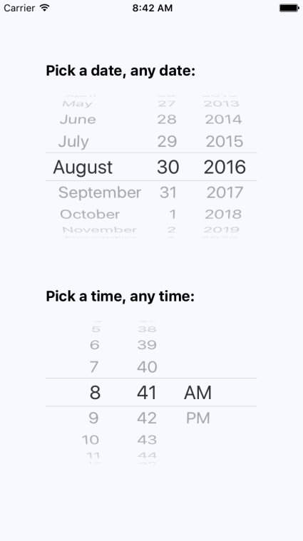
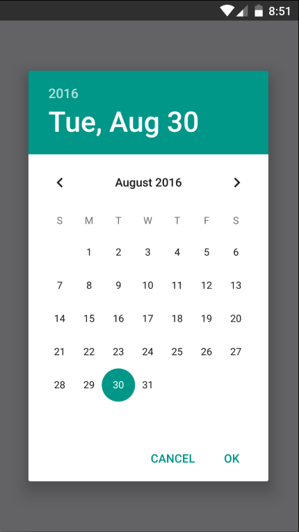
As you can see, the iOS date and time pickers use the Picker component that you learned about earlier in this chapter. The Android picker looks a lot different—let's look at it now: