Another common element you'll see in web forms is checkboxes. React Native has a Switch component that works on both iOS and Android. Thankfully, this component is a little easier to style than the Picker component. Here's a look at a simple abstraction you can implement to provide labels for your switches:
import React from 'react';
import PropTypes from 'prop-types';
import { View, Text, Switch } from 'react-native';

import styles from './styles';

// A fairly straightforward wrapper component
// that adds a label to the React Native
// "<Switch>" component.
const CustomSwitch = props => (
  <View style={styles.customSwitch}>
    <Text>{props.label}</Text>
    <Switch {...props} />
  </View>
);

CustomSwitch.propTypes = {
  label: PropTypes.string
};

export default CustomSwitch;
Now, let's see how we can use a couple of switches to control application state:
import React, { Component } from 'react';
import { View } from 'react-native';
import { fromJS } from 'immutable';

import styles from './styles';
import Switch from './Switch';

export default class TogglingOnAndOff extends Component {
  state = {
    data: fromJS({
      first: false,
      second: false
    })
  };

  // Getter for "Immutable.js" state data...
  get data() {
    return this.state.data;
  }

  // Setter for "Immutable.js" state data...
  set data(data) {
    this.setState({ data });
  }

  render() {
    const { first, second } = this.state.data.toJS();

    return (
      <View style={styles.container}>
        {/* When this switch is turned on, the
             second switch is disabled. */}
        <Switch
          label="Disable Next Switch"
          value={first}
          disabled={second}
          onValueChange={v => {
            this.data = this.data.set('first', v);
          }}
        />

        {/* When this switch is turned on, the
             first switch is disabled. */}
        <Switch
          label="Disable Previous Switch"
          value={second}
          disabled={first}
          onValueChange={v => {
            this.data = this.data.set('second', v);
          }}
        />
      </View>
    );
  }
}
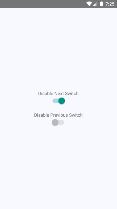
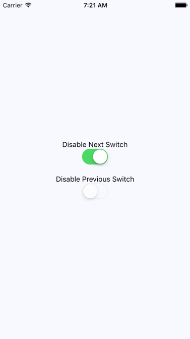
These two switches simply toggle the disabled property of one another. Here's what the screen looks like in iOS:
Here's what the same screen looks like on Android: