Table of Contents for
Mastering OpenLayers 3
 Mastering OpenLayers 3
Published by
Packt Publishing, 2016
Mastering OpenLayers 3
Published by
Packt Publishing, 2016
- Cover
- Table of Contents
- Mastering OpenLayers 3
- Mastering OpenLayers 3
- Credits
- About the Author
- About the Reviewer
- www.PacktPub.com
- Preface
- What you need for this book
- Who this book is for
- Conventions
- Reader feedback
- Customer support
- 1. Creating Simple Maps with OpenLayers 3
- Structure of OpenLayers 3
- Building the layout
- Using the API documentation
- Debugging the code
- Summary
- 2. Applying Custom Styles
- Customizing the default appearance
- Styling vector layers
- Customizing the appearance with JavaScript
- Creating a WebGIS client layout
- Summary
- 3. Working with Layers
- Building a layer tree
- Adding layers dynamically
- Adding vector layers with the File API
- Adding vector layers with a library
- Removing layers dynamically
- Changing layer attributes
- Changing the layer order with the Drag and Drop API
- Clearing the message bar
- Summary
- 4. Using Vector Data
- Accessing attributes
- Setting attributes
- Validating attributes
- Creating thematic layers
- Saving vector data
- Saving with WFS-T
- Modifying the geometry
- Summary
- 5. Creating Responsive Applications with Interactions and Controls
- Building the toolbar
- Mapping interactions to controls
- Building a set of feature selection controls
- Adding new vector layers
- Building a set of drawing tools
- Modifying and snapping to features
- Creating new interactions
- Building a measuring control
- Summary
- 6. Controlling the Map – View and Projection
- Customizing a view
- Constraining a view
- Creating a navigation history
- Working with extents
- Rotating a view
- Changing the map's projection
- Creating custom animations
- Summary
- 7. Mastering Renderers
- Using different renderers
- Creating a WebGL map
- Drawing lines and polygons with WebGL
- Blending layers
- Clipping layers
- Exporting a map
- Creating a raster calculator
- Creating a convolution matrix
- Clipping a layer with WebGL
- Summary
- 8. OpenLayers 3 for Mobile
- Responsive styling with CSS
- Generating geocaches
- Adding device-dependent controls
- Vectorizing the mobile version
- Making the mobile application interactive
- Summary
- 9. Tools of the Trade – Integrating Third-Party Applications
- Exporting a QGIS project
- Importing shapefiles
- Spatial analysis with Turf
- Spatial analysis with JSTS
- 3D rendering with Cesium
- Summary
- 10. Compiling Custom Builds with Closure
- Configuring Node JS
- Compiling OpenLayers 3
- Bundling an application with OpenLayers 3
- Extending OpenLayers 3
- Creating rich documentation with JSDoc
- Summary
- Index
In the first example, called ch08_css, we will create the layout of our application. We differentiate three styling methods. If the device is a desktop computer, we use regular styling, as in Chapter 2, Applying Custom Styles. If we come through a touch screen device, though, we use different rules for controls. Furthermore, we apply a slightly different style to the application in portrait mode than in landscape mode.
Firstly, we create the required elements in the HTML file in our example:
<body>
    <div id="map" class="map">
        <div id="toolbar" class="toolbar"></div>
    </div>
</body>
This part is more simple than ever before. However, in this case, we create our toolbar inside the map element. We will discuss the importance of this step later in this chapter.
Now that we have our HTML elements in place, let's head to the CSS file in this example. As you can see, we completely removed the map container from our design, putting everything in the map element. This way, we have to size our map element to have a full screen application:
.map {
    width: 100%;
    height: 100%; /*Fallback*/
    height: 100vh;
}
The rule for our tool bar is almost identical to the one used in Chapter 2, Applying Custom Styles. However, as we place it on top of our map, we position it accordingly and use an arbitrary high Z-index. This way, our control buttons won't get covered up by the map canvas:
.toolbar {
    height: 2em;
    padding: .2em;
    position: absolute;
    z-index: 999;
}
For the control buttons, we stop displaying them as table elements as we do not have to align them vertically anymore. Furthermore, we remove the distracting background color from them:
.toolbar .ol-control {
    position: static;
    display: inline-block;
    padding: 0;
}
.toolbar .ol-control {
    background-color: rgba(0,0,0,0);
}
.toolbar .ol-control button {
    border-radius: 2px;
    width: 2em;
    background-color: rgba(219,63,63,.5);
    display: inline-block;
}
Next, we define some touch screen-only rules. We handle touch screen devices by adding an ol-touch class to the map element when we encounter one. As hovering does not make sense on touch devices, we disable that feature:
.ol-touch .toolbar .ol-control button {
    background-color: rgba(219,63,63,0.5);
}
.ol-touch .toolbar .ol-control button:hover {
    background-color: rgba(219,63,63,0.5);
}Finally, we separate portrait styling from landscape styling with some media queries. When we have a portrait orientation, we make the control buttons look similar to the desktop styling, just bigger:
@media only screen and (orientation: portrait) {
    .ol-touch .toolbar {
        height: 2rem;
    }
    .ol-touch .toolbar .ol-control {
        height: 2rem;
    }
    .ol-touch .toolbar .ol-control button {
        width: 3rem;
        height: 2rem;
    }
}If we change our device's orientation to landscape, however, we make our controls appear on the left-hand side as we have rotated the tool bar by 90 degrees clockwise. This way, we create a feeling in the users that our controls cover up the least space possible from the application:
@media only screen and (orientation: landscape) {
    .ol-touch .toolbar {
        width: 2rem;
    }
    .ol-touch .toolbar .ol-control {
        display: block;
        width: 2rem;
    }
    .ol-touch .toolbar .ol-control button {
        height: 3rem;
        width: 2rem;
    }
}
Note
There are better ways and a lot of optimization methods in responsive web design. Covering this topic is out of the scope of this book, though there are other great and detailed literatures to learn from. Also, optimizing the design for every browser is harder on smartphones than desktop computers. Our code is only optimized for Webkit-based browsers, such as Google Chrome, Opera, or Safari.
As a final step, we construct our map object. It is simple, just like in Chapter 2, Applying Custom Styles. The only modification lies in touch detection. OpenLayers 3 grants some convenient browser feature detection methods in the namespace ol.has. One of them can easily detect touch screen devices, which we will use in this chapter:
var map = new ol.Map({
target: 'map',
layers: [
new ol.layer.Tile({
source: new ol.source.OSM()
})
],
controls: [
new ol.control.Zoom({
target: 'toolbar'
})
],
view: new ol.View({
center: [0, 0],
zoom: 2
})
});
if (ol.has.TOUCH) {
document.getElementById('map').classList.add('ol-touch');
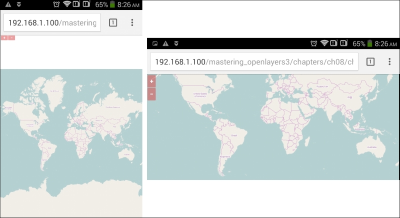
}If we detect a touch screen, we add the ol-touch class to our map element, just like we mentioned previously. Now, if you save the code and load it in a browser, you will see our new design in action, as shown in the following screenshot. Don't forget to check it with a smartphone (or a smartphone simulator) and a desktop computer too:
Tip
The only requirement for checking the code on your smartphone is connecting to the same network as your server. You can query your computer's IP from the command line of your OS. In Windows, you have to type the ipconfig command on Linux type ip addr show; while on OSX, you have to use the ifconfig command.
Don't worry about the small buttons in portrait mode and the address bar covering up valuable map space in landscape mode. Our application will look great in full screen mode, just after we implement it.
Tip
Simulating mobile devices is quite easy, you just need to know your tools. In Google Chrome, you can select a touch device after enabling emulation with the Toggle device mode button (smartphone icon) in the developer tools. In Firefox, you can start emulating by clicking on the Responsive Design Mode button in the dev tools and simulate touch events after that. In Internet Explorer 11 or Microsoft Edge, though, you can only change the user agent string, making those browsers inappropriate to test web pages with feature detection, such as our application.