Table of Contents for
Mastering OpenLayers 3
 Mastering OpenLayers 3
Published by
Packt Publishing, 2016
Mastering OpenLayers 3
Published by
Packt Publishing, 2016
- Cover
- Table of Contents
- Mastering OpenLayers 3
- Mastering OpenLayers 3
- Credits
- About the Author
- About the Reviewer
- www.PacktPub.com
- Preface
- What you need for this book
- Who this book is for
- Conventions
- Reader feedback
- Customer support
- 1. Creating Simple Maps with OpenLayers 3
- Structure of OpenLayers 3
- Building the layout
- Using the API documentation
- Debugging the code
- Summary
- 2. Applying Custom Styles
- Customizing the default appearance
- Styling vector layers
- Customizing the appearance with JavaScript
- Creating a WebGIS client layout
- Summary
- 3. Working with Layers
- Building a layer tree
- Adding layers dynamically
- Adding vector layers with the File API
- Adding vector layers with a library
- Removing layers dynamically
- Changing layer attributes
- Changing the layer order with the Drag and Drop API
- Clearing the message bar
- Summary
- 4. Using Vector Data
- Accessing attributes
- Setting attributes
- Validating attributes
- Creating thematic layers
- Saving vector data
- Saving with WFS-T
- Modifying the geometry
- Summary
- 5. Creating Responsive Applications with Interactions and Controls
- Building the toolbar
- Mapping interactions to controls
- Building a set of feature selection controls
- Adding new vector layers
- Building a set of drawing tools
- Modifying and snapping to features
- Creating new interactions
- Building a measuring control
- Summary
- 6. Controlling the Map – View and Projection
- Customizing a view
- Constraining a view
- Creating a navigation history
- Working with extents
- Rotating a view
- Changing the map's projection
- Creating custom animations
- Summary
- 7. Mastering Renderers
- Using different renderers
- Creating a WebGL map
- Drawing lines and polygons with WebGL
- Blending layers
- Clipping layers
- Exporting a map
- Creating a raster calculator
- Creating a convolution matrix
- Clipping a layer with WebGL
- Summary
- 8. OpenLayers 3 for Mobile
- Responsive styling with CSS
- Generating geocaches
- Adding device-dependent controls
- Vectorizing the mobile version
- Making the mobile application interactive
- Summary
- 9. Tools of the Trade – Integrating Third-Party Applications
- Exporting a QGIS project
- Importing shapefiles
- Spatial analysis with Turf
- Spatial analysis with JSTS
- 3D rendering with Cesium
- Summary
- 10. Compiling Custom Builds with Closure
- Configuring Node JS
- Compiling OpenLayers 3
- Bundling an application with OpenLayers 3
- Extending OpenLayers 3
- Creating rich documentation with JSDoc
- Summary
- Index
Now that we are clear about what parts can be customized with CSS, let's make an attempt to use it in practice. Firstly, we will need the code from the example in the previous chapter. If you look at the code appendix, you will see some files starting with ch02_css. The html and js files are exactly the same as we used in the last chapter. In this example, all the magic will take place in the css file.
Note
If you take a look at the html file, you can see our custom css file is declared after the official css file. This was done due to the phenomenon called CSS specificity. If two CSS file declarations are made to the same element with the same specificity, the order of the declarations will define the styling. As we have declared our custom css file after the official one, it will overwrite the default styling.
Open up the first example, called ch02_css.html, in your browser. You can see the already modified look of the previous example. The question is, how can you precisely tell which classes you have to modify to get the same results. To identify the required classes, right-click on one of the controls and then inspect the element. Your browser's inspector will open up and you will see something similar to the following screenshot:
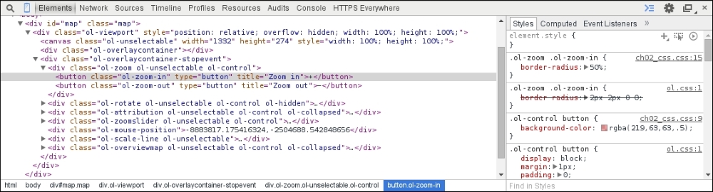
On the right, you can see the rules used by the official and our custom css file on the inspected element. On the left, you can see all the controls' DOM elements and the classes associated with them by default. These are the classes we have to modify, in order to alter the default appeal.
Now that we know which elements can be changed directly with CSS and also which classes have to be changed to modify the appearance of the application, it's time to make some declarations. Firstly, let's make some small changes to the default appearance. We change the controls' original blue glow to a reddish one and make the overview map appear above the scale bar with the following rules:
body {
    margin: 0px;
}
.map {
    width: 100%;
    height: 100%; /*Fallback*/
    height: 100vh;
}
.ol-control button {
    background-color: rgba(219,63,63,.5);
}
.ol-control button:focus {
    background-color: rgba(219,63,63,.5);
}
.ol-control button:hover {
    background-color: rgba(219,63,63,1);
}
.ol-scale-line {
    background-color: rgba(219,63,63,.5);
}
.ol-overviewmap {
    bottom: 2em;
}
Firstly, we remove the margin around the document because this will be a full-screen application.
Next, we define the size of the map element to match the size of the window. We declare every button control's color with RGBA values. Finally, we lift the overview map above the scale bar.
Tip
As mentioned previously, we are using relative values for styling, to make our application is greatly adaptable. For this purpose, the em value is a great choice, as it depends on the font size of the current element. We also use the vh (viewport height) value, which is relative to the viewport; therefore, it precisely stacks with it. As the vh unit has a limited support, defining a fallback option should be considered.
Let's also change the font type the mouse position control uses to a fixed-width one:
.ol-mouse-position {
    font-family: monospace;
}
Note
Specific font families can also be declared in the font-family property (Times New Roman) as generic families (monospace, serif, sans-serif). The browser will always try to use the defined font, but it might not be present on every system. If the defined font is not available, it tries to apply the most similar font, which can be used on the given operating system.
Finally, as drag boxes, the zoom box can also be styled with CSS; let's make a rule for the zoom box specifically:
.ol-dragzoom {
    background-color: rgba(219,63,63,.1);
    border-width: 2px;
    border-color: rgba(219,63,63,1);
}
If you save the current rules to a css file, link it to the example and open it up; you will see the following screenshot:
The controls have a reddish glow instead of the original blue one, the overview map is placed properly above the scale bar, and the coordinates are displayed with a fixed-width font type.
The attribution control has a nice inline styling by default. It is good to go when we have only a few layers to give credit to, but with more layers, it becomes more confusing to read. If you have a lot of layers to display, you might need to display those attributions in a list style. To achieve this effect, we simply overwrite the display rule of the containing element:
.ol-attribution li {
    display: table;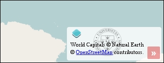
}With this styling option, the logo will always be on top, as it is the first element of the list. This cannot be overridden, but as the element is now taller, we can provide our logo as a background and optionally disable the one provided by the library. In this case, we will use my university's seal as a logo:
.ol-attribution ul {
    background-image: url(../../res/university_of_pecs_transparent.png);
    background-size: contain;
    background-position: 50%;
    background-repeat: no-repeat;
}If you extend your css file with these rules and open up the results, you will see the modified attribute control with our custom logo:
In the next step, let's make a zoom control similar to the one in OpenLayers 2, where the slider is between the two zoom buttons. At first glance, this job might seem difficult, but it can be done with pure CSS. Firstly, alter the zoom buttons in such a way that they will be in circles without the whitish background:
.ol-zoom .ol-zoom-in {
    border-radius: 50%;
}
.ol-zoom .ol-zoom-out {
    border-radius: 50%;
    top: 203px;
    position: relative;
}
.ol-zoom {
    background-color: rgba(255,255,255,0);
}
.ol-zoom:hover {
    background-color: rgba(255,255,255,0);
}
The zoom out button is placed exactly 203 pixels below the zoom in button. This is due to a single reason: the zoom slider is declared as 200 pixels tall, the buttons have a 1 pixel margin, and the zoom slider has a 2 pixel padding. Unfortunately, we cannot do anything about the absolute height of the zoom slider, as the library uses it to calculate resolutions.
Note
We made a note about CSS specificity before. In this case, the reason behind why we can't use the ol-zoom-in and ol-zoom-out classes without nesting is the fact that the more specific declaration wins. As the original declarations are more specific, they would overwrite our rules. For this reason, we have to make our declarations at least as specific as the original ones to overwrite them. For more information, visit the Mozilla Developer Network's related article at https://developer.mozilla.org/en-US/docs/Web/CSS/Specificity.
Modifying the slider is a bit trickier than customizing the buttons. There are two main elements: the rail and the thumb. The problem is that the position of the slider needs to be calculated from an absolute and a relative unit. Fortunately, we can calculate values with CSS; thus, the following lines solve our problem:
.ol-zoomslider {
    top: calc(1.875em + 6px);
    left: calc(.5em + 12px);
    width: 2px;
}
.ol-zoomslider-thumb {
    background-color: rgba(219,63,63,.5);
    left: -11px !important;
}
.ol-zoomslider-thumb:hover {
    background-color: rgba(219,63,63,1);
}
As the rail of the slider will only be a narrow line with the thumb centered on it, the top position of the rail should be the top position of the zoom in button (0.5 em) added to the height of the button (1.375 em) added to the paddings and margins (6 px). We have to correct this value by some pixels, which can be done by visual interpretation. The left position of the rail is calculated from the element's original left position (0.5 em) and its original width (24 pixels).
Tip
We fix the thumb to the rail by setting it back to 11 pixels and making an important exception. We must do it this way, as its left position gets reset to 0 by the library every time the slider changes. As the code changes, the inline styling of the element and inline rules have the most specificity; we can only fix the thumb with the !important exception to the rail with CSS. If there is any other way, using !important should be avoided.
If you save the whole set of rules to a css file, or use the one provided with the example, and load it up, you will see our new zoom control in all its splendor:
If you open the example from a touch device, it will be messy and disoriented. This is due to the library's design patterns. When the application is opened from a touch device, a class named ol-touch gets applied to the controls, and it overrides some of our rules. To make it compatible with touch devices, we have to make further declarations, which you can see in the css file named ch02_touch, too:
.ol-zoomslider, .ol-touch .ol-zoomslider {
    top: calc(1.875em + 6px);
    left: calc(.5em + 12px);
    width: 2px;
}
.ol-touch .ol-zoomslider-thumb {
    width: 22px;
}
.ol-touch .ol-control button {
    font-size: 1.14em;
}
As the ol-zoomslider class under the ol-touch class has declarations by default, which we already made in our custom ol-zoomslider class, we can save lines by applying our existing rules to the more specific class, too. We can do this by using a logical OR operator, which is a simple comma in CSS. The rest of the issues can be solved by making new ol-touch-specific rules.