
The ABOUT US section looks fine on the iPad view but starts to become a bit squishy on a mobile:
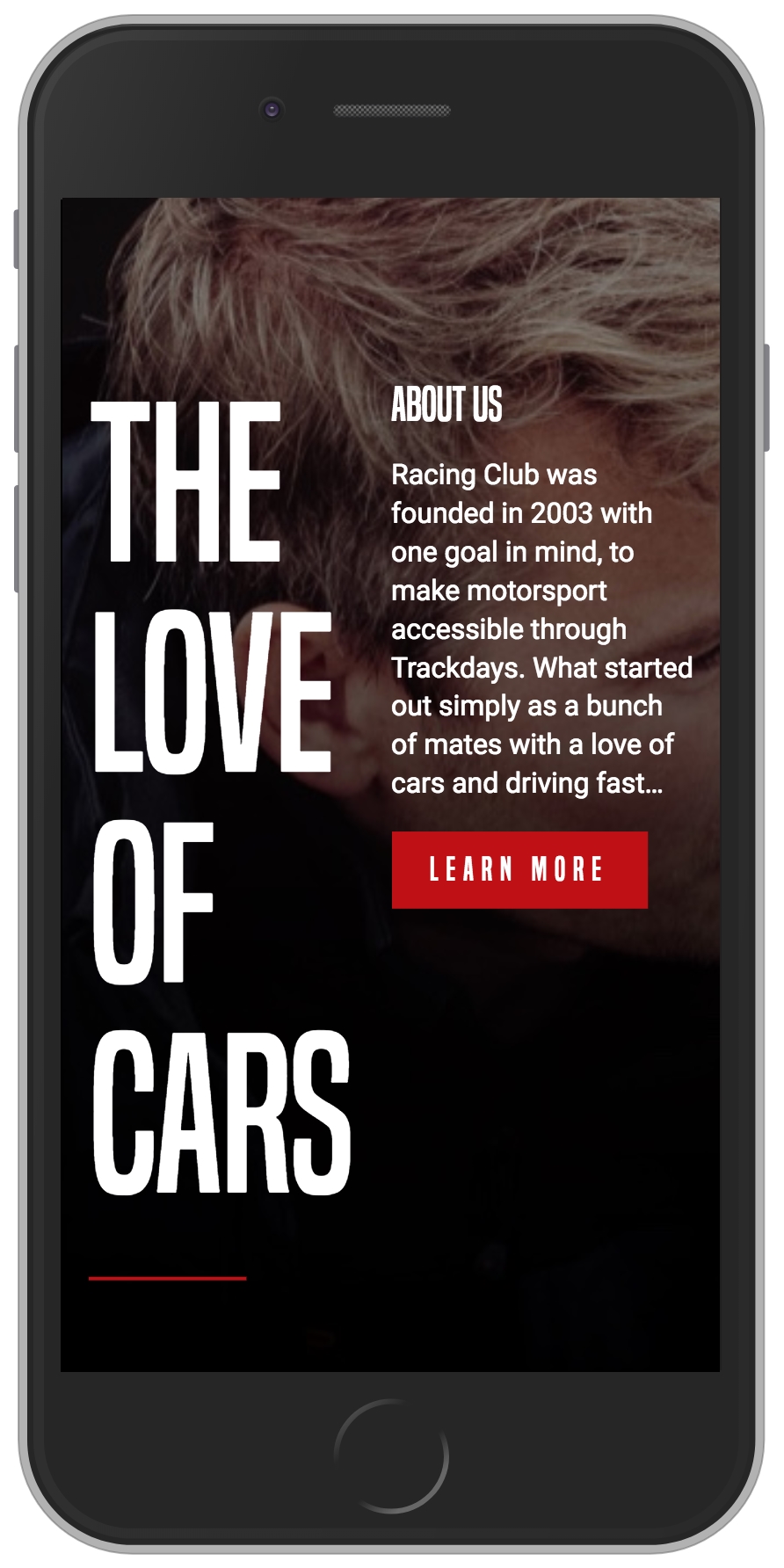
Mobile view of the About Us Section
To fix this issue, we will need to change the width value to 100% on the mobile breakpoint:
.about-us-title {
  width: 50%;
}

/* Small Mobile Styles */
@media only screen and (max-width: 400px) {
  .about-us-title {
    width: 100%;
  }
}

.about-us-desc {
  width: 50%;
}

/* Small Mobile Styles */
@media only screen and (max-width: 400px) {
  .about-us-desc {
    width: 100%;
  }
}
Also, we will change the orientation of the flexbox by adding the CSS property, flex-orientation: column. By default, this value is row, but you also have the ability to change the order by having the row-reverse value, the same for the column value with column-reverse:
/* Small Mobile Styles */
@media only screen and (max-width: 400px) {
  #about-us .container {
    flex-direction: column;
  }
}
The design looks good, but the text is still a bit too close to the title; let's fix this by adding a margin:
/* Small Mobile Styles */
@media only screen and (max-width: 400px) {
  .about-us-desc {
    width: 100%;
    margin-top: 50px;
  }
}
Now, save and check:
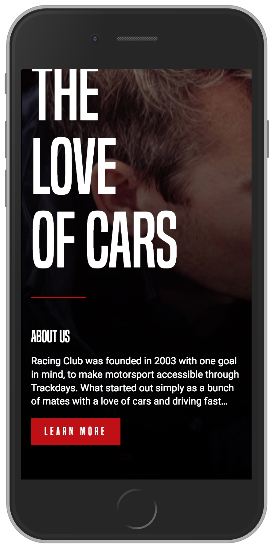
The ABOUT US responsive layout