
Now that we understand how to use Bootstrap, we can start to use other components in Bootstrap's library:
<!-- HERO SECTION -->

    <div class="hero position-relative overflow-hidden d-flex align-items-center">
      <div class="container">
        <div class="col-md-7 my-auto">
          <p class="lead font-weight-normal">13.05.17</p>
          <h1 class="display-2 font-weight-normal custom-font-title">WAKEFIELD PARK</h1>
          <a class="btn btn-primary" href="#">Book now</a>
        </div>
      </div>
    </div>

<!-- END HERO SECTION -->
Let me explain the preceding piece of code a bit.
For the first div it is as follows:
- We first set a custom class—.hero—so that we can apply a custom code in the parent element.
- We add the utility classes .position-relative and .overflow-hidden provided by Bootstrap so we don't have to apply them in the CSS.
- The class .d-flex will set the display on display: flex.
- The utility class .align-items-center will align the child elements so that they are vertically centered.
- We add a custom font .custom-font-title so that we can add to every element with a custom font.
We then apply a second div with the .container class so that we can apply the Bootstrap default container class.
The following classes are all part of the Bootstrap library. You can see them on the Bootstrap website.
The next part is to customize the .hero class we added:
.hero {
  width: 100%;
  height: 700px;
  background-image:
    linear-gradient(to bottom, rgba(0,0,0,0.3) 0%,rgba(0,0,0,0.4) 100%),
    url("../img/hero-image.jpg");
  background-repeat: no-repeat;
  background-size: cover;
  background-position: center;
  color: white;
}
Save, and take a look at what we have:
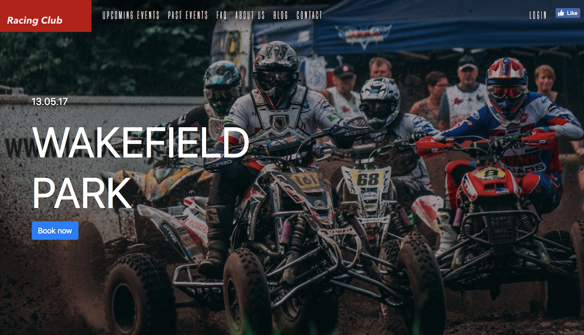
Preview of the hero section
Now let's add the final touch to it:
.custom-font-title {
  font-family: 'built_titling', Helvetica, sans-serif;
  font-weight: 400;
}

.btn-primary {
  font-size: 18px;
  letter-spacing: 4.5px;
  background: #BF0000;
  color: white;
  font-family: 'built_titling', Helvetica, sans-serif;
  font-weight: 400;
  padding: 12px 22px;
  border: none;
  outline: none;
  transition: all 0.3s ease;
  border-radius: 0px;
}

.btn-primary:hover {
  background: #A3171B;
}

.btn-primary:active {
  box-shadow: inset 0px 8px 4px rgba(0, 0, 0, 0.25);
  background: #A3171B!important;
  box-shadow: none!important;

}

.btn-primary:focus {
  box-shadow: inset 0px 8px 4px rgba(0, 0, 0, 0.25);
  background: #A3171B;
  box-shadow: none;
}
This will overwrite the default style of Bootstrap for the heading and primary button:
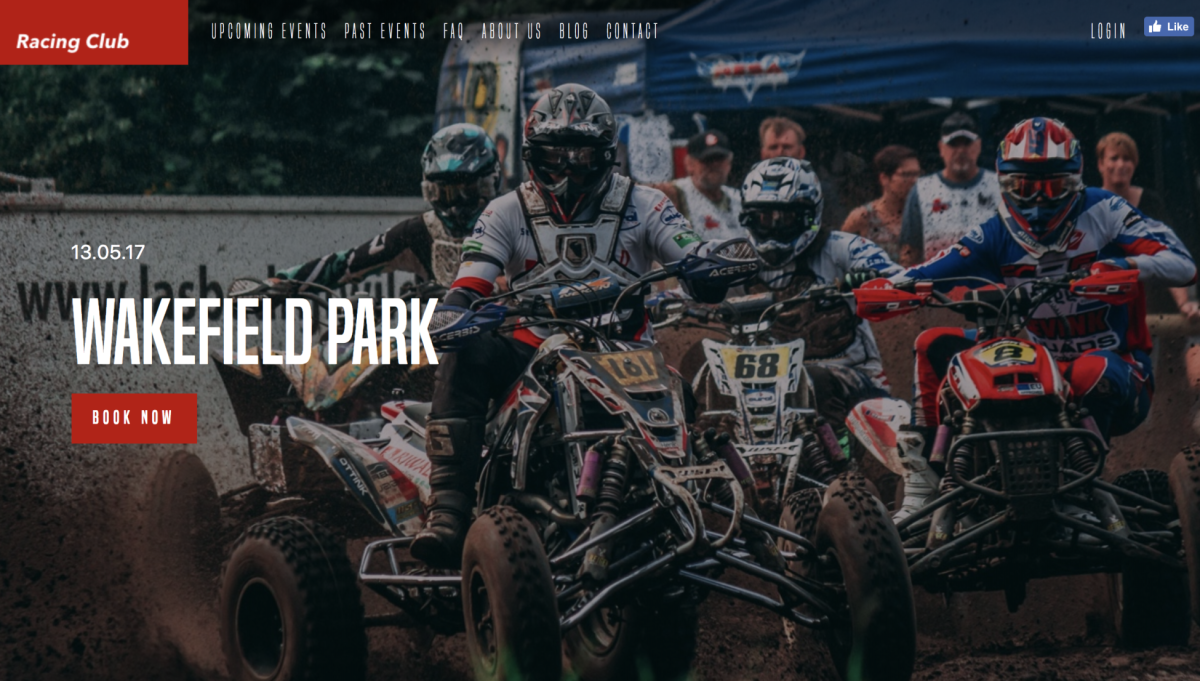
Our final hero section
Let's start the Blog section now.