
We talked about Responsive design very briefly in Chapter 1, Evolution of Web Design; if you remember, it describes a new way of designing for the desktop, and also for the mobile interface. It is basically proposing to use the same content, but a different layout for the design on each screen.
To be more precise, a Responsive website shows content based on the browser space. If you open a Responsive website on a desktop and change the size of the browser window, it will dynamically fit the window size and arrange itself.
The concept of Responsive design was first coined by Ethan Marcotte when he wrote an introductory article about the notion of Responsive architectural design, whereby a room/space automatically adjusts to the number of people within it.
The idea is to have similar behavior in web design. As with Responsive architecture, web design should automatically adjust for users. The ultimate endpoint is to have a seamless experience through every device, and mainly on the client side with CSS (media queries).
To make this easier to understand, look at the following diagram:
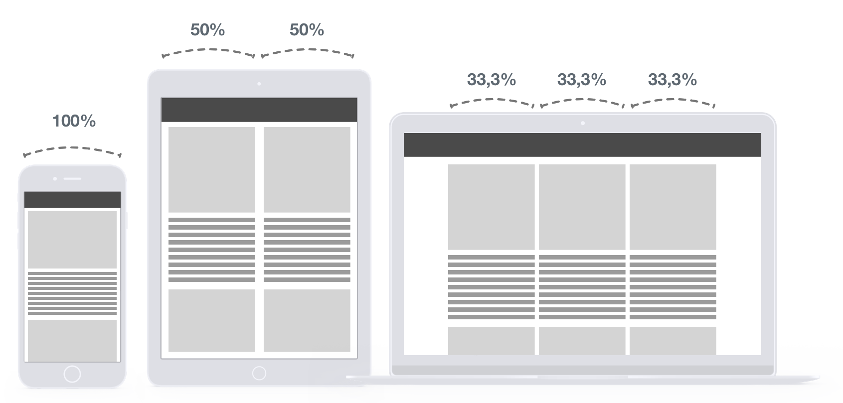
In this figure, you can see the behavior on each device. The desktop view has three columns of 33.3% of the total width. As we go down, we increase this value to 50% and an end to 100% on mobile view. The result, as we can see, is to have content that stretches to fit on every window size, so the content will still be readable on whatever device the user is using.
All the rules are made in the CSS file, so the HTML is not modified whatsoever. This is why CSS media queries are very powerful.
Here are a few examples of good Responsive design:
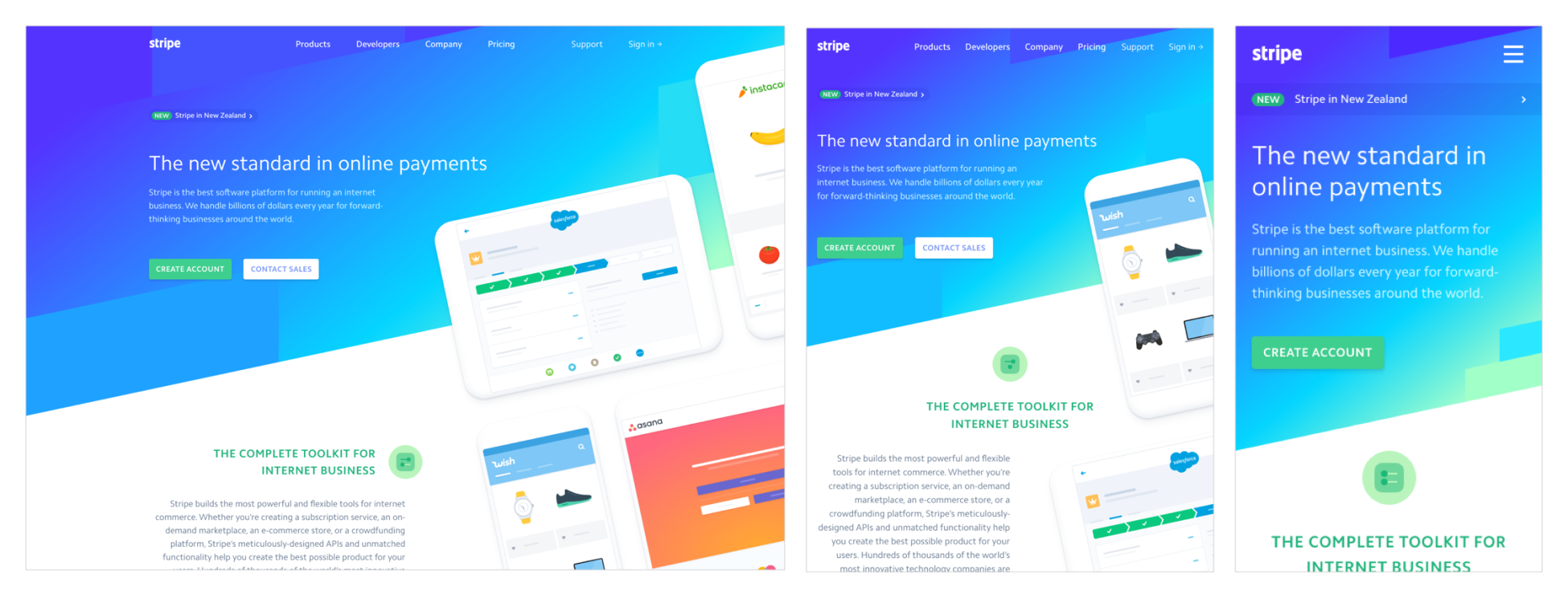
The preceding screenshot from the Stripe website shows that the layout is completely fluid and is able to stretch and adapt to various screen resolutions:
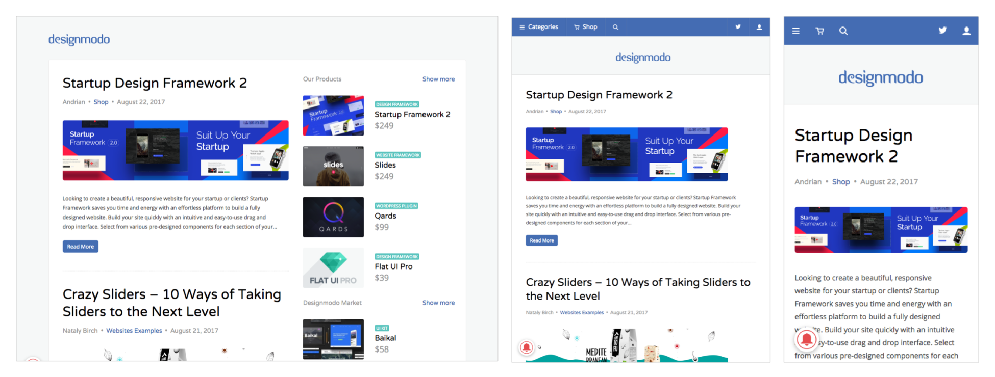
The preceding screenshot from the Designmodo website shows the very clean and clear design that is totally Responsive. You can see that the right sidebar disappeared on both tablet and mobile view.
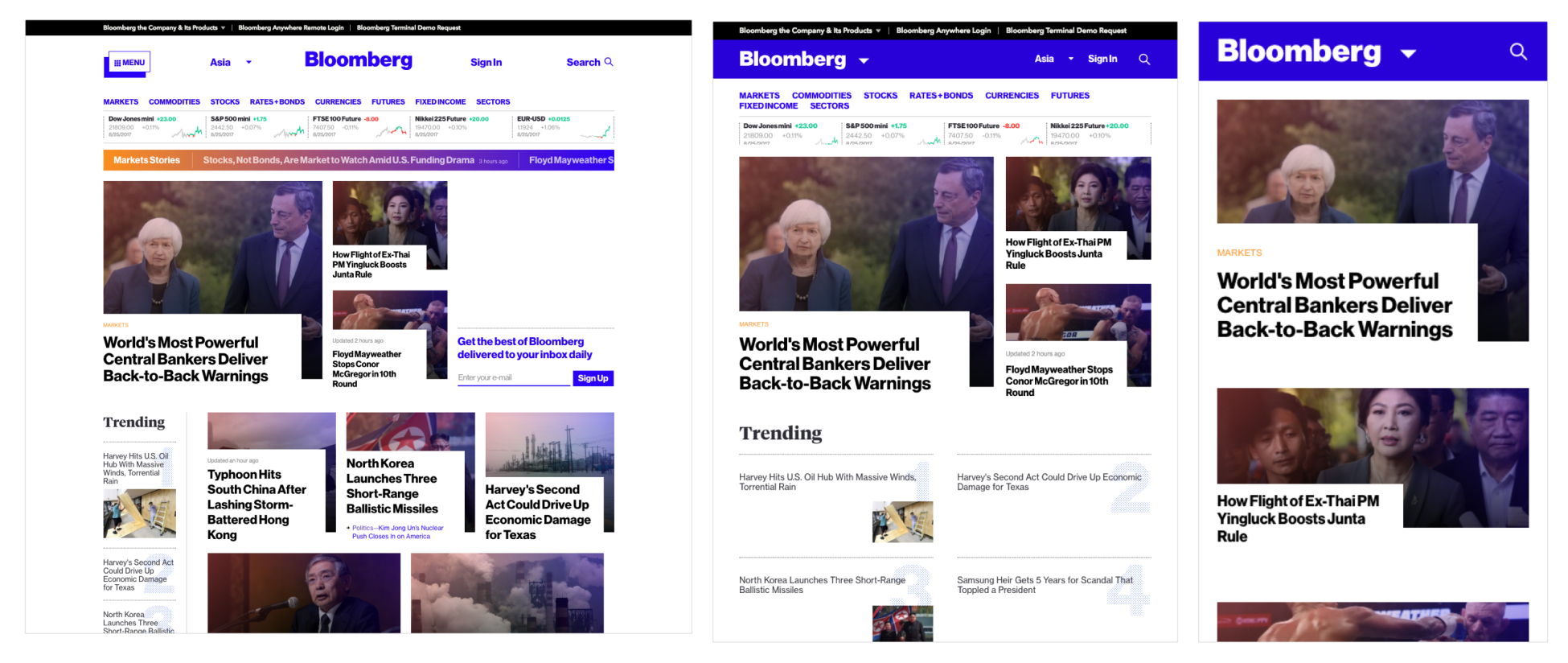
The preceding screenshot shows the Bloomberg website. The website is famous for its grid that responds well and lets the users focus on the content.