After implementing our header, we can now go the next step, which is the hero Section. The hero section is, in web design, usually composed with a big image, a title, a description, and a Call to Action (CTA). It serves as an overview of the website because it's the first thing the visitor will see.
In our design, we have the following:
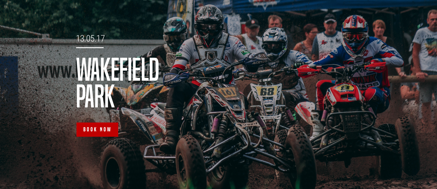
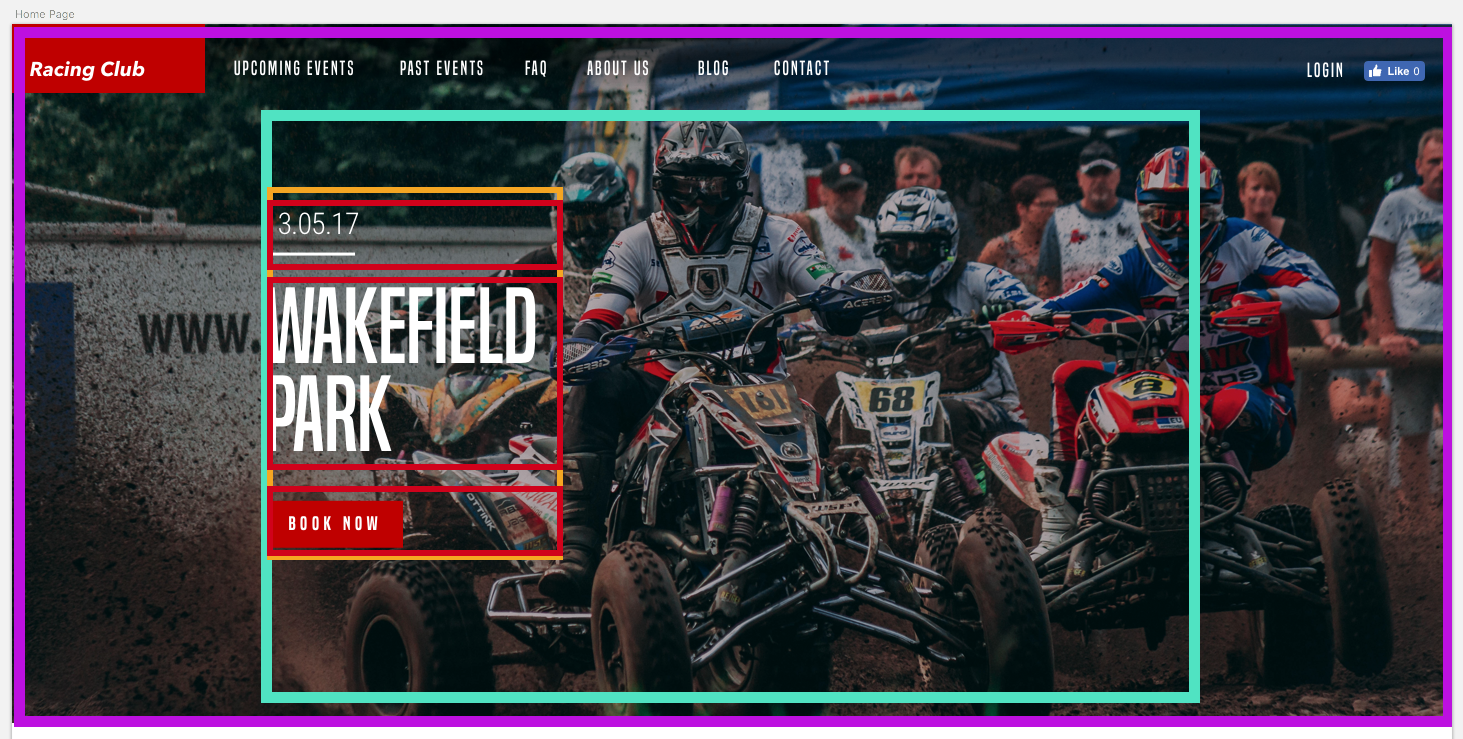
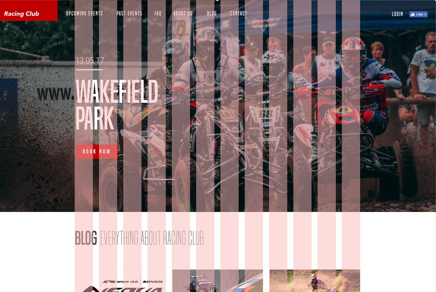
It's quite simple. It's composed of a background image, with a gradient overlay and some text with a button on the left. If we try to mark out the outline of each block, we could have something like this:
Maybe this can help you visualize what we're trying to do in HTML/CSS. Let's start with the HTML:
We can start first by creating a section (purple) that will hold everything:
<section id="hero">
</section>
We'll add an id so it's easier to call upon it later.
We now have to create a container (fuschia) that will contain all the elements inside but also be centered horizontally. For that, we'll create a div with the class container:
<section id="hero">
  <div class="container">

  </div>
</section>
Inside we'll have a block that will contain the title, description, and button, which will be left aligned. We can call it "hero-text":
<section id="hero">
  <div class="container">
    <div class="hero-text">

    </div>
  </div>
</section>
Now, let's add the content inside:
<section id="hero">
  <div class="container">
    <div class="hero-text">
      <p class="hero-date">10.05.18</p>
      <h1 class="hero-title">Wakefield Park</h1>
      <button type="button" name="button" class="btn-primary">Book now</button>
    </div>
  </div>
</section>
As you might have seen, we didn't add the image in the HTML, because we want to add it with CSS. Adding images with CSS allows more flexibility and customization. In this case, we want to make it full screen and to cover the background. First, let's call our #hero div:
#hero {

}
Let's add the following styling:
#hero {
  width: 100%;
  height: 700px;
  background-image:
    linear-gradient(to bottom, rgba(0,0,0,0.3) 0%,rgba(0,0,0,0.4) 100%),
    url("../img/hero-image.jpg");
  background-repeat: no-repeat;
  background-size: cover;
  background-position: center;
}
Here are some explanations:
- We first need to set the size of the block. As we want it to be full screen, we have to make the width 100 percent and the height 700px, as the dimension is the design.
- With CSS5, we have the ability to add multiple backgrounds. For that, we need to separate them with a comma, as shown previously.
- We use background-repeat to make the background not repeat indefinitely as per default.
- background-size: cover; will make the background image stretch following the size of the block, here the full screen.
- background-position: center; will always put the background in the center, even when resizing.
- Let's save our files and see what we get:
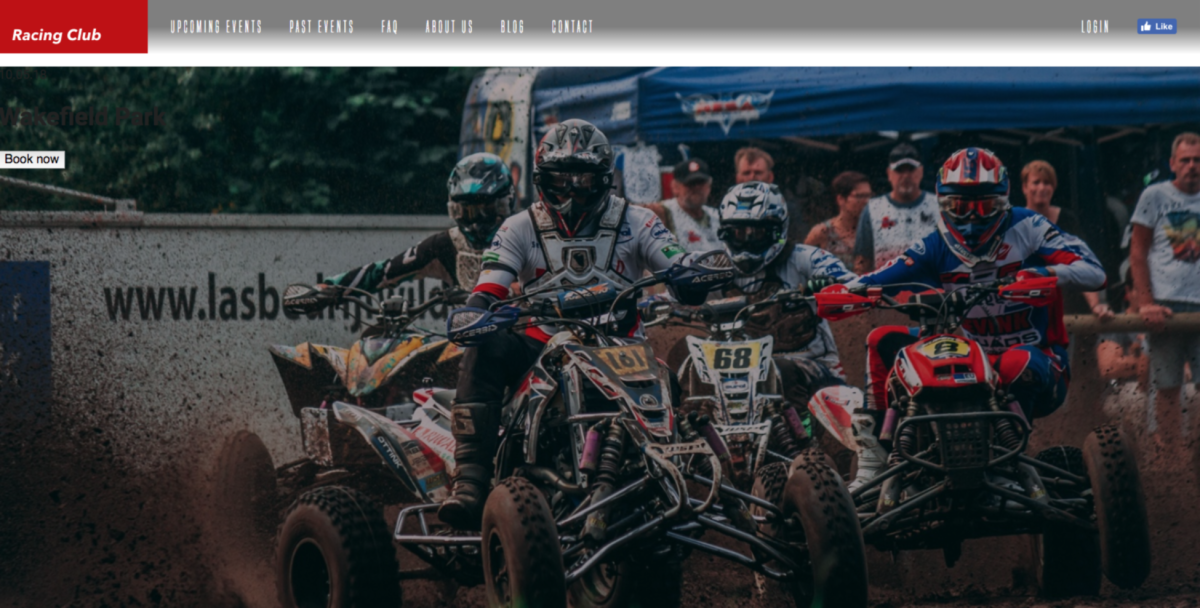
We have our image and gradient; let's now move into our content.
As we said earlier, we need our content to be centered. As you may have spotted, our design follows a grid:
We need to create this container, which has a width of 940px and is centered horizontally. For that it's very simple, all we'll need to do is:
.container {
  max-width: 940px;
  margin: 0 auto;
}
Here are some notes:
- max-width: 940px:: we don't want the container to be more than 940px, but it can be less than that depending on screen size.
- margin: 0 auto; is a simple way to horizontally center a block element.
The next step will be to stylise the content. But, first, we need to analyze the design before jumping into the code. When looking at the design, we can see that:
- The hero content needs to be vertically centered from the hero section
- The hero content needs to be aligned on the left and have a width of 50 percent