First, as we always do (and you need to get into this habit), we need to analyze the design and see how is it composed:
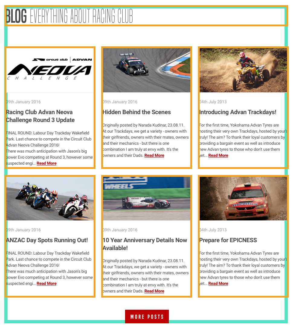
As we can see, the Blog section is composed of a header and six Blog posts. There are two rows of three posts each, with an equal width of one-third.
We know how to design this with a float and the display: inline-block properties. Let's try to build it with CSS flexbox.
Let's first add the HTML:
<section id="blog">
  <div class="container">
    <h2><b>Blog</b> Everything about RACING CLUB</h2>

  </div>
</section>
Here are some explanations:
- We need to create another section id "blog"
- We need to reuse the class container to have a container that follows the same width
- We add an <h2> since it's not as important as the hero title
- We add a <b> tag to make the word Blog bold
Let's add our blog posts section now:
<section id="blog">
  <div class="container">
    <h2><b>Blog</b> Everything about RACING CLUB</h2>
    <div class="blog-posts">
      <div class="blog-post">
        <img src="img/blog-img/blog1.jpg" srcset="img/blog-img/blog1.jpg 1x, img/blog-img/blog1@2x.jpg 2x">
        <p class="blog-post-date">09th January 2016</p>
        <h3>Racing Club Advan Neova Challenge Round 3 Update</h3>
        <p class="blog-post-desc">FINAL ROUND: Labour Day Trackday Wakefield Park. Last chance to compete in the Circuit Club Advan Neova Challenge 2016!
There was much anticipation with Jason's big power Evo competing at Round 3, however some suspected engi… <a href="#">Read More</a></p>
      </div>
    </div>
  </div>
</section>
Here is what we did:
- We added a div with the class "blog-posts" that contains all the Blog posts.
- Inside, we create a div with the class "blog-post", which will be a single blog post.
- Inside this div, we added the image with the img tag and srcset we learned earlier.
- We also added a p tag with a class "blog-post-date" for the Blog post date.
- We added a <h3> without class because it's the only h3 element, so we can target it easily with CSS.
- Lastly, we added the description text with a link inside.
This represents a single Blog post, so to make six of them, we simply need to duplicate the blog post element six times.
Let's also add another div to make our Show More button:
<div class="blog-show-more">
  <button type="button" name="button" class="btn-primary">More posts</button>
</div>
In the end, you should have something like this:
<section id="blog">
  <div class="container">
    <h2><b>Blog</b> Everything about RACING CLUB</h2>
    <div class="blog-posts">

      <div class="blog-post">
        <img src="img/blog-img/blog1.jpg" srcset="img/blog-img/blog1.jpg 1x, img/blog-img/blog1@2x.jpg 2x">
        <p class="blog-post-date">09th January 2016</p>
        <h3>Racing Club Advan Neova Challenge Round 3 Update</h3>
        <p class="blog-post-desc">FINAL ROUND: Labour Day Trackday Wakefield Park. Last chance to compete in the Circuit Club Advan Neova Challenge 2016!
There was much anticipation with Jason's big power Evo competing at Round 3, however some suspected engi… <a href="#">Read More</a></p>
      </div>

      <div class="blog-post">
        <img src="img/blog-img/blog2.jpg" srcset="img/blog-img/blog2.jpg 1x, img/blog-img/blog2@2x.jpg 2x">
        <p class="blog-post-date">09th January 2016</p>
        <h3>Hidden Behind the Scenes</h3>
        <p class="blog-post-desc">Originally posted by Narada Kudinar, 23.08.11.
At our Trackdays, we get a variety - owners with their girlfriends, owners with their mates, owners and their mechanics - but there is one combination I am truly at envy with. It's the owners and their Dads. <a href="#">Read More</a></p>
      </div>

      <div class="blog-post">
        <img src="img/blog-img/blog3.jpg" srcset="img/blog-img/blog3.jpg 1x, img/blog-img/blog3@2x.jpg 2x">
        <p class="blog-post-date">04th July 2015</p>
        <h3>Introducing Advan Trackdays!</h3>
        <p class="blog-post-desc">For the first time, Yokohama Advan Tyres are hosting their very own Trackdays, hosted by your's truly! The aim? To thank their loyal customers by providing a bargain event as well as introduce new Advan tyres to those who don't use them yet...<a href="#">Read More</a></p>
      </div>

      <div class="blog-post">
        <img src="img/blog-img/blog4.jpg" srcset="img/blog-img/blog4.jpg 1x, img/blog-img/blog4@2x.jpg 2x">
        <p class="blog-post-date">09th Jun 2015</p>
        <h3>ANZAC Day Spots Running Out!</h3>
        <p class="blog-post-desc">FINAL ROUND: Labour Day Trackday Wakefield Park. Last chance to compete in the Circuit Club Advan Neova Challenge 2016!
There was much anticipation with Jason's big power Evo competing at Round 3, however some suspected engi… <a href="#">Read More</a></p>
      </div>

      <div class="blog-post">
        <img src="img/blog-img/blog5.jpg" srcset="img/blog-img/blog5.jpg 1x, img/blog-img/blog5@2x.jpg 2x">
        <p class="blog-post-date">15th Mar 2015</p>
        <h3>10 Year Anniversary Details Now Available!</h3>
        <p class="blog-post-desc">Originally posted by Narada Kudinar, 23.08.11.
At our Trackdays, we get a variety - owners with their girlfriends, owners with their mates, owners and their mechanics - but there is one combination I am truly at envy with. It's the owners and their Dads. <a href="#">Read More</a></p>
      </div>

      <div class="blog-post">
        <img src="img/blog-img/blog6.jpg" srcset="img/blog-img/blog6.jpg 1x, img/blog-img/blog6@2x.jpg 2x">
        <p class="blog-post-date">16th Jan 2015</p>
        <h3>Prepare for EPICNESS</h3>
        <p class="blog-post-desc">For the first time, Yokohama Advan Tyres are hosting their very own Trackdays, hosted by your's truly! The aim? To thank their loyal customers by providing a bargain event as well as introduce new Advan tyres to those who don't use them yet... <a href="#">Read More</a></p>
      </div>

    </div>
div class="blog-show-more">
      <button type="button" name="button" class="btn-primary">More posts</button>
    </div>

  </div>
</section>
Let's head to the CSS now! We will style the title first:
#blog h2 {
  font-family: 'built_titling', Helvetica, sans-serif;
  font-weight: 200;
  font-size: 60px;
}
For the blog-posts container, we'll do as follows:
.blog-posts {
  display: flex;
  flex-direction: row;
  flex-wrap: wrap;
  margin-top: 50px;
}

.blog-post {
  width: 33.33%;
  padding: 0 5px;
  box-sizing: border-box;
  margin-bottom: 30px;
}
.blog-posts is the parent element and .blog-post is the child element.
Here is some information regarding .blog-posts:
- display: flex; always needs to be added to the parent element.
- flex-direction: row; will direct the child elements as a row. You can put it as a column if you want.
- flex-wrap: wrap; will make the child elements wrap onto multiple lines, from top to bottom. By default, it will try to fit every element on to one line.
- margin-top: 50px; adds a bit of margin on the top.
Here is some information regarding .blog-post:
- width: 33.33%; sets the width as one-third of the total width
- padding: 0 5px; adds some padding on the right and left sides
- box-sizing: border-box;: as we saw earlier, this makes the padding and margin properties apply inside the box instead of outside
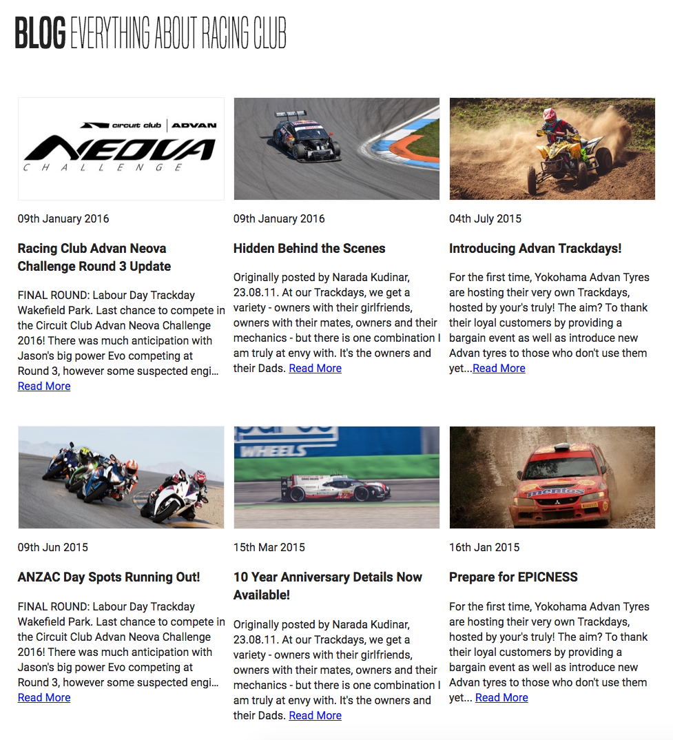
So far, we have the right layout:
Let's style the content inside a Blog post:
.blog-post img {
  width: 100%;
}
We use width: 100%; as we want our images to take 100% of the width. The rest is pretty basic CSS, just to follow the design:
.blog-post .blog-post-date {
  font-size: 14px;
  color: #9A9A9A;
  margin-top: 20px;
}

.blog-post h3 {
  font-size: 20px;
  color: #4A4A4A;
  letter-spacing: -0.4px;
  line-height: 1.4;
}


.blog-post .blog-post-desc {
  font-size: 14px;
  color: #4A4A4A;
  line-height: 1.6;
}

.blog-post .blog-post-desc a {
  color: #BF0000;
  text-decoration: underline;
  font-weight: bold;
}
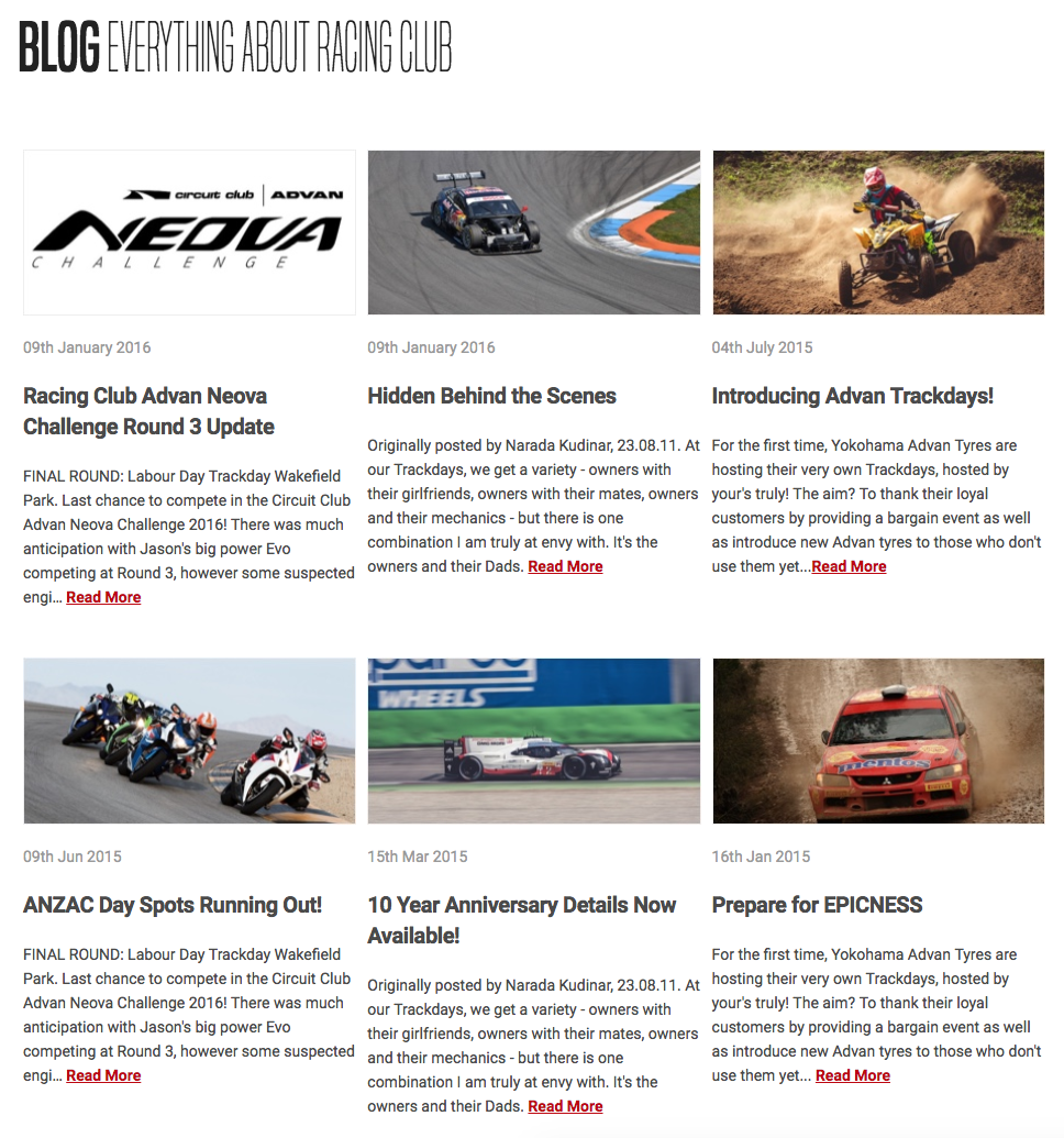
Here's what we end up with:
It's looking quite similar to me now. The last part is the Show More button. A simple hack would be to add a text-align: center to the parent element so it will make the button aligned in the middle:
.blog-show-more {
  text-align: center;
}
For the last touch, I'll add some margins at the bottom to add a bit of white space:
#blog {
  margin-bottom: 50px;
}
Our CSS for the blog section:
/* BLOG SECTION */

#blog {
  margin-bottom: 50px;
}

#blog h2 {
  font-family: 'built_titling', Helvetica, sans-serif;
  font-weight: 200;
  font-size: 60px;
}

.blog-posts {
  display: flex;
  flex-direction: row;
  flex-wrap: wrap;
  margin-top: 50px;
}

.blog-post {
  width: 33.33%;
  padding: 0 5px;
  box-sizing: border-box;
  margin-bottom: 30px;
}

.blog-post img {
  width: 100%;
}

.blog-post .blog-post-date {
  font-size: 14px;
  color: #9A9A9A;
  margin-top: 20px;
}

.blog-post h3 {
  font-size: 20px;
  color: #4A4A4A;
  letter-spacing: -0.4px;
  line-height: 1.4;
}

.blog-post .blog-post-desc {
  font-size: 14px;
  color: #4A4A4A;
  line-height: 1.6;
}

.blog-post .blog-post-desc a {
  color: #BF0000;
  text-decoration: underline;
  font-weight: bold;
}

.blog-show-more {
  text-align: center;
}


/* END OF BLOG SECTION */