
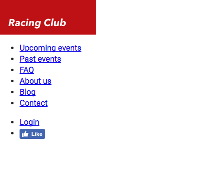
At the moment, our header is looking very boring. But, no worries, we'll add some magic with CSS and make it prettier.
We saw earlier that CSS can be written in three different ways:
- Inside an HTML Tag with a style attribute
- Inside our <head> section in a HTML document with the tag <style>
- CSS code can also be put into an external file
For our own project, we're going to use the third way, as commonly used in the web in general, because the CSS can be changed without changing the HTML file.
Let's create our CSS file that will be used for our general styling. In Atom, click File | New File, and save the file with File | Save As. Choose the folder css and name this file styles.css. We have to link this file as we did with the font.css file we created earlier:
<link href="https://fonts.googleapis.com/css?family=Roboto:400,700" rel="stylesheet">
<link rel="stylesheet" href="fonts/fonts.css"> <!-- Font face CSS link -->
<link rel="stylesheet" href="css/normalize.css">
<link rel="stylesheet" href="css/main.css">
<link rel="stylesheet" href="css/styles.css">
Now that we have our styles.css, we can get started. But I usually like to view both HTML and CSS at the same time. It's easy to do so; select your styles.css, then go to View | Panes | Split Right. You now have the file open on two different panes. You can close the one on the left:
First, we need to target the header tag. The header tag has no class, but we can target an HTML tag with just this tag. In CSS it will be:
header {
}
This will basically target every <header> tag in the HTML, so you need to be careful about it:

If we take a look closely at our design, we can notice that the header takes the full width of the web page, has a height of 70px, and has a gradient grey to a transparent background that lets the image appear behind it.
To do so we have the CSS property width:
header {
  width: 100%;
  height: 70px;
}
We can now add the background gradient. For that, we have the CSS property background-image: linear-gradient:
background-image: linear-gradient(0deg, rgba(0,0,0,0.00) 0%, rgba(0,0,0,0.50) 50%);
To create a gradient with CSS, I often use a generator (http://www.colorzilla.com/gradient-editor/) that creates the final code for me.
I also sometimes use the CSS tool provided by Sketch or Photoshop to copy the CSS property straight from the design.
For this exercise, you can just copy the code I provided:
header {
  width: 100%;
  background-image: linear-gradient(0deg, rgba(0,0,0,0.00) 0%, rgba(0,0,0,0.50) 50%);
}
Save both CSS and HTML files and open index.html on your browser:
We now have our container, but we still need to stylize our menu. Let's first target our list by its class, main-nav. If you remember, to call a class, we need to add a dot before the name of the class, like this:
header .main-nav {

}
Now we want to specifically target every <li> inside the <ul>. To do so, we simply have to add li after, as we saw in the chapter earlier:
header .main-nav li {

}
Let's first remove the list styling, which is a circle by default. To do that, we need to use the CSS property list-style-type:
header .main-nav li {
  list-style-type: none;
}
Let's put none, so it will remove all styling in the li tag.
We also have to display the list horizontally instead of vertically. To make this happen, we need to use the CSS property display: inline-block.
The CSS property display: inline-block will display the list as inline but with the ability to set width and height as a block element:
header .main-nav li {
  list-style-type: none;
  display: inline-block;
}
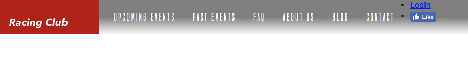
Let's save our work and check to see what we have so far:
Our goal now is to put the menu right next to the logo. For that, we'll need to make the logo float. As we saw earlier in the CSS chapter, we'll use the CSS property float: left; on the logo:
header .logo {
  float: left;
}
We now need to display the menu correctly. We'll first add a height to our main-nav :
header .main-nav {
  height: 70px;
}
We also need to make the menu float so the right-hand menu can come on top:
header .main-nav {
  height: 70px;
}
Since all <ul> tags have some padding and margin by default, we need to overwrite that:
Header .main-nav {
  height: 70px;
  float: left;
  margin: 0;
  padding: 0;
}

The problem is that we have the menu side by side with the logo, so we need to add some padding to the menu:
header .main-nav {
  height: 70px;
  float: left;
  margin: 0;
  padding: 0;
  padding-left: 0;
}
But now we have two properties that are overlapping since padding includes all paddings such as padding-left. This will still work but it's bad CSS. To write it properly, we can combine and modify the paddings with just one CSS property:
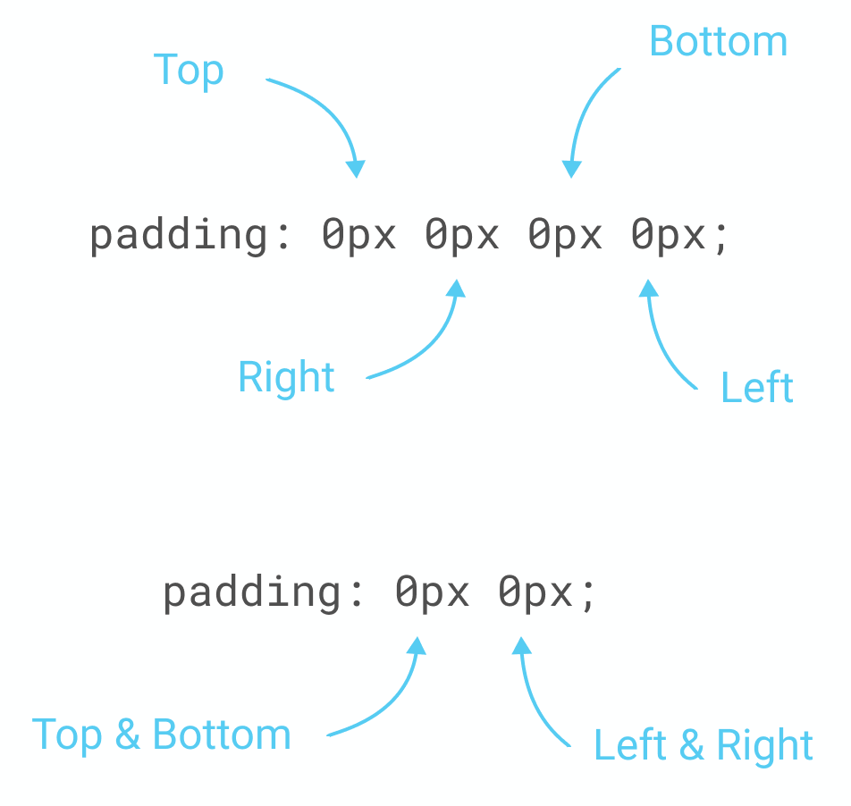
For our exercise, we will do the following:
header .main-nav {
  height: 70px;
  float: left;
  margin: 0;
  padding: 0px 15px;
}
Our next goal is to make our menu vertically aligned with the logo. To do so, we can use a little CSS hack by using line-height, which is used normally to change the space between lines on a paragraph. By setting the line-height to the height of the menu, we'll make the menu vertically aligned:
header .main-nav {
  height: 70px;
  float: left;
  margin: 0;
  padding: 0px 15px;
  line-height: 70px;
}
Now let's customize the font to the one we installed earlier. Let me show you the final CSS so that I can explain line by line what, exactly, it means:
header .main-nav li a {
  color: white;
  text-decoration: none;
  font-family: 'built_titling', Helvetica, sans-serif;
  font-weight: 200;
  font-size: 20px;
  letter-spacing: 4px;
  padding: 0px 15px;
}
First we need to target the <a> tag in our .main-nav class. Inside our bracket, we'll have the following:
- color: white; will specify the color of the text. You can set this color with a HEX code or with the 140 native color CSS support (https://www.w3schools.com/cssref/css_colors.asp).
- text-decoration: none; will suppress all decoration on the text. Here we want to suppress the underline on every link.
- font-family: 'built_titling', Helvetica, sans-serif; is to specify the font we want to display. The following font name will serve if the first one couldn't load.
- font-weight: 200; is the level of bold of the font.
- font-size: 20px; will be the size of the font in pixels.
- letter-spacing: will indicate the spacing between each character.
- padding: it's inside-padding as we learned earlier.
We're almost done. Let's save and have a look:
We have only the right-hand part to finish, let's get this done!
For this part, we'll need to make it float on the right. Let's first target this class:
Header .right-nav {

}
This right nav will follow almost the same properties as the left nav; we'll only change the float to right:
header .right-nav {
  height: 70px;
  float: right;
  margin: 0;
  padding: 0px 15px;
  line-height: 70px;
}
As you will see, we'll use a lot of copy/paste for coding as a lot of elements will use the same properties.
But what if we have a lot of selectors that use the same CSS properties? Do we have to copy/paste all of them? A good practice in coding is always to simplify our code so that it takes less time to load.
In CSS, we can call on multiple selectors and put the same CC properties. To do so, we need to separate them with a comma ,. For our left-nav and right-nav for example, we can do the following:
header .main-nav, header .right-nav{
  height: 70px;
  float: left;
  margin: 0;
  padding: 0px 15px;
  line-height: 70px;
}

header .right-nav {
  float: right;
}
This will have the same effect as the code we wrote before. And because we call .right-nav and put the property float: right; after, it overwrites the previous property, which was float: left;. This is a good practice to have when coding in CSS.
Let's make the rest of the code with this good practice in mind:
header .main-nav li, header .right-nav li {
  list-style-type: none;
  display: inline-block;
}

header .main-nav li a, header .right-nav li a {
  color: white;
  text-decoration: none;
  font-family: 'built_titling', Helvetica, sans-serif;
  font-weight: 200;
  font-size: 20px;
  letter-spacing: 4px;
  padding: 0px 15px;
}
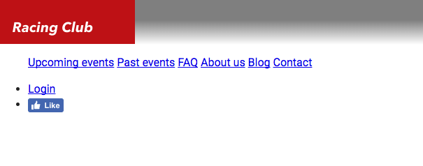
We now have our header. Let's save it and have a final look:

Fantastic! Lastly, to make our code clean and easy to read, I'll advise putting some comments at the beginning and at the end of each section of your code.
This will be the final CSS code for our HEADER section:
/* HEADER */

header {
  width: 100%;
  height: 70px;
  background-image: linear-gradient(0deg, rgba(0,0,0,0.00) 0%, rgba(0,0,0,0.50) 50%);
  position: absolute;
}

header .logo {
  float: left;
}

header .main-nav, header .right-nav{
  height: 70px;
  float: left;
  margin: 0;
  padding: 0px 15px;
  line-height: 70px;
}

header .right-nav {
  float: right;
}

header .main-nav li, header .right-nav li {
  list-style-type: none;
  display: inline-block;
}

header .main-nav li a, header .right-nav li a {
  color: white;
  text-decoration: none;
  font-family: 'built_titling', Helvetica, sans-serif;
  font-weight: 200;
  font-size: 20px;
  letter-spacing: 4px;
  padding: 0px 15px;
}

/* END OF HEADER */