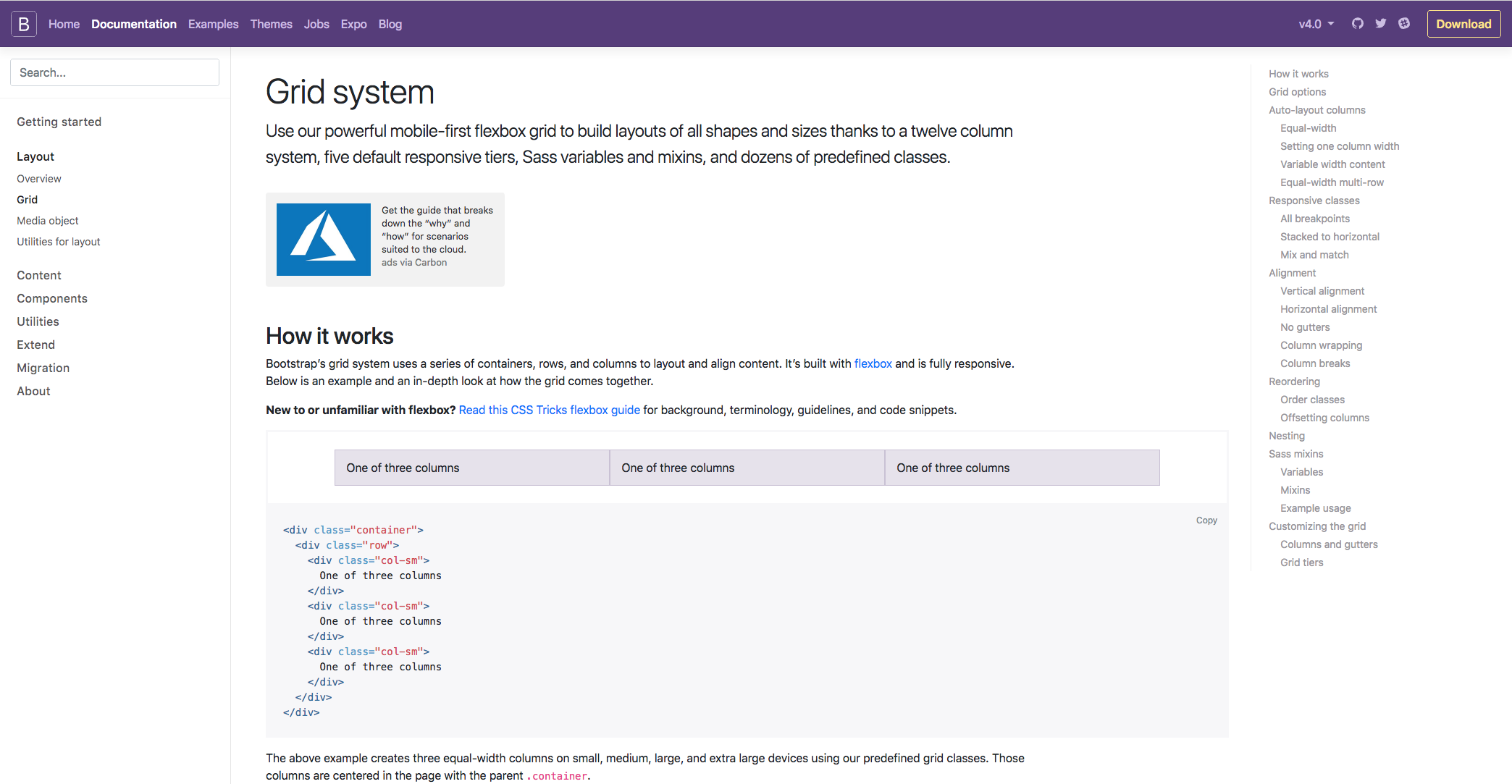
One of the main reasons why Bootstrap is so popular is due to the responsive nature of the framework. Now, Bootstrap is built on a grid system, and it's based on a set of 12 columns. If you just jump into the Documentation on the Bootstrap website, then into the layout section, and then to the Grid section, we can take a closer look:
Bootstrap contains three different components; they are the columns, containers, and rows. Essentially, the containers hold the content, the rows align the content, and the columns dictate how the content is split along that row. Don't worry too much if that doesn't make sense because you've got no experience of the grid system; it will all become clear as you work your way through the chapter and get hands-on experience. To give the best example of what the grid system is all about, we can take a look at the Responsive classes section on the following page. I feel this gives the best explanation of what the Grid system is all about: The Bootstrap:
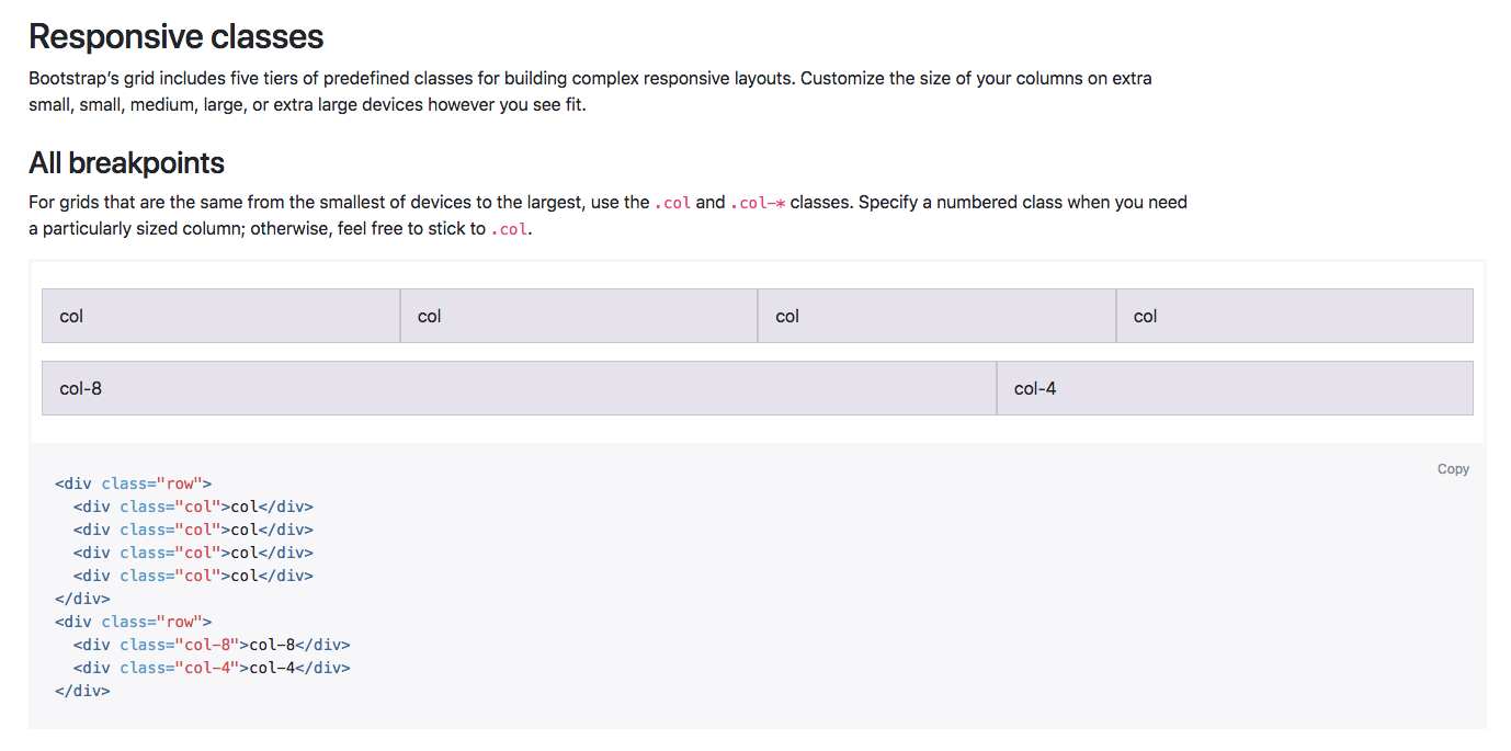
There are five tiers of predefined classes for building complex responsive layouts. In this example, we can see that the new col class is being used. This means that in this row, we have essentially four columns along the same row, and each element is taking up a specific number of columns along the 12 column row.
In the first case, each element is taking up three columns along the 12 column row, as three goes into 12 four times. This layout will also be the same on all devices, from extra small all the way up to extra large. You can also define the number of columns you want to take up along the row if you wanted, which is in this example in the second row.
So, the first bit of content will take up 8 columns, and the next will take up 4. Again, that will fill the entire 12 columns along the row, no matter what the screen size is. Bootstrap is so popular because of its responsive nature and the fact that certain elements are stacked on the smaller devices and they are aligned along the row on the larger devices. To do that, we simply need to define the device size within our column class:
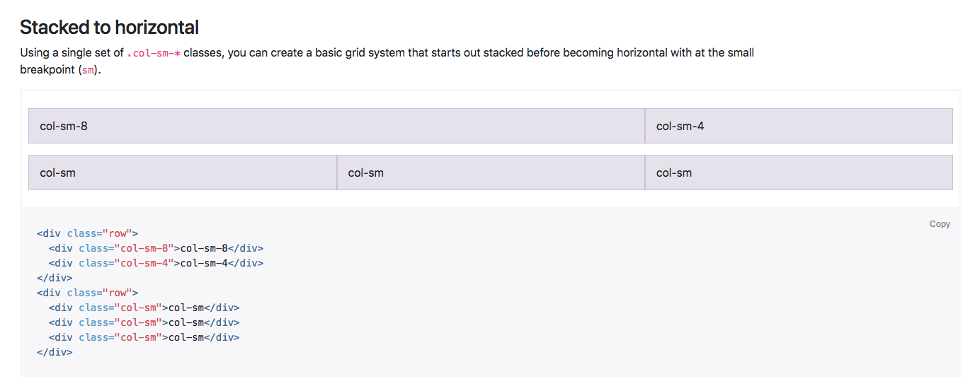
In this next example you can see that by using the sm class, or the small class, the content is similar, as we have 8 and 4 on the top, then the next row is switched into three sections. However, on the live example of both the content would actually stack on the smaller devices, and when the breakpoint hits anything above the smaller devices, it will display along the row. There is a lot more information on the Grid system within this page, however, as I mentioned, you'll soon get used to how it works as we work our way through the chapter.
I hope that explains the Grid system a little, but, as I said, you'll soon get the hang of it by working with it in the next chapter. Next up, we're going to have a look at Bootstrap media queries.