
Styling Bootstrap components is fairly simple. The only thing we need to do is to overwrite the Bootstrap CSS. However, we don't want to overwrite Bootstrap CSS files themselves; the only thing we want to do is add additional CSS properties that will overwrite the original Bootstrap CSS. We have beforehand created a CSS file called styles.css, and, since this file is linked after the Bootstrap CSS file in order on the HTML document, every CSS we write having the same properties and class will overwrite the original Bootstrap CSS:
<link rel="stylesheet" href="https://maxcdn.bootstrapcdn.com/bootstrap/4.0.0/css/bootstrap.min.css" integrity="sha384-Gn5384xqQ1aoWXA+058RXPxPg6fy4IWvTNh0E263XmFcJlSAwiGgFAW/dAiS6JXm" crossorigin="anonymous">
<link rel="stylesheet" href="css/styles.css">
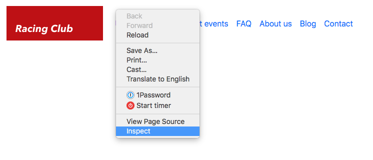
We need to target the right CSS class to overwrite it. If you remember, we used Google Chrome's Inspector to inspect elements and check their CSS. To open the Inspector (or Developer Tool), right-click on the element and click on Inspect:
Now we can see the developer panel, and there is a lot of information there. You can check the different panels available. When hovering over an element in the HTML, you can see it displayed on the web page itself:
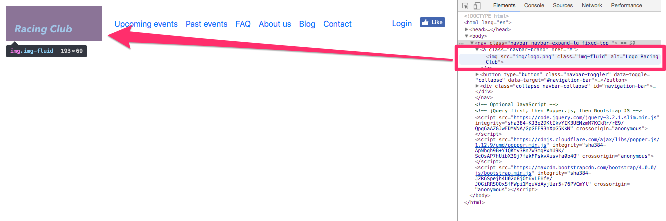
This is very useful when you want to fix any CSS style issues or look at the HTML. Let's fix the CSS now.
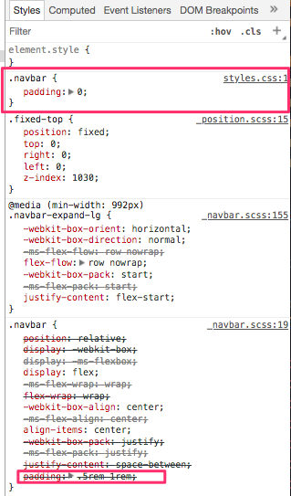
With the Inspector, we can see that the .navbar class has some padding by default, but we want to get rid of it.
Simply add the following CSS to your styles.css:
.navbar {
  padding: 0;
}
After saving, you can check that we overwrote the bootstrap CSS with our own:
Now that you understand the principle, we can quickly fix the navigation:
.navbar {
  padding: 0;
  background-image: linear-gradient(0deg, rgba(0,0,0,0.00) 0%, rgba(0,0,0,0.50) 50%);
}

.navbar-brand {
  padding: 0;
}

.navbar-nav li a {
  color: white;
  text-decoration: none;
  font-family: 'built_titling', Helvetica, sans-serif;
  font-weight: 200;
  font-size: 20px;
  letter-spacing: 4px;
}

.navbar-collapse {
  padding: 10px 15px;
}

@media (min-width: 992px) {
  .navbar-collapse {
    padding: 0;
  }
}

.navbar-toggler-icon {
  color: white;
}
The preceding code will stylize the navbar correctly. You can see that everything is functional without too many lines of code, even the responsive part. That's the power of Bootstrap. If we compare what we've done to make the navigation responsive, with jQuery and all the media queries, we've written a lot less code than we did for the first project. Let's move on to the hero section now.