Let's start by styling on the container class that we've just created. For this, let's go to our <style> section and add the following:
<style>
  .container {
    width: 960px;
  }
</style>
This will set the width property to the <div> with the class container to 960px.
We want our container to be centered on the page. To do that, we need to add a margin property, as follows:
<style>
  .container {
    width: 960px;
    margin-left: auto;
    margin-right: auto;
  }
</style>
Adding margin-left: auto; and margin-right: auto; means that the left and right margin are adjusted automatically according to the context of the element, which is the browser window in this case:
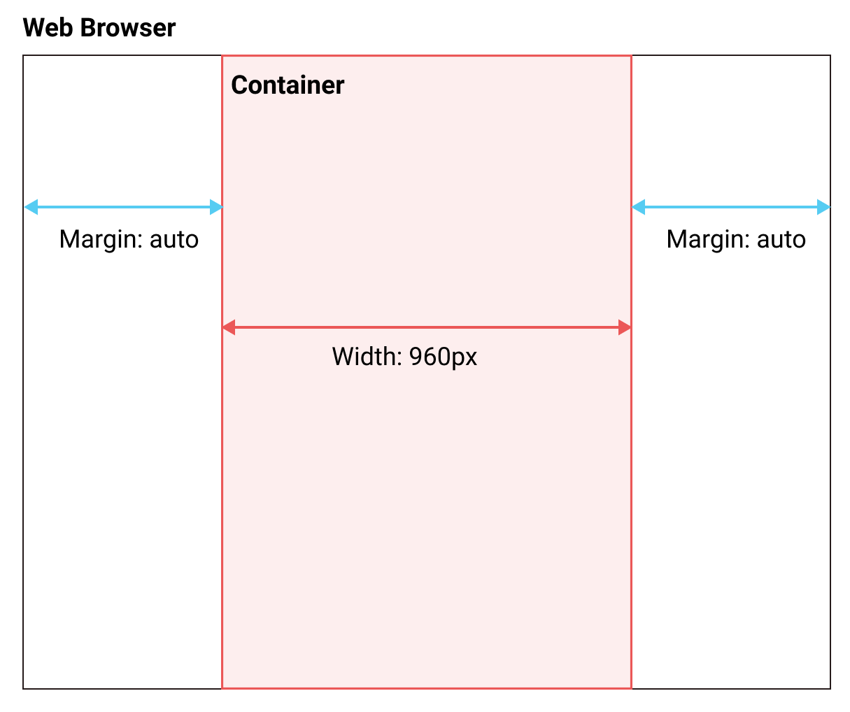
There are a lot of ways to center an element with CSS; this is the first one. We'll check out a couple of other ways in the upcoming chapters.
Now let's create our content element as defined in the layout we want to do.
Inside our <div class = "container">, let's add our <div class = "content">. Again, let's move our content inside this div, as follows:
<body> <!--This is where all our content will go-->
 <div class="container">
   <div class="content">
     <h1 id="my-name">John Doe</h1>
     <p class="text">I'm an <b>amazing</b> Designer</p>
     <input class="form" type="email" placeholder="Your email">
     <input class="button" type="submit">
     <img class="image" src="images/designer.jpg">
     <p class="text">Follow me on Twitter</p> <!--Added text-->
     <a class="link" href="http://twitter.com/philippehong">My Twitter</a>
   </div>
 </div>
</body>
Next, let's add our sidebar. After our <div class= "content">, add a div with the class sidebar.
Inside our sidebar, add a <p> element to create some content:
<div class="sidebar">
   <p>Lorem ipsum dolor sit amet, consectetur adipiscing elit. Duis turpis neque, volutpat ac consequat sed, ullamcorper at dolor. Donec placerat a mi quis ultricies. Etiam egestas semper tempor. Suspendisse nec eros porta, rhoncus tortor sed, consequat arcu. Suspendisse potenti. Nunc blandit nisl eu justo feugiat vestibulum. Vivamus consequat, quam vitae sagittis maximus, magna lacus fringilla justo, sit amet auctor mi nulla quis ante. Morbi malesuada gravida turpis, vel lobortis libero placerat sit amet. Vestibulum sollicitudin semper est eget ultricies. Donec posuere turpis urna.
  </p>
</div>
Lastly, let's add our footer element after our sidebar element:
<div class="footer">
  <p>This is my footer</p>
</div>
Our HTML document should now look as follows:
<html> <!--This is our HTML main tag-->
 <head> <!--This is our head tag where we put our title and script and all infos relative to our page.-->
  <title>My Page Title</title>
  <style>
    .container {
      width: 960px;
      margin-left: auto;
      margin-right: auto;
    }
  </style>
 </head>
 <body> <!--This is where all our content will go-->
   <div class="container">
     <div class="content">
       <h1 id="my-name">John Doe</h1>
       <p class="text">I'm an <b>amazing</b> Designer</p>
       <input class="form" type="email" placeholder="Your email">
       <input class="button" type="submit">
       <img class="image" src="images/designer.jpg">
       <p class="text">Follow me on Twitter</p> <!--Added text-->
       <a class="link" href="http://twitter.com/philippehong">My Twitter</a>
     </div>
     <div class="sidebar">
       <p>Lorem ipsum dolor sit amet, consectetur adipiscing elit. Duis turpis neque, volutpat ac consequat sed, ullamcorper at dolor. Donec placerat a mi quis ultricies. Etiam egestas semper tempor. Suspendisse nec eros porta, rhoncus tortor sed, consequat arcu. Suspendisse potenti. Nunc blandit nisl eu justo feugiat vestibulum. Vivamus consequat, quam vitae sagittis maximus, magna lacus fringilla justo, sit amet auctor mi nulla quis ante. Morbi malesuada gravida turpis, vel lobortis libero placerat sit amet. Vestibulum sollicitudin semper est eget ultricies. Donec posuere turpis urna.</p>
     </div>
     <div class="footer">
       <p>This is my footer</p>
     </div>
   </div>
 </body>
</html>
Now, for the purpose of this lesson, let's add some background color to each element to see how the layouts work. To do this, let's go to our style section and add a background-color property for each class, as follows:
<style>
  .container {
    width: 960px;
    margin-left: auto;
    margin-right: auto;
  }
  .content {
    background-color: red;
  }
  .sidebar {
    background-color: green;
  }
  .footer {
    background-color: blue;
  }
</style>
Now we will save our HTML document and refresh our browser to see how it looks:
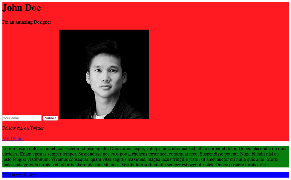
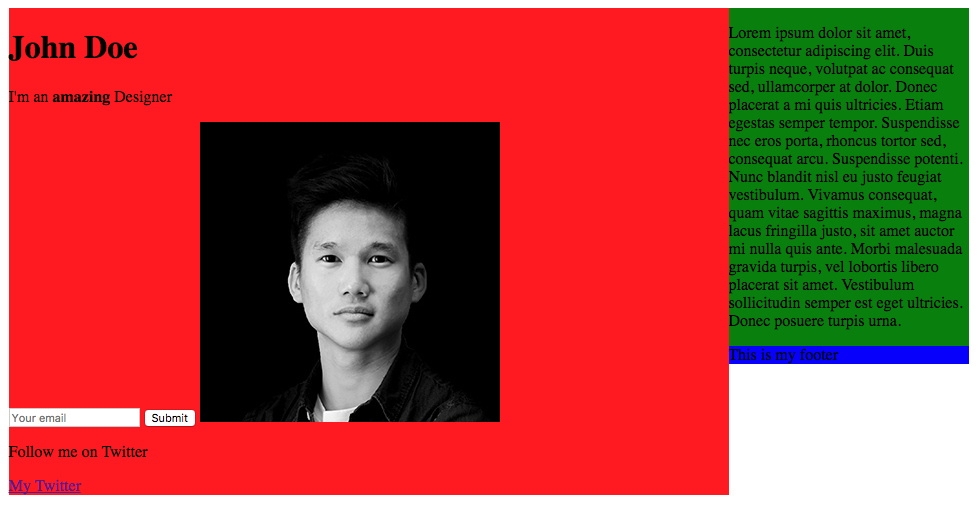
Our web page is pretty ugly, but it does show how the layout is put together. Let's add a few more CSS properties to make it look the way we want it to look.
We want the .content element to be 75% of the total width (960px), and the sidebar to be 25%. We could do some maths and calculate 75% of 960, but, in CSS, you can also set the width by percentages:
.content {
  background-color: red;
  width: 75%;
}
.sidebar {
  background-color: green;
  width: 25%;
}
Now we will save our HTML document and refresh our browser to see how it looks:
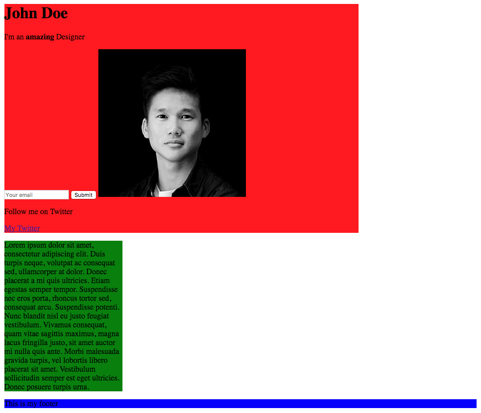
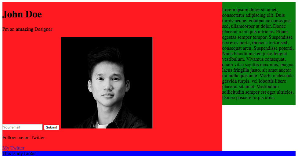
As you can see, our elements have their width properties of 75% and 25%. Now to move our sidebar next to the content, we'll need to use the CSS property called float. With float, an element can be pushed to the left or to the right, allowing other elements to wrap around it. So let's do that:
.content {
  background-color: red;
  width: 75%;
  float: left;
}
.sidebar {
  background-color: green;
  width: 25%;
  float: right;
}
Let's save our HTML document and refresh our browser to see how it looks:
Our content and sidebar are now side by side, but the problem is that our footer is on the right side, as it has the property float right from the sidebar. To avoid this, we need to use the clear property, which counterparts the float property. We'll set the property to both, which means right and left:
.footer {
  background-color: blue;
  clear: both;
}
Save and refresh the document.
We now have our layout fully coded with CSS.