
For the footer, things will get a bit more complex. The HTML will be something like this:
<!-- FOOTER -->
    <nav class="footer">
      <div class="container d-md-flex align-items-center py-md-5">
        <a class="navbar-brand" href="#"><img src="img/logo-footer.png" class="img-fluid pl-3" alt="Logo Racing Club"></a>
        <ul class="nav d-block d-md-flex pt-5 pt-md-0">
          <li class="nav-item"><a class="nav-link text-white" href="upcoming.html">Upcoming events</a></li>
          <li class="nav-item"><a class="nav-link text-white" href="past.html">Past events</a></li>
          <li class="nav-item"><a class="nav-link text-white" href="faq.html">FAQ</a></li>
          <li class="nav-item"><a class="nav-link text-white" href="about.html">About us</a></li>
          <li class="nav-item"><a class="nav-link text-white" href="blog.html">Blog</a></li>
          <li class="nav-item"><a class="nav-link text-white" href="contact.html">Contact</a></li>
        </ul>

        <ul class="nav ml-auto d-block d-md-flex pb-5 pb-md-0">
          <li class="nav-item"><a class="nav-link text-white" href="login.html">Login</a></li>
          <li class="nav-item"><span class="nav-link"><iframe src="https://www.facebook.com/plugins/like.php?href=http%3A%2F%2Ffacebook.com%2Fphilippehongcreative&width=51&layout=button&action=like&size=small&show_faces=false&share=false&height=65&appId=235448876515718" width="51" height="20" style="border:none;overflow:hidden"></iframe></span></li>
        </ul>
      </div>
    </nav>
    <!-- END FOOTER -->
In a lot of Bootstrap classes, there are some responsive utility classes you can apply, and they're always with the same references: xs, sm, md, and lg. For example, for the .d-flex class, you can apply the responsive utility class when you need to. By adding .d-md-flex, you apply the display:flex property only on medium screens. This is very useful and can be applied to a lot of Bootstrap classes.
With the good use of classes, the only CSS we needed to write was the following:
.footer {
  background: #000;
}

.footer .nav-link {
  text-decoration: none;
  font-family: 'built_titling', Helvetica, sans-serif;
  font-weight: 200;
  font-size: 20px;
  letter-spacing: 4px;
}
This is what our footer looks like:
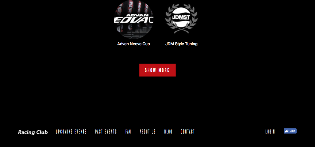
Our footer section
It's fully responsive:

The footer section on mobile