Responsive design can be accomplished using media queries. How does this work? Think of media queries as a condition that you apply to your CSS. You tell the browser to add or remove certain CSS rules depending on the device or viewport size:
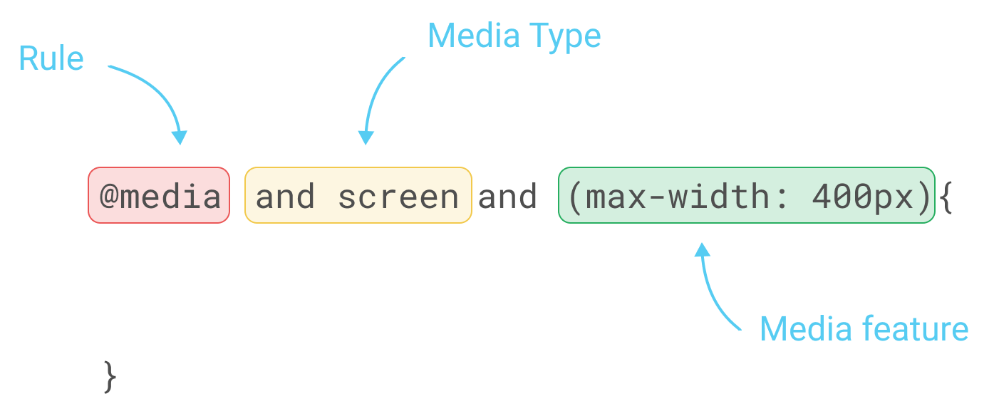
To apply those rules, we will need to use the CSS property @media, as follows:
/* Mobile Styles */
@media only screen and (max-width: 400px) {
  body {
    background-color: #F09A9D; /* Red */
  }
}
@media only screen and (max-width: 400px) means that if the screen/viewport size is fewer than or equal to 400px, then we apply this CSS.
There are a few different types of properties you can add to media and target a different type of device.
For example, you can target especially the iPhone 4 with the following code:
@media only screen
  and (min-device-width: 320px)
  and (max-device-width: 480px)
  and (-webkit-min-device-pixel-ratio: 2)
  and (orientation: portrait) {

}
This translates as the following:
and (min-device-width: 320px)
and (max-device-width: 480px)
The preceding code means any devices with a size greater than or equal to 320px and fewer than or equal to 480px:
and (-webkit-min-device-pixel-ratio: 2)
The following code targets any device with the pixel ratio or density of 2:
and (orientation: portrait)
The preceding code will target only devices with a portrait orientation.
Now that we have covered the basics of media queries, let's put this into practice with our project.