
How does the Instafeed plugin work to display our feed? It will look for the <div id="instafeed"></div> and fill it with linked thumbnails.
Let's head to the end of our HTML file, after our <footer> tag, and add <div id="instafeed"></div>:
<footer>
<div class="container">
<a class="logo" href="/"><img src="img/logo-footer.png" srcset="img/logo-footer.png 1x, img/logo-footer@2x.png 2x"></a>
<ul class="nav main-nav">
<li><a href="upcoming.html">Upcoming events</a></li>
<li><a href="past.html">Past events</a></li>
<li><a href="faq.html">FAQ</a></li>
<li><a href="about.html">About us</a></li>
<li><a href="blog.html">Blog</a></li>
<li><a href="contact.html">Contact</a></li>
</ul>
<ul class="nav right-nav">
<li><a href="login.html">Login</a></li>
<li><a href="#"><iframe src="https://www.facebook.com/plugins/like.php?href=http%3A%2F%2Ffacebook.com%2Fphilippehongcreative&width=51&layout=button&action=like&size=small&show_faces=false&share=false&height=65&appId=235448876515718" width="51" height="20" style="border:none;overflow:hidden" scrolling="no" frameborder="0" allowTransparency="true"></iframe></a></li>
</ul>
</div>
</footer>
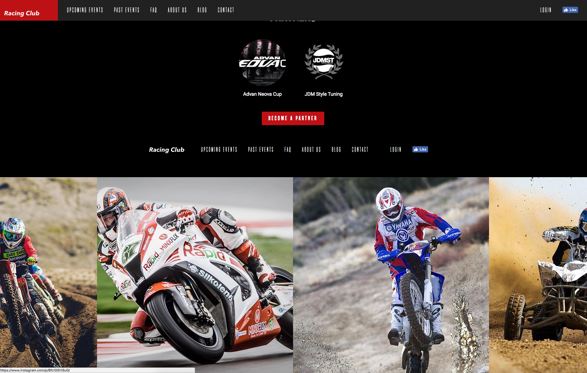
<div id="instafeed"></div>
Let's save and see how it looks:
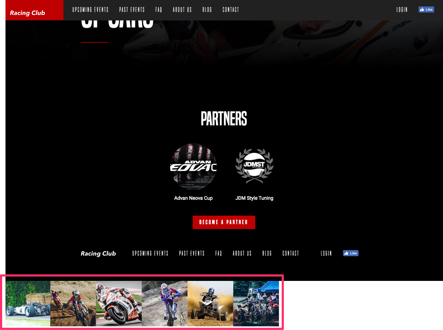
Our Instagram feed indeed appears, but we can't leave it like this. Let's customize our feed and add a bit of CSS to make it pretty.
The first thing we're going to do is to get larger images from our feed. By default, Instafeed gets the smallest size of thumbnails from Instagram. To get bigger thumbnails, we can read the documentation, and find the following information:
In the standard option provided by Instafeed, we can see that we have the option to choose between three types of resolution from the thumbnails with the attribute resolution:
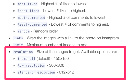
Let's choose the largest one. To add this option, we simply need to add an attribute to our JavaScript function:
var userFeed = new Instafeed({
get: 'user',
userId: '7149634230',
accessToken: '7149634230.1677ed0.45cf9bad017c431ba5365cc847977db7',
resolution: 'standard_resolution'
});
userFeed.run();
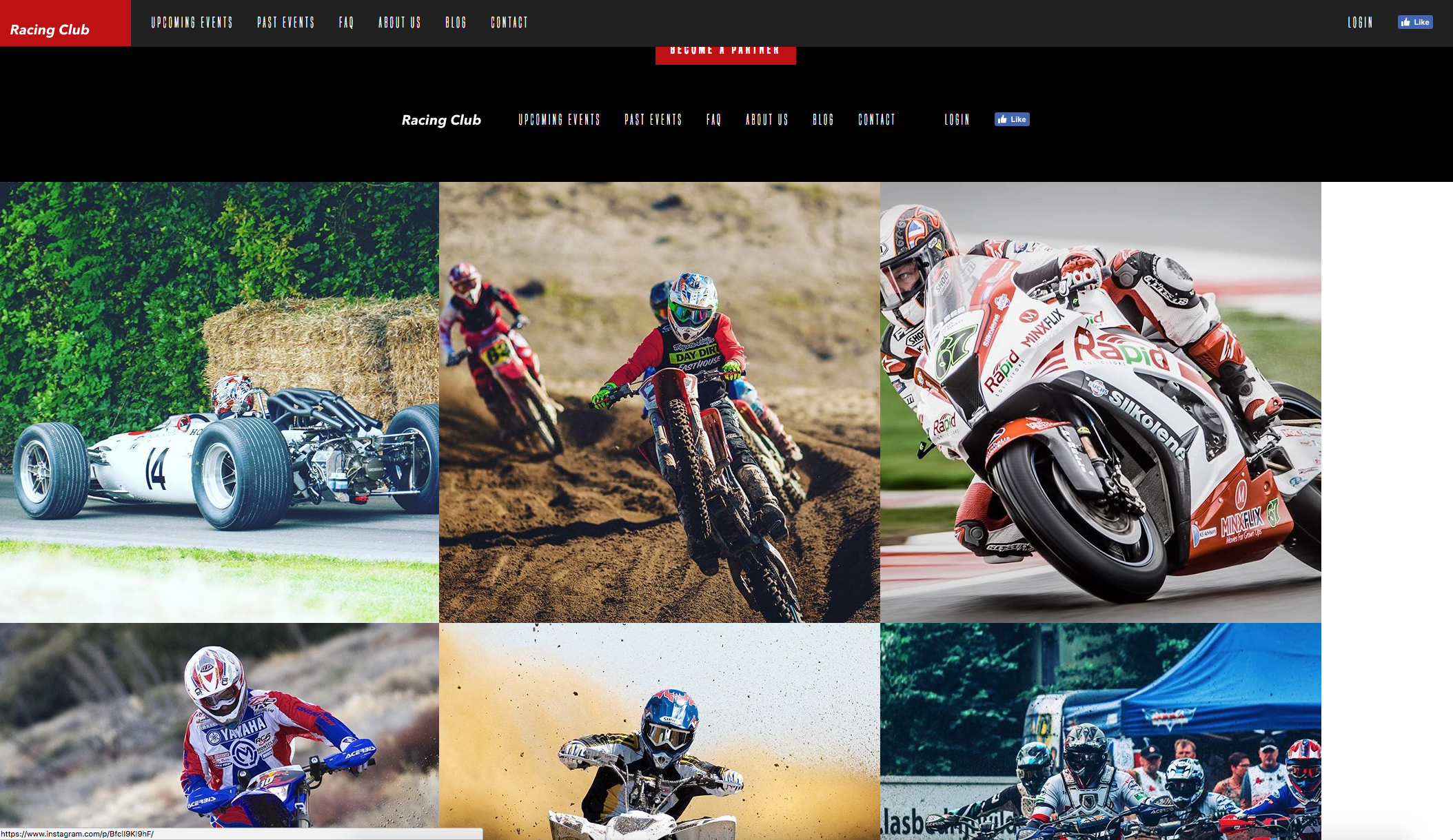
So, after accessToken, we can add the attribute resolution. Be sure to add a comma after the end of the attribute accessToken to mention that this is not the last property. The last attribute doesn't need a comma at the end.
Save and see what we have:
Great, now it needs a bit of CSS to make this pretty. Before heading to the CSS, we need to check what HTML Instafeed generates for us, so we are able to call it in CSS. If you remember, we can inspect the HTML of an element in Google Chrome. We just have to right-click on it and click on Inspect:
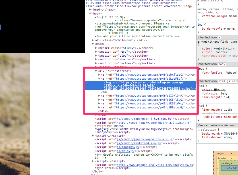
We can see that Instafeed generates a <a> tag with an <img> inside. Pretty straightforward.
Knowing that, let's go to our styles.css file, and write, after our footer section:
/* INSTAFEED */

#instafeed {
  width: 100%;
  display: flex;
  justify-content: center;
  overflow: hidden;
  background: black;
}

#instafeed a {
  flex-grow: 1;
}
To explain, we use:
- width: 100%; because #instafeed is our container that holds everything. We want it to take the full width.
- display: flex; because we want to display the thumbnails horizontally side by side.
- justify-content: center; to place the content in the center.
- overflow: hidden; because we don't want the page to extend horizontally.
- background: black; because by default the background is white.
And, last, but not the least, the most important one:
- flex-grow: 1;: The remaining space in the container will be distributed equally to all children if all items have flex-grow set to 1. If one of the children has a value of 2 or more, the remaining space or more would take up twice as much space as the others.
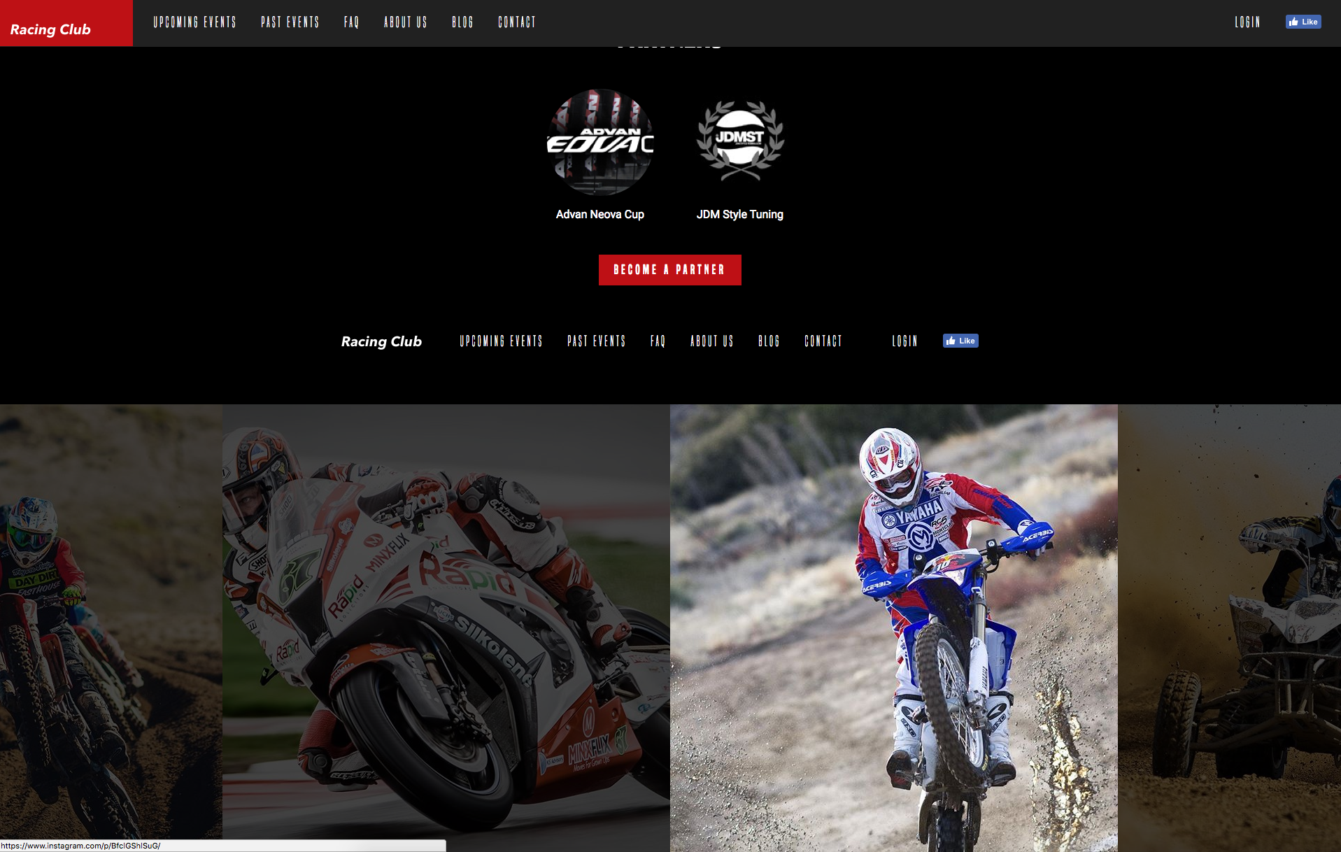
Let's see how it looks now:
Now, the last part is to add that opacity effect when hovering it. We'll play with opacity and pseudo-class :hover we learned just earlier:
#instafeed a {
  flex-grow: 1;
  opacity: 0.3;
}

#instafeed a:hover {
  opacity: 1;
}
Again, you only need to add the value you want to change in the pseudo-class; here, it is the opacity.
Let's also add some transition:
#instafeed a {
  flex-grow: 1;
  opacity: 0.3;
  transition: opacity 0.3 ease;
}
Let's save it and see:
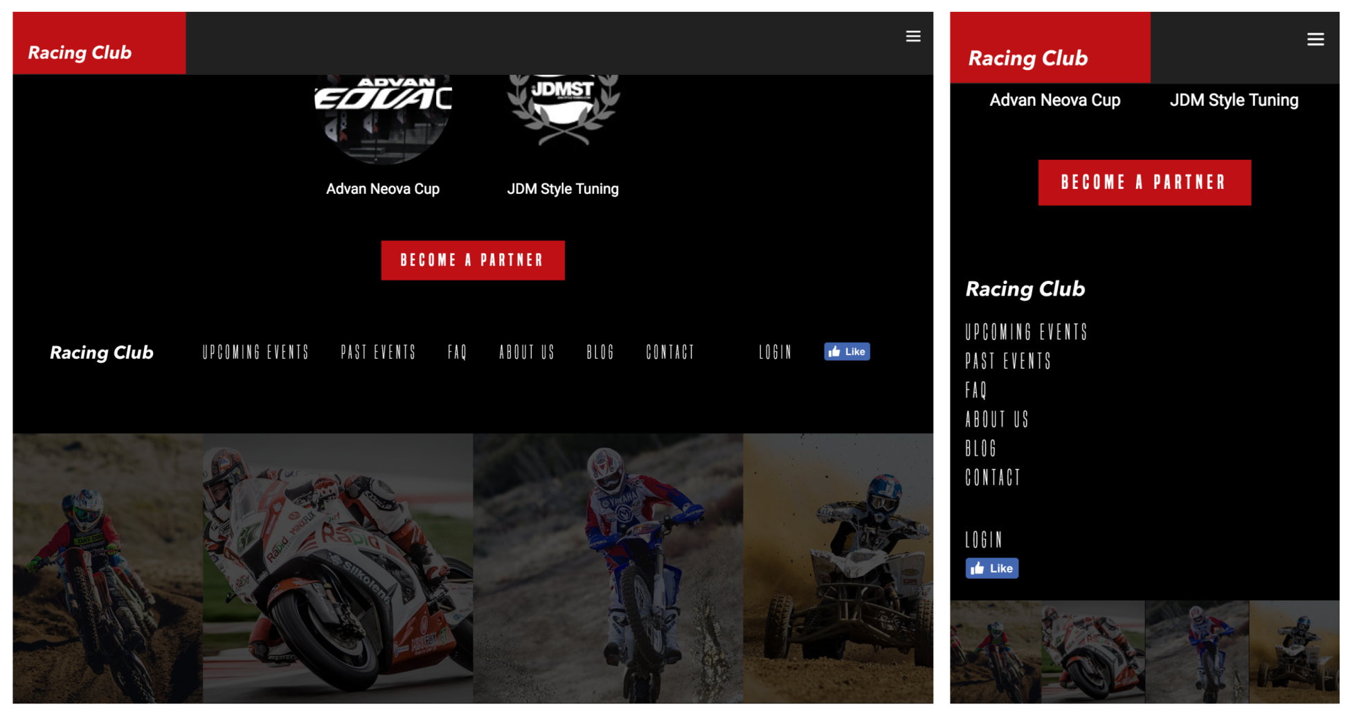
Perfect, we did a great job so far. But if you're a perfectionist, as I am, you'll notice that on mobiles and tablets, the images are quite big. Let's add some quick responsive CSS and we can wrap this up:
/* Tablet Styles */
@media only screen and (max-width: 1024px) {
  #instafeed a img {
    max-width: 300px;
  }
}

/* Large Mobile Styles */
@media only screen and (max-width: 768px) {
  #instafeed a img {
    max-width: 200px;
  }
}

/* Small Mobile Styles */
@media only screen and (max-width: 400px) {
  #instafeed a img {
    max-width: 100px;
  }
}
What I did here is to change the image size on each breakpoint:
We're now done with the interaction and dynamic content of our website.