
A pseudo-class is used to define a special state of an element. For example, when you hover or when you click on a button, a state can be activated.
We're going to learn two easy pseudo-classes for the moment, the most common ones. You can easily add and activate other pseudo-classes when you know how to use them:
The two pseudo-classes are hover and active. The hover state is used when you hover over an element with the mouse. It's useful to show that the element is clickable. The active state, on the other hand, is used when you click on an element.
To use these pseudo-classes, you simply have to call them with a colon ::
.element:hover {
    // Display something
}

.element:active {
    // Display something
}
For the first example, we'll add some styling when hovering over the links in the menu. We want to add an underline to the link when hovering it. To do that, it will be better for us to be able to target every single <a> with a class. But if we look at our HTML, we have many different classes for each navigation. What we'll do is add a common class to each nav so we can call it with CSS easily.
We have the class .main-nav and .right-nav on the header and footer. What we'll do is add a common class .nav to each of those classes:
<ul class="nav main-nav">
              <li><a href="upcoming.html">Upcoming events</a></li>
              <li><a href="past.html">Past events</a></li>
              <li><a href="faq.html">FAQ</a></li>
              <li><a href="about.html">About us</a></li>
              <li><a href="blog.html">Blog</a></li>
              <li><a href="contact.html">Contact</a></li>
            </ul>
            <ul class="nav right-nav">
              <li><a href="login.html">Login</a></li>
              <li><a href="#"><iframe src="https://www.facebook.com/plugins/like.php?href=http%3A%2F%2Ffacebook.com%2Fphilippehongcreative&width=51&layout=button&action=like&size=small&show_faces=false&share=false&height=65&appId=235448876515718" width="51" height="20" style="border:none;overflow:hidden" scrolling="no" frameborder="0" allowTransparency="true"></iframe></a></li>
            </ul>
Now, we have to target the link inside the nav. The link is the element <a> as we saw earlier. To target it, we will call in CSS as follows:
.nav li a {
  // CSS
}
This will target every <a> in every <li> that is a child of every .nav.
Let's add the pseudo-class :hover :
.nav li a:hover {
  // CSS
}
To add an underline under a link, we can use the CSS property text-decoration:underline;:
.nav li a:hover {
  text-decoration: underline;
}
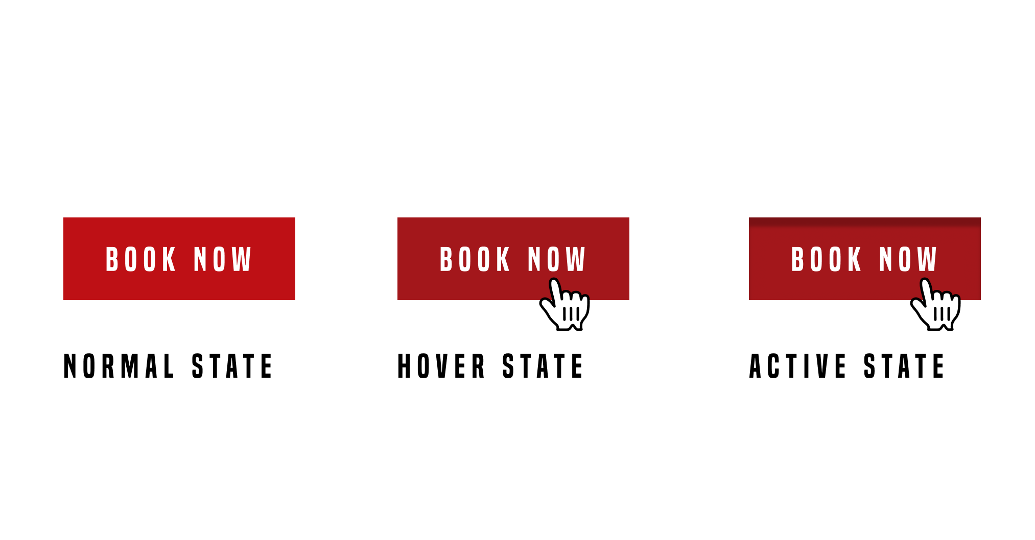
Now let's add some styling for the button as well.
For every button, we have the class .btn-primary, so, with the same process as before, we'll add the pseudo-class hover:
.btn-primary:hover {
  background: #A3171B;
}
What we did here is to change the background color of the button when hovering over it. Let's now add an active state:
.btn-primary:active {
  box-shadow: inset 0px 8px 4px rgba(0, 0, 0, 0.25);
}
This will add an inner-shadow to the button when clicking on it.
To add an extra touch, we can add a transition to make the action smoother. Don't forget, a transition has to be added in the normal state, not on the pseudo-classes:
.btn-primary {
  display: inline-block;
  font-family: 'built_titling', Helvetica, sans-serif;
  font-weight: 400;
  font-size: 18px;
  letter-spacing: 4.5px;
  background: #BF0000;
  color: white;
  padding: 12px 22px;
  border: none;
  outline: none;
  transition: all 0.3s ease;
}
Voila! Pretty easy. There are plenty of pseudo-classes in CSS. We'll go through some more but you can already have a play around. Here's a list of pseudo-classes in CSS: https://www.w3schools.com/css/css_pseudo_classes.asp.
The next step is to build a sticky navigation! We'll combine some jQuery and CSS and build a navigation that sticks to the top when the user scrolls the page. Exciting times!