
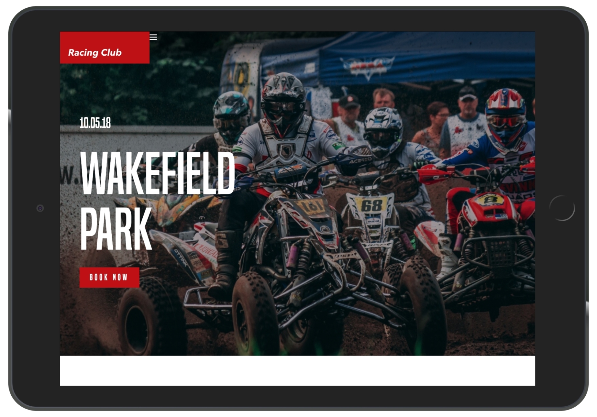
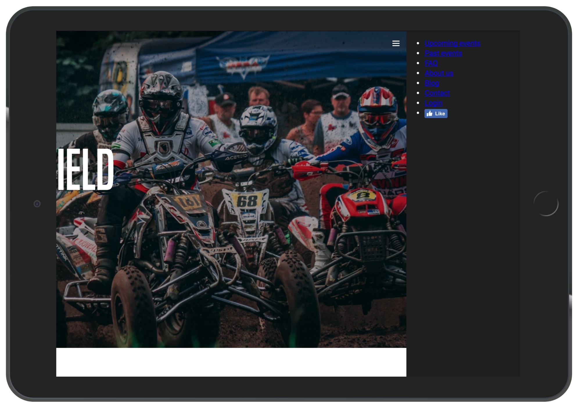
In this section, we will take a look at how to hide the desktop menu and show a hamburger icon instead when working on mobiles or tablets:

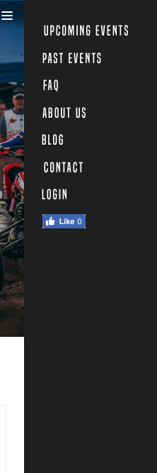
If we click on the icon, a menu opens on the right-hand side:
To do that, we will first need to hide the menu on the mobile version and the tablet version.
At the end of the header section in our CSS, add the following code:
/* Tablet Styles */
@media only screen and (max-width: 1024px) {
  header {
    display: none;
  }
}
Now we want to show the hamburger-menu on mobile. We will need to create a div tag in HTML and show it only on a mobile, with CSS:
<div class="hamburger-menu">
   <img src="img/hambuger-icon.svg">
</div>
We will place this just before the ending of our header tag </header>.
In CSS, we will need to hide the hamburger in desktop view and show it only on mobile view:
.hamburger-menu {
  display: none;
}
/* Tablet Styles */
@media only screen and (max-width: 1024px) {
  header .main-nav, header .right-nav {
    display: none;
  }
  .hamburger-menu {
    display: block;
  }
}
Let's save and take a look:
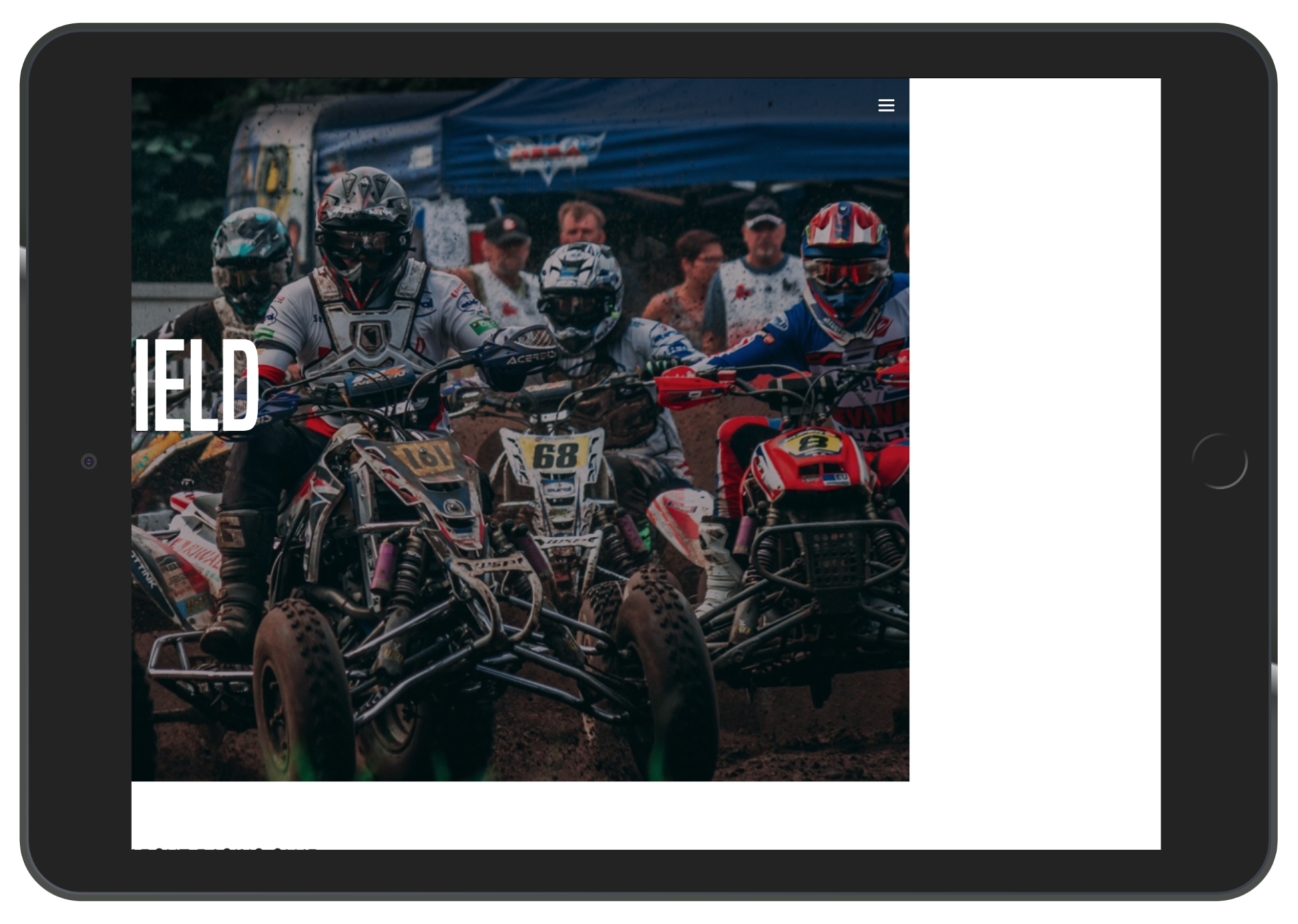
We can see that the hamburger icon shows up, but we need to place it correctly:
.hamburger-menu {
  display: none;
  position: absolute;
  right: 15px;
  top: 15px;
}
Don't forget that we only change the display property with our media queries, so the rules we apply here will apply to the the mobile version.
Now we have to create another menu that shows up only on mobile version, and when the user clicks on the hamburger menu, the entire page will move to the left:
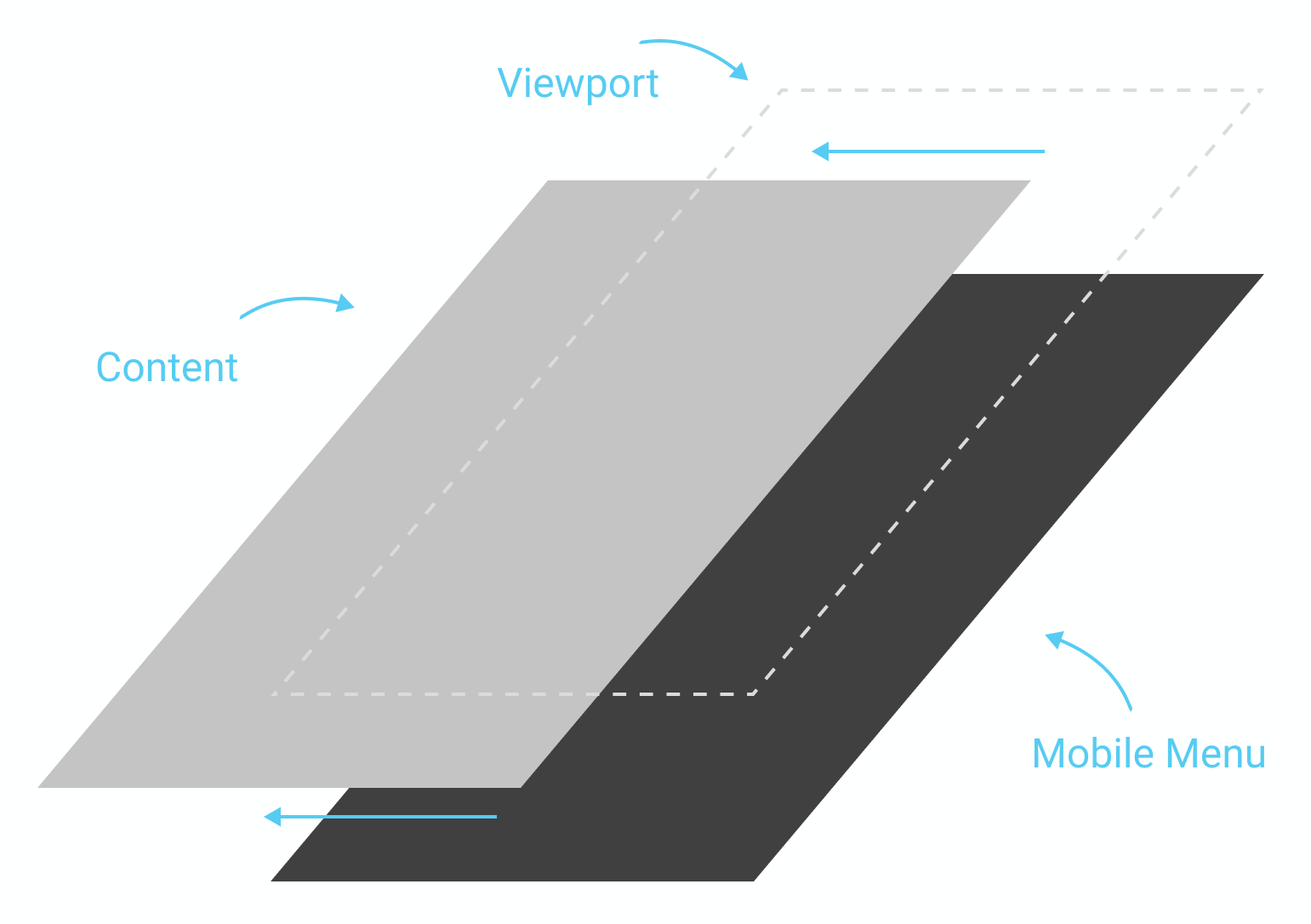
To be able to move the entire page, we will need to create an HTML tag and put our content inside it. We'll create a tag called <main> and put the content we created inside (from header to footer).
Now, in CSS, we will first need to add a new section for our main tag:
/* MAIN SECTION */

main {

}

/* END MAIN SECTION */
Now, to ensure that this element will be the parent element, we will need to make this element in a position: relative; so that every element with a position: absolute; will now relate to this one:
main {
  position: relative;
}
We'll also add a background-color: white; to make sure that it has the same background white as the default white:
main {
  position: relative;
  background-color: white;
}
Now, to move our main tag, we'll use the "left:-200px" CSS property:
main {
  position: relative;
  background-color: white;
  left:-200px;
}
This will move our element horizontally by -200px, that is, 200px to the left. Now, let's save and take a look:
For our mobile menu, let's create another div with the "mobile-nav" class, but we will put it outside of the <main> tag:
<div class="mobile-nav">

</div>
<main>
   <header>
    ...
In .mobile-nav, let's recreate our nav (including .main-nav and .right-nav lists):
<div class="mobile-nav">
          <ul>
            <li><a href="upcoming.html">Upcoming events</a></li>
            <li><a href="past.html">Past events</a></li>
            <li><a href="faq.html">FAQ</a></li>
            <li><a href="about.html">About us</a></li>
            <li><a href="blog.html">Blog</a></li>
            <li><a href="contact.html">Contact</a></li>
            <li><a href="login.html">Login</a></li>
            <li><a href="#"><iframe src="https://www.facebook.com/plugins/like.php?href=http%3A%2F%2Ffacebook.com%2Fphilippehongcreative&width=51&layout=button&action=like&size=small&show_faces=false&share=false&height=65&appId=235448876515718" width="51" height="20" style="border:none;overflow:hidden" scrolling="no" frameborder="0" allowTransparency="true"></iframe></a></li>
          </ul>
        </div>
In our CSS file, let's make sure that you hide our .mobile-nav in desktop view:
/* MOBILE MAVIGATION */

.mobile-nav {
  display: none;
}

/* Tablet Styles */
@media only screen and (max-width: 1024px) {
  .mobile-nav {
    display: block;
  }
}

/* END MOBILE NAVIGATION */
Let's add some customization:
.mobile-nav {
  display: none;
  position: fixed;
  background-color: #1F1F1F;
  width: 200px;
  height: 100%;
  right: 0;
  top: 0;
}
- position: fixed;: As we want the menu to stay fixed on the back while we move the <main> container
- background-color: #1F1F1F;: The color picked from the design
- width: 200px; and height: 100%;: As we want the dimension to be slightly lower than the minimum width of a mobile, which is 320px. 200px seems good, and, of course, we want the height to be 100%, to take the entire space vertically
- right: 0; and top: 0;: Specify the position from the viewport
Let's finish the customization of the menu:
.mobile-nav ul {
  margin: 0;
  padding: 25px;
}

.mobile-nav ul li {
  list-style-type: none;
  margin-bottom: 10px;
}

.mobile-nav ul li a {
  color: white;
  text-decoration: none;
  font-family: 'built_titling', Helvetica, sans-serif;
  font-weight: 200;
  font-size: 20px;
  letter-spacing: 4px;
}
Let's save and take a look at how it looks:
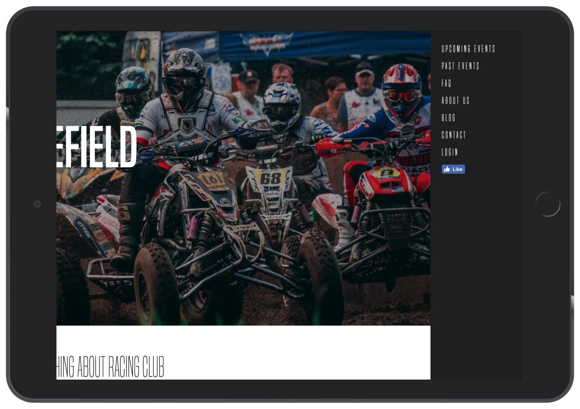
iPad View (1,024px)
Now let's return the <main> container to its initial position:
main {
  position: relative;
  background-color: white;
  left: 0px;
}
This is when the fun starts; we'll create a function in JS to animate the <main> container when the user clicks on the hamburger menu.
To make that happen, we will add a class to the <main> tag when the user clicks on the hamburger menu. This class called active will have the following value:
main.active {
  left: -200px;
}
So, if we add an active class to the <main> element, the container will move to the left as we specified.
Now let's remove it and get started with the JS.
To kick-start any project, the best way for any beginner is to start with jQuery. What is jQuery?