
Now let's head to the navbar section of Components in our Bootstrap website. Here, you can find all the necessary documentation to build your navigation with Bootstrap.
Now let's head back to our HTML file and write the following code:
<nav class="navbar navbar-expand-lg fixed-top ">

</nav>
The details of the preceding code are as follows:
- We start off within the body of the content by adding our <nav> element and all <nav> elements require a navbar class.
- Then, we added the new expand class, which is the navbar-expand-lg. This essentially tells the browser when to collapse the navbar and when to expand it.
- So, in this case, it will expand and show the desktop version when it hits large screens. If we wanted to expand when we hit medium screens, then we just need to change lg to md or, for smaller screens, to sm.
- Then, we added the positioning class, and, because we want this navbar to be fixed at the top of the screen so that when the user scrolls, the navigation is always visible, we simply added the class fixed-top.
Next, let's add some navigation options:
<nav class="navbar navbar-expand-lg fixed-top ">
      <div class="collapse navbar-collapse" id="navigation-bar">

      </div>
    </nav>
In this code, we simply id the following things:
- We added a div to the collapse class. This simply informs the browser that this div and all its content will be a collapsible element.
- Then, we added a class of navbar-collapse.
- Lastly, we added an id="navigation-bar" that will link to our toggle button later on.
Now we will need to add our navigation list, with a <ul> and <li> for the list and an <a> for every link:
<nav class="navbar navbar-expand-lg fixed-top ">
      <div class="collapse navbar-collapse" id="navigation-bar">
        <ul class="navbar-nav">
          <li class="nav-item"><a class="nav-link" href="upcoming.html">Upcoming events</a></li>
          <li class="nav-item"><a class="nav-link" href="past.html">Past events</a></li>
          <li class="nav-item"><a class="nav-link" href="faq.html">FAQ</a></li>
          <li class="nav-item"><a class="nav-link" href="about.html">About us</a></li>
          <li class="nav-item"><a class="nav-link" href="blog.html">Blog</a></li>
          <li class="nav-item"><a class="nav-link" href="contact.html">Contact</a></li>
        </ul>
      </div>
    </nav>
To make the navigation work properly, we will need the .navbar-nav class on the <ul> and the nav-item class on the <li>. Lastly, we will need a .nav-link class on the <a> tag.
Now let's check out our list in our browser:
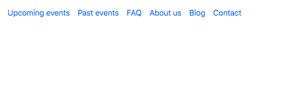
We have our Bootstrap navigation, but if you shrink the page to a mobile view, you will notice that the navigation disappears. That is because we haven't included our toggle button, so let's add it now.
Back in our index.html, we can add our button above the div we created. Let's create a button tag and give it the .navbar-toggler class and instructions, as follows:
<button type="button" class="navbar-toggler" data-toggle="collapse" data-target="#navigation-bar">

</button>
The data-target attribute is how we link the navigation options that we had earlier, which is the #navigation-bar ID.
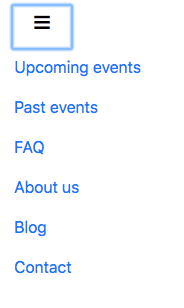
Now we will need to add the hamburger menu inside this button. To do that, we can use the ≡ HTML code, which is the HTML code for a three-bar icon. There are plenty of HTML symbols available that you could use. You can google HTML symbols and that will provide you with plenty of examples and symbols.
Let's add a span tag with the .navbar-toggler-icon class and the HTML symbol inside:
<button type="button" class="navbar-toggler" data-toggle="collapse" data-target="#navigation-bar">
   <span class="navbar-toggler-icon">≡</span>
</button>
Now, if we save and check it, we can see our menu icon on a mobile screen, and if we click on it, the menu appears correctly:
Now let's add the logo in our navbar. Usually, the logo is a link, so let's add a <a> tag with the .navbar-brand class.
We don't want the logo to collapse on mobile view, so we'll just add <a> before the <button>:
<nav class="navbar navbar-expand-lg fixed-top ">

      <a class="navbar-brand" href="#"><img src="img/logo.png" class="img-fluid" alt="Logo Racing Club"></a>

      <button type="button" class="navbar-toggler" data-toggle="collapse" data-target="#navigation-bar">
        <span class="navbar-toggler-icon">☰</span>
      </button>

      <div class="collapse navbar-collapse" id="navigation-bar">
        <ul class="navbar-nav">
          <li class="nav-item"><a class="nav-link" href="upcoming.html">Upcoming events</a></li>
          <li class="nav-item"><a class="nav-link" href="past.html">Past events</a></li>
          <li class="nav-item"><a class="nav-link" href="faq.html">FAQ</a></li>
          <li class="nav-item"><a class="nav-link" href="about.html">About us</a></li>
          <li class="nav-item"><a class="nav-link" href="blog.html">Blog</a></li>
          <li class="nav-item"><a class="nav-link" href="contact.html">Contact</a></li>
        </ul>
      </div>

    </nav>
In this <a>, we added the following:
- A class .navbar-brand
- An img tag linked with our logo
- In this img, we added a .img-fluid class that makes this image responsive
We have our logo set now, but it's not done yet. We will need to add the right-hand side navigation. To do that, we simply need to add another <ul> after our <ul class="navbar-nav">:
<div class="collapse navbar-collapse" id="navigation-bar">
        <ul class="navbar-nav">
          <li class="nav-item"><a class="nav-link" href="upcoming.html">Upcoming events</a></li>
          <li class="nav-item"><a class="nav-link" href="past.html">Past events</a></li>
          <li class="nav-item"><a class="nav-link" href="faq.html">FAQ</a></li>
          <li class="nav-item"><a class="nav-link" href="about.html">About us</a></li>
          <li class="nav-item"><a class="nav-link" href="blog.html">Blog</a></li>
          <li class="nav-item"><a class="nav-link" href="contact.html">Contact</a></li>
        </ul>

        <ul class="navbar-nav ml-auto">
          <li class="nav-item"><a class="nav-link" href="login.html">Login</a></li>
          <li class="nav-item"><span class="nav-link"><iframe src="https://www.facebook.com/plugins/like.php?href=http%3A%2F%2Ffacebook.com%2Fphilippehongcreative&width=51&layout=button&action=like&size=small&show_faces=false&share=false&height=65&appId=235448876515718" width="51" height="20" style="border:none;overflow:hidden"></iframe></span></li>
        </ul>
      </div>
We added the .ml-auto class to move this second navigation to the right. This stands for margin-left automatic. It fills the margin on the left-hand side of our navigation, which will effectively shift it to the right-hand side. If you wanted the opposite effect, you would simply add the .mr-auto class.
Now let's take a look at our navigation:
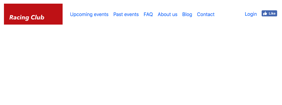
Our navigation looks awesome, and we have all the elements that we need for the navigation bar. Next, we will add some styles.