One of the best things about Bootstrap is the fact that you can incorporate media queries into your CSS files, which essentially lets you start specific items or breakpoints and helps you target styles for specific devices. If you first head to the Documentation tab and then head to the layout section, then we just need to scroll down slightly to the Responsive breakpoint section. We can see our media queries here. We can see that the breakpoints are important as these are generally used as guidelines for the queries so you can determine which device you want a style for:
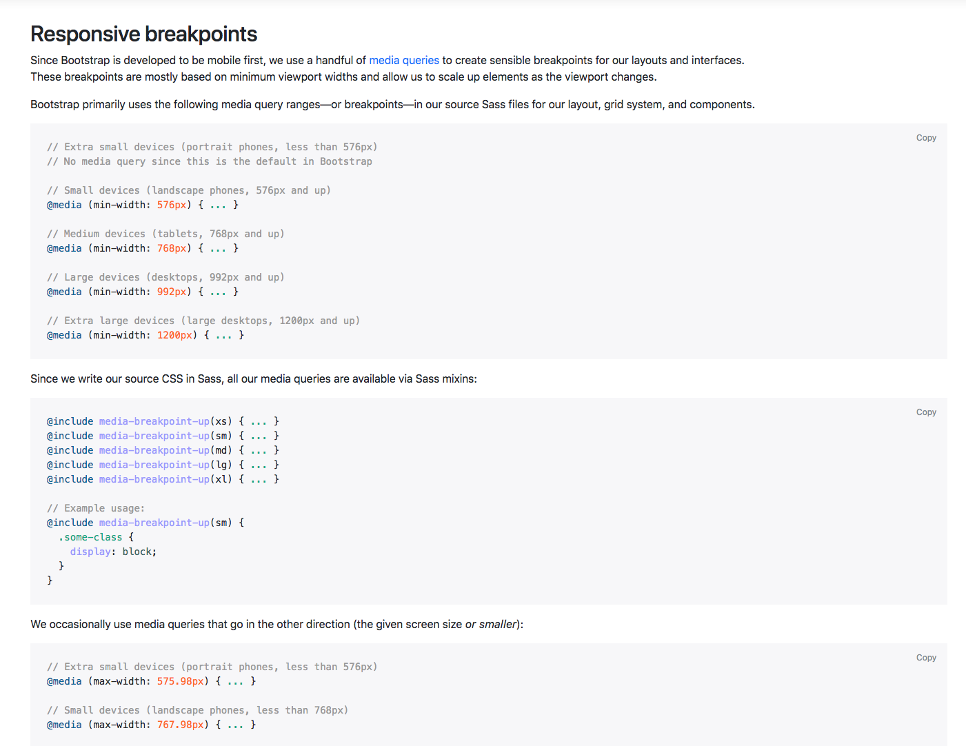
In this first section of code, we have the media queries for all the breakpoints except the extra small devices. This uses the min-width command. If we scroll down slightly we can see that we have all the breakpoints except for the extra large devices and these use the max-width command. The difference is that you tend to use the min-width option if you're designing for mobile first and the max-width if you're designing for desktop first:
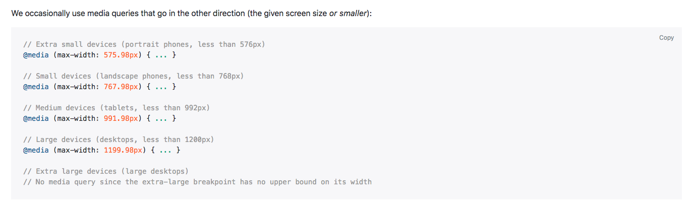
Generally, I tend to use max-width and I tend to design for desktop first, however; it is good to have an understanding of both, just in case you need to design for mobile first as well.
That was a simple introduction to media queries; again, you get a better understanding of that as we go through the course, but I hope that explains things a little so you have a basic understanding when we actually get there.