
While Responsive design works to create a universal look and feel with one design that varies from device to device, an Adaptive design has a different approach. Adaptive design is designed to detect the user device and to redirect the user to a website designed especially for this resolution.
First introduced by Aaron Gustafson in 2011 in his book Adaptive Web Design: Crafting Rich Experience with Progressive Enhancement, an Adaptive design has the main difference of having a totally different website on specific resolutions. Resizing the browser has no impact on the design.
The best example of Adaptive design is Amazon.com, which displays an entirely new layout of the website on tablet and mobile:

If you try to resize your browser, you can see that the design doesn't change any lower than 999 px.
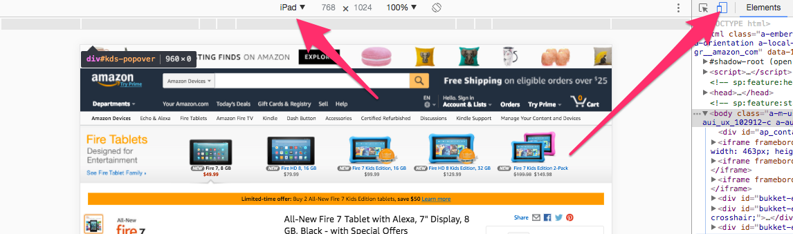
So remember that an Adaptive website will not be visible on the desktop, even if you resize it, but only on the device in question.
While Responsive design works on the client-side with CSS, an Adaptive design, on the other hand, works on the server-side. This is really the main difference between the two concepts.
The following are a few other examples:
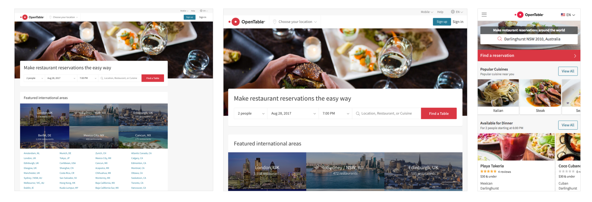
The preceding screenshot shows the OpenTable website, which has an Adaptive website for iPad view and iPhone view. It's interesting to see how they completely change the layout on mobile view:

The preceding screenshot from the Adidas website shows that Adidas has a completely different website on mobile view (m.adidas.com), with a more dynamic and user-friendly look:
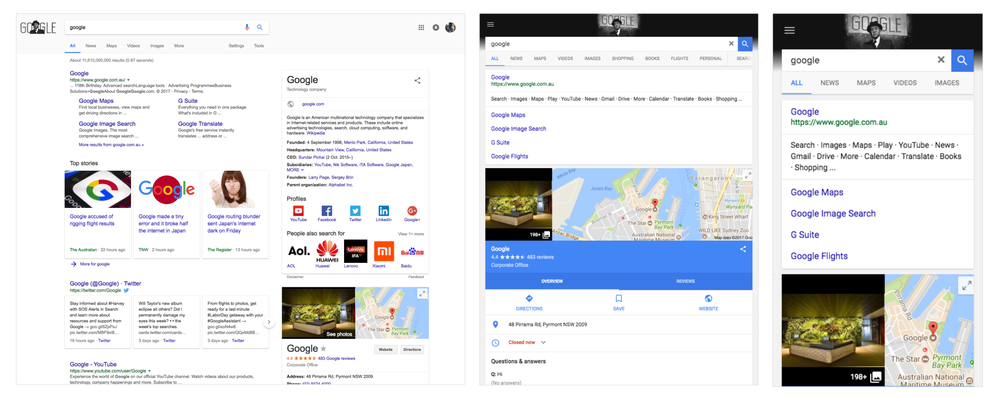
The preceding screenshot shows the Google website. If you haven't noticed, Google.com is an Adaptive website when it comes to iPad and iPhone, surprising, no?