Table of Contents for
Magento 2 - Build World-Class online stores
 Magento 2 - Build World-Class online stores
Published by
Packt Publishing, 2017
Magento 2 - Build World-Class online stores
Published by
Packt Publishing, 2017
- Cover
- Table of Contents
- Magento 2 - Build World-Class online stores
- Magento 2 - Build World-Class online stores
- Credits
- Preface
- 1. Module 1
- 1. Magento Fundamentals
- XAMPP installation
- Magento
- Summary
- 2. Magento 2.0 Features
- An introduction to the Magento order management system
- Magento 2.0 command-line configuration
- The command-line utility
- Summary
- 3. Working with Search Engine Optimization
- Store configuration
- SEO and searching
- SEO catalog configuration
- Google Analytics tracking code
- Optimizing Magento pages
- Summary
- 4. Magento 2.0 Theme Development – the Developers' Holy Grail
- Magento 2.0 theme structure
- The Magento Luma theme
- Magento theme inheritance
- CMS blocks and pages
- Custom variables
- Creating a basic Magento 2.0 theme
- Summary
- 5. Creating a Responsive Magento 2.0 Theme
- Composer – the PHP dependency manager
- Building the CompStore theme
- CSS preprocessing with LESS
- Applying new CSS to the CompStore theme
- Creating the CompStore logo
- Applying the theme
- Creating CompStore content
- Customizing Magento 2.0 templates
- Summary
- 6. Write Magento 2.0 Extensions – a Great Place to Go
- Using the Zend framework
- Magento 2.0 extension structure
- Developing your first Magento extension
- The Twitter REST API
- The TweetsAbout module structure
- Using TwitterOAuth to authenticate our extension
- Developing the module
- Summary
- 7. Go Mobile with Magento 2.0!
- Adjusting the CompStore theme for mobile devices
- The Magento 2.0 responsive design
- The Magento UI
- Implementing a new CSS mixin media query
- Adjusting tweets about extensions for mobile devices
- Summary
- 8. Speeding up Your Magento 2.0
- Indexing and caching Magento
- Indexing and re-indexing data
- The Magento cron job
- Caching
- Fine-tuning the Magento hosting server
- Selecting the right Magento hosting service
- Apache web server deflation
- Enabling the expires header
- Minifying scripts
- Summary
- 9. Improving Your Magento Skills
- Magento knowledge center
- Improving your Magento skills
- Summary
- 2. Module 2
- 1. Magento 2 System Tools
- Installing Magento 2 sample data via GUI
- Installing Magento 2 sample data via the command line
- Managing Magento 2 indexes via the command line
- Managing Magento 2 cache via the command line
- Managing Magento 2 backup via the command line
- Managing Magento 2 set mode (MAGE_MODE)
- Transferring your Magento 1 database to Magento 2
- 2. Enabling Performance in Magento 2
- Configuring Redis for backend cache
- Configuring Memcached for session caching
- Configuring Varnish as the Full Page Cache
- Configuring Magento 2 with CloudFlare
- Configuring optimized images in Magento 2
- Configuring Magento 2 with HTTP/2
- Configuring Magento 2 performance testing
- 3. Creating Catalogs and Categories
- Create a Root Catalog
- Create subcategories
- Manage attribute sets
- Create products
- Manage products in a catalog grid
- 4. Managing Your Store
- Creating shipping and tax rules
- Managing customer groups
- Configuring inventories
- Configuring currency rates
- Managing advanced pricing
- 5. Creating Magento 2 Extensions – the Basics
- Initializing extension basics
- Working with database models
- Creating tables using setup scripts
- Creating a web route and controller to display data
- Creating system configuration fields
- Creating a backend data grid
- Creating a backend form to add/edit data
- 6. Creating Magento 2 Extensions – Advanced
- Using dependency injection to pass classes to your own class
- Modifying functions with the use of plugins – Interception
- Creating your own XML module configuration file
- Creating your own product type
- Working with service layers/contracts
- Creating a Magento CLI command option
- 3. Module 3
- 1. Planning for Magento
- Technical considerations
- Global-Website-Store methodology
- Planning for multiple stores
- Summary
- 2. Managing Products
- Managing products the customer focused way
- Creating products
- Managing inventory
- Pricing tools
- Autosettings
- Related products, up-sells, and cross-sells
- Importing products
- Summary
- 3. Designs and Themes
- The concept of theme inheritance
- Default installation of design packages and themes
- Installing third-party themes
- Inline translations
- Working with theme variants
- Customizing themes
- Customizing layouts
- Summary
- 4. Configuring to Sell
- Payment methods
- Shipping methods
- Managing taxes
- Transactional e-mails
- Summary
- 5. Managing Non-Product Content
- Summary
- 6. Marketing Tools
- Promotions
- Newsletters
- Using sitemaps
- Optimizing for search engines
- Summary
- 7. Extending Magento
- The new Magento module architecture
- Extending Magento functionality with Magento plugins
- Building your own extensions
- Summary
- 8. Optimizing Magento
- Indexing and caching
- Caching in Magento 2 – not just FPC
- Tuning your server for speed
- Summary
- 9. Advanced Techniques
- Version control
- Magento cron
- Backing up your database
- Upgrading Magento
- Summary
- 10. Pre-Launch Checklist
- System configurations
- Design configurations
- Search engine optimization
- Sales configurations
- Product configurations
- Maintenance configurations
- Summary
- Index
Nowadays e-commerce stores must be responsive and mobile friendly to increase sales according to the huge number of people using mobile devices to buy products and services. It's very important to know the right tools to provide a mobile-friendly Magento theme for your project. Let's go mobile with Magento!
The following topics will be covered in this chapter:
- Why mobile and responsive?
- Testing the website on different devices
- The Google Chrome DevTools device mode
- Responsive web designer tester extension
- Adjusting the CompStore theme for mobile devices
- Adjusting tweets for mobile devices
According to a research called State of Mobile Commerce Growing like a weed Q1 2015 conducted by Criteo (http://www.criteo.com/), a digital marketing company, mobile accounts for 29% of e-commerce transactions in the US and 34% globally. By the end of 2015, mobile share is forecast to reach 33% in the US and 40% globally. This research is available at http://www.criteo.com/media/1894/criteo-state-of-mobile-commerce-q1-2015-ppt.pdf.
This is one of the main reasons for which all Magento developers must create responsive designs. We started this process indirectly by creating a new theme with Webcomm Magento Boilerplate. Despite its basic mobile support, we have to make some adjustments to create a completely responsive Magento theme. Let's return to work!
In order to test your website in different devices and, consequently, different screen sizes, it is recommended to use a specific software or service to simulate the screen sizes of devices. If you perform a search on the web, you may find a great number of online test tools, but these tools work only with published websites. Our Magento site works, for now, on our local development environment.
To take advantage of our local development environment, let's work with the Google Chrome DevTools Device Mode and the Responsive Web Designer Tester extensions. In this book, we'll have two options to work with mobile theme development. You choose both of them!
If you don't have Google Chrome installed, download it from the URL https://www.google.com/intl/en/chrome/browser/desktop/ to install it on your operating system.
Google Chrome DevTools is a native tool of Google Chrome that provides a bunch of tools for web developers. By working with DevTools, you can optimize your frontend code, including HTML, CSS, and JavaScript.
Before accessing the DevTools extensions, access your Magento CompStore website at the http://localhost/packt URL.
To access DevTools, in the Google Chrome browser, follow these steps:
- Click on the Google Chrome menu.
- Click on the More Tools option.
- Click on the Developer Tools option.
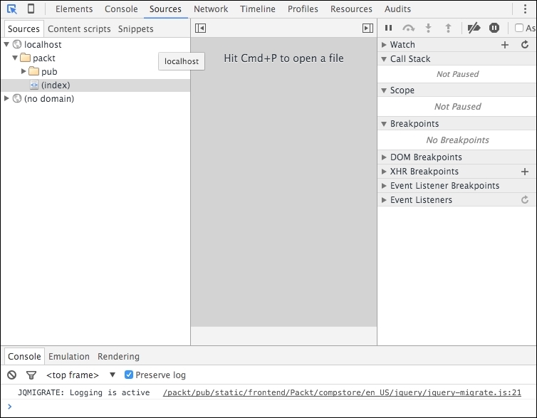
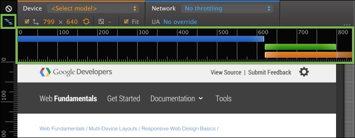
Now, you can see the DevTools window, as in the preceding screenshot.
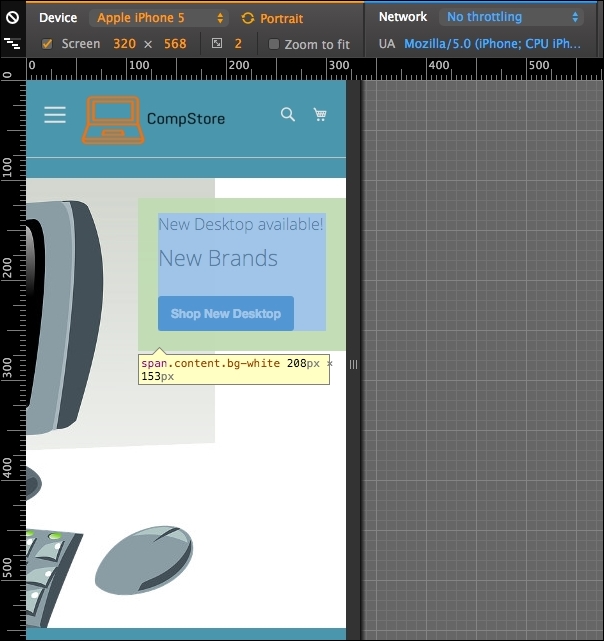
To activate Device Mode, click on the smartphone icon next to the Elements menu item. Now, you can see the page rendering with different options, as in the following screenshot:
According to the Google DevTools official page available at https://developers.google.com/web/tools/chrome-devtools/iterate/device-mode/, you can use the DevTools device mode to do the following:
The DevTools extension has the following options to enhance developer experience:
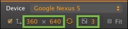
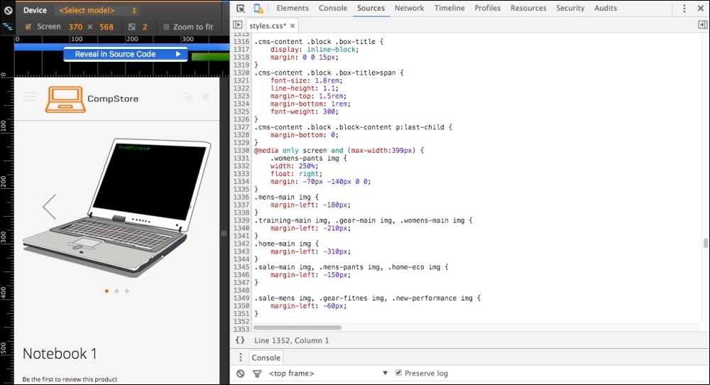
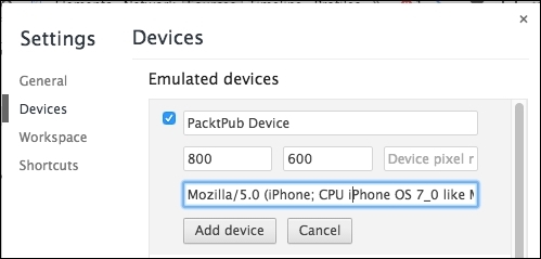
To change the device preset, click on the Device options:
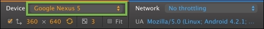
You can choose from among iPhone, Google Nexus, Samsung Galaxy, and Blackberry, and you can create custom devices to test the screen size.

The media queries are responsible for defining the CSS rule for each screen size. You can access all of these using DevTools. To access media queries, click on the icon in the upper-left corner:
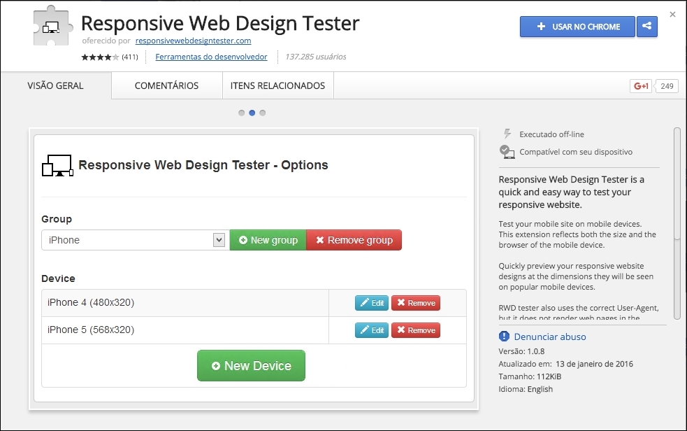
Now, open the Google Chrome browser and navigate to the address https://chrome.google.com/webstore/category/apps to access Chrome Web Store. Conduct a search to find the Responsive Web Designer Tester extension and then add the extension to Google Chrome, as follows:
Great work! Now, let's take a look at how this extension works. On your browser, go to your Magento local site, also known as CompStore, by accessing http://localhost/packt. Remember that you have to turn on Apache Service in XAMMP to test the local website.
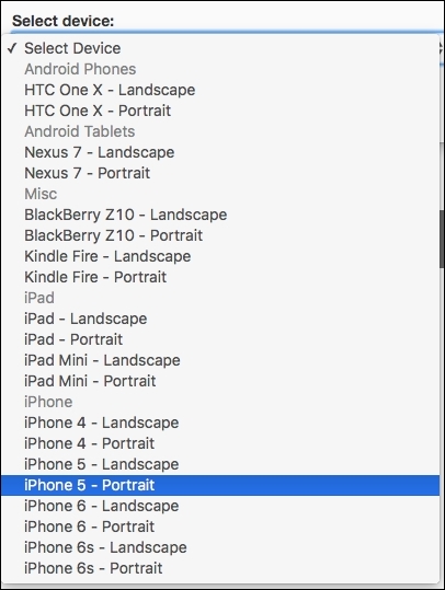
Click on the button of the Responsive Web Designer Tester extension shown on the right-hand side of your screen (generally near the end of the browser address bar) and select the iPhone 5—Portrait option for the first test:
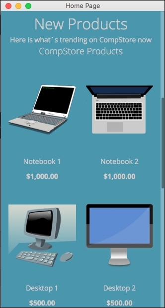
After you select the device, you will see a pop-up window having the size of iPhone 5 screen. Navigating on the page, you will see also that the layout is not fully responsive. We have some issues in the home page presentation:
Now we have a tool to test site behavior between the different devices. It is time to make our CompStore theme 100% compatible with multiple devices!