
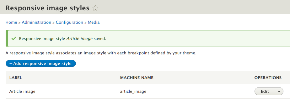
- Go to Configuration and then to Responsive image styles under the MEDIA section. Click on Add responsive image style to create a new style set.
- Provide a label that will be used to administratively identify the Responsive image style set.
- Select a breakpoint group that will be used as a source of breakpoints to define the image style map.
- Each breakpoint will have a fieldset. Expand the fieldset and choose Select a single image style, and then, pick an appropriate image style:
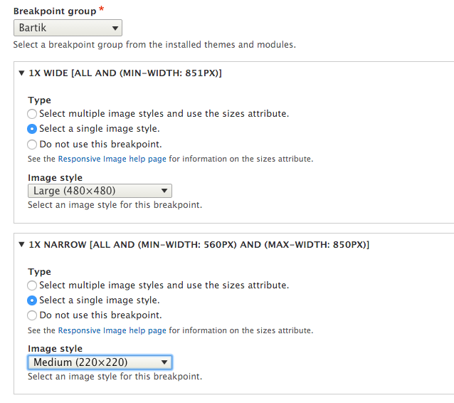
- Additionally, choose a fallback image style in the event of a browser that doesn't support source sets, such as Internet Explorer 8.
- Click on Save to save the configuration, and add the new style set:
- Go to Structure and Content types and select Manage Display from the Article content type's drop-down menu.
- Change the Image field's formatter to Responsive image.
- Click on the Settings tab of the field formatter to choose your new Responsive image style set. Select Article image from the Responsive image style dropdown:
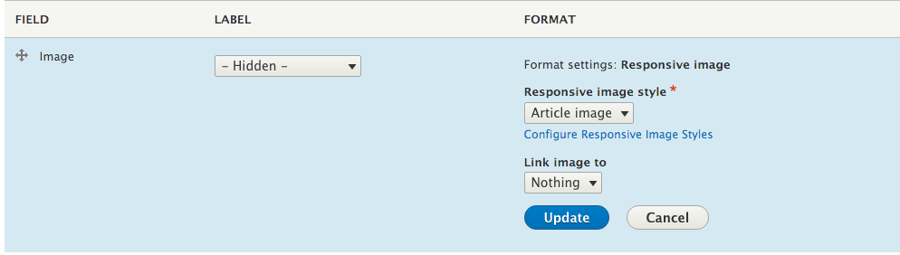
- Click on Update to save the field formatter settings, and then click on Save to save the field display settings.