The current home page has a simple text list that's not terribly touch-friendly and showing the key at the front of the line might be inexplicable to the user. Let's fix this.
Edit views/index.hbs and make this change:
<div class="container-fluid">
  <div class="row">
    <div class="col-12 btn-group-vertical" role="group">
      {{#each notelist}}
      <a class="btn btn-lg btn-block btn-outline-dark"
          href="/notes/view?key={{ key }}">{{ title }}</a>
      {{/each}}
    </div>
  </div>
</div>
The first change is to switch away from using a list and to use a vertical button group. By making the text links look and behave like buttons, we're improving the user interface, especially its touch friendliness. We chose the btn-outline-dark button style because it looks good in the user interface. We use large buttons (btn-lg) that fill the width of the container (btn-block).
We eliminated showing the notekey to the user. This information doesn't add anything to the user experience:
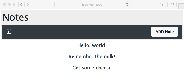
This is beginning to take shape, with a decent-looking home page that handles resizing very nicely and is touch friendly.
There's still something more to do with this, since the header area is taking up a fair amount of space. We should always feel free to rethink a plan as we look at intermediate results. Earlier, we created one design for the header area, but on reflection that design looks to be too large. The intention had been to insert a breadcrumb just to the right of the home icon, and to leave the <h1> title at the top of the header area. But this is taking up vertical space and we can tighten up the header and possibly improve the appearance.
Edit partials/header.hbs and replace it with the following:
<header class="page-header">
<nav class="navbar navbar-expand-md navbar-dark bg-dark">
  <a class="navbar-brand" href='/'><i data-feather="home"></i></a>
  <button class="navbar-toggler" type="button"
         data-toggle="collapse" data-target="#navbarSupportedContent"
         aria-controls="navbarSupportedContent"
         aria-expanded="false"
         aria-label="Toggle navigation">
     <span class="navbar-toggler-icon"></span>
  </button>
  <div class="collapse navbar-collapse" id="navbarSupportedContent">
    <span class="navbar-text col">{{ title }}</span>
    <a class="nav-item nav-link btn btn-light col-auto" href='/notes/add'>ADD Note</a>
  </div>
</nav>
</header>
This removes the <h1> tag at the top of the header area, immediately tightening the presentation.
Within the navbar-collapse area, we've replaced what had been intended as the breadcrumb, with a simple navbar-text component. To keep the ADD Note button glued to the right, we're maintaining the class="col" and class="col-auto" settings:
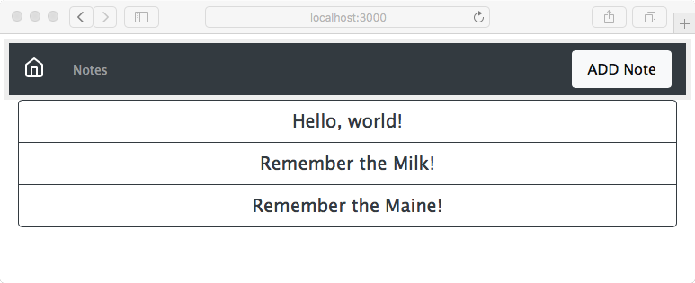
Which header area design is better? That's a good question. Since beauty is in the eye of the beholder, both designs are probably equally good. What we have demonstrated is the ease with which we can update the design by editing the template files.