
The header section we designed before contains a page title and a little navigation bar. Bootstrap has several ways to spiff this up, and even give us a responsive navigation bar which neatly collapses to a menu on small devices.
In views/pageHeader.ejs, make this change:
<header class="page-header">
<h1>{{ title }}</h1>
<nav class="navbar navbar-expand-md navbar-dark bg-dark">
  <a class="navbar-brand" href='/'><i data-feather="home"></i></a>
  <button class="navbar-toggler" type="button"
     data-toggle="collapse" data-target="#navbarSupportedContent"
     aria-controls="navbarSupportedContent"
     aria-expanded="false" aria-label="Toggle navigation">
     <span class="navbar-toggler-icon"></span>
  </button>
  <div class="collapse navbar-collapse" id="navbarSupportedContent">
     <div class="navbar-nav col">
     {{#if breadcrumb}}
     <a class="nav-item nav-link" href='{{breadcrumb.url}}'>
     {{breadcrumb.title}}</a>
     {{/if}}
     </div>
     <a class="nav-item nav-link btn btn-light col-auto"
                   href='/notes/add'>ADD Note</a>
  </div>
</nav>
</header>
Adding class="page-header" informs Bootstrap this is, well, the page header. Within that we have the <h1> header as before, giving the page title, and then a responsive Bootstrap navbar.
By default the navbar is expanded—meaning the components inside the navbar are visible—because of the navbar-expand-md class. This navbar is using a navbar-toggler button which governs the responsiveness of the navbar. By default, this button is hidden and the body of the navbar is visible. If the screen is small enough, the navbar-toggler is switched so it's visible, the body of the navbar is invisible, and when clicking on the now-visible navbar-toggler, a menu drops down containing the body of the navbar:
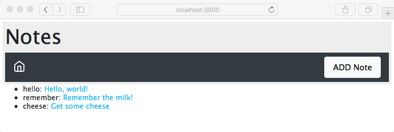
We chose the feather icons home icon because it says go home. It's intended that the middle portion of the navbar will contain a breadcrumb as we navigate around the Notes application.
The ADD Note button is glued to the right-hand-side with a little Flexbox magic. The container is a Flexbox, meaning we can use the Bootstrap classes to control the space consumed by each item. The breadcrumb area is empty in this case, but the <div> that would contain it is there and declared with class="col", meaning that it takes up a column unit. The ADD Note button is, on the other hand, declared with class="col-auto", meaning it takes up only the room required for itself. It is the empty breadcrumb area that will expand to fill the space, while the ADD Note button fills only its own space, and is therefore pushed over to the side.
Because it's the same application, the functionality all works; we're simply working on the presentation. We've added a few notes but the presentation of the list on the front page leaves a lot to be desired. The small size of the title is not very touch-friendly, since it doesn't present a large target area for a fingertip. And can you explain why the notekey value has to be displayed on the home page?