
Let's start by quantifying the problem. We need to explore how well (or not) the application behaves on a mobile device. This is simple to do:
- Start the Notes application. Determine the IP address of the host system.
- Using your mobile device, connect to the service using the IP address, and browse around the Notes application, putting it through its paces, noting any difficulties.
Another way to approach this is to use your desktop browser, resizing it to be very narrow. The Chrome DevTools also includes a mobile device emulator. Either way, you can mimic the small screen size of a smartphone on your desktop.
To see a real user interface problem on a mobile screen, edit views/noteedit.ejs and change this line:
<br/><textarea rows=5 cols=80 name='body' >
    {{#if note }}{{note.body}}{{/if}}
    </textarea>
What's changed is the cols=80 parameter. We want this textarea element to be overly large so that you can experience how a non-responsive web app appears on a mobile device. View the application on a mobile device and you'll see something like one of the screens in this screenshot:
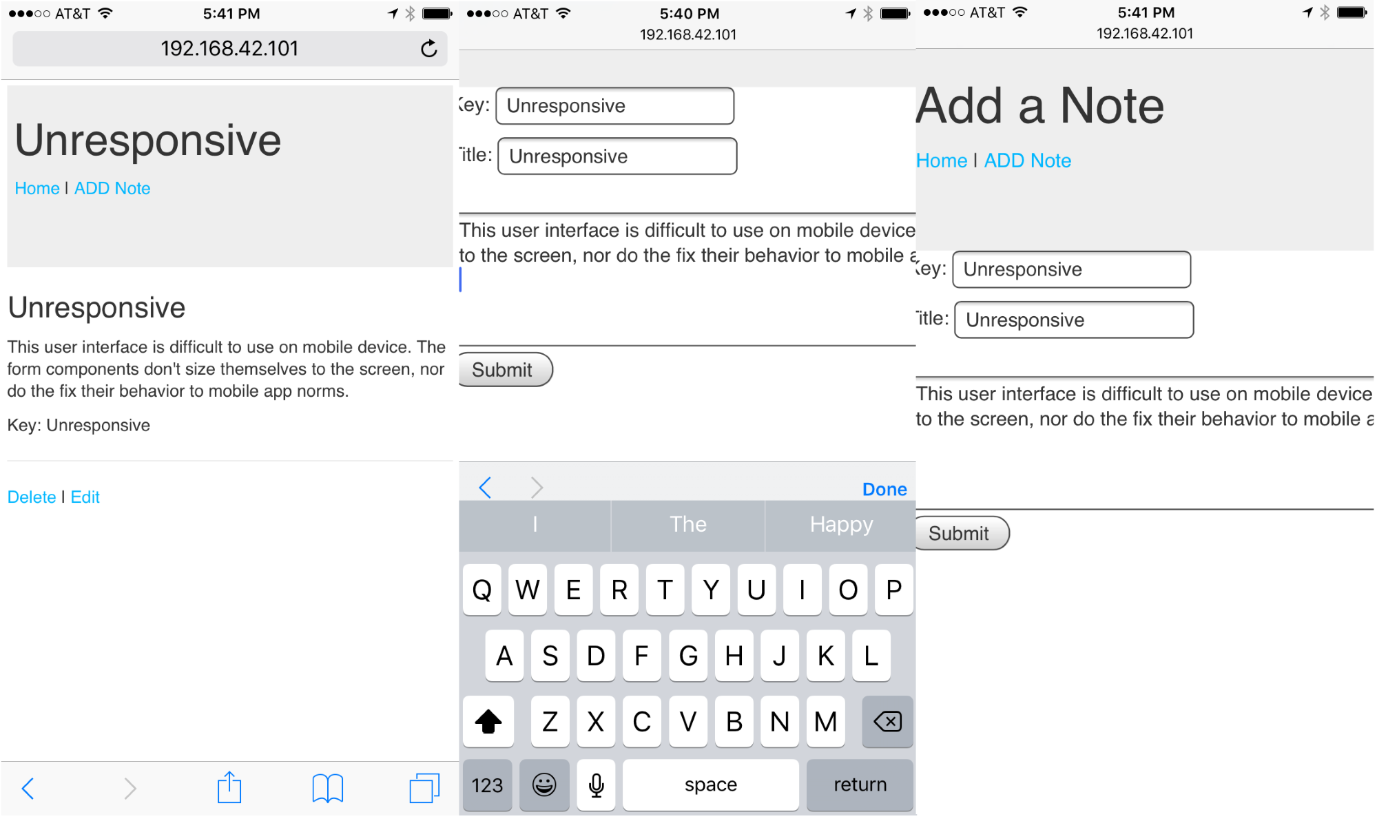
Viewing a note works well on an iPhone 6, but the screen for editing/adding a note is not good. The text entry area is so wide that it runs off the side of the screen. Even though interaction with FORM elements work well, it's clumsy. In general, browsing the Notes application gives an acceptable mobile user experience that doesn't suck and won't make our users give rave reviews.