
One reason to use Bootstrap is that you can easily build a customized version. Stylesheets are built using SASS, which is one of the CSS preprocessors to simplify CSS development. In Bootstrap's code, one file (scss/_variables.scss) contains variables used throughout the rest of Bootstrap's .scss files. Change one variable and it can automatically affect the rest of Bootstrap.
Earlier, we overrode a couple of Bootstrap behaviors with our custom CSS file, public/stylesheets/style.css. This is an easy way to change a couple of specific things, but it doesn't work for large-scale changes to Bootstrap. Serious Bootstrap customization requires generating a customized Bootstrap build.
The official documentation on the Bootstrap website (http://getbootstrap.com/docs/4.1/getting-started/build-tools/) is useful for reference on the build process.
If you've followed the directions given earlier, you have a directory, chap06/notes, containing the Notes application source code. Create a directory named chap06/notes/theme, within which we'll set up a custom Bootstrap build process.
As students of the Twelve Factor Application model, we'll be using a package.json in that directory to automate the build process. There isn't any Node.js code involved; npm is also a convenient tool to automate the software build processes.
To start, download the Bootstrap source tree from https://github.com/twbs/bootstrap. While the Bootstrap npm package includes SASS source files, it isn't sufficient to build Bootstrap, and therefore one must download the source tree. What we do is navigate to the GitHub repository, click on the Releases tab, and select the URL for the most recent release.
With theme/package.json containing this scripts section:
{
  "scripts": {
    "download": "wget -O - https://github.com/twbs/bootstrap/archive/v4.1.0.tar.gz | tar xvfz -",
    "postdownload": "cd bootstrap-4.1.0 && npm install"
  }
}
Type this command:
$ npm run download
This downloads the tar-gzip (tarball) archive from the Bootstrap repository and immediately unpacks it. If you are on Windows, it will be easiest to run that script in Windows Subsystem for Linux to execute these commands. After downloading and unpacking the archive, the postdownload step runs npm install in the directory. The Bootstrap team uses their package.json, not only to track all the dependencies required to build Bootstrap, but to drive the build process.
The npm install for Bootstrap will take a long time, so be patient.
This much only installs the tools necessary to build Bootstrap. Building the Bootstrap documentation requires installing additional Ruby-based tools (Jekyll and some plugins).
To build Bootstrap, let's add the following lines to the scripts section in our theme/package.json:
"scripts": {
...
 "build": "cd bootstrap-4.1.0 && npm run dist",
 "watch": "cd bootstrap-4.1.0 && npm run watch"
...
}
Obviously you'll need to adjust the directory name as the Bootstrap project issues new releases. In the Bootstrap source tree, running npm run dist builds Bootstrap, while npm run watch sets up an automated process to scan for changed files and rebuilds Bootstrap upon changing any file. By adding these lines to our theme/package.json, we can start this in the terminal and it automatically reruns the build as needed.
Now run a build with this command:
$ npm run build
The built files land in the theme/bootstrap-4.1.0/dist directory. The content of that directory will match the contents of the corresponding npm package.
In case it hasn't been obvious all along—there are Bootstrap version numbers embedded in these URLs and file or directory names. As new Bootstrap releases are issued, you must adjust the pathnames to match the current version number.
Before proceeding, let's take a look around the Bootstrap source tree. The scss directory contains the SASS source that will be compiled into the Bootstrap CSS files. To generate a customized Bootstrap build will require a few modifications in that directory.
The bootstrap-4.1.0/scss/bootstrap.scss file contains @import directives to pull in all Bootstrap components. The file bootstrap-4.1.0/scss/_variables.scss contains definitions used in the remainder of the Bootstrap SASS source. Editing, or overriding, these values will change the look of websites using the resulting Bootstrap build.
For example, these definitions determine the main color values:
$white: #fff !default;
$gray-100: #f8f9fa !default;
...
$gray-800: #343a40 !default;
...
$blue: #007bff !default;
...
$red: #dc3545 !default;
$orange: #fd7e14 !default;
$yellow: #ffc107 !default;
$green: #28a745 !default;
...
$primary: $blue !default;
$secondary: $gray-600 !default;
$success: $green !default;
$info: $cyan !default;
$warning: $yellow !default;
$danger: $red !default;
$light: $gray-100 !default;
$dark: $gray-800 !default;
These are similar to CSS statements. The !default attribute designates these values as the default. Any !default values can be overridden without editing _values.scss.
Create a file, theme/_custom.scss, containing the following:
$white: #fff !default;
$gray-900: #212529 !default;
$body-bg: $gray-900 !default;
$body-color: $white !default;
This reverses the values for the $body-bg and $body-color settings in _variables.scss. The Notes app will now use white text on a dark background, rather than the default white background with dark text. Because these declarations do not use !default, they'll override the values in _variables.scss.
Then make a copy of scss/bootstrap.scss in the theme directory and modify it, like so:
@import "custom";
@import "functions";
@import "variables";
...
We're importing the _custom.scss file we just created. Finally, add this line to the scripts section of theme/package.json:
"prebuild": "cp _custom.scss bootstrap.scss bootstrap-4.1.0/scss",
With that in place, before building Bootstrap these two files will be copied in place. Next, rebuild Bootstrap:
$ npm run build

> @ prebuild /Users/David/chap06/notes/theme
> cp _custom.scss bootstrap.scss bootstrap-4.1.0/scss

> @ build /Users/David/chap06/notes/theme
> cd bootstrap-4.1.0 && npm run dist
...
While that's building, let's modify notes/app.js to mount the build directory:
// app.use('/assets/vendor/bootstrap', express.static(
// path.join(__dirname, 'node_modules', 'bootstrap', 'dist'))); app.use('/assets/vendor/bootstrap', express.static(
  path.join(__dirname, 'theme', 'bootstrap-4.1.0', 'dist')));
What we've done is switch from the Bootstrap in node_modules to what we just built in the theme directory. The Bootstrap version number shows up here, so this must also be updated as new Bootstrap releases are adopted.
Then reload the application, and you'll see the following:
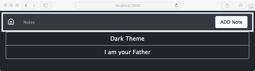
To get exactly this, you may need to make a change in the templates. The Button elements we used earlier have the btn-outline-dark class, which works well on a light background. The background is now dark and these buttons need to use light coloring.
To change the buttons, in views/index.hbs make this change:
<a class="btn btn-lg btn-block btn-outline-light"
   href="/notes/view?key={{ key }}"> {{ title }} </a>
Make a similar change in views/noteview.hbs:
<a class="btn btn-outline-light" href="/notes/destroy?key={{notekey}}"
   role="button"> Delete </a>
<a class="btn btn-outline-light" href="/notes/edit?key={{notekey}}"
   role="button"> Edit </a>
That's cool, we can now rework the Bootstrap color scheme any way we want. Don't show this to your user experience team, because they'll throw a fit. We did this to prove the point that we can edit _custom.scss and change the Bootstrap theme.