Viewing a Note isn't bad, but the user experience can be improved. The user does not need to see the notekey, for example. Additionally, Bootstrap has nicer-looking buttons we can use.
In views/noteview.hbs, make these changes:
<div class="container-fluid">
    <div class="row"><div class="col-xs-12">
        {{#if note}}<h3>{{ note.title }}</h3>{{/if}}
        {{#if note}}<p>{{ note.body }}</p>{{/if}}
        <p>Key: {{ notekey }}</p>
    </div></div>
    {{#if notekey }}
        <div class="row"><div class="col-xs-12">
        <div class="btn-group">
            <a class="btn btn-outline-dark"
                href="/notes/destroy?key={{notekey}}"
                role="button">Delete</a>
            <a class="btn btn-outline-dark"
                href="/notes/edit?key={{notekey}}"
                role="button">Edit</a>
        </div>
        </div></div>
    {{/if}}
</div>
We have declared two rows, one for the Note, and another for buttons to act on the Note. Both are declared to consume all 12 columns, and therefore take up the full available width. The buttons are again contained within a button group:
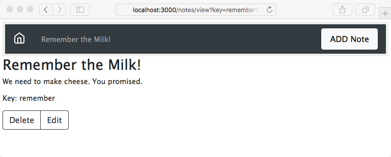
Do we really need to show the notekey to the user? We'll leave it there, but that's an open question for the user experience team. Otherwise, we've improved the note-reading experience.