
The next major glaring problem is the form for adding and editing notes. As we said earlier, it's easy to get the text input area to overflow a small screen. On the other hand, Bootstrap has extensive support for making nice-looking forms that work well on mobile devices.
Change the form in views/noteedit.hbs to this:
<form method='POST' action='/notes/save'>
  <div class="container-fluid">
    {{#if docreate}}
      <input type='hidden' name='docreate' value="create">
    {{else}}
      <input type='hidden' name='docreate' value="update">
    {{/if}}
    <div class="form-group row align-items-center">
      <label for="notekey" class="col-1 col-form-label">Key</label>
      {{#if docreate }}
        <div class="col">
          <input type='text' class="form-control"
                 placeholder="note key" name='notekey' value=''/>
        </div>
      {{else}}
        {{#if note }}
          <span class="input-group-text">{{notekey}}</span>
        {{/if}}
        <input type='hidden' name='notekey'
               value='{{#if note }}{{notekey}}{{/if}} '/>
      {{/if}}
    </div>

    <div class="form-group row">
      <label for="title" class="col-1 col-form-label">Title</label>
      <div class="col">
        <input type="text" class="form-control"
               id='title' name='title' placeholder="note title"
               value='{{#if note }}{{note.title}}{{/if}}'>
      </div>
    </div>

    <div class="form-group row">
      <textarea class="form-control" name='body'
                rows="5">{{#if note }}{{note.body}}{{/if}}</textarea>
    </div>
    <button type="submit" class="btn btn-default">Submit</button>
 </div>
</form>
There's a lot going on here. What we've done is reorganize the form so Bootstrap can do the right things with it. The first thing to note is that we have several instances of this:
<div class="form-group row"> .. </div>
These are contained within a container-fluid, meaning that we've set up three rows in the form.
Bootstrap uses form-group elements to add structure to forms, and to encourage proper use of <label> elements, along with other form elements. It's good practice to use a <label> with every <input> to improve assistive behavior in the browser, rather than if you simply left some dangling text.
Every form element has class="form-control". Bootstrap uses this to identify the controls so it can add styling and behavior.
By default, Bootstrap formats form-group elements so the label appears on another line from the input control. Note that we've added class="col-1" to the labels and class="col" to the <div> wrapping the input. This declares two columns, the first consuming one column unit and the other consuming the remainder.
The placeholder='key' attribute puts sample text in an otherwise empty text input element. It disappears as soon as the user types something and is an excellent way to prompt the user with what's expected.
Finally, we changed the Submit button to be a Bootstrap button. These look nice, and Bootstrap makes sure that they work great:
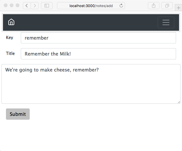
The result looks good and works well on the iPhone. It automatically sizes itself to whatever screen it's on. Everything behaves nicely. In this screenshot, we've resized the window small enough to cause the navbar to collapse. Clicking on the so-called hamburger icon on the right (the three horizontal lines) causes the navbar contents to pop up as a menu.