
Now, let's go to Statistics | I/O Graph:
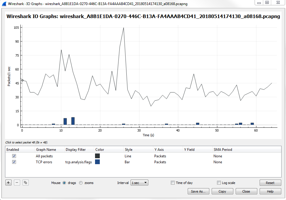
The I/O graph is a very powerful feature in Wireshark, and here it's showing us all the packets per second, and all of this is customizable. You can change the Interval and you can also change whether it's a linear or logarithmic scale:
Depending on the needs of the packet capture that you're looking at, maybe there are very drastic differences between some different streams that you're wanting to graph, or maybe some differences between the filters that we want to apply because you can layer filters in this section. You may want to use logarithmic for that; it all depends on what you need the packet capture to look like. By default, when you open it up, Wireshark will show you the number of packets per second, and then every tick is one second. What we have are a number of additional layers that we can customize. You can see that we have a Name column, where you can name the layer. We have a Display filter, which includes Color, where you can change the color and the Style type, whether it's a line graph or a bar graph. You can change what the y axis represents. You can turn on Smoothing; you can do a number of different adjustments here to your I/O graph to make it as customized as you need.
One powerful thing to look for in a packet capture that you know has a problematic transfer are TCP analysis flags. We'll do that for the second layer. For that we'll create a display filter for TCP analysis flags, and layer that on to our I/O graph. So, what we'll do is double-click on the second Display filter, which allows us to enter a display filter. It will work just as if you were adjusting the display filter in the main packet list area. We will add tcp.analysis.flags:

When we apply this, it will create a second layer on the graph with a red line graph of any packet that has an analysis done to the flags. Wireshark looked into the flags and saw that something occurred and it provided some sort of insight into it. Just like we saw with the expert information in the lower left, this display filter uses the same functionality as the expert information.
Next, we will negate window updates from this. We will add tcp.analysis.flags &&. If we use an exclamation mark, that will negate whatever we are about to include. It will be tcp.analysis.flags && !tcp.analysis.window_update.
When you're done, simply click away and it will apply the filter.
Now you can see that we have the check marks on the left that will enable or disable the following layers:
So, if we disable the first packet option, that gets rid of our packets per second. If we enable the second one, that will show us all of our TCP analysis flag issues. You will see that there are a number of problems.
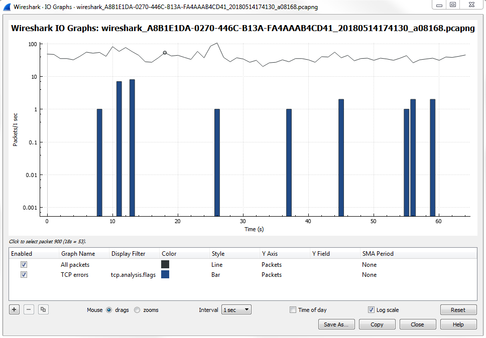
What we can do is, make this easier to view and really make it stand out, especially if there's a lot of data going on. If we have a lot of additional layers, sometimes you may want to make certain layers stand out. What we can do is change the Style of it to a Bar:
Once we change it to a Bar, you'll see that it's a bit thicker and stands out more.
And if you zoom in, you'll actually be able to see the pink there, and it really sticks out like a sore thumb. Then, we can click anywhere along this line and it will take us to the problem:
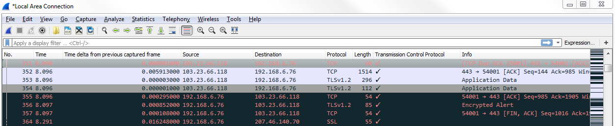
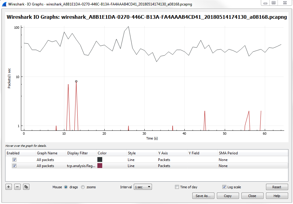
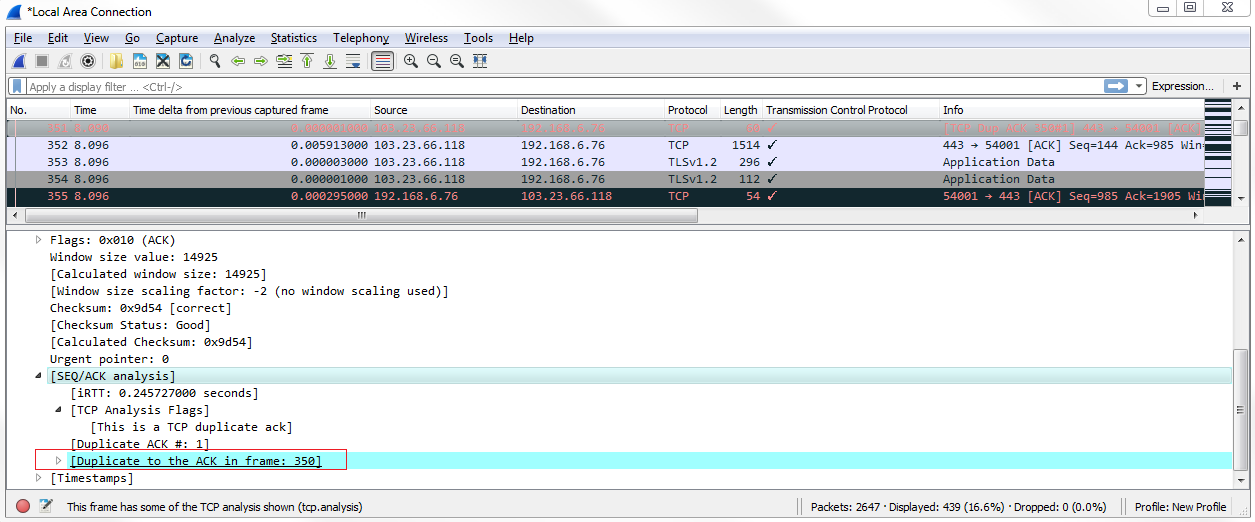
Now, we can see all of our TCP analysis issues. So what we can do is, click on that packet and validate this, as well. If we click on one of these black packets, expand TCP, and then look at the analysis section, it tells us that there's a duplicate. This is a duplicate to a previous acknowledgment, which is obviously a problem that's indicative of an issue:
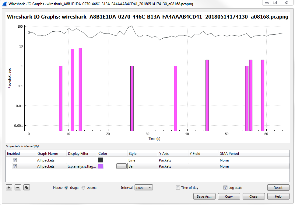
Also, note that these different layers are on top of each other, so the top layer is the one that's closest to the foreground and then the one towards the bottom is towards the background. If you have a lot of data on a foreground layer, it may overlap and overwrite visually what's going on in a background layer, so be aware of that. For example, consider changing the style of this to a Bar chart :
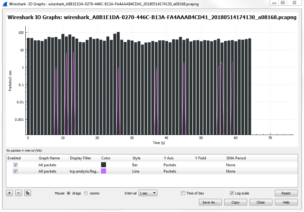
You'll see that it makes the second layer that we created with the analysis flags useless because it is now dominating the entire view. So be careful with the way you change and use your different layers.