Table of Contents for
Your Code as a Crime Scene
 Your Code as a Crime Scene
Published by
Pragmatic Bookshelf, 2015
Your Code as a Crime Scene
Published by
Pragmatic Bookshelf, 2015
- Title Page
- Your Code as a Crime Scene
- Your Code as a Crime Scene
- For the Best Reading Experience...
- Table of Contents
- Early praise for Your Code as a Crime Scene
- Foreword by Michael Feathers
- Acknowledgments
- Chapter 1: Welcome!
- About This Book
- Optimize for Understanding
- How to Read This Book
- Toward a New Approach
- Get Your Investigative Tools
- Part 1: Evolving Software
- Chapter 2: Code as a Crime Scene
- Meet the Problems of Scale
- Get a Crash Course in Offender Profiling
- Profiling the Ripper
- Apply Geographical Offender Profiling to Code
- Learn from the Spatial Movement of Programmers
- Find Your Own Hotspots
- Chapter 3: Creating an Offender Profile
- Mining Evolutionary Data
- Automated Mining with Code Maat
- Add the Complexity Dimension
- Merge Complexity and Effort
- Limitations of the Hotspot Criteria
- Use Hotspots as a Guide
- Dig Deeper
- Chapter 4: Analyze Hotspots in Large-Scale Systems
- Analyze a Large Codebase
- Visualize Hotspots
- Explore the Visualization
- Study the Distribution of Hotspots
- Differentiate Between True Problems and False Positives
- Chapter 5: Judge Hotspots with the Power of Names
- Know the Cognitive Advantages of Good Names
- Investigate a Hotspot by Its Name
- Understand the Limitations of Heuristics
- Chapter 6: Calculate Complexity Trends from Your Code’s Shape
- Complexity by the Visual Shape of Programs
- Learn About the Negative Space in Code
- Analyze Complexity Trends in Hotspots
- Evaluate the Growth Patterns
- From Individual Hotspots to Architectures
- Part 2: Dissect Your Architecture
- Chapter 7: Treat Your Code As a Cooperative Witness
- Know How Your Brain Deceives You
- Learn the Modus Operandi of a Code Change
- Use Temporal Coupling to Reduce Bias
- Prepare to Analyze Temporal Coupling
- Chapter 8: Detect Architectural Decay
- Support Your Redesigns with Data
- Analyze Temporal Coupling
- Catch Architectural Decay
- React to Structural Trends
- Scale to System Architectures
- Chapter 9: Build a Safety Net for Your Architecture
- Know What’s in an Architecture
- Analyze the Evolution on a System Level
- Differentiate Between the Level of Tests
- Create a Safety Net for Your Automated Tests
- Know the Costs of Automation Gone Wrong
- Chapter 10: Use Beauty as a Guiding Principle
- Learn Why Attractiveness Matters
- Write Beautiful Code
- Avoid Surprises in Your Architecture
- Analyze Layered Architectures
- Find Surprising Change Patterns
- Expand Your Analyses
- Part 3: Master the Social Aspects of Code
- Chapter 11: Norms, Groups, and False Serial Killers
- Learn Why the Right People Don’t Speak Up
- Understand Pluralistic Ignorance
- Witness Groupthink in Action
- Discover Your Team’s Modus Operandi
- Mine Organizational Metrics from Code
- Chapter 12: Discover Organizational Metrics in Your Codebase
- Let’s Work in the Communication Business
- Find the Social Problems of Scale
- Measure Temporal Coupling over Organizational Boundaries
- Evaluate Communication Costs
- Take It Step by Step
- Chapter 13: Build a Knowledge Map of Your System
- Know Your Knowledge Distribution
- Grow Your Mental Maps
- Investigate Knowledge in the Scala Repository
- Visualize Knowledge Loss
- Get More Details with Code Churn
- Chapter 14: Dive Deeper with Code Churn
- Cure the Disease, Not the Symptoms
- Discover Your Process Loss from Code
- Investigate the Disposal Sites of Killers and Code
- Predict Defects
- Time to Move On
- Chapter 15: Toward the Future
- Let Your Questions Guide Your Analysis
- Take Other Approaches
- Let’s Look into the Future
- Write to Evolve
- Appendix 1: Refactoring Hotspots
- Refactor Guided by Names
- Bibliography
- You May Be Interested In…
Know Your Knowledge Distribution
A while ago, I worked with a large development organization. We were hundreds of developers organized in multiple divisions and teams. To make it work, each team was responsible for one subsystem. The subsystems all had well-documented interfaces. However, sometimes the API had to change to support a new feature. That’s where things started to get expensive.
You’re probably reminded of Conway’s law from the previous chapter. The team organization was closely aligned to the system architecture. As a consequence, the communication worked well—at least on the surface. When we needed to change an API, we knew which team we should talk to. The problem was that these changes often rippled through the system; a change to our API meant another subsystem had to change as well. And to change that subsystem, our peers had to request a change to yet another API, and so on.
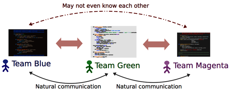
As the figure shows, when an organization creates isolated teams, collaboration across system boundaries suffers. While we may know the expertise on the team responsible for the interfaces we use, we rarely know what happens behind them. This is a problem when it comes to design, code reviews, and debugging. Ideally, you’d like to get input from everyone who’s affected by a change. So let’s find out who they are.
Find the Author to Praise
Modern version-control systems all provide a blame command. (I love that Subversion aliases the command as praise!) blame is useful if you know exactly which module you need to change. As you can see in the following figure, blame shows the author who last modified each line in a given file.
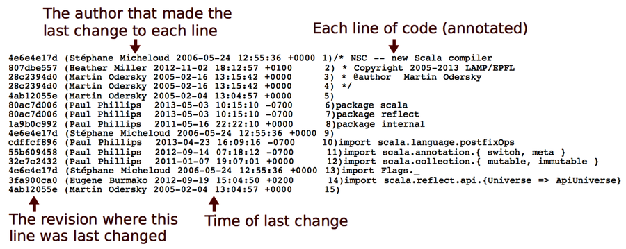
The information from blame is useful, but it doesn’t take us far enough. If we don’t know that part of the system, which is probably why we want to talk to someone else in the first place, then we don’t know which file to inspect. And even when we do, the information from blame is low-level. What we’d need is a summary, a high-level overview.
blame is also sensitive to superficial changes. So if we want information that reflects knowledge, we need to look deeper at the contributions that led up to the current code. Let’s see how to do that.
It’s Not About Blame or Praise | |
|---|---|
|
|
The analyses in this part of the book are easy to misuse by applying them as some kind of evaluation of programmer performance or productivity. There are several reasons why that’s a bad idea. Let’s focus on the one that social psychologists call a fundamental attribution error. The fundamental attribution error describes our tendency to overestimate personality factors when we explain other people’s behavior. For example, when you see that I committed a bunch of buggy spaghetti last week, you know it’s because I’m a bad programmer, irresponsible, and perhaps even a tad stupid. When you, on the other hand, deliver scrappy code (yes, I know—it’s a hypothetical scenario), you know it’s because you were close to a deadline, had to save the project, or just intended it to be a prototype. As you see, we attribute the same observable behavior to different factors depending on whether it concerns us or someone else. There’s also a group aspect to this bias. When we judge the behavior of someone closer to us, such as a team member, we’re more likely to understand the situational influence. That means the fundamental attribution error is a bias that we can learn to avoid. We just need to remind ourselves that the power of the situation is strong and often a better predictor of behavior than a person’s personality. |
Dig Below the Surface with Developer Patterns
Chapter 12, Discover Organizational Metrics in Your Codebase, used version-control data to identify the number of developers behind each module. While the measure is correlated with bugs, the number itself doesn’t reveal much. Even with many contributors, a module may still have one main developer who maintains overall consistency while other programmers contribute minor fixes to the code. Or, it could indeed be a shared effort where many different programmers contribute significant chunks of the total code.
To dig deeper, we need to get a summary of individual contributions. The algorithm we use summarizes the number of commits for each developer and presents it together with the total number of revisions for that module. Here’s how the metric looks on Hibernate:
| | prompt> maat -c git -l hib_evo.log -a entity-effort |
| | entity,author,author-revs,total-revs |
| | ... |
| | AbstractEntityPersister.java,Steve Ebersole,17,44 |
| | AbstractEntityPersister.java,Brett Meyer,3,44 |
| | AbstractEntityPersister.java,Rob Worsnop,5,44 |
| | ... |
| | AbstractEntityPersister.java,Gail Badner,4,44 |
| | AbstractEntityPersister.java,Paweł Stawicki,1,44 |
| | AbstractEntityPersister.java,Strong Liu,2,44 |
| | ... |
The results above are filtered on the AbstractEntityPersister module that we identified as a potential problem back in Evaluate Communication Costs. While these analysis results let you reason about how fragmented the development effort is, the raw text output soon becomes daunting; it’s hard to get the overall picture. So let’s turn to a more brain-friendly approach.
Visualize Developer Effort with Fractal Figures
Take a look at the following figure. In contrast to the raw analysis results, the fractal figures visualization immediately provides you with a view of how the programming effort was shared—how fragmented the developer effort is for each module in your system.
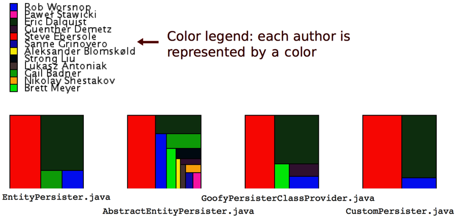
The fractal figures algorithm is simple: represent each programmer with a color and draw a rectangle whose area is proportional to the percentage of commits by that programmer. You can also see that the rectangles are rendered in alternating directions to increase the visual contrast between different parts. (You’ll find more details in the original research paper Fractal Figures: Visualizing Development Effort for CVS Entities [DLG05].)
If you want to try fractal figures on your own system—and you really should—check out the implementation and documentation on GitHub.[33] All you need is a result file from a Code Maat entity-effort analysis.
Now, let’s see what the different patterns tell us about the codebase.
Distinguish the Ownership Models
Three basic patterns keep showing up when you visualize development effort, and these patterns can be used to predict code quality. You can see the patterns in the following figure:
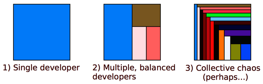
From a communication point of view, a single developer provides the simplest communication structure; there’s just one person to talk to. It’s also likely that the code within that module is consistent. The quality of the code depends, to a large extent, on the expertise of one single developer.
The second case with multiple, balanced developers is more interesting. Often, such code has one developer who contributed the most code. It turns out that the ownership proportion of that main developer is a good predictor of the quality of the code! The higher the ownership proportion of the main developer, the fewer defects in the code. (See Don’t Touch My Code! Examining the Effects of Ownership on Software Quality [BNMG11].)
An even stronger predictor of defects is the number of minor contributors. You see an example of that in case 3 in the preceding figure. When we make a change to a module where we are the main developer, we sometimes need to change a related piece of code that we haven’t worked on before. As such, we don’t know the background and thinking that went into the original code. It’s in that role as minor contributors that we’re more likely to introduce defects.
The fractal figures give you another investigative tool to uncover expensive development practices. Once you’ve identified one of the warning signs, such as many minor contributors, you react by performing code reviews, running a hotspot analysis, and talking to the contributing programmers to see whether they experience any problems.
Do More with Fractal Figures
Fractal figures work well on an architectural level, too. On this level, you use them to visualize the fragmentation of subsystems or even whole systems. You generate architectural fractal figures by specifying a transformation as we did back in Specify Your Architectural Boundaries. Then you just run an entity-effort analysis and tell Code Maat to use your transformation.
Another interesting variation on fractal figures is to use their size dimension to express other properties of the code. For example, you can use the size of each figure to visualize complexity or the number of historic bugs in each module. Used that way, fractal figures allow you to present a lot of information in a compact and brain-friendly way.