Table of Contents for
Your Code as a Crime Scene
 Your Code as a Crime Scene
Published by
Pragmatic Bookshelf, 2015
Your Code as a Crime Scene
Published by
Pragmatic Bookshelf, 2015
- Title Page
- Your Code as a Crime Scene
- Your Code as a Crime Scene
- For the Best Reading Experience...
- Table of Contents
- Early praise for Your Code as a Crime Scene
- Foreword by Michael Feathers
- Acknowledgments
- Chapter 1: Welcome!
- About This Book
- Optimize for Understanding
- How to Read This Book
- Toward a New Approach
- Get Your Investigative Tools
- Part 1: Evolving Software
- Chapter 2: Code as a Crime Scene
- Meet the Problems of Scale
- Get a Crash Course in Offender Profiling
- Profiling the Ripper
- Apply Geographical Offender Profiling to Code
- Learn from the Spatial Movement of Programmers
- Find Your Own Hotspots
- Chapter 3: Creating an Offender Profile
- Mining Evolutionary Data
- Automated Mining with Code Maat
- Add the Complexity Dimension
- Merge Complexity and Effort
- Limitations of the Hotspot Criteria
- Use Hotspots as a Guide
- Dig Deeper
- Chapter 4: Analyze Hotspots in Large-Scale Systems
- Analyze a Large Codebase
- Visualize Hotspots
- Explore the Visualization
- Study the Distribution of Hotspots
- Differentiate Between True Problems and False Positives
- Chapter 5: Judge Hotspots with the Power of Names
- Know the Cognitive Advantages of Good Names
- Investigate a Hotspot by Its Name
- Understand the Limitations of Heuristics
- Chapter 6: Calculate Complexity Trends from Your Code’s Shape
- Complexity by the Visual Shape of Programs
- Learn About the Negative Space in Code
- Analyze Complexity Trends in Hotspots
- Evaluate the Growth Patterns
- From Individual Hotspots to Architectures
- Part 2: Dissect Your Architecture
- Chapter 7: Treat Your Code As a Cooperative Witness
- Know How Your Brain Deceives You
- Learn the Modus Operandi of a Code Change
- Use Temporal Coupling to Reduce Bias
- Prepare to Analyze Temporal Coupling
- Chapter 8: Detect Architectural Decay
- Support Your Redesigns with Data
- Analyze Temporal Coupling
- Catch Architectural Decay
- React to Structural Trends
- Scale to System Architectures
- Chapter 9: Build a Safety Net for Your Architecture
- Know What’s in an Architecture
- Analyze the Evolution on a System Level
- Differentiate Between the Level of Tests
- Create a Safety Net for Your Automated Tests
- Know the Costs of Automation Gone Wrong
- Chapter 10: Use Beauty as a Guiding Principle
- Learn Why Attractiveness Matters
- Write Beautiful Code
- Avoid Surprises in Your Architecture
- Analyze Layered Architectures
- Find Surprising Change Patterns
- Expand Your Analyses
- Part 3: Master the Social Aspects of Code
- Chapter 11: Norms, Groups, and False Serial Killers
- Learn Why the Right People Don’t Speak Up
- Understand Pluralistic Ignorance
- Witness Groupthink in Action
- Discover Your Team’s Modus Operandi
- Mine Organizational Metrics from Code
- Chapter 12: Discover Organizational Metrics in Your Codebase
- Let’s Work in the Communication Business
- Find the Social Problems of Scale
- Measure Temporal Coupling over Organizational Boundaries
- Evaluate Communication Costs
- Take It Step by Step
- Chapter 13: Build a Knowledge Map of Your System
- Know Your Knowledge Distribution
- Grow Your Mental Maps
- Investigate Knowledge in the Scala Repository
- Visualize Knowledge Loss
- Get More Details with Code Churn
- Chapter 14: Dive Deeper with Code Churn
- Cure the Disease, Not the Symptoms
- Discover Your Process Loss from Code
- Investigate the Disposal Sites of Killers and Code
- Predict Defects
- Time to Move On
- Chapter 15: Toward the Future
- Let Your Questions Guide Your Analysis
- Take Other Approaches
- Let’s Look into the Future
- Write to Evolve
- Appendix 1: Refactoring Hotspots
- Refactor Guided by Names
- Bibliography
- You May Be Interested In…
React to Structural Trends
The following figure presents a visual view of the architectural decay we just spotted. It’s the same enclosure diagrams we used back in Chapter 4, Analyze Hotspots in Large-Scale Systems, but now they’re illustrating the modules coupled to MinecraftServer at two different points in time.
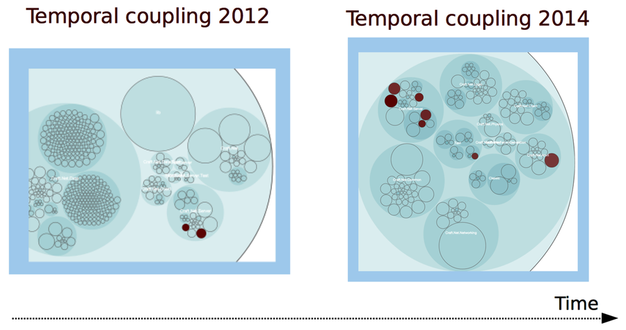
The obvious increase in temporal coupling says there are more modules that have to change with the MinecraftServer in 2014 than earlier in the development history. Note that the number of coupled modules isn’t a problem in itself. To classify a temporal coupling, you need to look at the architectural boundaries of the coupled modules.
When the coupled modules are located in entirely different parts of the system, that’s structural decay. Our data in the trend table shows one obvious case in 2014: Craft.Net.Anvil/Level.cs.
That coupling, together with the growing trend, suggests that our MinecraftServer has been accumulating responsibilities.
Remember how we initially discussed code changes that seem to break unrelated features? The risk with the trend we see here is that it leaves the system vulnerable to such unexpected feature interactions.
If allowed to grow, increased temporal coupling leads to fragile systems. As you saw earlier, temporal coupling has a high correlation with defects. That’s why we want to integrate the analysis into a team’s workflow. Let’s see how.
Use a Storyboard to Track Evolution
The trend analysis we just performed is reactive. It’s an after-the-fact analysis. The results are useful because they help us improve, but we can do even better.
With more activity, you want more sample points. So why not make it a habit to perform regular analyses on the projects you work on?
If you work iteratively, perform the analyses in each iteration. This approach has several advantages:
-
You spot structural decay immediately.
-
You see the structural impact of each feature as you work with it.
-
You make your evolving architecture visible to everyone on the team.
I recommend that you visualize the result of each analysis, perhaps as in Figure , , print them all out, and put them on a storyboard for each iteration.
Think back to our initial example on automated tests with nasty implicit couplings to a database. With an evolutionary storyboard, we’d spot the decay as soon as we noticed the pattern—a few iterations at most, and that’s it.
An iterative trend analysis of temporal coupling is a low-tech approach that helps us improve. It also has the notable advantage of putting focus on the right parts of the system. As such, an evolutionary storyboard is invaluable to complement and stimulate design discussions with peers.
If you find as much promise in this approach as I do, check out the article Animated Visualization of Software History using Evolution Storyboards [BH06]. The authors are the pioneers of the storyboard idea, and their paper shows some cool animations of growing systems.