Table of Contents for
Your Code as a Crime Scene
 Your Code as a Crime Scene
Published by
Pragmatic Bookshelf, 2015
Your Code as a Crime Scene
Published by
Pragmatic Bookshelf, 2015
- Title Page
- Your Code as a Crime Scene
- Your Code as a Crime Scene
- For the Best Reading Experience...
- Table of Contents
- Early praise for Your Code as a Crime Scene
- Foreword by Michael Feathers
- Acknowledgments
- Chapter 1: Welcome!
- About This Book
- Optimize for Understanding
- How to Read This Book
- Toward a New Approach
- Get Your Investigative Tools
- Part 1: Evolving Software
- Chapter 2: Code as a Crime Scene
- Meet the Problems of Scale
- Get a Crash Course in Offender Profiling
- Profiling the Ripper
- Apply Geographical Offender Profiling to Code
- Learn from the Spatial Movement of Programmers
- Find Your Own Hotspots
- Chapter 3: Creating an Offender Profile
- Mining Evolutionary Data
- Automated Mining with Code Maat
- Add the Complexity Dimension
- Merge Complexity and Effort
- Limitations of the Hotspot Criteria
- Use Hotspots as a Guide
- Dig Deeper
- Chapter 4: Analyze Hotspots in Large-Scale Systems
- Analyze a Large Codebase
- Visualize Hotspots
- Explore the Visualization
- Study the Distribution of Hotspots
- Differentiate Between True Problems and False Positives
- Chapter 5: Judge Hotspots with the Power of Names
- Know the Cognitive Advantages of Good Names
- Investigate a Hotspot by Its Name
- Understand the Limitations of Heuristics
- Chapter 6: Calculate Complexity Trends from Your Code’s Shape
- Complexity by the Visual Shape of Programs
- Learn About the Negative Space in Code
- Analyze Complexity Trends in Hotspots
- Evaluate the Growth Patterns
- From Individual Hotspots to Architectures
- Part 2: Dissect Your Architecture
- Chapter 7: Treat Your Code As a Cooperative Witness
- Know How Your Brain Deceives You
- Learn the Modus Operandi of a Code Change
- Use Temporal Coupling to Reduce Bias
- Prepare to Analyze Temporal Coupling
- Chapter 8: Detect Architectural Decay
- Support Your Redesigns with Data
- Analyze Temporal Coupling
- Catch Architectural Decay
- React to Structural Trends
- Scale to System Architectures
- Chapter 9: Build a Safety Net for Your Architecture
- Know What’s in an Architecture
- Analyze the Evolution on a System Level
- Differentiate Between the Level of Tests
- Create a Safety Net for Your Automated Tests
- Know the Costs of Automation Gone Wrong
- Chapter 10: Use Beauty as a Guiding Principle
- Learn Why Attractiveness Matters
- Write Beautiful Code
- Avoid Surprises in Your Architecture
- Analyze Layered Architectures
- Find Surprising Change Patterns
- Expand Your Analyses
- Part 3: Master the Social Aspects of Code
- Chapter 11: Norms, Groups, and False Serial Killers
- Learn Why the Right People Don’t Speak Up
- Understand Pluralistic Ignorance
- Witness Groupthink in Action
- Discover Your Team’s Modus Operandi
- Mine Organizational Metrics from Code
- Chapter 12: Discover Organizational Metrics in Your Codebase
- Let’s Work in the Communication Business
- Find the Social Problems of Scale
- Measure Temporal Coupling over Organizational Boundaries
- Evaluate Communication Costs
- Take It Step by Step
- Chapter 13: Build a Knowledge Map of Your System
- Know Your Knowledge Distribution
- Grow Your Mental Maps
- Investigate Knowledge in the Scala Repository
- Visualize Knowledge Loss
- Get More Details with Code Churn
- Chapter 14: Dive Deeper with Code Churn
- Cure the Disease, Not the Symptoms
- Discover Your Process Loss from Code
- Investigate the Disposal Sites of Killers and Code
- Predict Defects
- Time to Move On
- Chapter 15: Toward the Future
- Let Your Questions Guide Your Analysis
- Take Other Approaches
- Let’s Look into the Future
- Write to Evolve
- Appendix 1: Refactoring Hotspots
- Refactor Guided by Names
- Bibliography
- You May Be Interested In…
Explore the Visualization
The circle-packing visualization used earlier is based on an algorithm from D3.js,[14] a JavaScript library based on data-driven documents. We won’t dig deeper into D3.js, as that is enough material for a book of its own. Instead, we’ll explore a ready-made visualization.
Before we start, I want to remind you that the strategies we are learning in this book don’t depend on specific tools. D3.js is just one of the many ways to visualize the code. Other options include:
-
Spreadsheets: Since we’re using CSV as the output format, any spreadsheet application lets you visualize the results from Code Maat. Spreadsheet applications are great for processing your analysis results (for example, sorting and filtering the resulting data).
-
R programming language:[15] The programming language R is a complete environment for both statistical computations and data visualizations. It has a steeper learning curve, but it pays off if you want to dive deeper into data analysis.
Launch the Hotspot Visualization
If you haven’t done it already, download the samples from the Code Maat distribution[16] accompanying this book. Unpack the samples and open a command prompt in that directory.
The visualization is an html file, so you can open it in any web browser. The html file will load a JSON resource describing our hotspots. Modern browsers introduce a security restriction on that. To make it work flawlessly, launch Python’s SimpleHTTPServer in the sample/hibernate directory:
| | prompt> python -m SimpleHTTPServer 8888 |
Point your browser to http://localhost:8888/hibzoomable.html. You should now see a familiar picture: the image we saw earlier.
Use Interactive Hotspot Visualizations
The resulting patterns do look cool—who said large-scale software isn’t beautiful? But we’re not here to marvel at its beauty. Instead, click on one of the circles. The first thing you notice is that the visualization is interactive, as shown in the following figure.
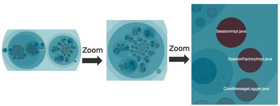
An interactive visualization lets you chose your own level of detail. If you see a hot area, zoom in to explore it further.
To get this visual advantage, we need to discuss one more trick to decide which modules to include.
Include All Modules in the Visualization
Look at the preceding figure again. See how the hotspots pop out? The reason is that the entire codebase is visualized, not just code we have recorded changes for. We get that for free, since cloc includes size metrics for all modules in the current snapshot. We then apply color only to the modules that changed within the period of interest.
This visualization makes it easy to toggle between analysis findings and the actual code they represent. Another win is that you get a quick overview of both volatile clusters and the stable parts of the system. Let’s see what that distribution of hotspots tells us about our code.