
Lastly, in our render method, let's add an indicator component. We will read from the state of the component to determine the color of our indicator.
<script type="text/babel">
  ...
  function getIndicatorColor (state) {
    if (state.valid === null || state.value.length === 0) {
      return 'transparent';
    }
    return state.valid ? 'green' : 'red';
  }

  class Input extends React.Component {
    constructor() { ... }
    validate = (event) => { ... }
    render () {
      return (
        <label>
          {this.props.label}
          <input type={this.props.type} onChange={this.validate}/>
          <div className="indicator" style={{
            height: "20px",
            width: "20px",
            backgroundColor: getIndicatorColor(this.state)
          }}></div>
        </label>
      )
    }
  }
  ...
</script>
Now, open index.html on your browser, and try out the input boxes. If you enter an invalid email, or your password is too short/long, the indicator will show red.
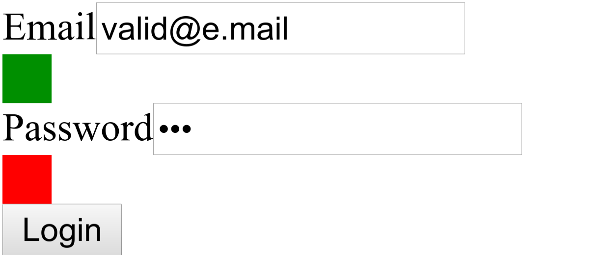
It is not very pretty, but "function over form" - let's care about the looks once we have the functionality in place.