Table of Contents for
Responsive Web Design with HTML5 and CSS3 - Second Edition
 Responsive Web Design with HTML5 and CSS3 - Second Edition
Published by
Packt Publishing, 2015
Responsive Web Design with HTML5 and CSS3 - Second Edition
Published by
Packt Publishing, 2015
- Cover
- Table of Contents
- Responsive Web Design with HTML5 and CSS3 Second Edition
- Responsive Web Design with HTML5 and CSS3 Second Edition
- Credits
- About the Author
- About the Reviewers
- www.PacktPub.com
- Preface
- What you need for this book
- Who this book is for
- Conventions
- Reader feedback
- Customer support
- 1. The Essentials of Responsive Web Design
- Defining responsive web design
- Setting browser support levels
- Our first responsive example
- The shortcomings of our example
- Summary
- 2. Media Queries – Supporting Differing Viewports
- Media query syntax
- Combining media queries
- Using media queries to alter a design
- Considerations for organizing and authoring media queries
- Combine media queries or write them where it suits?
- The viewport meta tag
- Media Queries Level 4
- Summary
- 3. Fluid Layouts and Responsive Images
- Introducing Flexbox
- Getting Flexy
- Responsive images
- Summary
- 4. HTML5 for Responsive Web Designs
- Starting an HTML5 page the right way
- Easy-going HTML5
- New semantic elements in HTML5
- HTML5 text-level semantics
- Obsolete HTML features
- Putting HTML5 elements to use
- WCAG and WAI-ARIA for more accessible web applications
- Embedding media in HTML5
- Responsive HTML5 video and iFrames
- A note about 'offline first'
- Summary
- 5. CSS3 – Selectors, Typography, Color Modes, and New Features
- Anatomy of a CSS rule
- Quick and useful CSS tricks
- Word wrapping
- Facilitating feature forks in CSS
- New CSS3 selectors and how to use them
- CSS3 structural pseudo-classes
- CSS custom properties and variables
- CSS calc
- CSS Level 4 selectors
- Web typography
- New CSS3 color formats and alpha transparency
- Summary
- 6. Stunning Aesthetics with CSS3
- Box shadows
- Background gradients
- Repeating gradients
- Background gradient patterns
- Multiple background images
- High-resolution background images
- CSS filters
- A warning on CSS performance
- Summary
- 7. Using SVGs for Resolution Independence
- The graphic that is a document
- Creating SVGs with popular image editing packages and services
- Inserting SVGs into your web pages
- Inserting an SVG inline
- What you can do with each SVG insertion method (inline, object, background-image, and img)
- Extra SVG capabilities and oddities
- Animating SVG with JavaScript
- Optimising SVGs
- Using SVGs as filters
- A note on media queries inside SVGs
- Summary
- 8. Transitions, Transformations, and Animations
- CSS3 2D transforms
- CSS3 3D transformations
- Animating with CSS3
- Summary
- 9. Conquer Forms with HTML5 and CSS3
- Understanding the component parts of HTML5 forms
- HTML5 input types
- How to polyfill non-supporting browsers
- Styling HTML5 forms with CSS3
- Summary
- 10. Approaching a Responsive Web Design
- View and use the design on real devices
- Embracing progressive enhancement
- Defining a browser support matrix
- Tiering the user experience
- Linking CSS breakpoints to JavaScript
- Avoid CSS frameworks in production
- Coding pragmatic solutions
- Use the simplest code possible
- Hiding, showing, and loading content across viewports
- Validators and linting tools
- Performance
- The next big things
- Summary
- Index
When it comes to front-end web development, 'ivory towered idealism' is a particular bugbear of mine. While we should always endeavor try to do things 'the right way', pragmatism must always win out. Let me give you an example (the finished code is example_10-02). Suppose we have a button to style that opens an off-canvas menu. Our natural inclination might be to mark it up something like this:
<button class="menu-toggle js-activate-off-canvas-menu">
<span aria-label="site navigation">☰</span> menu
</button>Nice and simple. It's a button so we have used the button element. We have used two different HTML classes on the button, one will be a hook for CSS styling (menu-toggle), and the other as a JavaScript hook (js-activate-off-canvas-menu). In addition, we are using the aria-label attribute (ARIA is covered in more detail in Chapter 4, HTML5 for Responsive Web Designs) to communicate to screen readers the meaning of the character inside the span. In this example, we have used the HTML entity ☰ which is the Unicode character 'Trigram for Heaven'. It's used here merely because it looks like the 'Hamburger icon' often used to symbolize a menu.
Tip
If you'd like some solid advice on when and how to use the aria-label attribute I thoroughly recommend the following post on the Opera developer site by Heydon Pickering: https://dev.opera.com/articles/ux-accessibility-aria-label/
At this point, we seem to be in good shape. Semantic, highly accessible markup and classes to separate concerns. Great. Let's add some styling:
.menu-toggle {
    appearance: none;
    display: inline-flex;
    padding: 0 10px;
    font-size: 17px;
    align-items: center;
    justify-content: center;
    border-radius: 8px;
    border: 1px solid #ebebeb;
    min-height: 44px;
    text-decoration: none;
    color: #777;
}

[aria-label="site navigation"] {
    margin-right: 1ch;
    font-size: 24px;
}
Open this up in Firefox and this is what we see:

Not exactly what we were hoping for. In this case, the browser has decided we've gone too far; Firefox simply won't allow us to use a button element as a Flex container. This is a very real conflict for a developer. Do we choose the right element or the right aesthetic? Given that ideally, we would like to have the menu 'hamburger icon' on the left and the word 'menu' on the right.
Tip
You can see in the prior code we have used the appearance property. It's used to remove the browsers default styling for form elements, and has had a potted history. It was specified by the W3C for some time and then later dropped, leaving behind vendor-prefixed versions of the property in both Mozilla and WebKit browsers. Thankfully, it's now back on the standards track: http://dev.w3.org/csswg/css-ui-4/#appearance-switching
I won't lie. Given this conundrum, I usually opt for the latter. Then I try and make up for the fact I'll be using the wrong element by choosing the next best element and changing the ARIA role where possible. In this case, while our menu button is certainly not a link (after all, it doesn't take the user anywhere), it's an a tag that I will be using. I've decided it's the next best thing—more like a button than any other element. And by using a link we can achieve the desired aesthetic. Here's the markup I'd go with. Note the added ARIA role on the a tag to indicate its role as a button (and not a link which is the default) to assistive technology:
<a class="menu-toggle js-activate-off-canvas-menu" role="button">
<span aria-label="site navigation">☰</span> menu
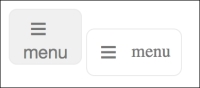
</a>It's not perfect but it's a pragmatic solution. Here's the two (button element on the left, a tag on the right) next to each other in Firefox (version 39.0a2 if you're curious):
Of course, for this simplistic example, we could change the display from flex to block and play around with the padding until our desired aesthetic was achieved. Or, we could keep the button element and nest another semantically meaningless element (span) and make that a Flex container. There are trade-offs whichever approach you favor.
Ultimately, it's up to us to markup documents as sensibly as possible. At one end of the scale, there are developers that only markup with divs and spans to ensure no unwanted styles from the browser. The cost being no inherent meaning from their elements and in turn, no 'free' accessibility. At the other end of the scale are markup purists, who will only ever markup content in what they consider to be the correct element, regardless of how 'off' the visuals might end up as a result. There is a middle ground. I feel that's the sensible and most productive place to be.