Table of Contents for
Responsive Web Design with HTML5 and CSS3 - Second Edition
 Responsive Web Design with HTML5 and CSS3 - Second Edition
Published by
Packt Publishing, 2015
Responsive Web Design with HTML5 and CSS3 - Second Edition
Published by
Packt Publishing, 2015
- Cover
- Table of Contents
- Responsive Web Design with HTML5 and CSS3 Second Edition
- Responsive Web Design with HTML5 and CSS3 Second Edition
- Credits
- About the Author
- About the Reviewers
- www.PacktPub.com
- Preface
- What you need for this book
- Who this book is for
- Conventions
- Reader feedback
- Customer support
- 1. The Essentials of Responsive Web Design
- Defining responsive web design
- Setting browser support levels
- Our first responsive example
- The shortcomings of our example
- Summary
- 2. Media Queries – Supporting Differing Viewports
- Media query syntax
- Combining media queries
- Using media queries to alter a design
- Considerations for organizing and authoring media queries
- Combine media queries or write them where it suits?
- The viewport meta tag
- Media Queries Level 4
- Summary
- 3. Fluid Layouts and Responsive Images
- Introducing Flexbox
- Getting Flexy
- Responsive images
- Summary
- 4. HTML5 for Responsive Web Designs
- Starting an HTML5 page the right way
- Easy-going HTML5
- New semantic elements in HTML5
- HTML5 text-level semantics
- Obsolete HTML features
- Putting HTML5 elements to use
- WCAG and WAI-ARIA for more accessible web applications
- Embedding media in HTML5
- Responsive HTML5 video and iFrames
- A note about 'offline first'
- Summary
- 5. CSS3 – Selectors, Typography, Color Modes, and New Features
- Anatomy of a CSS rule
- Quick and useful CSS tricks
- Word wrapping
- Facilitating feature forks in CSS
- New CSS3 selectors and how to use them
- CSS3 structural pseudo-classes
- CSS custom properties and variables
- CSS calc
- CSS Level 4 selectors
- Web typography
- New CSS3 color formats and alpha transparency
- Summary
- 6. Stunning Aesthetics with CSS3
- Box shadows
- Background gradients
- Repeating gradients
- Background gradient patterns
- Multiple background images
- High-resolution background images
- CSS filters
- A warning on CSS performance
- Summary
- 7. Using SVGs for Resolution Independence
- The graphic that is a document
- Creating SVGs with popular image editing packages and services
- Inserting SVGs into your web pages
- Inserting an SVG inline
- What you can do with each SVG insertion method (inline, object, background-image, and img)
- Extra SVG capabilities and oddities
- Animating SVG with JavaScript
- Optimising SVGs
- Using SVGs as filters
- A note on media queries inside SVGs
- Summary
- 8. Transitions, Transformations, and Animations
- CSS3 2D transforms
- CSS3 3D transformations
- Animating with CSS3
- Summary
- 9. Conquer Forms with HTML5 and CSS3
- Understanding the component parts of HTML5 forms
- HTML5 input types
- How to polyfill non-supporting browsers
- Styling HTML5 forms with CSS3
- Summary
- 10. Approaching a Responsive Web Design
- View and use the design on real devices
- Embracing progressive enhancement
- Defining a browser support matrix
- Tiering the user experience
- Linking CSS breakpoints to JavaScript
- Avoid CSS frameworks in production
- Coding pragmatic solutions
- Use the simplest code possible
- Hiding, showing, and loading content across viewports
- Validators and linting tools
- Performance
- The next big things
- Summary
- Index
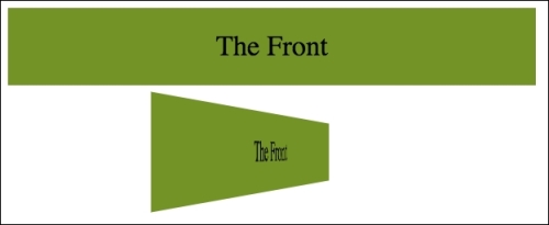
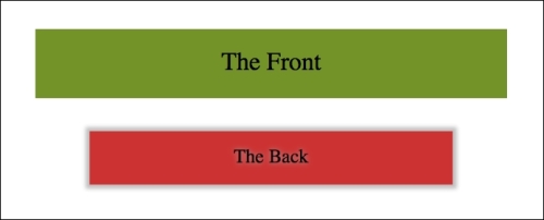
Let's look at our first example. An element that flips when we hover over it. I've used hover here to invoke the change as it's simple for the sake of illustration, however the flipping action could just as easily be initiated with a class change (via JavaScript) or when an element received focus.
We will have two of these elements; a horizontal flipping element and a vertical flipping element. You can view the final example at example_08-04. Images fail to fully convey this technique but the idea is that the element flips from the green 'face' to the red 'face' and gives the illusion of doing so through 3D space with the aid of perspective. Here's a grab partway through the transition from green to red which hopefully conveys some of the effect.
Here's the markup for the flipping element:
<div class="flipper">
    <span class="flipper-object flipper-vertical">
        <span class="panel front">The Front</span>
        <span class="panel back">The Back</span>
    </span>
</div>
The only difference with the horizontal one, markup wise is the flipper-horizontal class instead of flipper-vertical.
As the majority of the styles relate to aesthetics, we'll merely look at the essential ingredients in our styles to make the flipping effect possible. Refer to the full style sheet in the example for the aesthetic styles.
First of all, we need to set some perspective for the .flipper-object to flip within. For that we use the perspective property. This takes a length attempting to simulate the distance from the viewer's screen to the edge of the elements 3D space.
If you set a low number like 20px for the perspective value, the 3D space of the element will extend right out to only 20px from your screen; the result being a very pronounced 3D effect. Setting a high number on the other hand, will mean the edge of that imaginary 3D space will be further away, and therefore produce a less pronounced 3D effect.
.flipper {
    perspective: 400px;
    position: relative;
}
We are positioning the outer element relatively to create a context for the flipper-object to be positioned within:
.flipper-object {
    position: absolute;
    transition: transform 1s;
    transform-style: preserve-3d;
}
Besides positioning the .flipper-object absolutely at the top left of its closest relatively positioned parent (the default position for absolutely positioned elements), we have set a transition for the transform. The key thing here, 3D wise, though is the transform-styles: preserve-3d. This tells the browser that when we transform this element, we want any children elements to preserve the 3D effect.
If we didn't set preserve-3d on the .flipper-object, we would never get to see the back (the red part) of the flipping element. You can read the specification for this property at http://www.w3.org/TR/2009/WD-css3-3d-transforms-20090320/.
Each 'panel' in our flipping element needs positioning at the top of its container but we also want to make sure that if rotated, we don't see the 'rear' of it (otherwise we would never see the green panel as it sits 'behind' the red one). To do that we use the backface-visibility property. We set this to hidden so that the back face of the element is, you guessed it, hidden:
.panel {
    top: 0;
    position: absolute;
    backface-visibility: hidden;
}
Tip
I've found that backface-visibility actually has a few surprising side effects in some browsers. It's particularly useful for improving the performance of fixed position elements on older Android devices. For more on this and why it does what it does, take a look at this post: http://benfrain.com/easy-css-fix-fixed-positioning-android-2-2-2-3/ and this one: http://benfrain.com/improving-css-performance-fixed-position-elements/
Next we want to make our back panel flipped by default (so that when we flip the whole thing it will actually be in the correct position). To do that we apply a rotate transform:
.flipper-vertical .back {
    transform: rotateX(180deg);
}

.flipper-horizontal .back {
    transform: rotateY(180deg);
}
Now everything is in place, now all we want to do is flip the entire inner element when the outer one is hovered over:
.flipper:hover .flipper-vertical {
    transform: rotateX(180deg);
}

.flipper:hover .flipper-horizontal {
    transform: rotateY(180deg);
}
As you can imagine there are a bazillion (by the way, that's definitely not a real amount, I just checked) ways you can use these principals. If you're wondering what a fancy navigation effect, or off-canvas menu, might look like with a spot of perspective, I highly recommend paying Codrops a visit: http://tympanus.net/Development/PerspectivePageViewNavigation/index.html.
Tip
Read about the latest W3C developments on CSS Transforms Module Level 1 at http://dev.w3.org/csswg/css-transforms/.
In addition to using perspective, I've also found great utility in the transform3d value. With a single property and value, this allows you to move an element in the X (left/right), Y (up/down), and Z (forwards/backwards) axis. Let's amend our last example and make use of the translate3d transform. You can view this example at example_08-06.
Besides setting the elements in with a little padding, the only changes from our previous example can be seen here:
.flipper:hover .flipper-vertical {
    transform: rotateX(180deg) translate3d(0, 0, -120px);
    animation: pulse 1s 1s infinite alternate both;
}

.flipper:hover .flipper-horizontal {
    transform: rotateY(180deg) translate3d(0, 0, 120px);
    animation: pulse 1s 1s infinite alternate both;
}
We're still applying a transform but this time, in addition to our rotate we have also added a translate3d. The syntax for the comma-separated 'arguments' you can pass into translate3d are x axis movement, y axis movement, and z axis movement.
In our two examples I'm not moving the element in the x or y axis (left to right, and up and down) instead I'm moving towards or further away from you as you look at it.
If you look at the top example you will see it flip behind the bottom button and end 120px closer to the screen (minus values effectively pull it backwards towards you).
On the other hand, the bottom button flips around horizontally and ends with the button 120px further away from you.
Tip
You can read the specification for translate3d at http://www.w3.org/TR/css3-3d-transforms/.
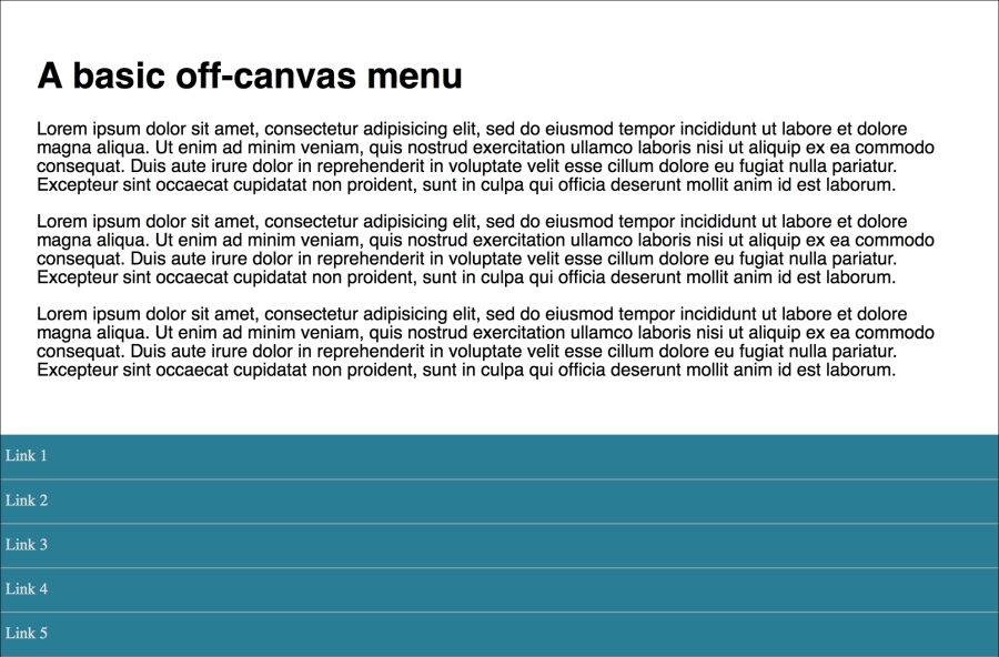
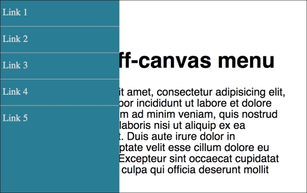
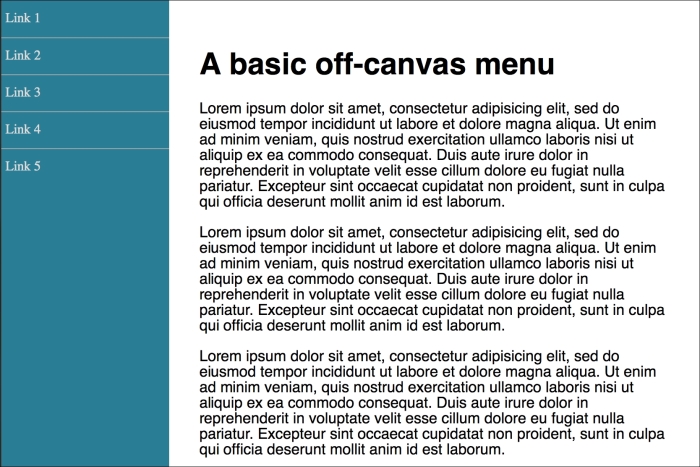
The area I have found the greatest utility for transform3d is in sliding panels on and off the screen, particularly 'off-canvas' navigation patterns. If you open example_08-07 you'll see I have created a basic, progressively enhanced off-canvas pattern.
Whenever you create interaction with JavaScript and modern CSS features like transforms it makes sense to try and consider things from the lowest possible device you want to support. What about the two people that don't have JavaScript (yes, those guys) or if there is a problem with the JavaScript loading or executing? What if somebody's device doesn't support transform (Opera Mini for example)? Don't worry, it's possible, with a little effort, to ensure a working interface for every eventuality.
When building these kind of interface patterns I find it most useful to start with the lowest set of features and enhance from there. So, first establish what someone sees if they don't have JavaScript available. After all, it's no use parking a menu off-screen if the method for displaying the menu relies upon JavaScript. In this case, we are relying upon markup to place the navigation area in the normal document flow. Worst case, whatever the viewport width, they can merely scroll down the page and click a link:
If JavaScript is available, for smaller screens we 'pull' the menu off to the left. When the menu button is clicked, we add a class onto the body tag (with JavaScript) and use this class as a hook to move the navigation back into view with CSS.
For larger viewports we hide the menu button and merely position the navigation to the left and move the main content over to accommodate.
We then progressively enhance the navigation show/hide effect. This is where a tool like Modernizr really earns its place; adding classes to the HTML tag we can use as styling hooks (Modernizr is discussed in greater detail in Chapter 5, CSS3 – Selectors, Typography, Color Modes, and New Features).
First, for browsers that only support translate transforms (old Android for example), a simple translateX:
.js .csstransforms .navigation-menu {
    left: auto;
    transform: translateX(-200px);
}
For browsers that support translate3d we use translate3d instead. This will perform far better, where supported, thanks to being offloaded to the graphics processors on most devices:
.js .csstransforms3d .navigation-menu {
    left: auto;
    transform: translate3d(-200px, 0, 0);
}
Embracing a progressive enhancement approach ensures the widest possible audience will get a workable experience from your design. Remember, your users don't need visual parity but they might appreciate capability parity.