Table of Contents for
Responsive Web Design with HTML5 and CSS3 - Second Edition
 Responsive Web Design with HTML5 and CSS3 - Second Edition
Published by
Packt Publishing, 2015
Responsive Web Design with HTML5 and CSS3 - Second Edition
Published by
Packt Publishing, 2015
- Cover
- Table of Contents
- Responsive Web Design with HTML5 and CSS3 Second Edition
- Responsive Web Design with HTML5 and CSS3 Second Edition
- Credits
- About the Author
- About the Reviewers
- www.PacktPub.com
- Preface
- What you need for this book
- Who this book is for
- Conventions
- Reader feedback
- Customer support
- 1. The Essentials of Responsive Web Design
- Defining responsive web design
- Setting browser support levels
- Our first responsive example
- The shortcomings of our example
- Summary
- 2. Media Queries – Supporting Differing Viewports
- Media query syntax
- Combining media queries
- Using media queries to alter a design
- Considerations for organizing and authoring media queries
- Combine media queries or write them where it suits?
- The viewport meta tag
- Media Queries Level 4
- Summary
- 3. Fluid Layouts and Responsive Images
- Introducing Flexbox
- Getting Flexy
- Responsive images
- Summary
- 4. HTML5 for Responsive Web Designs
- Starting an HTML5 page the right way
- Easy-going HTML5
- New semantic elements in HTML5
- HTML5 text-level semantics
- Obsolete HTML features
- Putting HTML5 elements to use
- WCAG and WAI-ARIA for more accessible web applications
- Embedding media in HTML5
- Responsive HTML5 video and iFrames
- A note about 'offline first'
- Summary
- 5. CSS3 – Selectors, Typography, Color Modes, and New Features
- Anatomy of a CSS rule
- Quick and useful CSS tricks
- Word wrapping
- Facilitating feature forks in CSS
- New CSS3 selectors and how to use them
- CSS3 structural pseudo-classes
- CSS custom properties and variables
- CSS calc
- CSS Level 4 selectors
- Web typography
- New CSS3 color formats and alpha transparency
- Summary
- 6. Stunning Aesthetics with CSS3
- Box shadows
- Background gradients
- Repeating gradients
- Background gradient patterns
- Multiple background images
- High-resolution background images
- CSS filters
- A warning on CSS performance
- Summary
- 7. Using SVGs for Resolution Independence
- The graphic that is a document
- Creating SVGs with popular image editing packages and services
- Inserting SVGs into your web pages
- Inserting an SVG inline
- What you can do with each SVG insertion method (inline, object, background-image, and img)
- Extra SVG capabilities and oddities
- Animating SVG with JavaScript
- Optimising SVGs
- Using SVGs as filters
- A note on media queries inside SVGs
- Summary
- 8. Transitions, Transformations, and Animations
- CSS3 2D transforms
- CSS3 3D transformations
- Animating with CSS3
- Summary
- 9. Conquer Forms with HTML5 and CSS3
- Understanding the component parts of HTML5 forms
- HTML5 input types
- How to polyfill non-supporting browsers
- Styling HTML5 forms with CSS3
- Summary
- 10. Approaching a Responsive Web Design
- View and use the design on real devices
- Embracing progressive enhancement
- Defining a browser support matrix
- Tiering the user experience
- Linking CSS breakpoints to JavaScript
- Avoid CSS frameworks in production
- Coding pragmatic solutions
- Use the simplest code possible
- Hiding, showing, and loading content across viewports
- Validators and linting tools
- Performance
- The next big things
- Summary
- Index
The popularity and ubiquity of responsive web design makes it an easier sell to clients and stakeholders than ever before. Most people have some idea what responsive web design is about. The notion of a single codebase that will just work across all devices is a compelling offering.
One question that almost always comes up when starting a responsive design project is that of browser support. With so many browser and device variants, it's not always pragmatic to support every single browser permutation fully. Perhaps time is a limiting factor, perhaps money. Perhaps both.
Typically, the older the browser, the greater the work and code required to gain feature or aesthetic parity with modern browsers. Therefore, it may make more sense to have a leaner, and therefore faster, codebase by tiering the experience and only providing enhanced visuals and capabilities for more capable browsers.
In the previous edition of this book, some time was spent covering how to cater for very old desktop-only browsers. In this edition, we will not.
As I write this in mid-2015, Internet Explorer 6, 7, and 8 are all but gone. Even IE 9 only has a 2.45% worldwide share of the browser market (IE 10 is only 1.94% while IE 11 is rising nicely at 11.68%). If you have no alternative but to develop for Internet Explorer 8 and below, you have my sympathies and I'm afraid I must be upfront and advise you that there won't be a terrific amount you can use in this book.
For everyone else, you owe it to your client/paymaster to explain why developing for ailing browsers might be a mistake and investing development time and resource primarily for modern browsers and platforms makes good fiscal sense in every respect.
Ultimately however, the only statistics that really matter are yours. In all but extreme cases, the sites we build should at least be functional in every common browser. Beyond basic functionality, for any web project it makes sense to decide, in advance, what platforms you want to fully enhance the experience for, and which you are happy to concede visual/functional anomalies to.
You'll also find that practically, starting with the simplest 'base level' experience and enhancing (an approach known as progressive enhancement) is easier than coming at the problem from the opposite direction—building the ultimate experience first then attempting to provide fall backs for less capable platforms (an approach known as graceful degradation).
To exemplify why knowing this in advance matters, consider that if you were unlucky enough to have 25% of your website visitors using Internet Explorer 9 (for example), you'd need to consider what features that browser supports and tailor your solution accordingly. The same caution would be required if large amounts of your users are visiting with older mobile phone platforms such as Android 2. What you can consider a 'base' experience will vary depending upon the project.
If suitable data isn't available, I apply a simple and crude piece of logic to determine whether I should spend time developing a particular platform/browser version: if the cost of developing and supporting browser X is more than the revenue/benefit created by the users on browser X; don't develop specific solutions for browser X.
It's rarely a question of whether you could 'fix' an older platform/version. It's a question of whether you should.
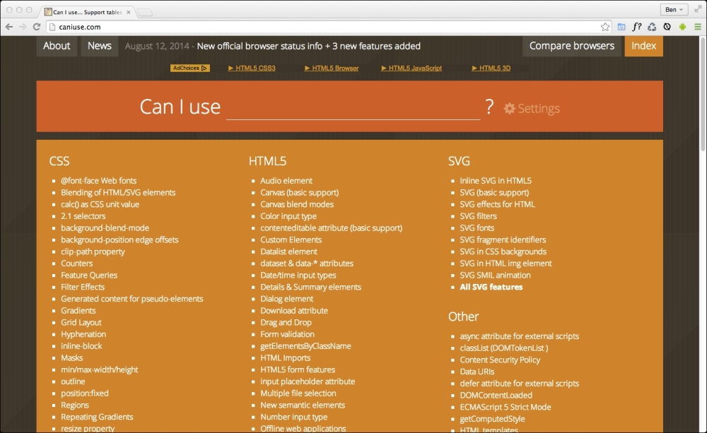
When considering which platforms and browser versions support which features, if you aren't already, become familiar the http://caniuse.com website. It provides a simple interface for establishing what browser support there is for the features we will be looking at throughout.
It makes no difference what text editor or IDE system you use to build your responsive web designs. If the simplest of text editors allows you to write your HTML, CSS, and JavaScript efficiently, that's absolutely fine. Similarly there are no requisite pieces of tooling that are essential to get a responsive web design out of the door. All you actually need is something that enables you to write HTML, CSS, and JavaScript. Whether your preference is Sublime Text, Vim, Coda, Visual Studio, or Notepad - it matters little. Just use what works best for you.
However, be aware that there are more tools available now (often free) to negate many of the manual and time-intensive tasks of building web sites than ever before. For example, CSS processors (Sass, LESS, Stylus, PostCSS) can help with code organization, variables, color manipulations, and arithmetic. Tools like PostCSS can also automate horrible and thankless jobs like CSS vendor prefixing. Furthermore, 'Linting' and validation tools can check your HTML, JavaScript, and CSS code against standards as you work, eliminating many time wasting typos or syntax errors.
New tools come out constantly and they are continually improving. Therefore, whilst some relevant and beneficial tools will be mentioned by name as we go, be aware that something better may be just around the corner. Hence we won't be relying on anything other than standards based HTML and CSS in our examples. You should however, use whatever tools you can to produce your front-end code as quickly and reliably as possible.