Table of Contents for
Responsive Web Design with HTML5 and CSS3 - Second Edition
 Responsive Web Design with HTML5 and CSS3 - Second Edition
Published by
Packt Publishing, 2015
Responsive Web Design with HTML5 and CSS3 - Second Edition
Published by
Packt Publishing, 2015
- Cover
- Table of Contents
- Responsive Web Design with HTML5 and CSS3 Second Edition
- Responsive Web Design with HTML5 and CSS3 Second Edition
- Credits
- About the Author
- About the Reviewers
- www.PacktPub.com
- Preface
- What you need for this book
- Who this book is for
- Conventions
- Reader feedback
- Customer support
- 1. The Essentials of Responsive Web Design
- Defining responsive web design
- Setting browser support levels
- Our first responsive example
- The shortcomings of our example
- Summary
- 2. Media Queries – Supporting Differing Viewports
- Media query syntax
- Combining media queries
- Using media queries to alter a design
- Considerations for organizing and authoring media queries
- Combine media queries or write them where it suits?
- The viewport meta tag
- Media Queries Level 4
- Summary
- 3. Fluid Layouts and Responsive Images
- Introducing Flexbox
- Getting Flexy
- Responsive images
- Summary
- 4. HTML5 for Responsive Web Designs
- Starting an HTML5 page the right way
- Easy-going HTML5
- New semantic elements in HTML5
- HTML5 text-level semantics
- Obsolete HTML features
- Putting HTML5 elements to use
- WCAG and WAI-ARIA for more accessible web applications
- Embedding media in HTML5
- Responsive HTML5 video and iFrames
- A note about 'offline first'
- Summary
- 5. CSS3 – Selectors, Typography, Color Modes, and New Features
- Anatomy of a CSS rule
- Quick and useful CSS tricks
- Word wrapping
- Facilitating feature forks in CSS
- New CSS3 selectors and how to use them
- CSS3 structural pseudo-classes
- CSS custom properties and variables
- CSS calc
- CSS Level 4 selectors
- Web typography
- New CSS3 color formats and alpha transparency
- Summary
- 6. Stunning Aesthetics with CSS3
- Box shadows
- Background gradients
- Repeating gradients
- Background gradient patterns
- Multiple background images
- High-resolution background images
- CSS filters
- A warning on CSS performance
- Summary
- 7. Using SVGs for Resolution Independence
- The graphic that is a document
- Creating SVGs with popular image editing packages and services
- Inserting SVGs into your web pages
- Inserting an SVG inline
- What you can do with each SVG insertion method (inline, object, background-image, and img)
- Extra SVG capabilities and oddities
- Animating SVG with JavaScript
- Optimising SVGs
- Using SVGs as filters
- A note on media queries inside SVGs
- Summary
- 8. Transitions, Transformations, and Animations
- CSS3 2D transforms
- CSS3 3D transformations
- Animating with CSS3
- Summary
- 9. Conquer Forms with HTML5 and CSS3
- Understanding the component parts of HTML5 forms
- HTML5 input types
- How to polyfill non-supporting browsers
- Styling HTML5 forms with CSS3
- Summary
- 10. Approaching a Responsive Web Design
- View and use the design on real devices
- Embracing progressive enhancement
- Defining a browser support matrix
- Tiering the user experience
- Linking CSS breakpoints to JavaScript
- Avoid CSS frameworks in production
- Coding pragmatic solutions
- Use the simplest code possible
- Hiding, showing, and loading content across viewports
- Validators and linting tools
- Performance
- The next big things
- Summary
- Index
Despite sounding similar, CSS transforms are entirely different to CSS transitions. Think of it like this: transitions smooth the change from one state to another, while transforms are defining what the element will actually become. My own (admittedly childish) way of remembering the difference is like this: imagine a transformer robot such as Optimus Prime. When he has changed into a truck he has transformed. However, the period between robot and truck is a transition (he's transitioning from one state to another).
Obviously, if you have no idea who or what Optimus Prime even is, feel free to mentally discard the last few sentences. Hopefully all will become clear momentarily.
There are two groups of CSS3 transforms available: 2D and 3D. 2D variants are far more widely implemented, browser wise, and certainly easier to write so let's look at those first. The CSS3 2D Transforms Module allows us to use the following transforms:
scale: Used to scale an element (larger or smaller)translate: Move an element on the screen (up, down, left, and right)rotate: Rotate the element by a specified amount (defined in degrees)skew: Used to skew an element with its x and y co-ordinatesmatrix: Allows you to move and shape transformations with pixel precision
Let's try out the various 2D transitions. You can test each of these out by opening example_08-02 in the browser. There's a transition applied to all of the transforms so you get a better idea of what's happening.
.scale:hover {
    transform: scale(1.4);
}
Hovering over the 'scale' link in our example produces this effect:
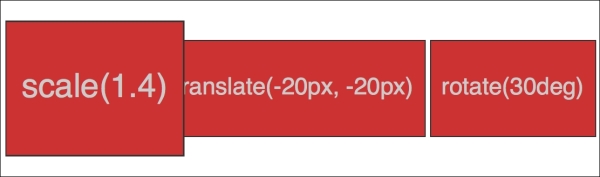
We've told the browser that when this element is hovered over, we want the element to scale to 1.4 times its original value.
Besides the values we've already used to enlarge elements, by using values below 1, we can shrink elements; the following will shrink the element to half its size:
transform: scale(0.5);
Here's the syntax for translate:
.translate:hover {
    transform: translate(-20px, -20px);
}
Here's the effect that rule has in our example:
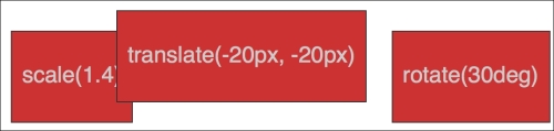
The translate property tells the browser to move an element by an amount, defined in either pixels or percentages. The first value is the x axis and the second value is the y axis. Positive values given within parentheses move the element right or down; negative values move it left or up.
If you only pass one value then it is applied to the x axis. If you want to specify just one axis to translate an element you can also use translateX or translateY.
The translate provides a really useful way to center absolutely positioned elements within a relatively positioned container. You can view this example at example_08-03.
Consider this markup:
<div class="outer">
    <div class="inner"></div>
</div>
And then this CSS:
.outer {
    position: relative;
    height: 400px;
    background-color: #f90;
}

.inner {
    position: absolute;
    height: 200px;
    width: 200px;
    margin-top: -100px;
    margin-left: -100px;
    top: 50%;
    left: 50%;
}
You've perhaps done something similar to this yourself. When the dimensions of the absolutely positioned element are known (200px x 200px in this case) we can use negative margins to 'pull' the item back to the center. However, what happens when you want to include content and have no way of knowing how tall it will be? Transform to the rescue.
Let's add some random content into the inner box:
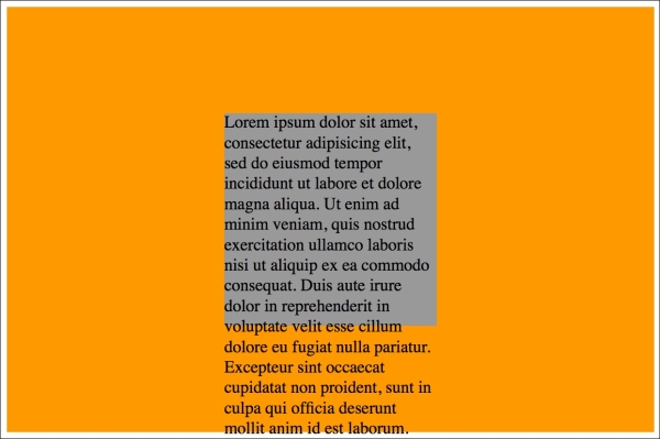
Yes, that problem! Right, let's use transform to sort this mess out.
.inner {
    position: absolute;
    width: 200px;
    background-color: #999;
    top: 50%;
    left: 50%;
    transform: translate(-50%, -50%);
}
And here is the result:
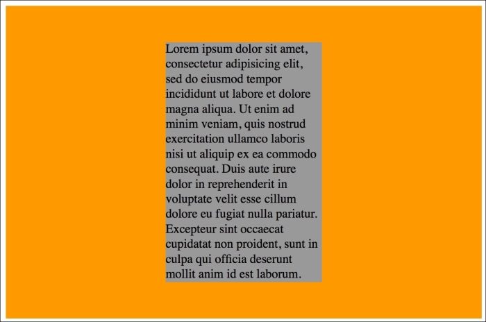
Here, top and left are positioning the inner box inside its container so that the top left corner of the inner box starts at a point 50% along and 50% down the outer. Then the transform is working on the inner element and positioning it negatively in those axis by half (-50%) of its own width and height. Nice!
The rotate transform allows you to rotate an element. Here's the syntax:
.rotate:hover {
    transform: rotate(30deg);
}
In the browser, here's what happens:
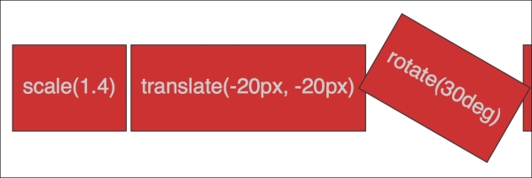
The value in parentheses should always be in degrees (for example, 90deg). While positive values always apply clockwise, using negative values will rotate the element counter-clockwise. You can also go crazy and make elements spin by specifying a value like the following:
transform: rotate(3600deg);
This will rotate the element 10 times in a complete circle. Practical uses for this particular value are few and far between but you know, if you ever find yourself designing websites for a windmill company, it may come in handy.
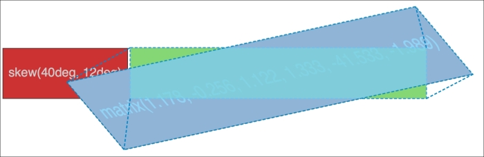
If you've spent any time working in Photoshop, you'll have a good idea what skew will do. It allows an element to be skewed on either or both of its axes. Here's the code for our example:
.skew:hover {
    transform: skew(40deg, 12deg);
}
Setting this on the hover link produces the following effect on hover:
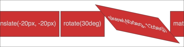
The first value is the skew applied to the x axis (in our example, 40deg), while the second (12deg) is for the y axis. Omitting the second value means any value will merely be applied to the x axis (horizontal). For example:
transform: skew(10deg);
Did somebody mention a completely over-rated film? No? What's that? You want to know about the CSS3 matrix, not the film? Oh, okay.
I'm not going to lie. I think the matrix transform syntax looks scary. Here's our example code:
.matrix:hover {
    transform: matrix(1.678, -0.256, 1.522, 2.333, -51.533, -1.989);
}
It essentially allows you to combine a number of other transforms (scale, rotate, skew, and so on) into a single declaration. The preceding declaration results in the following effect in the browser:
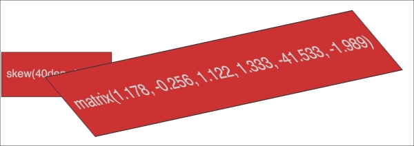
Now, I like a challenge like the best of them (unless, you know, it's sitting through the Twilight films) but I'm sure we can agree that syntax is a bit testing. For me, things got worse when I looked at the specification and realized that it involved mathematics knowledge beyond my rudimentary level to fully understand: http://www.w3.org/TR/css3-2d-transforms/
Tip
If you find yourself doing work with animations in JavaScript without the help of an animation library, you'll probably need to become a little more acquainted with the matrix. It's the syntax all the other transforms get computed into so if you're grabbing the current state of an animation with JavaScript, it will be the matrix value you will need to inspect and understand.
I'm not a mathematician by any stretch of the imagination, so when faced with the need to create a matrix-based transformation, I cheat. If your mathematical skills are also found wanting, I'd suggest heading over to http://www.useragentman.com/matrix/.
The Matrix Construction Set website allows you to drag and drop the element exactly where you want it and then includes good ol' copy and paste code(including vendor-prefixes) for your CSS file.
Notice how with CSS, the default transform origin (the point at which the browser uses as the center for the transform) is in the middle: 50% along the x axis and 50% along the y axis of the element. This differs from SVG which defaults to top left (or 0 0).
Using the transform-origin property we can amend the point from which transforms originate.
Consider our earlier matrix transform. The default transform-origin is '50% 50%' (the center of the element). The Firefox developer tools show how the transform is applied:
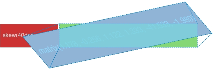
Now, if we adjust the transform-origin like this:
.matrix:hover {
   transform: matrix(1.678, -0.256, 1.522, 2.333, -51.533, -1.989);
   transform-origin: 270px 20px;
}
Then you can see the effect this has:
The first value is the horizontal offset and the second value is the vertical offset. You can use keywords. For example, left is equal to 0% horizontal, right is equal to 100% horizontal, top is equal to 0% vertical, and bottom is equal to 100% vertical. Alternatively, you can use a length, using any of the CSS length units.
If you use a percentage for the transform-origin values, then the horizontal/vertical offset is relative to the height/width of the elements bounding box.
If you use a length, then the values are measured from the top-left corner of the elements bounding box.
Full information on the transform-origin property can be found at http://www.w3.org/TR/css3-2d-transforms/.
That covers the essentials of 2D transforms. They are far more widely implemented than their 3D brethren and provide a far better means to move elements around the screen than older methods such as absolute positioning.
Read the full specification on CSS3 2D Transforms Module Level 3 at http://www.w3.org/TR/css3-2d-transforms/.
Tip
For more on the benefits of moving element with transform, here's a great post by Paul Irish (http://www.paulirish.com/2012/why-moving-elements-with-translate-is-better-than-posabs-topleft/) that provides some good data.
And, for a fantastic overview of how browsers actually deal with transitions and animations, and why transforms can be so effective, I highly recommend the following blog post: http://blogs.adobe.com/webplatform/2014/03/18/css-animations-and-transitions-performance/